Jun 11, 2014 | design, illustration

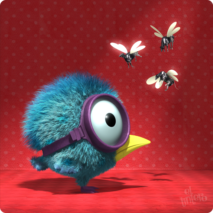
“Policarpio,” 2010: “Policarpio is a little swimmer birdie who is visited by his 3 fairy godmothers …”

“Simon The Dog,” 2009: Character modeled for a marketing agency.

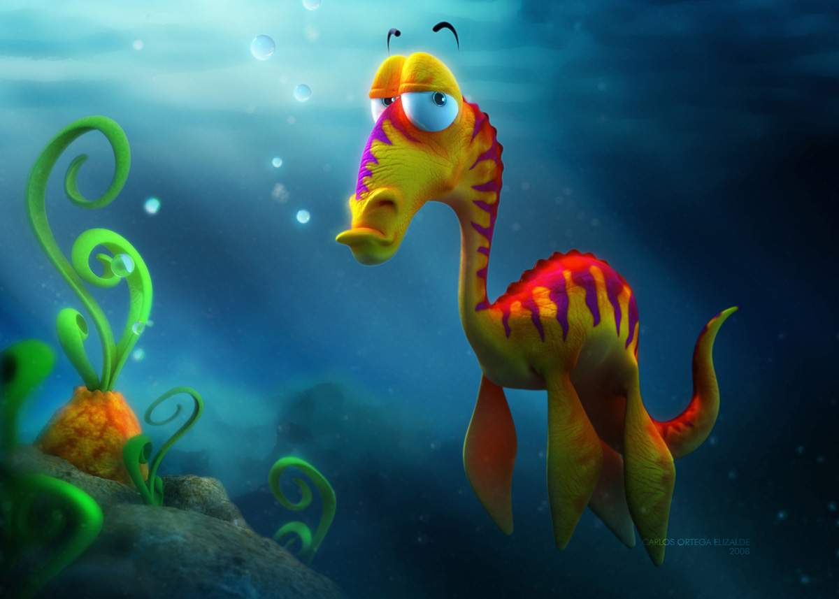
“Erasmo the plesiosaur,” 2008: “I created this character for a challenge at 3DTotal.com. My concept was simple: to make a cute and colorful animal with a grumpy and annoyed attitude.”

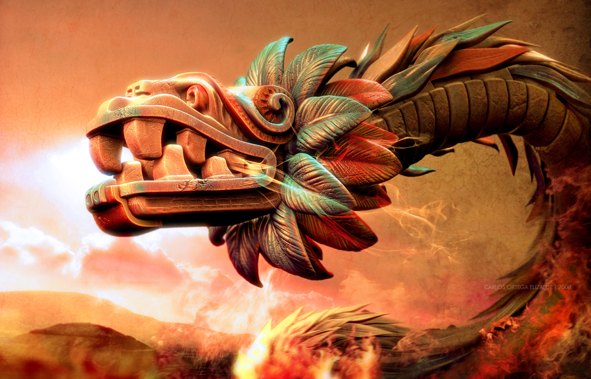
“Quetzalcoatl’s Rage,” 2008: “The aztec god Quetzalcoatl waking up in his stone body and facing the enemy, waiting for the battle…”

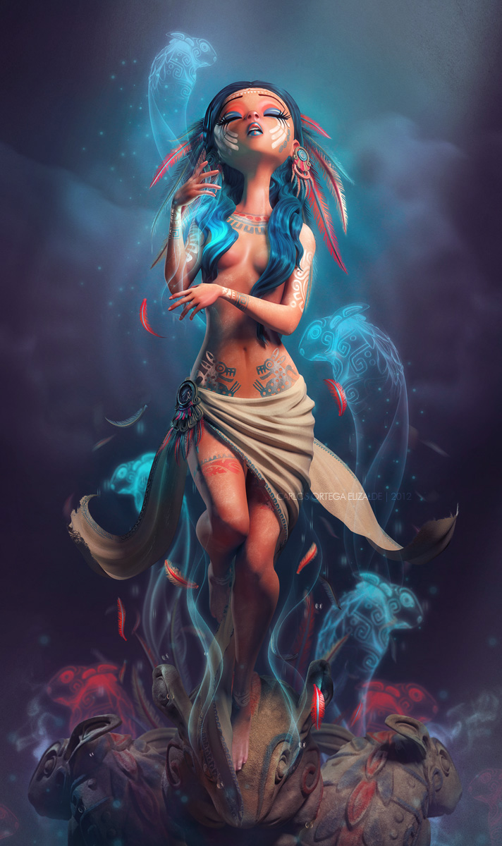
“The Weeping Woman,” 2012: “Created for the Collective Exhibition in Mexico: “Ilustrando para” as homage for the mexican Rock Band ‘Caifanes'”
Spunky animals take on personalities to match in Carlos Ortega‘s 3D artwork. Similar in style to Pixar movies and Frozen, his women have teeny tiny button noses and huge almond eyes that rest in their perfect round cheeks. But it’s his birds with goggles and imagined sea creatures that open the gates of possibility.
If you’ve seen the 2012 CocaCola short, “Crabs & Penguins,” Carlos designed the soccer-playing penguins in the video!
May 15, 2013 | illustration
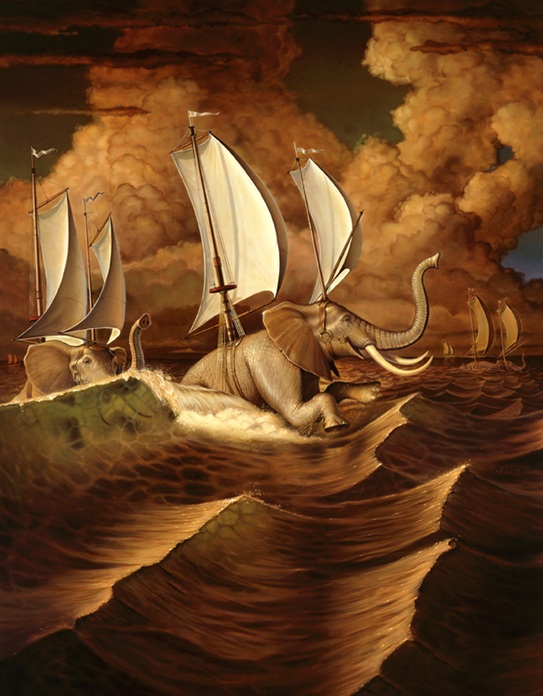
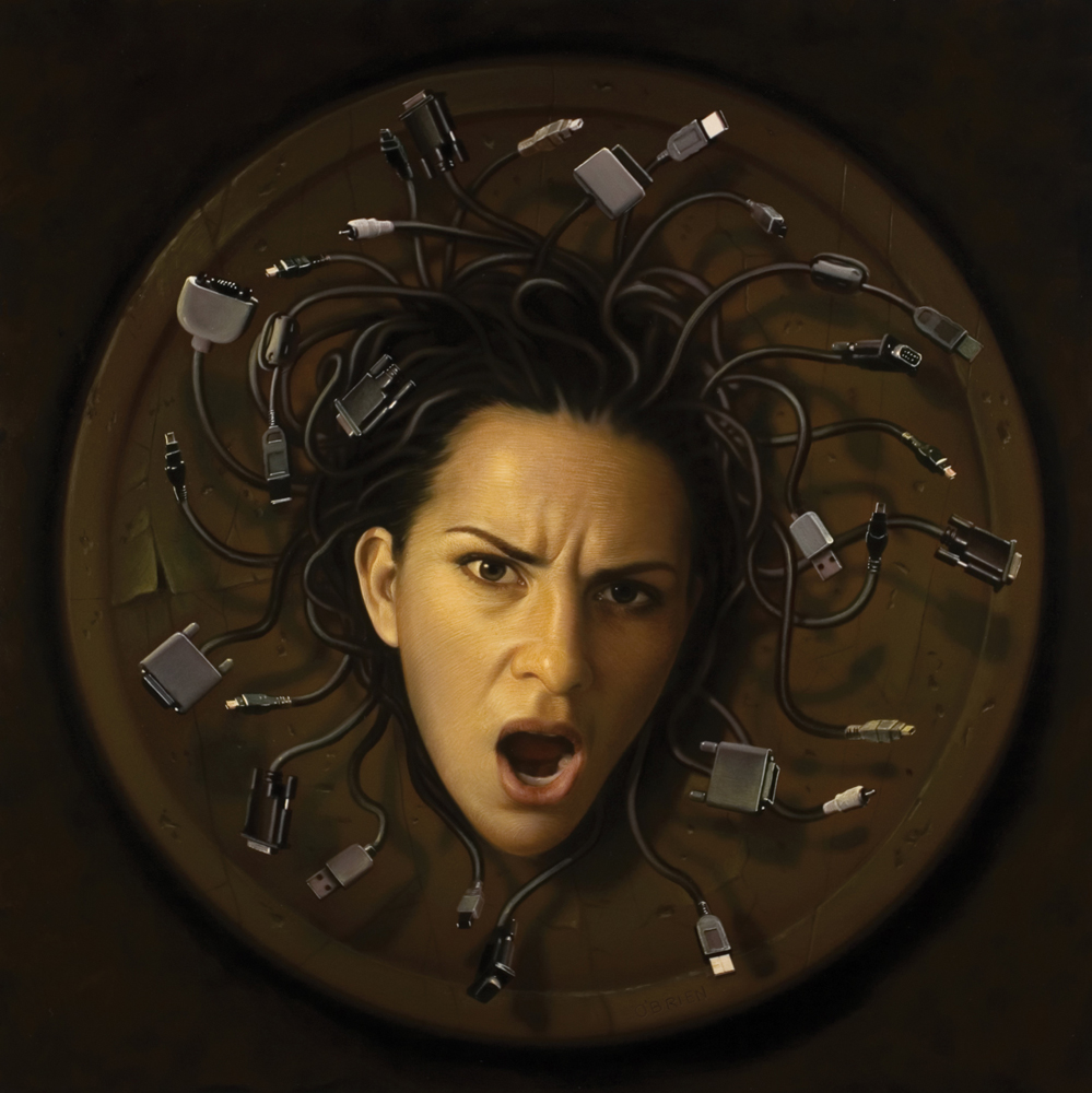
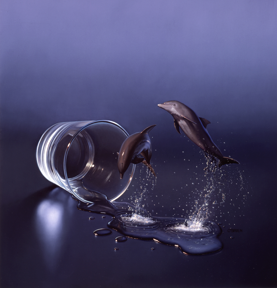
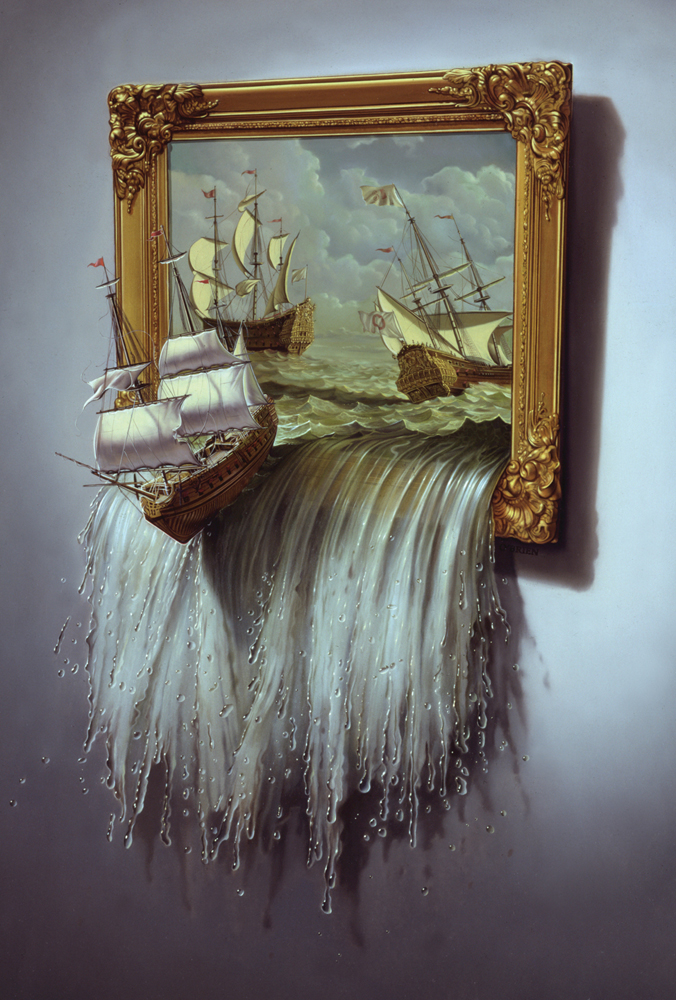
Tim O’Brien’s illustrations have been published in Rolling Stone, Newsweek, The New York Times and so many more – simple, conceptual images that resonate with audiences and stick a message in your brain. His personal pieces trade in celebrities and politicians for animals with bodies elegant and strong, and they persevere through hardships that make our stresses seem silly. There’s always a surreal aspect in his conceptual pieces but often they hide in subtleties, turning each illustration into a new game of “what in this picture is impossible?”
Tim is a professor at the University of Arts in Philadelphia and at the Pratt Institute in Brooklyn, and he’s lectured at The Norman Rockwell Museum, Rhode Island School of Design and the School of Visual Arts in New York City.


For more of Tim’s work see his website.
All images courtesy of the artist.
May 14, 2013 | design, illustration
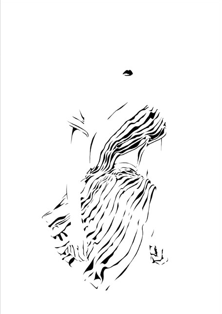
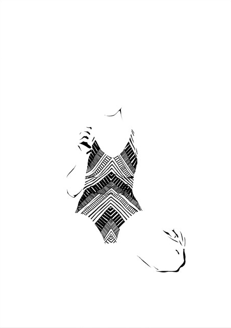
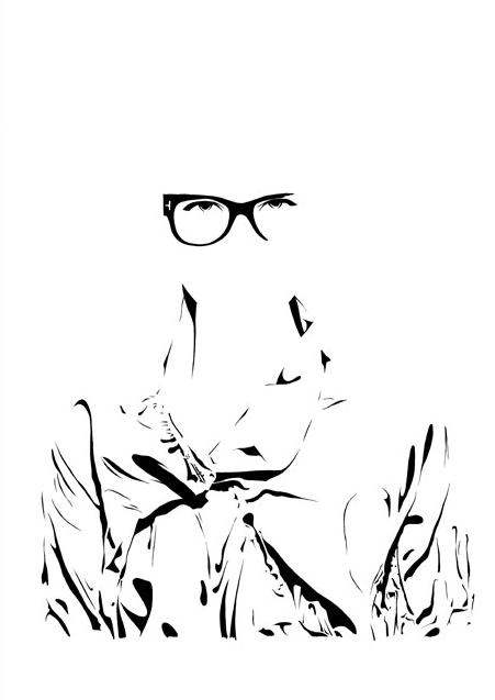
She goes by Zivabelle, and her designs and illustrations are gorgeous. So simple and clean, but always with something more to them that makes you look just a bit longer. These minimalist fashion illustrations play with black and white, visible and invisible, light and shadow. She got her bachelors in Visual Communication at Bezalel Academy of Design in Jerusalem, then headed to Barcelona to get a masters in Fashion at ELISAVA – Universitat Pompeu Fabra.

Is she there?

Wait, where’d she go?

Images courtesy of the artist’s website. Check it out for more!
May 1, 2013 | illustration
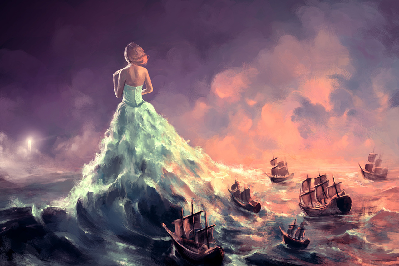
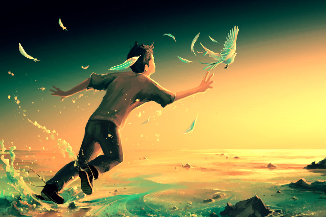
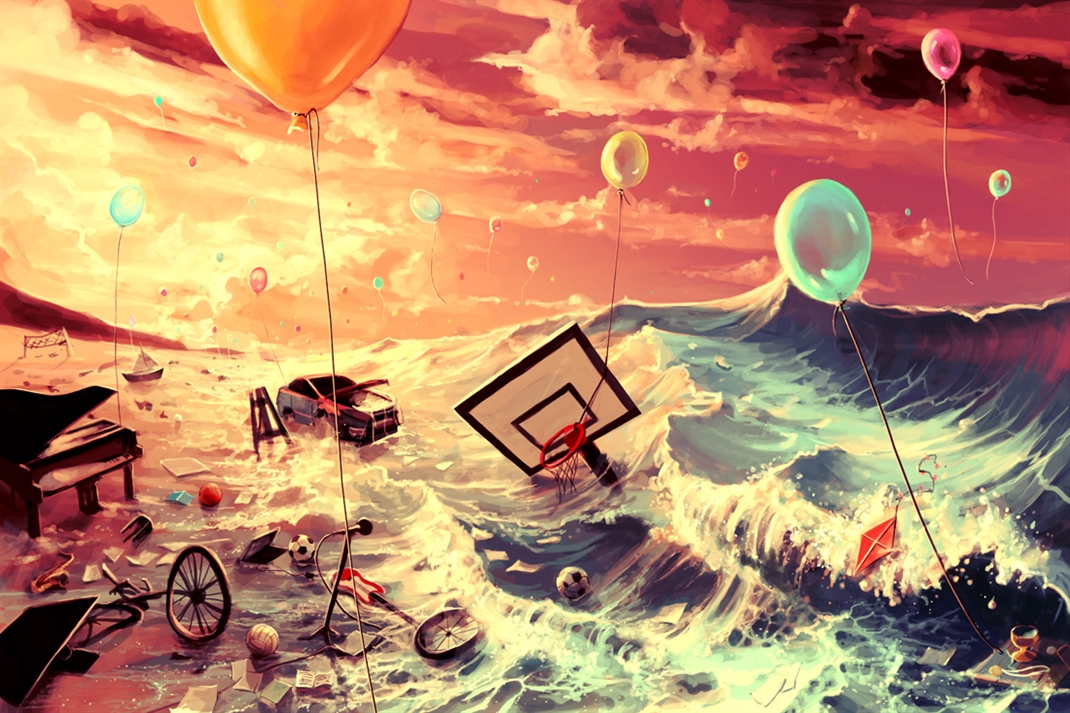
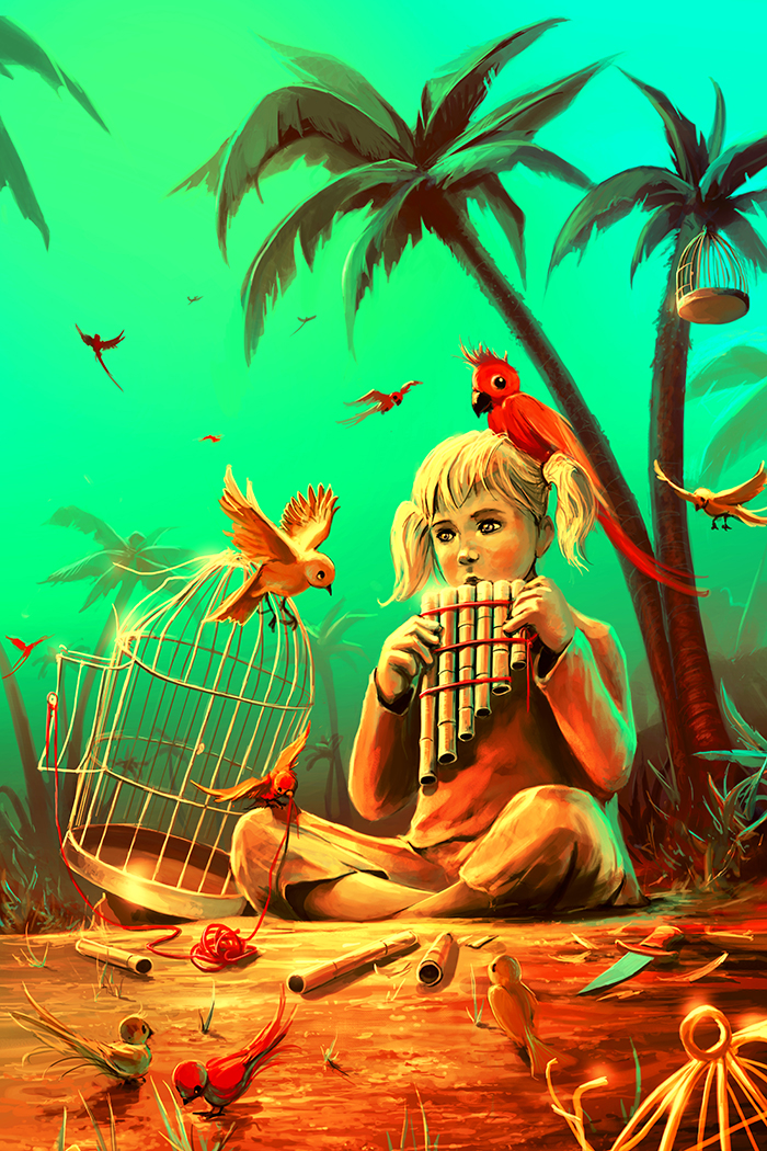
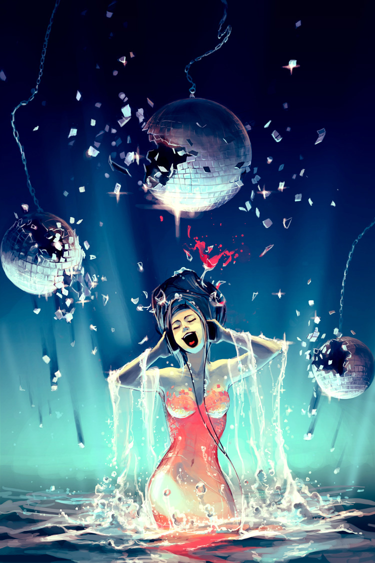
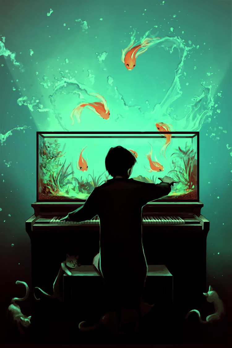
Each of Cyril Rolando’s graphic illustrations creates it own landscape of wonder, taking your eyes to colorful places buried deep in imagination. He uses a lot of ocean which tends to set each scene on the shore – a dramatic place where land meets water.
In some works the water transforms into something else, becoming dresses and music that add a conceptual component to these bright effortless works.


Cyril Rolando is a 28-year-old digital artist and clinical psychologist living in southern France. He began drawing on his computer in 2004 and is completely self-taught, using only Photoshop CS2 and a Wacom tablet to create these incredible ethereal scenes.
On his DeviantArt page he writes,
“My artistic approach is set between surreal and fantasy style… in one word : Otherworldly… I like the absurdity, the creativity and the enchanting universes, where colors bring more emotions than thousand smiles or a million tears. I am curious of life. I admire the work of the time, the evolution of societies, the change of thoughts, the human revolutions….how drops after drops are born oceans. I choose the pseudo Aquasixio to put together my favorite element with my favorite digit. My characters are often lost children or in quest for their truth (and not THE truth). Their stories are quite sad but the darkness of life is more inspiring than happy and safe people, in my opinion.”
He says he doesn’t consider himself an artist, just a Photoshop user trying to tell a story with a picture, and his fulltime job as a psychologist allows for more distance between him and his work.


[zl_mate_code name=”twitter/facebook” label=”5″ count=”2″ link1=”http://www.twitter.com/share?url=https://thingsworthdescribing.com/2013/05/01/bright-surreal-worlds-by-cyril-rolando/” link2=”http://www.facebook.com/share.php?u=https://thingsworthdescribing.com/2013/05/01/bright-surreal-worlds-by-cyril-rolando/”]

[/zl_mate_code]
For more of Cyril’s work, see his Tumblr and DeviantArt page.
Apr 16, 2013 | illustration
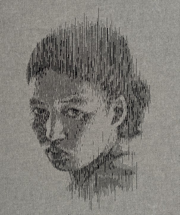
Even though she creates the likenesses of people, they’re not portraits in any traditional sense. Kumi Yamashita has worked with shadow, alphabet letters, and even shoe prints to render the delicate faces of individuals, using whatever obscure medium she’s working in to highlight every glance, wrinkle and shadow. Her portraits focus on faces and let the rest of the body fade away underneath, each face revealing a perfect, unique composition of nose, eyes, mouth, and cheeks.
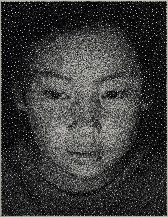
Her two newest works were created in opposite ways – the first involves the stripping away of white threads from a single piece of denim, revealing the vertically oriented portrait of a woman who turns to look back at us in “Warp & Weft – Mother #2.” Her second latest work comes from her Constellation series – portraits made from a single unbroken thread that’s been wrapped around a dense forest of galvanized nails. “Constellation – Mana #2” reveals the nail-speckled face of a little Asian girl, her eyes cast down in wonder and her face glowing against a dark background.

“Warp & Weft – Mother #2”
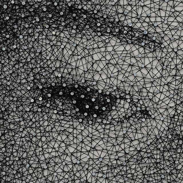
The intricacies of Kumi’s Constellation works can only be fully appreciated in the detail shots that let you see how much intricate detail it takes to capture a likeness with just nails and a single piece of thread. One eye alone takes at least thirty nails, and who knows how many hours to create. According to Kumi’s website each Constellation portrait takes a process lasting many months to create, all the nails piercing through a wooden panel painted solid white.

Detail, “Constellation – Mana #2”
It looks like the little girl is discovering something for the first time, her face glowing and eyebrows arched with interest. In my mind she’s watching Kumi create this very portrait, lips parted in awe as the string is wound rapidly around the nails to create her likeness out of a single black thread.
A Japanese artist living and working in New York City, Kumi Yamashita has been showing her work all over the world since the early 2000s. Her piece “Constellation – Mana” was chosen as a finalist in the Smithsonian’s Outwin Boochever Competition, and will be on display at the National Portrait Gallery in Washington D.C. for almost an entire year, from March 23, 2013 through February 23, 2014. The competition asks artists to create a portrait from a living person they’ve had direct contact with.
According to Philip Kennicott’s Washington Post article about the competition, “Constellation – Mana” shows an image of Kumi’s niece, someone she described as “chatty, awkward and sometimes obnoxious.” Kennicott writes, “From a distance, the portrait appears to be a photograph that has been slightly altered to give its surface the look of a lightly crackled pottery glaze. Closer inspection reveals the astonishingly complicated method of its production: A single fine string has been wound around hundreds of delicate nails, giving a sense of the missing snapshot through the density of the web it creates.”

“Constellation – Mana #2”
For more of Kumi Yamashita’s work, see her website and her Facebook page.
Apr 5, 2013 | illustration
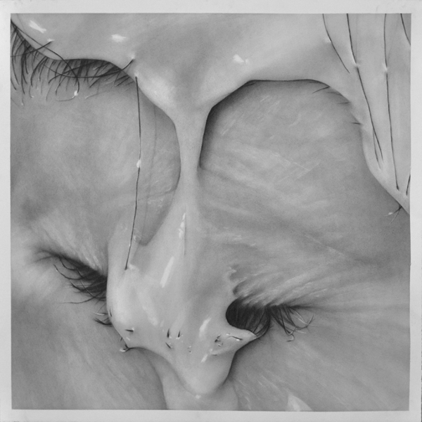
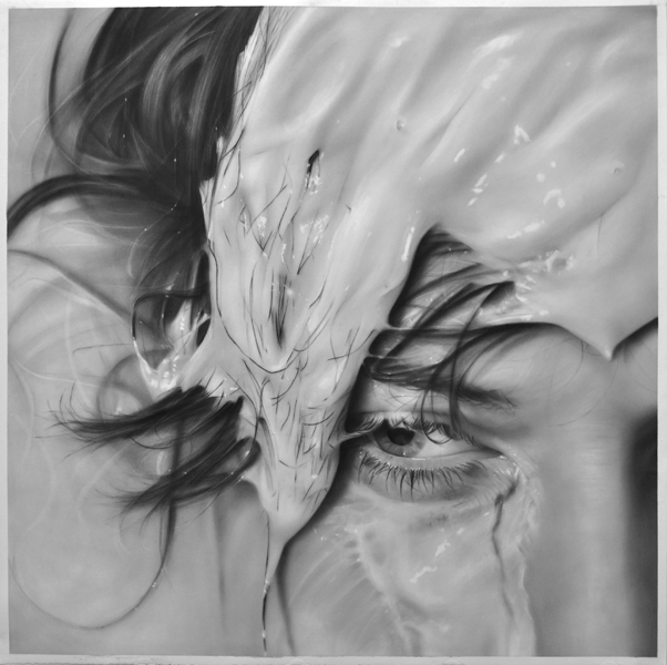
Thick paint drips down her face in a color close the skin’s; it covers and reveals hair and flesh wherever gravity takes it.
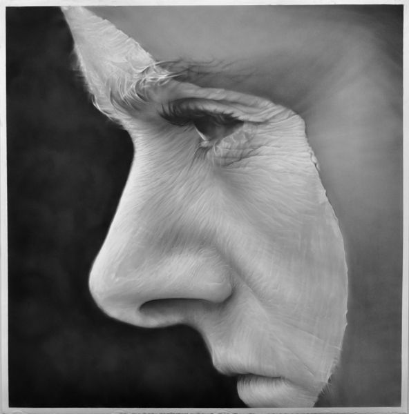
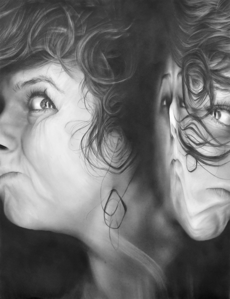
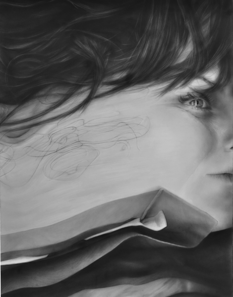
Melissa Cooke’s series “Surfaced” analyzes obscured faces – faces covered in liquids and warped by Xerox machines in ways that make you wonder where the real skin actually begins and ends. But these aren’t photographs, so none of it is really real anyways – they’re graphite drawings that capture every follicle and wrinkle, every tug and pull of skin, and they immerse you in a world that plays with texture and perception in bold closeup ways, gathering intensity from details.

Trickle, graphite on paper, 24 ” x 24 “
Paint and hair don’t function harmoniously the way paint and skin do. Hair isn’t manageable and flat – it pokes through the liquid that’s attempting to cover it, refusing to be masked or hidden. In “Surfaced,” this is the role of the eyelashes and eyebrows, lines of rebellion against the paint, breaking through the color the same way the lines in the skin do.
They become something different because the paint gives them an alias, a form of cover, but the most substantive parts can’t be completely obscured. The paint dips into the flesh’s crevices, filling and amplifying the lines that have come from years of smiling and crying.

Crested, graphite on paper, 50 ” x 50 “
According to Melissa’s description of the series, “Surfaced” works to examine the relationship between photography, painting and drawing in portraiture. She used her own face as a canvas, painting and pouring liquids onto herself as she took photographs. Then, she used those photos to create her graphite drawings.
“The photo shoot references the practice of drawing and painting; then the final graphite drawing references photography,” she said, “The boundaries between the mediums are broken down and the processes are interwoven.”
She purposefully focused on zoomed in sections of her face, obscuring the notion of the portrait and concentrating on humanness in general as opposed to one specific human:
“The cropping pushes the face to the surface of the paper, making the figure more ambiguous. Flesh becomes abstracted: obliterated by paint on the skin, distorted by the eye of the camera lens, or smeared by the glass of a Xerox machine.”

Xerox #5, graphite on paper, 50 ” x 38 “

Washed Out, graphite on paper, 50 ” x 50 “
Melissa Cooke, 30, is an artist originally from Wisconsin specializing in these kind of intricate graphite drawings that examine the relationships between photography, performance, and drawing in portraiture.
She makes her drawings by dusting thin layers of graphite onto paper with a dry brush, and then editing the soft graphite against the smooth paper by erasing in details and textures. She doesn’t use pencils at all, so more than anything it’s an art of subtraction instead of addition, likening it to sculpture in a way, as Melissa carefully chips away the spots of color that shouldn’t be there.

Xerox #1, graphite on paper, 50 ” x 38 “
See more from “Surfaced” and her other series of graphite drawings on Melissa’s website.
