Nov 16, 2016 | interviews, painting

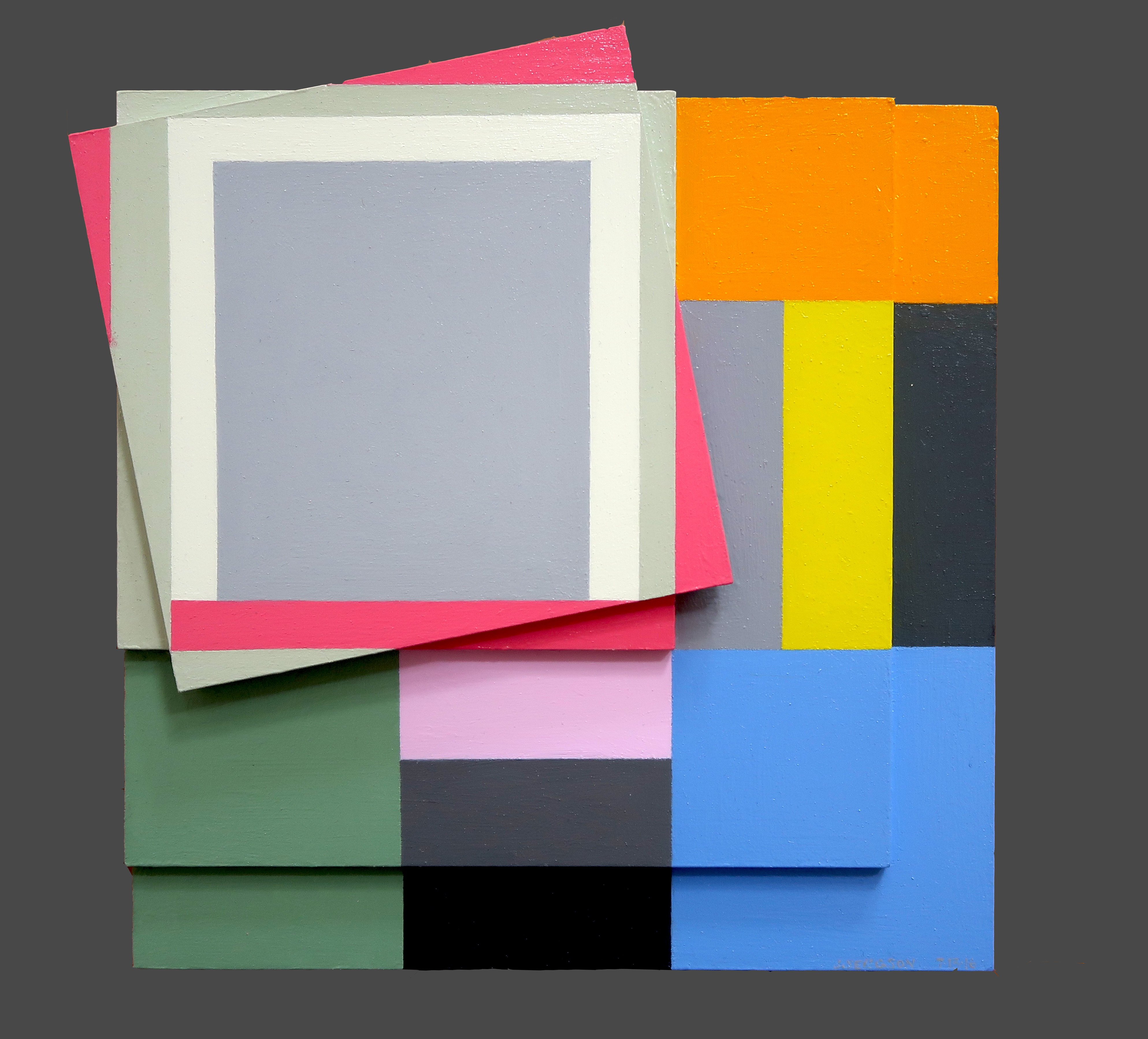
Judith Seligson
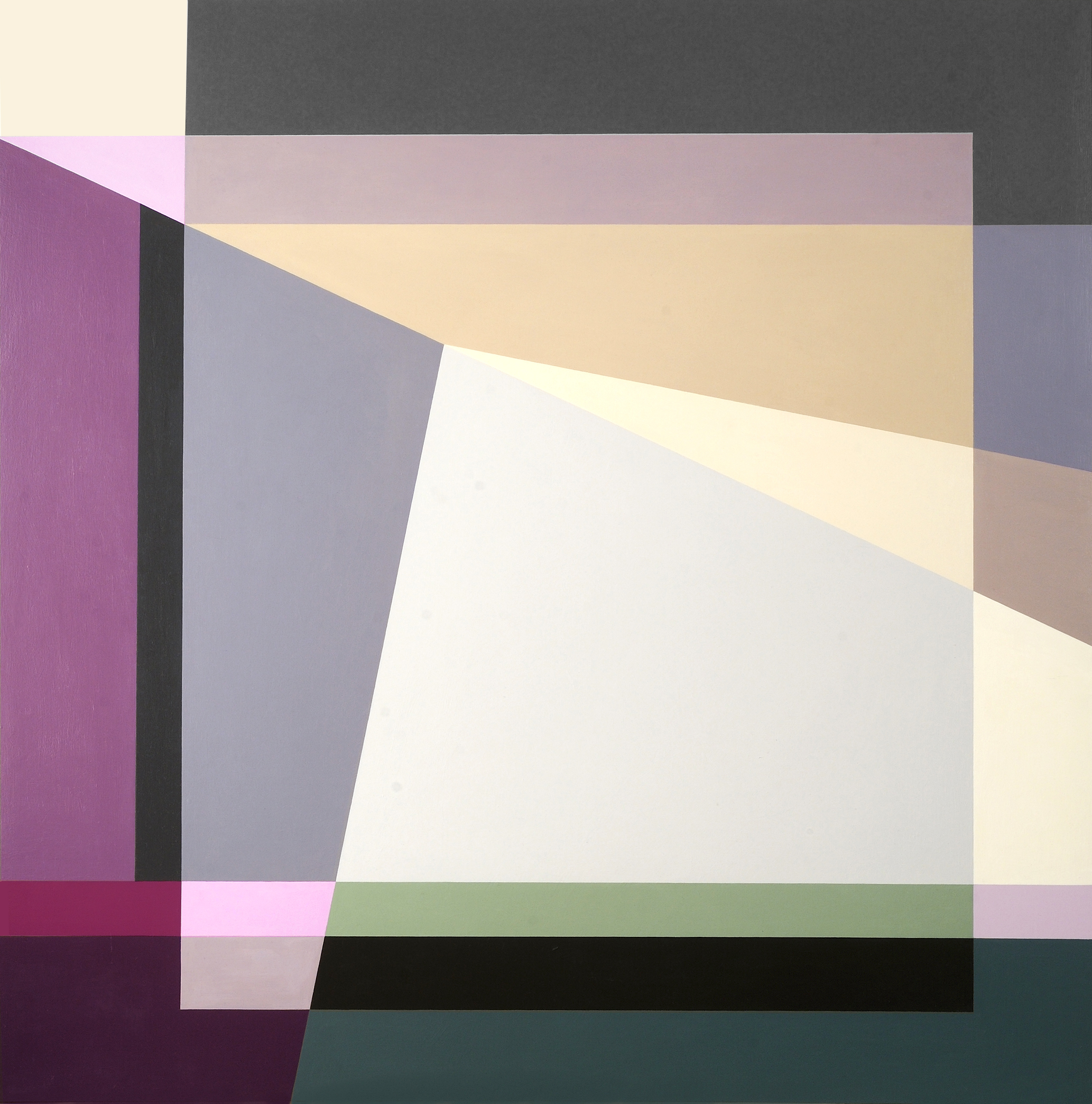
Signs Of Struggle, 2016
Oil on panels
8.5 x 8.5 in.
Courtesy of the artist
Colors fracture, shapes surface, and together the two work in tandem to continue Josef Albers’ exploration of minimalist, geometric compositions. Judith Seligson’s new exhibition Drawing the Line is comprised of elegant, cheerful examples of shape and color getting well acquainted.
How did you begin in geometric painting? What was the initial spark of inspiration for you?
I developed a series of charcoal drawings in my first studio, in Cambridge, MA in 1973, just after I graduated from Harvard, that presaged everything that was to come. I was drawing from life; both the studio itself and a vase of my mother’s dead roses were my subjects. Despite charcoal’s propensity for infinite shades of gray, I found myself using the charcoal simply to outline discrete empty shapes. Each petal surface was a shape. This method flattened objects and made them of a piece with everything else in the work, like tesserae in a mosaic.
At that time, too, I was studying a book called Cézanne’s Composition: Analysis of His Form with Diagrams and Photographs of His Motifs by Erle Loran. He “reduced” a painting to a series of lines of force. I began applying this method to some of my favorite Vermeers. Vermeer too focused my attention on drawing architecture.
My love of building blocks and of finding hidden structures in a painting and in life continued to grow and develop. Still, I pushed against it then and still do. In 1978 I had a show of painting pairs – each pair used the same palette, but one was geometric and one expressionist. I ended up pursuing the geometric direction, thinking that I could always pull the expressionist one off the back burner if I needed a change. When I look at those small painting pairs now, I find the expressionist ones much better than the geometric ones.
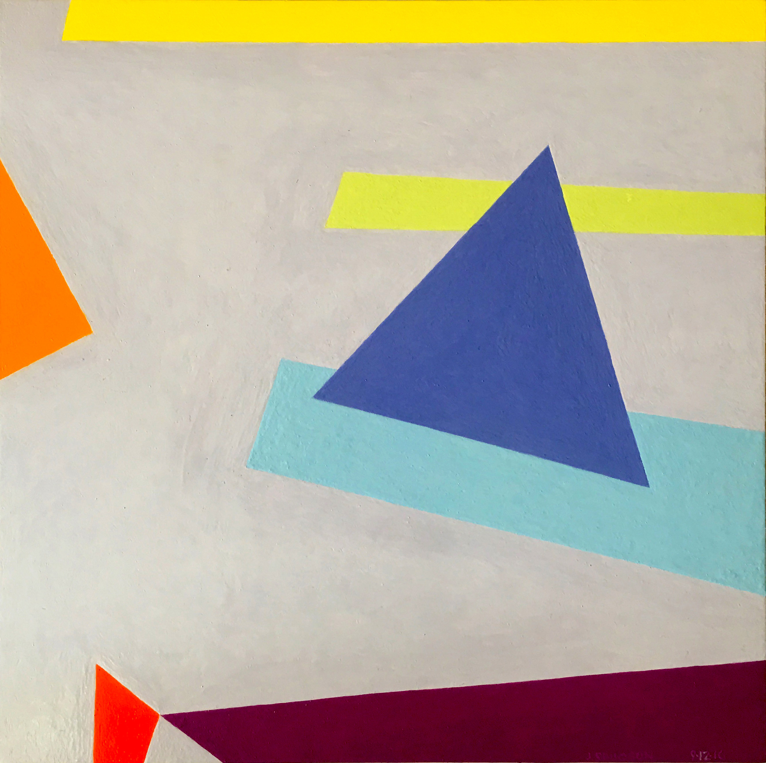
Judith Seligson
Golden, 2016
Oil on panel
7 x 7 in.
Courtesy of the artist
Galérie Mourlot describes your work as having a “feminist bent.” In what ways do you see your work as uniquely feminist?
Here is a quote from my article, Contrapuntal Painting, which appeared in the Radcliffe Quarterly, March 1992:
“Many of my paintings are diminutive, intimate, three to five inches in either direction. Rather than physically overpowering (as many men are to women), they suggest a more interactive relationship with the viewer. Smallness in art may be coming under a more favorable star, but in my lifetime size has mostly been a directly proportional measure of importance and, though no one would admit it, quality. The small works are painted on paper. Arthur Danto has aptly pointed out that paper, since it is so expendable, is considered a less “serious” medium than canvas, panels, or walls, and so has become associated with the artist’s “intimate moods.”
“Paper and women have a lot in common in that they both have developed a reputation for being less than serious but good for intimate moods, and maybe even expendable. I take these stereotypes, these preconceptions, and play with them. I draw on the bare paper — actually four-ply museum board — and then apply multiple layers of a gesso wash to protect the painting from the board. This way I can be serious, intimate, expendable, and conservable all at once.”
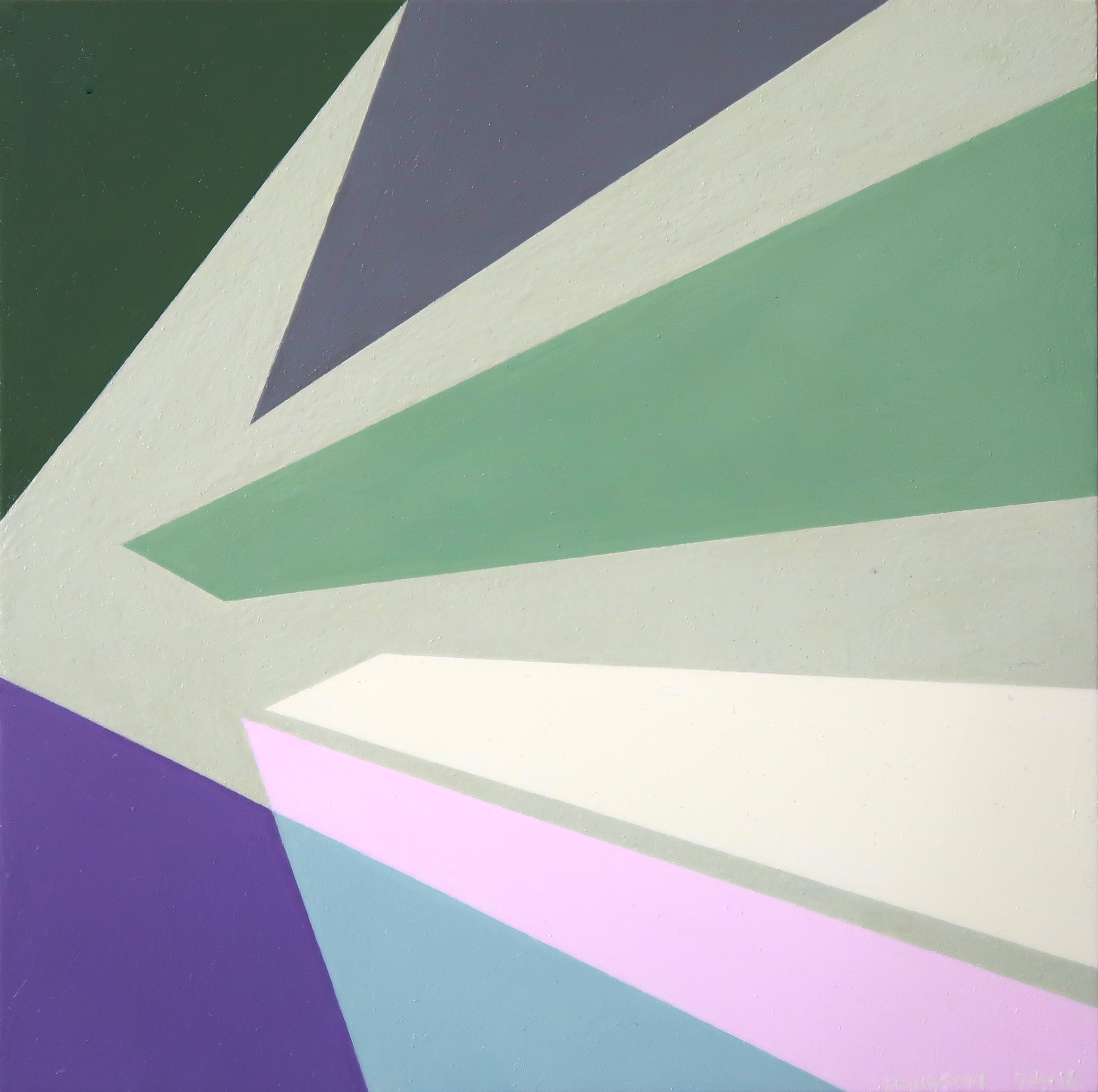
Judith Seligson
Healing Brush, 2016
Oil on panel
6 x 6 in.
Courtesy of the artist
When did you first introduce three-dimensionality to your work?
About four years ago. I was making a series of collages using, among other things, fragments of my own paintings. These were works I didn’t love or didn’t think were finished, but couldn’t toss. Then I started placing paintings that I had signed into a single composition. That led to adjusting one or the other to improve the composition. Then I started gluing together completely blank panels. At that point, I didn’t know how I wanted to paint them. I looked at them for over two years until I figured out the topological painting in Fine Tuned.
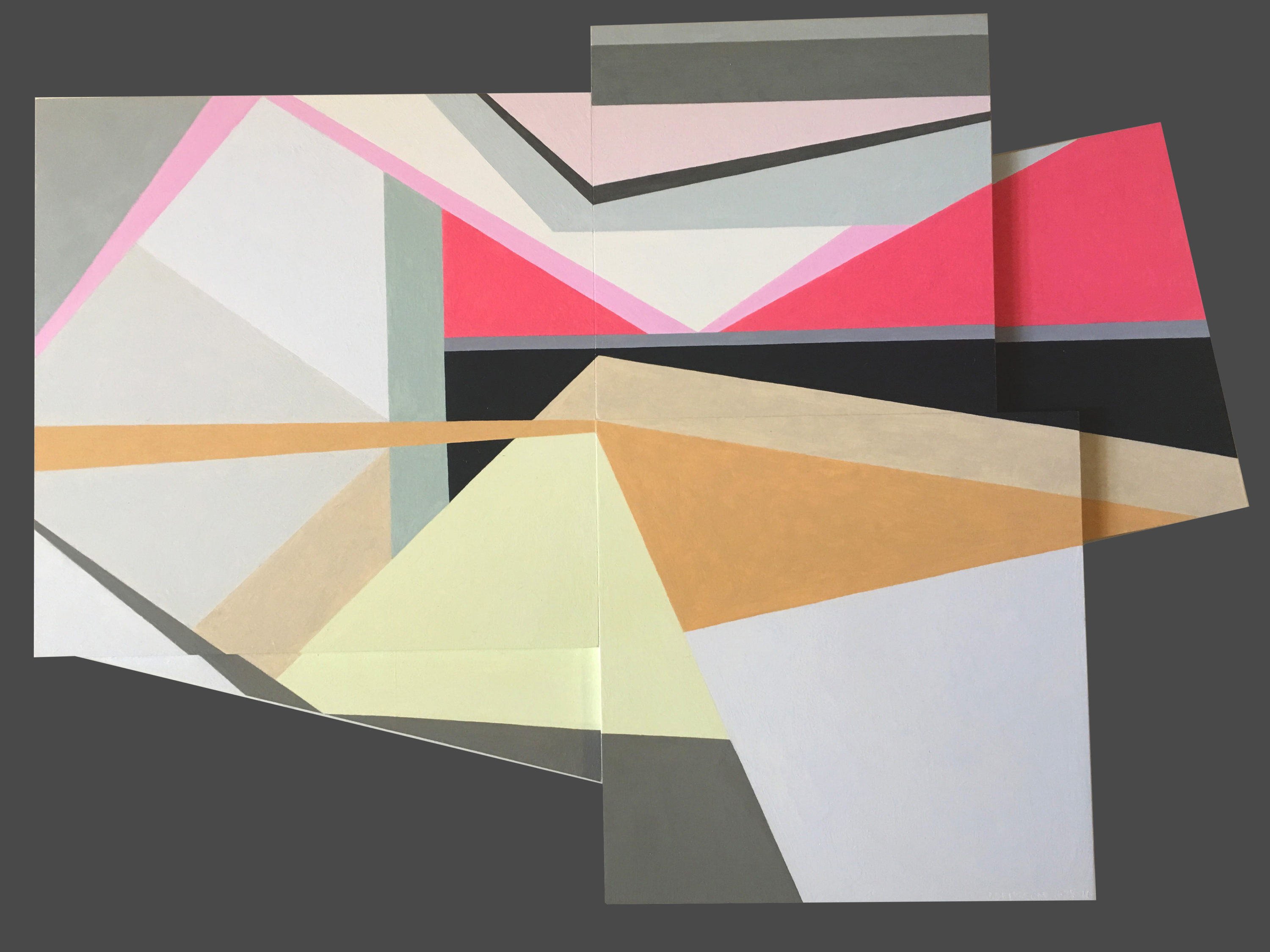
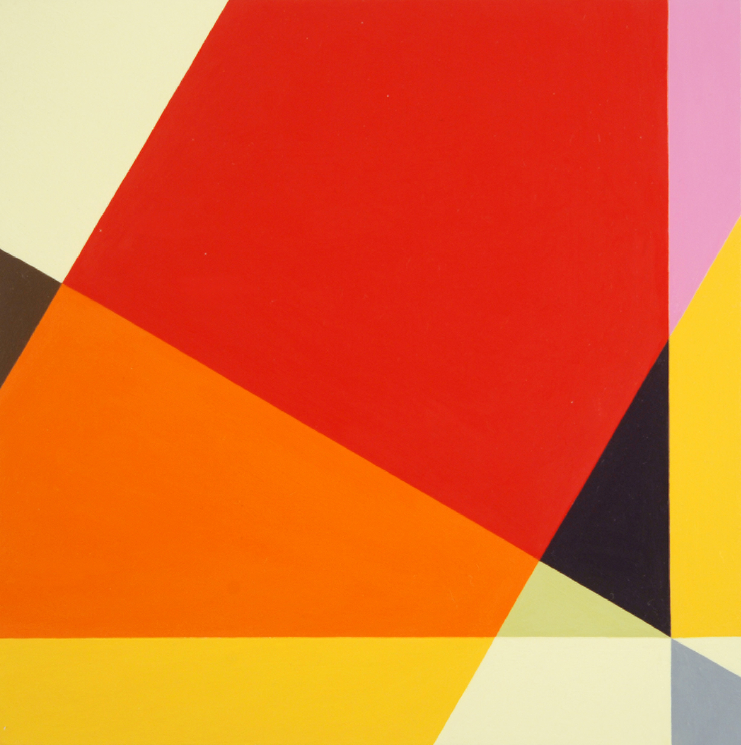
Judith Seligson
Complications, 2016
Oil on panel
11 x 16 in.
Courtesy of the artist
Can you walk us through the process of creating one of your works? Which comes first, color or shape?
The chicken or the egg. Each painting begins with a graphite line drawing. Usually, I draw directly on the painting surface. Sometimes, I trace a drawing onto a panel, or enlarge a small drawing onto a larger surface. I draw and erase until I see the blank shapes pushing and pulling, à la Hans Hoffman, moving in the shallow 3-D illusionary space created by an interplay of color and form.
I then apply several layers of thinned gesso, sanding between layers, to get a very smooth surface. The drawing is still visible, but the graphite will not mix with the paint.
Positive shapes, like a vase, will appear in front of a negative shape, like the shape around the vase. Matisse said that painting begins when you can see both the vase and the space around it at the same time. Warm reds push forward, blues recede. I work each against the other so that the color shapes are pushing and pulling my eye around the surface in what I call I visual melody. I will use a cool color to push back a shape that appears too forward, or a warmer color to pull forward a shape that is receding. Like a great song, a visual melody is a whole structured by notes, tempo, dynamics, and a sense of beauty – or is it pleasure? Each shape is a note in several simultaneous visual melodies, playing on the scales of hue, tone, temperature, intensity, and negative/positive shape. I have called my work Contrapuntal Painting, in that counterpoint in music is created by two or more melodies played simultaneously. Each is both an independent melody and also the harmony to the other.
In this sense, too, my work is feminist. Man and woman can be the counterpoint to each other, rather than the woman traditionally being only the harmony to the man’s melody.
Judith Seligson
Self Portrait, 2014
Oil on panel
36 x 36 x 2 in.
Courtesy of the artist
Which artists or websites do you most often find yourself looking towards for inspiration?
I look to many of the Dutch painters – Rembrandt, Vermeer, Mondrian, and de Kooning. Their devotion to structure and to light in a painting is a constant inspiration.
I like Elizabeth Peyton’s small portraits and Cecily Brown’s paint handling. I like Peter Halley’s electrical circuit paintings. I look at and read Artforum and Bookforum in print. Intermittently, I read artnet News, Hyperallergic, and Blouin Artinfo.
Judith Seligson
Candy, 2008
Unique digital painting on canvas
43 x 43 in.
Courtesy of the artist
Drawing the Line opens tomorrow, November 17 at Galerie Mourlot on 79th Street in Manhattan where it will remain on view through January 9, 2017.
May 7, 2015 | art fairs, painting, political art, San Francisco
This past weekend three different art fairs decorated the San Francisco peninsula. One of them, Art Market SF, comes around every time this year, but the two others celebrated their inaugural opening. The Parking Lot Art Fair let artists set up booths in parking spots on a first-come, first-serve basis, starting as early as 5am. They didn’t even announce which parking lot they’d be momentarily filling with art until the day before the pop-up fair opened.
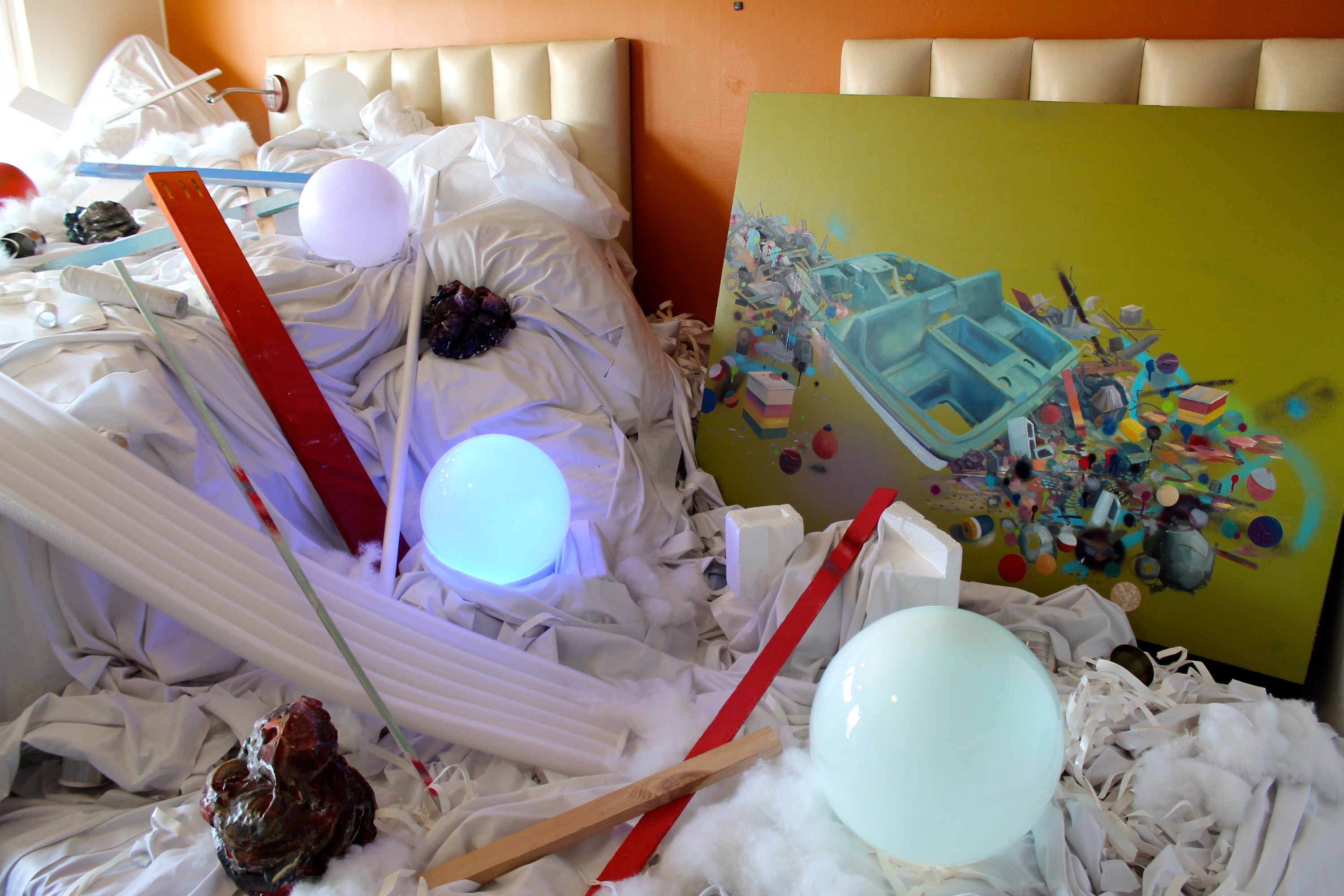
But my favorite was the stARTup Art Fair, an independently produced contemporary collection of unrepresented artists. The fair was held in the open-air grounds of Hotel Del Sol, a 1950s motel turned boutique hotel, which housed one exhibitor per hotel room during the three-day event. More than 3,500 people came to browse the hotel filled up with art.
Here are a few of my favorite rooms:
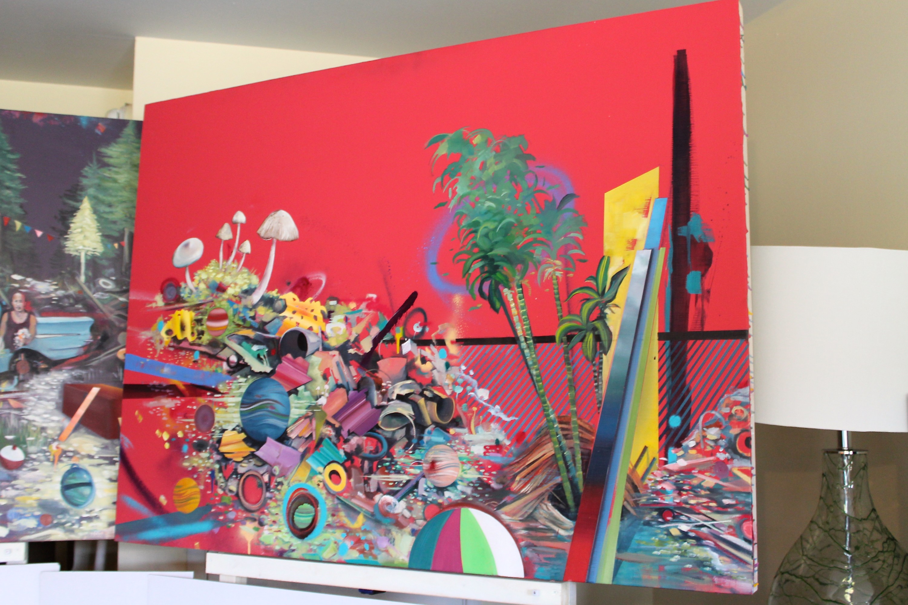
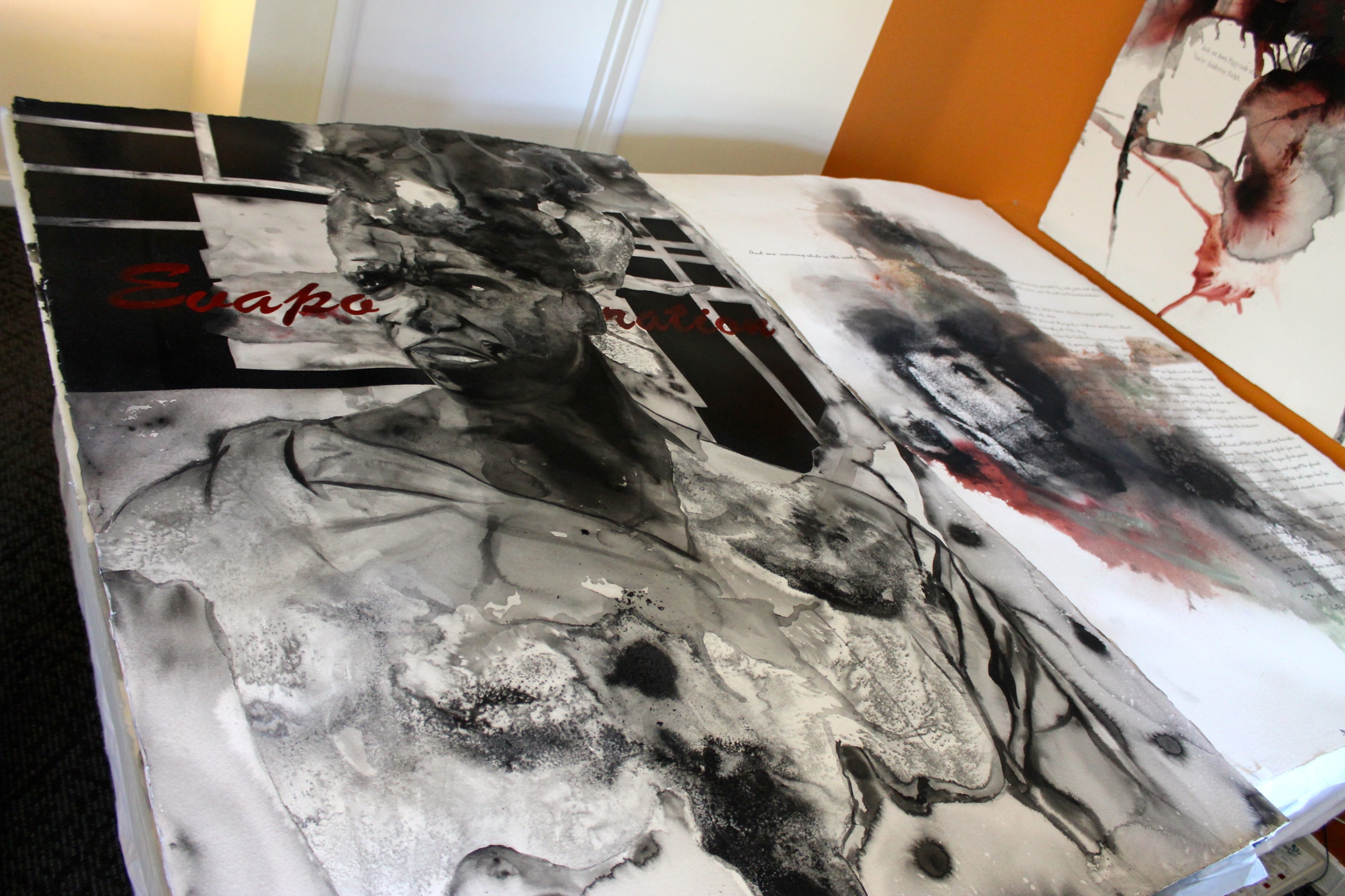
Joshua‘s work breaks memories down into hues and shapes set against solid neon color. Because our conceptions of the memories that shape us can’t always be explained through smiling grainy photographs. A day on the beach is a chaotic pile of planets and geometric debris, a shovel lost in the mix and the beachball nearly out of sight. A cluster of palm trees are ringed like Saturn in blue, but they stand against a bright yellow backdrop, a line of ugly tall brown sand hiding not-so-conspicuously behind it.
How many our happiest childhood moments have been reshaped by the reflections of all the happy images we’ve seen in ads and TV shows since? The way Joshua paints them, I definitely prefer the messy bright amalgamations of color to fading, disappointing memories.
“The deconstruction of both form and subject reveals the fragile fabrication of the facade, as well as equating the surreal deterioration to our capacity to retain memory and the inevitable fleeting of the details. color and suggestive shape alone play a huge part in tickling the senses. Even the most gestural marks in context with each other can suggest something so real to our memory.”
Light touches Theresa‘s subjects the same way we imagine clouds splitting to shine down eternal wisdom. She paints skin with a soft, glowing brightness that gives way to all the tender muscles and bones struggling quietly underneath. And yet her faces and gestures are delicate and relaxed, thick brushstrokes interpreting each figure and scene through a silky haze, like when you first see the world with your eyes half-closed each morning.
“I aim to find what is interesting in what is ordinary; an appreciation for the every day experience. Through close observation, I use the versatility of oil paints to capture the interesting abstractions found in even the simplest of objects… My work is centered on drawing attention to what we might otherwise take for granted.”
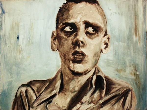
Rodney‘s work uses black and white text and images to prove that the world could never be that simple. Splashing watercolors are dissolved away by salts that further fade each figure, as if these canvases held the histories we’re so in danger of losing. But the one part of each figure you can always see unmistakably is a pair of eyes peering out, sometimes with hope and other times with defiance, but always witnessing the circumstances that surround them.
Some in our country jump to say the roots of these problems don’t exist anymore, but the politics behind thousands of years of racial injustice should feel very real when our cities are rioting because sons and fathers aren’t safe.
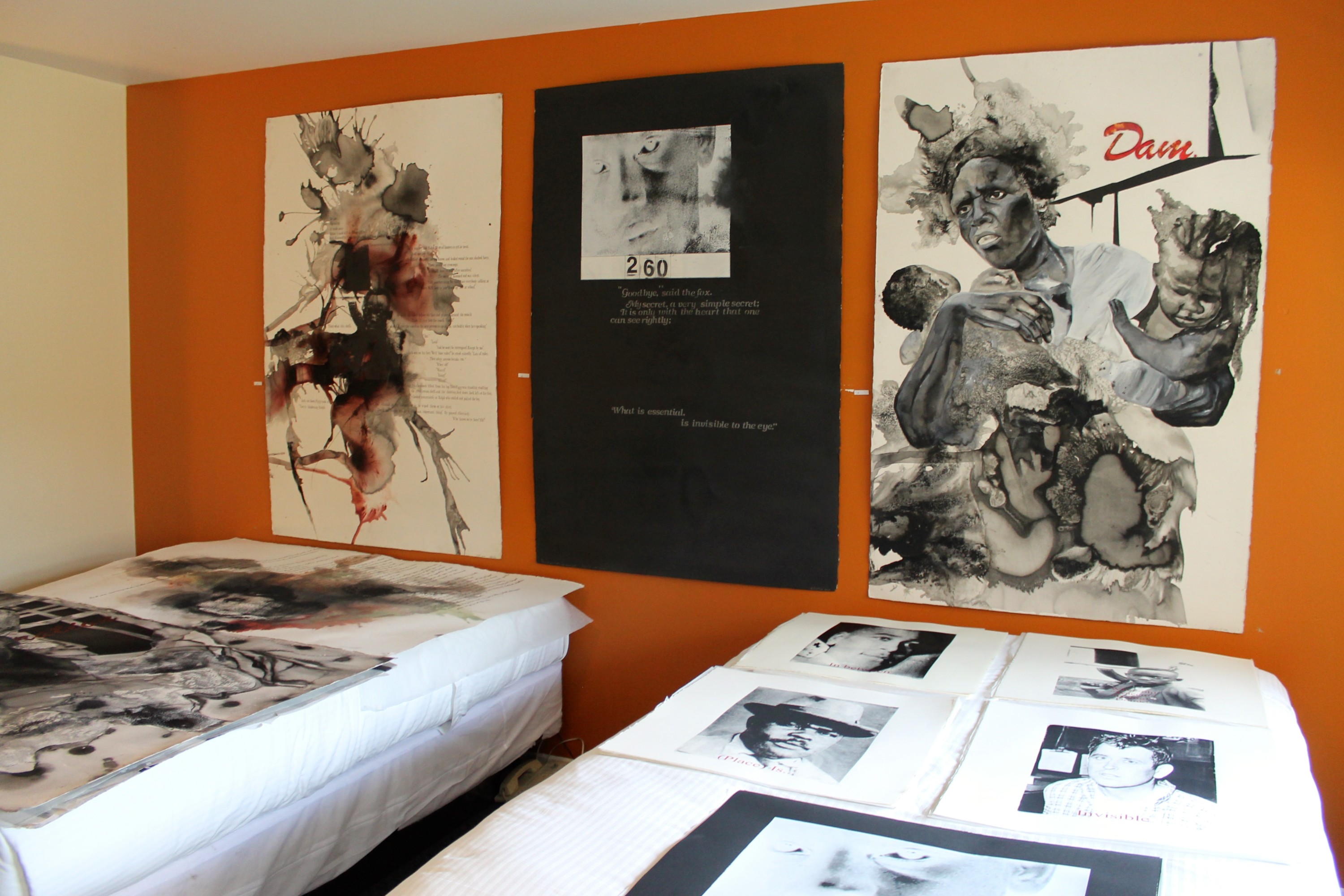
“While debating demanding topics such as race, religion, or war, it is simple enough to become polarized, and see situations in either black or white, right or wrong. These tactics may satisfy individuals whose position depends on employing policies or implementing strategies that promote specific agendas for a specific constituency. But as an artist, it is more important to create a platform that moves us past alliances, and begins a dialogue that informs, questions, and in some cases even satires our divisive issues.
Without this type of introspection, we are in danger of having apathy rule our senses. We can easily succumb to a national mob mentality, and ignore individual accounts and memories. With my work I am creating an intersection where body and place, memory and fact are merged to re-examine human interactions and cultural conditions to create a narrative that requires us to be present and profound.”
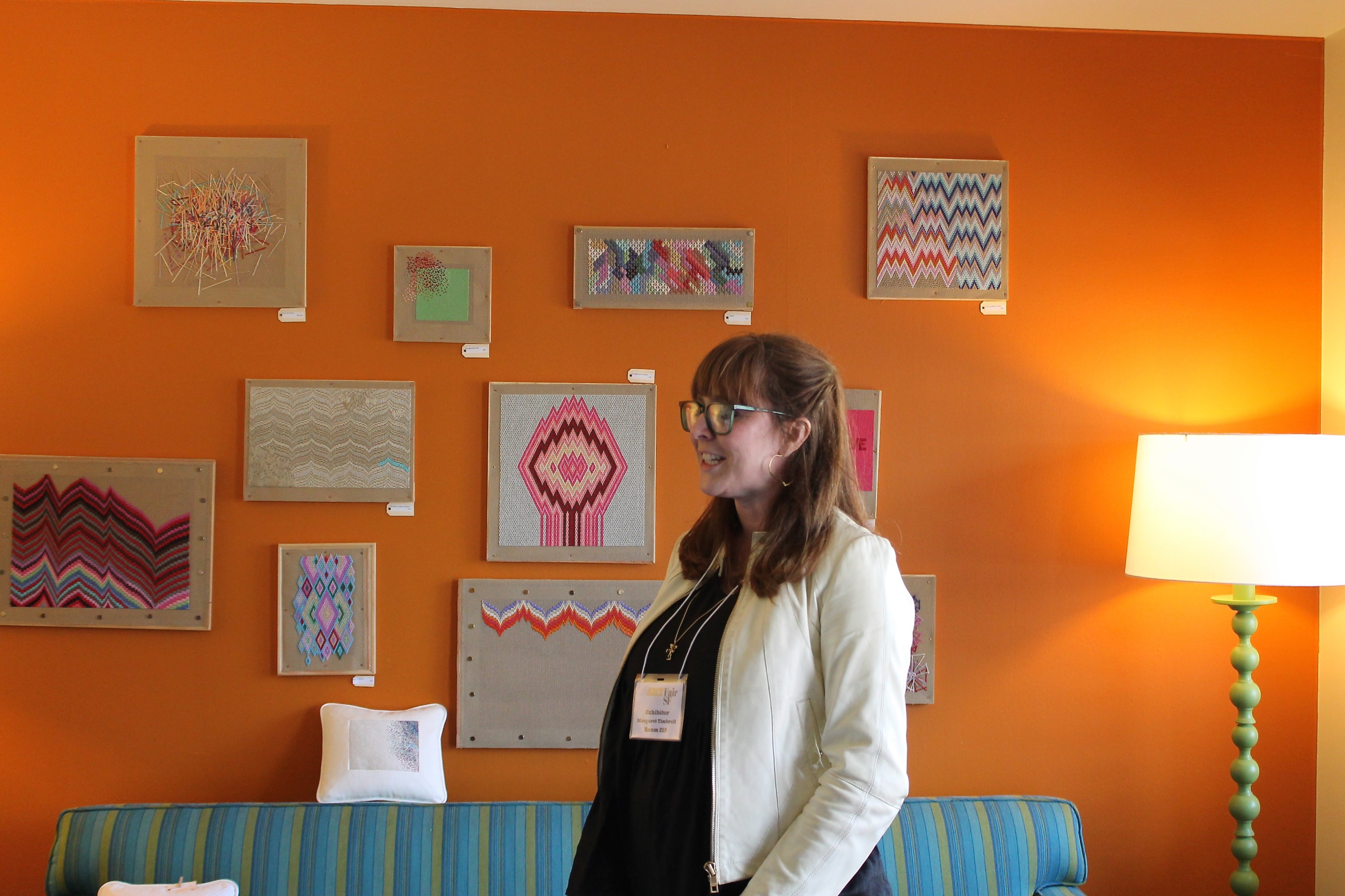
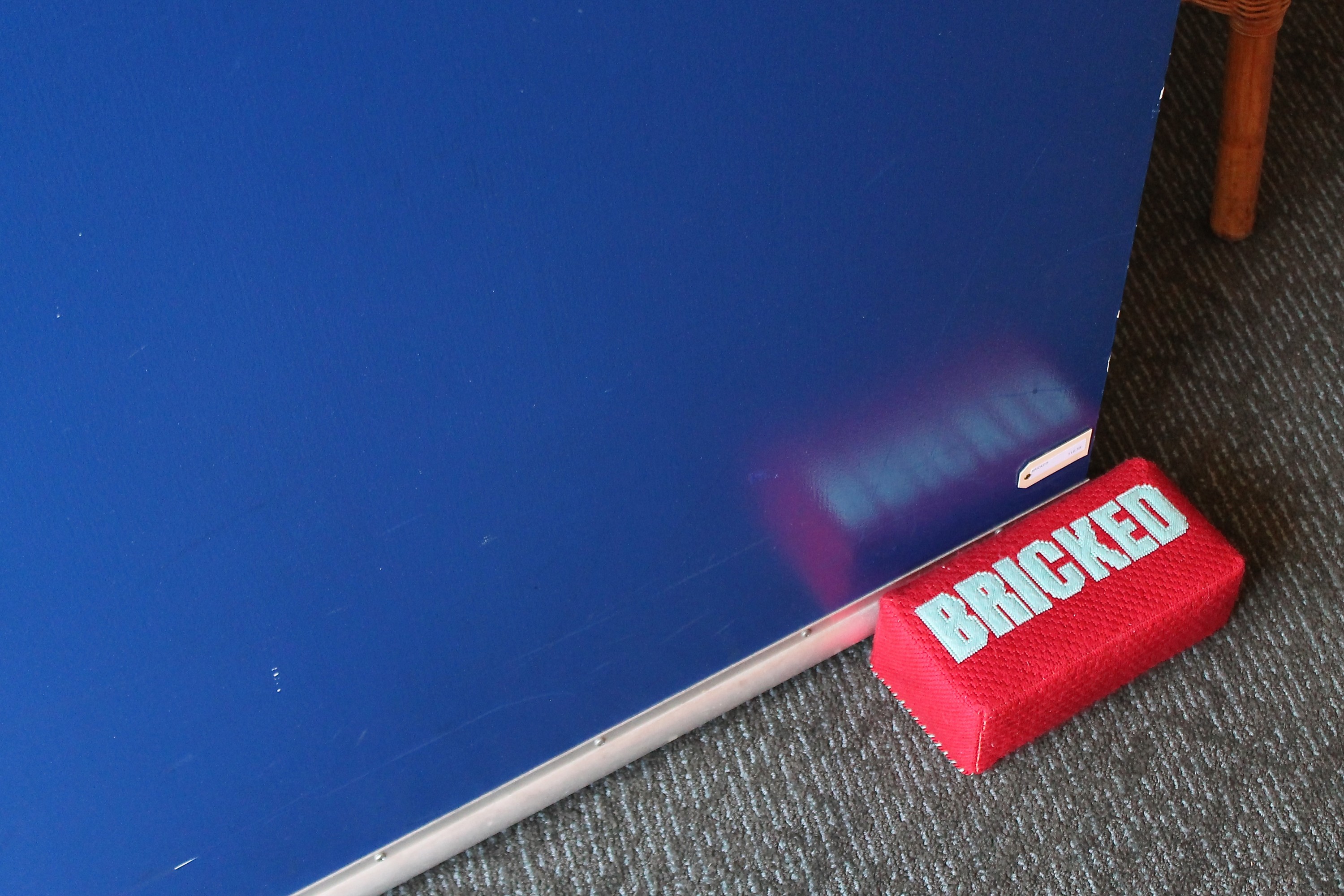
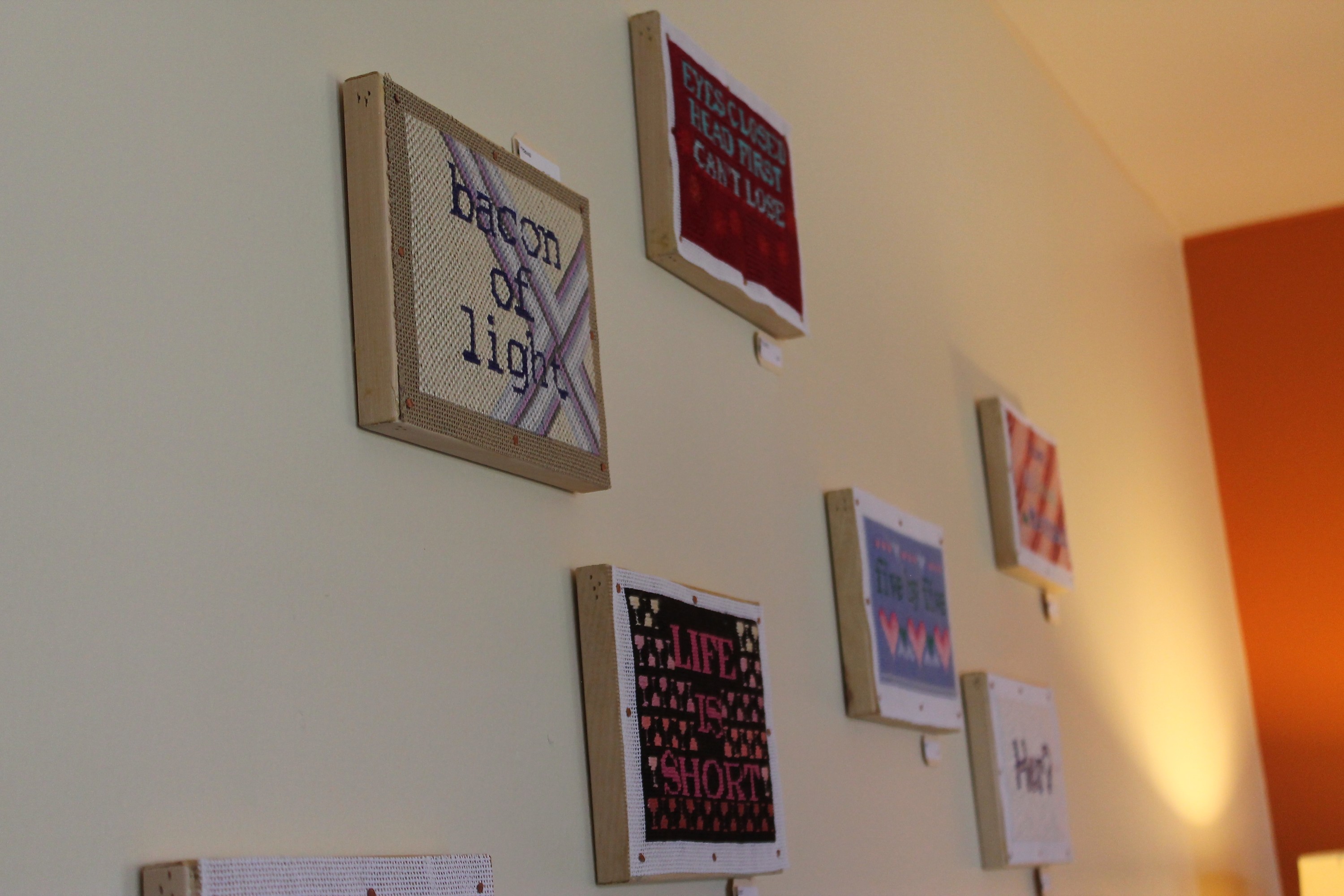
Margaret‘s needlework pays homage to the art of sewing while relaying quips that definitely wouldn’t land as hard in another medium. Something about cross-stitched letters begs you not to take them seriously, and in this case that intuition happens to be exactly right. Motivational statements like “Life is short,” and “Eyes closed head first can’t lose” are funny stitched out, and intentionally silly pieces like “Bacon of light,” “There’s no crying in baseball,” “Hello? This is dog” and “Her?” are borderline hilarious.
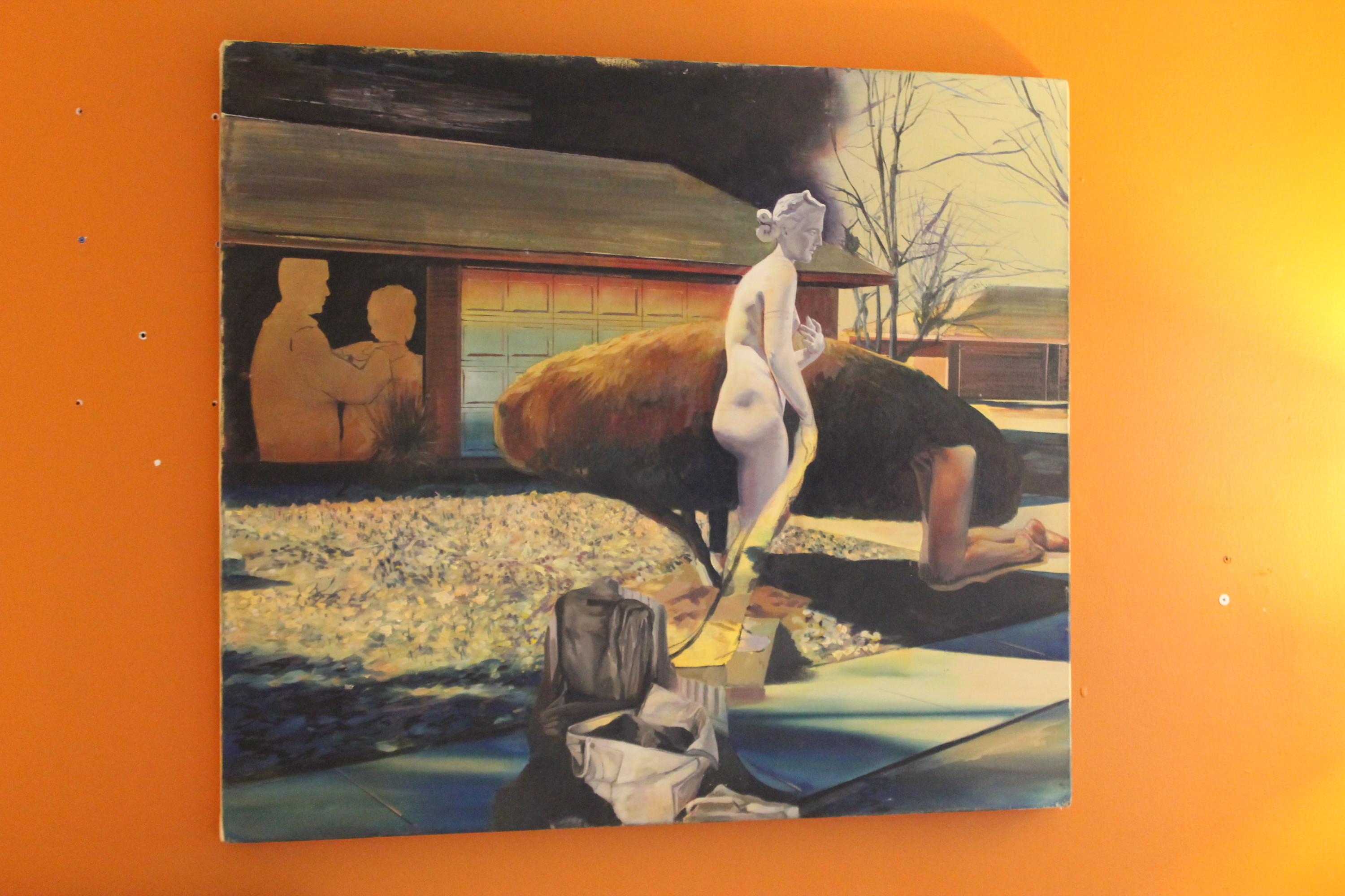
Jessica‘s paintings play with reflection and memory in an art-historical way, using color schemes and scene framings to give her work a stunning voice. The line between what’s real and what isn’t doesn’t matter in a world where what’s tangible serves as the backdrop to representations of a memory or frame of mind.
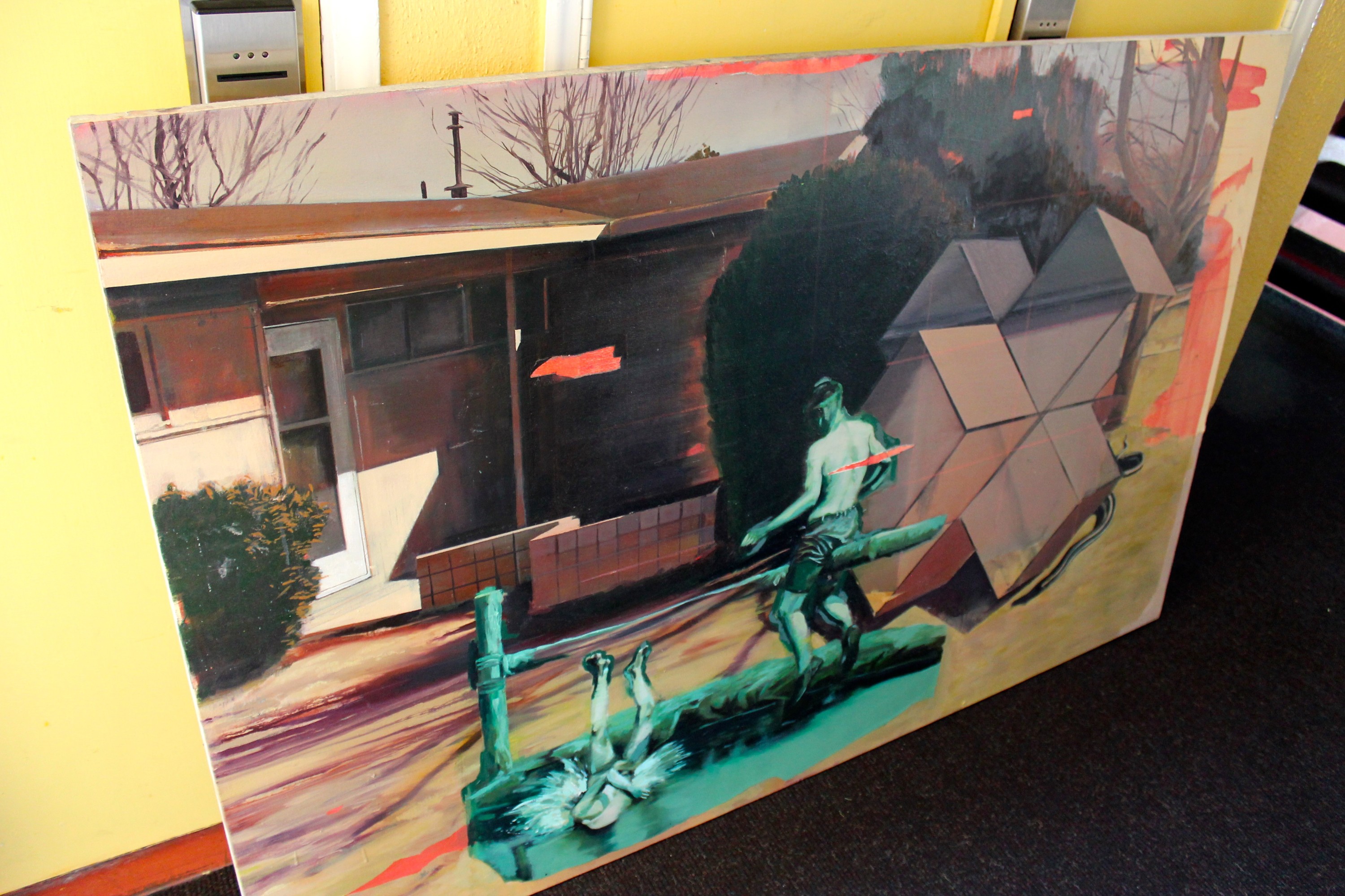
“In my pictures, I manipulate the body’s position in space to explore the dynamic between place and identity. My paintings often reflect the decentered, placeless zones of suburbia or urban peripheral as a function of a dislocated identity or collective fantasy. I construct narrative clashes, where the protagonist participates in the pictorial space of the painting surface, residing in the logic of an allegorical perspective.”
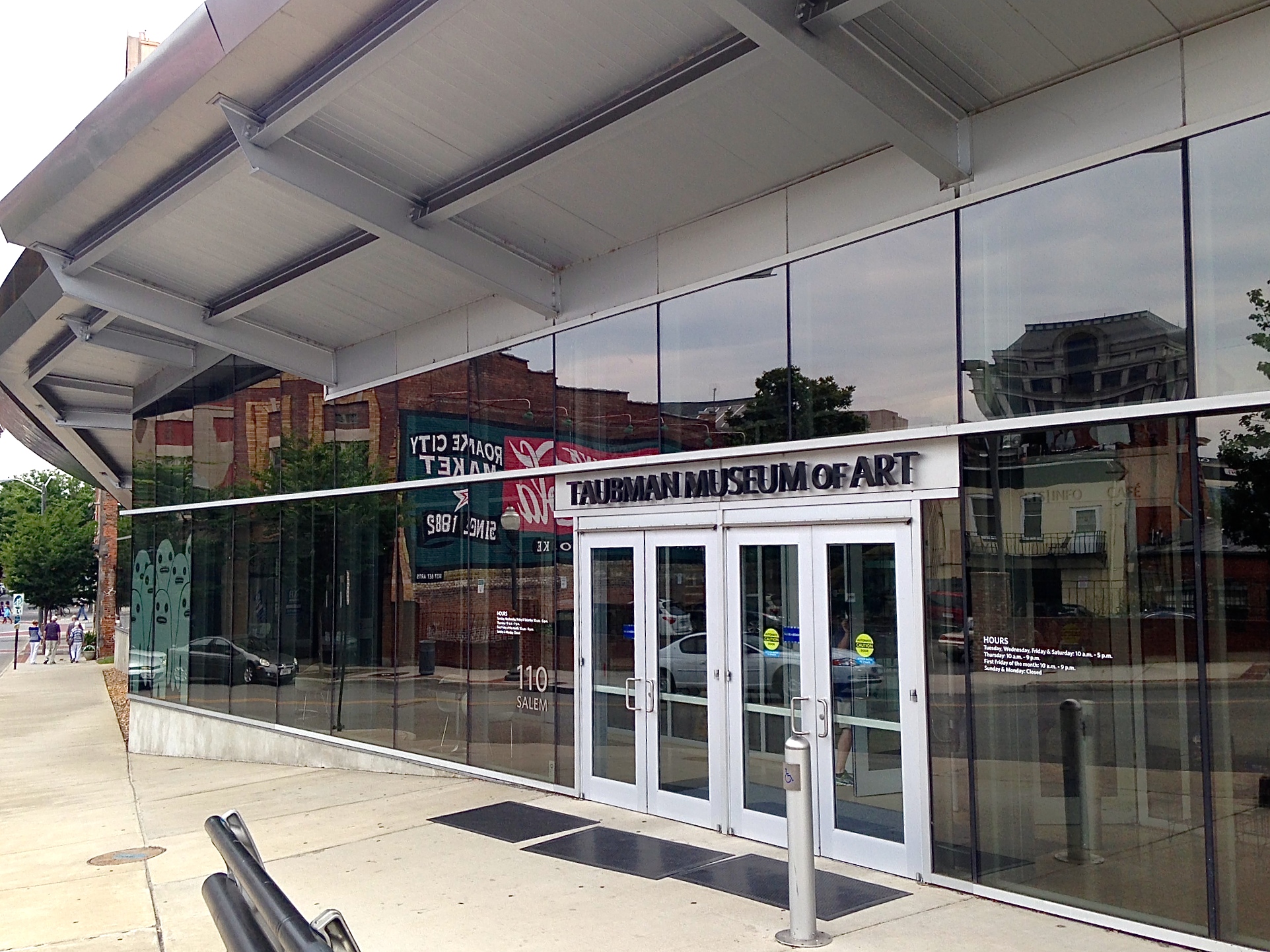
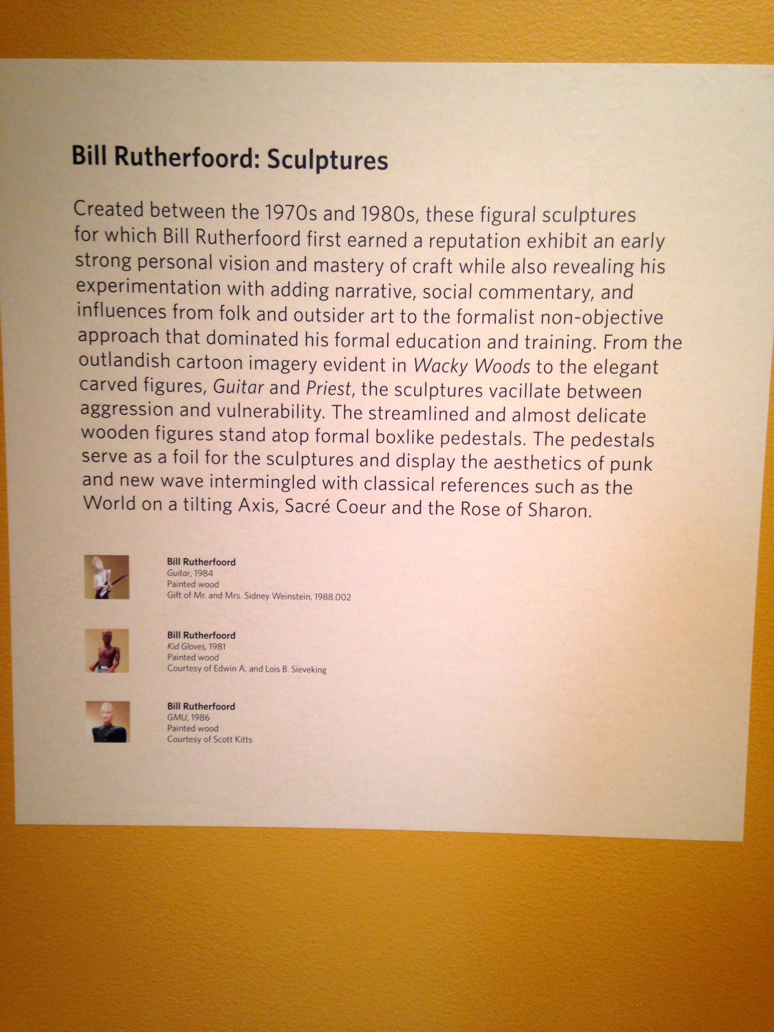
Sep 11, 2014 | art history, happenings, museums, painting, sculpture, Taubman Museum of Art
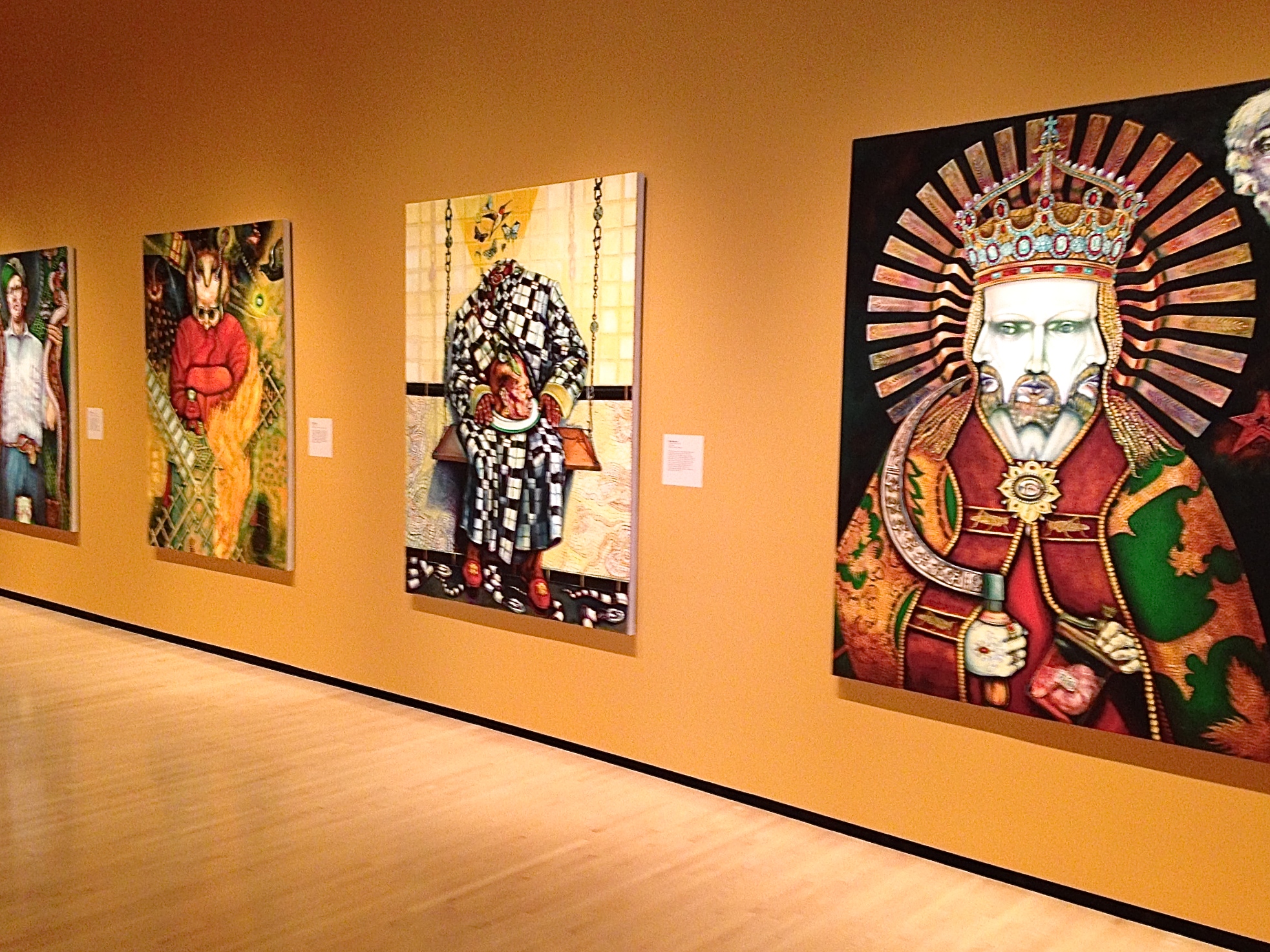
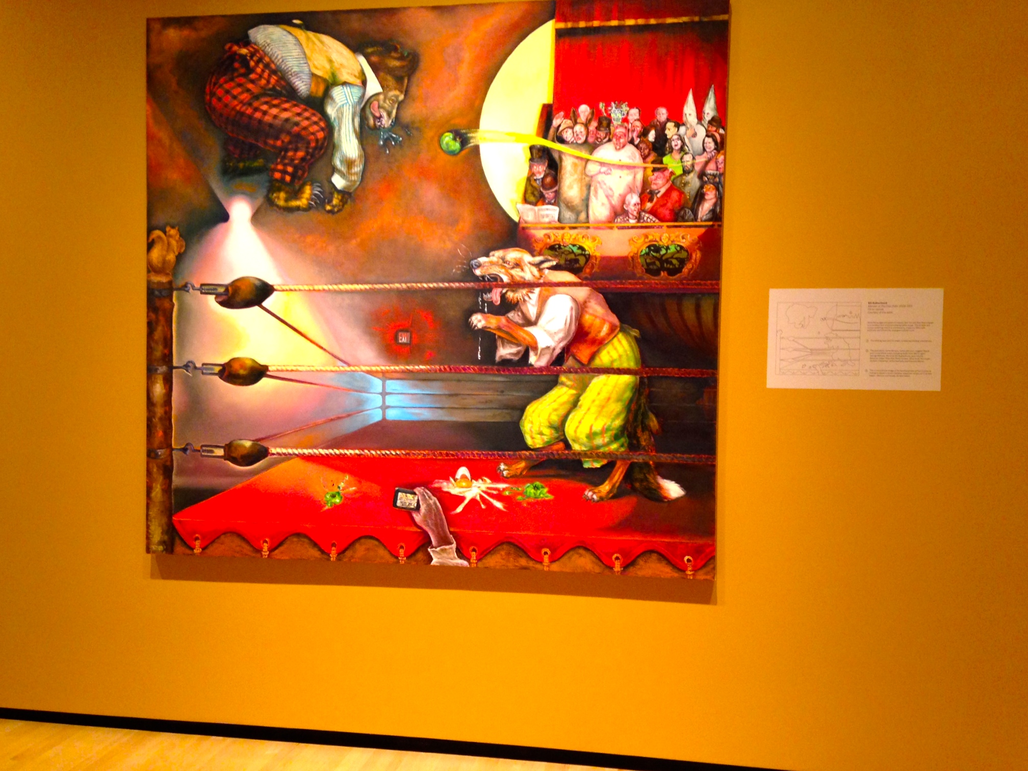
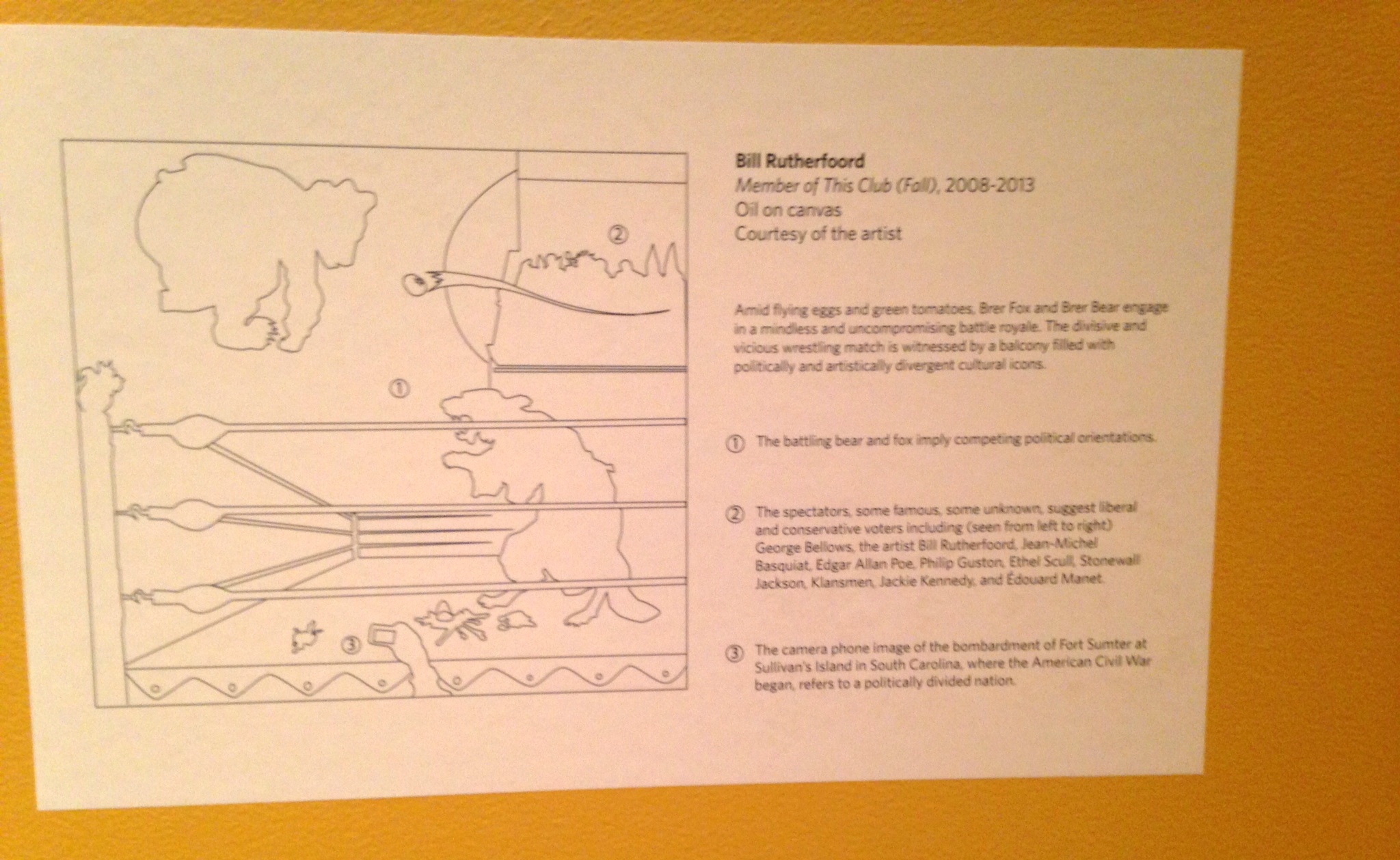
Bill Rutherfoord has been painting surreal scenes of animals and people in stark, arresting actions for decades, but his gallery at the Taubman Museum is the product of eight very reflective years spent working in the basement of his Roanoke home. Allegory of No Region is comprised of 11 huge, terrifying works that merge folk, myth, metaphor, science and symbolism at once.
This collection can’t be fully appreciated without understanding the story within the paintings, and I don’t think I can explain it any better than the Museum itself:
“The reclaimed character Brer Rabbit leads the viewer on an epic journey across three centuries of heroism and trickery both comic and tragic ultimately creating historical and contemporary allegories and conundrums that lead to an investigation of the very nature of identity, culture and history – personal and public, regional and national, high and low.”
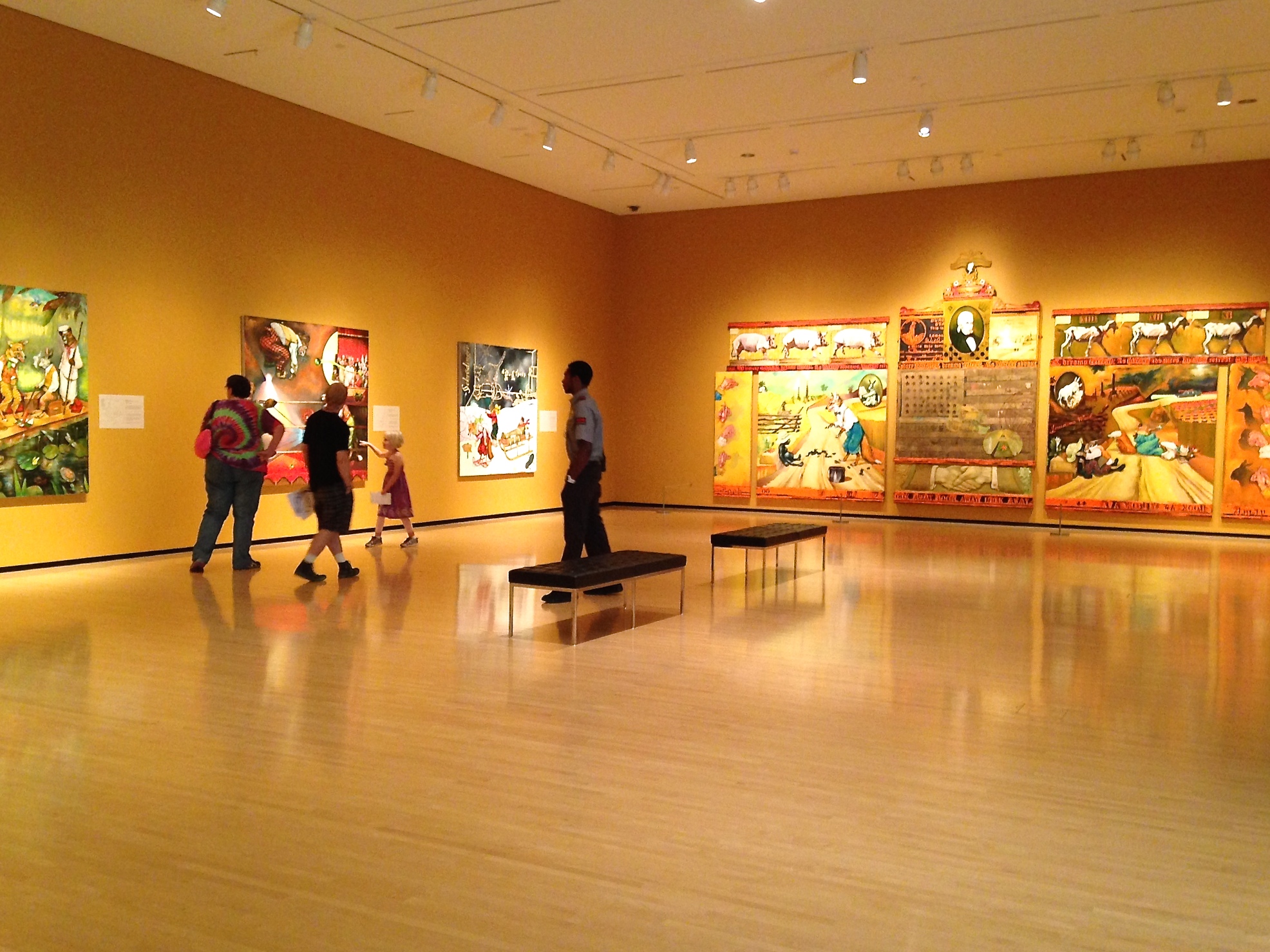
Each painting’s placard includes a diagram letting the viewer know the exact meaning behind the work, so that everyone can follow the twists and turns in Brier Rabbit’s path as he travels from the 18th century to present time, tackling every topic from Jamestown to the BP oil spill.
A lot of the symbolism deals with the New York School of art, and the break between the elites in the high-brow Northeastern art market and the equally legitimate styles being pursued in the rural U.S. Rutherfoord’s own career battled against the art market’s supposed trendiness, remaining figurative and refusing to bend to the ever-popular abstract styles.
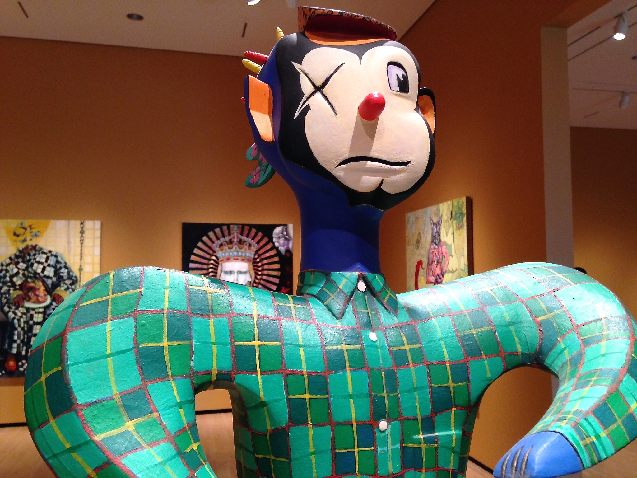
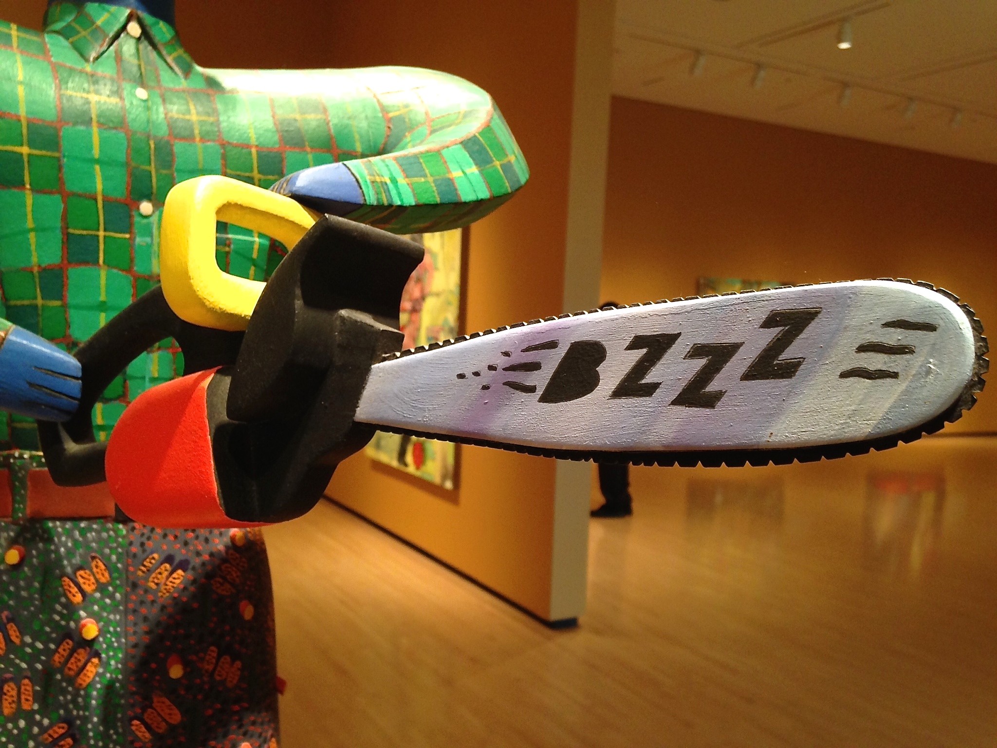
The gallery’s second room contained two collections of Rutherfoord’s past work to contextualize the Allegory of No Region series. The first was a set of Apocalypse paintings inspired by the Bible’s Book of Revelation, but my favorite was the set of five painted wood sculptures completed between the early ’80s and the early ’90s. Their silhouettes’ have life and rhythm but their small size and abstract faces make them feel like dolls propped up.
“Wacky Woods” takes Dr. Suess seriously — a one-eyed cartoon lumberjack BZZZing his chainsaw.
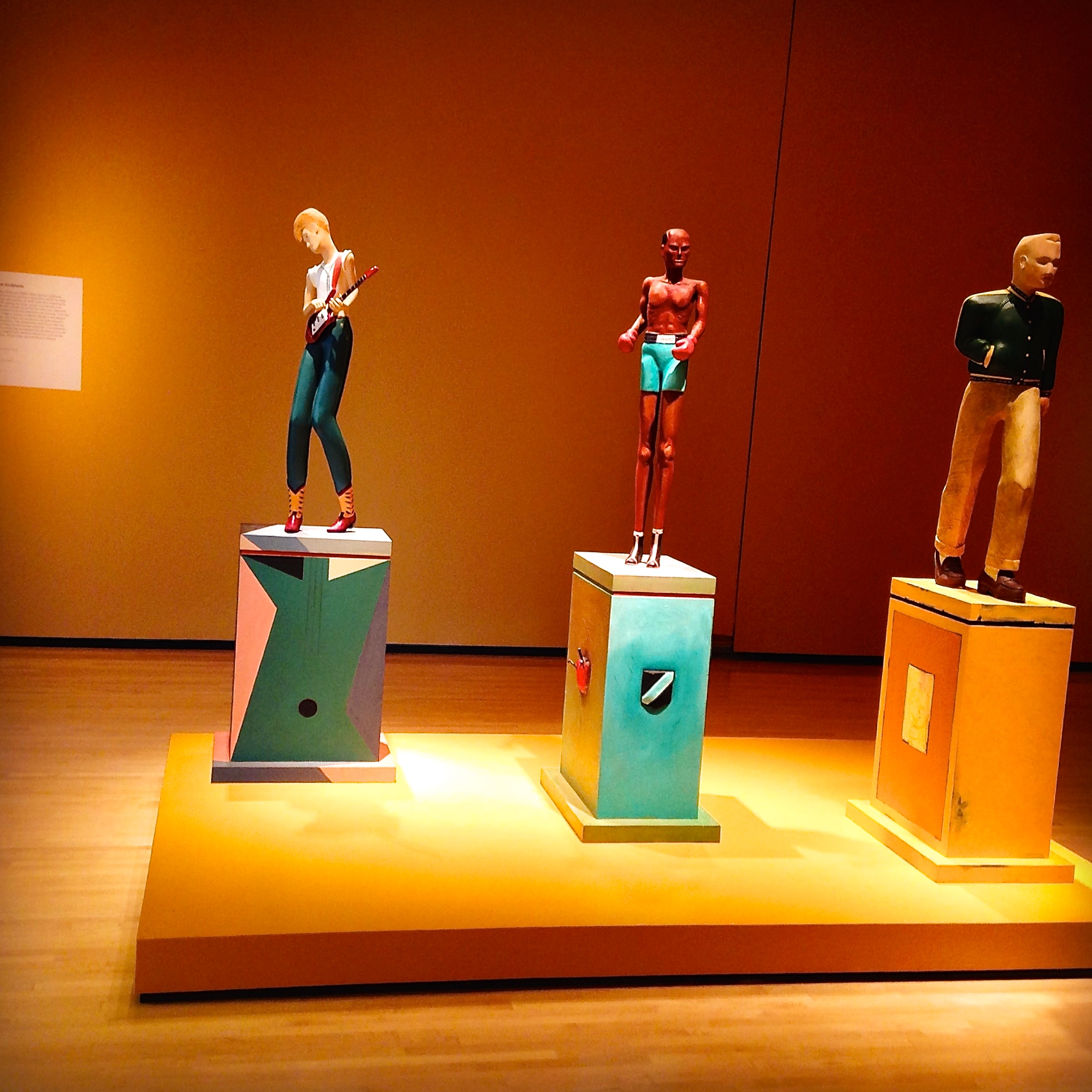
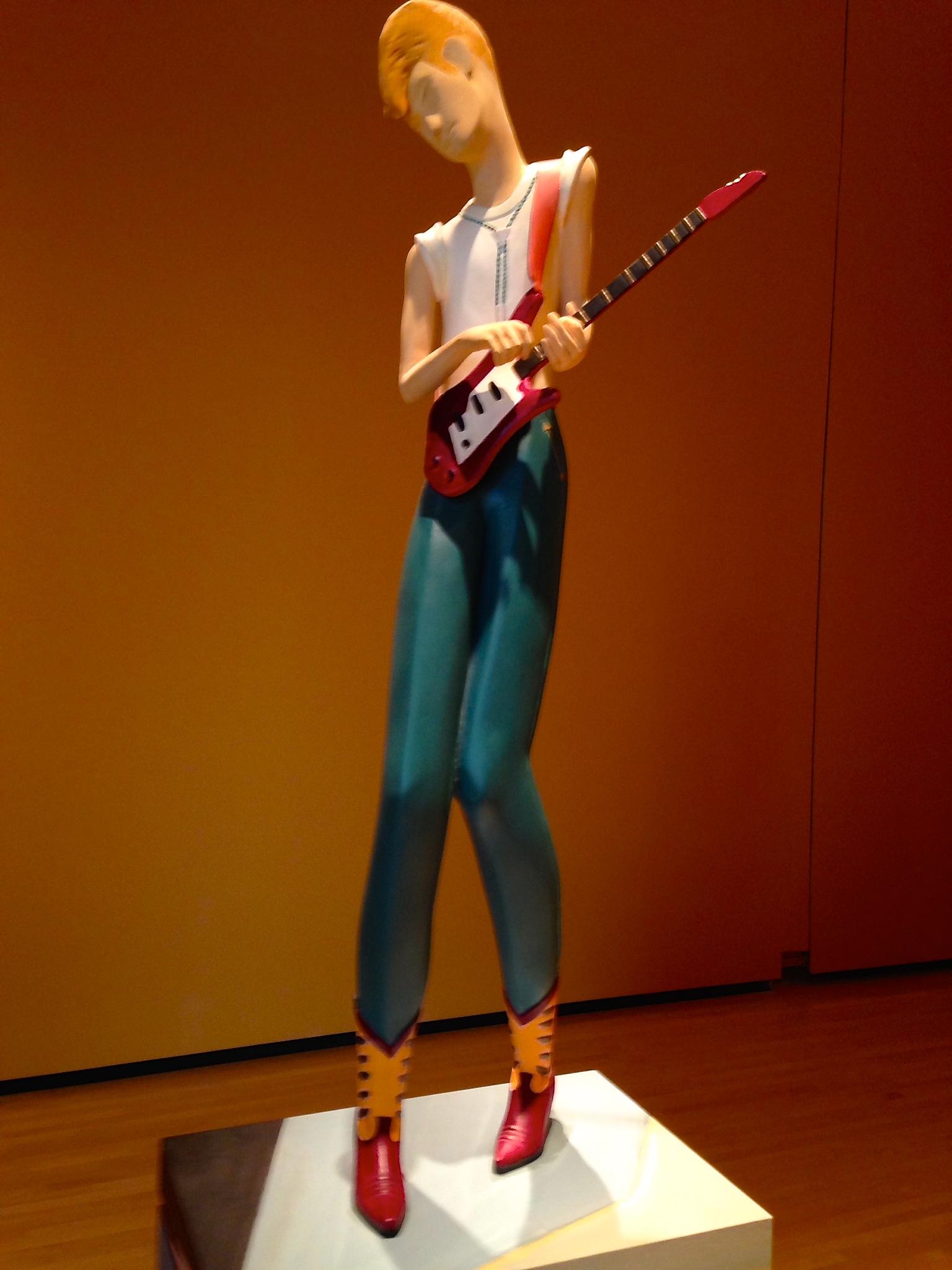
“Guitar,” 1984
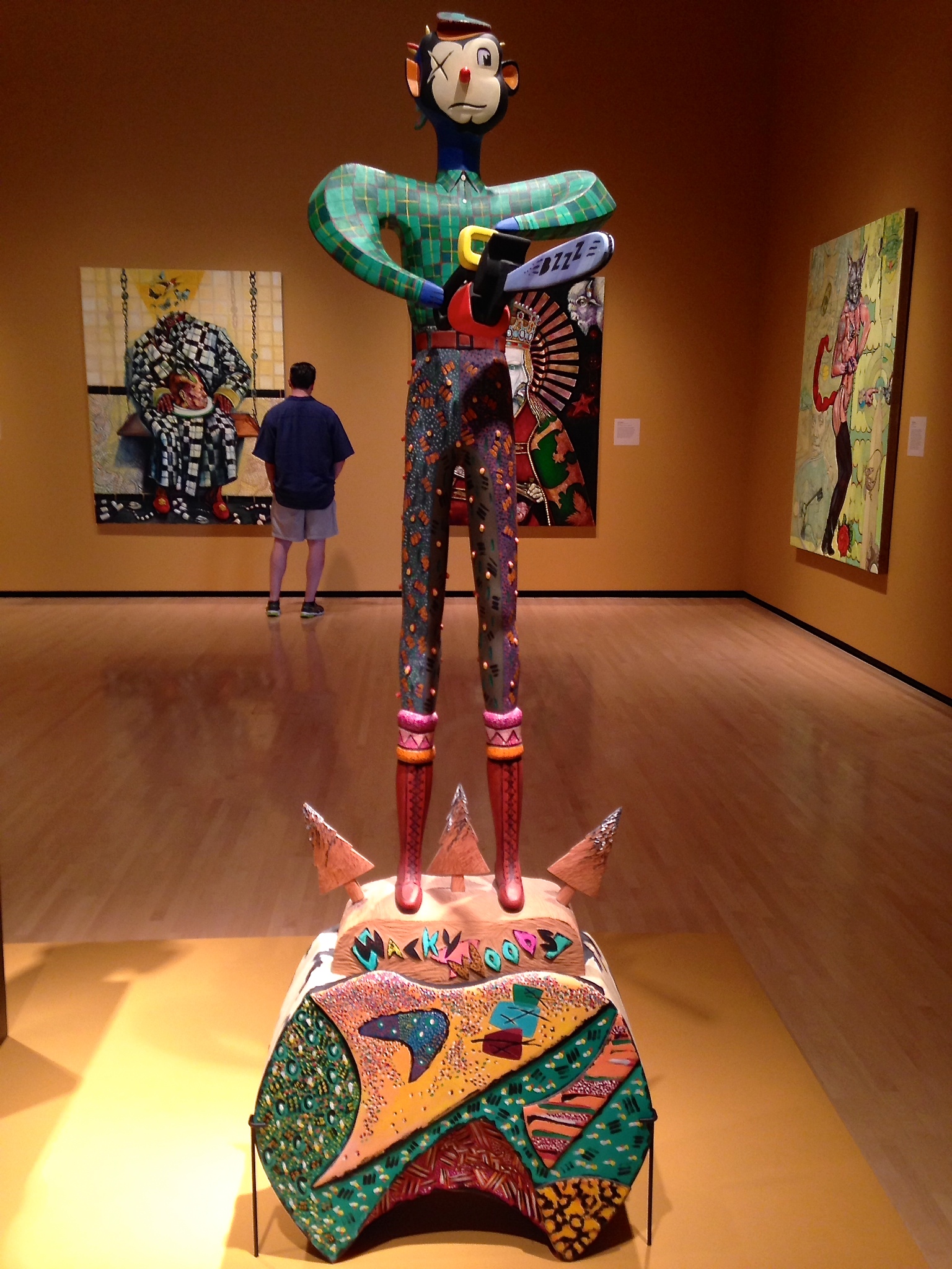
“Wacky Woods,” 1991
This show closes on Saturday, September 13th so if you live in Virginia, make the trip this weekend!
For more on Bill Rutherfoord, check out this incredible profile video created about him and this exhibit by William Sellari on Vimeo:
Jun 25, 2014 | design, painting
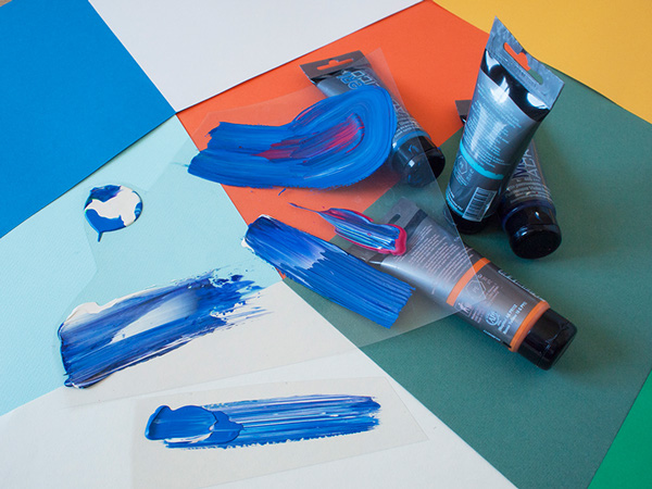
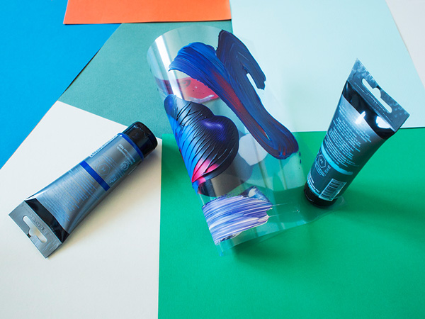
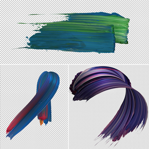
Pawel Nolbert is a graphic artist in Poland, whose work with digital visuals began 13 years ago. He’s created for Adobe, Google, Disney, the Grammy’s and a lot of other names you’d recognize, but it’s the work he makes for himself that blows everything else out of the water.
His latest project, Atypical is a part-typography, part-contemporary art series that features bright, elegant swishes of paint dancing through the air, freed from their usual canvas prison. Most of the eight prints have some semblance to a letter or number, which contradicts that freedom-feeling that comes from working in four dimensions. But there is one spiraling tunnel of blue-purple that really lets loose.
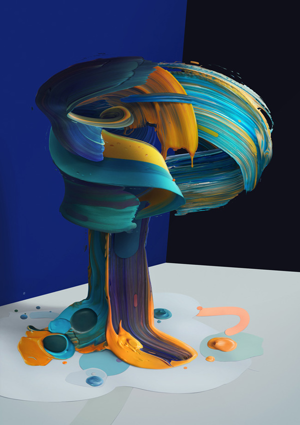
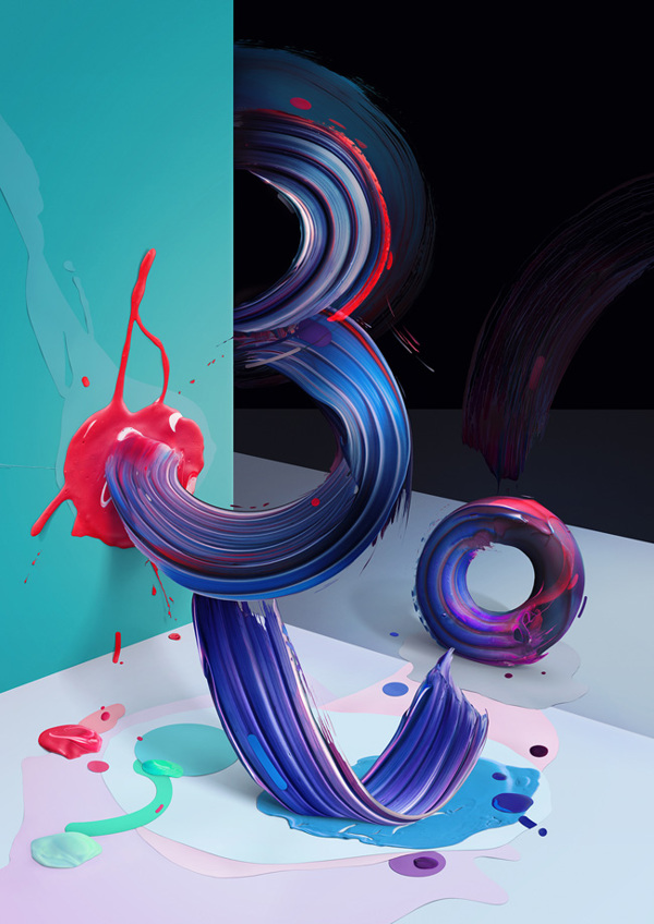
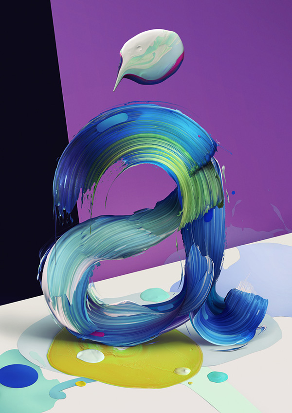
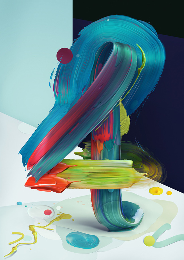
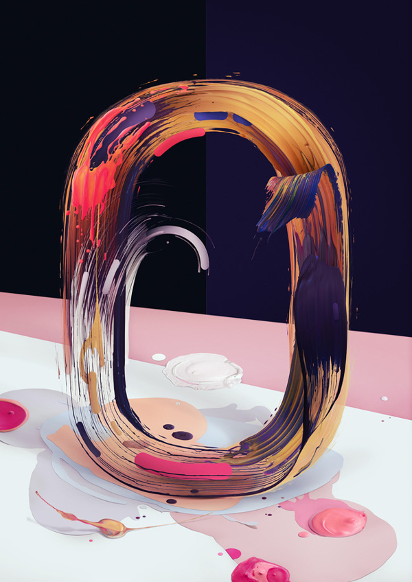
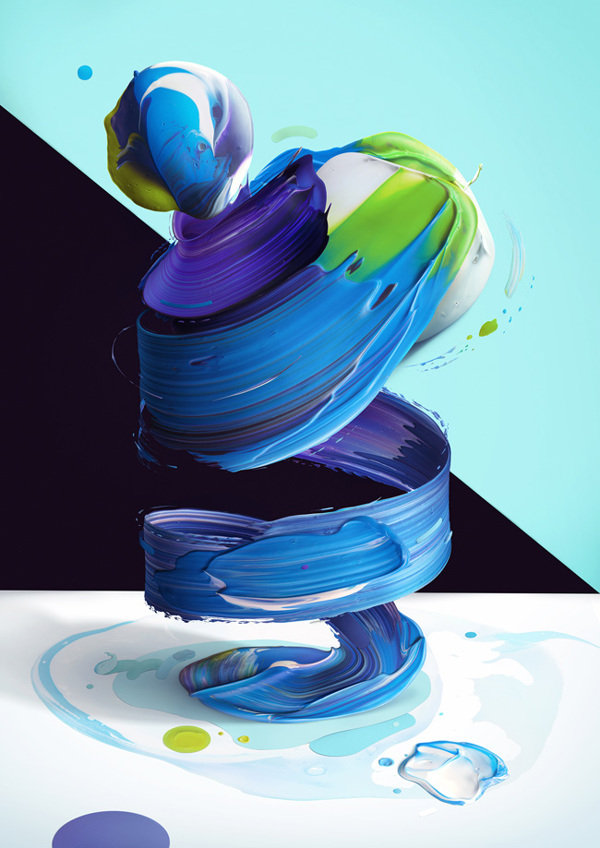
Nolbert created Atypical by actually painting what you see in the works on clear plastic panels that could be twisted and manipulated. The photographs of that painted plastic were then perfected and assembled digitally so that the paint became it’s own entity — thick brushstrokes waltzing in the wind.
To see more of Pawel Nolbert’s work, find him on Facebook, Twitter, Behance and his amazing Instagram.
Jun 16, 2014 | art history, guest post, painting
by Alison Lansky
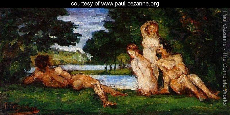
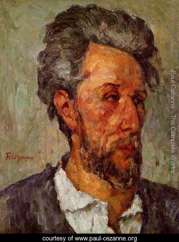
Paul Cézanne was a French artist perhaps most famous for his ‘Bathers’ and who is often credited with having bridged the gap between Impressionism in the late 19th Century and Cubism in the early part of the 20th Century. Like many artists, his work can be defined by a number of distinct periods each with its own style. The four most commonly recognised periods in terms of Cézanne’s work are his post-impressionism period; his cubism period; his impressionism period; and his modern art period. However, the period that I want to look at today is his impressionist and post-impressionist period and more specifically how his work impacted the impressionist movement.
What Is Impressionism?
Impressionism was a style of painting which emerged in France during the 1860’s. The main characteristics of the impressionist style were the need to capture a visual impression of the moment and the effects of light and color. It has often been said that impressionists are more concerned with capturing the feeling or the experience rather than creating an accurate reproduction of a scene. Nature played a big role in the impressionist movement with most artwork focused on the outdoors. One of the hallmarks of an impressionist painting is the use of short brush strokes and thickly applied paint along with a lack of fine detail. If you want to try your hand at impressionist style painting then you should be able to find a selection of useful books at most leading art supplies stores. There are several interesting titles available from JacksonsArt.com.
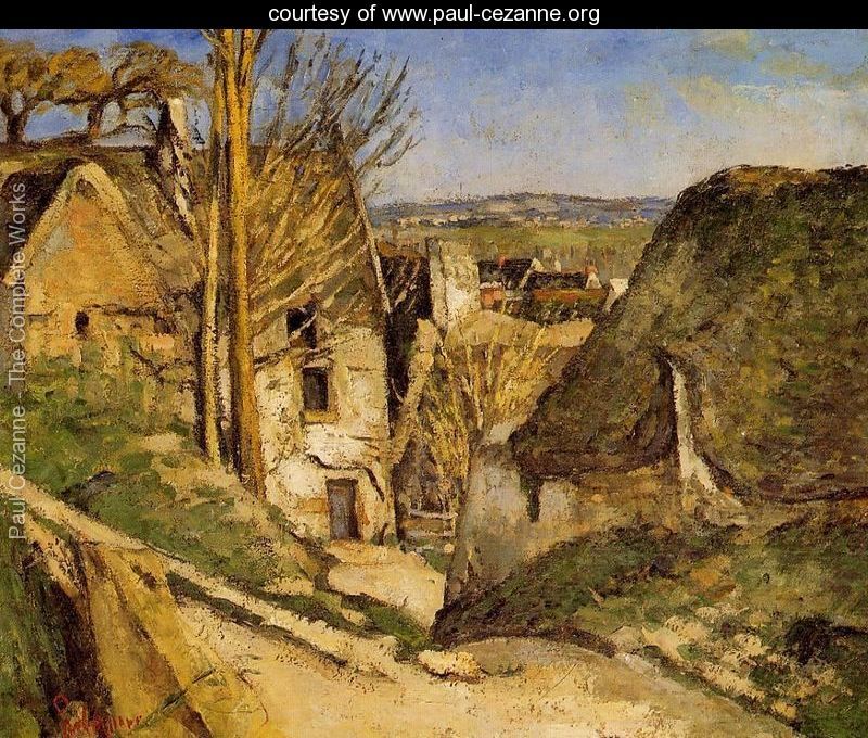
Cézanne’s Impressionist and Post-Impressionist Works
Cézanne’s impressionist period was at its peak in the 1870’s. Some of his most famous impressionist works include ‘House of the Hanged Man’ and his series of ‘Bathers’. While Cézanne exhibited his paintings alongside other impressionists such as Claude Monet, over time his style began to change setting him apart from the other artists of the time. He was plagued by the feeling that the impressionists were lacking in one of the most important hallmarks of classical art : structured composition.
This deviation from the normal impressionist style was met wit criticism. Where other impressionists captures a delicate and sensuous feel in their work, any felt that Cezanne’s brush strokes were forced or strained due to his insistence on creating a more unified structure between color, surface and brush strokes. It was Cézanne’s experimentation with planes of color which led to other artists including Pablo Picasso being influenced to create the style we now know as cubism. It is because of this that Paul Cézanne is often thought of as one of the fathers of modern art.
Overall, it is clear that although Cézanne initially came under fire upon deviating from what was expected in the art world at the time to the point where he was routinely rejected by the Salon, his distinctive style certainly developed over time and went on to influence great artists including Manet, Picasso and Renoir to develop a more modern style. In fact, Pablo Picasso is quoted as having said, ‘As if I didn’t know Cezanne! He was my one and only master. […] It was the same with all of us – he was like our father.’ Modern art would not be where it is today without the likes of visionary artists like Paul Cézanne.
–
Alison Lansky loves blogging and art. She is also the mother of 2 beautiful children – her own works of art!
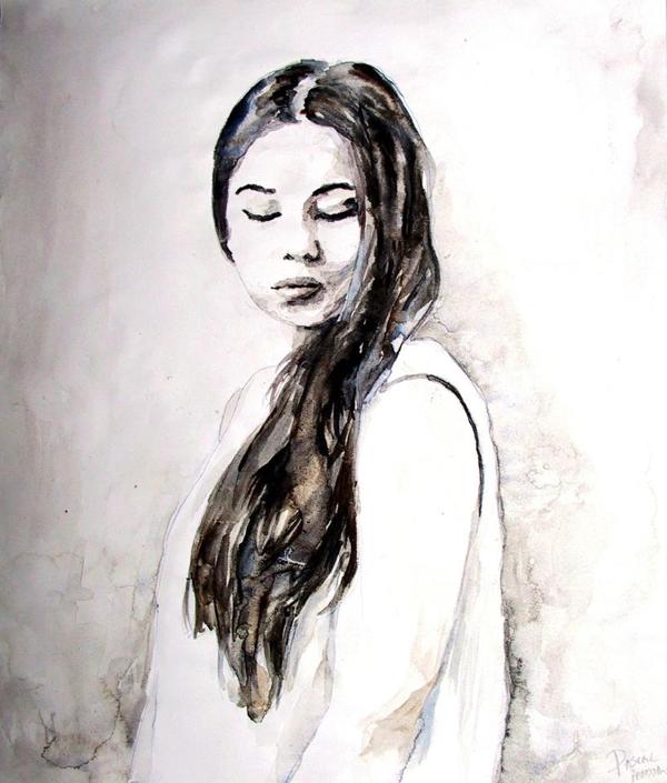
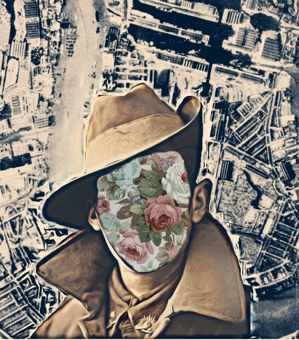
Apr 6, 2014 | collage, interviews, painting
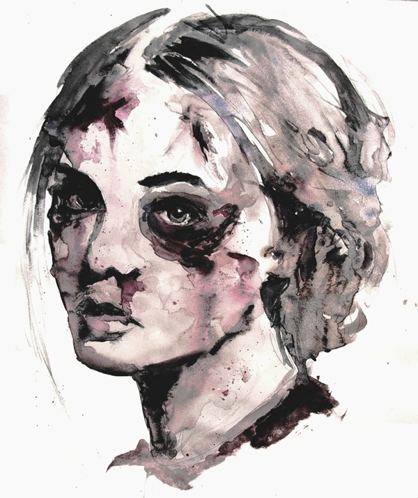
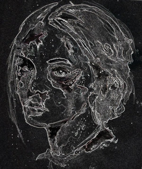
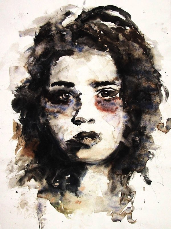
Pascal Janssen‘s talent for creating faces makes it hard to believe he’s just 21 years old. The Belgian artist paints, draws and collages features with so much emotion in them, each face nearly breathes with life.
He mostly draws portraits of his friends, occasionally including a favorite musician. He captures those moments of revelation and self-doubt as each new set of eyebrows and chins depict them, emphasizing each subtlety to reveal a depiction truer than a photograph.
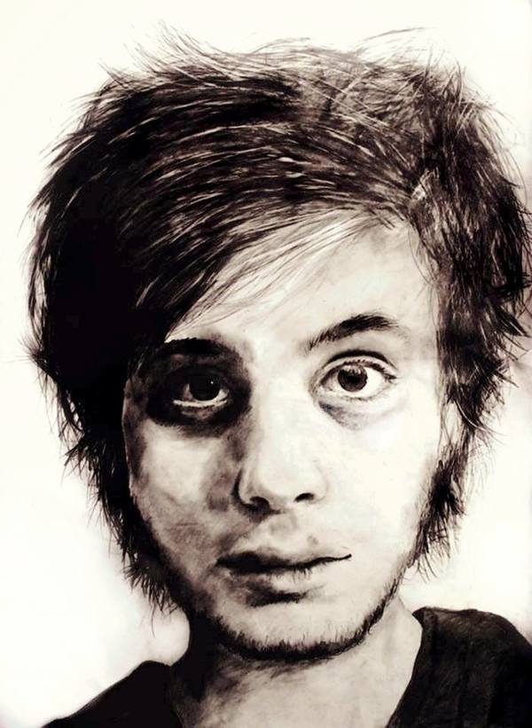
“My artwork is mostly based on the mind of the human being, how it’s perception on the world and itself is,” he writes.
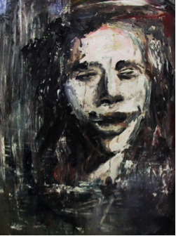
Drugs and their affects also played a role in the formation of his work. Pascal seems fascinated by the changes drugs cause within the body, and how those changes manifest themselves in expressions.
Pascal was nice enough to answer my questions about his work, and how his fixation on the face began:
How has living in Belgium helped shape your art? What do you like most about Hasselt?
Even though art in Europe is more active in Berlin, Belgium is also a nice place for an artist. You have a lot of art schools around the country. My parents sent me to art classes since I was in kindergarden, it was once a week and just for fun.
I quit those art classes when I went to high school in Hasselt where I did visual arts. I really loved it there and had a great time, the people there were a lot more open minded than they were in middle school. I really hated middle school, some teachers even mocked me for planning to go to art school.
But I couldn’t care less, I always wanted to be an artist. And for now I’m studying at an art college, just next to my high school. I’ve always loved Hasselt. It’s not the most interesting place in Belgium like Gent, Antwerp or Brussels. But I do feel safe there, it feels like home. I currently live at Rekem, close to the border of the Netherlands where Maastricht is located. Maastricht is also a nice place for an artist, I had my first exhibition there with 7 other artists in September 2013 and planning to have my first solo exhibition there in April 2014.
When did you first start creating portraits? Can you remember the first person you ever painted?
I don’t really remember, I probably had some assignments to paint or drew a portrait for school, but didn’t care about it cause I mostly just made what I felt like making. When I was in elementary school I drew a lot of cartoons but when I went to high school I mostly painted abstract paintings and when I was around 17 I really noticed I just love painting portraits.
And that was when I created “Ignorance is Bliss.” It’s a portrait of some stoner, to this day I still don’t know who this guy is but I thought it was kinda hilarious to paint him because my teachers back then hated anything that had something to do with drugs. Most of my work back then had references to drugs and sometimes it still does, because I still think it has some interesting factors like hallucinations, psychoses, addiction, depersonalisation, etc. I think making portraits is something I’ll always will love doing, but I’m always open to paint new things or use new techniques. I like to experiment a lot.
What do you love about reinterpreting the human face over and over again?
I never thought about that really, for me it’s more than just a face. It’s like I’m painting a complete person as he or she is, or just how I feel about them. I like painting my favorite musicians. Mostly musicians who make lyrics which reflect the thoughts and feelings in my life, like King Krule, I love the melancholy in his music. But I mostly love to paint my friends, like I said it’s more then just a face.
How long does it usually take to create each of your works, and what methods do you use to create them?
I mostly work in a fast tempo, it takes normally about an hour or 2, depending on size of course. And if I start working on a piece, I don’t stop untill it’s finished or else I just start all over again. I learned to paint this fast because I work a lot with watercolor. With that kind of paint you have to work fast and you cannot really correct mistakes.
My technique with watercolor also had an effect on my technique with painting in oil. I use a lot of terpentine on my oil paintings just like I use a lot of water on my watercolor paintings. I also don’t use white oil paint, instead I use gesso, a thick paint you actually use for preparation of your canvas. I never really liked working traditionally I guess.
What’s one of your favorite quotes about art and how do you see it applying to your own work?
The quotes of Vincent van Gogh are my favorites, they might sound cheesy but I love them: ” If you hear a voice within you say ‘you cannot paint,’ then by all means paint, and that voice will be silenced.” Criticism has always motivated me even if it came from within me. I’m not trying to be a better artist then somebody else, I’m just try to be better than myself.
“I feel that there is nothing more artistic than to love.” As the romantic person I am, love has always motivated me to paint.
“I know nothing with any certainty, but the sight of stars make me dream.” I’m also a very agnostic person who will question about anything, but I do have an endless fascination for the universe.
For more from Pascal, you can find him on Facebook, Tumblr and Behance.