“Connecting Cultures: A World in Brooklyn” is a new exhibition that presents more than 300 works from nearly every era in The Brooklyn Museum’s impressive collection, comparing universal ideas that have been represented in art over the centuries. It opened on April 19, 2012 as a long-term exhibition in the museum’s newly renovated Great Hall on the first floor, placed directly after the ticket booth and serving as an introduction to the museum’s collection that will be expanded upon in the floors above. The display is segmented into three loosely coordinated collections of Connecting People, Places, and Things that converge in the center of the square gallery space. The exhibition was organized by the museum’s Chief Curator Kevin Stayton and works to present the institution as both an innovative risk-taker using a unique form of cross-culture display, and as a well-established collector of some of the world’s most precious artworks and artifacts. This combination of innovation and establishment aligns perfectly with the Brooklyn Museum’s revised rebranding strategy — what used to be a more populist approach until criticism begged for a change in 2010, because the institution’s survival is already a difficult feat due to its location and ranking among competing museums in Manhattan.
 |
| Entering the Great Hall. |
The Museum Director Arnold L. Lehman said, “For the very first time, our visitors have the opportunity to sample the breadth and depth of our holdings as they enter the Museum,” and the museum creates as impressive an entrance as possible, placing “Connecting Cultures” within four free-standing walls surrounded by a row of giant columns in the Great Hall. The space was previously home to a gallery of American Indian art, but the New York Times wrote, “The space never worked. Its parameters were vague, its sightlines blighted by clunky pillars.” Here, the pillars are used as a grand sort of frame, presenting “Connecting Cultures” as an embellished and classicized white cube with all the art shaken up within.
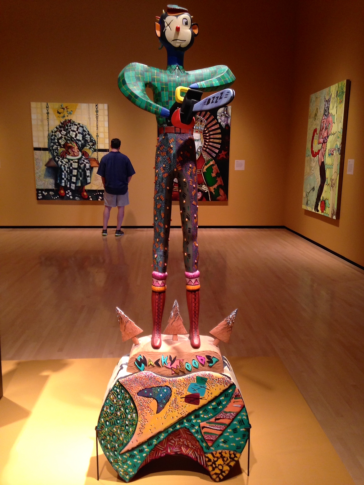
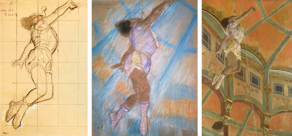
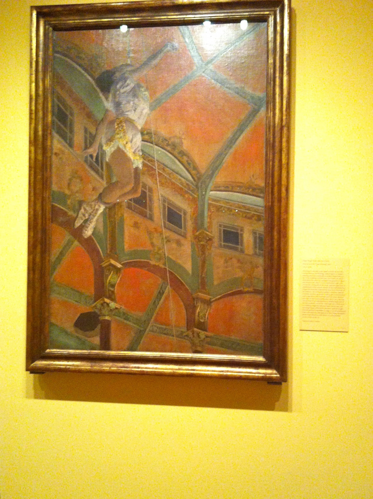
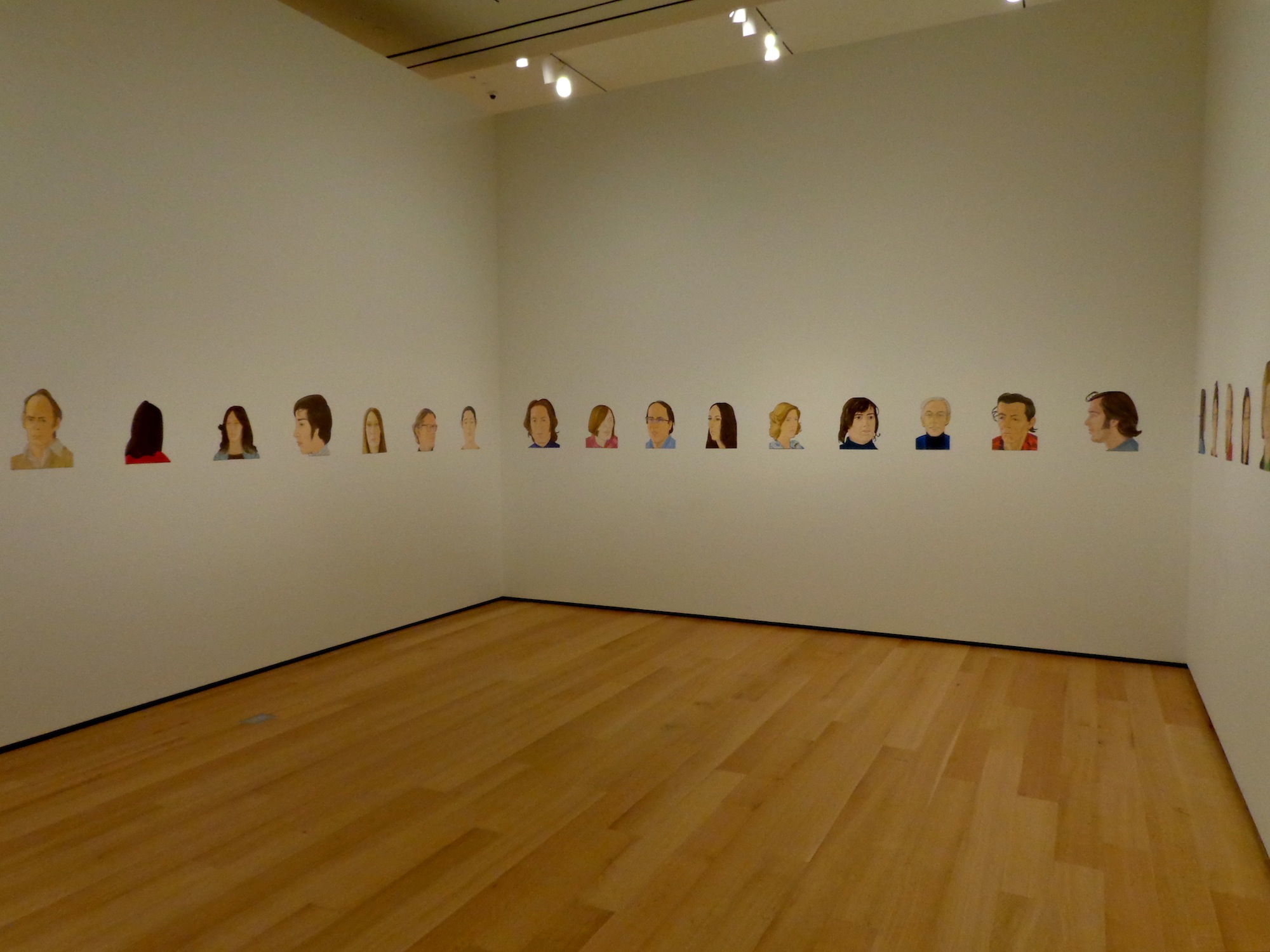
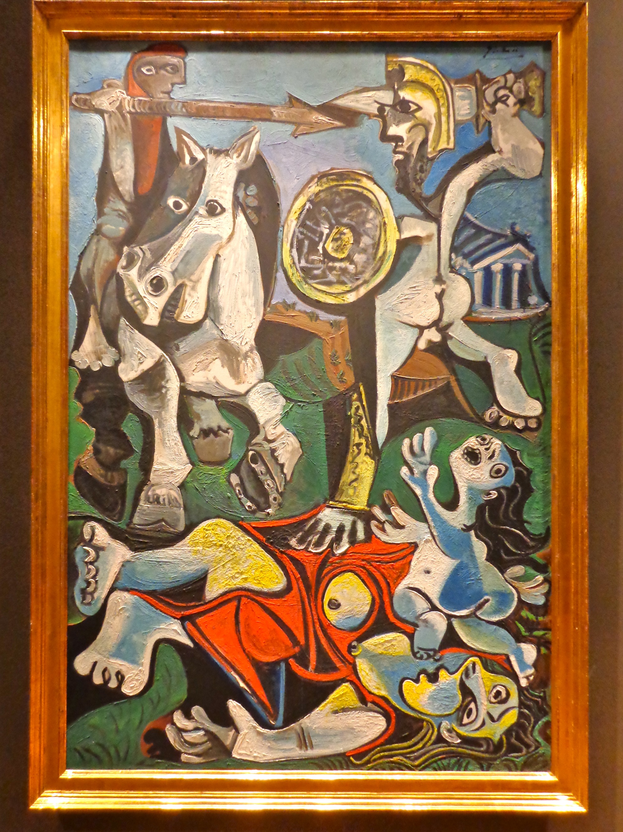
The visitor enters the exhibition space through the grand colonnaded entrance and greeted with what could very well be mistaken for a yard sale. There are so many items stacked on top of one another, paintings that are hung as high as ten feet, and every kind of object you can ever imagine. Walking through the space forces a sort of focus on individual pieces, but there are still so many options that each viewer is able to choose which ones they prefer to focus on and learn about. In the exhibition press release the Brooklyn Museum wrote, “The ‘Connecting Places’ section presents artworks that reflect the human fascination with the physical world around us and how it relates to spirituality,” and here there are giant landscape paintings, tribal animal masks, and tile mosaics, among countless other items. “Connecting People” on the other hand “investigates the ways in which human beings have represented themselves in artworks, in various cultures throughout time.” There is the obvious Picasso placed next to a more standard portrait, but also Gaston Lachaise’s phenomenally powerful “Standing Woman” from 1932 placed next to Abelam ancestral figures and Nigerian masks. Finally the “Connecting Things” section “includes work that carry particular significance to those who make a use them.” Obviously the most general section that includes vast collections of the same items like mirrors and pitchers, alongside smaller pairings of two or three similar items intended for comparison.
 |
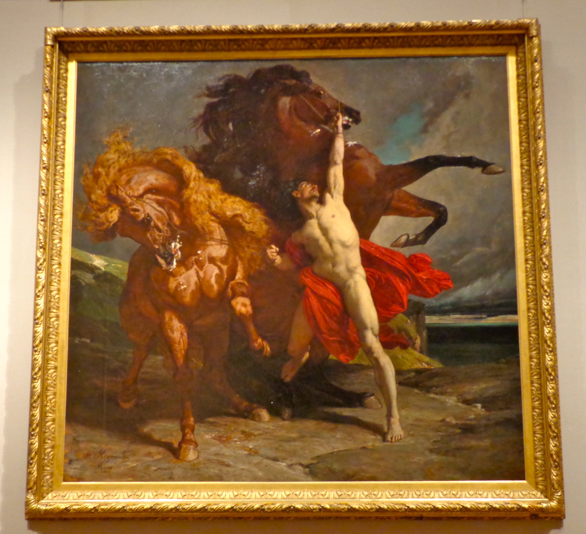
| “Connecting Places” |
“Connecting Cultures” constantly juxtaposed objects with similar themes by placing them next to each other, forcing the viewer to determine their similarities and differences even though the two artifacts may have been made on opposite sides of the globe in completely different millennia. One of these most obvious comparisons came at the introduction to the “Connecting People” section of the exhibit. At the top of an L-shaped display arrangement that began on the very left side of the wall hung a painting from Peru in 1765, “Our Lady of Cocharcas” which depicts a pilgrimage during the time of the Spanish conversion and conquest of the Incas, when they allowed for the apparition of the Virgin statue at sites sacred to the locals as a way of easing them into accepting Christianity. Below this painting sits an 18th century statue of the Buddhist goddess of Dawn from China, and to its left hangs Chevalier Fereol de Bonnemaison’s “Young Woman Overtaken by a Storm” from 1799. It features an idealized representation of a young woman wrapped in sheer fabric that is blown about by the wind; the turbulence here was intended to evoke the instability left in the wake of the French Revolution. These three works were all made in the same century but on different continents, and all use the figure of a woman to represent a larger idea, whether that be the incoming of forced religious change, the spirit behind the dawn, or the vulnerability of a nation still recuperating. The Brooklyn Museum’s press release stated, “In viewing the juxtaposition and combination of works from different cultures around the world, the visitor will be asked to consider the importance of the idea of place to the definition of culture and the self; the ways in which people represent themselves in the works of art that help define them and the role of objects, or things, in supporting identity, both personal and cultural.”
Another theme frequented by “Connecting Cultures” was showcasing single artworks that involved a combination of different cultural influences. These pieces were most prevalent in the “Connecting Things” section of the exhibition, the most generalized group of objects that gave the curators free reign to choose whichever kinds of “things” they desired. On a large scale, mirrors and pitchers were selected as the two “things” to highlight, nineteen mirrors impressively stacked alongside a giant open cupboard filled with pitchers along the “Connecting Things” wall. These multiple interpretations were displayed alongside conglomerate artworks, more modern pieces that gathered inspiration from multiple cultures. Paa Joe’s “Coffin in the Form of a Sneaker” from 1990 is one of the most striking examples. Here the artist combines the Ghanaian tradition of creating coffins that resemble the characteristics or profession of the deceased, with a reflection on the symbols of status and modernity in the late 20th century, effectively commenting on the West’s takeover of “cool.”
 |
“Female Figure Standing with Arms Raised,” Dogon artist, Mali, 16th-19th century
“Girl in a Japanese Costume,” by William Merritt Chase, c. 1890
“Jizo Bosatsu,” Japan, late 10th-early 11th century |
The exhibition concentrated on the museum’s responsibility of education, including a huge amount of supplementary teaching materials sprinkled throughout. Two out of the four pillars at the corners within the space incorporated some sort of additional learning feature. There was an open exhibition catalogue and a hanging “Pictorial History of the Brooklyn Museum,” which featured a simple walkthrough of some of the greatest artifacts collected throughout each decade of the Brooklyn Museum’s history since its founding in 1823. The resources for learning about “Connecting Cultures” are even greater online, and include the exhibition website and its original press release, an online exhibition archive with full-length object descriptions, and continuous blog posts that tie the exhibition to other events within the museum with titles like “Connecting through Conservation” and “Connecting Cultures Through Books!” There is even a Flickr set that includes photos of the exhibition as it was being set up, allowing the most interested visitors a behind-the-scenes look into how this huge expansive exhibition came to be. There was also an opportunity for feedback both in the exhibition and online. On another of the four columns sat a propped up iPad complete with a keyboard and a screen that read, “Please comment.” There is also a whole section of the Brooklyn Museum website dedicated to asking for feedback for “Connecting Cultures,” and currently there are twenty-two pages of comments that have already been posted. This emphasis on didacticism and feedback, both within the exhibition and online, create an open back and forth between the museum and its visitors, allowing for the Brooklyn Museum to gather ideas for future exhibitions while also allowing for the visitors to feel like they are part of a grand cultural tradition.
The exhibition also works to present the Brooklyn Museum as a transparent and humble institution, bringing the conceptual display of visual storage to a featured first-floor exhibition. They compared multiple mediums by including small-scale video screens along with the bottom placards, but left the wires and the DVD players completely exposed. This seemed to be a very deliberate choice used to create a more informal environment and convey a sense of openness, presenting a new concept of what a museum is supposed to be: a tool for community education instead of an elite and aesthetically flawless collection of artwork. The museum utilizes the same lit bookshelves used in their fifth-floor Luce Center for American Art Visible Storage and Study Center, expanding upon the idea in the open cupboards full of pitchers, each with its own individually lit cubbyhole.
This type of display did garner some criticism since it is makes attribution and wall text difficult to locate. In fact, there was a whole lit bookshelf filled with different interpretations of the Buddha figure that included no information whatsoever, which resulted in a crippling decontextualization of these works. How can the visitor compare these figures if there is no information about where they came from? Many of the comments posted by exhibition visitors online complained of a space that was “too cluttered” and left them with an uncomfortable, overwhelmed feeling. One visitor who identified herself as Jenn wrote, “I hadn’t seen this type of approach before, and I’m not sure how I feel about it. On the one hand, the dark backdrop really emphasizes the objects. On the other, it reminded me that I was in a 21st century museum, and thus decontextualized the objects.” The New York Times’ Holland Cotter offered the only institutional critique of the exhibition, which mostly consisted of ample praise for the exhibition’s “witty suggestive connections,” but continued on to complain of “sightline issues” and others that arose from utilizing this visual storage display technique. Cotter writes, “Open storage is a great idea, but because it crowds lots of objects together, it doesn’t give all the inventory optimal visibility… Many of the 100 pitchers are in compartments well above eye level. You know they’re there because labels say so, but they have no more physical presence than entries in an mail-order catalogue.”
 |
| “Blossom,” by Sanford Biggers, 2011 |
Although these issues of excessive clutter and disrupted sightlines were highlighted, almost all of the literature online praised the exhibition and the museum extensively, especially bloggers who are always searching for innovative new exhibitions to share with their readers. Aisha G., who writes the blog Hartlyn Kids said, “I would describe it as a ‘sampling’ of all the museum offers in one space.” The Rubin Museum of Art in New York City has a Tumblr blog for teens where one blogger wrote, “The exhibit is actually a new perspective on presenting art,” continuing on to say, “So it’s like a time machine, something that connects time and place!” The New York Times wrote that “Connecting Cultures” was an “art immersion experience, fast and condensed in a 21st-century way.” Cotter wrapped up her review writing:
“The ultimate goal of the Brooklyn installation it to encourage you to play with art, with meanings and values and cultural interconnections, which also means to play with the museum itself, to move its contents around mentally, to make friends where you ordinarily wouldn’t think to find them: to be at home in a large world. Some of us learned this through early soaks in art. Brooklyn’s installation offers a deep-end dive. Either way, the water’s fine. Come on in.”
So although there were some issues that accompanied the use of visible storage display, all around the exhibition was very well received by bloggers and critics alike who praised it for offering an introductory snapshot of the Brooklyn Museum’s impressive collection of artwork and artifacts.
A large part of why “Connecting Cultures” was such a successful exhibition can be attributed to another New York Times article written in April 2010 that offered advice for the museum, which at the time was clearly struggling to find a balance between appealing to its local community of minorities and young people and presenting itself as a renowned, distinguished institution that was on par with museums like the Metropolitan and the Guggenheim in Manhattan. Robin Pogrebin’s article, “Sketching a Future for Brooklyn Museum,” recounted what some had believed to be the museum’s missteps and offered advice from eighteen different artists, curators, and those in arts management, to prevent the institution from falling off the too-populist end of the spectrum, and as an exhibition, “Connecting Cultures,” directly answers much of the advice put forth. Essentially the Brooklyn Museum was losing credibility with the art community by presenting exhibitions like 2002’s Star Wars gallery which featured props and costumes from the films, and 2008’s Takashi Murakami exhibition which included a Louis Vuitton shop that sold handbags designed by the artist. The Brooklyn Museum also hosted a month-long exhibition in 2010 dedicated to the work of the most successful artist on Bravo’s reality show “Work of Art.” Although it can be assumed that some in the established art community looked down on the Brooklyn Museum for incorporating these populist exhibitions, Pogrebin’s article did a lot to grant the institution the benefit of the doubt, recounting the difficulties in its location and its incredible competition in a more-accessible Manhattan. Brooklyn’s changing demographics also accounts for the museum’s ever-shifting audience, now with an average age of 35 and with 40 percent from minority groups.
 |
| “Connecting Things” |
After “Sketching a Future for Brooklyn Museum” was published in April 2010, there was a noticeable difference in the exhibitions undertaken by the museum, that accompanied a more conscious institutional understanding of just where to stand on the line between populist and distinguished. The Brooklyn Museum hired LaPlaca Cohen, the same marketing and design firm whose current clients include the Metropolitan Museum and the Museum of Fine Arts in Boston. LaPlaca Cohen “crafted and communicated a new vision focused on connecting with Brooklyn’s diverse, local community” according to the Brooklyn Museum’s listing in their online client list. The Brooklyn Museum also worked to develop their social media ventures as a way to reach out to their younger local community while still holding exhibitions with prestige. Their Flickr account now has more than 5,000 images of behind-the-scenes installation photos of nearly all their exhibitions from the past six years, and their YouTube account has uploaded more than 300 videos of events and lectures that have accrued more than 800,000 views with nearly 3,000 subscribers. The Brooklyn Museum has also maintained a WordPress blog since May 2006, and their Facebook page has more than 70,000 likes. Their Twitter account currently stands at 5,074 tweets and has more than 380,000 followers.
The Brooklyn Museum has also been returning to the more traditional, art historically based exhibitions in answer to the New York Times’ advice since 2010. They held three different “from the collection” exhibitions in 2011, including “Thinking Big: Recent Design Acquisitions” and “That Place: Selections from the Collection,” with the intent of appearing as both a resourceful institution and an ever growing acclaimed force within the New York art scene. One of their most controversial exhibitions since 2010 was “Hide/Seek: Difference and Desire in American Portraiture” which ran from November 2011 until February 2012, and focused on “sexual difference in modern American portraiture.” However the exhibition’s controversial nature was eroded by the fact that it was completed in cooperation with the National Portrait Gallery and the Tacoma Art Museum, both esteemed institutions, one to the east and one to the west, which still worked to present the Brooklyn Museum as a respected member of the international art community. In the 2010 article, chairman of the New York State Council on the Arts, Daniel Simmons Jr. stressed the importance of “developing a core identity and marketing this effectively,” which was clearly advice taken to heart as the Brooklyn Museum carefully balances populism with its own prestige in every exhibition.
The Brooklyn Museum has also continued to strengthen its relationship with its local arts community, both by hosting exhibitions in honor of local tragedies like 9/11 and by coming up with innovative programs designed to engage the thousands of artists embedded in its own surrounding neighborhood. The Museum exhibited the gallery “Ten Years Later: Ground Zero Remembered” from September 7th through the end of October in 2011, which featured a book of comments left by visitors to their similar 2002 exhibition, shown more immediately in the aftermath of the tragedy. The Brooklyn Museum also created the GO Brooklyn Art program, which organized an Open Studios weekend where community members could visit the studios of local artists and vote for which should be featured in an upcoming Brooklyn Museum exhibition. The exhibition opened on the free-admission night, Target First Saturday, the first Saturday of December 2012 and featured the work of five artists nominated by the more than 18,000 people who made approximately 147,000 studio visits during the designated weekend in September. By connecting directly with the artists in the area through innovative programs like GO Brooklyn Art, the Museum continues to, as Bill Ivey former chairman of the National Endowment for the Arts suggests, “focus on growing its local audience, perhaps by developing an annual exhibition on a Brooklyn theme.”
 |
| The wall of pitchers – visible storage style. |
“Connecting Cultures” is just one more example of the Brooklyn Museum’s direct answering to the 2010 New York Times article. Stephen A. Schwarzman, the chairman of the private equity firm the Blackstone Group wrote, “With its collection, among the best in the world, there’s no reason why the museum cannot reclaim this role,” as a source of pride for New York City residents. The director of the Museum of the Moving Image, Rochelle Slovin gave similar advice when she said, “Continue to take excellent care of your treasured collections, hang tough, and pile it on.” “Connecting Cultures” features some of the best selections from the Brooklyn Museum’s renowned collection, and reminds the viewer that all these treasures come from that collection repeatedly throughout the exhibit, most notably by including a pictorial collecting history and using a visual storage display that mimics their own visual storage five floors above. They also work to counteract comparisons to flea markets by including some of their most precious items. Cotter’s New York Times review reads, “As a group, they’re eclectic for sure, but this is by no means second-rank stuff. Some of the museum’s signature items are in the mix.” By following all of this advice, the Brooklyn Museum used “Connecting Cultures” to showoff its esteemed collection while setting forth an improved identity, an innovative one that is also a valuable educational resource for the community.
This emphasis on “Connecting Cultures’” role as a showcase of the Brooklyn Museum’s collection also follows the advice given by Peter Marzio, the director of the Museum of Fine Arts in Houston who wrote, “By looking closely at Brooklyn, by exploring the ideals and values of its citizens, the museum is opening a dialogue that is creating a sense of community ownership.” The visible storage display stressed this feeling of community ownership, as if the museum was working to share everything in storage because it all belongs to the people. Caitlin Williams wrote on her blog Brush, Chisel, & Spray Can that “Connecting Cultures” “encourages, rather than stifles, conversation,” directly answering Peter Marzio’s advice about opening a dialogue. This strengthened relationship with the community and emphasis on showing off their own collection also serves to reestablish the Brooklyn Museum’s institutional presence within their five floors. In the 2010 article, Brooklyn artist William Powhida wrote, “The museum has tarnished its reputation by ceding too much institutional control to outsiders, with Charles Saatchi’s ‘Sensation,’ the commercial artist Takashi Murakami’s boutique and now Bravo’s ‘Work of Art’ prize show. These efforts tend to dominate the conversation.” “Connecting Cultures” does all it can to present a new Brooklyn Museum, one that is proud of its collection and history and has the masterpieces to back it up.
“Connecting Cultures” is not the first exhibition to showcase the museum’s collection using this kind of cross-culture display. In fact, in 1992 the Brooklyn Museum used the same exact concept, but instead asked artist Joseph Kosuth to choose the items from their collection and juxtapose intentionally to create a political message; an exhibition that played on the idea of the curator as artist. “The Play of the Unmentionable” showcased the history of art censorship, a hot button topic at a time when the “culture wars” were at their peak due to fighting over funding for the National Endowment for the Arts. This 1992 cross-culture gallery “clearly illustrated that by deploying rather than denying its position as a site of ideological contest, the museum provides an arena for engaging contemporary issues.” In a way, “Connecting Cultures” could even be viewed as a self-referential affirmation of an institutional tradition that began two decades before. This same sort of integrated display can also be seen on a smaller scale throughout the Brooklyn Museum in other permanent installations. The American Identities gallery on the fifth floor includes art from all over the Americas, not just the United States, presenting an amalgamation of the art from the whole continent. This sort of inclusive, flexible brand the museum is working to cultivate presents them as impartial and proud of diversity in their galleries.
“Connecting Cultures” utilized a new trend in exhibition display by creating an entire gallery from its already existing collection, presenting them in a broad and unassuming way as an introduction to the rest of the museum. The Brooklyn Museum’s criticism of becoming too focused on populist exhibitions came to fruition in 2010 when their Bravo reality exhibition prompted polite suggestions from the New York arts community, and since then the Brooklyn Museum has found firmer footing on the line between populism and prestige. Because of “Connecting Cultures’” diversity and openness in the display, aesthetically and through teaching materials as well, it successfully opens a dialogue with its community and purports a sense of local ownership, all the while showcasing one of the most impressive collections of art in the world.
 |
| “Avarice,” by Fernando Mastrangelo, 2008 |
Extreme detail and formality again due to this piece originally serving as my final research paper in an art history class at NYU called Histories of Display: Modern Museums, Exhibitions, and Art History.
See more pictures in my Flickr album here.
LINKS/SOURCES:
- Comment pages for “Connecting Cultures:”
- “Connecting Cultures” Press Release, February 2012.
- Community Blog Archives, Brooklyn Museum.
- http://www.brooklynmuseum.org/community/blogosphere/archives/
- Online Exhibition Archives, Brooklyn Museum.
- https://www.brooklynmuseum.org/opencollection/exhibitions/
- Holland Cotter’s New York Times article, April 19, 2012.
- Robin Pogrebin’s New York Times article, August 5, 2010.
- La Placa Cohen portfolio
- http://www.laplacacohen.com/main.html
- Carbonell, Bettina M. Museum Studies: An Anthology of Contexts, Second Edition. Blackwell Publishing, 2012.
Brooklyn Museum Social Media:
- Brush, Chisel, & Spray Can: The Modern Art Life, May 7, 2012
- Hartlyn Kids, September 17, 2012
- Rubin Museum of Art Teens, November 17, 2012