Dec 3, 2012 | art history, museums, painting, The Met
In 1906 Henri Matisse painted “Young Sailor I,” a roughly shaded, almost abstract interpretation of an eighteen-year-old fisherman in his neighborhood. The young man is shown sitting with his arm propping up his head, his features outlined in dark black lines, and the same green of his pants creeping up to his cheek indicating shadow. Matisse lived with this portrait he’d created for almost a year before it inspired a reinterpretation that became “Young Sailor II,” one of his most iconic works. It’s clearly the same man, his hands arranged identically and his posture only slightly improved, but his face is completely different, almost unrecognizable – his eyes elongated and spread apart and his cheek bones accentuated; all traces of green-shadowed abstraction gone. Now the sailor sits in front of a glowing pink background instead one shaded in rough random lines of orange, blue, and green. Although “Young Sailor II” is now the more well-known of the two, at first Matisse was so insecure about this reinterpretation that he originally told people it was painted by the postman.
 |
| “Young Sailor I” |
 |
| “Young Sailor II” |
Both of these paintings sit side by side in Matisse: In Search of True Painting, the new exhibition at the Metropolitan Museum of Art opening on Tuesday, December 4th. It presents the artist as a perfectionist, constantly reworking the same compositions to see if they could be improved upon, by using a different set colors or tweaking the arrangement. It showcases the repetitive nature he was prone to as an artist, displaying some of his most famous paintings like “Young Sailor II” alongside the lesser-known masterpieces that were created first for inspiration, allowing you to compare them directly and trace his thought process from one interpretation to the next.
Read the rest of my review HERE on Woman Around Town.
And check out more photos from the gallery in my Flickr set here.
Oct 8, 2012 | art history, museums, news, The Guggenheim, The Met
 This weekend was a busy one. So much art in so little time wears me out, and I’m a firm supporter of the Put-More-Benches-In-Museums Movement, but the ones that the museums actually do have are never at great vantage points anyway. On Saturday we saw the Picasso Black and White exhibit at the Guggenheim and this morning it was the Met’s new Bernini: Sculpting in Clay show. I’m taking a whole class on the latter, which made it cool to actually be able to put all that tuition money to good use.
Picasso Black and White was a whole lot of the same, but not in a bad way – they almost saturate you in his shapes and forms till you feel like you have to shake it off to keep your face from getting out of whack. And although most of it was kept to the two shades listed, there were quite a few works that were colored everything from purple to blue to yellow, to the point where it might have been more appropriate to call it Picasso in Monochrome – although I suppose “black and white” sounds classier.
 |
Pablo Picasso, The Maids of Honor (Las Meninas, after Velazquez)
August 17, 1957 |
Most of the pieces were profiles of women or girls “seated” or “reclining,” and it was so interesting to see him move from beautiful realist portraits to skewed, geometricized, sexualized ones, as his interpretation of the human form grew into abstract shapes both two and three dimensional. The three dimensional ones were some of my favorite, where the profile was constructed as a grouping of deep shapes, stacked and hanging on top of each other, sometimes with little eyes peeping out from somewhere unexpected and usually an obvious nose protruding.
 |
| Diego de Velazquez, Las Meninas, c. 1656 |
There were also beautiful renditions of compositions taken from artists that came before him, like “Las Meninas” by Velasquez and the “Rape of the Sabines”story that so many artists have interpreted since Rome’s founding. So many of the pieces looked like the roughest of sketches too, and some were only completed on one half of the canvas. The whole time I couldn’t stop wondering what Picasso would think of this great triumph he’s been built up into; if he’d be proud or embarrassed that all of us were looking at something he made on an unconscious whim that was never intended as a finished product.
They do a pretty good job letting you know that in the exhibit, but it still feels like so much of it is prep work for masterpieces we can’t see.
Bernini: Sculpting in Clay was a whole different universe of art – although both exhibits are heavily idolizing one individual’s contribution to the scene. It could just be because his 17th century time period can’t help but leave him wrapped up in mystery, but I’d choose Bernini over Picasso when it comes to inherent talent. I wish he could’ve lived in a different era though, outside the pope’s reign of power, but maybe then it would’ve turned out much differently and he wouldn’t have had the resources he did to create all that he was able to.
 |
| Faun teased by putti |
This exhibit is the best you can do without actually going to Rome – on the wall are giant black and white photographs of the massive sculptural programs that actually made it into the palazzos and churches in Rome, out of the bozzetti planning stages on paper and in terracotta before you. The gallery is laid out underground, with two rows of lights above strategically pointed at each glass case containing a little red-brown masterpiece.
 The curators did a really great job explaining everything to the viewer. You can see the thought process behind each piece as it develops from sketches to bozzetti to the giant black and white photographs on the walls. Because the sculptures are in the middle and the sketches are hung on the walls, the gallery ends up grouped into little clumps of the same character or type.
The angels that line the back aisle of the exhibit was one of my favorite groupings, since walking through these sculptural pairs that face each other and face you creates the greatest sense of environment, giving you one little glimpse of how it woulda-coulda-shoulda felt to see these pieces in all their finished-product marvelousness in Rome.
Feb 15, 2012 | painting, The Met
 |
| Magna on canvas. At the Met. |
The title pretty much says it all with this one. Well, either “On Deck” or “Reminiscent of a 60s Coke Ad.” “On Deck” is probably more poignant, not to mention accurate considering no one in the image is even holding a coke. Instead we see couples having another kind of drink on the deck of a cruise ship. Headscarves and sunglasses are worn by those around a red table holding red drinks. One man on the right stares solitarily into the distance, but everyone else seems to be engaged in general merriment, or at the very least conversation. This was definitely during a time when cruise ships were the exotic luxuries they started off as, and not the smelly, crowded islands of isolation they are now. The colors are incredibly rich– the bright blue sky with thin whisky clouds mirrors the blue clothing of those at the table. The woman closest to us has her bare legs in the sun’s rays as she enjoys a cigarette. The glamorous side of a regular life.
Feb 5, 2012 | painting, The Met
.JPG) |
| Oil on canvas, The Met |
The flow and sparkle of the river spills across the entire canvas. The small naked child in the foreground has her back to us– she’s about to jump in and join her friends whose white and pink gowns are already clinging to their bodies and floating in the water. Even though the little girl’s distinct shape separates her from the dream-like scene, the same melting shades of yellow, green, and blue are reflected in her skin and in the shadows cast on it. The smallest shadow, cast by her left shoulder blade onto her back, gives her a level of naturalism that contrasts with her flowy, dreamy surroundings. Her feet are in transition, inches from the water and already blurrier than the rest of her that is to follow. She wears a red ribbon in her braided brown hair, the sole addition to her soft, glowing body. The only face revealed to us within the scene is faceless. It’s that of the white-gowned older girl, and it only further emphasizes this lake as a dream-scape– elusive and blurry, but sparkling and beautiful. The little girl’s friends led her, and now she’s leading us to the lake.
Nov 22, 2011 | sculpture, The Met
I’m just going to be honest, in this statue she looks like a dude. From the neck up, she could be a man– her face is really masculine and you can’t see any of her hair because it’s all covered up by her khat (or, pharoah hat). If her dress hadn’t slid down quite scantily to reveal her entire left breast, she could have easily been mistaken for a boy.
She is wearing a very crisply carved flowing dress that hangs around her stone body as if it were actual fabric. Her doubled beaded necklace has a huge centerpiece hanging from it that looks like it would have been pretty heavy in real life. But for all this glamour she looks upset, her eyebrows are furrowed and her right arm is propping up her head and casting her gaze downward, like the answer to whatever problem she’s having is somewhere on the floor. Or maybe she’s just upset that she’s been put by the wall where no one can see her, instead of out in the middle of the gallery exhibit where all the more naked, more feminine statues stand.
Oct 27, 2011 | museums, The Met

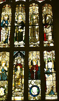
Christian art is so funny. It looks like how it’s supposed to look, which I suppose is a good thing but usually it just feels so… uninspired. Which is ironic because Christianity takes its essence in inspiration. You’re supposed to feel Jesus in your heart and sense the evil of Satan and temptation. And compared to how involved your heart is supposed to be in the religion, there’s a surprising lack of heart in the art that represents it here in this exhibit. I don’t think anyone’s ever seen a painting or a statue of Jesus and been able to recognize who made it. There’s no style, there’s no voice. Because just like any of the various establishments that teach the religion, nothing is ever really open to interpretation. Because different interpretations mean different sects and stand as dividing factors between who’s Lutheran and who’s Catholic. Somehow though, all of these sects seemed to agree on how the general field of Christianity would be represented to the world: Jesus is white (even though he probably wasn’t) he has a beard, Mary is young and beautiful, and for the most part, everyone looks exactly the same. People are always kneeling or praying or reading the Bible or mourning Jesus’ death. And honestly, if you’ve seen one stained glass window, you’ve seen them all.
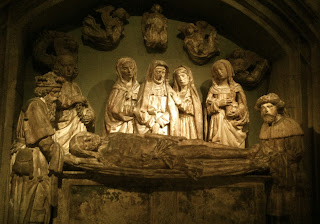
Size is the only difference I can find. But the only other really obvious difference in these depictions is the little halo around Mary’s head—she’s either divine or she isn’t. And for one little circle there really has been a whole lot of fighting. But sitting down, looking at all of this Chrisitan art in one space makes all those subtle differences (that for some reason are the biggest deal) seem like the dumbest disagreement I’ve ever heard of because when it comes down to it, a cross is a cross. And all the artistic representations of what the Catholics and the Protestants believe in look almost exactly the same.
Even in other religions, it’s basically all just praise of the divine, and it’s so upsetting that so many people have had to die just because “the divine” means different things to different people, even though the fundamental concept remains the same. Because even though almost every religion attempts to teach peace and acceptance, if your Jesus isn’t white or bearded then you’re wrong and all of this boring repetitive art is what’s getting into heaven instead of you.


.JPG)


