Mar 4, 2013 | illustration
Children’s Labyrinth, 1954.
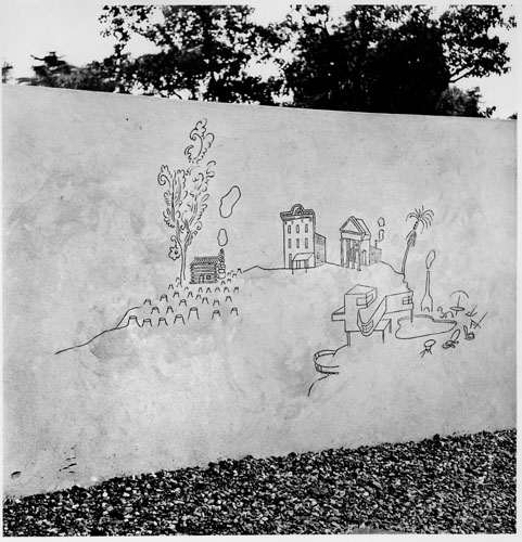
10th Milan Triennial, detail of History of Architecture section of mural.
Saul Steinberg‘s illustrations combine whimsy with art, creating mini-worlds that are clean and simple but at the same time lead the eye to someplace happy and bright.
Like a refined dose of Dr. Seuss, Steinberg prefers to draw realistically, turning typical scenes into magical places where the trees stretch up taller than the buildings – a small detail that makes our world seem more like a simply designed amusement park where thrill and wonder fill the air.
His work for the New Yorker explains all the scenes of the city, but I prefer the imaginary “Children’s Labyrinth,” drawn as part of the History of Architecture section of a mural. On the left sits a log cabin surrounded by the stumps of the trees those logs used to be. The most beautifully detailed tree stands next to the little building puffing smoke; the tree’s branches take delicate curlicue shapes as they expand just like the smoke beside them.
See more of Saul Steinberg’s work online at the Saul Steinberg Foundation Gallery.
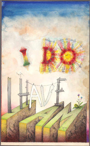
I Do, I Have, I Am, 1971.
Ink, marker pens, ballpoint pen, crayon, gouache, watercolor, and collage on paper, 22 3/4 x 14″.
Cover drawing for The New Yorker, July 31, 1971.
The Saul Steinberg Foundation.
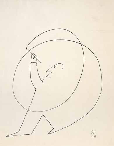
Untitled, 1948.
Ink on paper, 14 1/4 x 11 1/4″.
Beinecke Rare Book and Manuscript Library, Yale University.
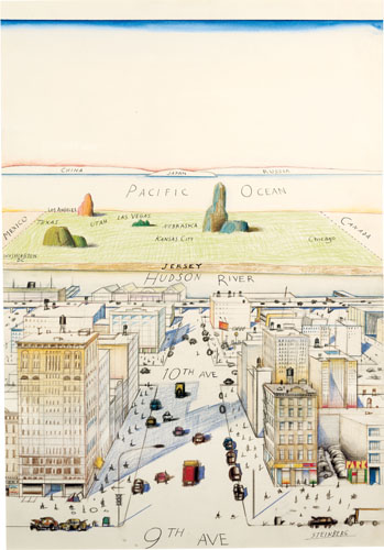
View of the World from 9th Avenue, 1976.
Ink, pencil, colored pencil, and watercolor on paper, 28 x 19″.
Cover drawing for The New Yorker, March 29, 1976.
Private collection.
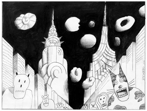
Untitled, 1974.
Ink, colored pencil, and collage on paper, 14 1/2 x 19 1/4″.
Originally published in The New Yorker, July 22, 1974.
The Saul Steinberg Foundation.
Feb 28, 2013 | illustration, interviews, painting
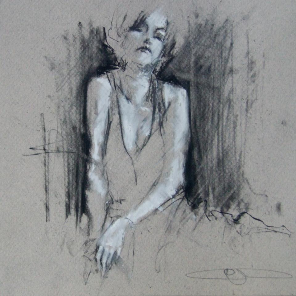
From his series, “Where the crows fly on their backs.”
We see her through smoke, the black outlines only revealing what’s necessary and letting the rest of her float away. Her skin is luminescent in white chalk that’s used to cast shadows across her body, left side glowing and right side faded, but her high cheekbones pick up light on both sides. Her head tilts back, and even though there’s no way to know for sure if her eyes are open, it somehow still feels like she’s looking at you because she knows you’re looking. After all, someone this beautiful must always have eyes on them.
Guy Denning’s impulsive sketching masterfully reveals something beautiful, usually a person, which is probably the most beautiful thing there is. The faces he draws use heavy shadow and sometimes a filled in background to emerge from the lines and paper, but they always come to life with the movements of the sketch, made so obvious that you’re able to imagine the process of each drawing coming to life.
“And the other heads FIST
Since they’ve lost the desire to even try
And instead look ahead.”
conte and chalk on paper
30 x 40 cm
12th February 2013
What usually inspires the creation of a new image?
Ideas come from all over the place. Usually it arrives to a canvas after it’s sat in my head for a couple of months, and I’ve drawn it a couple of times. I’ve got more ideas in my head than time left to do ’em.
How would you define neomodernism?
No more than what’s defined here. In fact there’s a lot on my blog about methods, ideas and inspiration.
From Guy’s blog: “The Post-modern is useful only in terms of further defining Modernism from its origins and is essentially only a continuity of modernism – sometimes termed hyper-modernism. These are all useful, to a greater or lesser degree, in terms of avoiding the ideas of the ‘end of (Art) history’ but with regards to the actual creation of artworks they are invalid. People do not set out to create a work of ‘Post-modern Art’. If we must have a new label, let it be a New Modernism – a return to the critical aesthetic giving the artist the opportunity to create work that has some relevance to the new modern audience – an audience already familiar with ‘modern art’, where validation of quality is not founded on post-modern hyper-obsession with language and semiology and the artist is not ground into politically correct subservience. I do not see this as a retrograde step – it can be the only way forward – to let the artist communicate without the bonds of corporate and state art politics.
To those claims of ‘Art is Dead – long live Art’ –
Post-modernism is dead – long live Neo-modernism.”
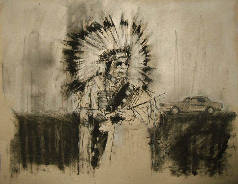
“AIM, the second battle of Wounded Knee (February 1973)”
conte and pastel on paper
66 x 55 cm
28th February 2013
What do you hope your pieces accomplish?
The most I can hope for is to emotionally move a viewer. Everyone brings their own lives and history to anything they look at, listen to or read. Consuming culture is as specific to the individual as making it.
When did you first begin painting and why?
I was drawing from childhood and I think that’s where my competency came from. I did little but draw and read – I certainly didn’t mix with other kids. First oil paintings were done at age 10 or 11 after my dad gave me a set of oil paints that he’d got bored with (a passing hobby in his 30s). I was hooked from the start.
Guy Denning is an English artist who’s been creating since the early 90s, and his work has been featured in exhibitions all over the UK as well as in Germany, Italy, France, and the US. You can see more of Guy’s work on his website, and all of these images come from his Facebook, which is filled with more things worth describing than I could ever filter into one post.
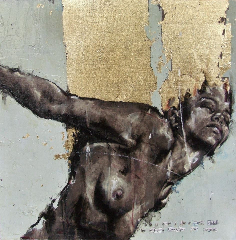
From the Purgatorio show, 2011 “dì, dì se questo è vero a tanta accusa tua confession conviene esser congiunta”
Feb 25, 2013 | illustration, painting
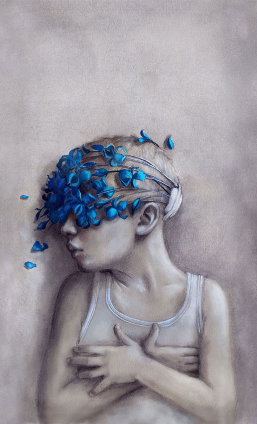
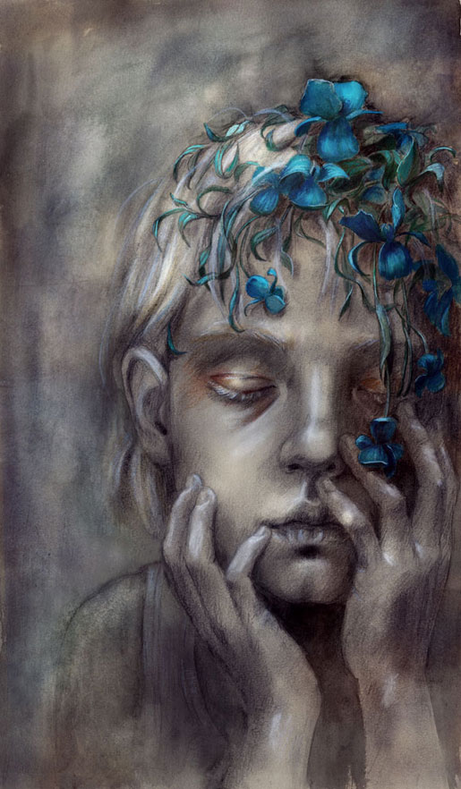
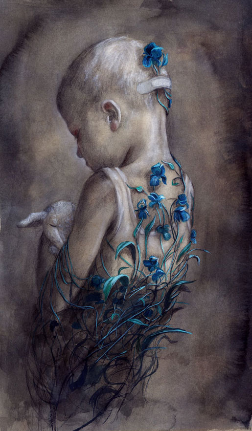
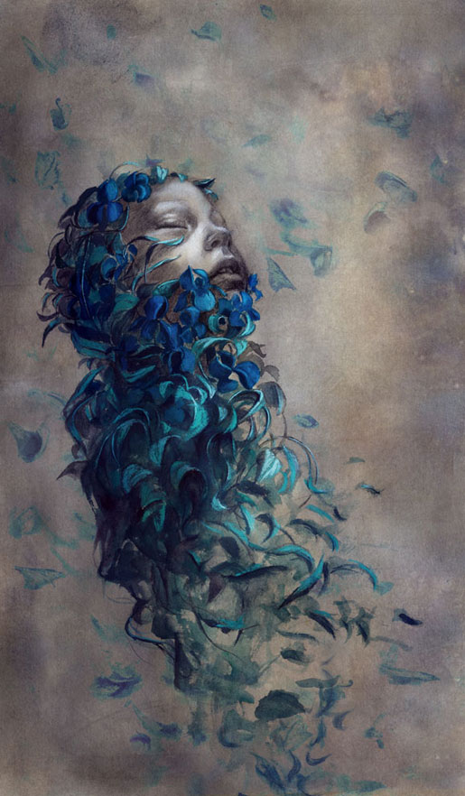
Artist and illustrator Beatriz Martin Vidal draws children in such an incredible way, highlighting their purity and innocence with simple shadows and sharp colors. The arresting colors – the ones that really make your eyes pull the car over – are usually only applied to flowers and other visual accessories, contrasting with the child and his monochrome background in a meaningful way – suggesting connections between youth and vitality while always maintaining a somber undertone about how fleeting all of it is anyway.
This collection is titled “birgit” in Vidal’s gallery of novel illustratons, and here she uses these stunning bright blue flowers to metaphorically encircle the beautiful children. Here they’re drawn in white tank tops with disheveled hair, creating a link to poverty and want – two things a child should never have to experience for herself.
In this first work the flowers cover the little boy’s eyes, stemming from a bandage at the back of his head, creating a blindfold on everything outside his own imagination, protecting him from whatever caused the need for a bandage in the first place.
In the second we see what to me looks like a little girl’s face, although her hair is cut short just past her ears. She sits, eyes closed, holding her face in her hands with eyelids tinted gold, as the bright blue flowers blossom and cascade down her forehead.
In the third work, a little boy stands with his back to us, holding his bunny/sheep stuffed animal close to his chest with his head cast down toward it. The flowers creep up his back, vines growing up from the depths and encircling his tiny frame.
In the last illustration the flowers have almost whisked the whole child away to someplace safer, only her face still peeking through the petals, turned up towards the sky with eyes closed and an expression of gratitude and peace.
See more of Beatriz Martin Vidal’s work on her website here.
Feb 21, 2013 | illustration, interviews
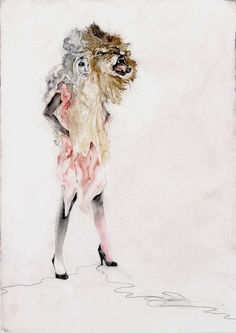
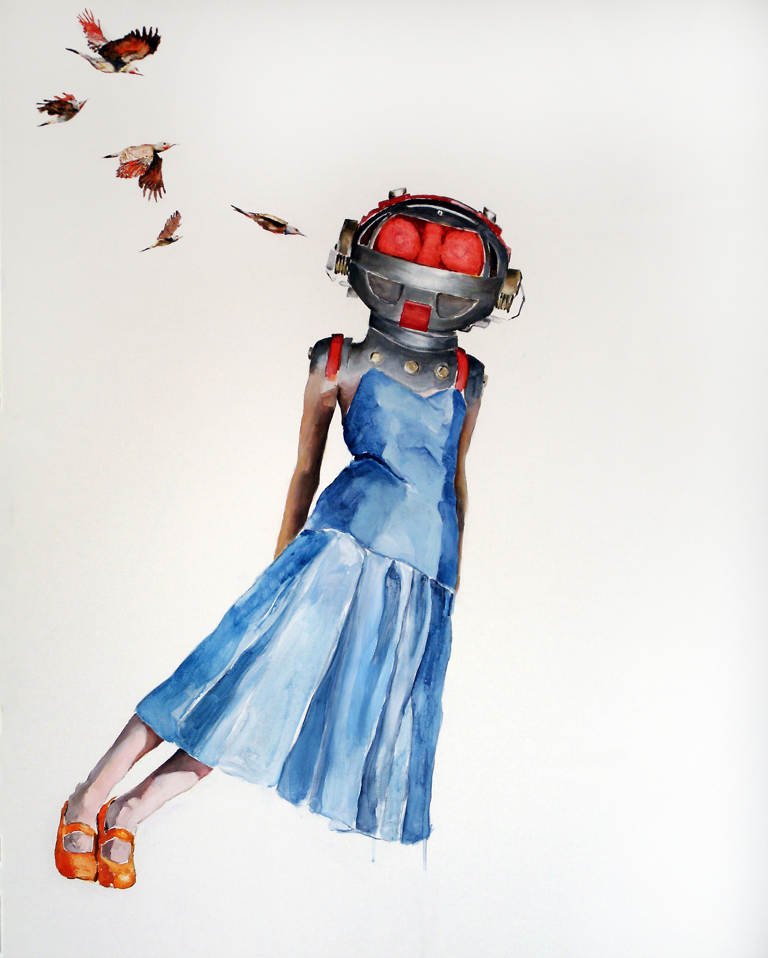
Contemporary artist Shari Rubeck uses watercolor and acrylics to create simple scenes filled with glamour, curiosity and chaos. Each brightly colored artwork beautifully explores the human psyche, with a suggested meaning that’s left open to interpretation . Her style is multi-faceted, each series develops its own sort of visual voice that usually involves some kind of animal imagery along with a sense of raw purity, the paint allowed to run and swirl organically in confined areas of the composition.
“Lion Girl” is a watercolor and graphite work that shows a woman standing defiantly, hands on her hips as her serene face is overlaid with that of a powerful lion roaring, the color of his mane melting into her fiery tethered dress. A girl in a blue dress leans impossibly far to the right in “Sharp Intrusion,” her head hidden by a glowing red space helmet with five birds flying towards it, as if they were working as a team to knock her over.
What’s the first thing you can remember painting?
The inside of my parent’s station wagon with crayons is one of my earliest artistic memories. But my first memory of painting would have to be when I received a good quality set of brushes and went to town filling large pieces of watercolor paper with all varieties of brushstrokes until I could think of no more.
What do you think watercolor adds to the creation of a piece?
Watercolors are fresh, light and have an immediate quality. I am working to bring that sense of luminescence to some of my larger acrylic paintings on linen.
What do you like about including animals in your work? Particularly bunnies?
Animals are a big part of my life and psyche. They are present often in my thoughts, dreams and work. They are my connection to the subtle workings of the world. They are magical, intuitive, and fierce, connected and make wonderful story tellers. As a human race we have turned our backs on them. Should technology suddenly drop off we would look to them for knowledge, guidance and find ourselves thanking them once again for sustenance.
The Bunnies arrived on the ‘scene’ soon after I began ‘working’ a puppet, named ‘Bunny’ for my son in his struggle to find comfort of sleep at bedtime. Bunny has a tremendously silly, but slightly cynical sense of humor and became my artistic story teller. The bunnies illustrate humor in the serious and not so serious sides of life’s events and emotions.
Who are the people your works represent?
The figures in my work represent all of us – humans and humanness. Some pieces are more representative of my own self and direct experiences, while others are observations from distant perspectives.
What do empty backgrounds allow for in your work and how do you choose a background for each character?
 I fluctuate between giving color & detail to the areas surrounding my characters and leaving them alone in their space. An intense drive to express an idea, message or observation leaves me feeling that the figures can communicate strongly without anything around them. The blank or negative space is carefully considered and tells much about the tensions while simultaneously allowing for areas of visual repose.
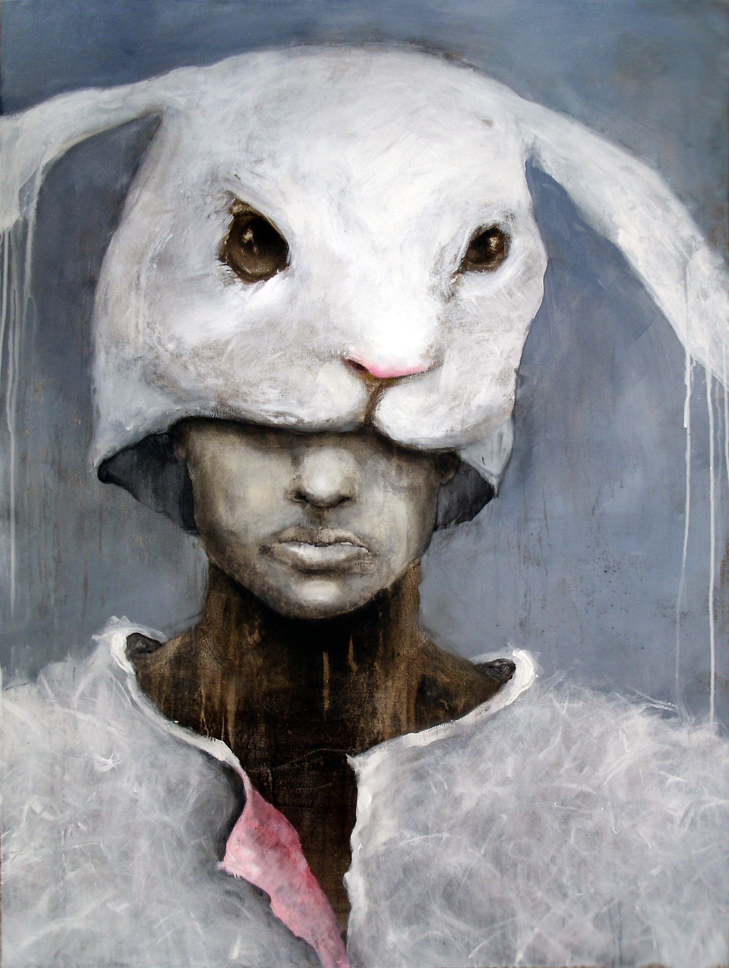
What do you like about the image of a figure with a mismatched head?
A figure with mismatched head…isn’t that what we all are? Or I could elaborate and say that we are all different degrees of mask wearers. My Ego series transformed into the Alter Egos. The first Alter Ego shows a human wearing a bunni mask or a bunni wearing a human – there is some ambiguity. I have always been intrigued by masks and what they can represent. There is so much that goes on ‘backstage’. I do also love the weight of a head that is too large for its body; whether mechanical or creature.
What are some of the art websites or blogs you follow?
Some sites that I am affiliated with or keep up with are: BlueCanvas, Twitter, ARTCZAR, Elisa Contemporary, Artsrogueisland, GalleryZ, ColoColo, Hallway Gallery, and now of course ThingsWorthDescribing. I find many intriguing sites on random searches but may only visit them once.
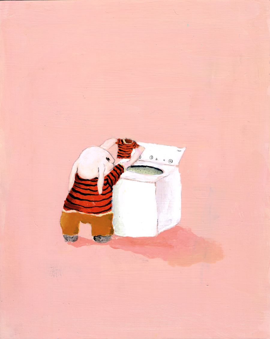
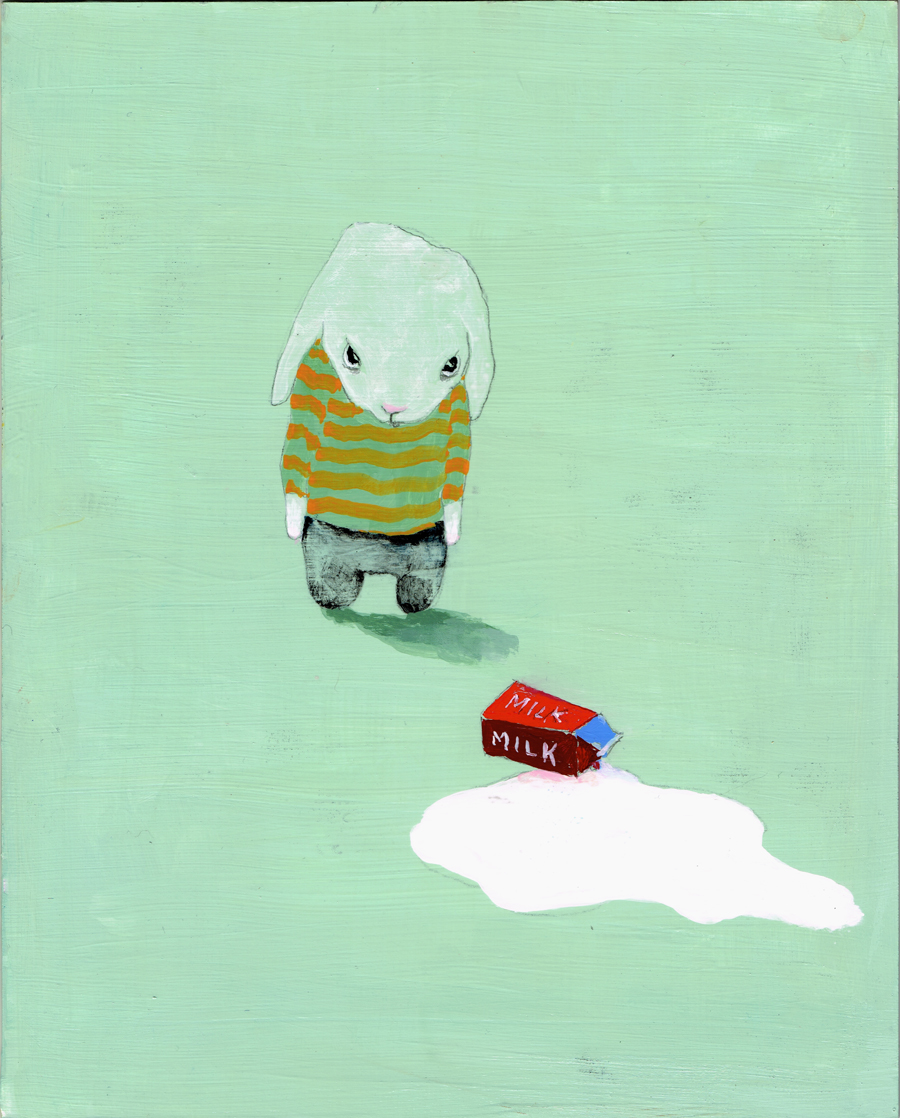
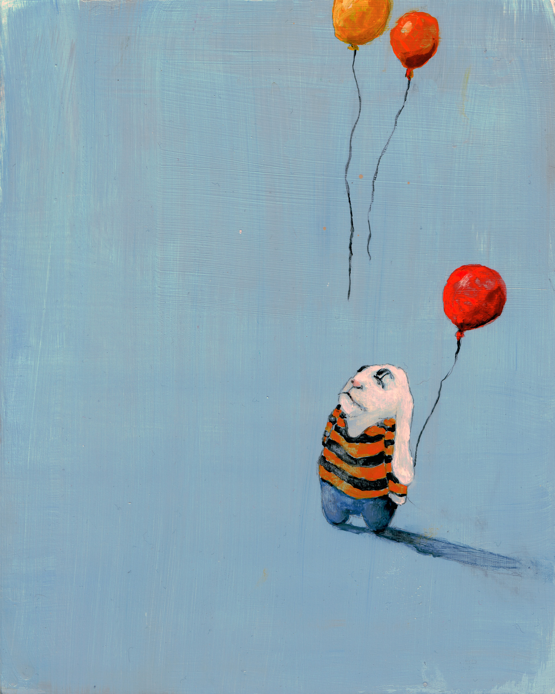
Minor Situations is her newest series of bunny paintings that’s by far the most adorable – fluffy floppy characters shown after a small disappointment like burning toast, letting balloons go, or spilling milk. Their little bunny faces look so downtrodden, and their long ears allow for an exaggerated sense of unhappiness as they fall down the back of every bunny. Simple scenes against bright-colored backgrounds, these works are lovable in a silly sad way.
For more of Shari’s work, head to her website Art in Mind.
Oct 22, 2012 | art history, illustration, museums, The Morgan Library & Museum
I wrote a little too much for this review, so below you can read the extra describing I did about the pieces from this phenomenal new exhibit at the Morgan.
Read the full review on Woman Around Town here.
 |
| Andrea Mantegna, Dancing Muse, c. 1495 |
Last week the Morgan Library and Museum opened their first fall exhibit featuring 100 drawings by almost as many artists, all on loan from the Staatliche Graphische Sammlung, or State Graphic Collection in Munich, Germany. This new exhibit was made possible by an agreement between the two institutions – in 2008 the Morgan sent 100 drawings in their collection to the Staatliche Graphische Sammlung as a part of their 250th anniversary celebration. Four years later, 100 drawings from Munich have made their way across the ocean to create Durer to de Kooning, an exhibit that fills both the East and West Morgan Stanley Galleries.
The Staaliche Graphische Sammlung has a collection of 400,000 works that began in the 1750s, growing over time until it was moved to Munich in 1794 for protection from approaching French revolutionary forces. German kings continued to add to the collection and it was opened to the public in 1823, becoming an independent museum in 1874. It was the only art institution that remained open during World War II, until July 12, 1944 when the building was bombed and almost a third of the collection was lost. But it only continued to grow in the twentieth century, adding a number of German Expressionist works and more modern and contemporary drawings, which still remains the collection’s largest and fastest growing genre.
Beginning at the High Renaissance in Italy, the artists represented are instantly recognizable, to the point where it seems as if some pieces were chosen based on name alone.
The drawing by Leonardo da Vinci seems a little out of place.

|
Matthais Grunewald,
Study of a Woman with her Head Raised in Prayer |
It looks like it came straight from an engineer’s notebook and all the pieces surrounding it are sketches of religious scenes.
Still, the names are impressive, and being able to see the actual handwriting and sketches of all these ancient artistic masters feels more intimate than standing before finished portraits and paintings. A few of the works have placards that even include an image of the finished painting, revealing the artist’s thought process as he worked out compositional arrangements and the orientation of the figures.
The first work to include the finished painting counterpart is Andrea Mantegna’s Dancing Muse. Completed around 1495, it features a young woman dressed in flowing, flying wrinkled dress with her hair parted down the middle and tied back; her arms teased behind her back as well and her body twisted and on her toes like she’s dancing in the wind. Drawn in pen and brown ink plus brown wash and heightened with white, the brown-gray paper the figure rests on is aged and near crumpling. Her ankles are fading away on the edge of the paper and her dress looks Greek and ancient, as if this could have come from thousands of years ago instead of hundreds. This ancient muse is only one character of many in the finished painting, shown in the placards as a detail of Parnassus, a tempera painting now in the Louvre.

|
Leonardo da Vinci,
Mechanism for Gold Processing, before 1495 |
Vincent Van Gogh’s View of Arles Across the Rhome features a typical Van Gogh scene through an atypical lens, his thick gobs of paint traded in for pen and brown ink hatching. A town can be seen across the water, a bridge connecting it to what’s across the way, and a shadowed figure in a boat is rowing in the water before us. While traveling in Arles, France, Van Gogh had to save money on materials and so turned to drawing, and this work shows his drawing style’s turn towards more rapid, fluid strokes.
Read the rest of my review here on Woman Around Town >>
 |
| Vincent van Gogh, View of Arles on the Rhone River, c. 1888 |
 |
| Francis Picabia, Mask and transparence, 1925 |
Mar 18, 2012 | illustration, Museum of Fine Arts: Boston
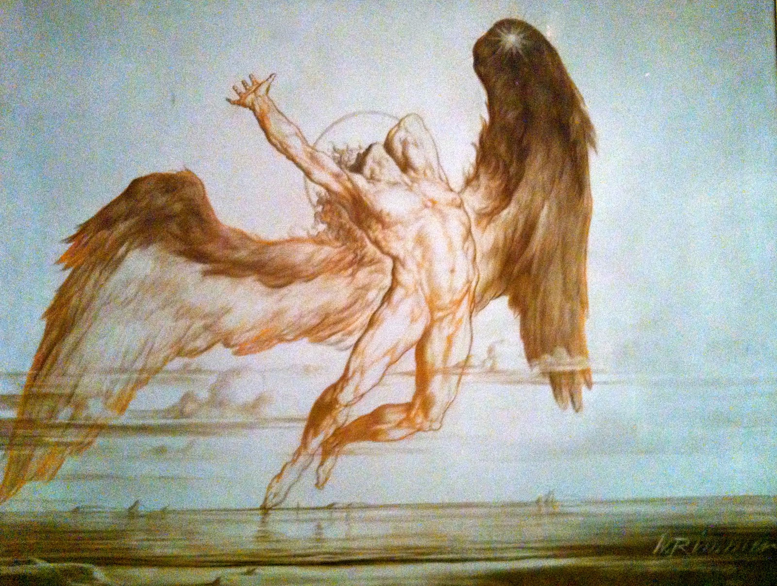
A sun in the center of the sky hovers above a low, watery horizon. An angel made of pure muscle seems to leap from this horizon, his back toe just resting on the edge of the water, thrusting the rest of his body with heavy, feathery wings expanded, into the center of the composition.
His whole body is twitching with motion; his hand reaches up and back to the sun that falls behind him. All limbs are outstretched and exposed, his head shot back as well, leaving his jaw lit but his face in shadow, surrounded by a shroud of whispy, curly hair.
 |
| Crayon, oil, and graphite on canvas. At the MFA in Boston. |
The rest of the painting is left blank, allowing us to focus on the pose and outstretched motion of the angel, who is somehow being lit from the front even with the sun behind him. The dark weighty feathers of his wings are given details only where necessary.
His overly lined musculature is perfectly sketched in brown outline and shading before a light shade of orange was applied – the same orange added at the edges of his great wings for accent.