Jul 30, 2012 | museums, photography
With the Olympics starting this week, the whole world seems focused on London. And that includes the Museum of the City of New York, which just opened a new exhibit London Street Photography this week.
 |
London Street Photography
Matt Stuart (b.1974), “Trafalgar Square,” 2006 |
The exhibit features over 70 photographs recording the people and streets of London, and you walk through them chronologically from 1860 to present day, watching photography develop alongside the bustling streets.
The room is white and wide open; it’s as if you can see decades of time sprawled out before you in one glance. The late 1800s saw photography in its developmental stages, as exposure times finally became short enough to freeze a city as busy as London. The 1910 photo by Horace Nicholls, “Derby Day,” looks like it came straight out of My Fair Lady, with the man in the foreground chewing merrily on his big cigar opposite a jolly woman in a giant hat.
Jul 27, 2012 | museums, painting, The Morgan Library & Museum
“Juxtaposing two colors puts me in a state of intense excitement” –Josef Albers
 |
Color Study for Homage to the Square
oil and graphite on blotting paper with varnish |
An exhibition that began in Germany and worked its way around Europe has finally landed in the States at the Morgan Library & Museum. Josef Albers in America gives you a behind-the-scenes look at the work of this German-born artist, most famous for his studies of color and the series, Homage to the Square.
It’s interesting to see what came before that famous colored squares series; how much work went into choosing just the right pigments and color combinations. There are even notes carved into the paint and scribbled in the margins, notes like “Try Again.”
I found the opening pieces most interesting, as squares that play with perspective and color do more than just with color alone. His three “Studies for a Kinetic” placed side-by-side, give three different versions of the same lines becoming squares, each playing with the canvas space in its own way based on the angles and colors chosen. But it wasn’t perspective that most interested Albers, who once described the square as “the dish I serve my craziness about color in.”
 |
Study for a Kinetic, ca. 1945
oil and graphite on blotting paper
|
Jul 9, 2012 | MoMA, Museum of Fine Arts: Boston, museums

Favorite: Museum of Fine Arts, Boston
You can probably tell by all the MFA pieces I’ve been posting recently that I’m kind of smitten. From the outside, it looks like a mini-Met, but inside the rooms are more specifically decorated for the kinds of art within them. For instance the ancient Etruscan/Persian room is lined with geometric shapes with yellow/brown walls, while the contemporary art (in a completely different part of the building) is in a huge open room with white walls and high ceilings. Each room you walk into changes your mindset, and makes you more receptive to what’s inside.
There’s even a long, tall hallway filled with Renaissance paintings stacked on top of one another. It reminded me of the National Gallery in London or the Louvre, both filled with tall rooms of painting on top of painting next to painting. A part of me hates rooms like this because it doesn’t give each piece the space it deserves, but most of me loves the impressiveness of all those beautiful things so close to each other.
They also have these great “Conservation in Action” rooms where you can see works of art in the process of being preserved. There’s clear glass separating you from the preservationist’s workroom and they write notes on a blackboard about what step of the process they’re on

and what else it will take to keep the work in good condition. I’ve never seen a room like this in a museum before, but now I really think they all should have them, because anyone interested in seeing art and ancient artifacts would definitely be interested in what it takes to keep these things around.
Aside from being well-curated with beautiful rooms, the museum has a really solid collection– both in ancient art and contemporary, a feat not easily accomplished. They have the Red and Black Room wall paintings from ancient Rome, gold-lit rooms of Egyptian hieroglyphics, plus the standards by Warhol and Chuck Close. It’s also one of the few museums that actually had great contemporary art, including Manhole by Ivan Navarro (right, 2011) and some I’ve already written about like Cecily Brown’s Skulldiver III. Of course there’s always that “Black Panel” that sneaks in under the guise of ambiguity and draw-your-own-conclusion nonsense, but for the most part this place is filled to the brim with must-sees.
Least Favorite: Museum of Modern Art, New York
Now that I’ve been living in New York for a while, this and the Met are probably the museums I frequent the most. And every time I go I think, “Maybe this time they’ll step it up,” but unfortunately most of it is just trash– and I mean literal trash. I think it was supposed to be some sort of comment on the wastefulness of our society, but I’ll never forget walking into one of the temporary first floor galleries and just seeing random piles of trash sectioned off as “art.” Which is pretty lazy art if you ask me.
Maybe it’s because I just don’t “get” modern art most of the time, but I really don’t understand most of what this place chooses to showcase. The reason art is so great is because it takes time and talent and actual thought, and to me, calling everything you make “Untitled” is just a cop-out for not having a reason for making it in the first place.
The permanent collection is what I go to see. Of course there’s Starry Night and they recently acquired Monet’s Water Lillies (although I’m not sure for how long), but the new exhibits on the top and bottom-most floors are usually not worth taking the escalator to see. I know some people enjoyed the Cindy Sherman exhibit, but if I wanted to see a narcissistic Halloween party I would have stayed home and played dress-up myself.
I just feel like there’s so much potential for the temporary exhibits, and so much of it is wasted on blurry photographs and type-print posters. The Paining and Sculpture exhibits on the fourth and fifth floors make the MoMA worth going to, there’s just nothing to come back for once you’ve seen the good stuff. I recommend going on Friday afternoons when it’s free– just be prepared to elbow some tourists if you want to see what’s worth seeing.
More photos of the MFA (all taken by me):
Oct 27, 2011 | museums, The Met

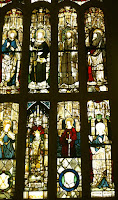
Christian art is so funny. It looks like how it’s supposed to look, which I suppose is a good thing but usually it just feels so… uninspired. Which is ironic because Christianity takes its essence in inspiration. You’re supposed to feel Jesus in your heart and sense the evil of Satan and temptation. And compared to how involved your heart is supposed to be in the religion, there’s a surprising lack of heart in the art that represents it here in this exhibit. I don’t think anyone’s ever seen a painting or a statue of Jesus and been able to recognize who made it. There’s no style, there’s no voice. Because just like any of the various establishments that teach the religion, nothing is ever really open to interpretation. Because different interpretations mean different sects and stand as dividing factors between who’s Lutheran and who’s Catholic. Somehow though, all of these sects seemed to agree on how the general field of Christianity would be represented to the world: Jesus is white (even though he probably wasn’t) he has a beard, Mary is young and beautiful, and for the most part, everyone looks exactly the same. People are always kneeling or praying or reading the Bible or mourning Jesus’ death. And honestly, if you’ve seen one stained glass window, you’ve seen them all.

Size is the only difference I can find. But the only other really obvious difference in these depictions is the little halo around Mary’s head—she’s either divine or she isn’t. And for one little circle there really has been a whole lot of fighting. But sitting down, looking at all of this Chrisitan art in one space makes all those subtle differences (that for some reason are the biggest deal) seem like the dumbest disagreement I’ve ever heard of because when it comes down to it, a cross is a cross. And all the artistic representations of what the Catholics and the Protestants believe in look almost exactly the same.
Even in other religions, it’s basically all just praise of the divine, and it’s so upsetting that so many people have had to die just because “the divine” means different things to different people, even though the fundamental concept remains the same. Because even though almost every religion attempts to teach peace and acceptance, if your Jesus isn’t white or bearded then you’re wrong and all of this boring repetitive art is what’s getting into heaven instead of you.
Jul 4, 2011 | museums, The Met
The Sackler Wing
June 25, 2011
Right now I’m sitting in probably one of the most well-known museum exhibits in the world: the ancient Egyptian section of the Met. More specifically, the Sackler Wing, which doesn’t really mean anything to anybody until you know it’s the huge open room with the little lake and the huge wall of windows overlooking Central Park. If you’ve ever been here, you know how impressive-looking this room is. Stone benches form the frame of the island in this little man-made lake scattered with shiny pennies. And in the middle of this elevated stone island stands two ancient Egyptian structures that look like they came straight out of The Mummy (or The Mummy Returns, either one…). Or maybe from the ride based off the movie at Universal…

Digression: I wonder when society shifted from the movie looking like the real thing to the real thing looking like the movie. At what point in time did kids start watching Spongebob before they saw the ocean for the first time? Probably around the time that one kid drowned trying to find him. I mean, obviously it’s much easier for some people to rent The Mummy than go to the Met and see this amazing exhibit, but I just think it’s so interesting that some child in this room is probably mentioning how much this place looks like the movies instead of the other way around. That movies and commercial places and things did such a good job marketing themselves that now those are the original to most people. And the time period or place that it was modeled after (like ancient Egypt and The Mummy ride or Africa and The Lion King) now looks like the movie or the ride instead of the other way around. How many people that have ridden the Spiderman ride have actually held the comic book in their hands? Not me at least.
But ANYWAYS, back to the Met: Surrounding the island are walls filled with pieces of broken hieroglyphics and ancient, pompous-looking statues. But people hardly even notice them for because they’re just the supporting players, since a picture of you in an enveloping ancient Egyptian building is way more impressive to your friends back home than a picture of you next to a comparatively tiny broken piece of stone with a bird painted on it. Besides, the two buildings have hieroglyphics engraved all over them anyways. The cool kind that look like they tell a story about something much more important than us. The first structure in front us really just a giant doorway that people can walk through if they felt so inclined. I’d say it’s about 30 feet tall if I had to guess, and it’s made up of huge blocks of stone stacked masterfully on top of one another, and a pretty impressive arching top that peers over either entrance. The designs ethed into it are still so clear that I would imagine it looked pretty similar to this when it was first built—the museum keeps it in good shape. The building standing behind it is longer and shorter—an actual building with at least four walls and internal rooms you can venture through. But the two columns at the front make it the most impressive; you can tell they used to be fluted although it’s pretty faded now. For some reason it looks like there’s an extra layer of stoned sitting on top of the roof—maybe it used to be two stories and those are the only remains. Or maybe they were just extra and the museum didn’t know where to put them. But either way, a couple of extra stones, if anything only makes this room more intense, and as I sit here on the stone bench with water on either side of me, ancient Egyptian ruins in front, and light streaming in from the huge panels of glass that unveil one of the most extensive urban (not to mention beautiful) parks in the world, I could never fully realize how lucky I am to have such beautiful things surrounding me. It would be hard not to write about them.


