Oct 8, 2012 | art history, museums, news, The Guggenheim, The Met
 This weekend was a busy one. So much art in so little time wears me out, and I’m a firm supporter of the Put-More-Benches-In-Museums Movement, but the ones that the museums actually do have are never at great vantage points anyway. On Saturday we saw the Picasso Black and White exhibit at the Guggenheim and this morning it was the Met’s new Bernini: Sculpting in Clay show. I’m taking a whole class on the latter, which made it cool to actually be able to put all that tuition money to good use.
Picasso Black and White was a whole lot of the same, but not in a bad way – they almost saturate you in his shapes and forms till you feel like you have to shake it off to keep your face from getting out of whack. And although most of it was kept to the two shades listed, there were quite a few works that were colored everything from purple to blue to yellow, to the point where it might have been more appropriate to call it Picasso in Monochrome – although I suppose “black and white” sounds classier.
 |
Pablo Picasso, The Maids of Honor (Las Meninas, after Velazquez)
August 17, 1957 |
Most of the pieces were profiles of women or girls “seated” or “reclining,” and it was so interesting to see him move from beautiful realist portraits to skewed, geometricized, sexualized ones, as his interpretation of the human form grew into abstract shapes both two and three dimensional. The three dimensional ones were some of my favorite, where the profile was constructed as a grouping of deep shapes, stacked and hanging on top of each other, sometimes with little eyes peeping out from somewhere unexpected and usually an obvious nose protruding.
 |
| Diego de Velazquez, Las Meninas, c. 1656 |
There were also beautiful renditions of compositions taken from artists that came before him, like “Las Meninas” by Velasquez and the “Rape of the Sabines”story that so many artists have interpreted since Rome’s founding. So many of the pieces looked like the roughest of sketches too, and some were only completed on one half of the canvas. The whole time I couldn’t stop wondering what Picasso would think of this great triumph he’s been built up into; if he’d be proud or embarrassed that all of us were looking at something he made on an unconscious whim that was never intended as a finished product.
They do a pretty good job letting you know that in the exhibit, but it still feels like so much of it is prep work for masterpieces we can’t see.
Bernini: Sculpting in Clay was a whole different universe of art – although both exhibits are heavily idolizing one individual’s contribution to the scene. It could just be because his 17th century time period can’t help but leave him wrapped up in mystery, but I’d choose Bernini over Picasso when it comes to inherent talent. I wish he could’ve lived in a different era though, outside the pope’s reign of power, but maybe then it would’ve turned out much differently and he wouldn’t have had the resources he did to create all that he was able to.
 |
| Faun teased by putti |
This exhibit is the best you can do without actually going to Rome – on the wall are giant black and white photographs of the massive sculptural programs that actually made it into the palazzos and churches in Rome, out of the bozzetti planning stages on paper and in terracotta before you. The gallery is laid out underground, with two rows of lights above strategically pointed at each glass case containing a little red-brown masterpiece.
 The curators did a really great job explaining everything to the viewer. You can see the thought process behind each piece as it develops from sketches to bozzetti to the giant black and white photographs on the walls. Because the sculptures are in the middle and the sketches are hung on the walls, the gallery ends up grouped into little clumps of the same character or type.
The angels that line the back aisle of the exhibit was one of my favorite groupings, since walking through these sculptural pairs that face each other and face you creates the greatest sense of environment, giving you one little glimpse of how it woulda-coulda-shoulda felt to see these pieces in all their finished-product marvelousness in Rome.
Sep 14, 2012 | Art Institute in Chicago, features, museums
Unfortunately I visited this museum on the last day of my trip to Chicago. Had I known how incredibly huge and impressive it is, I definitely would have dedicated double the time to soak all of it up.
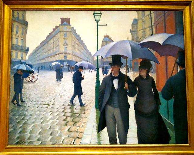
Think of the most famous iconic artwork you can, and it’s probably sitting at the Art Institute. I felt like every corner I turned led me to another piece of art history – everything from “American Gothic” to tons of Picassos to van Gogh’s “The Room” – all of my favorites and a couple of new ones too.
 |
| Paris Street; Rainy Day by Gustave Caillebotte, 1877 |
 |
| American Gothic by Grant Wood, 1930 |

|
| New favorite! The Eventuality of Destiny by Giorgio de Chirico, 1927 |
It’s a funny thing finding a painting in a museum that you’ve studied and learned about through slides and textbooks. I imagine meeting up with someone from an online dating site would give you a similar feeling. Because you know so much about this piece and sometimes even the person who made it, which makes meeting it in person kind of phenomenal. Since its appearance never changes, I guess it’s more like meeting an old friend that always surpasses your expectations.
Whatever the feeling that I can’t do justice describing, it’s one I felt dozens of times at the Art Institute. Three straight floors of glass and slick pale wood was the perfect environment to see the works in; nothing extra where it wasn’t necessary. The rooms and hallways of beauty and masterpieces just kept coming and coming, so I’m just going to focus on my absolute favorites.
 |
| Nighthawks by Edward Hopper, 1942 |
The third floor European Modern Art gallery, from 1900-1950, was one of the greatest collections I’ve seen in so long. It could have been a substantial collection of work all on its own; maybe it’s own mini-museum. There were so many Picasso’s, Mattisse’s, and Dali’s – it always amazes me how much work those artists actually completed over the course of their lives, that they can be featured numerous times in hundreds of museums all around the world.
 |
| Detail of van Gogh’s The Room, 1888 |
American Modern Art was almost as great, well actually it was just as great, but in a different way. It’s really clear how different the styles of those two continents are after seeing these exhibits in succession. Right next to this space on the second floor was the featured exhibition, and when I visited I saw the Roy Lichtenstein retrospective.
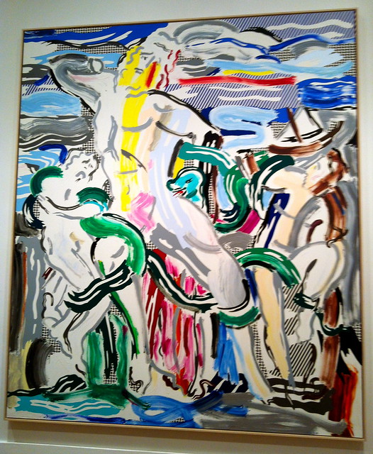
I never really appreciated Roy Lichtenstein’s contributions until seeing this show, mostly because it was so hard for me to believe that they were actually oil paintings and not just pop art. But after seeing it as up close as the guards would let me, it was one part surprising and one part impressive to be wrong about how talented that man was. The show works chronologically, allowing us to really see how Lichtenstein developed his style and the different phases he went through during his progression as an artist. My favorite phase came later in his life, when he began to apply his own technique and style to the works of different artists and time periods. It really showed how great Lichtenstein had become – he had created such a unique visual language that could be applied to previous masterpieces, and it was so clear which aspects had come from where.
 |
| Masterpiece by Roy Lichtenstein, 1962 |
 |
| Laocoon by Roy Lichtenstein, 1988 |
Someday soon I’ll visit the Art Institute again. Comment if you’ve been – I want to hear what you thought of it!
You can see more of my pictures from the Art Institute in my Flickr set here.
Sep 4, 2012 | Brooklyn Museum, features, museums
 This post was meant to precede the Brooklyn Museum’s Target First Saturday this past weekend, but as it turns out, they didn’t even have it this month because of the West Indian-American Day Parade. The first Saturday of every month, the Brooklyn Museum allows free admission for everyone, and hosts a number of (pretty rowdy) events from 5pm-10pm, sponsored by Target.
But truth be told, the Target First events are pretty distracting from the art you’re there to see. The museum was packed full when I visited on the first Saturday of August, and it’s clear that most everyone is there for the drinking and music, with very few people bothering to look at all the beautiful things surrounding them.
 |
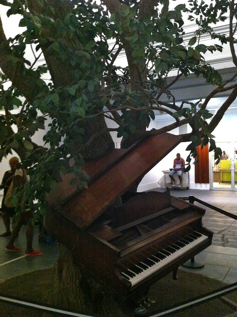
Blossom
by Sanford Biggers, 2007 |
The outside of the building is incredible – neoclassical architecture reminiscent of the Met, with statues of Old Testament prophets and Greek philosophers lining the exterior. You’d never guess that the inside is fully modernized with glass panels and exposed brick leading you into the center lobby that all the art revolves around.
 |
Maximum Sensation
by Mounir Fatmi, 2010 |
The first floor’s Great Hall exhibit is overwhelming. They’ve collected and curated pieces that in no way go together, but it’s interesting to compare these works that came from completely opposite times and cultures. They call it, Connecting Cultures, A World in Brooklyn and it focuses on three simplistic themes: connecting places, people, and things, with juxtaposed artworks for each section. One of my favorite pieces from the whole museum was sitting just outside this exhibit: a piano (working keyboard included) with a tree growing up out of the center of it. It’s called “Blossom,” and could have only been more beautiful if the tree was actually real.
 |
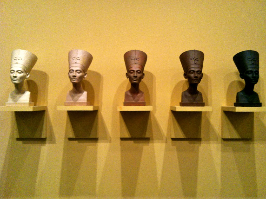
Grey Area (Brown Version)
by Fred Wilson, 1993 |
The first floor is also home to a pretty extensive collection of African art. The art of Asia and the Isalmic World finds a home on the second floor, and they have nearly a whole floor’s worth of Ancient Egyptian work, complete with decorated walls and ceilings matching the ancient vibe. The third floor also has a fantastic collection of European art surrounding the open court below. It’s separated by country, with translations of each description, determined by the nationality of the artist.
The fourth floor has a lot of great contemporary pieces also circling the open court, one floor directly above the European paintings. Here you can find Mounir Fatmi’s “Maximum Sensation” from 2010: beautifully decorated felt-covered skateboards skattered about on the floor. Walk a bit farther and there’s Fred Wilson’s “Grey Area (Brown Version)”, five different solid shades of the iconic Cleopatra bust lined up in the center of an alarmingly yellow wall from lightest to darkest.
 |
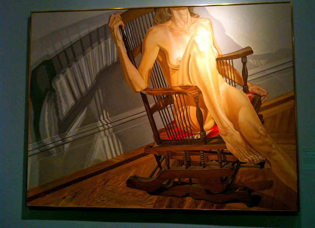
Female Model on a Rocker
by Philip Pearlstein, 1977-78
American Art, 5th floor |
|
|
On the fifth floor is the Luce Center for American Art, with everything from Native American artifacts to portraits of George Washington; everything from sixteenth century to contemporary American work. The most remarkable part of the museum is here on this floor: the Brooklyn Museum’s Visible Storage Center, where you can see all the works not on view, organized by numbers in clear glass cases. There’s shelves upon shelves of sculptures and rows upon rows of paintings, plus computer screens where you can search for anything you might be looking for. There’s even smaller, more fragile works stored in protective metal drawers.
I loved being taken behind the scenes in this special exhibit, and I honestly believe it’s something every larger-scale museum should have. If the works aren’t being used in a particular themed gallery, that doesn’t mean your visitors should be kept from them, especially since it’s just museum management’s decision to hide them away. Share all your art all the time – because why not?
See all my Brooklyn Museum photos in the Flickr set here.
Aug 17, 2012 | features, MCA Chicago, museums
 |
| Martin Creed’s “MOTHERS” just outside the MCA. |
Although the first couple of galleries you encounter on the first floor of this place are kind of underwhelming, don’t give up hope because the higher you go, the better the art. I found the MCA to be like one of those rope swings they throw out of helicopters – you have to climb up to get out of the awful water full of sharks and backwards-on-purpose canvases.
The first floor only gives you the contemporary art I’m used to being disappointed by – the lazy print-outs with paint on top that couldn’t have taken more than ten minutes. The second floor gets a little better with a First 50 gallery, showcasing the first fifty pieces acquired by the museum, although most of these are just blank spaces, some with polaroids, where the pieces used to be.
 |
Bluntschli by Charline von Heyl, 2005
Gem in the first floor contemporary galleries. |
The third floor is where you’ll find Heidi Norton’s first solo museum exhibition, Plants on the verge of a natural breakdown (and other stories of life and death). At first it might look like just a swath of leaves and paint splattered and combined, but comparing either side of the glass on these two-sided little ecosystems is surprisingly beautiful. One side looks like a crazy person’s collection of plants and odd bits all plastered together, but the other side shows what those bits look like up against glass – and the fusion of natural and unnatural elements somehow manages to seem symmetrical and pastel pretty.
The fourth floor is where things get great. My favorite exhibit in the museum, Skyscraper: Art and Architecture Against Gravity has one of the best collections I can remember. Here, architecture becomes more than just a bunch of vocabulary words about columns – the buildings on the canvases and in the sculptures of this exhibit are able to reach outside reality and prove how fascinating it is to form the space we live and move in. I’ll be posting descriptions of all my favorites from this floor so stay tuned (there are probably ten of them, so brace yourselves:)
Overall the MCA is a white-walled, wood-floored, wide-open space of potential that scales from just discovered to fully maxed. It’s an exciting place to walk through, never knowing if what’s around the corner is the best thing or the worst thing you’ve ever seen.
If you live in Chicago, check it out – especially on Tuesdays when admission is free for Illinois residents!
Check out all my pictures from the MCA Chicago here on Flickr.
 |
| What’s behind a Heidi Norton piece. |
 |
| And what’s in front. |
 |
| The Portable City of Hangzou, China by Yin Xiuzhen |
Aug 15, 2012 | Art Institute in Chicago, MCA Chicago, museums
A million thanks to my boyfriend’s family who let me tag along on their family vacation to Chicago last week. They took me to the Shedd Aquarium, on an Architecture River Cruise, and stuck it out with me through (almost) both museums! Thanks to them I now have two great collections to add to my mini online database of photos, posts, and descriptions.
Four days in Chicago means we only had time for the highlights, so I chose to check out the Museum of Contemporary Art (MCA) Chicago and the Art Institute of Chicago.
| MCA Chicago |
The Art Institute of Chicago |
|
|
|
Open Tuesdays
10am-8pm
and Wednesdays-Sundays
10am-5pm (closed Mondays) |
Open Thursdays
10:30am-8pm
and Mondays-Sundays
10:30am-5pm |
Highlights:
- Skyscaper: Art and Architecture Against Gravity
- Heidi Norton’s Plants on the verge of a natural breakdown
|
Highlights:
- Roy Lichtenstein: A Retrospective
- European Modern Art, 1900-1950 – 3rd floor
- Impressionism Galleries – 2nd floor
- American Modern Art, 1900-1950 – 2nd floor
|
|
I’ll be publishing more in-depth posts on both museums in the next couple of days, so stay tuned if you want more info and descriptions on these beautiful places and all the wonderful art they contain. There’s nothing like walking into a brand new museum for the first time.
Jul 31, 2012 | features, museums, The Frick Collection, The Morgan Library & Museum
You know what they say: money runs in the family, or at least the family name. And apparently so does art, and even though Mr. Morgan and Mr. Frick have “generously” made their collections “available” to the public, somehow they’re still making money off of it, going against my number one motto: art is for everyone.
I’ll give you the rundown on these two museums that began as hobbies for these men, a couple of the first true 1%-ers to begin the process of hoarding all the wealth and beauty for themselves:
The Morgan Library and Museum:
$15 Adults
 |
| Outside view of the Morgan, photo from NYTimes. |
$10 Students/Seniors/Children
Free on Fridays from 7pm-9pm
 |
| Ceiling paintings in Morgan Library, taken by me. |
Originally the collection of John Pierpont (or JP) Morgan, an American financier and banker who arranged the merger of General Electric and created the Federal Steel Company. He died in 1913, leaving his fortune and business to his son John Pierpont “Jack” Morgan Jr. On Wikipedia it says he left his mansion and collections to become the Morgan Library and Museum, but on the museum website, it says his son didn’t “give his father’s extraordinary library to the public” until 1924.
The museum itself is pretty remarkable, but with all that money how could it not be? A relatively new addition is an open glass-box structure that doesn’t even need artificial lighting, and unlike the Frick, they usually have around five temporary exhibits that focus on a single artist or time period. It’s more of your typical museum with moving galleries – most of Morgan’s collection is in the Library section.
Right now for example they have the Josef Albers: Art in America exhibit that I reviewed, plus a pretty cool Churchill: The Power of Words gallery that features a three-screen documentary about his role in WWII, plus letters and awards received and sent by Churchill while he was alive.
These five exhibits exist separately from Mr. Morgan’s original collection, that resides mostly in the Library section, a different building linked to the glass Museum. Here, there are impressive ceiling paintings commissioned by Morgan, with four lavish rooms filled with books and ancient artifacts. Everything is left pretty much the same as he kept it, so much so that there aren’t even labels or identifiers next to the paintings that date back as far as the 12th century. You have to search for each piece separately in a little booklet, and some rooms have no booklets at all. The pieces in display cases do have information though, and in the largest library room you can find handwritten sheet music from Brahms, Debussy and Mozart.
The Frick Collection:
$18 Adults
$15 Seniors/$10 Students
Free on Sundays from 11am-1pm (but boy is it crowded)
Henry Clay Frick who saw the turn of the 20th century at nearly the same time as Morgan, was an industrialist, financier, and art patron who served as chairman of the Carnegie Steel Company and financed the construction of the Pennsylvania Railroad. Portfolio.com called him one of the “Worst American CEOs of All Time,” and he has a pretty terrible reputation stemming from his ruthlessness in business.
Sixteen years after his death the Frick Collection opened its doors, fulfilling Frick’s intention to leave his collection to the city, although for the life of me I can’t figure out why it took so long. The neoclassical mansion he built on Central Park became the Frick Collection we visit now, with everything left exactly the way he left it, the only exception being the small downstairs space now used for the one temporary gallery.
 |
| Prime example of my frustration. Yes that is Jan Vermeer’s Officer with a Laughing Woman (1657) behind the chair that you can’t sit on. Photo from NYTimes. |
This is the part that most frustrates me. Everything is EXACTLY the way he left it, with little clear numbers marking the pieces instead of proper labels, with some left completely unnumbered and unnamed. To me, this is just selfish. He wanted everything to exist just as he had it, as if that’s some way to remain immortal, while the artists never receive the proper credit for the masterpieces they created. And there are some ridiculously famous paintings here, so many that I personally consider it a crime for this place to ever charge admission. The Frick hoards has Rembrandt’s self portrait from 1658, Titian’s famed “Portrait of a Man in a Red Cap,” plus multiple pieces by Jan Vermeer, JMW Turner, Hans Memling, and El Greco. Just check out the collections’s archives to see for yourself. Pretty much every piece I’ve ever studied in my art history classes that isn’t at the Met.
These artists did far more than Frick ever did, and yet somehow some of their most renowned pieces are stuck in his hallways without labels. There are old roped off chairs beneath them so you can’t see them properly or look close, and random little statuettes everywhere that they don’t even bother to number or name. Plus there’s really terrible placement of legitimate masterpieces in too-dark transition rooms and out in the hallways – people just walk past without noticing.
 |
Portrait of a Man in a Red Cap, Titian, 1516, oil on canvas.
Frick Collection. |
 |
Self-portrait, Rembrandt, 1658, oil on canvas.
Unfortunately at the Frick Collection. |
Art should be for everyone. No one should be able to buy The Scream or own a Rembrandt. And it doesn’t help that these places you have to pay to get into are also the ones that don’t let you take pictures. They’re trying to hoard away the image itself, along with the original.
These works should belong to the people and should be seen by them too, not just by those who can afford the $18 admission price. It’s awesome that these places do have times when everyone can come and pay what they’re able, but the judgment I get when handing over my measly one dollar bill is not justified.
No one should have to pay to see the beautiful things that formed the foundations of modern art, especially those looking to learn and find inspiration. Plus, it’s not like these guys can’t afford it.
 This weekend was a busy one. So much art in so little time wears me out, and I’m a firm supporter of the Put-More-Benches-In-Museums Movement, but the ones that the museums actually do have are never at great vantage points anyway. On Saturday we saw the Picasso Black and White exhibit at the Guggenheim and this morning it was the Met’s new Bernini: Sculpting in Clay show. I’m taking a whole class on the latter, which made it cool to actually be able to put all that tuition money to good use.


 The curators did a really great job explaining everything to the viewer. You can see the thought process behind each piece as it develops from sketches to bozzetti to the giant black and white photographs on the walls. Because the sculptures are in the middle and the sketches are hung on the walls, the gallery ends up grouped into little clumps of the same character or type.
