Aug 2, 2014 | design, GIF, inspiration, surreal, video
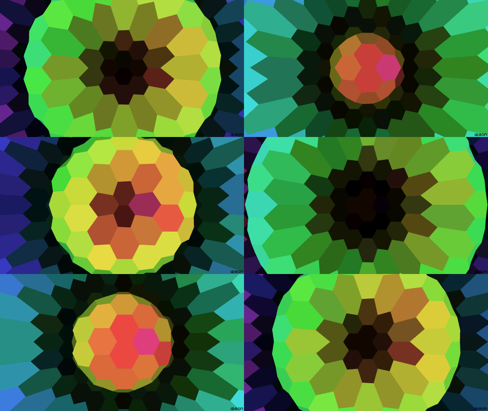
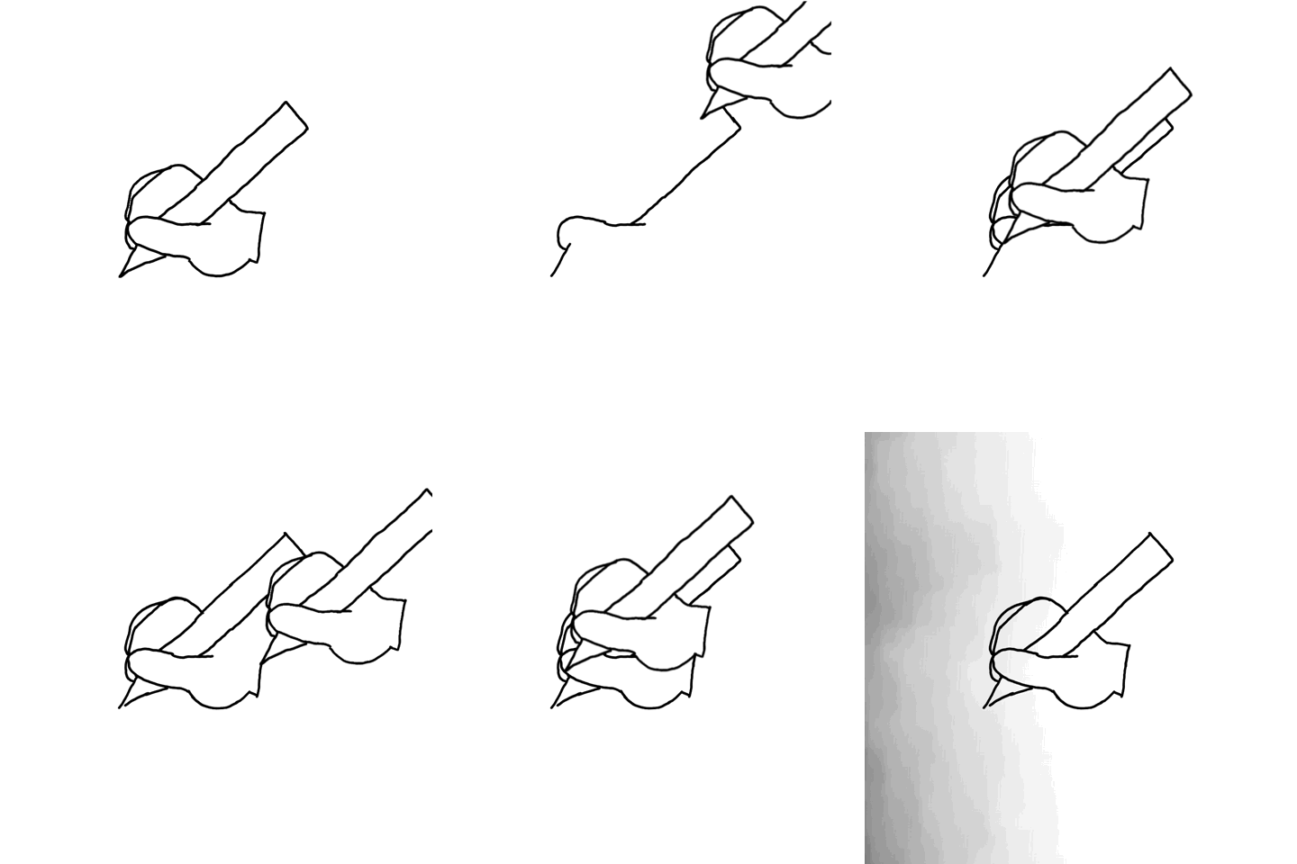
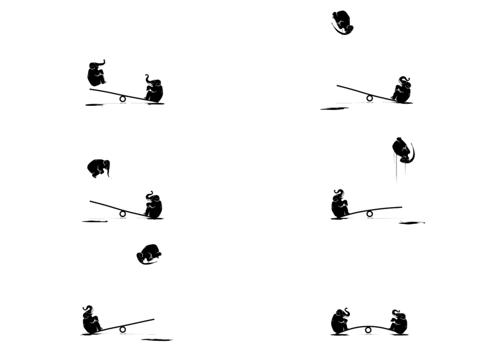
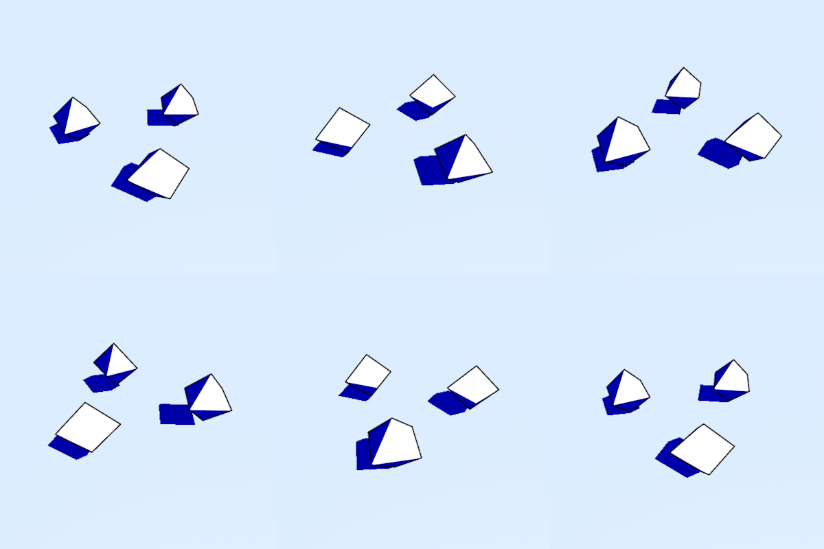
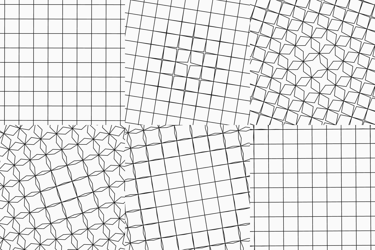
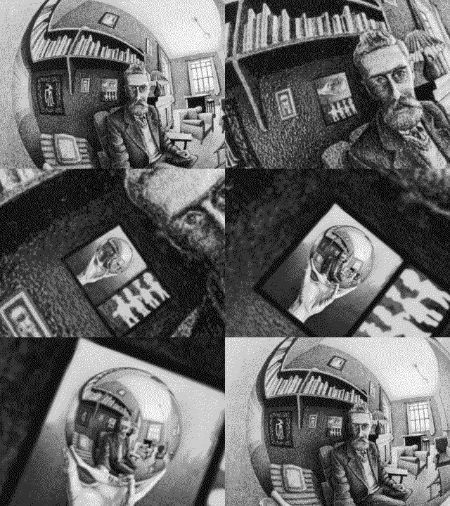
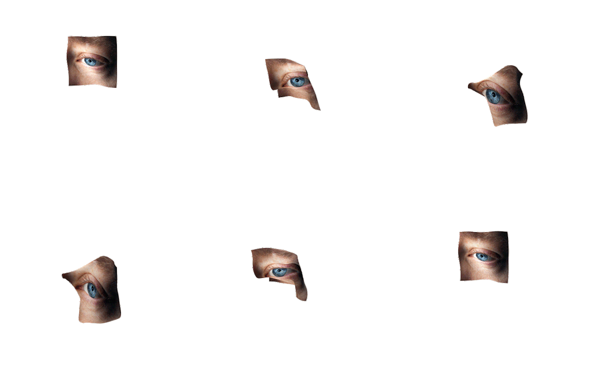
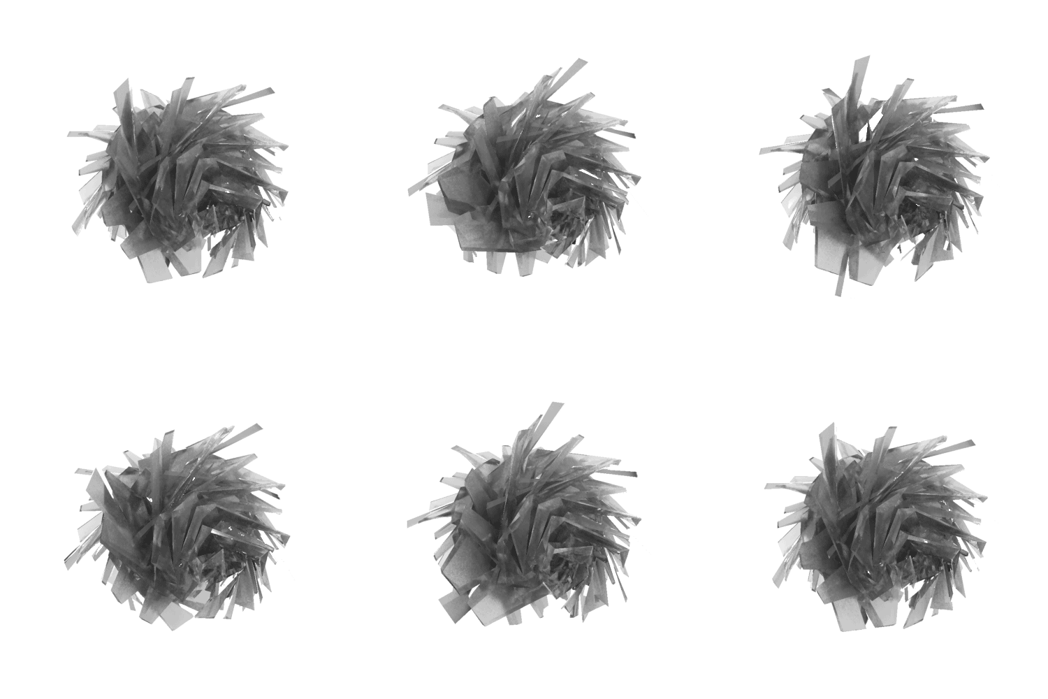
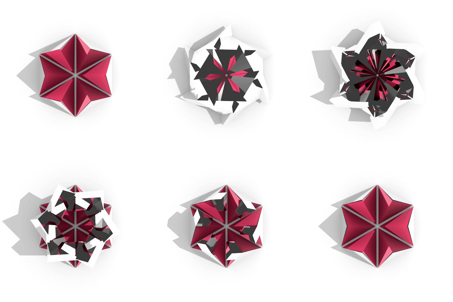
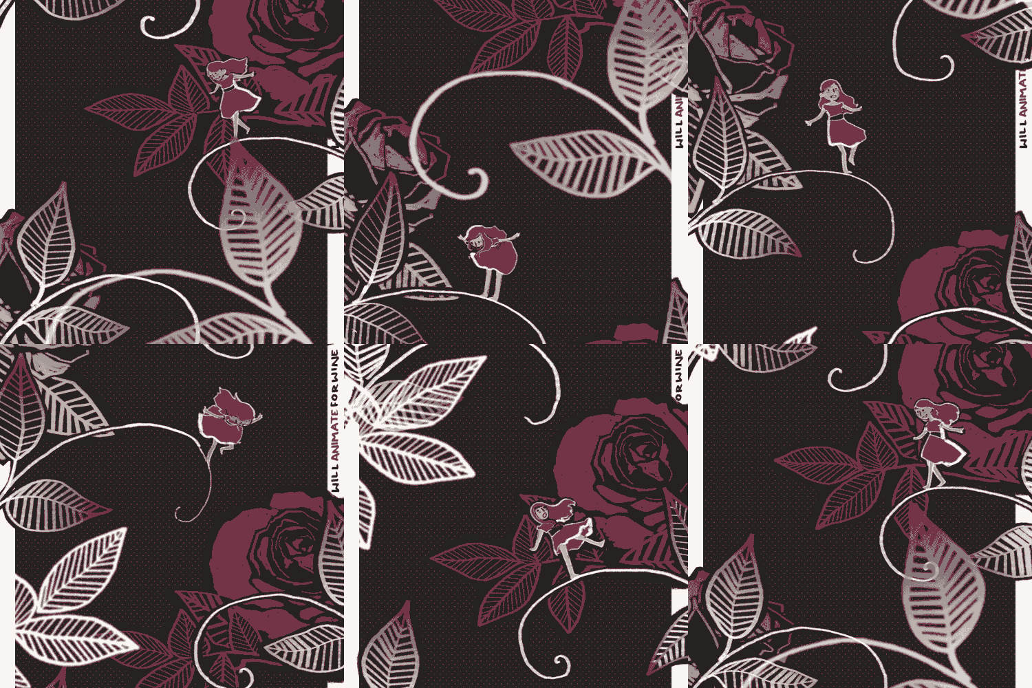
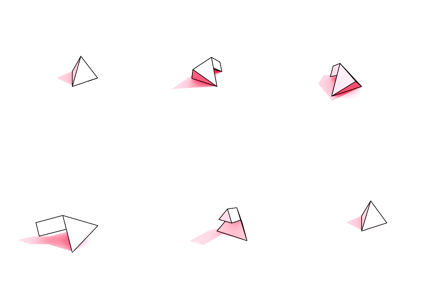
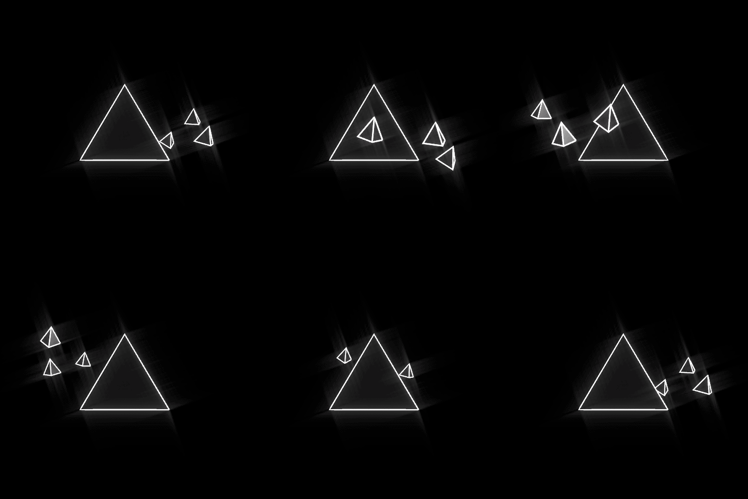
Looped GIFs are like “The Song That Never Ends.”
They visually lead into and out of themselves in a dizzying, mind-blowing way that makes me so excited to be living in this new digital age of art.
GIFs are my new favorite medium because they blend design, graphics, video and fine art together — four things I am learning to appreciate more and more in my everyday life, and four things that come alive in short looped spurts of color.
Plus, the amount of time it takes to create a looped GIF explains why it most definitely deserves its own classification as a new media artform. Welcome to the party, GIFs!


[Tweet ““I dream of painting and then I paint my dream” -Vincent Van Gogh “]


Jul 10, 2014 | design, sculpture
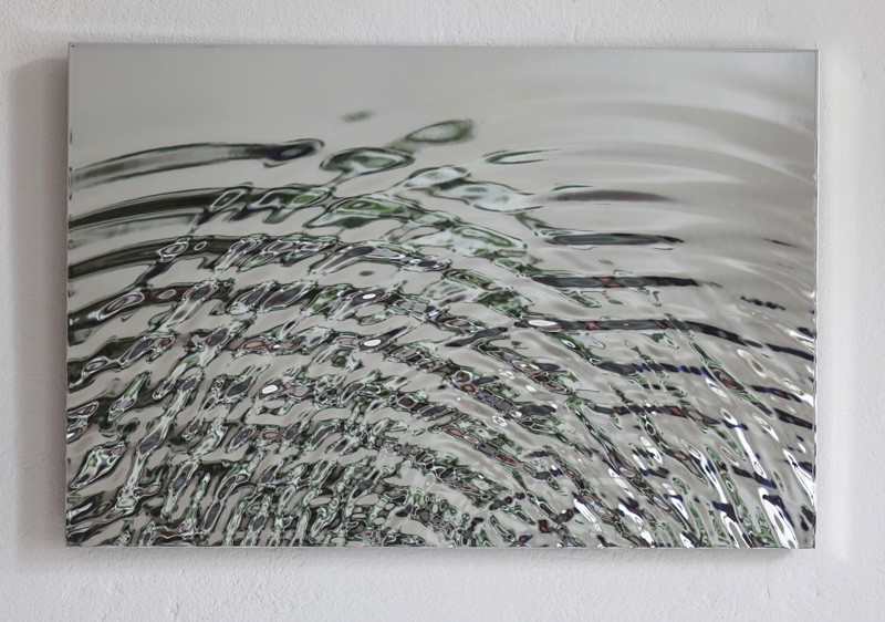
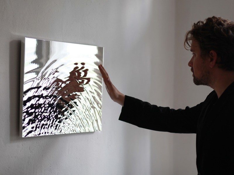
Fredrik Skåtar is a Swedish architect, artist and researcher exploring and manipulating natural forms. He created his “Vibration mirror” in 2010, a polished aluminum sculpture that expanded on a previous work “Wave table.” “Wave table” was made of acrylic glass so you could see ‘through’ the water instead of your own reflection.
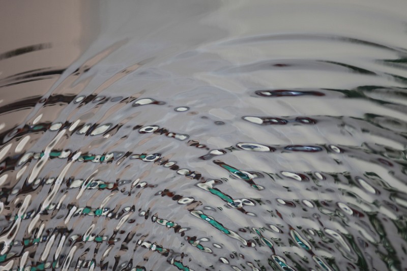
The ripples in the ‘water’ of “Vibration Mirror” reveal a distorted view of what’s before the piece, bringing the viewer into direct interaction with the work. Two half-circles radiate out, as if two people standing in front of the work each created their own stir in the flat mirror. The mirror’s flat top contrasts its busy bottom, where the two sets of scattered wrinkles intersect to create a loose grid of waves.


Fredrik writes, “Shapes of water are constantly generated all around us, too fast for the human eye to perceive. The Vibration mirror is a sculpture where time has been stopped to materialize the complex geometry of intersecting water ripples.
The Vibration mirror is a part of the projects ‘From animation to sculpture’ and ‘Matter of sound’ that was funded by The Swedish Arts Grants Committee (Konstnärsnämnden) and The Royal Swedish Academy of Fine Arts in 2010 and 2012.”
Jun 25, 2014 | design, painting
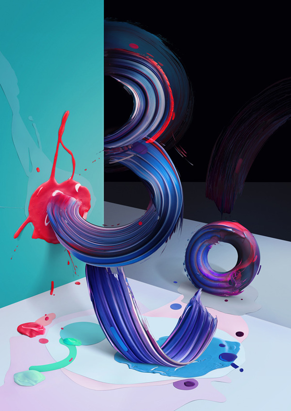
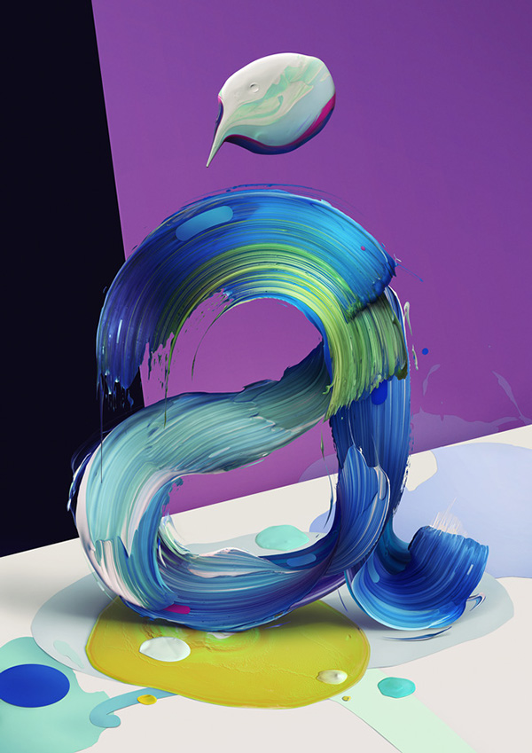
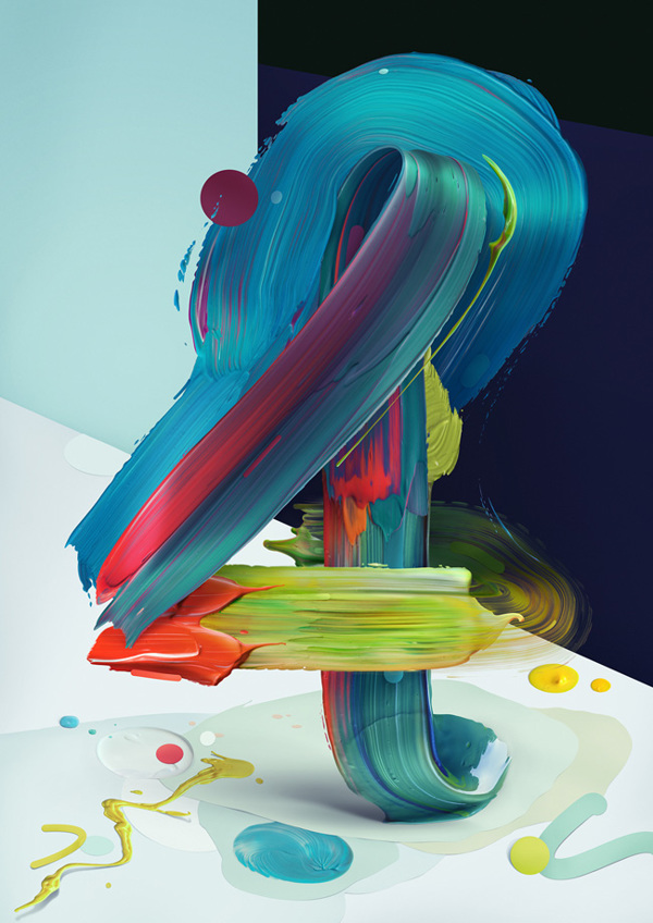
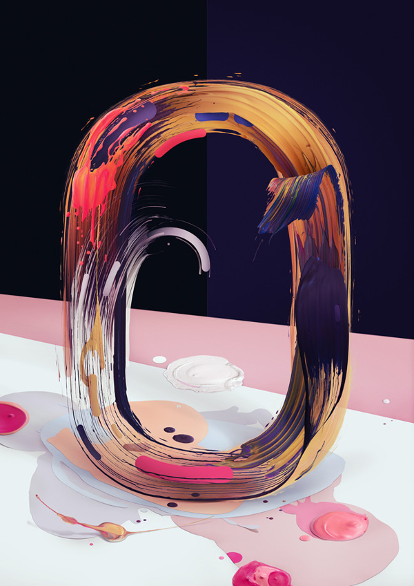
Pawel Nolbert is a graphic artist in Poland, whose work with digital visuals began 13 years ago. He’s created for Adobe, Google, Disney, the Grammy’s and a lot of other names you’d recognize, but it’s the work he makes for himself that blows everything else out of the water.
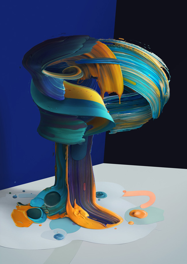
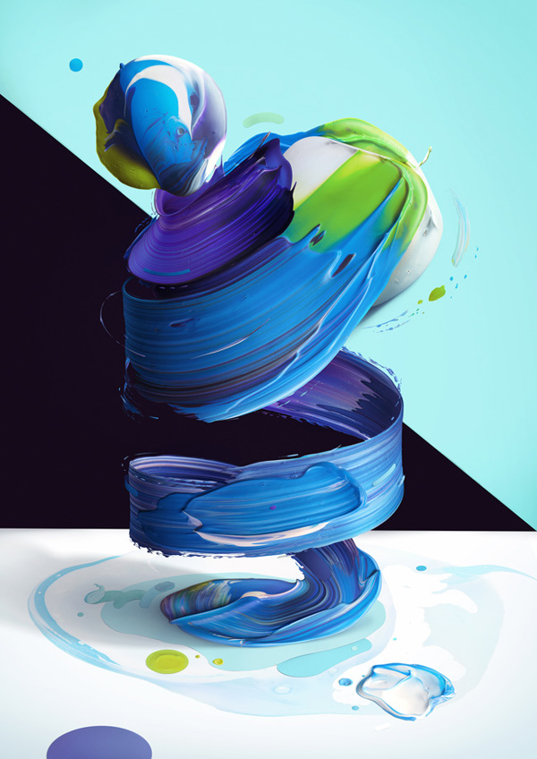
His latest project, Atypical is a part-typography, part-contemporary art series that features bright, elegant swishes of paint dancing through the air, freed from their usual canvas prison. Most of the eight prints have some semblance to a letter or number, which contradicts that freedom-feeling that comes from working in four dimensions. But there is one spiraling tunnel of blue-purple that really lets loose.


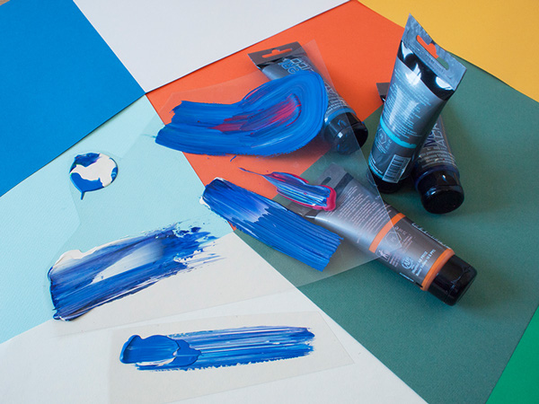
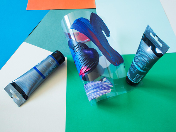
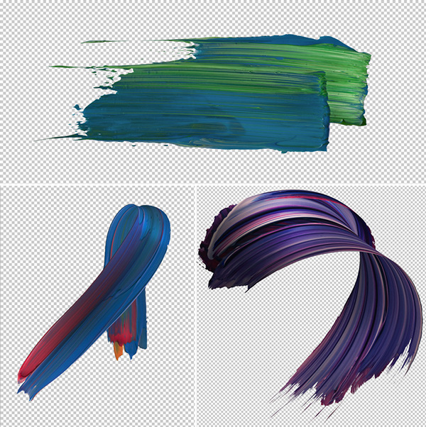
Nolbert created Atypical by actually painting what you see in the works on clear plastic panels that could be twisted and manipulated. The photographs of that painted plastic were then perfected and assembled digitally so that the paint became it’s own entity — thick brushstrokes waltzing in the wind.


To see more of Pawel Nolbert’s work, find him on Facebook, Twitter, Behance and his amazing Instagram.
Jun 11, 2014 | design, illustration

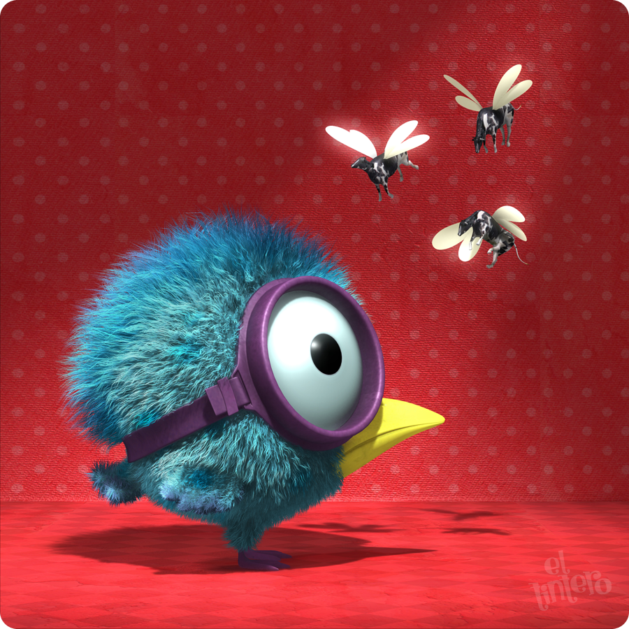
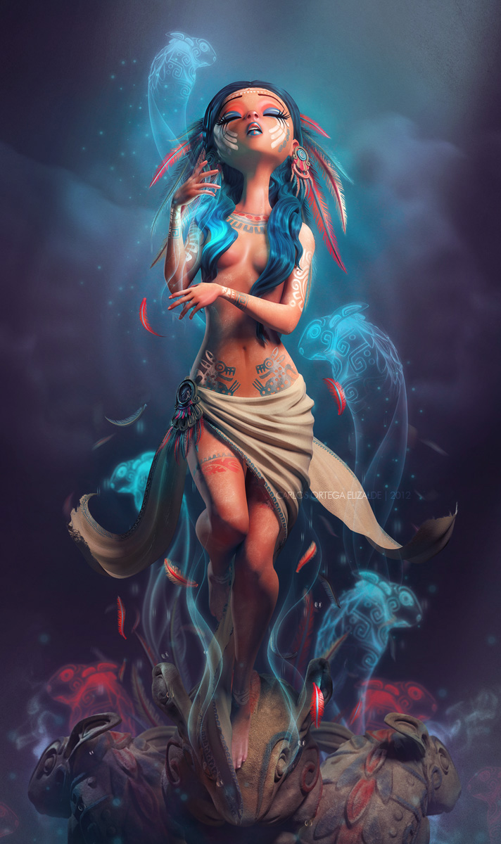
“Policarpio,” 2010: “Policarpio is a little swimmer birdie who is visited by his 3 fairy godmothers …”

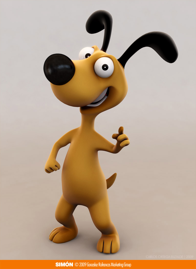
“Simon The Dog,” 2009: Character modeled for a marketing agency.

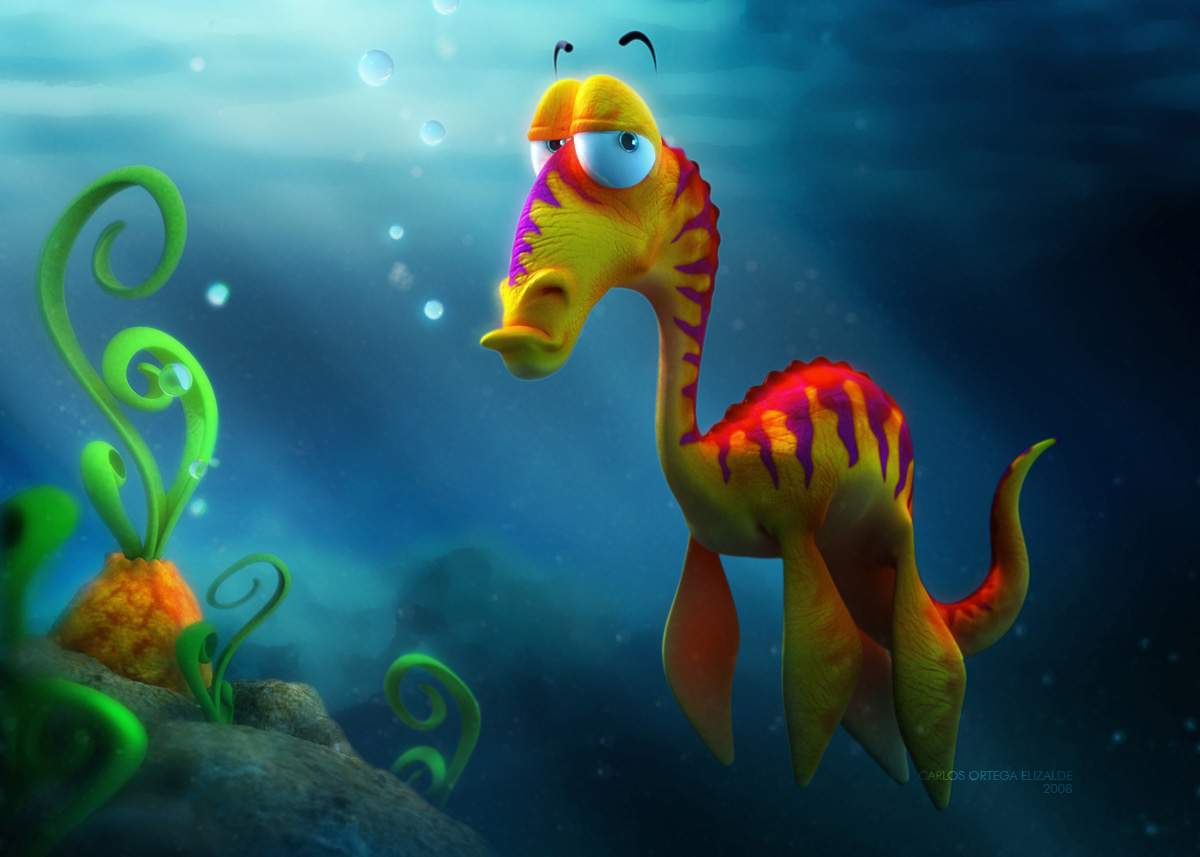
“Erasmo the plesiosaur,” 2008: “I created this character for a challenge at 3DTotal.com. My concept was simple: to make a cute and colorful animal with a grumpy and annoyed attitude.”

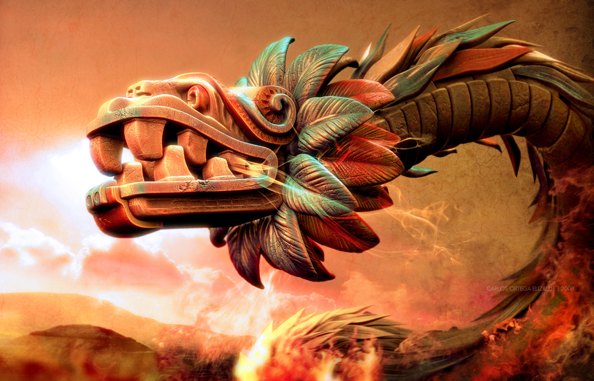
“Quetzalcoatl’s Rage,” 2008: “The aztec god Quetzalcoatl waking up in his stone body and facing the enemy, waiting for the battle…”

“The Weeping Woman,” 2012: “Created for the Collective Exhibition in Mexico: “Ilustrando para” as homage for the mexican Rock Band ‘Caifanes'”
Spunky animals take on personalities to match in Carlos Ortega‘s 3D artwork. Similar in style to Pixar movies and Frozen, his women have teeny tiny button noses and huge almond eyes that rest in their perfect round cheeks. But it’s his birds with goggles and imagined sea creatures that open the gates of possibility.
If you’ve seen the 2012 CocaCola short, “Crabs & Penguins,” Carlos designed the soccer-playing penguins in the video!
Jul 12, 2013 | design
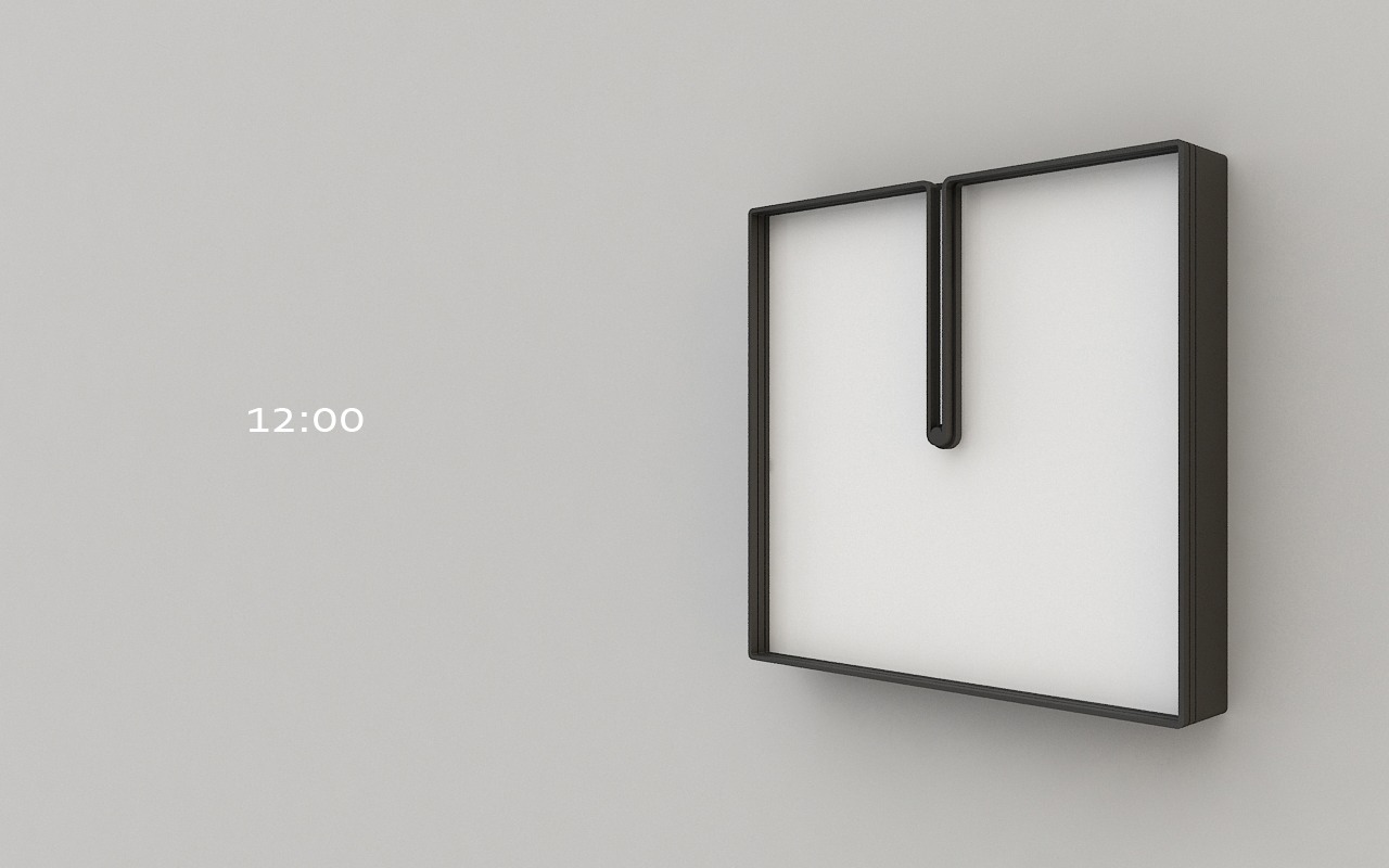
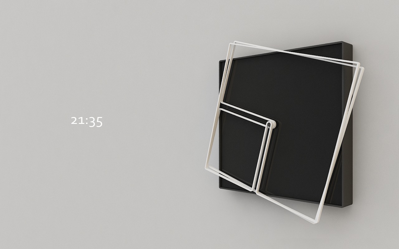
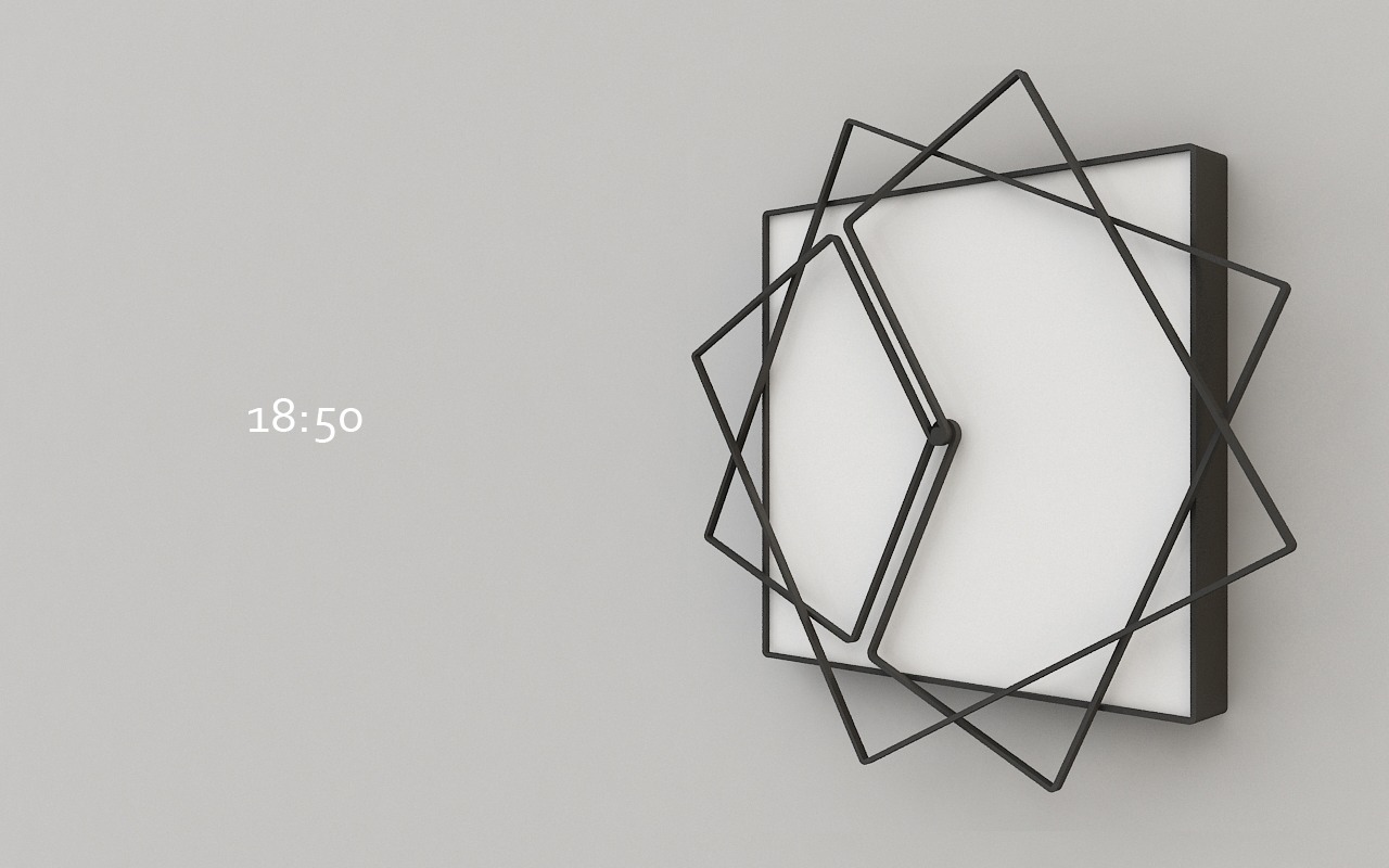
The hands of a clock and it’s frame are made of the same material – and each hand it attached to a separate frame that moves with it as it circles the space of the clock over and over again.
Two squares rotating according to the increments we’ve given time result in clean shapes at the hours and varying degrees of chaos within them. Nazar Şigaher is a designer, interior designer and artist in Turkey. He’s pursuing a Masters in the History of Architecture at Mimar Sinan Fine Arts University, just north of Istanbul.
His website tells us,
“The hour and minute hands of Frame have frames made of material identical to that of hour and minute hands. The clock constantly changes its form as the hour and minute hands keep moving and take a given form twice a day only. Such constant change of form created by moving hour and minute hands give this clock a peculiarity that identifies with the concept of time.”


For more of Nazar’s work, see his website.
Source: egedesigns.
May 14, 2013 | design, illustration
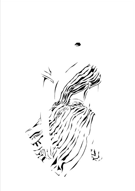
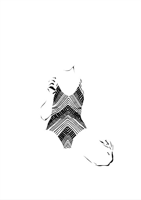
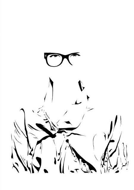
She goes by Zivabelle, and her designs and illustrations are gorgeous. So simple and clean, but always with something more to them that makes you look just a bit longer. These minimalist fashion illustrations play with black and white, visible and invisible, light and shadow. She got her bachelors in Visual Communication at Bezalel Academy of Design in Jerusalem, then headed to Barcelona to get a masters in Fashion at ELISAVA – Universitat Pompeu Fabra.

Is she there?

Wait, where’d she go?

Images courtesy of the artist’s website. Check it out for more!
