May 7, 2013 | museums, The Morgan Library & Museum
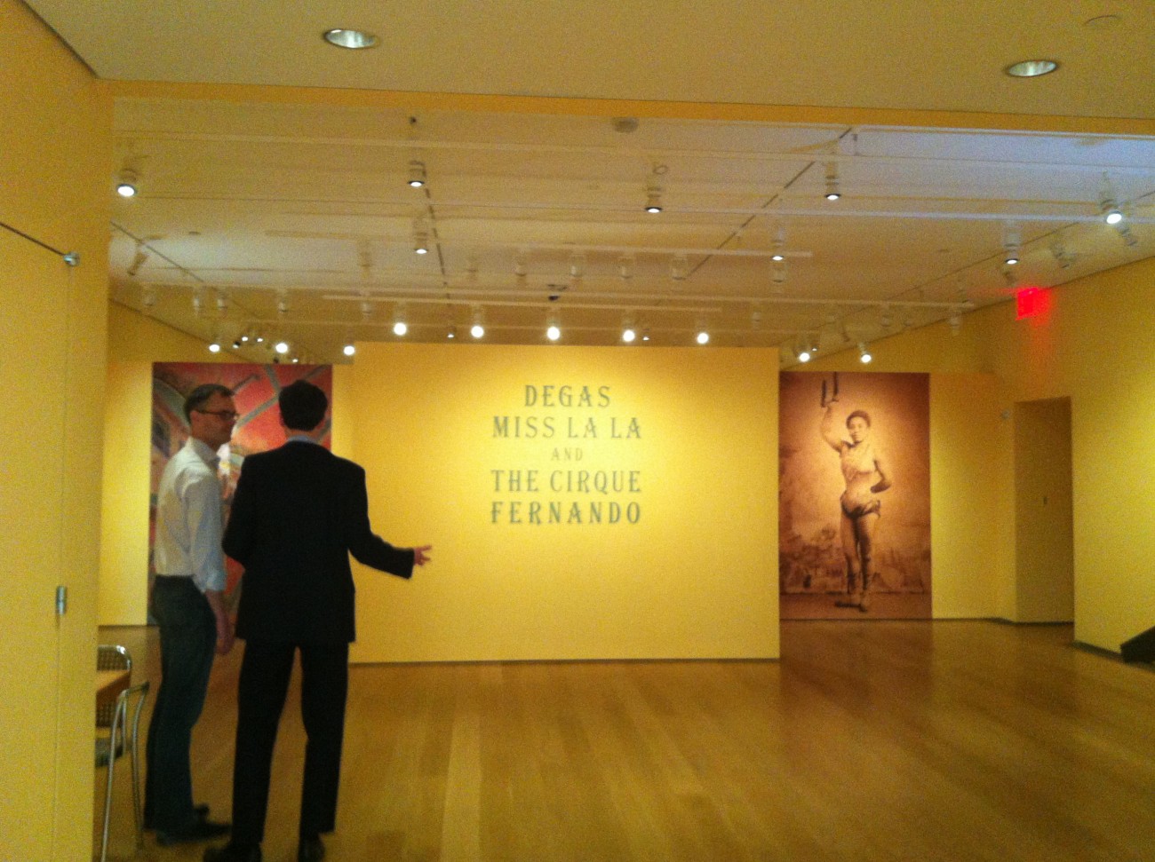
The Morgan Library and Museum in New York is transitioning two of their main galleries right now, so if you visit before May 10th, the only temporary installation you’ll find is the second floor room currently holding Degas, Miss La La, and the Cirque Fernando.
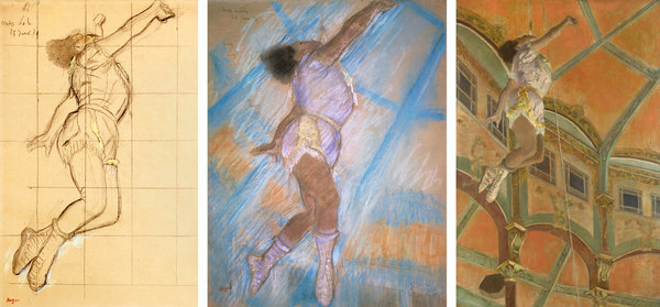
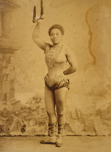
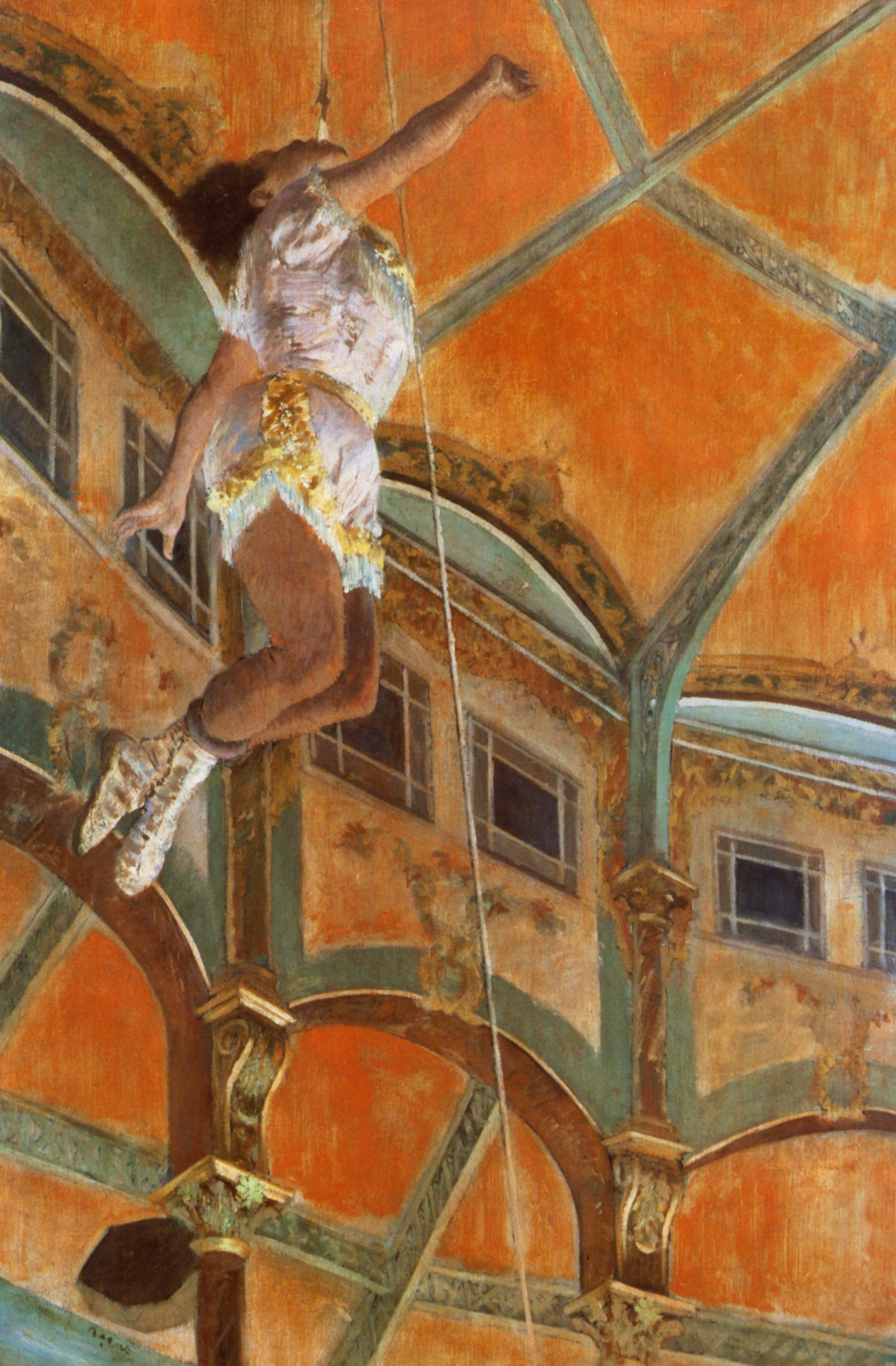
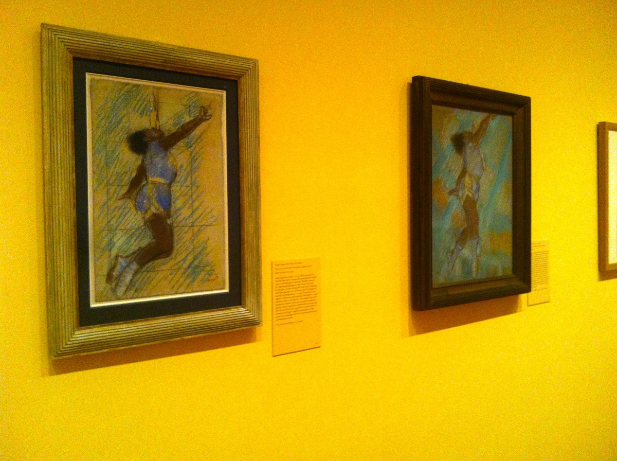
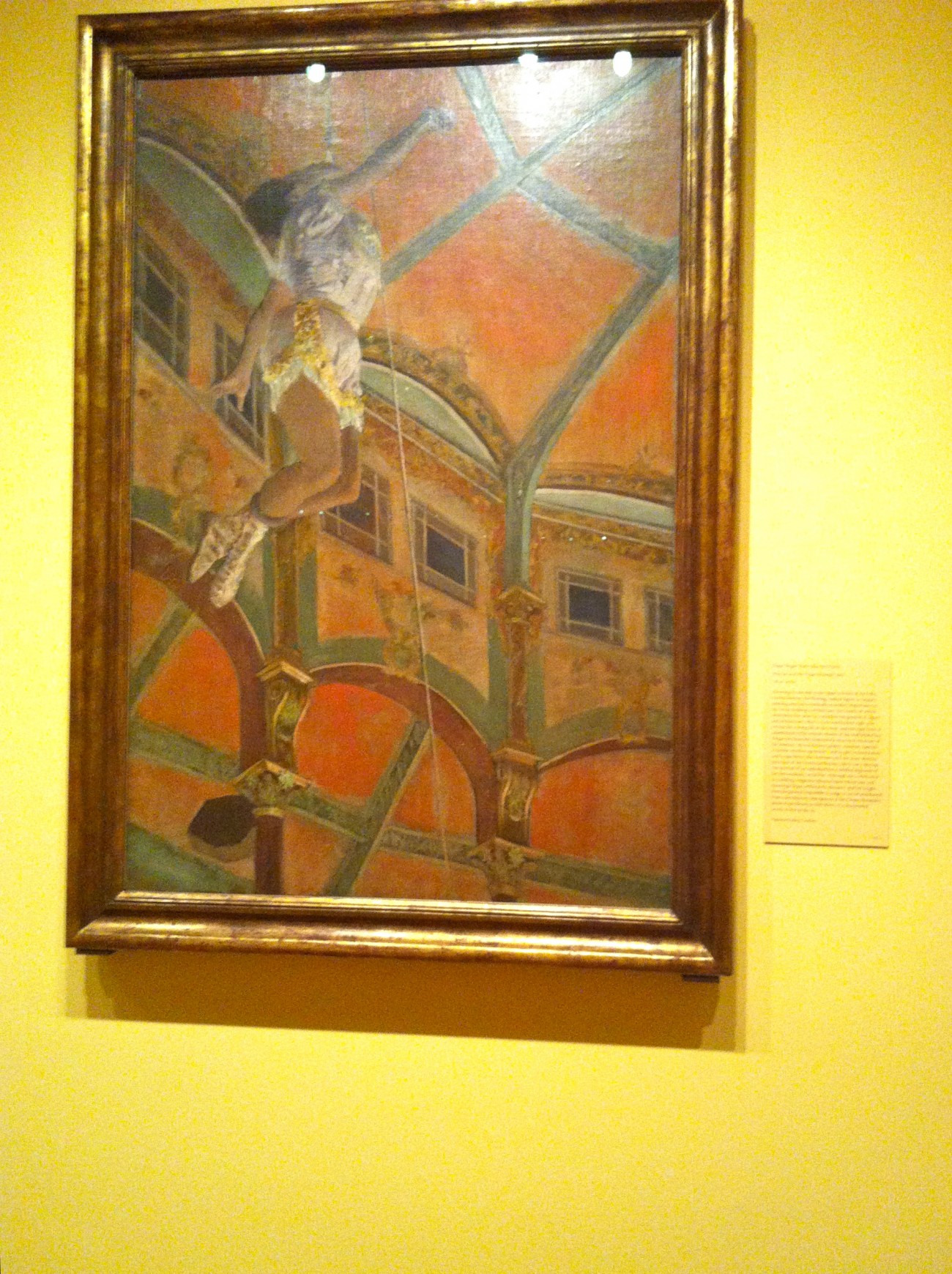
The entire exhibit is based on a single painting hung in the center of the back wall: Degas’ “Miss La La at the Cirque Fernando” painted in oil in 1879, and the only work Degas ever painted with a circus subject. As you walk clockwise around the room, you’re first greeted with the pastel and oil studies completed in preparation for the final work, but after you pass the painting, you find Henry Gabriel Ibels’ lithographs of circus rings from the 1860s, followed by late nineteenth century circus posters – two of which feature Miss La La.
Miss La La was an aerialist traveling with the Troupe Kaira who performed for Degas during their appearance at the Cirque Fernando in Paris from December 1878 to February of the following year. In the painting she’s performing one of her signature acts: gripping a rope with her teeth and flying through the air.

Books lay open under glass in the gallery’s center – a novel about the circus that a friend of Degas wrote around the same time and glossaries of infamous circus performers and tricks of the trade. The exhibit ends with a far-reaching connection to Renaissance representations of the angels in ceiling paintings, calling Miss La La a “secular angel” because her occupation also involves people craning their necks to see her. The four brown wash drawings by Giovanni Battista Tiepolo completed centuries before the rest of the exhibit’s work seemed like too obvious a filler, especially for an institution whose holdings lie predominantly in drawings.
As you leave the exhibit it hits you that the whole thing only takes up half of the room because its entrance is blocked off by large introductory walls. It’s difficult to curate an entire show around a singular work, especially when it’s the only one where the artist worked that subject matter. Seeing the different studies that led up to the final piece is definitely the highlight, but it could have been rounded out with paintings and studies from other artists who painted more circus scenes, even though their names might not have the booming resonance of da Vinci or Degas.

From left, The Trustees of the Barber Institute of Fine Arts, University of Birmingham; Tate, London/Art Resource, New York; National Gallery, London/Art Resource, New York. via NYTimes.


Collection Zimmerli Art Museum at Rutgers University, Museum
Miss La La around 1880. via NYTimes.

For more about the Morgan’s exhibit, see their website.
May 6, 2013 | Los Angeles, street art
Culver City got an amazing new exhibit last month – a collection from guerilla art group TrustoCorp titled “The Future is Blight” at LeBasse Projects. “Known for their bold, unexpected artwork and on site installations of meticulously fabricated billboards, highly produced street and subway signs and complex sculptural objects, TrustoCorp seeks to point out the follies of contemporary society and politics,” the gallery writes.
The exhibition includes a larger, citywide installation of “poverty kits,” made up of things like toothbrushes, candy bars, condoms and cigarettes that attempt to shed light on the issue of homelessness in Los Angeles, a city where an estimated 50,000 people are homeless. If you graph out the locations of these “poverty kits” throughout the city, their locations will spell out an “urgent message.”
The artists summarize their impression of of Los Angeles in the following statement:
‘Underneath the glossy veneer of tabloid magazines and Hollywood movies, the former middle class is struggling, families are facing poverty and America is slowly becoming a third world country. In the absence of any real help or solid solutions, there is hypocrisy, greed and hopelessness. Through our work, we hope to call attention to this reality, crack a few smiles and hopefully make some people think along the way.’

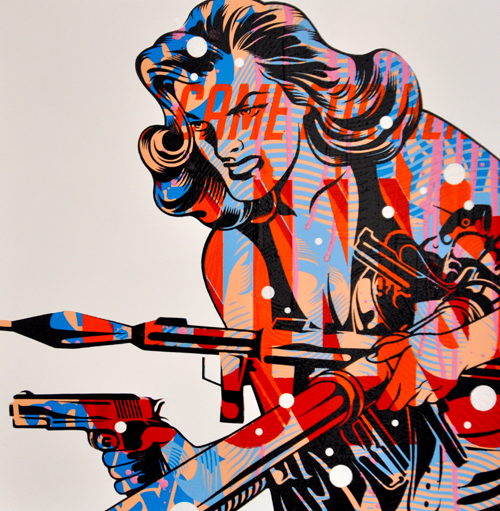
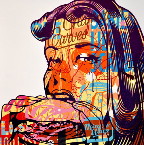
TrustoCorp :: Trusto Pulp (They Can For Her Guns)
Mixed media on wood panel, 18×18″

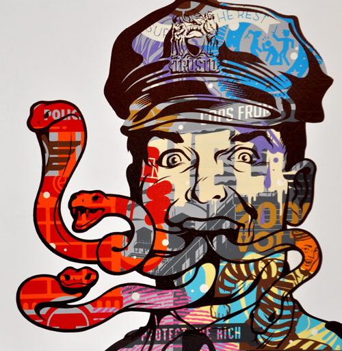
TrustoCorp :: Trusto Pulp (Cops From Hell)
Mixed media on wood panel

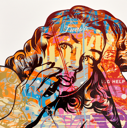
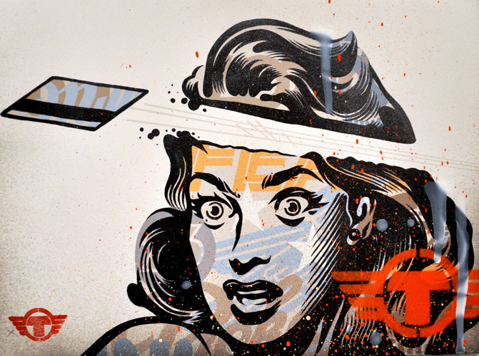
TrustoCorp :: Trusto Pulp (I Was A Botox Junkie)
Mixed media on wood panel, 18×18

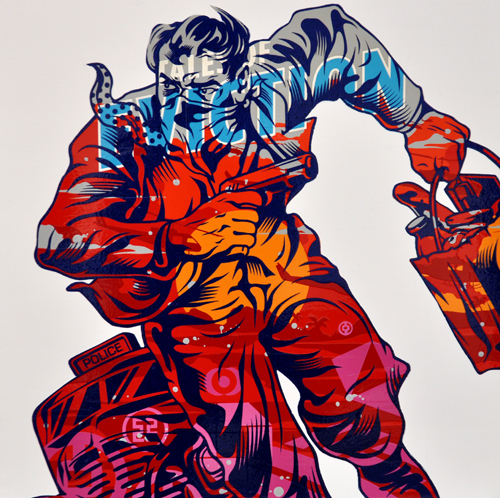
TrustoCorp :: Trusto Pulp (Tales of Eviction)
Mixed media on wood panel, 18×18″

TrustoCorp :: Everything Is Fine
Mixed media on paper, 10.5 x 18″

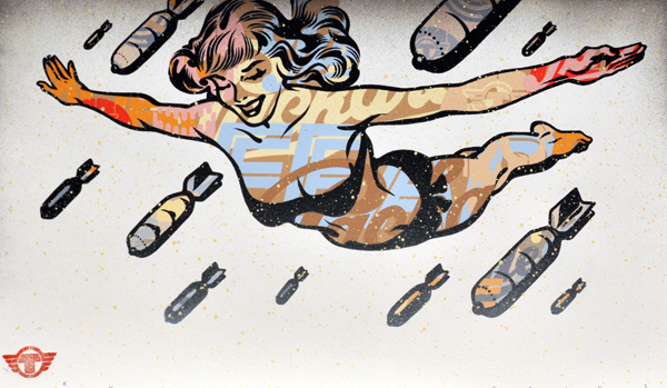
TrustoCorp :: Trusto Pulp (It Rhymes With Fame)
Mixed media on wood panel, 18×18″

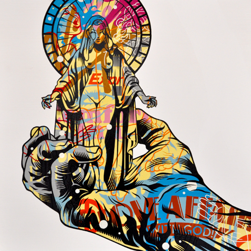
TrustoCorp :: Trusto Pulp (Love Affair With God)
Mixed media on wood panel, 18×18″

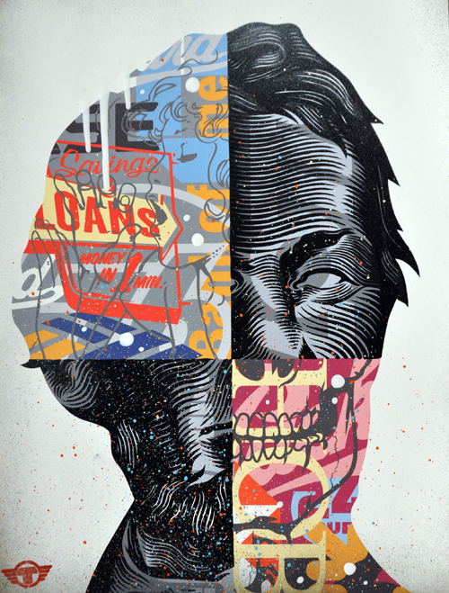
rustoCorp :: Floundering Father II
Mixed media on paper, 17.5 x 13″
[zl_mate_code name=”twitter/facebook” label=”5″ count=”2″ link1=”http://www.twitter.com/share?url=https://thingsworthdescribing.com/2013/05/06/the-future-is-blight-trustocorp-los-angeles/” link2=”http://www.facebook.com/share.php?u=https://thingsworthdescribing.com/2013/05/06/the-future-is-blight-trustocorp-los-angeles/”]

[/zl_mate_code] All images and info via LeBasse Projects.
And you can find these works in real life here:
LeBasse Projects 6023 Washington Blvd Culver City, CA 90232
April 13th – May 11th, 2013
May 6, 2013 | photography
German artist Sascha Bokelmann goes by B-O-K-E on his DeviantArt page, where he shares the incredible freeze-frame photo manipulations that turn water droplets into animals and insects. He uses a camera and lots of Photoshop brushwork to convert splashing water into a three-dimensional outline of dragonflies, horses and elephants, and each image takes anywhere between six hours and a week to complete.
Crafting shapes from water turns them into ethereal transparent beings, glowing with the crystal shine of water against dark backgrounds. More than anything though these water sculptures appear temporary – they’re fleeting ghosts of the creatures they represent, shifting and shining like a powerful natural element.


See more of Sascha’s work on his DeviantArt page.
Source: PerthNow.com
May 3, 2013 | design
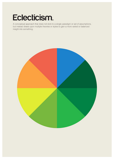
Genis Carreras is a Catalan graphic designer whose latest project turns whole complicated concepts into minimalist designs. He breaks down the essence of what ideas mean, and reinterprets them in bright colors, calling the series philographics. It began as a set of 24 posters, “But so many important ‘isms’ were left out that I decided to add more designs to the collection,” he said. So far he’s created 95 different designs after spending the past six months immersed in the project in his London studio.
He’s turning the designs into a book and a postcard set, using Kickstarter to fund their creation. He needed £15,000 for the project, and has already reached £40,721 after starting funding just a little over a week ago.


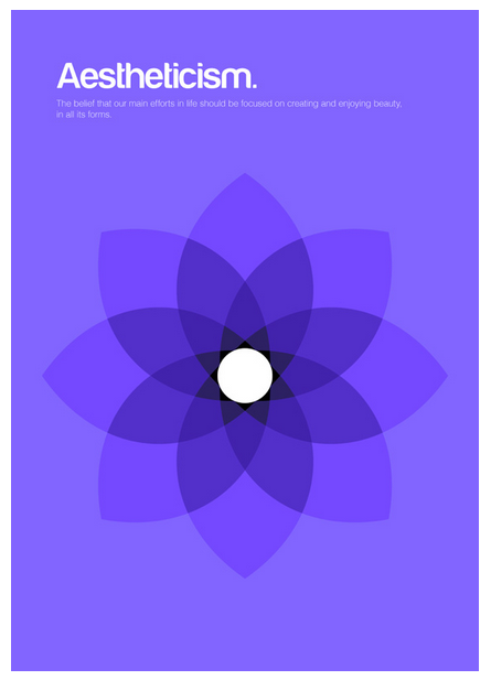
Each design includes a simple definition of the philosophy it represents, written by Chris Thomas. Each uses a bright background color topped with simple, often symmetrical shapes that interact with each other to embody concepts that can be difficult to grasp.
The designs don’t reduce the concepts, they make them beautiful and understandable, transforming centuries of theoretical debate and discussion into colors and shapes that effortlessly explain everything.


Only 25, Genis said he wants philographics to serve as a “visual dictionary of philosophy,” and previously he’s designed posters, websites, icons, album covers and more. He also made this really cool portrait of Steve Jobs out of Macbook parts with Ben Redford at Mint Digital. Philographics will be his second self-published book after writing and designing Colouring our Perceptions, a book that examines how color effects communication.
His Kickstarter profile reads:
“I love things like simplicity, books, modernism, video games, nature, London and beagles. And beer, I love beer too.”


For more about Genis and his work, see his website, his Kickstarter project page, and his print shop.
May 2, 2013 | apropos//ts, art about
The other night I started perusing new apps on my iPhone, and then I looked up and an hour had gone by. I don’t know how technology does it, but it’s so useful and sleek I can’t help myself. “Yes I would like organize my passwords!” “Live tv on my phone all the time? Have to have it.”
Technology is really spoiling us, and we tricked ourselves into thinking we deserve it because somewhere out there someone’s father invented it for us. Which is why it’s such a paradox that nostalgia is so in now – we probably couldn’t survive one hour without our little tethers to the universe in our smart phones, but somehow we pine for the 90s and love tv shows like Mad Men and movies like Django.
I think it’s because we’re worried about preserving the time before technology for those who won’t remember it. I’m 21 and I barely remember it, so my kids probably won’t even know what it’s like to have a car that won’t talk or maybe drive itself even. Do you think we’ll still teach our kids to drive, and will they teach theirs? Probably not, and that blows my mind.
Below you’ll find six artworks that visualize this bond that’s forming between people and our technology. They warn of dependency, surrounding us with screens and transforming us into them in amazing ways.
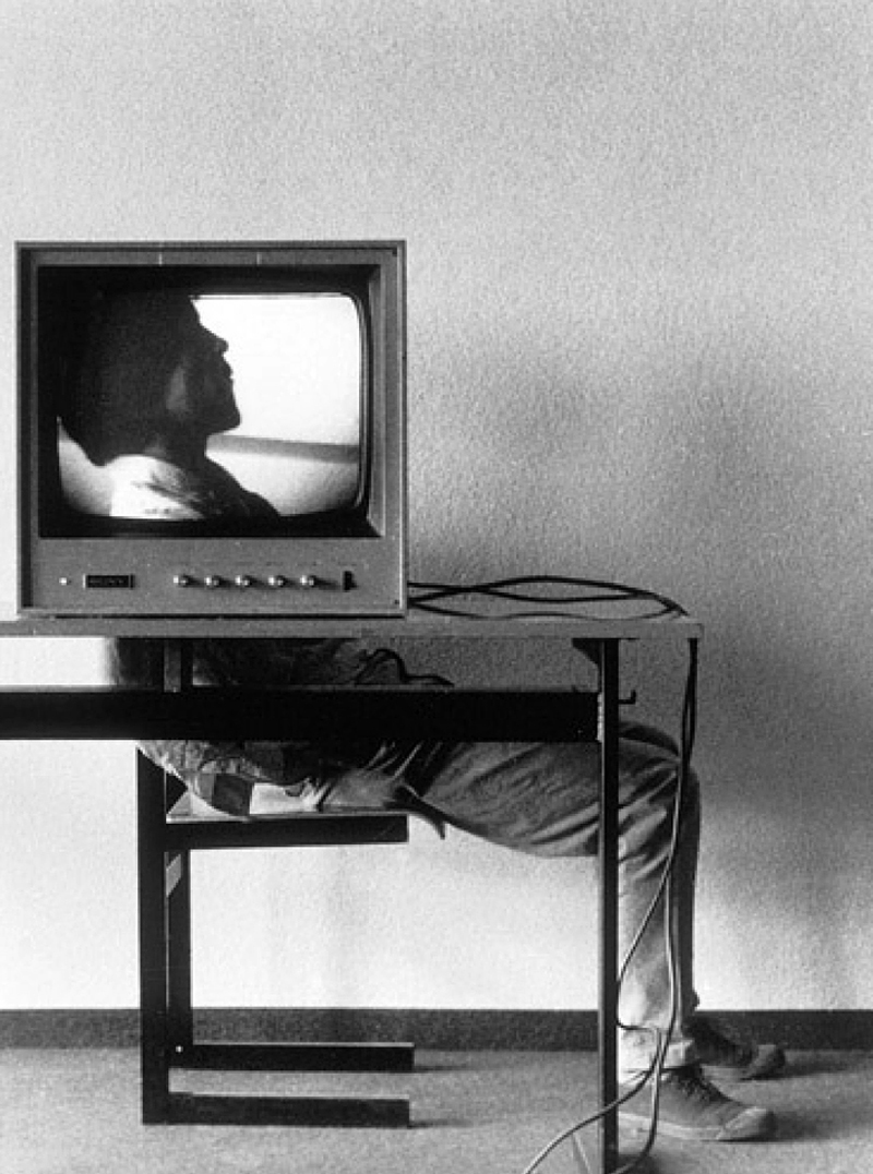
1. Ernst Caramelle, Video
Landscapes (1974)
[zl_mate_code name=”Orange Dynamic” label=”3″ count=”1″ who=”div” text=”Even in 1974, television was inside our heads and here a man sits with his head behind one, his face shining through the screen.”]

[/zl_mate_code] Source: polychronidis.tumblr.com
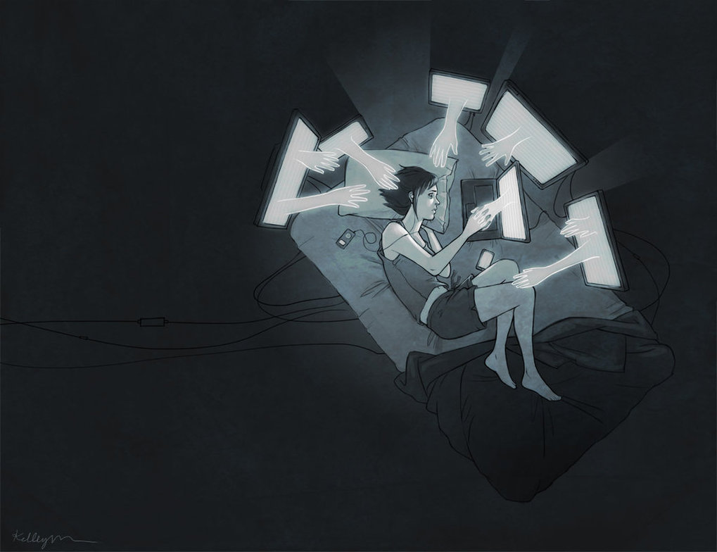
2. Kelley McMorris, Deeper
Understanding
[zl_mate_code name=”Pink Dynamic” label=”1″ count=”1″ who=”div” text=”A white ghost hand emerges from each screen, enveloping the girl whose fingers interlace with the hand in her laptop.”]

[/zl_mate_code] Source: noimnotluckyimblessedyes.tumblr.com
See more from this artist on her website.
3. David Schermann, Computer
Head
[zl_mate_code name=”Blue Dynamic” label=”2″ count=”1″ who=”div” text=”In a warm outdoor scene a man looks up toward the light, with an old computer monitor instead of a head.”]

[/zl_mate_code] Source: Deviant Art
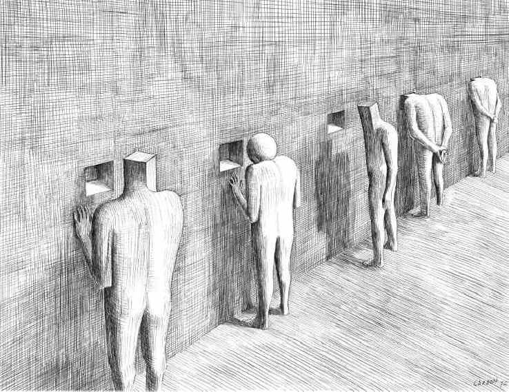
4. Jacques-Armand Cardon,
Untitled
[zl_mate_code name=”Orange Dynamic” label=”3″ count=”1″ who=”div” text=”The sphere-headed man can’t follow suit as he stands before a square hole in the wall.”]

[/zl_mate_code] Source: workman.tumblr.com
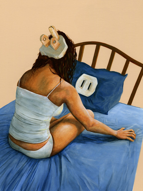
5. Brian DeYoung, Insomnia
[zl_mate_code name=”Pink Dynamic” label=”1″ count=”1″ who=”div” text=”A woman with a plug on the back of her head sits crisscross on her bed, but the outlet on her pillow isn’t three-pronged.”]

[/zl_mate_code] Source: anytimealways.tumblr.com
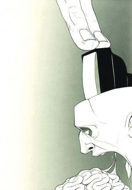
6. artist unknown
[zl_mate_code name=”Green Dynamic” label=”4″ count=”1″ who=”div” text=”Two giant fingers violently push a monitor through an empty-eyed open head and the mouth is vomiting brains.”]

[/zl_mate_code] Source: bjorklund1.tumblr.com
If you know who created #5 & #6, please email me! Googling descriptions got me nowhere…
