Jul 25, 2013 | art history, painting, photography
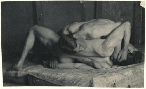
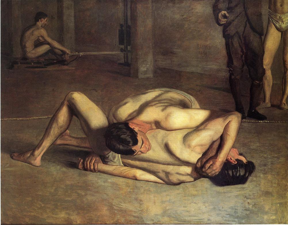
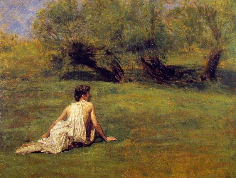
Thomas Eakins lived from 1844-1916, and spent the majority of that time as an artist – painting, photographing, sculpting, and teaching others the craft. He was an American realist painter whose style is remembered for its loose, rich color. Eakins used photography, still a relatively new technology at the time, to study the details of a body in motion as it travels through space – a practice now regarded as one of his most important innovations.
“Strain your brain more than your eye… You can copy a thing to a certain limit. Then you must use intellect.”
-advice to his art students; quoted in Lloyd Goodrich, Thomas Eakins (1933)
Photography

Motion study: Male Nude, Standing Jump to Right, 1885.
image source
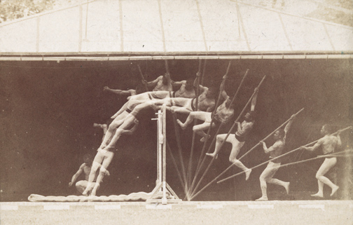
Motion Study: George Reynolds, nude, pole-vaulting to left, 1885
image source
He explored the heart of American life through portraiture, but didn’t receive recognition until late in life because of his role as a controversial figure when it came to the sexes. His studies of the male nude were often regarded as homoerotic, and later made him a major figure of art historical sexuality studies in the 1990s.
He insisted on teaching men and women the same way, using male models in female classes and vice versa, but was also accused of abusing female students. The scandals cut his success short, and his influence in the history of art was only realized after his death.
Painting
For more info about Thomas Eakin, see the artist’s Wikipedia page.
May 16, 2013 | art history, Art Institute in Chicago, painting
A painter paints another painter in this picture, a man in blue holding a palette of colors. And since this is Picasso, it’s done in a style based off of his own. His figure is disjointed and geometricized, turned into shining cubes of color that hold pieces of a nose here and an ear there. It’s like looking at a realistic work by Picasso through an organized kaleidoscope.
Juan Gris was a Spanish painter and sculptor who met Picasso in France after moving to Paris in 1906. Gris regarded Picasso as a teacher, but Gertrude Stein wrote “Juan Gris was the only person whom Picasso wished away.”


These photographs were taken at the Art Institute in Chicago.
For more pictures of this museum’s work, see my Flickr album.
May 13, 2013 | painting
No matter how steady I held my camera, the lights inside Alexandra Pacula’s paintings just wouldn’t hold still. They’re now part of an exhibition at Gallery Henoch on New York City’s West Side, arranged alongside the abstracted figurative works of Gary Ruddell. The two create a balance between people and landscapes, rural and urban.
Alexandra gives us the urban landscapes – dynamic shots of New York City that set a dizzying scene in motion – the paint wet like the city and the lights of buildings and cars streaming like we’re racing across the sky. The multicolored lights are a manmade rainbow in the dark – a testament to advancements in technology and architecture.
(Click photos to enlarge!)
-

-
Oil on Canvas, 59″ x 59″
-

-
Oil on Canvas, 74″ x 84″
-

-
Oil on Panel, 11″ x 84″ (overall)
-

-
Oil on Canvas, 46″ x 34″
-

-
Oil on Canvas, 46″ x 46″
-

-
gallery photo
-

-
Oil on Canvas, 68″ x 48″
For more from Alexandra Pacula, see her website.
These photographs were taken at her current Gallery Henoch showing, on view until May 25th in Chelsea, NYC.
Open Tuesday – Saturday 10:30am-6pm, 555 W. 25th Street
Apr 25, 2013 | art history, Art Institute in Chicago, painting
“The Eventuality of Destiny” shows what could be the Three Graces, or just three random goddesses who are trapped on all sides by gray walls and ceiling. The architecture creates a sense of confinement that’s relieved only under the arm of the featured goddess – a little patch of blue sky that holds three tiny clouds.
This featured goddess stands tall with her arm gracefully draped over her head, and her whole body seems to glow from within with bright fiery colors. The greens, blues and oranges nearly burst out of her assumed human form, and the only sitting goddess looks like she holds whole universes within her. The women overtake the manmade architecture behind them, three maidens in elegant postures and only one reveals her face, bright blue shadows cast across her cheek with the tops and bottoms of her eyes lined in bold streaks of white.
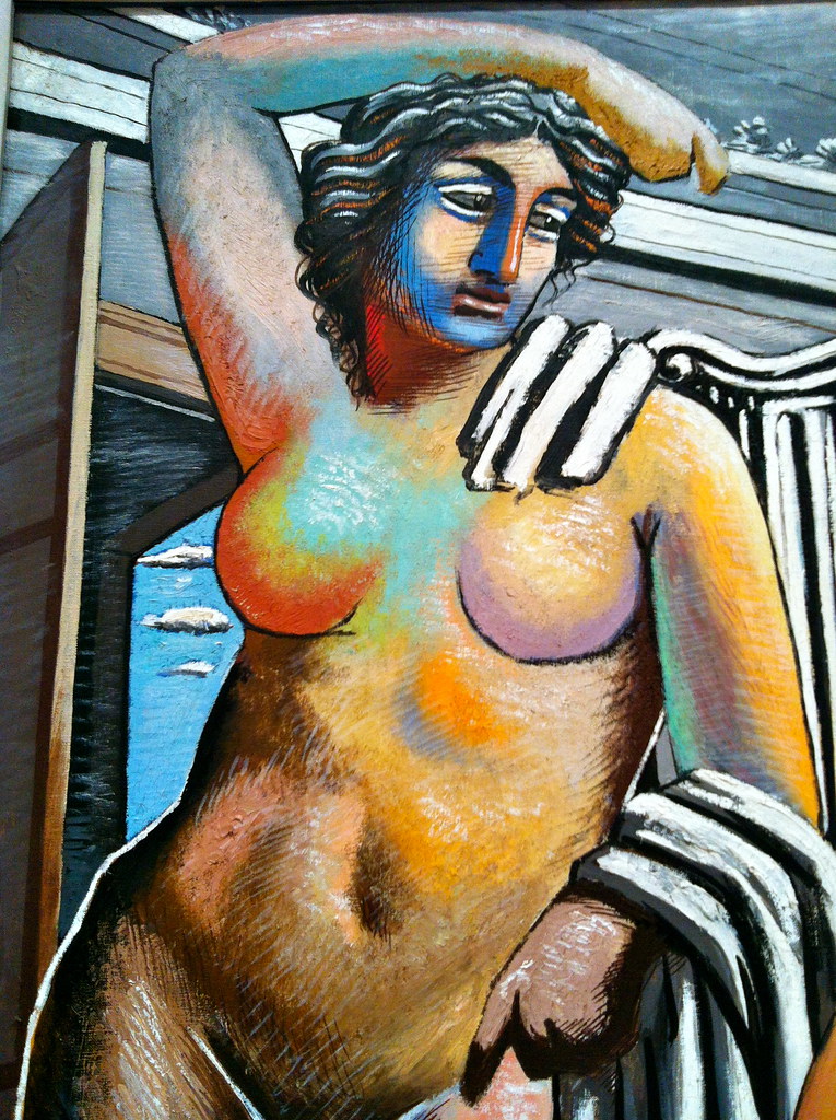
An Italian artist born in Greece, Giorgio de Chirico imagines the Greek goddesses as colossal creatures, perfect in form and covered in color. This painting gives a glorious hopeful portrayal of the supernatural beings in charge of our universe, and yet they’re still confined within the boundaries we created for them.
[zl_mate_code name=”twitter/facebook” label=”5″ count=”2″ link1=”http://www.twitter.com/share?url=https://thingsworthdescribing.com/2013/04/25/the-eventuality-of-destiny-by-giorgio-de-chirico-1927/” link2=”http://www.facebook.com/share.php?u=https://thingsworthdescribing.com/2013/04/25/the-eventuality-of-destiny-by-giorgio-de-chirico-1927/”]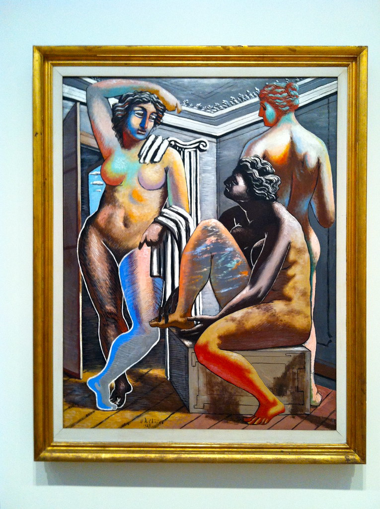 [/zl_mate_code]
Photographs taken at the Art Institute in Chicago. For more photos from this museum, see my Flickr set.
And for more information about this painting or de Chirico, check out this JAMA article.
Apr 9, 2013 | painting
Frothy clouds and hazy distances make for simple scenes of awe in Samantha Keely Smith’s paintings. They’re landscapes taken to a new level – sparkling, glowing and fading – shining enigmas that show more of what we all hope heaven looks like than anything we could ever dream of seeing on this earth. The gods and elements interact without people to mess things up – water, nature and light converging into one scene of wonder.
Land combines with water in “Shift” – a wave of cloud crests in the sunlight above blue sand dunes and before misty air that shines in warm effervescence. Below the breaking wave you can see into the distant blue, to what looks like a glowing forest with clouds instead of leaves. Between two of the center trees shines a white spot of light, like a patronus spell being cast in the distance, or the center seed from which all this beauty has sprung.
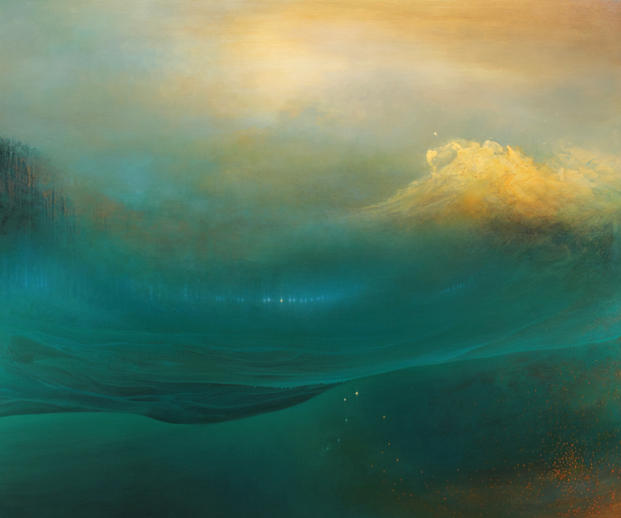
Shift
oil, enamel, shellac on canvas
60″ x 72 “
2012
The waves get speckled orange in “Progeny” – light clouds of paint breaking and bursting in the foreground before a shimmering blue-green haze. “Mutiny” substantiates the water more, almost letting it fill up the canvas and submerging us below its depths, but not without a look into the distance at the land that might be there. Again with a breaking wave as the focus, this one glows bright white, splashing up with spots of pink and shades of orange. “Gathering” shows the calmer scene of a watery mountainside that leads off into the light.
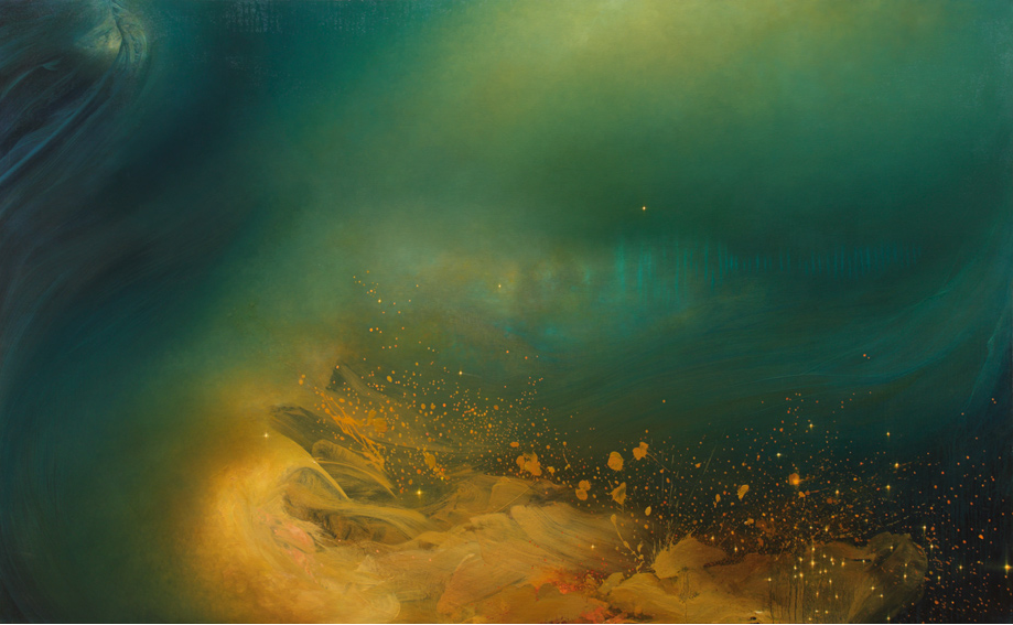
Progeny
oil, enamel, and shellac on canvas
48″ x 78″
2013
Samantha Keely Smith was born in England but moved to the US as a child, and now lives and works in New York. Her work has been shown all over New York City and in Arkansas as well. In 2011, her solo exhibition on Madison Avenue was featured as an Editor’s Pick on ArtInfo, who wrote that her works, “play at the edge of abstraction, blurring between light-filled fields and non-objective compositions.”
Samantha’s artist statement reads:
“Smith’s artwork represents a striving to reconcile the inner world of instinct and the tidal sweep of our emotional life, with an external world that is both beautiful and hostile in its natural grandeur. She attempts to map the place where these worlds intersect.
The translucent layers of paint, contrasting soft ethereal brushwork and harder edged sweeping gestures, echo this divergence and depict a timeless place that hovers between dream and reality in a way that is simultaneously alluring and menacing. The work exhibits the struggle between and among the variety of human impulses: impulses that are as necessary as they are contradictory, and which therefore constantly undermine our psychic and social coherence even as they endow us with vitality, soul, and life. “
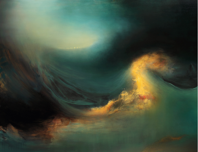
Mutiny
oil, enamel, shellac on canvas
60″ x 78 “
2012
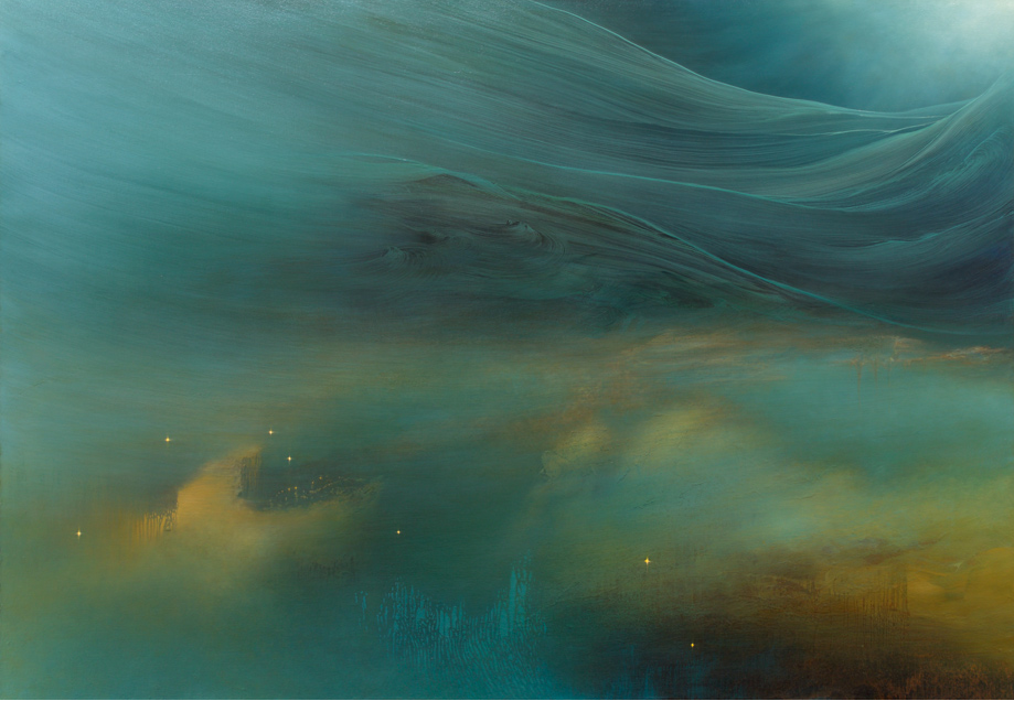
Gathering
oil, enamel, and shellac on canvas
50″ x 72″
2013
For more of Samantha Keely Smith’s work check out her website and her Tumblr.
Mar 29, 2013 | interviews, painting
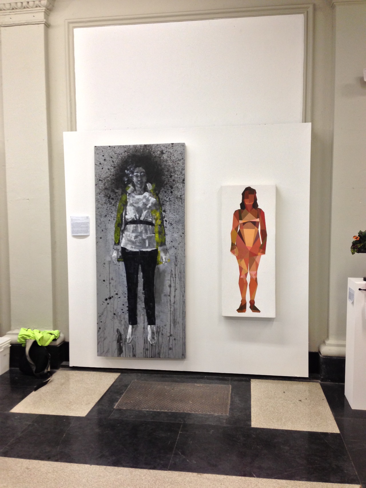
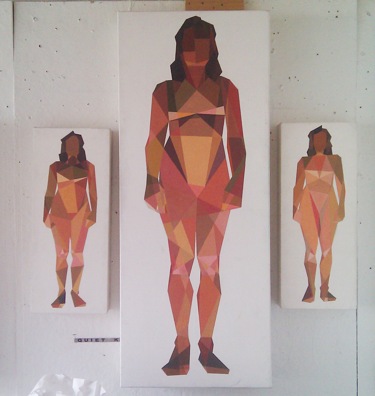
The women in Ian Gage’s paintings have recently begun transitioning – changing from realistic women splashed in dark paint to geometric pixillations that fragment her body and surroundings. The result is a shattered representation of women like minimalist stained glass windows, the light shining off of each shape differently, and with her body arranged in sometimes symmetrical but always balanced compositions.
Toll, Knell, & Peal reveal three different interpretations of the same front facing woman, and in each, her body is shattered into different shapes shaded in different shades of light. The transition between Ian’s realism style and his fragmented one can be traced from work to work, like a breadcrumb trail of the artistic process. Scrolling through his Tumblr is like reading a mystery novel where all the clues are visual, connecting the works that come before and after.
Cease and Knell shown at the Sustain/Able show at MassArt, 2012
What is the first thing you can ever remember drawing?
I think Godzilla. I was pretty preoccupied with typical giant robot/creature type products as a child—typically referred to as kaiju, though I don’t usually throw around that term. A Google search of that pretty much sums up the things I drew as a child.
Toll, Knell, & Peal
To you, what is it about women that make them so worth painting?
The anecdote I usually dispense as an answer for this is that I only took up an interest in drawing in response to a middle school crush. The crush in question was very interested in art and I pursued it to impress her. She moved away and nothing ever came of that, but I kept drawing. Ever since that point I’ve been interested in drawing or painting my romantic interests—it’s fairly transparent at this point to the people close to me.
I think there are a lot of things about painting women, in particular romantic interests, which one has to be cautious about. The first thing you hear in art school is that portraying someone you’re close to inevitably leads to an idealization complex—you’re never really able to accurately portray your subject because you’re occupied trying to flatter them. I’d like to think I’ve broken that barrier based alone on my obsession with proportionate accuracy, but one can never be trusted to judge themselves objectively. I can at least say in my defense that no one has mentioned idealization critically to me for probably two years. The second—and more broadly relevant point of caution, is my position as a male painting the female form. After seeing a Hilary Harkness lecture this past fall I grew somewhat uncomfortable with the plausibility of being labeled a misogynist based on my work, and so I try to be as aware of the presence of the male gaze in my paintings as possible. The effectiveness of that awareness can really only be judged by the female audience—I am at their mercy under the circumstances and that is the way it ought to be. Those are the two chief dangers I think.
I realize of course I have yet to answer the question, but that feels like some necessary pretext. I think I’ve always been very interested in making art about women due to their general impact on my life; it’s difficult to give an answer less nebulous than that. Painting women is something I generally don’t question, it’s just something that feels necessary, and has felt more so as I’ve gotten older. Continuing painting women, and justifying it, involves a lot of thought and deliberation on a daily basis; particularly revolving all of the implications of me painting women, and of painting women in general.
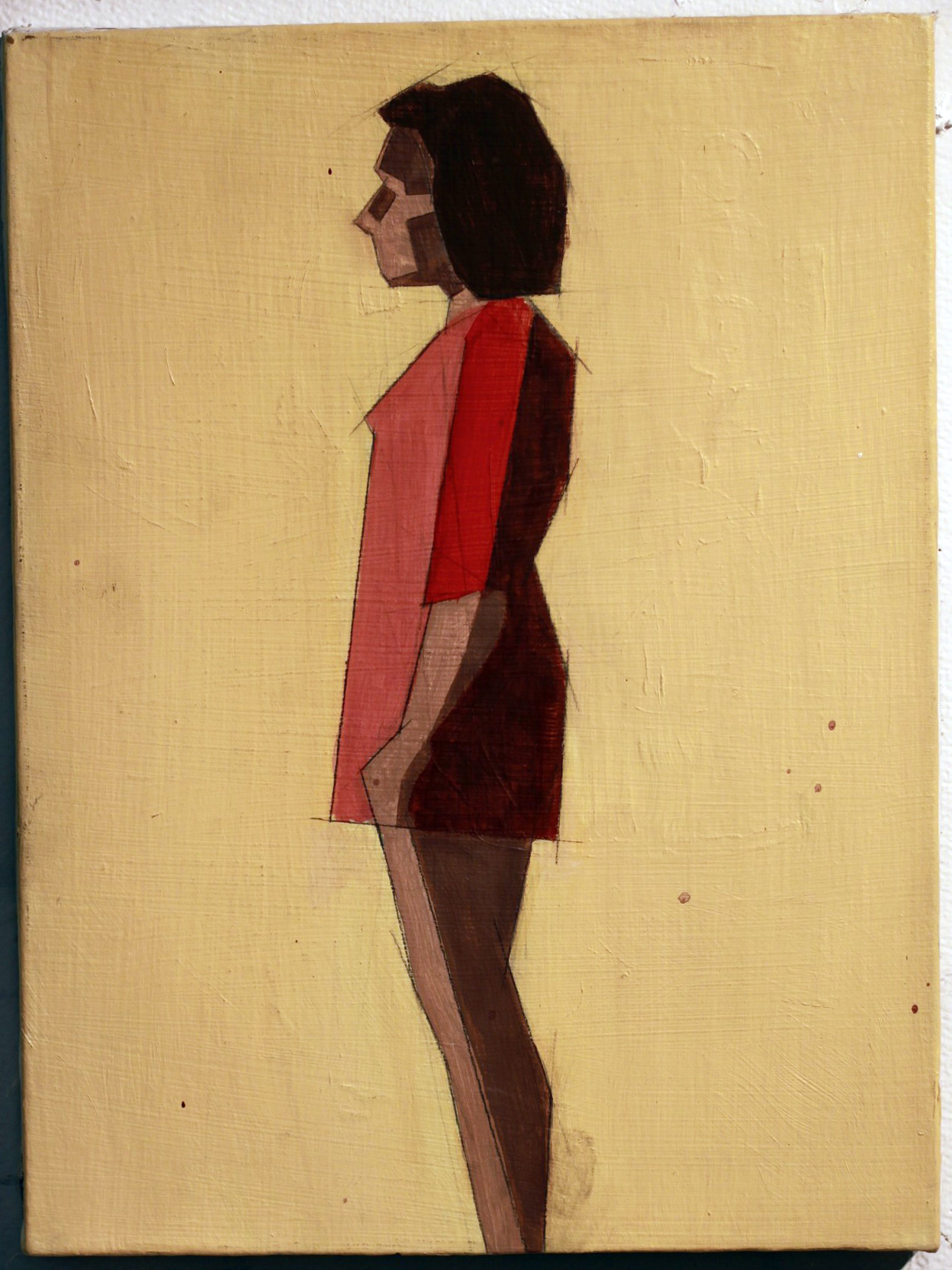
Untitled, Oil on canvas, 12”x16”
When did you first begin moving away from straight representations to geometry-inspired interpretations, and why?
I really started painting the geometric pieces in Catherine Kehoe’s representative painting class. From the beginning of the class I assumed we were learning to paint representatively (a logical assumption) but we were in fact learning the building blocks. I assumed the class structure would revolve around Kehoe giving us broad lessons on the tenets of painting naturalistically, and then individual suggestions to improve the realism of our work. I was chiefly interested in exhaustive detail—I wanted to paint like Scott Prior by the end of the class.
I found fairly quickly she was teaching the opposite of detail. Kehoe encouraged us to reduce the picture plane to the simplest shapes possible. I fiercely resisted this for about half of the semester, at which point I became exasperated and painted an exhaustively reductive study in an attempt to parody her lessons. It was absolutely meant to be a juvenile jab at her teaching, but to my surprise she loved the painting and encouraged me to pursue it further. For the duration of the class I developed a vocabulary in a style I had originally created as a joke, and grew to like it despite the fact I was painting expressive acrylic paintings in my personal studio. When I had my final critique in my painting studio the professor and guest artists were enamored of the Kehoe paintings and uninterested in my expressive paintings. That was the point at which I decided I needed to explore reductive painting more.
Untitled, Acrylic on canvas, 12”x16”
How would you describe the differences between those two styles?
Per the usual tortured artist criteria: I was in an emotionally turbulent point in my life for about a year, during which I lacked a single subject to paint. During that year I was really painting self-portraits with other people’s faces—I wanted to paint women but really just wanted to paint what I was feeling. That kind of expressive venting was the source of the majority of the imagery in that period of painting.
In a sort of coincidental windfall I was transitioning to painting geometrically when I met my current girlfriend, who is the subject of all of my paintings since that point (about a year now). In my personal life I moved into a more stable place, and my paintings became a lot more stable too. I think under these circumstances the primary difference is that the older paintings are very expressive and energetic; I was clearly being very physical with the works, and the current paintings are more analytical. I’m interested right now with proportionate accuracy, the dynamics of different geometric hierarchies, and color theory. Succinctly, the difference is expression vs. study.
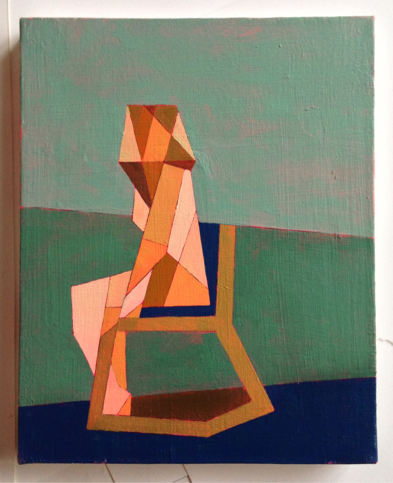
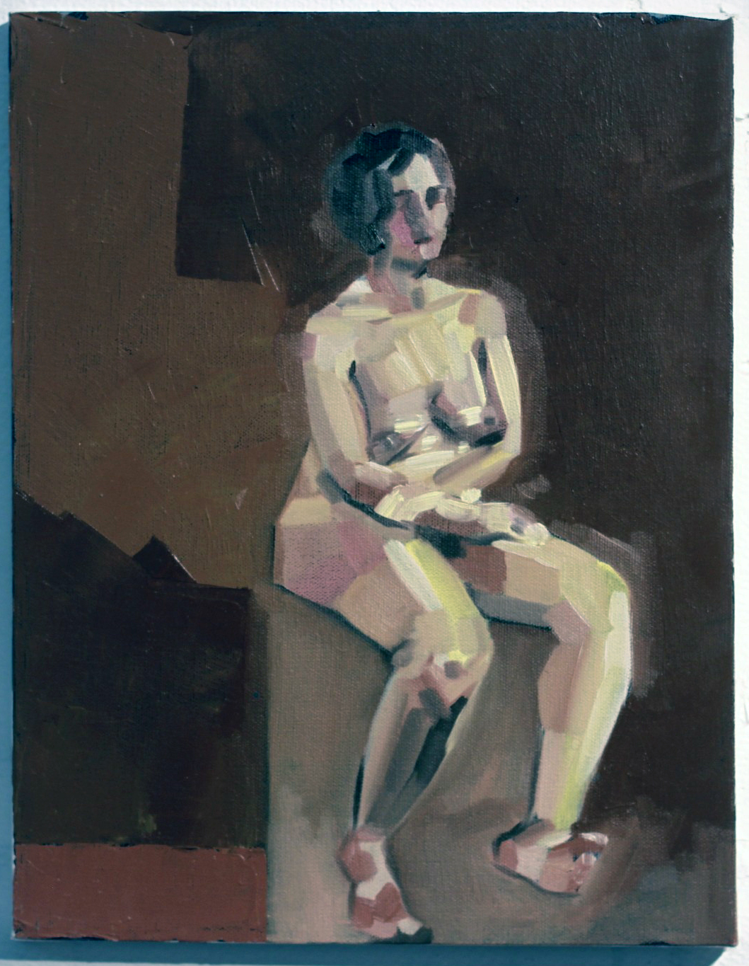
Seated Nude #3, Oil, Acrylic, Graphite on Canvas, 8”x10”
Who are these women? What do they represent to you?
The current paintings are all of Melissa, my girlfriend. Most of the older works are of Emma, a friend. The Emma paintings really fall under the self-portrait category, they’re about me at the time if anything. There were a couple of early Melissa paintings that fell under that category as well, namely Seam Ripper and Discrete Mathematics, after which point I dropped the expressive self-portrait vein for the reductive paintings.
The reductive paintings are a lot less about expression and more about study. Every painting is an attempt at adding or manipulating a variable in a previously established control. When something works I add it to the control; I add it to my toolbox. When it doesn’t work it remains exclusive to that painting. For instance: the blank figures in Seated Nudes 1 & 2 were an accident—I had placed a red ground, drawn the space, and painted the backgrounds. I decided before I painted the figures that they looked interesting as they stood, and left them. The silhouetted figure became part of my vocabulary at that point, and it reappeared in later paintings.
As far as what the women in the paintings represent to me beyond the above technicalities, I can’t really say. I try not to assign meaning to my paintings; I find I’m opposed to explaining the content because it places the painting in a box. A painting is infinitely more valuable to the viewer when they can assign their own meaning to it or attempt to glean the meaning themselves.
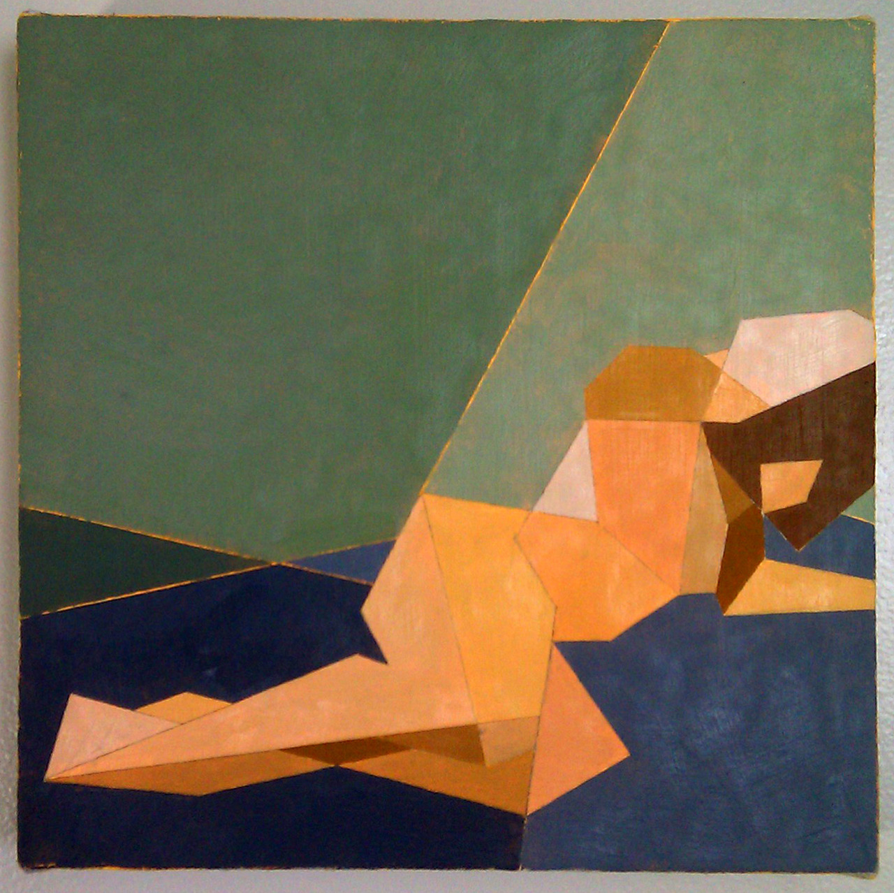
Reclining Nude IV, Oil on canvas 12”x12”
What sort of impression do you hope your works leave on the viewer?
It’s difficult to say based on the above statement. I hope it strikes a chord with them, I hope there’s something in them that they can take away. I hope they want to spend more time with it than five seconds.
[pureslideshow] https://thingsworthdescribing.com/wp-content/uploads/2013/03/gage8.jpg;https://thingsworthdescribing.com/wp-content/uploads/2013/03/gage7.jpg; [/pureslideshow]
Ian will be graduating from Massachusetts College of Art and Design this spring.
See more of his work on his Tumblr.