Mar 26, 2013 | painting
Two figures eerily creep through a scene, with a strong sense of light shooting up at them. Dark shadows are cast behind everything that catches the light, and within one of the corners sits a sculpted portrait bust, whose giant face looms like the Ghost of Performances Past. His nose is broken and his mouth is twisted, and the space behind his head is the only part painted black – an ominous warning against the dangers of acting, cautioning how much of your own self that might be forfeited in the desire to become someone else on stage.
And even though the subject matter may lean towards the creepy, the colors are anything but – bright oranges and whites against a pale green background, colors painted so thick that they become autonomous, living on their own within the 63 x 79 inches of canvas, bleeding and oozing but with enough restraint for detail. There’s a strong sense of the artist’s hand across a floor that’s painted in lines mimicking the light’s direction. But the walls and clothes seem to glow from the color within them, somehow shiny and organic at the same time.
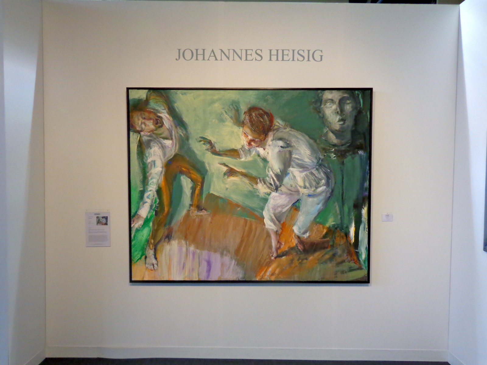
“Performance” by Johannes Heisig, 2012
Also on view in Heisig’s booth on the Modern Art pier was a triptych of sorts – three watery interpretations of himself, each numbered as a different “Selbstbetrachtung” or “Self Reflection.” Each utilizes a distinct color palette and emphasizes a different part of the artist’s face – the first focuses on his nose, the second on his head/ear, and the third on his mouth and chin, as if he painted three different still frames from one good head shaking. They could be three totally different people, and shown altogether they play with the ideas of how drastically the way we view ourselves changes from day to day and hour to hour.
The artist stares right at you in the middle portrait – his head swimming in bright colors that highlight the fleshiness of his skin that’s even painted a burning red/orange in some places. His eyes look out disapprovingly, his mouth puckered in a grimace as if he’s judging your outfits or your bad habits from within the frame. If you look closely, you can see each individual stroke of the artist’s brush – they seem random and chaotic, but somehow take a few steps back and they come together to become an impassioned kind of melting impressionism.
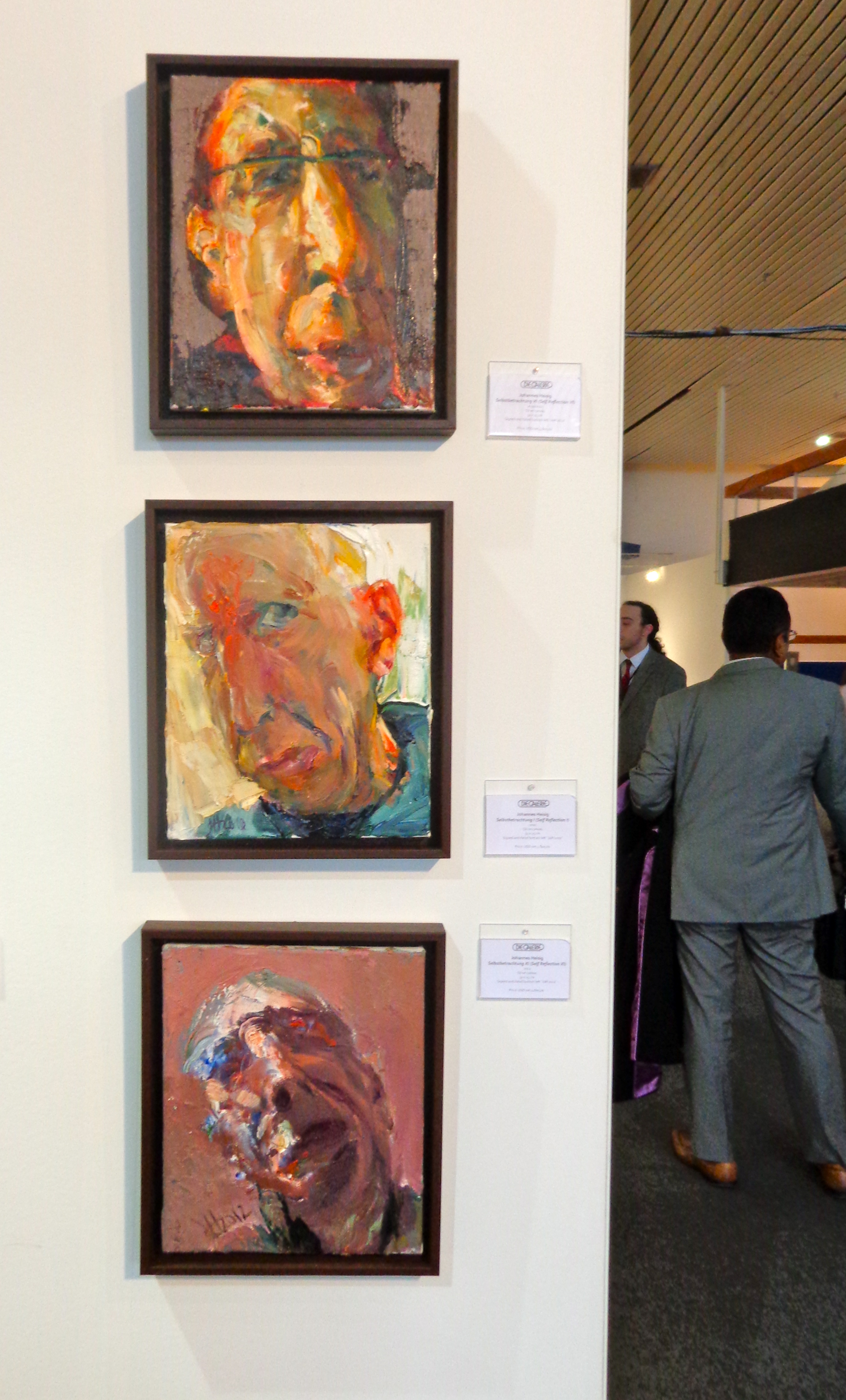
Heisig’s “Selbstbetrachtung” or “Self Reflections”
Johannes Heisig, 60, has been described as a social realist painter working in subjective expressionism. From Germany, he’s painted a number of German politicians and also works in graphic design and illustration. His artwork has been shown throughout Europe since the early 80s, and at the Armory Show he was represented by Die Galerie in Frankfurt.
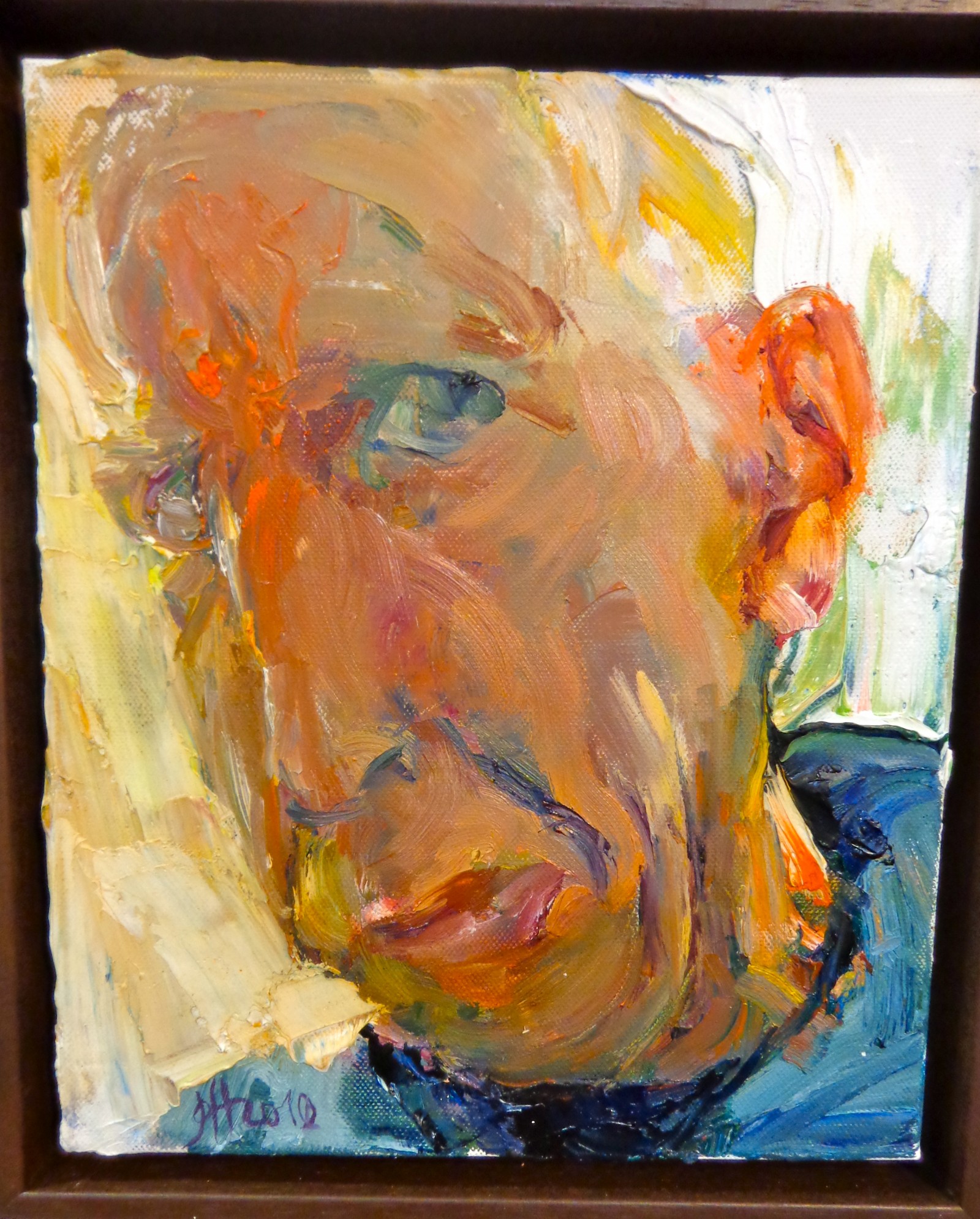
“Selbstbetrachtung I (Self Reflection I), 2010.
See more from Johannes Heisig on his website.
Mar 19, 2013 | art fairs, installation, painting
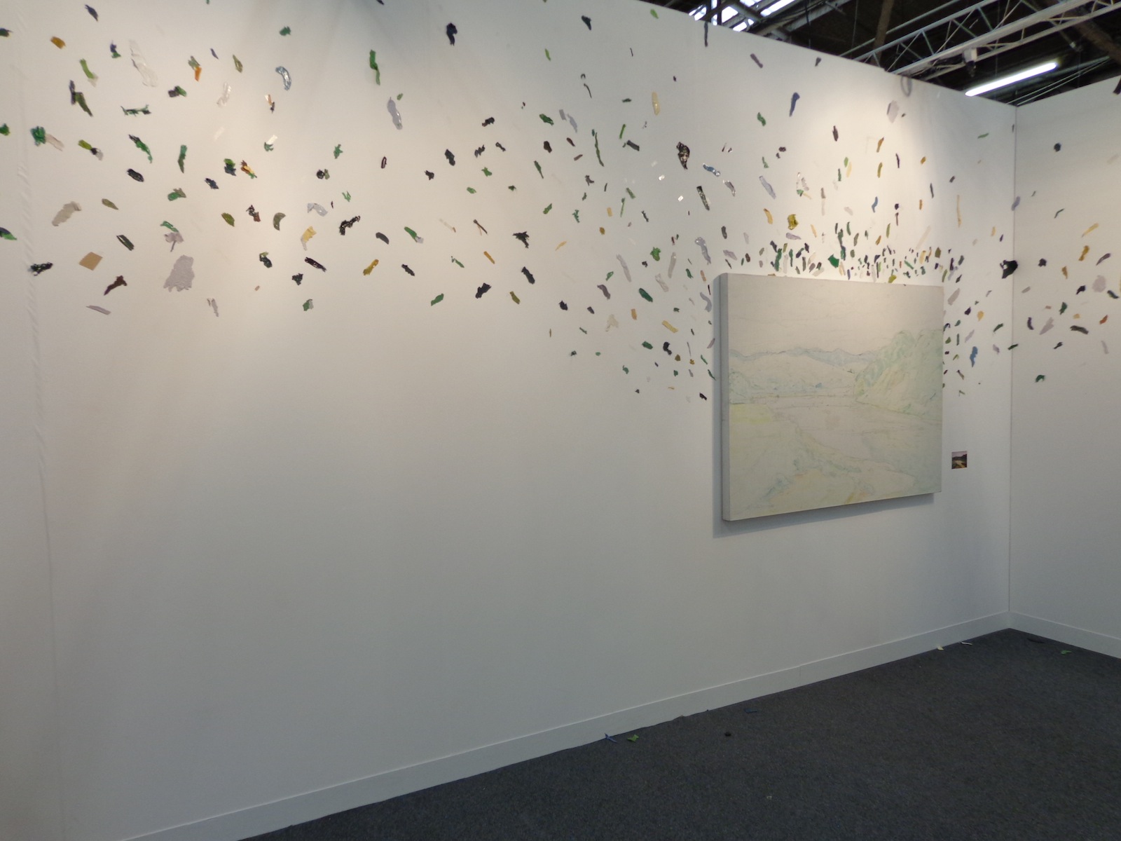
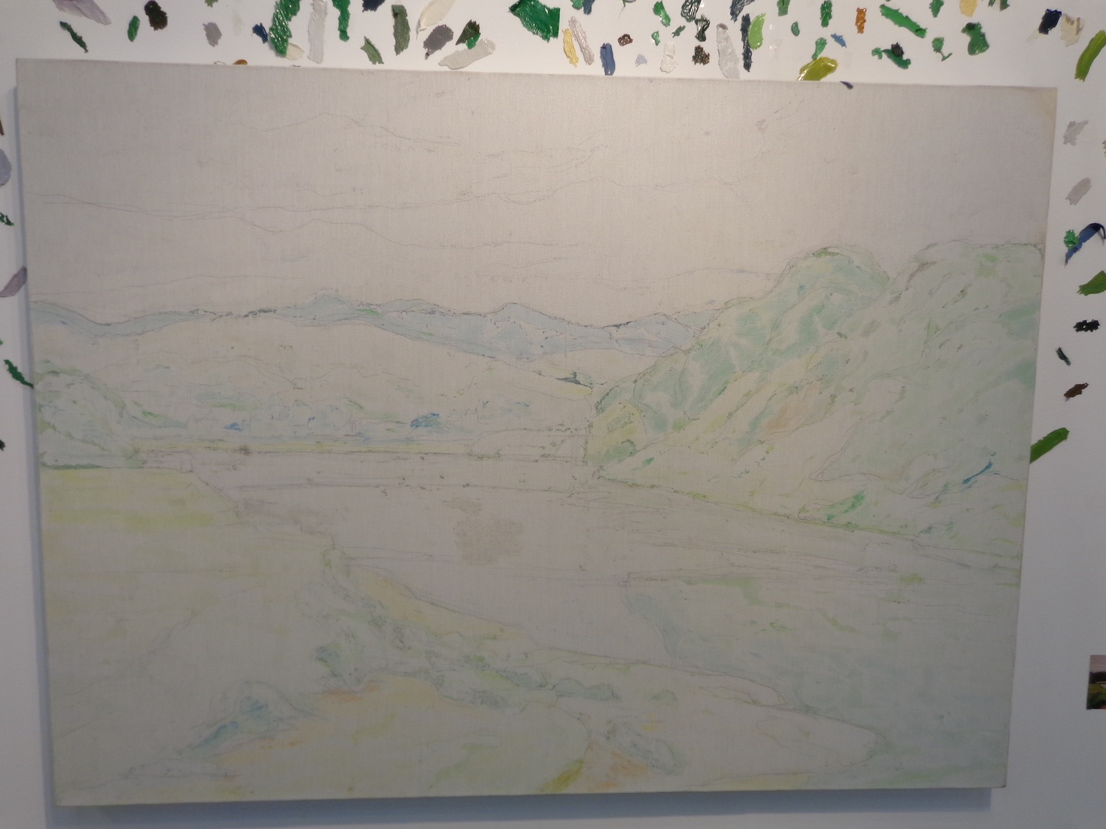
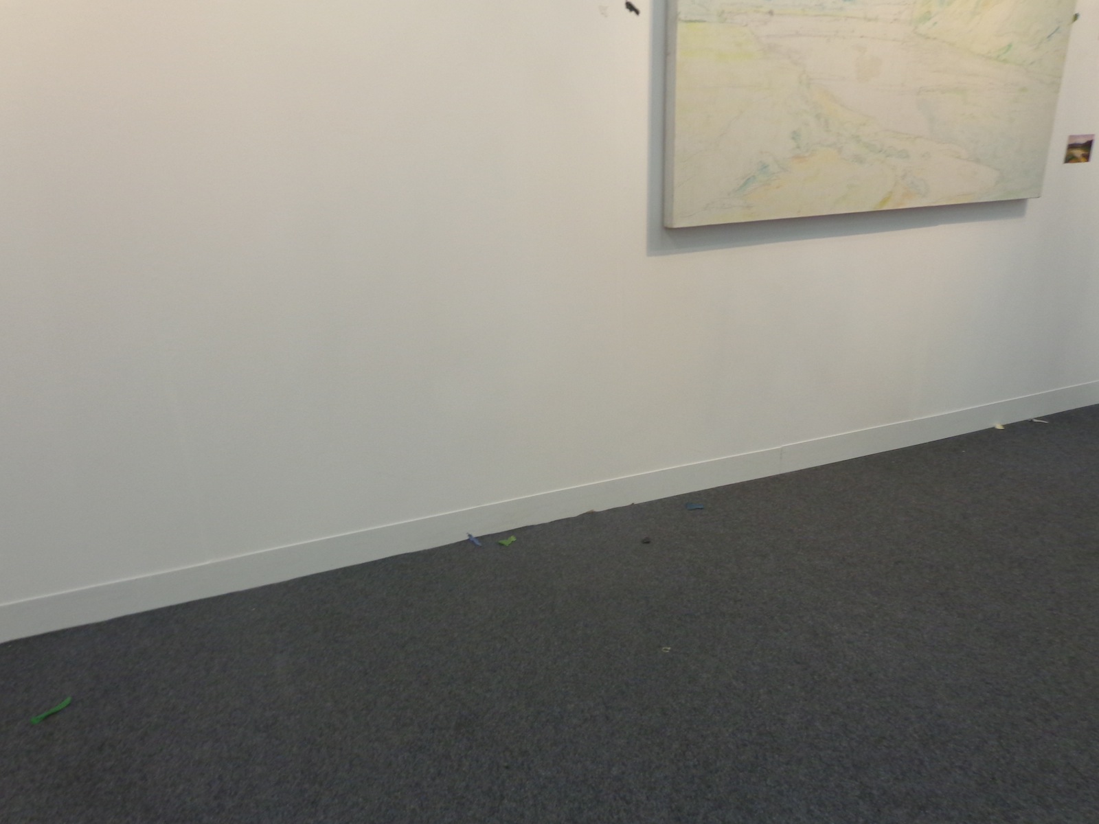
One large-scale canvas that was covered only in colored pencil underpainting took up an entire wall of Tang Contemporary’s booth at The Armory Show. The canvas was surrounded by flying flecks of color, the same colors that should be on the painting instead of around it. It was just a simple landscape scene, a valley surrounded by green hills that led the eye off into the distance, but spreading the paint everywhere keeps you inside the booth instead of letting you escape into the scene like typical paintings intend.
A scattered, abstract way of interpreting absence versus presence, the piece is titled “A painting-Landscape,” and was created by contemporary Chinese artist Wang Yuyang in 2010.
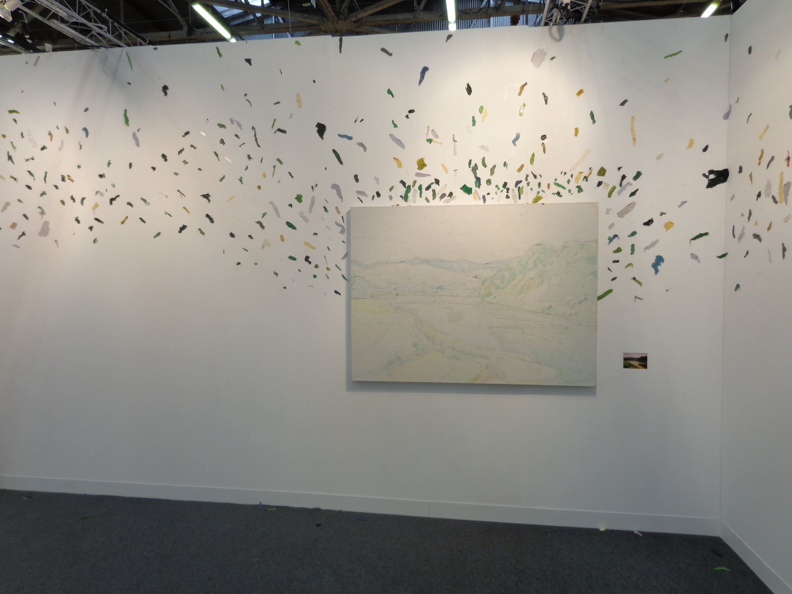
The piece mimics the Dr. Suessian notion of smacking color right off of the objects they belong to – you can almost see the artist finishing the landscape, hating it, and then KERSPLAT! He slams the canvas against the wall and paints flies everywhere. Of course, the canvas can’t be left completely empty since then there would be no correlation between the colors and what they used to represent, so the pale outlines and colors remain within the 85 x 55 cm rectangle.
There’s a connection between past and present, what used to be and what is now, all compared to what should be. Societal standards are overrated.
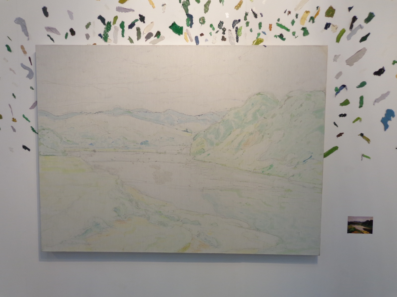
A miniature version of what the painting was intended to look like stood beside it, allowing viewers to compare color with the lack of it, although it’s hard to tell if this painting was ever really completed or just filled in with computers. Similar to one of those cube-scaling projects each art class has on its curriculum, the miniature version lets your eyes fill in the appropriate emptinesses of its older brother scene whose paint has flown the coop.
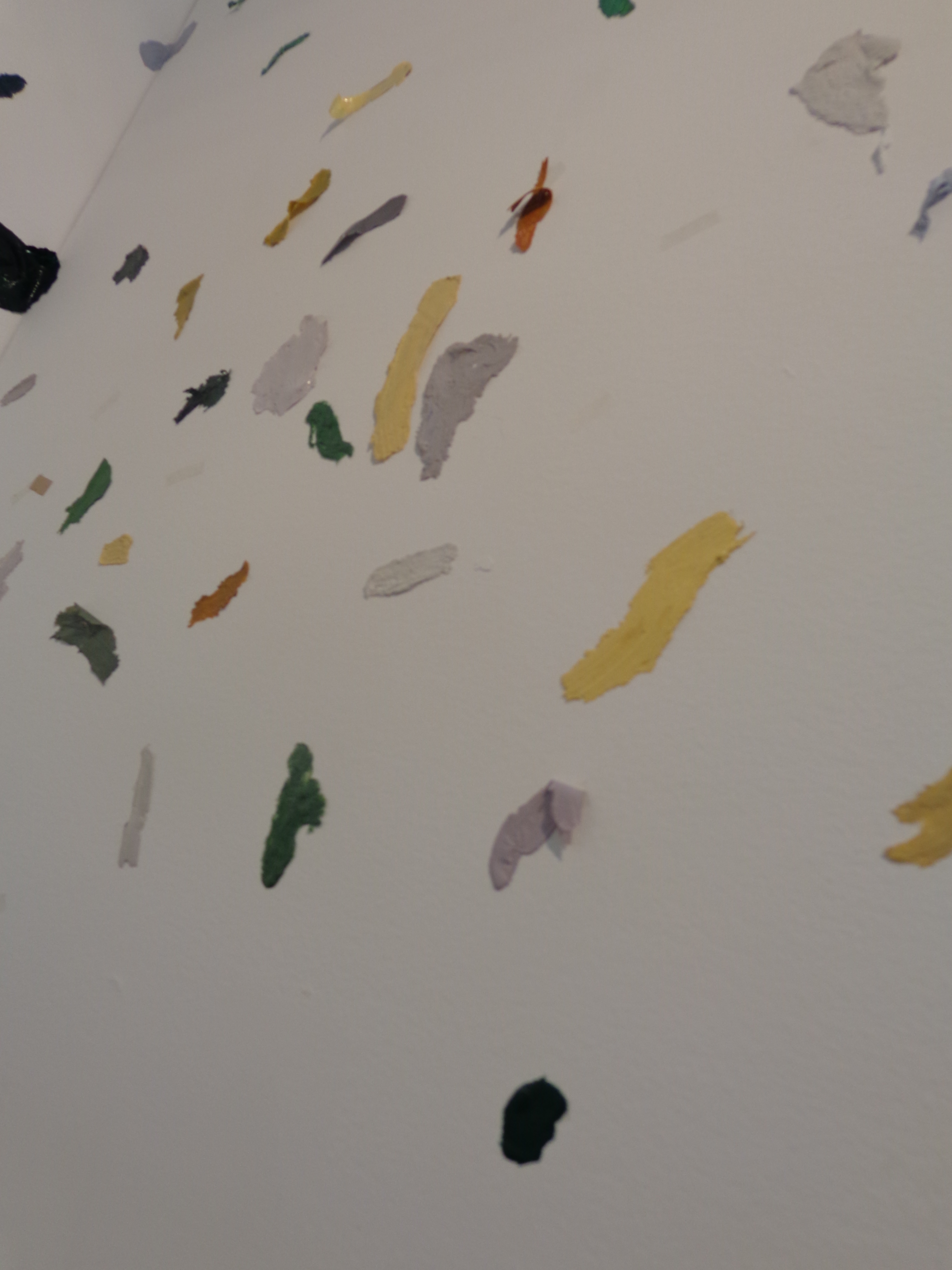
If you look close, you can see that all the little flecks of paint aren’t just oil and water, they have a plasticity to them that makes them more substantial than if they’d just been merged and flowed across a landscape scene. Each individual shade of green, yellow, gray, white, blue and black stands independently – defiantly almost, refusing to become part of the whole and wanting its own space on the wall to be noticed by passing viewers.
Tiny colored flecks even fall on the floor beneath the painting, bringing this contemporary art piece all the way to your feet.
Wang Yuyang is a 34-year-old contemporary Chinese artist whose work deals with technology and our relationship to it, along with the aesthetics of brokenness and pilings of material waste.
“I like the traditional Chinese philosophy because it talks about the relationship between 1 and 0, on and off, black and white, something and nothing,” Yuyang explained, “My works explore this connection.” He is also particularly interested in exploring what he calls “the zero state” – an emptiness filled with nothing but silence and stillness.
For more of Wang Yuyang’s work, see his bio pages from the galleries who represent him, White Rabbit and Boers-Li.
Mar 13, 2013 | art fairs, painting
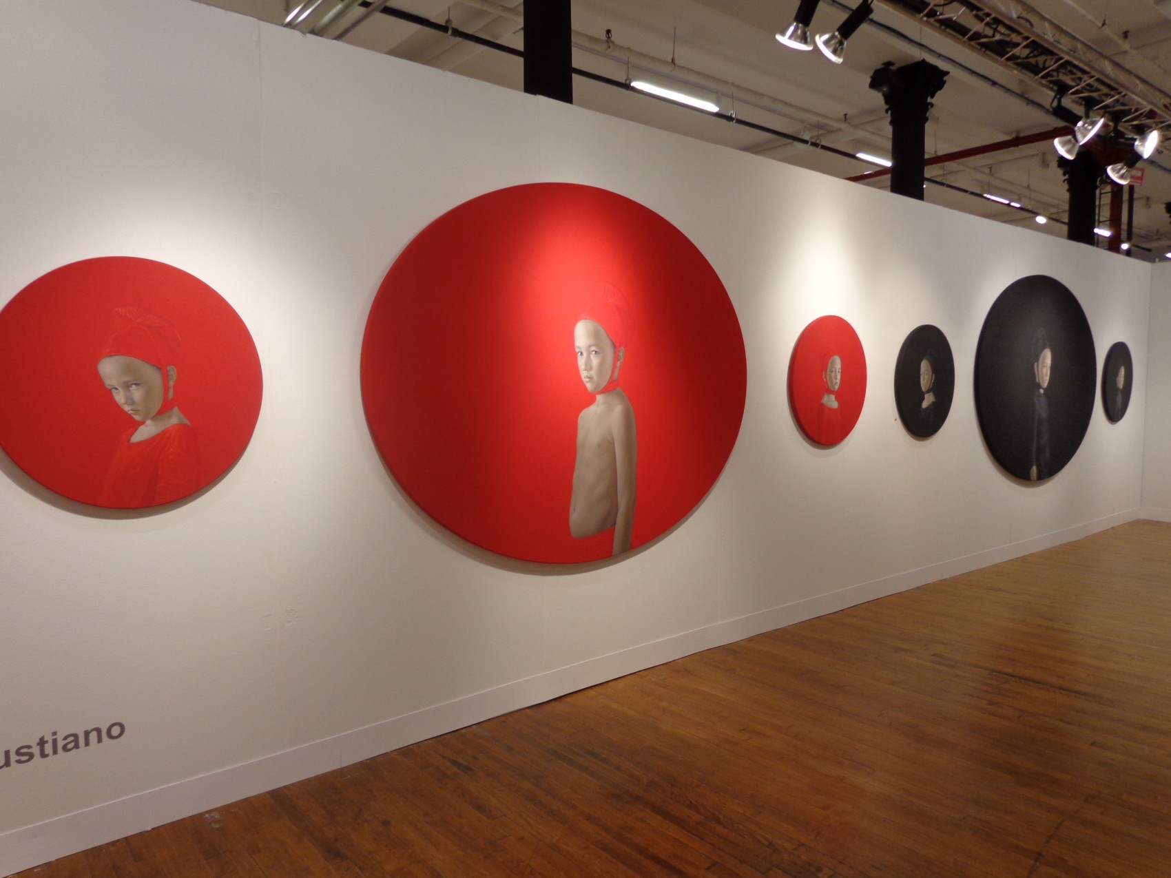
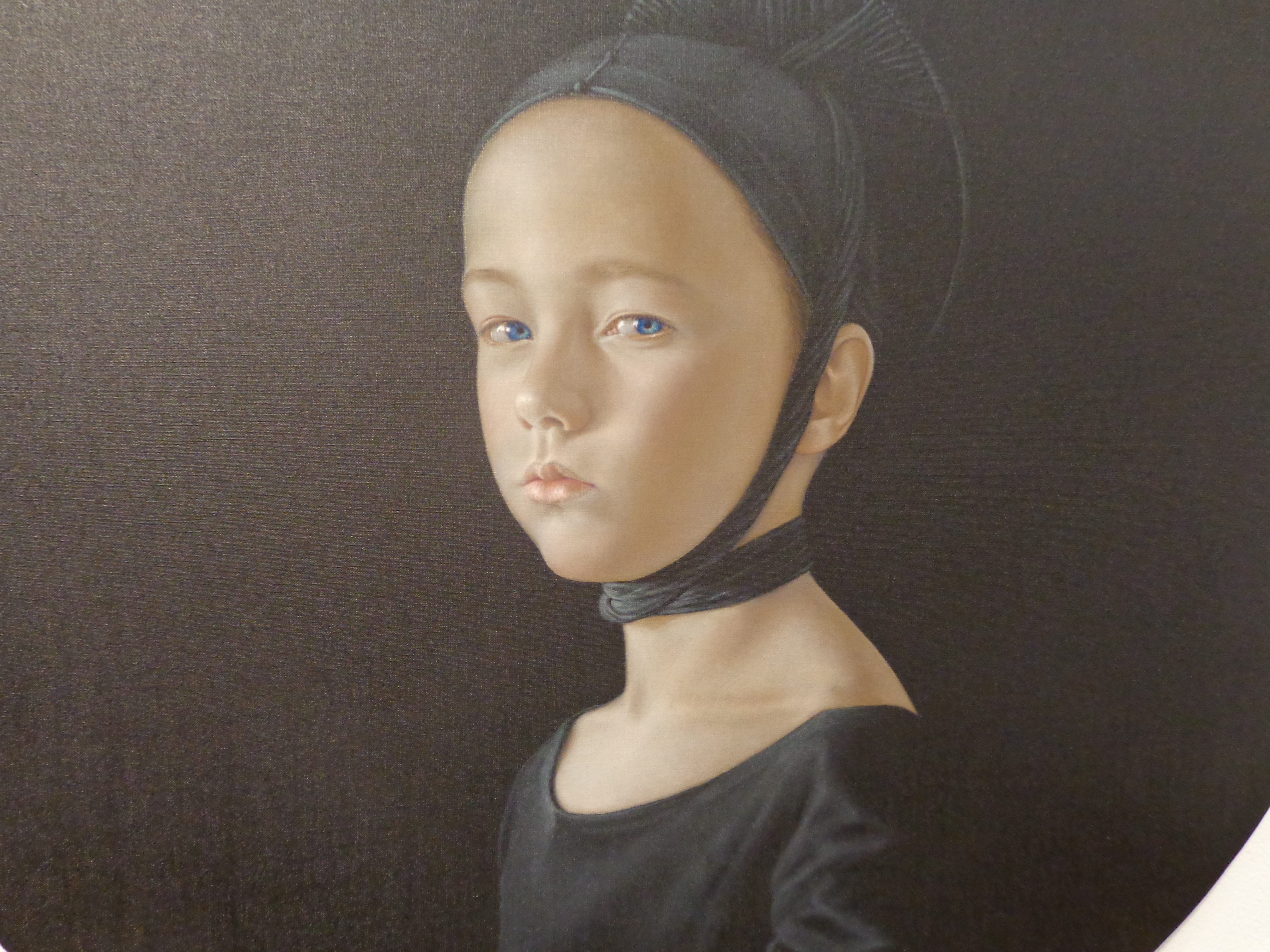
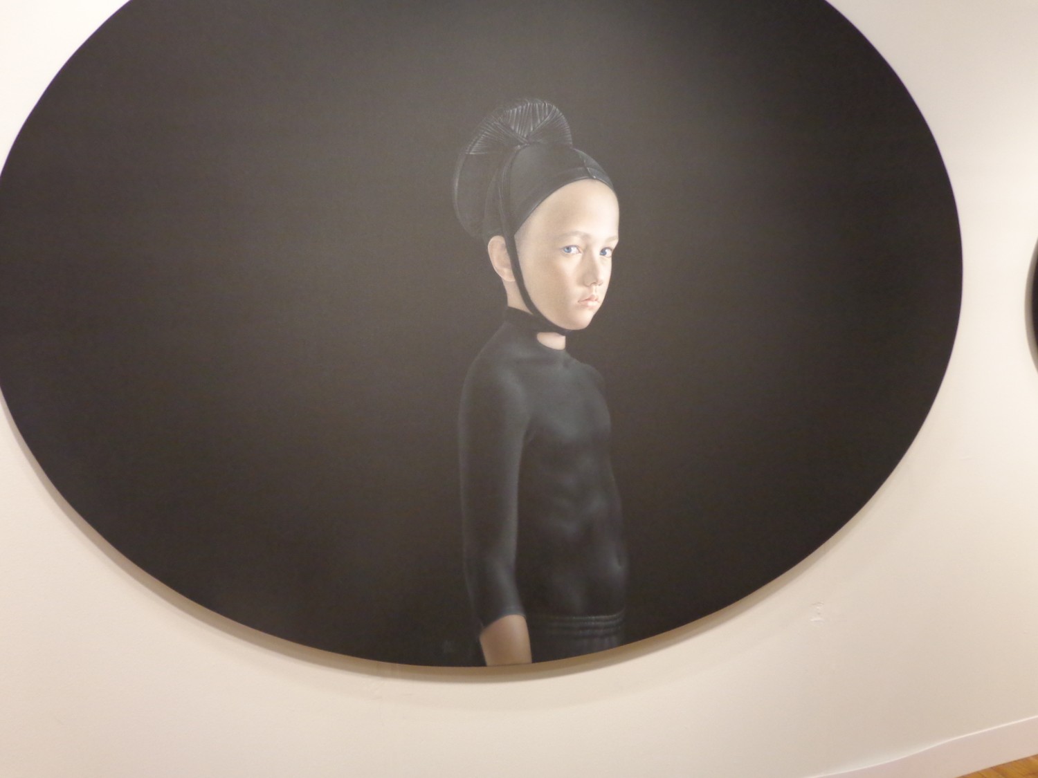
It’s arresting – seeing six symmetrical circles holding the faces of little scowling children, all spread across the wall, three red paired against three black. Cast in Renaissance clothing, these children wear the exact color of the background, making the definition between the two an act of magic. Your eyes tell you where the headdress stops and where her shirt begins, but they only know because of delicate shadows and folds that are obvious in some places, but left invisible where the painted fabric is as tight as the canvas.
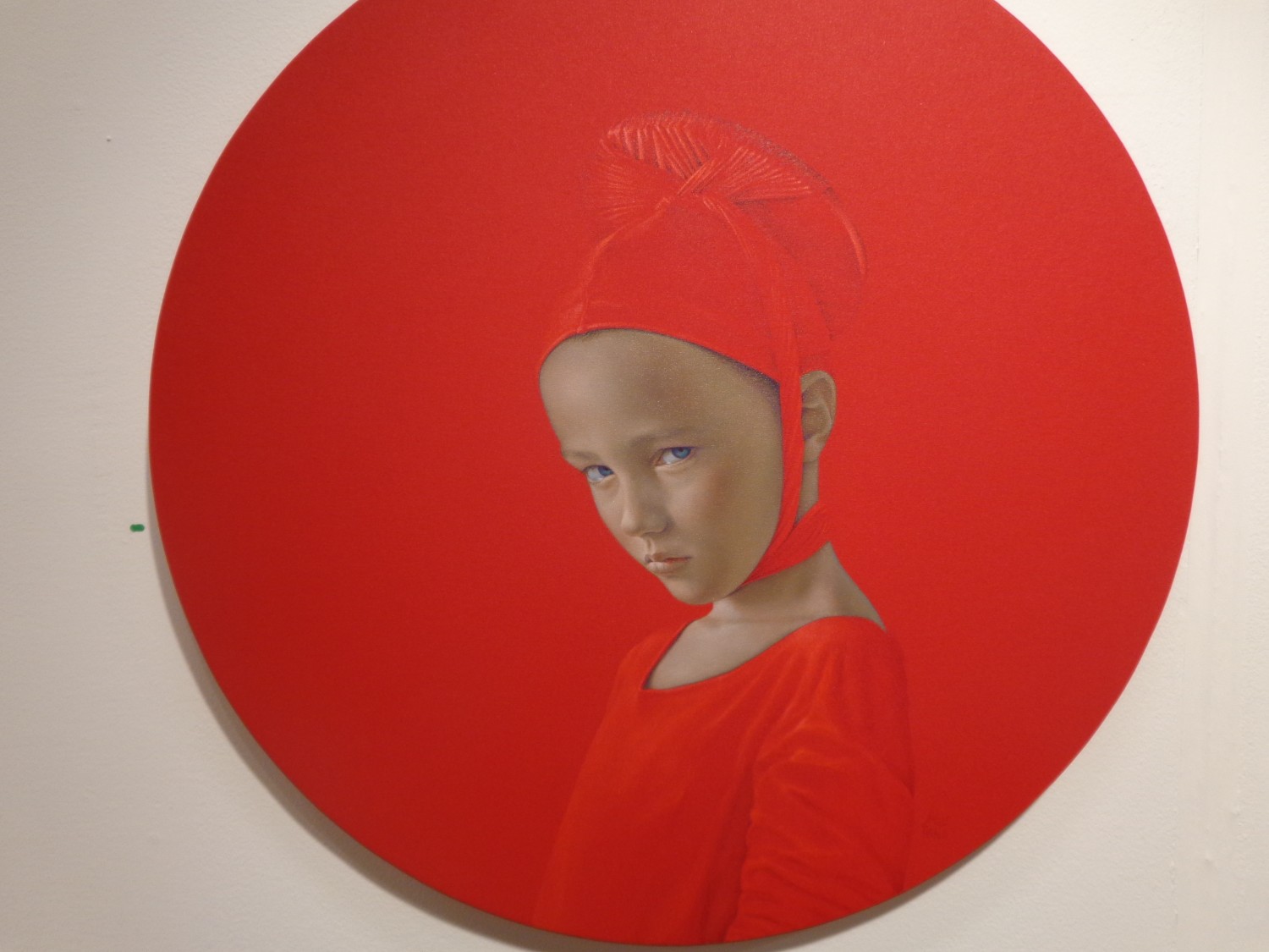
It’s hard to tell whether these are all the same little boy or girl – all of their faces have the same elegant roundness, the same crystal blue eyes and the same smooth perfect skin. But their expressions are subtly different – the four within the smaller circles seem to hold more contempt in their eyes, like they’re upset with how small their worlds are compared to the two children within the larger circles, whose expressions lie closer to curiosity or suspicion.
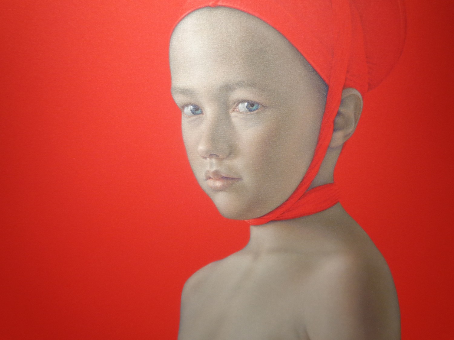
The only element offsetting perfect symmetry here comes in the clothing of these two children within the largest circles. The boy in red is bare-chested, wearing only a headdress while the child in the large black oval wears a shiny black shirt that grips his little body so tight he might as well not be wearing it at all.
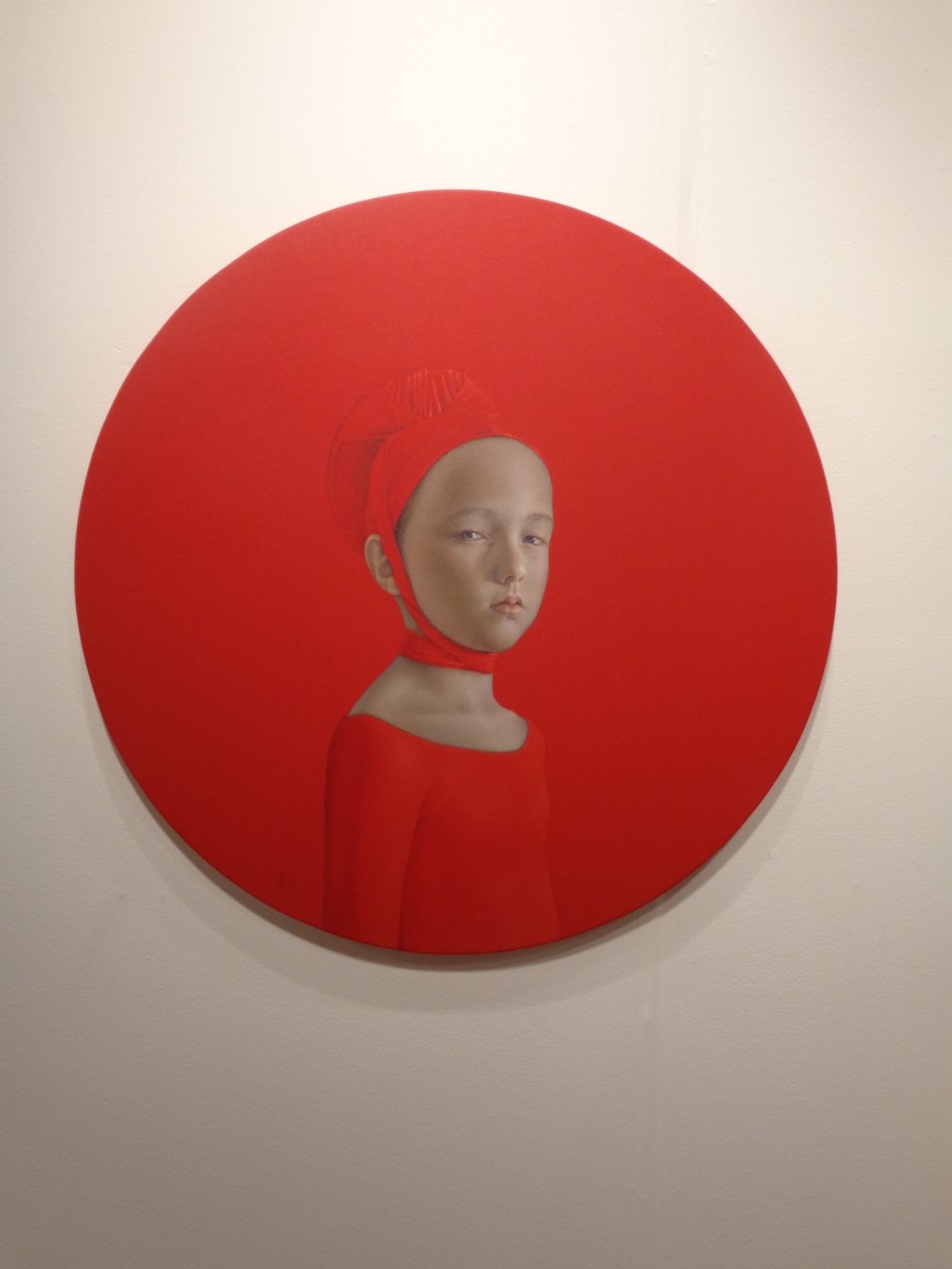
The largest circles are stretched wider to form more of an oval shape – the smaller perfect circles play a supporting role by framing their larger counterpart and interacting with the opposite color across the wall. The abrupt visual contrast of the black versus red, along with the dagger stares coming from intense perfect children makes the whole wall come alive with ideas about conflict and disdain, youth and maturity. And the Renaissance headdresses hint at an address of institutionalized religion or just religion as a whole.
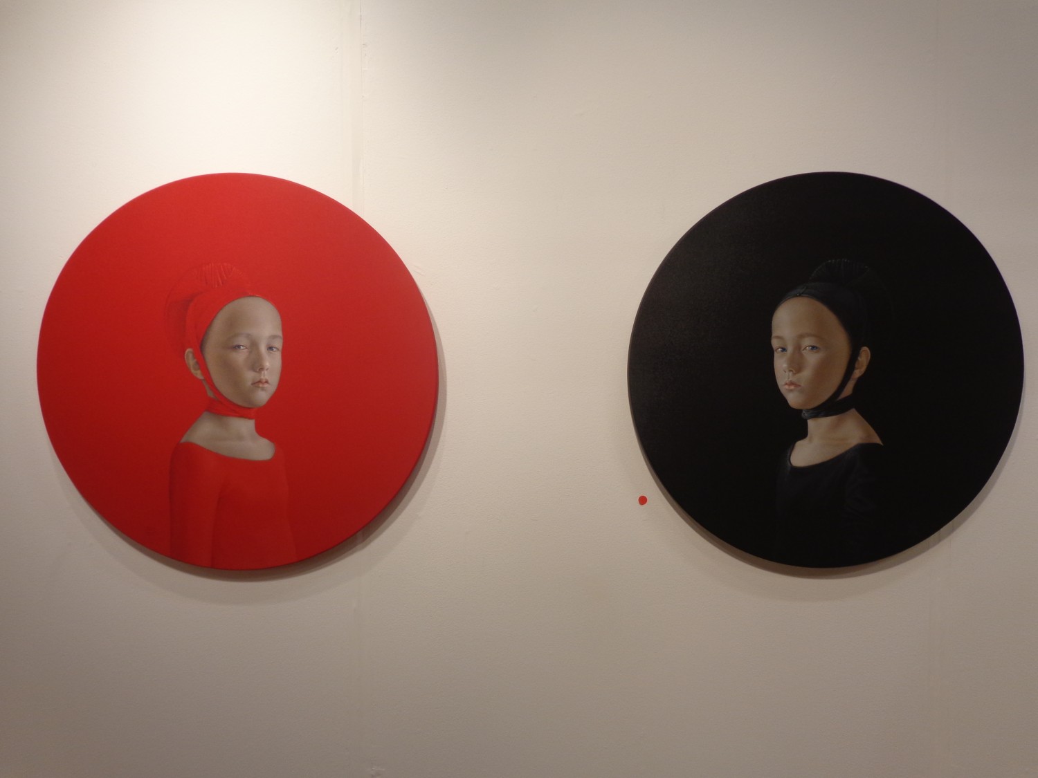
Perhaps the most dynamic part comes where the two colors meet – both children with the exact same grimacing glare pointed right at us, although it really seems like their unhappiness is actually rooted in their physical closeness to the antidote – the opposite color with a contrast too strong to look directly at.
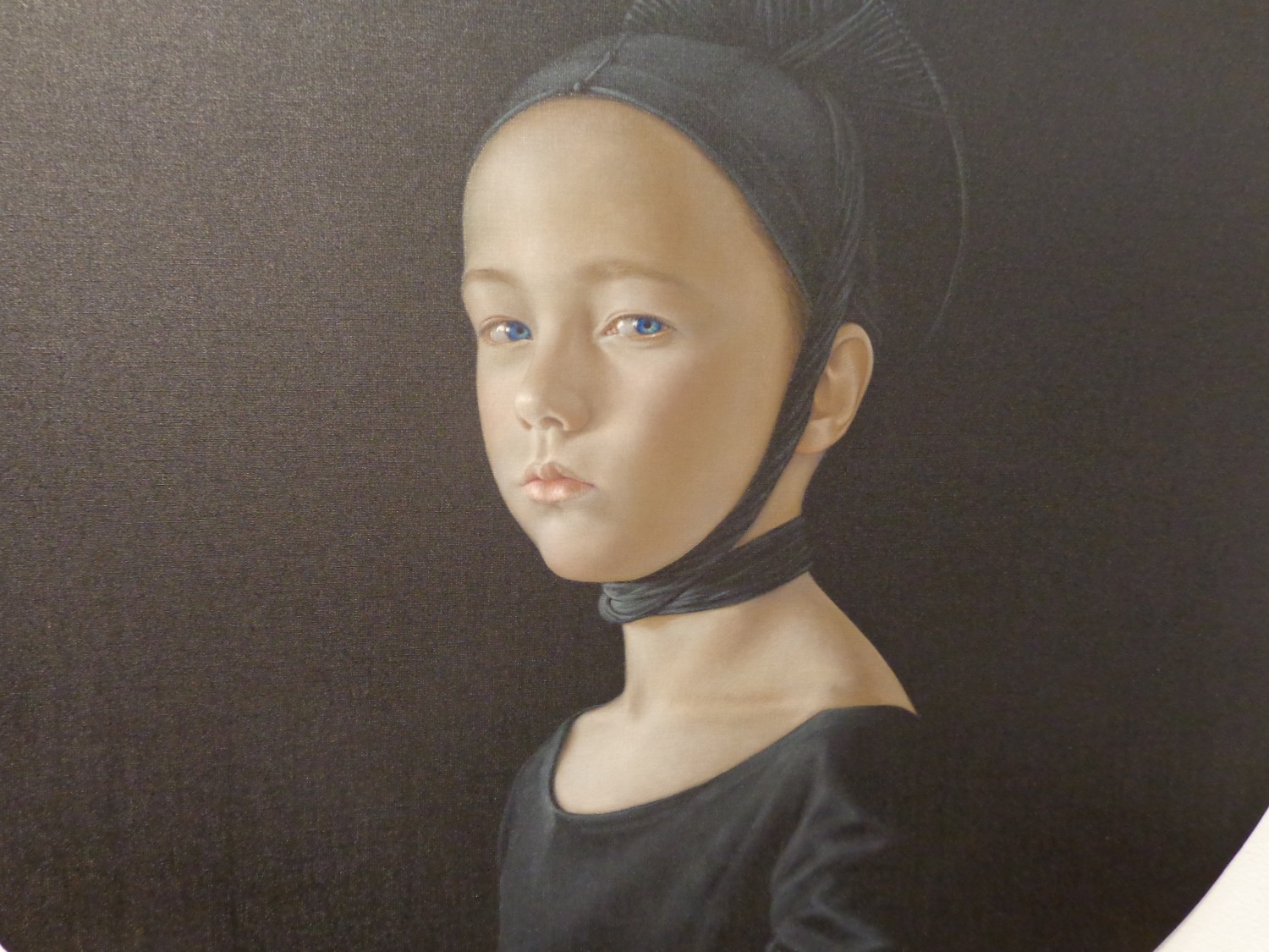
Born in Seville, Spain in 1965, Salustiano has an exhibition list too long for even multiple pages on his website. He’s shown between 10-20 exhibitions per year since 2001, and began all the way back in 1994. Beginning in Spain, then moving to Portugal in 1999, he showed in Italy in 2000 and New York City in 2001, and has since had work displayed all over the world, from Seoul to Salzburg to Moscow.
Salustiano’s VOLTA comment read:
“For me, emotion is a key word in contemporary art and should continue to be so in the future. In recent years in the art world, artists have tried to flee from ’emotion’: saturated with every kind of visual stimulus, they have been more concerned with making an ‘impact’ on the spectator than in touching an emotional fibre. I strongly believe that emotion should be the principal motivation and purpose of the artist. For centuries art has emotionally impacted upon, moved or even perturbed the spectator; and this ‘interior’ movement has contributed to the evolution of mankind. I also think that even if the artist intends to stimulate the intellect of his or her audience, then this should be done through ’emotion’….”
For more of Salustiano’s work, see his website.
All photographs taken by Lindsey @VOLTA NY ’13 where Salustiano was represented by KAVACHNINA CONTEMPORARY in Miami.
Mar 12, 2013 | installation, painting
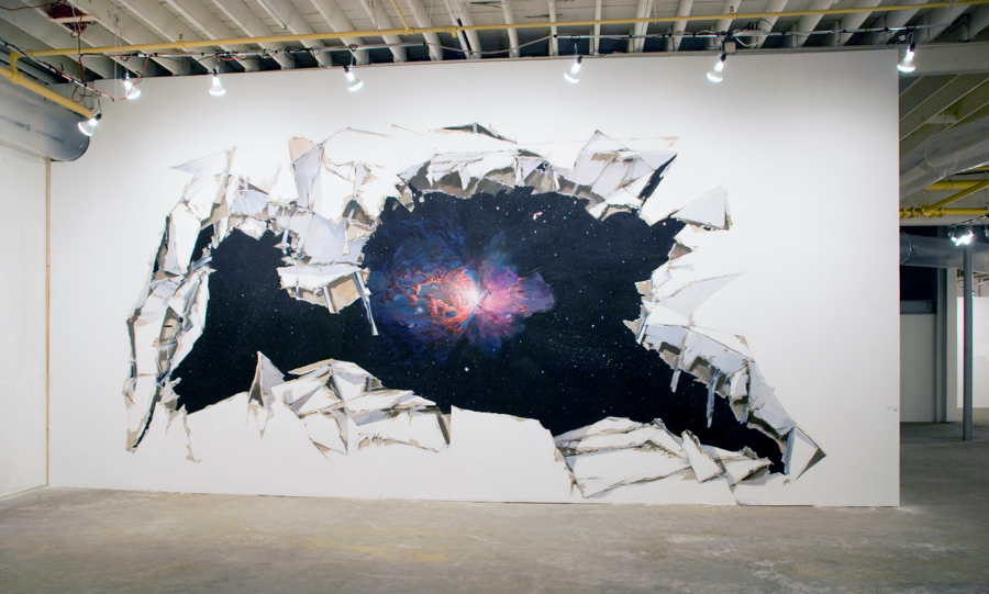
“Stardust,” 2010.
flash acrylic paint on tyvek
12 x 30 feet (144 x 360 inches) Image from artist’s website.
“Stardust” is a flash of make-believe, tricking your eyes into seeing something only found through a very powerful telescope or on the background of a Mac. The wall is painted like its falling apart, crumbling to reveal the image that’s breaking through behind. A star appears to be exploding – mid-transition on its way to becoming a white dwarf or a black hole – something other than what it used to be. With an asymmetrical form glowing bright, white light springs from the center while the rest of it shines red through the clouds that cover it.

Image via Slow Show.
Adam Cvijanovic is a 54-year-old artist born in Cambridge, MA and now living in New York City. His work has been featured in the New York Times, Time Out NY, the New Yorker, along with ArtSlant, ARTnews, and Art Forum. He is currently represented by Postmasters Gallery in New York, and according to his CV he was continuously creating and exhibiting work from the mid-eighties until 2010, but hasn’t publicized making anything since.
For more of Adam’s work, see his Postmasters profile.
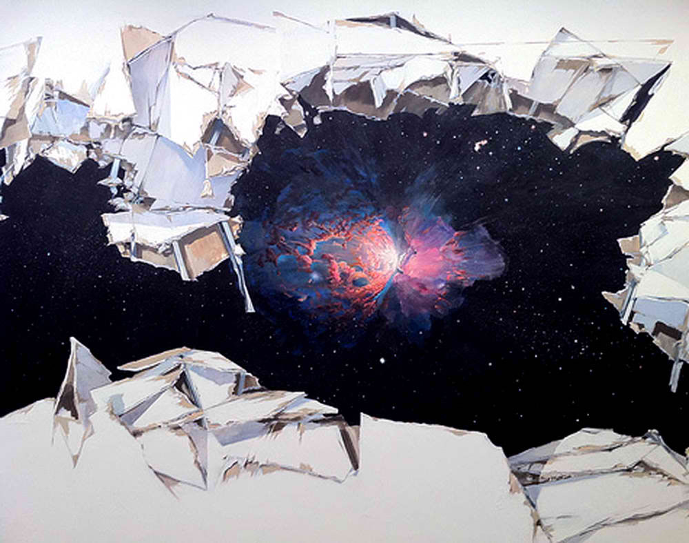
Image via Slow Show.
Mar 8, 2013 | interviews, painting
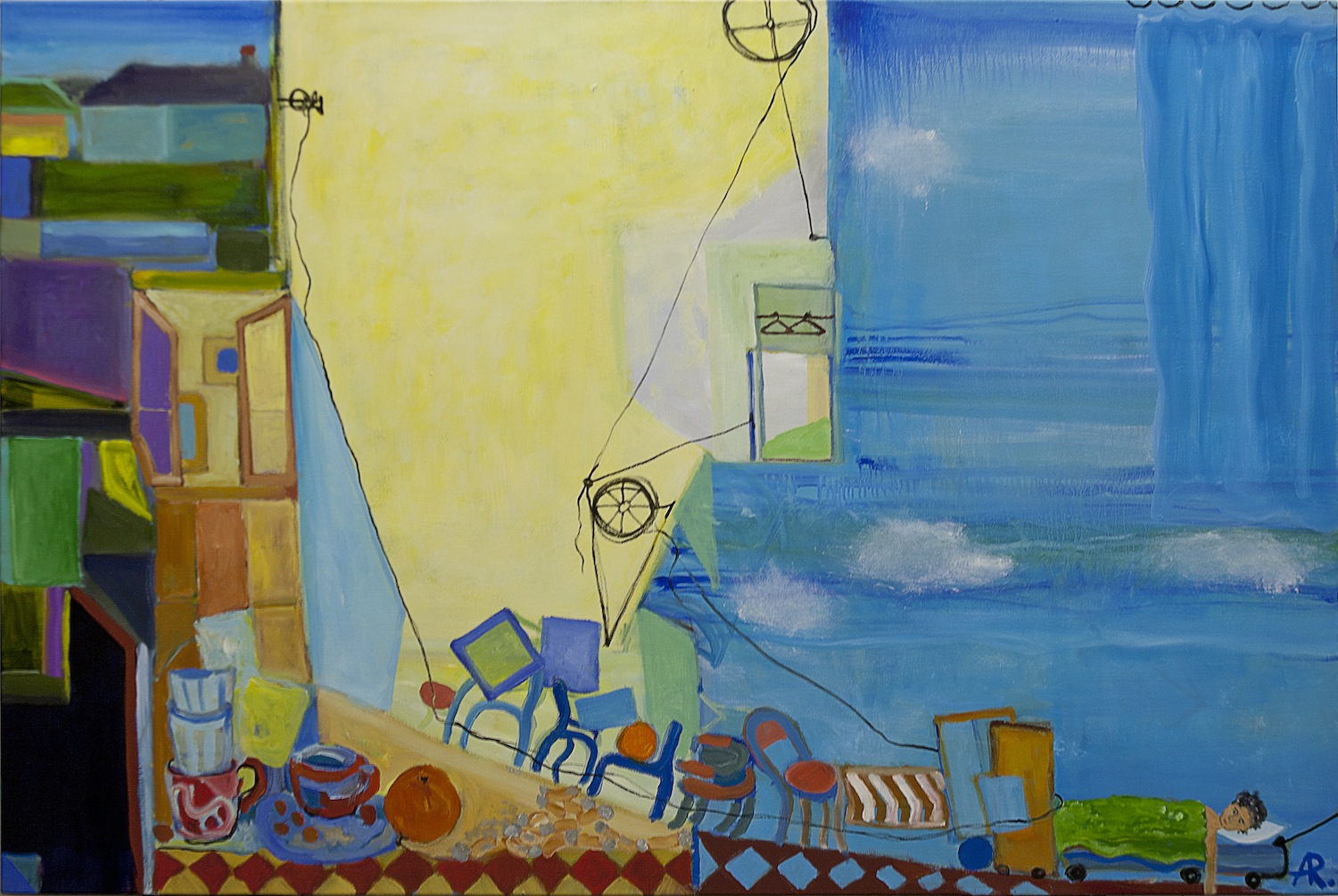
“Moving in with Richard Diebenkorn”
Alexandra Rozenman is an artist now living and working in New England after coming to America as a political refugee from Moscow at the end of the 80s. Her paintings reveal simple scenes of beauty and most often peace – a utopia so perfect that it could only exist within four walls of canvas. Her new show, “Transplanted” continues her exploration of scenic storytelling, using color and shape to serve as a narrative for each viewer to interpret on their own.
“Moving in with de Chirico”l art
What was the first thing you can remember painting?
I started painting when I was 5 taking classes at the Fine Art Museum in Moscow. There is a photograph taken at the dacha that my parents rented in 1977 for the summer. I am sitting at the easel looking very serious. Painting on an easel tells a story the same way my work does now: there is a house in the woods and a fairytale character: Petrushka ! ( Petrushka is a stock character of Russian folk puppetry, known at least since 17th century). I would not be surprised if I found out about him from a Stravinsky ballet that has the same name, because may be there was not always paper, but the theater was affordable, wonderful and available. This painting has two big eyes in the sky – one of the images in my work for the last 20 years.
Do you have any routines required for the creation of your work?
In ideal world I prefer to work in the morning after 2-3 cups of strong black tea. Afterwards I eat good lunch and have a nap! Then work for 2-3 hours more. I like to feel alienated when I work. I like listening to a very loud music (something nobody will guess I do). With the schedule I have right now ( I started my own private art school www.artschool99.com) and am teaching almost every day for 5 hours or so). I am trying to cut out pieces of time for myself and just make it work. A tight schedule became one of my art materials:)
“Moving in with Leonardo”
How do you find the right color scheme for each scene?
I don’t think I find the right color. I allow colors to find me. Paint floats and has its own mind based on subject matter, technique, materials, time, space. It is alive for me and my goal is to allow it to grow up (like a plant) and only later – some time in the middle of the painting process – start changing it, based on my instinct, ideas and goals. Each painting is different.
Where do you hope to take the viewer with your paintings, and why?
I tell my viewer a story, allow them to enter into the world of magic and hope that they will get curious and will spend some time thinking and looking around. My work expresses longing for understanding and being understood, for non-belonging and finding a place to be. Playfulness in my work points to instability of life – visually, culturally and literally. I am working playing on the conflicts between identity and assimilation, tradition and modernity, so each viewer can take my messages and interpret them any way they want and discover for themselves. I want the viewer to start wondering after looking at my paintings, if maybe things are a bit different sometimes, maybe something can still be both beautiful and interesting at the same time.
“Moving in with Winslow Homer”
How would you describe your style of painting?
In todays world “style” is usually a combination of many different styles, isms and personal history or/and an artists place in the world. Inside my work liquid layers and thick abstractly painted surfaces meet familiar landscapes, and create a place where I explore the world through the mixture of autobiography, symbolism and philosophy. I am a mix of Moscow alternative cultural scene of the 1980’s ( my visual vocabulary, environments, approach to a hidden metaphor are all coming from their ), Painting for paintings sake, Abstract Expressionism, New image painting, Fauvism , 16th-17th century Romanticism and Symbolism can all be found in my work.
My favorite artists are: Bruegel, Vermeer, Turner, Matisse, Richard Diebenkorn, Joan Snyder and Frida Kahlo. For many many years my work has been compared to Marc Chagall. I like his early work and am even really related to his first wife (Bella Rosenfeld) – my Great Grand father is her younger brother, but I don’t think that he is my main influence. However, if there is a group of artists called “Jewish Artists” I am sure I am a part of it.
How does “Transplanted” expand upon the styles and themes your work has already been exploring?
For me “Transplanted” has a seed of placing myself in the world of art. Thoughts and practice on what it is to be a painter in the 21st century. Saying that replanted artists, immigrants from the disintegrated homeland, like myself, survive against all odds
And, kind of a random one: what’s your favorite color?
I don’t think I have one favorite color. I love color. It depends on what it is for. There is one color that I strongly dislike: pink. I agree with Matisse who said that:”The use of expressive colors is felt to be one of the basic elements of the modern mentality, an historical necessity, beyond choice.”
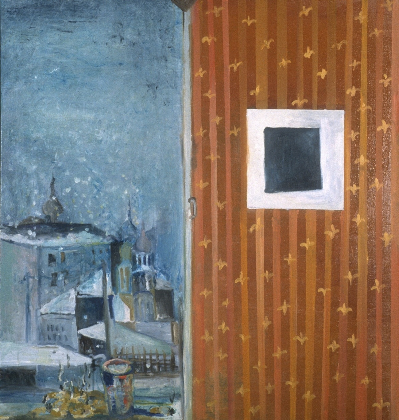
“Re-thinking Malevich in Moscow”
From Alexandra: “Re-thinking series was 15
years ago and is sort of a mother of ‘moving in.'”
See Alexandra’s website for more of her work.
“Transplanted” is on view at the Multicultural Arts Center in East Cambridge, MA from January 3 – April 8, 2013.
Mar 1, 2013 | painting
This week, the Isabella Stewart Gardner Museum opened a new exhibition dedicated to the works of Anders Zorn, a Scandinavian artist whose skillful impressionist portraiture won him celebrity status during the Belle Epoque in Paris.
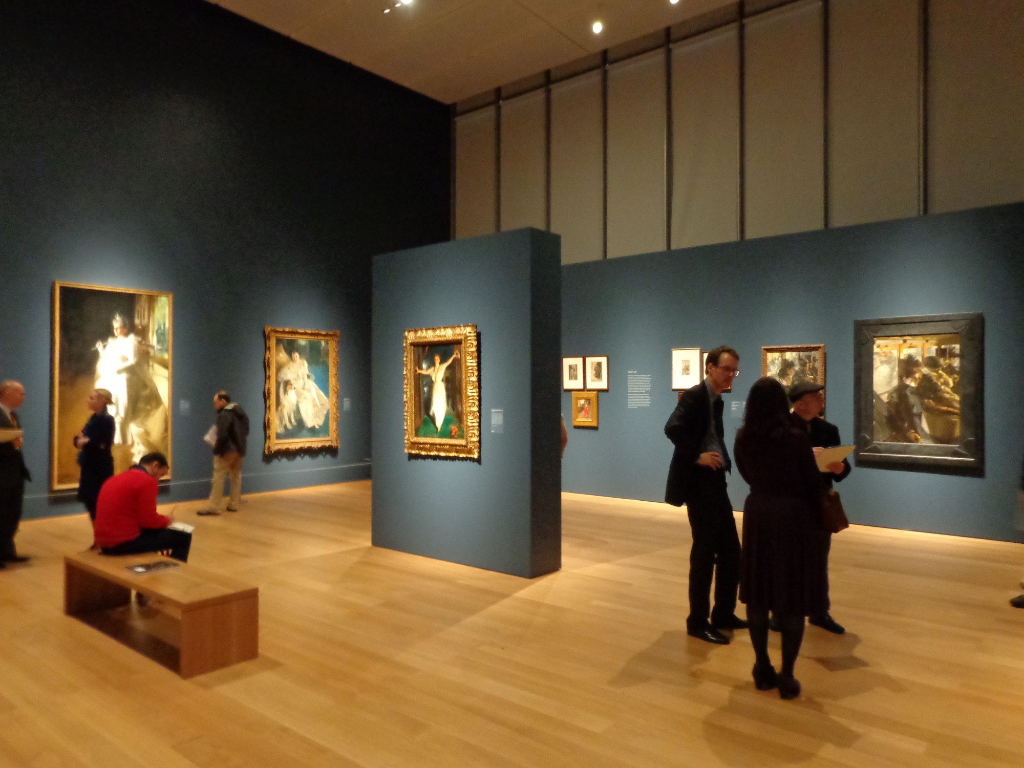
The gallery was just phenomenal, but I’m a sucker for impressionism, especially when its framed by shiny gold and hung on deep blue walls.
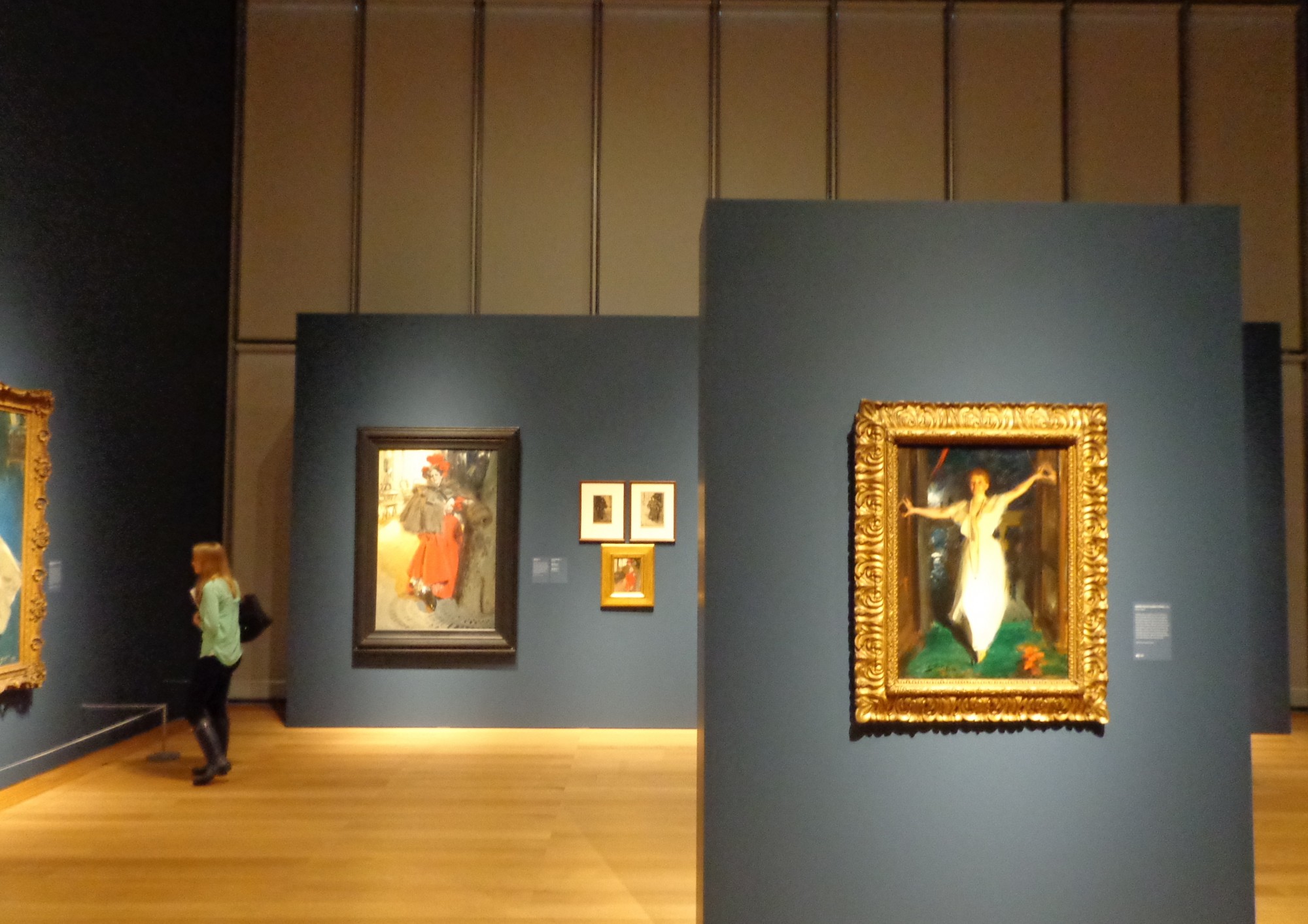
Each wall of this high-ceilinged cube was given allotted works from a different section of Zorn’s life, and even though the women looked like goddesses in the high society portraits, my favorite wall was the “In the Studio.”
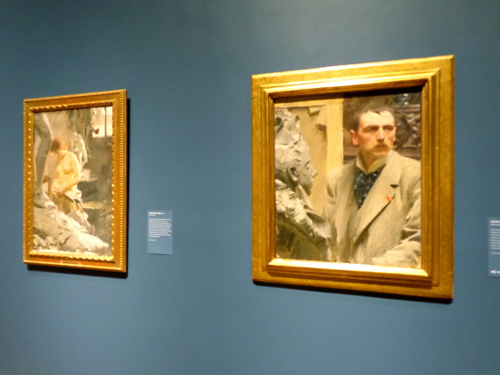
Left: In Wikstrom’s Studio, 1889
Right: Self-Portrait, 1889
In Zorn’s “Self-Portrait,” his face looks out past the frame, placed kitty-corner to a bust’s face staring past him the same way. His whiskers are long and balance out a wide forehead that crouches over small eyes with a very serious look in them.
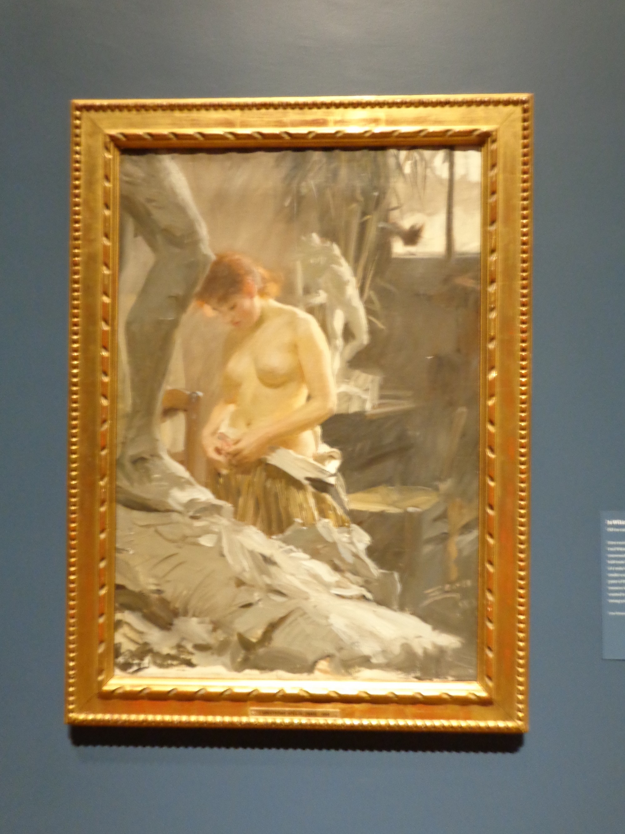
In Wikstrom’s Studio, 1889
Hanging next to this work sits another painting incorporating sculpture – here creating soft blurry contrast with the model undressing. “In Wikstrom’s Studio,” her smooth figure stands behind a large gray leg and before a headless white nude sculpture facing the light and leaning back, his shoulders still suppoted by a brace. The warm light shines across all three figures: sculpture, model, sculpture with red hair glowing.
For more pictures of the new exhibit, check out the Gardner’s website and my Flickr set!
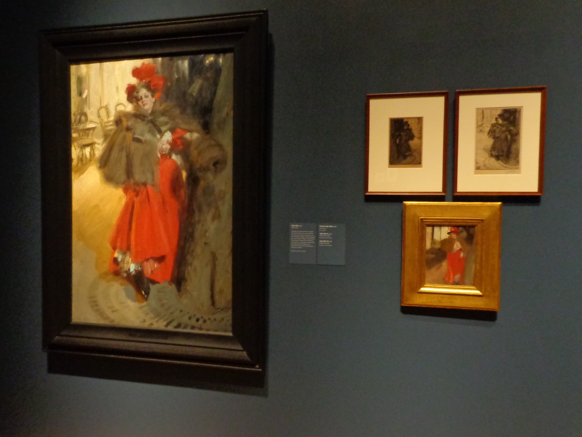
Night Effect, 1895
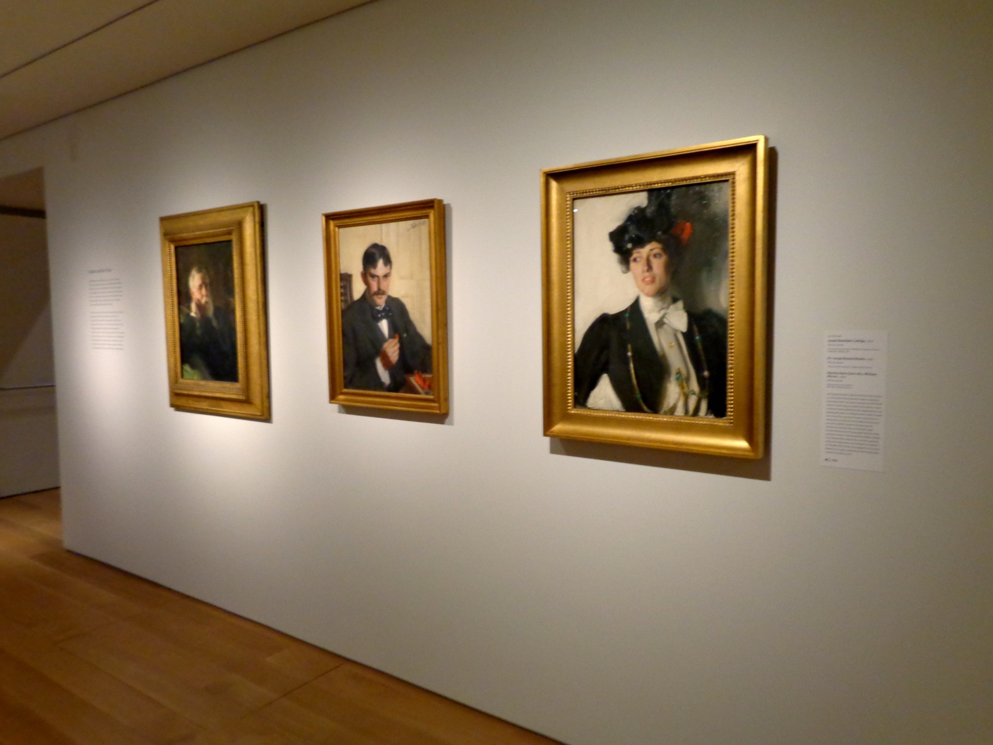
Right: Martha Dana, 1899
Left: Joseph Randall Coolidge, 1899
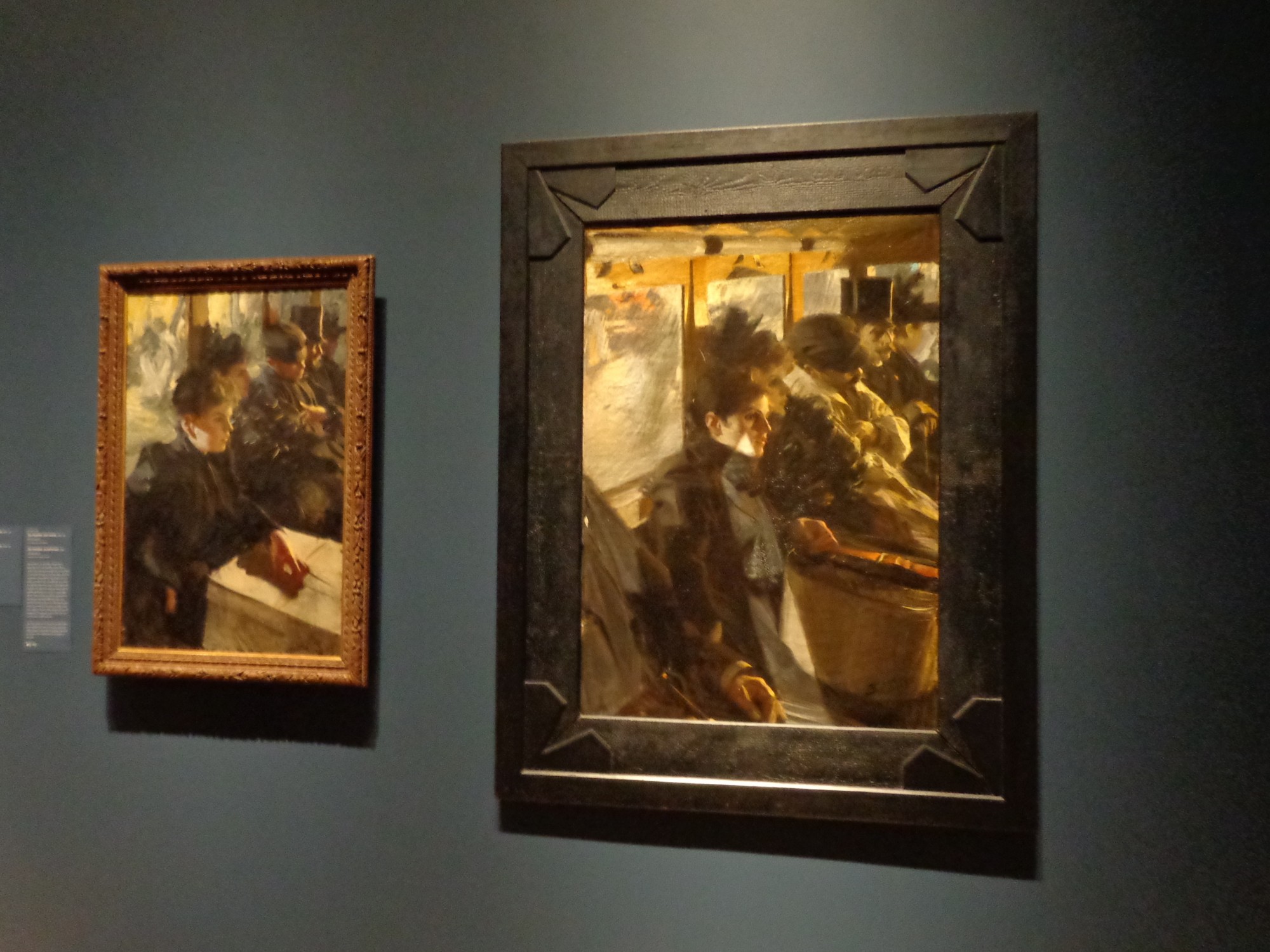
“Omnibus,” Paris 1892