Jul 12, 2013 | design
The hands of a clock and it’s frame are made of the same material – and each hand it attached to a separate frame that moves with it as it circles the space of the clock over and over again.
Two squares rotating according to the increments we’ve given time result in clean shapes at the hours and varying degrees of chaos within them. Nazar Şigaher is a designer, interior designer and artist in Turkey. He’s pursuing a Masters in the History of Architecture at Mimar Sinan Fine Arts University, just north of Istanbul.
His website tells us,
“The hour and minute hands of Frame have frames made of material identical to that of hour and minute hands. The clock constantly changes its form as the hour and minute hands keep moving and take a given form twice a day only. Such constant change of form created by moving hour and minute hands give this clock a peculiarity that identifies with the concept of time.”


For more of Nazar’s work, see his website.
Source: egedesigns.
May 14, 2013 | design, illustration
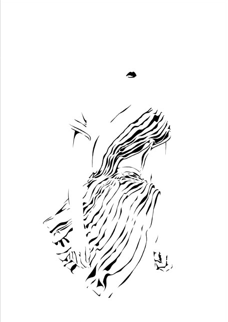
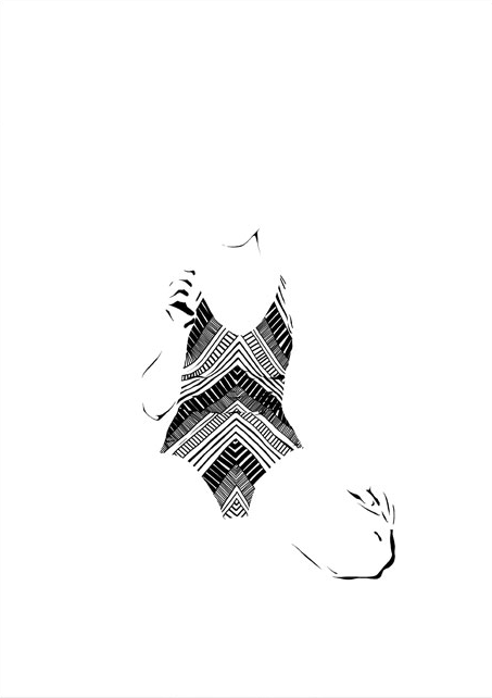
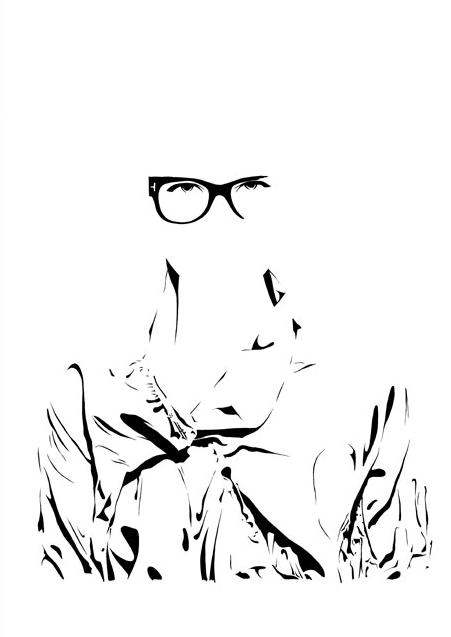
She goes by Zivabelle, and her designs and illustrations are gorgeous. So simple and clean, but always with something more to them that makes you look just a bit longer. These minimalist fashion illustrations play with black and white, visible and invisible, light and shadow. She got her bachelors in Visual Communication at Bezalel Academy of Design in Jerusalem, then headed to Barcelona to get a masters in Fashion at ELISAVA – Universitat Pompeu Fabra.

Is she there?

Wait, where’d she go?

Images courtesy of the artist’s website. Check it out for more!
May 3, 2013 | design
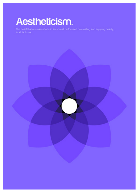
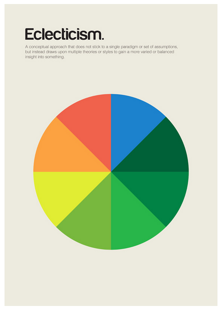
Genis Carreras is a Catalan graphic designer whose latest project turns whole complicated concepts into minimalist designs. He breaks down the essence of what ideas mean, and reinterprets them in bright colors, calling the series philographics. It began as a set of 24 posters, “But so many important ‘isms’ were left out that I decided to add more designs to the collection,” he said. So far he’s created 95 different designs after spending the past six months immersed in the project in his London studio.
He’s turning the designs into a book and a postcard set, using Kickstarter to fund their creation. He needed £15,000 for the project, and has already reached £40,721 after starting funding just a little over a week ago.


Each design includes a simple definition of the philosophy it represents, written by Chris Thomas. Each uses a bright background color topped with simple, often symmetrical shapes that interact with each other to embody concepts that can be difficult to grasp.
The designs don’t reduce the concepts, they make them beautiful and understandable, transforming centuries of theoretical debate and discussion into colors and shapes that effortlessly explain everything.


Only 25, Genis said he wants philographics to serve as a “visual dictionary of philosophy,” and previously he’s designed posters, websites, icons, album covers and more. He also made this really cool portrait of Steve Jobs out of Macbook parts with Ben Redford at Mint Digital. Philographics will be his second self-published book after writing and designing Colouring our Perceptions, a book that examines how color effects communication.
His Kickstarter profile reads:
“I love things like simplicity, books, modernism, video games, nature, London and beagles. And beer, I love beer too.”


For more about Genis and his work, see his website, his Kickstarter project page, and his print shop.
Mar 14, 2013 | design

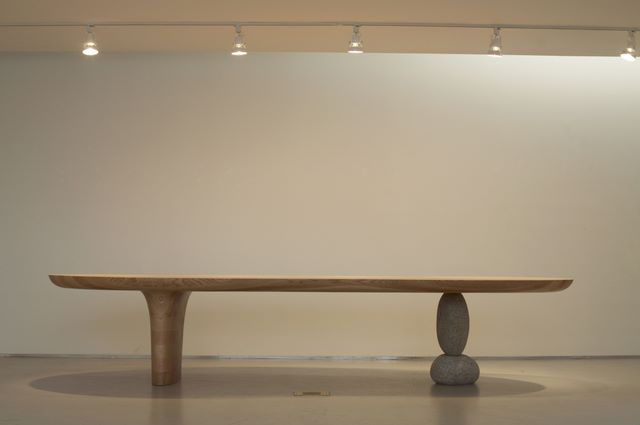
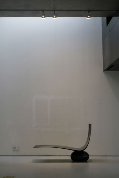
Image from artist’s 2008 solo exhibition at Gallery HANGIL, in Paju, Korea.
Byung-Hoon Choi makes seats and benches that look too precarious for real use, but you can sit on them as long as they’re not part of an art exhibition. Someone might yell at you.
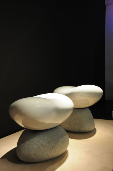
Some of these seats are made of one smooth solid piece of sculpted wood and others balance that wood on stones, playing with gravity as if it were a separate medium all its own.

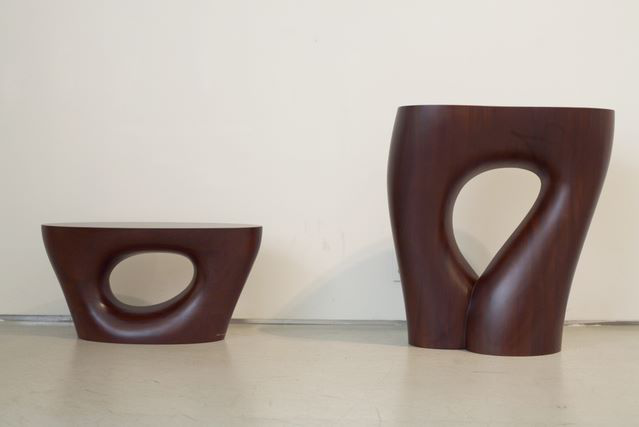
Image from artist’s 2008 solo exhibition at Gallery HANGIL, in Paju, Korea.
These stools are abruptly flat on top while their legs curve elegantly outwards until reaching the floor, a matching pair in deep mahogany. The left-hand stool is punctured by an asymmetrical hole, like a perfect tree had grown around a dinosaur egg only to be turned into a chair. The stool on the right stretches higher, an upside-down tear shape cut out of its middle makes it look more like women’s legs cut off at the hip or a really groovy pair of flared jeans.
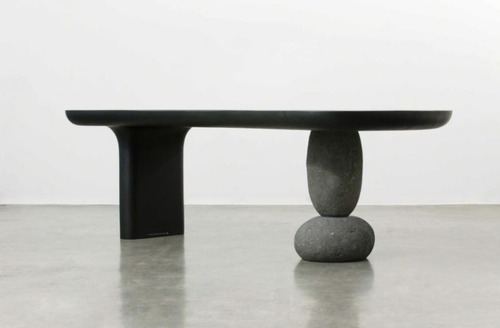
The chair below appears the most dangerous for actual sitting, but thanks to very heavy weights, balance only looks like it would be a problem. Have you ever gone to sit down when your friend pulled out the chair beneath you because he thought it would be hilarious to see you fall on your ass? That reactionary feeling of uncertainty – a subconscious verification of free fall, is what these works evoke, because to sit in them would mean trusting in the artist more than what your own eyes tell you.

Image from artist’s 2008 solo exhibition at Gallery HANGIL, in Paju, Korea.
Choi currently works as a dean and professor at Hongik University’s College of Fine Arts in Seoul, South Korea. He previously worked as the director of Hongik’s Museum of Art and his work can be found in nearly every museum in Korea including the Seoul Metropolitan Museum of Art and the National Museum of Contemporary Art. In addition to seating, he also constructs intricate sculptures along with tables and other kinds of furniture that can be improved aesthetically.

Image from artist’s 2010 solo exhibition at galerieDOWNTOWN, in Paris.
See more of Choi’s work on his website.
Mar 7, 2013 | design
When you’re a kid, a treehouse is the one place where grownups aren’t in charge. If you’re a girl it’s no boys allowed and vice versa. Only those deemed trustworthy are allowed up to the sacred space so that everyone can feel safe enough to discuss their hopes for the future – even if that only includes trying to get out of going to school tomorrow.
But treehouses become more than that when Kobayahsi Takashi makes them – a professional treehouse architect, he’s traveled around Japan and the world creating miniature spaces high up in the branches, brought to life by the fact that the very thing supporting them is alive. He writes, “…everywhere I’ve been, I’ve seen reflected in these largest and oldest of living beings the same nameless light that I’ve struggled to maintain within myself for so many years, the one that no one could tarnish and that never seemed to disappear. That comfort, that sense of calm, is something I’d like to share with as many people as possible. And it is with that in mind that I will continue with the one-of-a-kind rush that is treehouse creation, all the while carrying out my own personal dialogue with their hosts.”

Takashi is a member of the Tree People, both a company and organization that stands with trees and builds off them. Their website reads, “We who build these structures are not architects; our aim rather, through art and free expression, is to break down the feeling of separation that exists between humans and nature.”

Kobayahsi Takashi
I especially love this glass treehouse nestled in an Okinawa forest – just a little dome that transforms people into birds, letting them soar up high in the branches; plenty of windows for fresh air and with opening at the top towards the sky. This photograph was taken at just the right angle too – its obvious why they selected this tree as each side of its arms open wide, embracing and balancing the little glass dome held within.
See more Tree People treehouses in their online gallery.
Takashi also wrote a book called “Treedom” if you’re interested.


