Sep 4, 2012 | Brooklyn Museum, features, museums
 This post was meant to precede the Brooklyn Museum’s Target First Saturday this past weekend, but as it turns out, they didn’t even have it this month because of the West Indian-American Day Parade. The first Saturday of every month, the Brooklyn Museum allows free admission for everyone, and hosts a number of (pretty rowdy) events from 5pm-10pm, sponsored by Target.
But truth be told, the Target First events are pretty distracting from the art you’re there to see. The museum was packed full when I visited on the first Saturday of August, and it’s clear that most everyone is there for the drinking and music, with very few people bothering to look at all the beautiful things surrounding them.
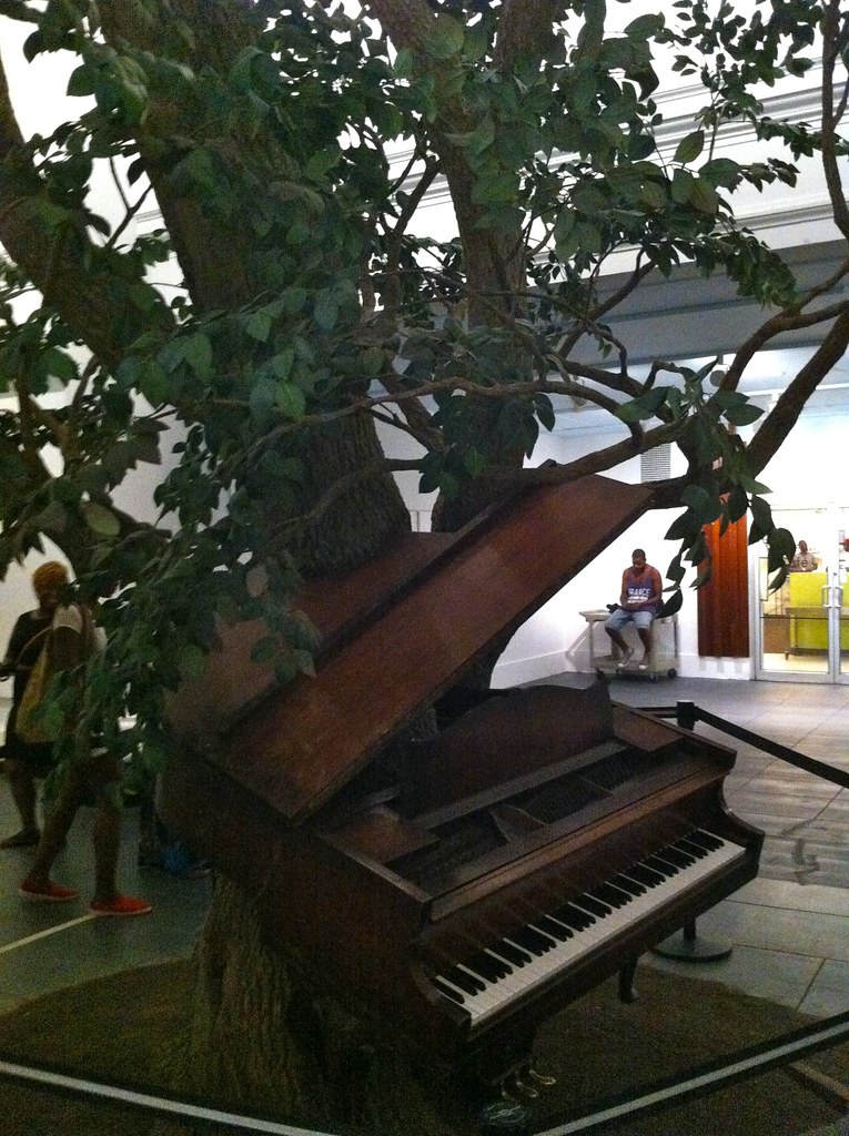 |
Blossom
by Sanford Biggers, 2007 |
The outside of the building is incredible – neoclassical architecture reminiscent of the Met, with statues of Old Testament prophets and Greek philosophers lining the exterior. You’d never guess that the inside is fully modernized with glass panels and exposed brick leading you into the center lobby that all the art revolves around.
 |
Maximum Sensation
by Mounir Fatmi, 2010 |
The first floor’s Great Hall exhibit is overwhelming. They’ve collected and curated pieces that in no way go together, but it’s interesting to compare these works that came from completely opposite times and cultures. They call it, Connecting Cultures, A World in Brooklyn and it focuses on three simplistic themes: connecting places, people, and things, with juxtaposed artworks for each section. One of my favorite pieces from the whole museum was sitting just outside this exhibit: a piano (working keyboard included) with a tree growing up out of the center of it. It’s called “Blossom,” and could have only been more beautiful if the tree was actually real.
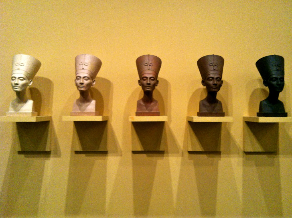 |
Grey Area (Brown Version)
by Fred Wilson, 1993 |
The first floor is also home to a pretty extensive collection of African art. The art of Asia and the Isalmic World finds a home on the second floor, and they have nearly a whole floor’s worth of Ancient Egyptian work, complete with decorated walls and ceilings matching the ancient vibe. The third floor also has a fantastic collection of European art surrounding the open court below. It’s separated by country, with translations of each description, determined by the nationality of the artist.
The fourth floor has a lot of great contemporary pieces also circling the open court, one floor directly above the European paintings. Here you can find Mounir Fatmi’s “Maximum Sensation” from 2010: beautifully decorated felt-covered skateboards skattered about on the floor. Walk a bit farther and there’s Fred Wilson’s “Grey Area (Brown Version)”, five different solid shades of the iconic Cleopatra bust lined up in the center of an alarmingly yellow wall from lightest to darkest.
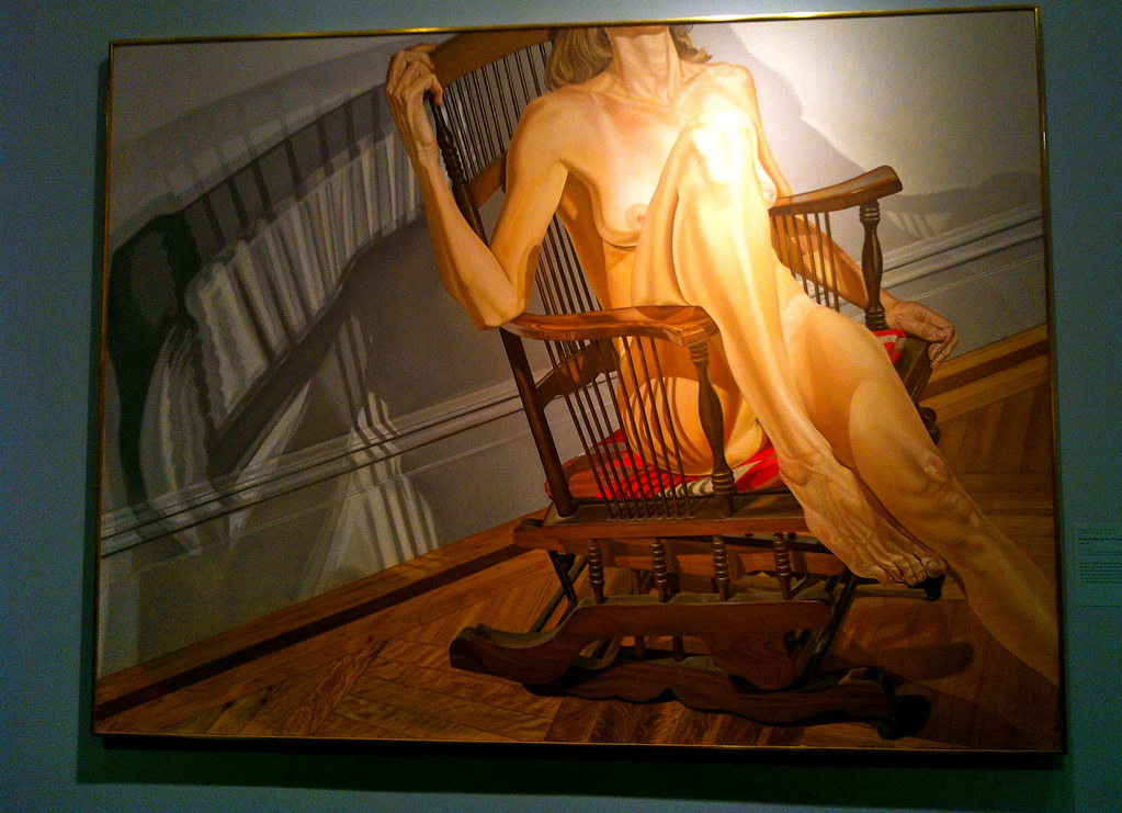 |
Female Model on a Rocker
by Philip Pearlstein, 1977-78
American Art, 5th floor |
|
|
On the fifth floor is the Luce Center for American Art, with everything from Native American artifacts to portraits of George Washington; everything from sixteenth century to contemporary American work. The most remarkable part of the museum is here on this floor: the Brooklyn Museum’s Visible Storage Center, where you can see all the works not on view, organized by numbers in clear glass cases. There’s shelves upon shelves of sculptures and rows upon rows of paintings, plus computer screens where you can search for anything you might be looking for. There’s even smaller, more fragile works stored in protective metal drawers.
I loved being taken behind the scenes in this special exhibit, and I honestly believe it’s something every larger-scale museum should have. If the works aren’t being used in a particular themed gallery, that doesn’t mean your visitors should be kept from them, especially since it’s just museum management’s decision to hide them away. Share all your art all the time – because why not?
See all my Brooklyn Museum photos in the Flickr set here.
GD Star Rating
loading...
Sep 1, 2012 | inspiration
It’s the back-to-school time of year, and for kids my age, back to school usually means away from home. To me, home is where your dog is or at the very least where most of your useful stuff takes up space. It’s a pain in the ass to haul all your things somewhere new every semester of college, but if you think about the grand number of times you’ll have to do it till you graduate, it’ll only make you depressed.
Each new dorm or apartment is an opportunity to recreate the space you spend the most time in (even if it’s only a few square feet), so this inspiration post is dedicated to everyone currently in transition.
May you settle with grace in a space that suits you.
 |
| Andrew Wyeth (1917 – 2009) – Ericksons Photo found on Tumblr here. |
This man sits patiently, hands delicately intertwined, and the expression on his face is one of near-surprise. As if he’s been looking out that same window for years and all of a sudden something’s different, someone’s arrived.
 |
by Belgian artist Henri de Braekeleer, 1877
Photo from Tumblr, found here. |
Although I couldn’t exactly tell if this was the man’s studio or his home, I imagine that as an artist the two places are pretty closely related. The objects in the painting remain somewhat still, but the floor and empty walls seem to shake and shimmer with the vibration of empty space.
 |
Henri Matisse, The Violinist at the Window, 1918
Photo found here via Tumblr. |
I love Matisse’s colored works. So many of his sketches could become masterpieces with just a little pigment. Here, the faceless violinist looks out the window as he practices. It looks like there may be a balcony indicated by the white railing beyond the windowpane, but he stays inside – almost as if he’s worried of losing the acoustics of his home, unwilling to share his sound outside.
 |
Daylight Raid from My Studio Window, Sir John Lavery, 1917
Photo found on Tumblr here. |
I’m not sure what he means by “Daylight Raid” since it seems remarkably peaceful outside the painted window, but my eye goes straight to the woman looking out of it. The funny thing about looking out windows with someone, is that you can’t both properly look out and look at each other at the same time, so here we’re left with the woman’s backside, half in shadow, as her shimmery dress falls on the couch she’s kneeling on. Perhaps those are planes and not birds in the sky, but I prefer the latter.
While searching for these selections, I found that most images featuring someone inside their home usually included a window or doorway somewhere, leading the eye out. I think that’s a good metaphor for the restlessness within all of us, and that sense of almost-relief you feel when there’s someplace new to move to.
GD Star Rating
loading...
Aug 30, 2012 | news
Starting this Sunday, you’ll be able to find a spruced-up Campbell’s soup can at Target, design courtesy of Andy Warhol. These colorful new cans are Campbell’s way of celebrating the fiftieth anniversary of Warhol’s famous “32 Campbell’s Soup Cans.”
To accompany these special soup cans, Campbell’s Facebook page has gone Warhol-wild, with a pop art filter for your photos and a memory game where you match up the new different colored cans.
Warhol had always loved Campbell’s Soup, and the company used to send him cases of it for free. “I used to have the same lunch every day for twenty years,” he said.
 |
| Warhol’s “32 Cambell’s Soup Cans,” each a different kind, made 1962. |
Initially, Campbell’s didn’t like the idea of Warhol using their cans in his work. But they decided to wait on taking legal action until the public had reacted to the piece. By 1964 the pop art soup cans had become a phenomenon, and Campbell’s even sent a letter to the artist thanking him and praising his work.
“I have since learned that you like tomato soup,” Campbell’s marketing manager wrote, “I am taking the liberty of having a couple cases of our tomato soup delivered to you.”
Story found on the ABC News blog here.
Read more about the history between Warhol and Campbell’s in USA Today’s article here.
GD Star Rating
loading...


