Apr 17, 2012 | Museum of Fine Arts: Boston, painting
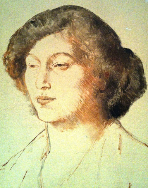
Her face is etched out in flowing lines that all follow the same path. Her hair is dark and given curls and volume in a lighter shade beneath this river of lines. Her eyes squint and look out, and she’s positioned in a three-quarter pose but her body’s only minimally sketched, bringing all the emphasis on this mostly empty canvas to the lined shadows cast by her face.
Apr 6, 2012 | Museum of Fine Arts: Boston, painting
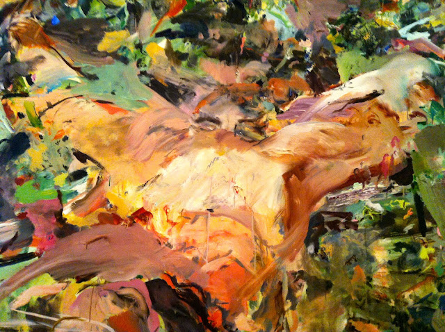
A large swath of pinky flesh-tones drips and sags as the canvas’s main attraction. The color scheme is what I love most. That’s all this painting really is anyway– random slashes and markings in colors that barely seem to go together in some places. The top layer of paint is raised, built up and sometimes too thick. Above the fleshy X is a closed pair of eyes, the eyelashes nearly lost in the color, but the thick dark eyebrows give them away.
 |
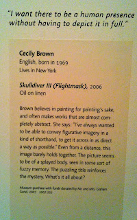
| Oil on linen. |
Mar 27, 2012 | Museum of Fine Arts: Boston, painting
 |
| Oil on canvas. This photo really doesn’t do it justice. Go see it at the MFA in Boston:) |
 |
| Sorry about the blur! The info behind it is actually really interesting. |
Standing this close, I can see every individual brushstroke. The top-most layer of paint still looks wet, splotchy and thick in places with the most color. The image shows a couple embracing– standing and holding each other as if they were practicing the tango naked. Their bodies are rough streaks of different shades of purple, the whole image a kind of group of these streaks that makes the picture seem blurry as if I was staring at it without my contacts. She holds his head delicately with her blue and purple fingers, but they both seem to be looking out of the frame, almost making an X of eye contact as their planes of vision cross each other and past us, the viewer. The matching greens and blues of their surroundings puts them in a jungle, or an ever-fertile make believe place, where the colors are much brighter and the details are much less important.
Mar 8, 2012 | MoMA, painting
Water lilies, water lilies, water lilies. One of the most renowned and beautiful pieces of art sits before me right now. I mean, I couldn’t not write about it. Or at least try. I don’t know when these paintings arrived at the MoMA, but I’m so glad they’re here. The different layers of water, white, and lillies gives the whole scene so much depth. The rich, whitest pink that reflects the clouds above, along with the dark deep shadows on the right, lets me imagine the world outside this piece, and imagine myself in it. Another layer of depth comes from the varying shades of blue, indicating which spots of the lake are the deepest within the water. The green lillies are surrounded by a light hue of purple in some places, setting them apart while blending them into the blue water beneath at the same time. So so beautiful. Everyone come see it in person. Right this second.
Feb 15, 2012 | painting, The Met
 |
| Magna on canvas. At the Met. |
The title pretty much says it all with this one. Well, either “On Deck” or “Reminiscent of a 60s Coke Ad.” “On Deck” is probably more poignant, not to mention accurate considering no one in the image is even holding a coke. Instead we see couples having another kind of drink on the deck of a cruise ship. Headscarves and sunglasses are worn by those around a red table holding red drinks. One man on the right stares solitarily into the distance, but everyone else seems to be engaged in general merriment, or at the very least conversation. This was definitely during a time when cruise ships were the exotic luxuries they started off as, and not the smelly, crowded islands of isolation they are now. The colors are incredibly rich– the bright blue sky with thin whisky clouds mirrors the blue clothing of those at the table. The woman closest to us has her bare legs in the sun’s rays as she enjoys a cigarette. The glamorous side of a regular life.
Feb 14, 2012 | MoMA, painting
 |
| Oil on canvas. It’s at the MoMA! |
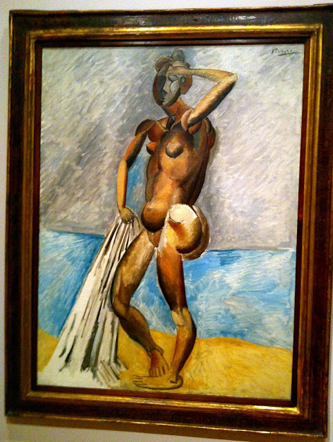
His body is shown contorted, comprised of rounded shapes derived from the natural world. Reality is not a concern in this place, a semi-composite view is even used to reveal a second butt cheek and a line of back muscle that would have remained hidden otherwise. His face is grayed and abstracted in the same fashion. His joints consist of more rounded pieces than the rest of him; each piece of his shoulder fits into the next the same way our shoulders give us the same ability. But second to his abstracted use of composite parts, comes his use of color, with dark to light gradients revealing shadows on his back and a point of light lying behind the viewer. And the abstract use of stark white on his behind and dull gray on his face complements the rest of the portraits abstract nature. He’s holding his towel that still partly lingers on the ground while wiping his brow with his other hand. His unnatural pose and abstract representation leave us with no indication as to whether he’s just had a bath or is about to. He could be really dirty or really clean, although it hardly seems to matter. Only in that it gives him a reason to be nude and on the beach.

