Art, Again

It’s funny how art can be reinterpreted. There’s a super-human group of iconic artists, the ones every one can recognize whose incredible style gets digested and reappropriated on nearly every other artist’s canvas that came after them.

I recently came across an artist who uses faces instead of canvases for a more personal kind of reinterpretation. Andy Alcala posts “Making of” videos where you can watch him perform the coolest face painting of all time; very calm and methodical, working in front of a black sheet to match the black backwards baseball cap holding his hair back. But more impressive are the collection of final photographs – dozens of repurposed masterpieces painted onto a face facing you with eyes closed.

Below you’ll find a few of his works with their corresponding artwork beside:

“You Are So Little” by Andy Warhol, 1958

From the artist’s Flickr here.


“The Persistence of Memory” by Salvador Dali, 1931

From the artist’s Flickr here.

“Nympheas” by Claude Money, 1904

From the artist’s Flickr here.

“Sailboats in Pourville” by Anna Bilinska, 1885

From the artist’s Flickr here.


“Whaam!” by Roy Lichtenstein, 1983


From the artist’s Flickr here.

There’s a really cool “Making of” video for “Whaam!” on Vimeo here.

Sometimes we apply these reinterpretations of artworks to the artists themselves. We’ve all seen the adorable little artist costumes, but I really love the dissected artists, the men in full costume with their insides painted the same way their hands did.

All photos from Vlamboyant.

Dissected Picasso: 

Dissected Van Gogh:


Dissected Dali:


Matisse: In Search of True Painting @ the Metropolitan


In 1906 Henri Matisse painted “Young Sailor I,” a roughly shaded, almost abstract interpretation of an eighteen-year-old fisherman in his neighborhood. The young man is shown sitting with his arm propping up his head, his features outlined in dark black lines, and the same green of his pants creeping up to his cheek indicating shadow. Matisse lived with this portrait he’d created for almost a year before it inspired a reinterpretation that became “Young Sailor II,” one of his most iconic works. It’s clearly the same man, his hands arranged identically and his posture only slightly improved, but his face is completely different, almost unrecognizable – his eyes elongated and spread apart and his cheek bones accentuated; all traces of green-shadowed abstraction gone. Now the sailor sits in front of a glowing pink background instead one shaded in rough random lines of orange, blue, and green. Although “Young Sailor II” is now the more well-known of the two, at first Matisse was so insecure about this reinterpretation that he originally told people it was painted by the postman.

“Young Sailor I”
“Young Sailor II”


Both of these paintings sit side by side in Matisse: In Search of True Painting, the new exhibition at the Metropolitan Museum of Art opening on Tuesday, December 4th. It presents the artist as a perfectionist, constantly reworking the same compositions to see if they could be improved upon, by using a different set colors or tweaking the arrangement. It showcases the repetitive nature he was prone to as an artist, displaying some of his most famous paintings like “Young Sailor II” alongside the lesser-known masterpieces that were created first for inspiration, allowing you to compare them directly and trace his thought process from one interpretation to the next.

Read the rest of my review HERE on Woman Around Town.


And check out more photos from the gallery in my Flickr set here.

Election night special!: Purple Art? A review of "Party Headquarters" at the Pratt Manhattan Gallery

Happy Election Day! I hope everyone didn’t have to wait too long in line. This was the first presidential election I’ve ever been able to vote in, so I’ve been excited all day, feverishly posting on Seeing Politics.

I’ve been spending a big portion of my time recently considering this election and the issues surrounding it, I reviewed and interviewed artists and the curator of the Pratt Manhattan Gallery’s new show, “Party Headquarters: Art in the Age of Political Absurdity.” I was really affected by the art in this show, and have been trying to get this piece published but so far have had no luck.

So in honor of election day, please enjoy learning about what 14 artists have to say about all the hullabaloo:
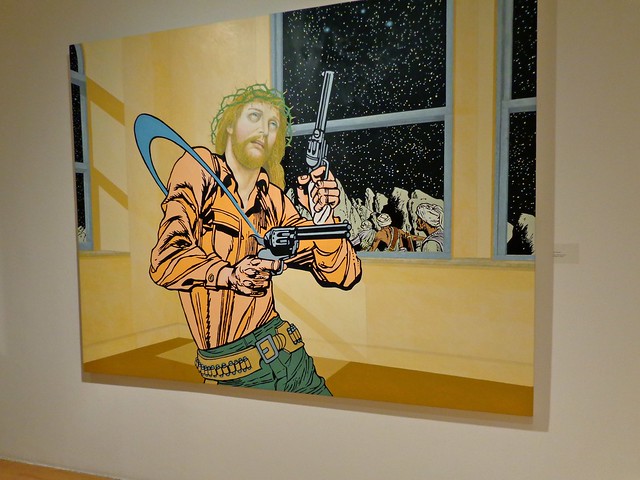
One Trick Pony, Jerry Kearns
Acrylic on canvas, 2012


A pretty bored-looking Jesus is slinging his guns around out in the cosmos while armed Middle Eastern travelers climb mountains in the background. Jerry Kearn’s painting, “One Trick Pony” is more than six square feet of acrylic irony that pairs comic book graphics with Jesus’ face painted in a 16th century fresco style. The bright colors grab your attention and the subject matter doesn’t let it go, no matter how much any ordinary American Christian would be offended.

Right now this painting is sitting at the end of a gallery room filled with other startling artworks as part of the Pratt Manhattan Gallery’s new show, “Party Headquarters: Art in the Age of Political Absurdity.” Larry Litt and Eleanor Heartney have been curating a gallery of political art for every national, state, and sometimes even mayoral election in New York for the past 20 years, but in 2012 it’s all about the money; money in oil paintings, money in acrylics, and dollar bills cut up into their own little money collages.

“There’s a certain deviousness to the money in politics now,” Larry Litt said on opening night.
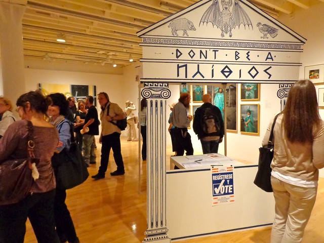
Duke Riley’s “Idiocracy (from the Greek ‘idiot’)”
Photo taken on opening night, 2012

Fourteen artists each gave their own interpretations on the state of things, and although you’d expect an Obama-rama from northeast artsy urbanites, nearly every piece criticized the system as a whole and sometimes just questioned establishments themselves, like “One Trick Pony’s” exploration of how our concept of Jesus has evolved over time. The more current political works always cast blame on both sides equally. There’s Gretta Pratt’s “Liberty Wavers,” a collection of photographs featuring low-income Americans in the same silly Statue of Liberty costume, and Mark Wagner’s money collages, cut up dollar bills with scenes or written messages like “Blood in the Water” and “Gaming the System.” Perhaps the one exception of partisanship is Peter Saul’s acrylic painting of a giant Newt Gingrich who is fist fighting little orphan Annie. Her little puppy even throws up all over Rush Limbaugh’s head in the corner.

The opening reception of “Party Headquarters” was bustling with artists and admirers, and the recessing rectangular gallery space just managed to fit all those people comfortably. The artists were excited to see their work so well received, and the show featured everything from installation sculpture and oil painting to photography and mixed media, so everyone seemed able to find something in their favorite medium that resonated.

Liberty Wavers, Gretta Pratt
Photographic installation, 2010-2012

The sun was setting throughout the reception, letting warm light flood the white walls and columns down a gallery space that bottle-necks at the window end, and culminates in “One Trick Pony” that stands alone, stretching across the entire back wall. Besides these truly massive works, the other pieces were clustered together in arranged framed collections, featuring multiple works by the same artist from the same sort of series. The overall effect suited the space well; you were able to get to know each artist a little more – an important quality in a gallery with fourteen different opinions competing for attention.

Hooray for Progress, Jade Townsend
installation/sculpture, 2011

In the center of the room stands a mini-popup tent that’s shaped and decorated like a Greek temple, and a table within it held four neat stacks of paper. It’s actually a functioning voter registration booth/art work called “Idiocracy (from the Greek ‘idiot’)” by New York artist Duke Riley, placing a real part of the democratic process within a reimagined Greek temple, updated for our new speedy lifestyles. Although I didn’t see anyone go near those forms on opening night, the artist’s description of the makeshift temple ends with real voter motivation: “Just as Aesop’s great fable ‘The Bat, the Birds and Beasts’ will tell: SOMETIMES YOU JUST GOTTA PICK A TEAM AND PLAY ON IT,” stressing that regardless of how disconnected we might feel from those who represent us, not voting undoes centuries of progress.

I spoke to the Pratt’s guest curator Larry Litt at the opening reception, who looked like he couldn’t have been more pleased with the turnout at the event. He was buzzing around, kissing cheeks in between answering my questions, excited to talk about this project he was still so passionate about after twenty years.
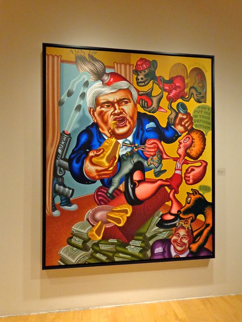
Newt Gingrich vs. Orphan Annie, Peter Saul
Acrylic and alkyd on canvas, 1995

He said this year was different from all the others though, mostly because of how corrupt our campaign finance laws have become. Although some pieces in the show diverged, most did seem to have a similar message: money is ruining everything and we’ll never get anywhere if we keep letting it. Larry talked about the fact that no one wants to donate now because your $10 or even $1,000 will be drowned out by billions and billions of donations on the other side, so only those willing to shell out six figures or more have any sort of say, because you know, money equals speech. He seemed really concerned about this exclusion of the American public from their own government and passionate about doing something to fix it. 

“We feel that this is what we can give back to the art world,” he said, going on to explain how important it is that there’s productive discourse about all the terrible places where our politics have gone wrong. Although he admitted that the artists themselves were predominately liberal, he stressed that the pieces themselves aren’t partisan, because it’s that very divide between red and blue that is stopping all the progress we could be making – and the American people know it, even if Washington is still covering it’s eyes with dollar bills.

If you’re interested in publishing, I have also written in-depth interviews with two of the artists from “Party Headquarters,” Michael D’Antuono and Jade Townsend.


For more pictures of the gallery, check out my Flickr set here.


From concrete to abstract: a conceptual evolution of the chair

Socrates had a theory about how we know things exist – I’ve been trying for a while to find a way to explain so it makes sense, but this excerpt from HistoryforKids.org (not embarrassed:) breaks it down better than I could:

He thought that everything had a sort of ideal form, like the idea of a chair, and then an actual chair was a sort of poor imitation of the ideal chair that exists only in your mind. One of the ways Plato tried to explain his ideas was with the famous metaphor of the cave. He said, Suppose there is a cave, and inside the cave there are some men chained up to a wall, so that they can only see the back wall of the cave and nothing else. These men can’t see anything outside of the cave, or even see each other clearly, but they can see shadows of what is going on outside the cave. Wouldn’t these prisoners come to think that the shadows were real, and that was what things really looked like?

I like to think that art developed alongside this same kind of idea – beginning at creating exact replications of reality for documentation purposes, evolving and evolving into billions of beautiful interpretations until the invention of photography slingshot substantive art into billions of other possibilities, but all the other types – the Untitled’s with no beginning or ending or purpose now have an easy way out with clicks of technology.

A chair started out as just a chair and became interpretations of what a chair looked like – sometimes colorful sometimes abstracted – and then moved into the concept of sitting down, resting and comfort, and now has moved into realms of design, rethinking how we’re able to manipulate the construction of chairs in the first place.

I want to create a series out of this thought, posting artworks that focus on an item or idea and move from the most realistic to the most abstract representations of that thing in art, as we move chronologically. If you think I’m missing a work that belongs in the line – if I leave out your favorite representation of a char for instance – and you want me to add another piece to the post, send it on over!

Van Gogh Chair, 1888-1889
for more works by Van Gogh, check out the Van Gogh Gallery here🙂

One and Three Chairs by Joseph Kosuth, 1965

This is another kind of concept along the same lines – how many ways can you represent the same thing?

“Kitchen Chair” by Küchenstuhl, 1965
found here

Man in a Chair, 1983-5
A portrait of Baron Thyssen by Jean-Antoine Watteau
(from the Tate catalogue) found here
Roy McMakin, paintings with chairs & sculptures of chairs, 2006, installation view
Courtesy Matthew Marks Gallery, New York and James Harris Gallery, Seattle, Photo: Mark Woods
found here
Rocking Wheel Chair By Mathias Koehler
found in this post with a lot of other cool chairs

Laocoön & Roy Lichtenstein

Laocoön’s story comes from a lost play by Sophocles, that we know about through mentions by other Greek writers. He attempted to prove that the Trojan Horse was a trick by throwing his spear at it, but snakes were sent by Poseidon to stop him, and were thought by the Trojans to mean that the horse was sacred and not to be touched. Some versions of the story say that Athena blinded him first and then sent the snakes, but either way the gods were with the Greeks.

The sculpture of Laocoön and his sons Antiphantes and Thymbraeus being strangled by the serpent is attributed by the Roman writer Pliny the Edler to three sculptors from the island of Rhodes: Agesander, Athenodoros and Polydorus. 
I remember the first time I saw this sculpture in my introductory art history class, and it was one of those right-where-you-wanna-be-in-life moments, after spending two years chasing majors that didn’t click. 
This rendition by Roy Lichtenstein is one hell of a take – at this point in his life, he’s developed a recognizable style that can be applied to almost anything. He turned all of art history into bright, cartoonified refinement, using Ben-Day dots for shading and colors galore. This Laocoon evokes the struggle and aesthetic of the masterpiece that inspired it, but makes it more of a lighthearted reference to one of the most influential works of art of all time – sort of nodding at it in thanks for all it’s contributed to the craft of aesthetics and beautiful things.
Cubist Still Life, 1974
Frolic, 1977
Channelling surrealism:)

You can see the rest of the Roy Lichtenstein retrospective on the Art Institute’s website here.

And the rest of my pictures from the Art Institute in Chicago here.

Palettes of Powerful Painters

 So amazing that these palettes are still around to be blogged about. I’ve placed each one next to one of the artist’s works as a kind of not-quite before and after. I think Seurat’s is my favorite – his transition from dark to light on the palette is not only really beautiful but probably pretty functional as well. 
All the palette photos were found on this post on Retronaut.co.
Pierre-Auguste Renoir, 1841-1919
The Luncheon of the Boating Party, 1881

Edgar Degas, 1834-1917

Dancers in Blue, 1899

Georges-Pierre Seurat, 1859-1891

La Grande Jatte, 1886
Paul Gauguin, 1848-1903

Tahiti Women on the Beach, 1891
Vincent van Gogh, 1853-1890

The Bedroom, 1888
See more at the Van Gogh Gallery
Eugene Delacroix, 1798-1863
Liberty Leading the People, 1830