Feb 28, 2013 | illustration, interviews, painting
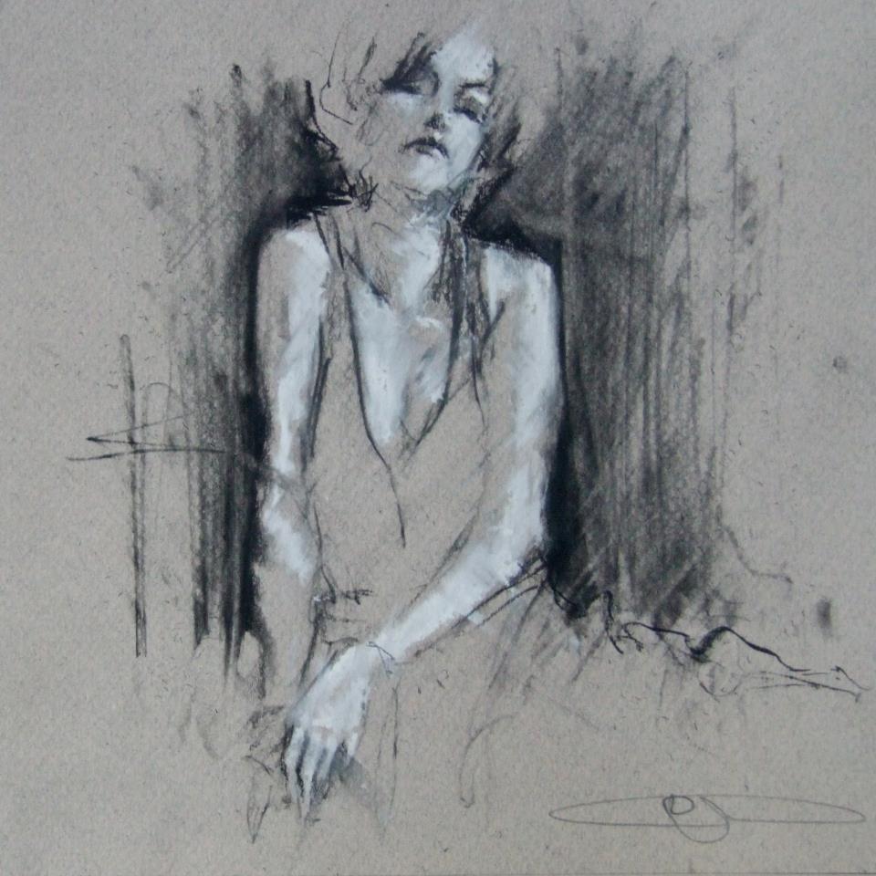
From his series, “Where the crows fly on their backs.”
We see her through smoke, the black outlines only revealing what’s necessary and letting the rest of her float away. Her skin is luminescent in white chalk that’s used to cast shadows across her body, left side glowing and right side faded, but her high cheekbones pick up light on both sides. Her head tilts back, and even though there’s no way to know for sure if her eyes are open, it somehow still feels like she’s looking at you because she knows you’re looking. After all, someone this beautiful must always have eyes on them.
Guy Denning’s impulsive sketching masterfully reveals something beautiful, usually a person, which is probably the most beautiful thing there is. The faces he draws use heavy shadow and sometimes a filled in background to emerge from the lines and paper, but they always come to life with the movements of the sketch, made so obvious that you’re able to imagine the process of each drawing coming to life.
“And the other heads FIST
Since they’ve lost the desire to even try
And instead look ahead.”
conte and chalk on paper
30 x 40 cm
12th February 2013
What usually inspires the creation of a new image?
Ideas come from all over the place. Usually it arrives to a canvas after it’s sat in my head for a couple of months, and I’ve drawn it a couple of times. I’ve got more ideas in my head than time left to do ’em.
How would you define neomodernism?
No more than what’s defined here. In fact there’s a lot on my blog about methods, ideas and inspiration.
From Guy’s blog: “The Post-modern is useful only in terms of further defining Modernism from its origins and is essentially only a continuity of modernism – sometimes termed hyper-modernism. These are all useful, to a greater or lesser degree, in terms of avoiding the ideas of the ‘end of (Art) history’ but with regards to the actual creation of artworks they are invalid. People do not set out to create a work of ‘Post-modern Art’. If we must have a new label, let it be a New Modernism – a return to the critical aesthetic giving the artist the opportunity to create work that has some relevance to the new modern audience – an audience already familiar with ‘modern art’, where validation of quality is not founded on post-modern hyper-obsession with language and semiology and the artist is not ground into politically correct subservience. I do not see this as a retrograde step – it can be the only way forward – to let the artist communicate without the bonds of corporate and state art politics.
To those claims of ‘Art is Dead – long live Art’ –
Post-modernism is dead – long live Neo-modernism.”
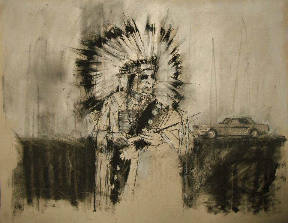
“AIM, the second battle of Wounded Knee (February 1973)”
conte and pastel on paper
66 x 55 cm
28th February 2013
What do you hope your pieces accomplish?
The most I can hope for is to emotionally move a viewer. Everyone brings their own lives and history to anything they look at, listen to or read. Consuming culture is as specific to the individual as making it.
When did you first begin painting and why?
I was drawing from childhood and I think that’s where my competency came from. I did little but draw and read – I certainly didn’t mix with other kids. First oil paintings were done at age 10 or 11 after my dad gave me a set of oil paints that he’d got bored with (a passing hobby in his 30s). I was hooked from the start.
Guy Denning is an English artist who’s been creating since the early 90s, and his work has been featured in exhibitions all over the UK as well as in Germany, Italy, France, and the US. You can see more of Guy’s work on his website, and all of these images come from his Facebook, which is filled with more things worth describing than I could ever filter into one post.
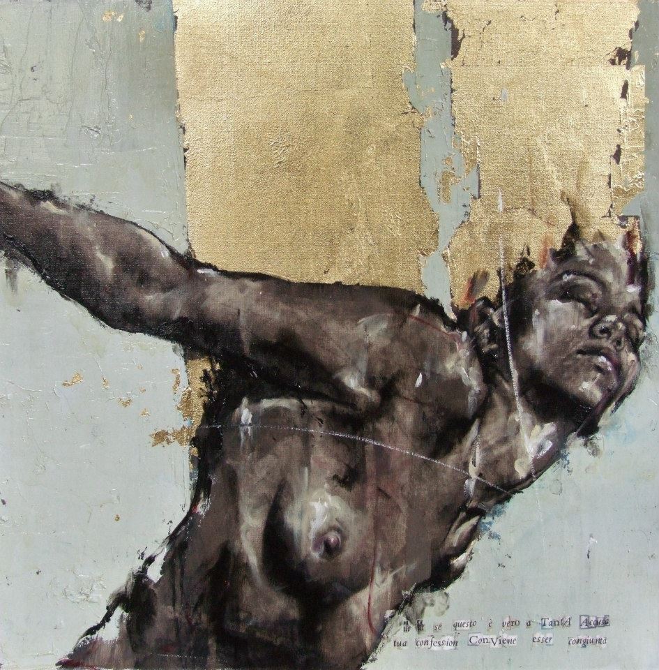
From the Purgatorio show, 2011 “dì, dì se questo è vero a tanta accusa tua confession conviene esser congiunta”
Feb 25, 2013 | illustration, painting
Artist and illustrator Beatriz Martin Vidal draws children in such an incredible way, highlighting their purity and innocence with simple shadows and sharp colors. The arresting colors – the ones that really make your eyes pull the car over – are usually only applied to flowers and other visual accessories, contrasting with the child and his monochrome background in a meaningful way – suggesting connections between youth and vitality while always maintaining a somber undertone about how fleeting all of it is anyway.
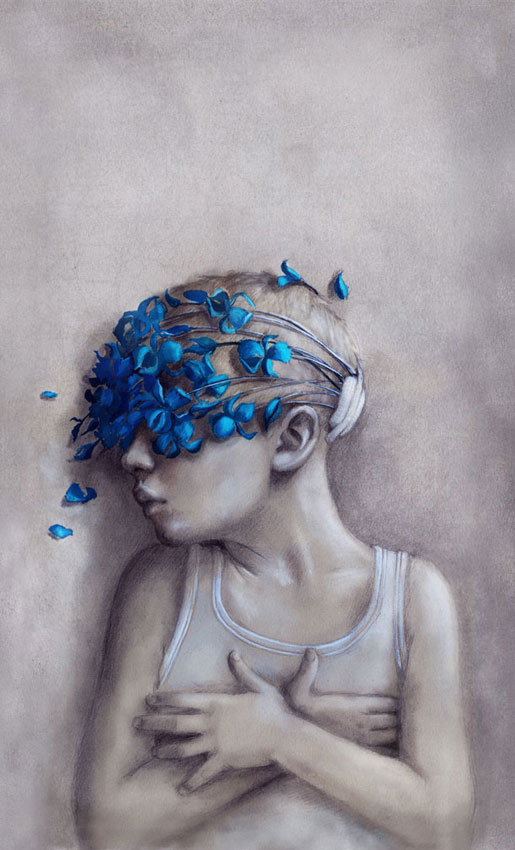
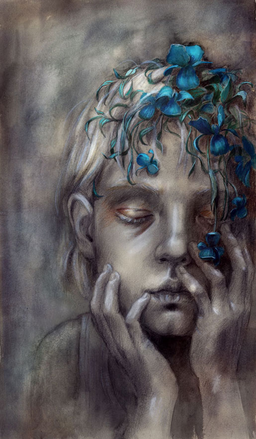
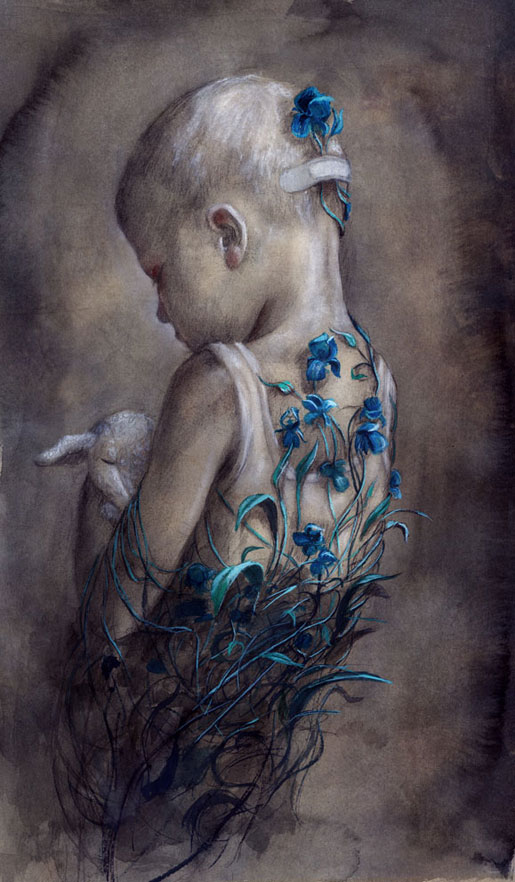
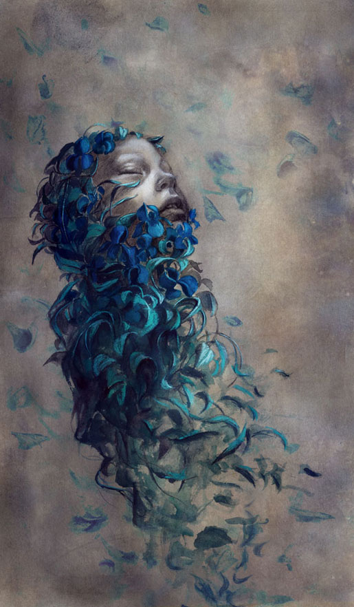
This collection is titled “birgit” in Vidal’s gallery of novel illustratons, and here she uses these stunning bright blue flowers to metaphorically encircle the beautiful children. Here they’re drawn in white tank tops with disheveled hair, creating a link to poverty and want – two things a child should never have to experience for herself.
In this first work the flowers cover the little boy’s eyes, stemming from a bandage at the back of his head, creating a blindfold on everything outside his own imagination, protecting him from whatever caused the need for a bandage in the first place.
In the second we see what to me looks like a little girl’s face, although her hair is cut short just past her ears. She sits, eyes closed, holding her face in her hands with eyelids tinted gold, as the bright blue flowers blossom and cascade down her forehead.
In the third work, a little boy stands with his back to us, holding his bunny/sheep stuffed animal close to his chest with his head cast down toward it. The flowers creep up his back, vines growing up from the depths and encircling his tiny frame.
In the last illustration the flowers have almost whisked the whole child away to someplace safer, only her face still peeking through the petals, turned up towards the sky with eyes closed and an expression of gratitude and peace.
See more of Beatriz Martin Vidal’s work on her website here.
Feb 18, 2013 | painting
These characters come from the 1699 French novel Les Aventures de Télémaque that fills a gap in Homer’s Odyssey, telling of Ulysses son Telemachus’ educational travels with a mentor that turns out to be the goddess of wisdom Minerva. The author Fénelon tells of how Telemachus fell in love with this beautiful nymph Eucharis but his duty as a son demanded that he leave her and find his missing father.
In this scene they say goodbye, an image that David makes so powerful and real with a warm white light that sets their light skin aglow. Telemachus stares straight out at us, his face still babyish and framed by blonde curls, like a lamb who doesn’t know to be scared as it’s naively lead toward slaughter. That’s not what happens in this story though. Telemachus is rewarded for sacrificing in the name of his father, and at the end of the story he learns his mentor has been the goddess of wisdom this whole time and he reaches Ithaca safely and smarter and stronger than ever.
Eucharis wraps her arms gently around his neck, leaning her head on his shoulder, eyes downcast because she knows she’s about to be left behind and there’s nothing she can do about it. Telemachus has his right hand placed gently on her leg as a temporary consolation prize, holding his spear in the other hand, fingers spread across it as he leans back and acknowledges the viewer with his sad blue-eyed stare. A skinny ghost of a dog peeks his head out of the darkness in the right-hand corner, staring up at his master as another faithful admirer, but perhaps one that actually gets to come along.
This painting currently belongs to the Getty Museum in LA whose website reads, “David painted The Farewell of Telemachus and Eucharis during his exile in Brussels. The use of saturated reds and blues contrasted with flesh-tones and combined with a clarity of line and form typifies the Neoclassical style, which is characteristic of David’s late history paintings.”
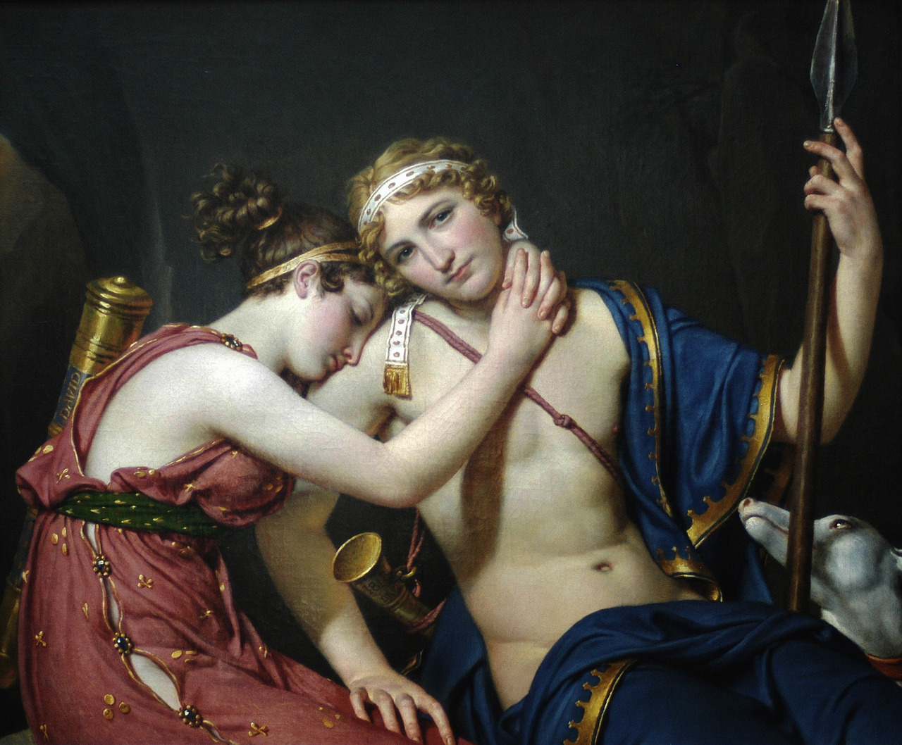
“The Farewell of Telemachus and Eucharis” by Jacques-Louis David
French, 1818
Oil on canvas
34 1/2 x 40 1/2 in.
For corrections and additions to my telling of this French novel, please email me. I did a good amount of research but unfortunately I can’t speak French and may have got a few things wrong.
Feb 14, 2013 | painting
Marco Grassi is an Italian artist working in Milan, and his artworks are all casual colorful interpretations of people – usually sexy women. Some of his styles are looser than others, letting the color scribble across or swath wherever they please. His lines are always perfect though, each knowing exactly where that body part would emerge from the sometimes empty, sometimes patterned background.
Each of these women have so much personality behind their simply drawn expressions, but it’s always some form of happiness: peace, excitement, and especially “come hither.”
The piece below was my absolute favorite: the girl closes her eyes with so much serenity, like she’s finally free of a what used to be an excruciatingly heavy burden. Her hair shines, picking up reflections of gold and yellow, and the horizontal wooden striped pattern covers her skin in purples and pinks, like colors coming in the wind. A beautiful trusting face beneath a reflective color filter, applied by the artist’s hand to accentuate parts of her face and body in purple and gold.
See more of Marco Grassi’s work on his website here.
Feb 5, 2013 | painting, sculpture
I’ve always found the whole “paragone” thing so interesting. Paragone is the Italian Renaissance word for the competition between different media, often referred to as the competition between the arts. In the contemporary art world the idea doesn’t really translate since media are often crossed over and blended, either in one image on a computer or physically in one place. Most artists today refuse to classify as themselves as a “painter” or a “sculptor,” but I really feel like the limitations of traditional media force artists to push themselves and their craft in a way that doesn’t happen often anymore.
When artists broaden their scope to include anything and everything – concepts from every range of the human experience along with every kind of media available – there isn’t the obsessive, hyper-attuned focus that’s needed to create something powerful. All good works have to have something obsessive about them, whether it’s one idea or one media. Before photography that obsessive bit usually involved an incredible faithfulness to reality.
 |
| Triple Portrait of Cardinal de Richelieu by Philippe de Champaigne and studio, c. 1642 |
During the Italian Renaissance when this word was floated across the lofty circles of artists and patrons, that competition of the paragone was completely focused on the work’s faithfulness to reality. These patrons were paying scudi by the thousand so that us, the people who live thousands of years later, could still remember what they looked like.
The portrait bust below was completed after Bernini’s model of Cardinal Richelieu, a portrait the Cardinal didn’t sit for. Bernini created the sculpture solely from examining the painting of the Cardinal above, sent to him and completed by Philippe de Champaigne. Bernini was known to be actively involved in the paragone discussion, and this opportunity to create a portrait sculpture purely from a painting is often seen as one of the best examples of Bernini proving sculptures place among the arts.
 |
White Marble Bust of Cardinal Richelieu, after the model by Gianlorenzo Bernini
French, mid 19th century, from Christies
|
Although the painting of Cardinal Richelieu lights up the screen with all its color, at a time when works couldn’t just be reproduced a million times over, I imagine sculpture would have been the more impressive medium. It know it’s a lot easier for me to connect with an object that exists in my space rather than in a set scene somewhere far away. But painting also allows for more possibility – it can take you out of your space to an impossible one, while sculpture is limited physically, in the same ways we are.
What do you think: painting or sculpture?
Feb 1, 2013 | installation, interviews, painting
 |
| Sophia Ainslie’s mural in progress on 1/30/13 at the Kingston Gallery |
On Wednesday I was lucky enough to meet with Sophia Ainslie, a South African artist who’s currently working on a mural at the Kingston Gallery in Boston’s South End. Right now I’m working on
an Artscope post about this new show “in person,” but I needed to write something else too because it was just so incredible to watch that mural come to life.
 |
| Mural with projection. |
Sophia had three trained assistants painting while I was there, two up on ladders filling in bright colored sections and one standing, tracing the lines coming from a projector. The projector contained a zoomed in section of the wall’s intended design, made with a computer that was used to combine works from “Fragments,” the drawing series Sophia has been working on for the past four years.
 |
| Sophia Ainslie (right) instructing an assistant. |
She made a number of murals from this same series last year, but this is the first time she’s ever used assistants. She told me she wanted to see how much of the work she could give away, kind of like Sol LeWitt but without giving it all up – more like Frank Stella she said. She wants the concept to be hers, but she was still very particular about how the assistants painted, she trained them and walked them through the process, overseeing the wall’s development every step of the way. “I’m a painter,” she said, “I’m seduced by the architecture of paint.”
 |
| Paper works for “in person” at the Kingston Gallery |
The lined sections of this feathered, almost camouflage-like design, were inspired by landscapes, but the ones seen beneath her feet so that she’s involved in what surrounds her. The colored bits are abstracted interpretations of her mother’s last X-ray, before she made the decision against surgery for cancer at the age of 82. Sophia has been developing this series since her mother’s passing in 2009, and now the horizontal large-scale medium of the mural is allowing for a release, “This is more about a letting go,” she said, “all the other images were vertical and more about the body. This is a release of her.”
 |
| Sophia Ainslie (right) instructing an assistant. |
 |
| Mural with finished design taped up. |
See more of Sophia’s work on her website here.
And read more about this show in my Artscope post!


