Sep 25, 2012 | news
A new study done over the summer tries to prove that the jargon and language perpetuated in the art world has stepped over a threshold, and become its very own language termed International Art English. It’s still English, but includes a rejection of most nouns and remains limited to a small group of phrases and ideas.
 |
| Work by Jessica Krause Smith – photo by me:) |
 |
| Photo courtesy of Rory MacLeod on Flickr |
Alix Rule, a Columbian PhD candidate in Sociology, worked with New York artist David Levine to create the study that’s based on actual data and published by Triple Canopy, an online magazine that facilitates research projects like this outside the usual realms of academia.
A lot of the research is gathered from word counts and comparisons art journals and critiques in addition to collecting and examining 13 years worth of museum press releases and artist newsletters from e-flux, the online institution of the international art world.
IAE has come to be characterized as a mix of spacey terms like “parallel” and “void,” with abstract inconsistencies and prefixes; where words like “real” and “space” are used hundreds of times more often. There’s a distinct rhythm and vocabulary that’s recognizable immediately; it’s described in the study as having “pornographic” tendencies because you know it when you see it.
Words like radically, tension, and autonomy are used to describe art that serves to, functions to or seems to interrogate, transform, or displace something or other.
Although it is definitely a distinct subset of English, IAE shouldn’t necessarily be considered as worthy of having it’s very own language, especially given that everything it consists of actually is English, just arranged in a particular way and with similar words and meanings. Writing about art became such a difficult thing to do – attempting to grasp at what’s become an increasingly vague art world where everything is mostly “Untitled” and is open to millions of interpretations on purpose. What do you say about something like that?
Read more about the origins and spread of IAE in my new article on Artsia here!
All quotes come from the Triple Canopy study cited, which you can read in full here.
Sep 17, 2012 | art history, news
If you spend any time on the internet at all, you’ve probably noticed the swanky new features Google has been adding to their searches.
One of the coolest new features is the little drop-down artwork list that pops up whenever you search an artist’s name plus the word “artwork.” Google automatically arranges the pieces showcased here by search popularity, thus inspiring this new series, “Google, what’s my masterpiece?”
 |
| Screen shot from my iPad:) |
I think it’s so fascinating that the entire portfolio of an artist’s life and work can be stripped down to six pieces and a little blurb, and although some might consider this trivializing, I think it’s a great way to appeal to those outside the typical art community. It shows the basics in a really useful way, at the same time ranking the artist’s works by how many people know about them enough to search for them; how many people want to learn more.
Clicking on each work takes you to a Google search of that painting individually, including the right-hand breakdown of the work which gives you a background summary, year it was completed, artist’s name, dimensions of the work, genre, media, and artistic period during which it was made.
 |
| The Kiss, 1908 |
This week I’m starting with Gustav Klimt, the Austrian painter who used a collage-like sometimes called “symbolism” style to create lofty dream-scenes that are too beautiful to be real. Obviously his incredibly famous work “The Kiss” was the very first work listed on Google, although it was probably given a big boost the day Google chose to showcase this work in their logo as a way of honoring Klimt’s 150th birthday this past July.
Coming in second is Klimt’s Portrait of Adele Bloch-Bauer I, created in 1907. Klimt also made a second portrait of this woman that’s listed fourth on Google. Adele was the wife of a wealthy industrialist, Ferdinand Bloch-Bauer, who was a patron of the arts and a supporter of Gustav Klimt.
 |
| Portrait of Adele Bloch-Bauer I, 1907 |
 |
| Adele Bloch-Bauer II, 1912 |
Can you imagine what the artists would think if they knew we were arranging their works based on how SEO-friendly they’ve become? What do you think about the way technology is simplifying our art intake?
Sep 15, 2012 | Brooklyn Museum, features, news
 Thanks to all the fabulous technology now available, GO Brooklyn Art’s Open Studios weekend was a huge success. It was hard to tell at first though, since everyone participating was spread out all over Brooklyn during two full days (well, from 11am-7pm), but judging from the statistics just released (you can see all of them at the end of this post), there were more visitors than artists which at first seemed a hard feat to accomplish.
More than 1,800 artists in Brooklyn (can you believe there are that many artists in one borough?) opened their studio doors last weekend to whoever wanted to come by. And thanks to an awesome website set up by GO Brooklyn Art, visitors could peruse the works of participating artists and set up an itinerary of people and pieces they wanted to see for themselves. A neat little accompanying app let you take your profile on the go so that all the info you needed was right there in your pocket. You could register as a Voter online, and after checking into at least five studios with unique check-in numbers posted at each studio, you’re able to vote for your three favorites – and the three artists with the most votes win a spot at an exhibition hosted by the Brooklyn Museum.
Each studio was marked with a little “GO Brooklyn Art” sign, making them easy to pick out, plus specific instructions on what apartment number to buzz and which artists were in the building. Mostly there was an uncomfortable feeling of walking into someone’s home, but the spaces where multiple artists worked together and lived somewhere else were my absolute favorite.
What I didn’t realize when first looking at a map of Brooklyn, is that the place is actually gigantic, and venturing from one specifically chosen studio to the next required either a lot of walking or subway rides that added up. After checking in to the first studio on my itinerary and finding the next closest at least two subway stops away, I opted for proximity over itinerary, moving to the space on the map with the most studios in one place.
Once I had the strategy of it down, getting to meet the artists in person was actually a really great experience. They really wanted first-viewer opinons of their work, and listened to what I had to say. They wanted to know where I went to school and why I came all the way out to Brooklyn by myself. I was able to hear from the artists themselves why they created what they did and what it meant to them.
Now I’ll just give a little synopsis of each of the six studios I was able to visit (before the time constraints of weekend homework set in):
1. Chadwick Augustine: sculpture, mixed media, installation
Kind of like sculpture for a giant, Chadwick’s work was simplified large-scale shapes that looked impressive when gathered altogether.
>GO Brooklyn Art profile
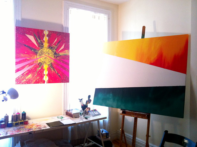
2. Clark Goolsby: painting, sculpture, mixed media
Clark’s paintings were my favorite, like an explosive collage made from bright colors and shapes, every once in a while a recognizable animal or image.
>GO Brooklyn Art profile
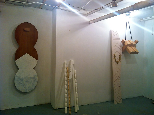
3. Jessica Krause Smith: painting, photography
Her paintings were whimsical chaotic canvases and her photographs were organized compositions, so it made sense when she said “the fulfill completely different purposes in my life.”
>GO Brooklyn Art profile
4. Ian Pawelec: painting
His work was inspired by the “spiritual search we all experience,” striving to “illustrate the energy of life within the universe” through abstract painting, which usually I don’t buy, but all his pieces looked like abstract planets exploding with color.
>GO Brooklyn Art profile
5. Peter Daverington: painting, video/film/sound
Using his canvases as a silly interpretation of propaganda, Peter’s pieces combined stylistic themes and recognizable images to bombard the viewer with a colorful joke.
>GO Brooklyn Art profile
6. Sepideh Salehi: video/film/sound, mixed media, drawing
Her studio was tiny, and so was a lot of her work. She paints individual frames of a film and pieces them together, as if the canvas could move, letting the whole image swim in the color of paint. The image below is a picture from the film, where a girl in a cape is running and running.
>GO Brooklyn Art profile
Open Studios Statistics: (from GOBrooklynArt site)
- Estimated visitors: 18,000
- Estimated studio visits: 147,000
- Total participating artists: 1,708
- Total neighborhoods with participating artists: 44
- Total registered voters: 10,319
- Total voters who checked in to at least 1 studio: 6,106
- Total voters who checked in to at least 5 studios and are therefore eligible to nominate: 4,929
- Total studio check ins: 48,918
- Average number of studios visited per participant: 8
See all the pictures of these artists’ work, plus some really cool Brooklyn street art in my new Flickr set here!
Sep 8, 2012 | news, political art
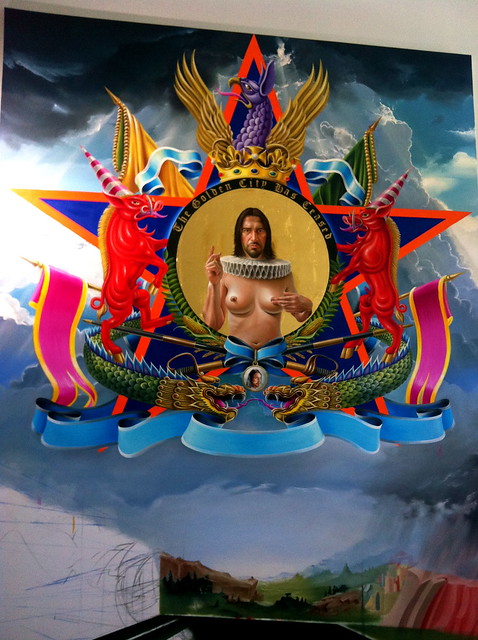
The Divided State of America is a collection of huge spray paintings by renowned artist Chor Boogie, all with representations of the issues we’re facing in modern politics. The exhibition was shown throughout the Democratic National Convention in Charlotte, NC, with all events hosted by entrepreneurs.
They also hosted a symposium yesterday afternoon during the convention, gathering prominent minds in different fields and asking them fundamental questions about why America is so polarized right now ,and how we can resolve all these huge differences before the election.
This collection will also feature at a later series of public events around the country in preparation for the presidential election in November.
For more info check out their Facebook page here.
And you can read the original story on BrooklynStreetArt.com here.
*****************************************************************************************************************************************************************
They’re powerful images for sure, almost too violent – although I suppose it could be argued that the current state of things warrants all that harshness.
I spent a good part of yesterday catching up on all the major speeches from both conventions, and the differences in the rhetoric were absolutely ridiculous. It was like they were speaking two different languages.
Like with climate change: Mitt Romney made a sarcastic face 16 seconds too long while everyone in the room cracked up at the “sea level rising” – and Obama treats that same issue with the seriousness and respect of our children’s futures.
The differences are too big now. The gulf is so wide that understanding and compromise now seem so impossible, because hard-heartedness and violence has filled up that space.And these spray paintings by Chor Boogie certainly have that intense quality to them. Almost like propaganda for a war. It’s them versus us – the powerful few against the less powerful many.
 |
PAIN AT THE PUMP
One side advocates the use of nuclear power and the expansion of oil drilling. The other for the construction of windmills and solar panels. And yet, both solutions are not enough – waning resources are insufficient to support America’s continued consumption, and the economy is suppressed by Wall Street, continuing wars, and our unsustainable growth. The same gas that fuels American productivity forms the noose that may one day hang us.
Can America pledge allegiance to finding sustainable solution? |
 |
ANNUIT COEPTIS
On every dollar bill, the Great Seal of the United States seals our fate with Annuit Coeptis, Latin for “He approves of the undertakings.” Since the Citizens United decision, centers of power – not the individual – approve of the undertakings of American politicians over the heads of working citizens. Atlas-like Americans have been rendered silent by this influence in a society intended to be of the people, by the people, for the people.
How do we restore the voice of the people as the political authority in the United States? |
 |
THE PURSUIT OF HAPPINESS
For a nation built on the idea that all men are created equal, prejudice divides us at the polls and on the streets. Gone are of Lincoln’s log cabins and the fifty years since we sent man into space, and yet our youth are still targeted by “the man” and his manmade means of oppression. The Pursuit of Happiness remains in fierce competition with the deadly forces of injustice, prejudice, and inequality.
How can all Americans be truly endowed with the inalienable rights of life, liberty, and the pursuit of happiness? |
**All captions and images from the Divided State of America Facebook page here.
Aug 30, 2012 | news
Starting this Sunday, you’ll be able to find a spruced-up Campbell’s soup can at Target, design courtesy of Andy Warhol. These colorful new cans are Campbell’s way of celebrating the fiftieth anniversary of Warhol’s famous “32 Campbell’s Soup Cans.”
To accompany these special soup cans, Campbell’s Facebook page has gone Warhol-wild, with a pop art filter for your photos and a memory game where you match up the new different colored cans.
Warhol had always loved Campbell’s Soup, and the company used to send him cases of it for free. “I used to have the same lunch every day for twenty years,” he said.
 |
| Warhol’s “32 Cambell’s Soup Cans,” each a different kind, made 1962. |
Initially, Campbell’s didn’t like the idea of Warhol using their cans in his work. But they decided to wait on taking legal action until the public had reacted to the piece. By 1964 the pop art soup cans had become a phenomenon, and Campbell’s even sent a letter to the artist thanking him and praising his work.
“I have since learned that you like tomato soup,” Campbell’s marketing manager wrote, “I am taking the liberty of having a couple cases of our tomato soup delivered to you.”
Story found on the ABC News blog here.
Read more about the history between Warhol and Campbell’s in USA Today’s article here.
Aug 21, 2012 | news
 |
| Photograph by Violette Bule, also courtesy of the Guardian. |
Remember Matisse’s “Odalisque in Red Pants” painting that was recently found in Miami? Well recently more than a dozen women went topless, wearing only red pants at the Caracas’s Museum of Contemporary Art, to ask for a quicker return of the painting to its rightful place in Venezuela.
Even though the painting was said to have been recovered by FBI agents more than a month ago (my last post on this painting being found is from exactly a month ago, to the day), the whereabouts of the Odalisque are still unknown. The Venezuelan attorney general has asked US officials about the painting twice with no response. Some think that this could mean the oil painting recovered is just another copy.
The women protesting were photographed here by Venezuelan artist Violette Bule, playing with prop frames and in poses related to the 1925 post-impressionist work. “My main goal is to have the original returned, but I also want to call attention to the irony behind the way the art market works,” she said, “After this scandal, the Odalisque will surely be worth much more.”
Read the whole story on the Guardian here.