May 3, 2013 | design
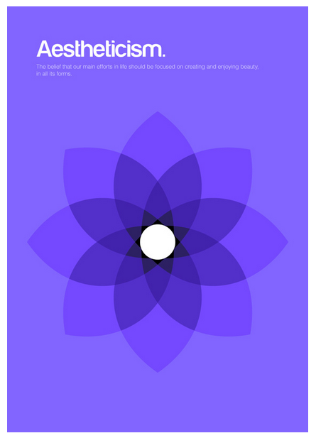
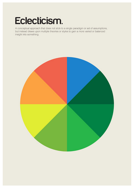
Genis Carreras is a Catalan graphic designer whose latest project turns whole complicated concepts into minimalist designs. He breaks down the essence of what ideas mean, and reinterprets them in bright colors, calling the series philographics. It began as a set of 24 posters, “But so many important ‘isms’ were left out that I decided to add more designs to the collection,” he said. So far he’s created 95 different designs after spending the past six months immersed in the project in his London studio.
He’s turning the designs into a book and a postcard set, using Kickstarter to fund their creation. He needed £15,000 for the project, and has already reached £40,721 after starting funding just a little over a week ago.


Each design includes a simple definition of the philosophy it represents, written by Chris Thomas. Each uses a bright background color topped with simple, often symmetrical shapes that interact with each other to embody concepts that can be difficult to grasp.
The designs don’t reduce the concepts, they make them beautiful and understandable, transforming centuries of theoretical debate and discussion into colors and shapes that effortlessly explain everything.


Only 25, Genis said he wants philographics to serve as a “visual dictionary of philosophy,” and previously he’s designed posters, websites, icons, album covers and more. He also made this really cool portrait of Steve Jobs out of Macbook parts with Ben Redford at Mint Digital. Philographics will be his second self-published book after writing and designing Colouring our Perceptions, a book that examines how color effects communication.
His Kickstarter profile reads:
“I love things like simplicity, books, modernism, video games, nature, London and beagles. And beer, I love beer too.”


For more about Genis and his work, see his website, his Kickstarter project page, and his print shop.
Apr 24, 2013 | design
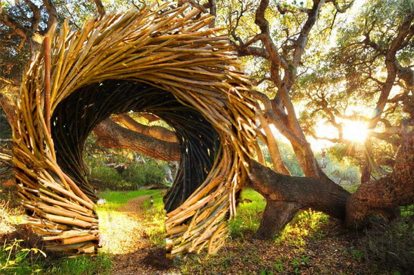
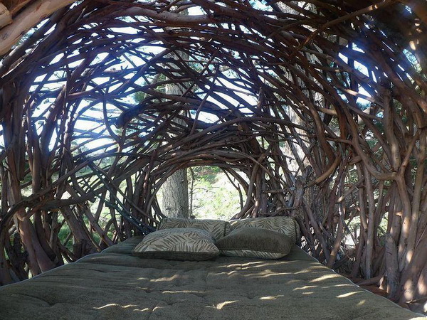
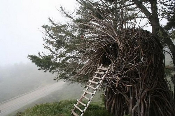
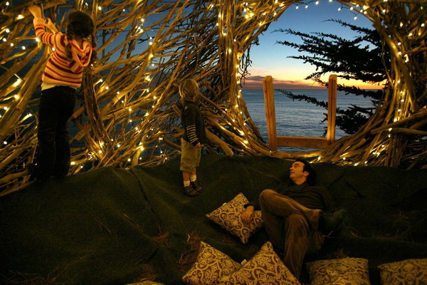
California artist Jayson Fann creates these spirit nests as part of the Big Sur Spirit Garden, an International Arts and Cultural Center in California’s Big Sur valley, between the Santa Lucia Mountains and the Pacific Ocean. Each nest is big enough for at least one person, and they range in scale from love seat size all the way to a 20 person nest that is wider than a highway and has a second story inside it.
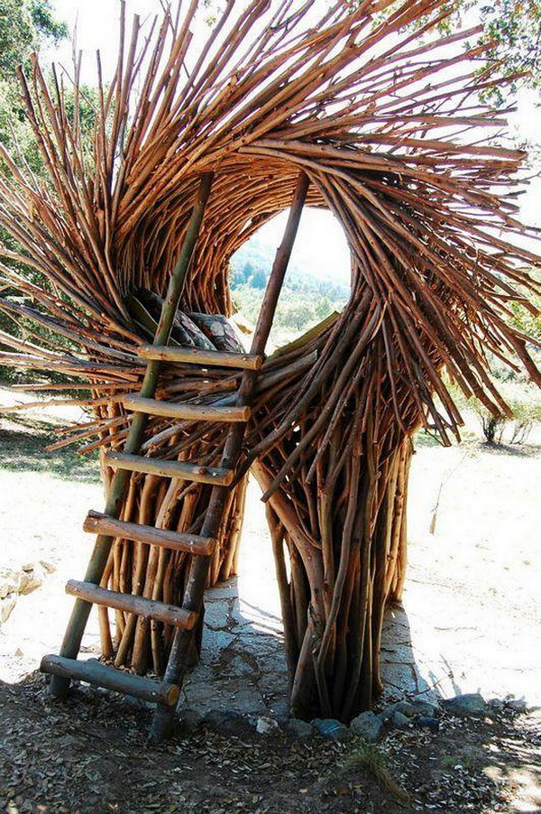
Each nest is made with tree branches from local forests, each limb carefully cut and chosen to ensure that the tree itself isn’t damaged in the process. Jayson most often uses the wood from Eucalyptus trees because it’s strongest and lasts longer than most others, cutting away their leaves with a machete and transporting the harvested wood to the new nest’s building site.

To begin building the nest, Jayson first separates the wood by size.
“The process consists of fitting the puzzle of branches into a flowing form that integrates structural integrity with artistic flow,” he said, “I use tension by bending the wood and counter sunk screws that are virtually invisible to ensure a strong structure.”


Each nest creates a delicate new relationship between human and nature, one that was lost long ago when we first went indoors to shield ourselves from the elements. In these nests, we’re granted a place among the elements instead of being pitted against them, connecting us for an instant to the all the beauty that’s out there in this miracle of a world.
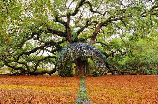
That’s the perfect image these pictures create. The nests are set in elegant forests and waterfronts, with the sun shining and the sky glowing, and all of these ingredients are amplified in each tree branch that’s been harmoniously joined with its brother to create a pattern of protection.


Image source: Cuded
For more information, check out Big Sur Spirit Garden’s website.
Apr 18, 2013 | design
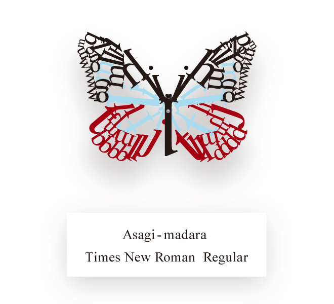
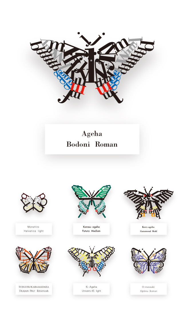
These lovely lettered butterflies were created by a 25-year-old graphic design student who used a different font for each. He goes only by guusan, and on loftwork, the Japanese portfolio site where these images were uploaded, he said, “I imagined different fonts as butterflies and then created a specimen book based on that.”

These typographic butterflies use the shape of the letters to decide whether each wing will curve or point, and “I’s” and “J’s” stretch up to form antennas. The color schemes correspond to the severity of the letter’s shapes – Helvetica Light is black, gray and yellow, Futura Medium is green and turquoise with a hint of red, and Garamond Bold is mostly black with splashes of orange, red and yellow thrown in. Each wing is the mirror of its opposite – jumbled letters that are given shape, color and a significance that might let them fly away.

Source: Spoon & Tamago
Apr 2, 2013 | design, news

‘mark’s house’ by two islands
image © two islands
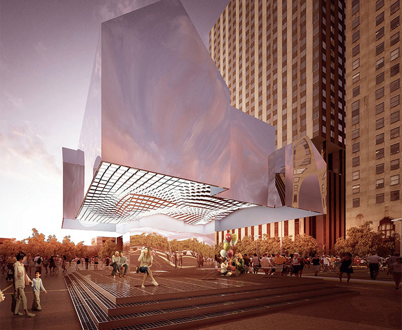
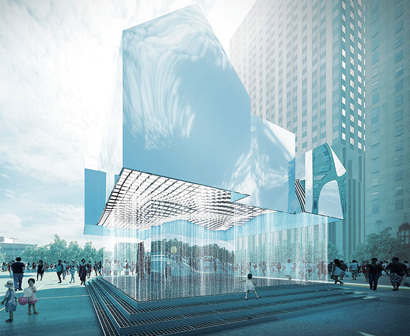
A giant reflective structure seems to float above the platform, but it actually sits on a thick mirrored pedestal that can’t be seen until you look close enough. Titled “Mark’s House” by the London-based design studio Two Islands, the design tells the story of an imagined Flint, Michigan resident named Mark Hamilton, whose family loses a home to foreclosure. Their Tudor-style home is reborn as a flying shining mirage of what it used to be, serving as a metaphor both for what the city has lost and what it’s working to gain back again.
“Mark’s House” was among the 221 entries submitted to the Flint Public Art Project’s inaugural Flat Lot Competition, which called for designs of temporary structures that take up no more than eight parking spots, and offer support for public programs by providing a stage, shade, and cooling devices.
“Mark’s House” can hold up to 1,500 gallons of water for a cooling spray on the hottest days, and its gridded panels beneath the floating house soak up even more of the sun’s rays. In the end this multi-faceted functionality of a design illusion won the $25,000 grand prize in the Flat Lot competition, and “Mark’s House” will be the temporary summer pavilion in Flint’s downtown parking lot during Flint Art Walk, opening on June 14 and remaining until Fall.

water droplets cool down visitors
image © two islands
Images & info via Flint Public Art Project.
Mar 14, 2013 | design

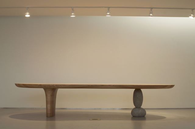
Image from artist’s 2008 solo exhibition at Gallery HANGIL, in Paju, Korea.
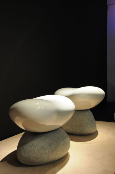
Byung-Hoon Choi makes seats and benches that look too precarious for real use, but you can sit on them as long as they’re not part of an art exhibition. Someone might yell at you.
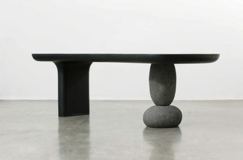
Some of these seats are made of one smooth solid piece of sculpted wood and others balance that wood on stones, playing with gravity as if it were a separate medium all its own.

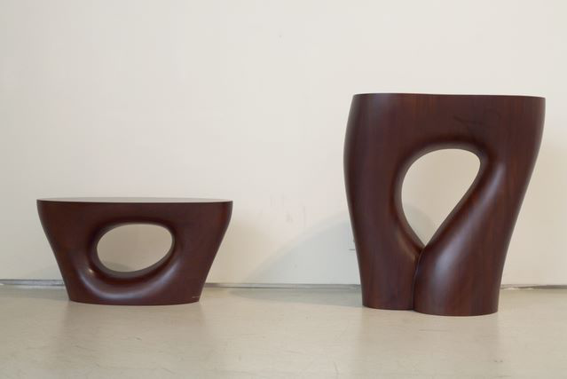
Image from artist’s 2008 solo exhibition at Gallery HANGIL, in Paju, Korea.
These stools are abruptly flat on top while their legs curve elegantly outwards until reaching the floor, a matching pair in deep mahogany. The left-hand stool is punctured by an asymmetrical hole, like a perfect tree had grown around a dinosaur egg only to be turned into a chair. The stool on the right stretches higher, an upside-down tear shape cut out of its middle makes it look more like women’s legs cut off at the hip or a really groovy pair of flared jeans.
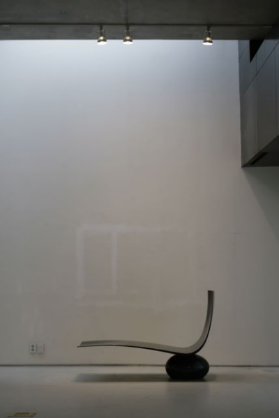
The chair below appears the most dangerous for actual sitting, but thanks to very heavy weights, balance only looks like it would be a problem. Have you ever gone to sit down when your friend pulled out the chair beneath you because he thought it would be hilarious to see you fall on your ass? That reactionary feeling of uncertainty – a subconscious verification of free fall, is what these works evoke, because to sit in them would mean trusting in the artist more than what your own eyes tell you.

Image from artist’s 2008 solo exhibition at Gallery HANGIL, in Paju, Korea.
Choi currently works as a dean and professor at Hongik University’s College of Fine Arts in Seoul, South Korea. He previously worked as the director of Hongik’s Museum of Art and his work can be found in nearly every museum in Korea including the Seoul Metropolitan Museum of Art and the National Museum of Contemporary Art. In addition to seating, he also constructs intricate sculptures along with tables and other kinds of furniture that can be improved aesthetically.

Image from artist’s 2010 solo exhibition at galerieDOWNTOWN, in Paris.
See more of Choi’s work on his website.
Mar 7, 2013 | design
When you’re a kid, a treehouse is the one place where grownups aren’t in charge. If you’re a girl it’s no boys allowed and vice versa. Only those deemed trustworthy are allowed up to the sacred space so that everyone can feel safe enough to discuss their hopes for the future – even if that only includes trying to get out of going to school tomorrow.
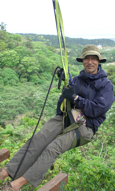
But treehouses become more than that when Kobayahsi Takashi makes them – a professional treehouse architect, he’s traveled around Japan and the world creating miniature spaces high up in the branches, brought to life by the fact that the very thing supporting them is alive. He writes, “…everywhere I’ve been, I’ve seen reflected in these largest and oldest of living beings the same nameless light that I’ve struggled to maintain within myself for so many years, the one that no one could tarnish and that never seemed to disappear. That comfort, that sense of calm, is something I’d like to share with as many people as possible. And it is with that in mind that I will continue with the one-of-a-kind rush that is treehouse creation, all the while carrying out my own personal dialogue with their hosts.”

Takashi is a member of the Tree People, both a company and organization that stands with trees and builds off them. Their website reads, “We who build these structures are not architects; our aim rather, through art and free expression, is to break down the feeling of separation that exists between humans and nature.”

Kobayahsi Takashi
I especially love this glass treehouse nestled in an Okinawa forest – just a little dome that transforms people into birds, letting them soar up high in the branches; plenty of windows for fresh air and with opening at the top towards the sky. This photograph was taken at just the right angle too – its obvious why they selected this tree as each side of its arms open wide, embracing and balancing the little glass dome held within.
See more Tree People treehouses in their online gallery.
Takashi also wrote a book called “Treedom” if you’re interested.


