Sep 17, 2012 | art history, news
If you spend any time on the internet at all, you’ve probably noticed the swanky new features Google has been adding to their searches.
One of the coolest new features is the little drop-down artwork list that pops up whenever you search an artist’s name plus the word “artwork.” Google automatically arranges the pieces showcased here by search popularity, thus inspiring this new series, “Google, what’s my masterpiece?”
 |
| Screen shot from my iPad:) |
I think it’s so fascinating that the entire portfolio of an artist’s life and work can be stripped down to six pieces and a little blurb, and although some might consider this trivializing, I think it’s a great way to appeal to those outside the typical art community. It shows the basics in a really useful way, at the same time ranking the artist’s works by how many people know about them enough to search for them; how many people want to learn more.
Clicking on each work takes you to a Google search of that painting individually, including the right-hand breakdown of the work which gives you a background summary, year it was completed, artist’s name, dimensions of the work, genre, media, and artistic period during which it was made.
 |
| The Kiss, 1908 |
This week I’m starting with Gustav Klimt, the Austrian painter who used a collage-like sometimes called “symbolism” style to create lofty dream-scenes that are too beautiful to be real. Obviously his incredibly famous work “The Kiss” was the very first work listed on Google, although it was probably given a big boost the day Google chose to showcase this work in their logo as a way of honoring Klimt’s 150th birthday this past July.
Coming in second is Klimt’s Portrait of Adele Bloch-Bauer I, created in 1907. Klimt also made a second portrait of this woman that’s listed fourth on Google. Adele was the wife of a wealthy industrialist, Ferdinand Bloch-Bauer, who was a patron of the arts and a supporter of Gustav Klimt.
 |
| Portrait of Adele Bloch-Bauer I, 1907 |
 |
| Adele Bloch-Bauer II, 1912 |
Can you imagine what the artists would think if they knew we were arranging their works based on how SEO-friendly they’ve become? What do you think about the way technology is simplifying our art intake?
GD Star Rating
loading...
Sep 15, 2012 | Brooklyn Museum, features, news
 Thanks to all the fabulous technology now available, GO Brooklyn Art’s Open Studios weekend was a huge success. It was hard to tell at first though, since everyone participating was spread out all over Brooklyn during two full days (well, from 11am-7pm), but judging from the statistics just released (you can see all of them at the end of this post), there were more visitors than artists which at first seemed a hard feat to accomplish.
More than 1,800 artists in Brooklyn (can you believe there are that many artists in one borough?) opened their studio doors last weekend to whoever wanted to come by. And thanks to an awesome website set up by GO Brooklyn Art, visitors could peruse the works of participating artists and set up an itinerary of people and pieces they wanted to see for themselves. A neat little accompanying app let you take your profile on the go so that all the info you needed was right there in your pocket. You could register as a Voter online, and after checking into at least five studios with unique check-in numbers posted at each studio, you’re able to vote for your three favorites – and the three artists with the most votes win a spot at an exhibition hosted by the Brooklyn Museum.
Each studio was marked with a little “GO Brooklyn Art” sign, making them easy to pick out, plus specific instructions on what apartment number to buzz and which artists were in the building. Mostly there was an uncomfortable feeling of walking into someone’s home, but the spaces where multiple artists worked together and lived somewhere else were my absolute favorite.
What I didn’t realize when first looking at a map of Brooklyn, is that the place is actually gigantic, and venturing from one specifically chosen studio to the next required either a lot of walking or subway rides that added up. After checking in to the first studio on my itinerary and finding the next closest at least two subway stops away, I opted for proximity over itinerary, moving to the space on the map with the most studios in one place.
Once I had the strategy of it down, getting to meet the artists in person was actually a really great experience. They really wanted first-viewer opinons of their work, and listened to what I had to say. They wanted to know where I went to school and why I came all the way out to Brooklyn by myself. I was able to hear from the artists themselves why they created what they did and what it meant to them.
Now I’ll just give a little synopsis of each of the six studios I was able to visit (before the time constraints of weekend homework set in):
1. Chadwick Augustine: sculpture, mixed media, installation
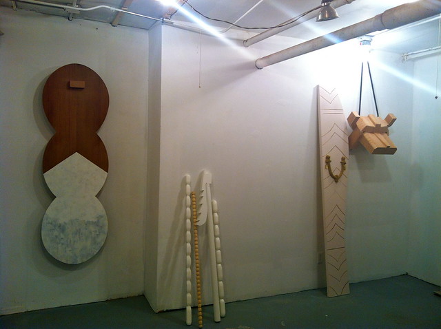
Kind of like sculpture for a giant, Chadwick’s work was simplified large-scale shapes that looked impressive when gathered altogether.
>GO Brooklyn Art profile
2. Clark Goolsby: painting, sculpture, mixed media
Clark’s paintings were my favorite, like an explosive collage made from bright colors and shapes, every once in a while a recognizable animal or image.
>GO Brooklyn Art profile
3. Jessica Krause Smith: painting, photography
Her paintings were whimsical chaotic canvases and her photographs were organized compositions, so it made sense when she said “the fulfill completely different purposes in my life.”
>GO Brooklyn Art profile
4. Ian Pawelec: painting
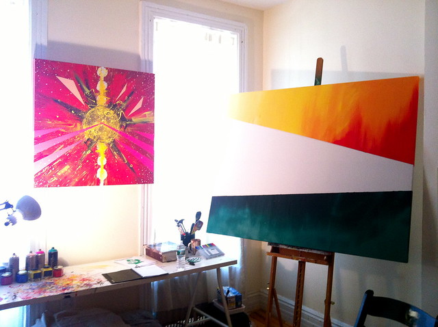
His work was inspired by the “spiritual search we all experience,” striving to “illustrate the energy of life within the universe” through abstract painting, which usually I don’t buy, but all his pieces looked like abstract planets exploding with color.
>GO Brooklyn Art profile
5. Peter Daverington: painting, video/film/sound
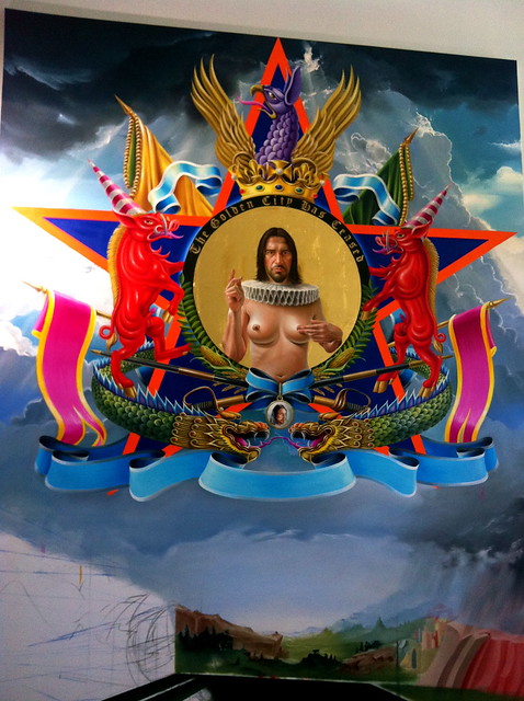
Using his canvases as a silly interpretation of propaganda, Peter’s pieces combined stylistic themes and recognizable images to bombard the viewer with a colorful joke.
>GO Brooklyn Art profile
6. Sepideh Salehi: video/film/sound, mixed media, drawing
Her studio was tiny, and so was a lot of her work. She paints individual frames of a film and pieces them together, as if the canvas could move, letting the whole image swim in the color of paint. The image below is a picture from the film, where a girl in a cape is running and running.
>GO Brooklyn Art profile
Open Studios Statistics: (from GOBrooklynArt site)
- Estimated visitors: 18,000
- Estimated studio visits: 147,000
- Total participating artists: 1,708
- Total neighborhoods with participating artists: 44
- Total registered voters: 10,319
- Total voters who checked in to at least 1 studio: 6,106
- Total voters who checked in to at least 5 studios and are therefore eligible to nominate: 4,929
- Total studio check ins: 48,918
- Average number of studios visited per participant: 8
See all the pictures of these artists’ work, plus some really cool Brooklyn street art in my new Flickr set here!
GD Star Rating
loading...
Sep 14, 2012 | Art Institute in Chicago, features, museums
Unfortunately I visited this museum on the last day of my trip to Chicago. Had I known how incredibly huge and impressive it is, I definitely would have dedicated double the time to soak all of it up.
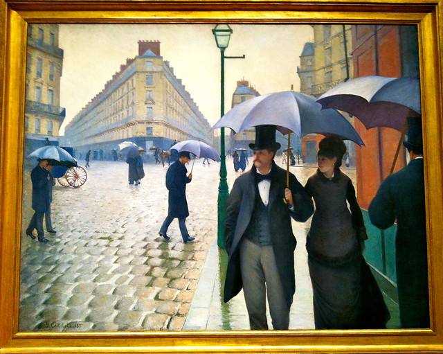
Think of the most famous iconic artwork you can, and it’s probably sitting at the Art Institute. I felt like every corner I turned led me to another piece of art history – everything from “American Gothic” to tons of Picassos to van Gogh’s “The Room” – all of my favorites and a couple of new ones too.
 |
| Paris Street; Rainy Day by Gustave Caillebotte, 1877 |
 |
| American Gothic by Grant Wood, 1930 |

|
| New favorite! The Eventuality of Destiny by Giorgio de Chirico, 1927 |
It’s a funny thing finding a painting in a museum that you’ve studied and learned about through slides and textbooks. I imagine meeting up with someone from an online dating site would give you a similar feeling. Because you know so much about this piece and sometimes even the person who made it, which makes meeting it in person kind of phenomenal. Since its appearance never changes, I guess it’s more like meeting an old friend that always surpasses your expectations.
Whatever the feeling that I can’t do justice describing, it’s one I felt dozens of times at the Art Institute. Three straight floors of glass and slick pale wood was the perfect environment to see the works in; nothing extra where it wasn’t necessary. The rooms and hallways of beauty and masterpieces just kept coming and coming, so I’m just going to focus on my absolute favorites.
 |
| Nighthawks by Edward Hopper, 1942 |
The third floor European Modern Art gallery, from 1900-1950, was one of the greatest collections I’ve seen in so long. It could have been a substantial collection of work all on its own; maybe it’s own mini-museum. There were so many Picasso’s, Mattisse’s, and Dali’s – it always amazes me how much work those artists actually completed over the course of their lives, that they can be featured numerous times in hundreds of museums all around the world.
 |
| Detail of van Gogh’s The Room, 1888 |
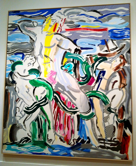
American Modern Art was almost as great, well actually it was just as great, but in a different way. It’s really clear how different the styles of those two continents are after seeing these exhibits in succession. Right next to this space on the second floor was the featured exhibition, and when I visited I saw the Roy Lichtenstein retrospective.
I never really appreciated Roy Lichtenstein’s contributions until seeing this show, mostly because it was so hard for me to believe that they were actually oil paintings and not just pop art. But after seeing it as up close as the guards would let me, it was one part surprising and one part impressive to be wrong about how talented that man was. The show works chronologically, allowing us to really see how Lichtenstein developed his style and the different phases he went through during his progression as an artist. My favorite phase came later in his life, when he began to apply his own technique and style to the works of different artists and time periods. It really showed how great Lichtenstein had become – he had created such a unique visual language that could be applied to previous masterpieces, and it was so clear which aspects had come from where.
 |
| Masterpiece by Roy Lichtenstein, 1962 |
 |
| Laocoon by Roy Lichtenstein, 1988 |
Someday soon I’ll visit the Art Institute again. Comment if you’ve been – I want to hear what you thought of it!
You can see more of my pictures from the Art Institute in my Flickr set here.
GD Star Rating
loading...


