Mar 4, 2013 | illustration

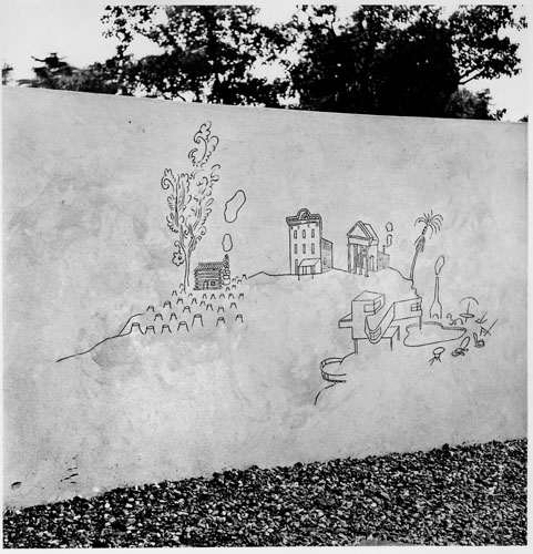
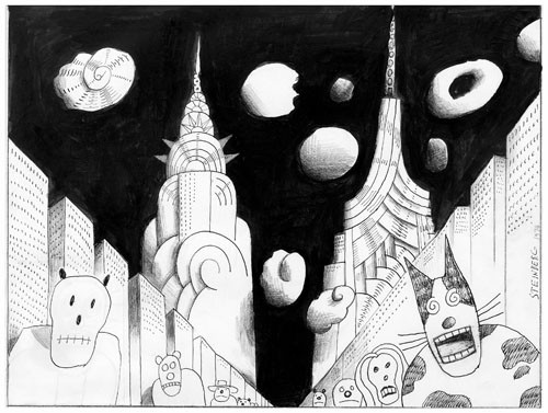
Children’s Labyrinth, 1954.
10th Milan Triennial, detail of History of Architecture section of mural.
Saul Steinberg‘s illustrations combine whimsy with art, creating mini-worlds that are clean and simple but at the same time lead the eye to someplace happy and bright.
Like a refined dose of Dr. Seuss, Steinberg prefers to draw realistically, turning typical scenes into magical places where the trees stretch up taller than the buildings – a small detail that makes our world seem more like a simply designed amusement park where thrill and wonder fill the air.
His work for the New Yorker explains all the scenes of the city, but I prefer the imaginary “Children’s Labyrinth,” drawn as part of the History of Architecture section of a mural. On the left sits a log cabin surrounded by the stumps of the trees those logs used to be. The most beautifully detailed tree stands next to the little building puffing smoke; the tree’s branches take delicate curlicue shapes as they expand just like the smoke beside them.
See more of Saul Steinberg’s work online at the Saul Steinberg Foundation Gallery.

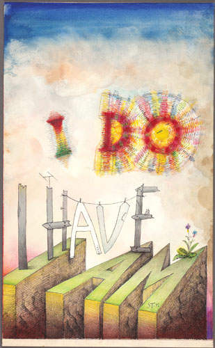
I Do, I Have, I Am, 1971.
Ink, marker pens, ballpoint pen, crayon, gouache, watercolor, and collage on paper, 22 3/4 x 14″.
Cover drawing for The New Yorker, July 31, 1971.
The Saul Steinberg Foundation.

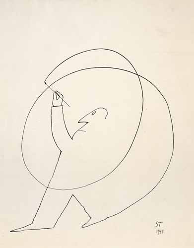
Untitled, 1948.
Ink on paper, 14 1/4 x 11 1/4″.
Beinecke Rare Book and Manuscript Library, Yale University.

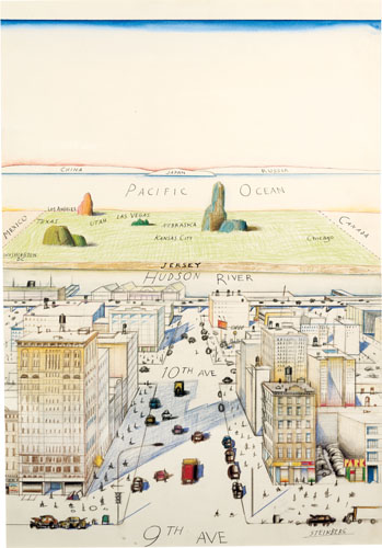
View of the World from 9th Avenue, 1976.
Ink, pencil, colored pencil, and watercolor on paper, 28 x 19″.
Cover drawing for The New Yorker, March 29, 1976.
Private collection.

Untitled, 1974.
Ink, colored pencil, and collage on paper, 14 1/2 x 19 1/4″.
Originally published in The New Yorker, July 22, 1974.
The Saul Steinberg Foundation.
GD Star Rating
loading...
Mar 1, 2013 | painting
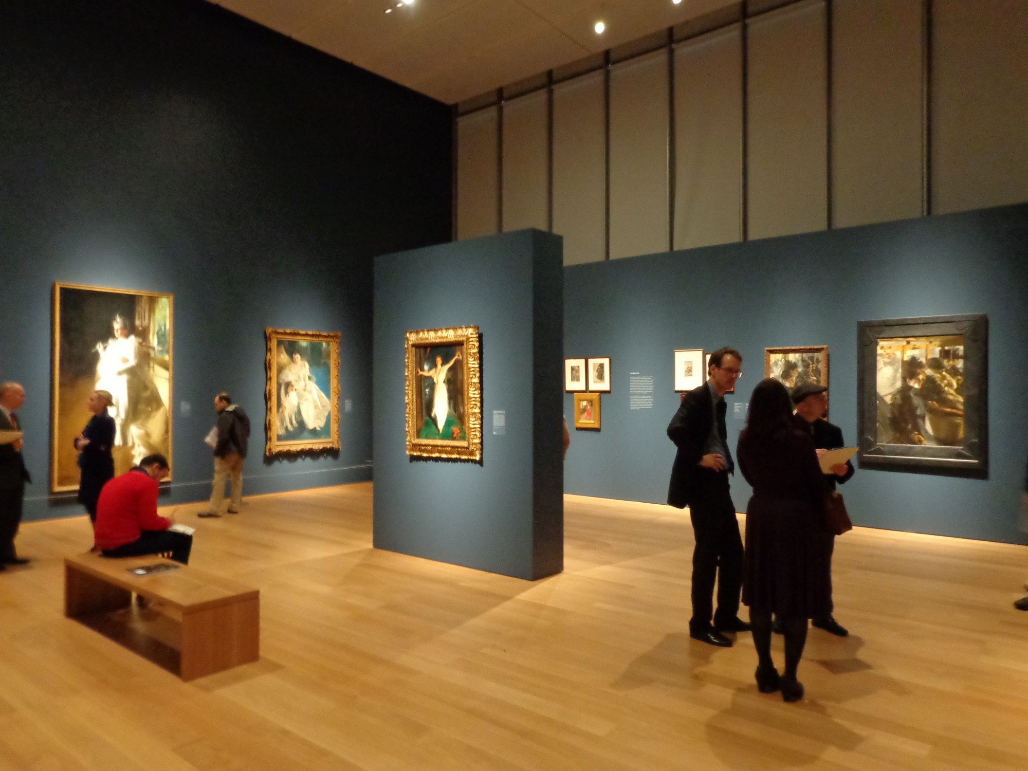
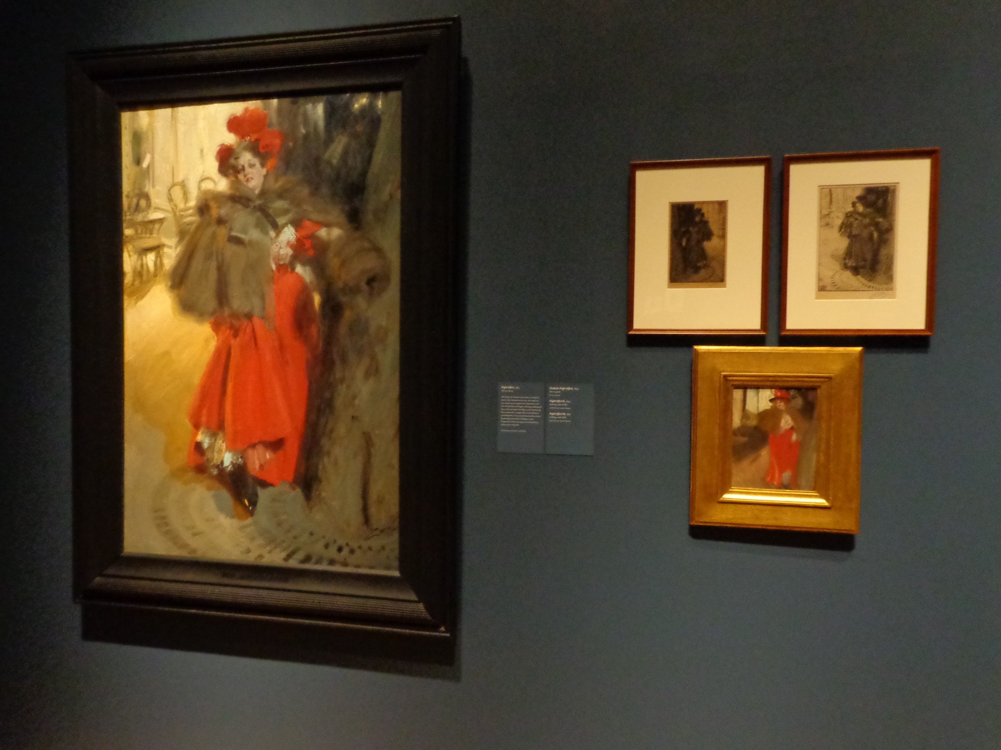
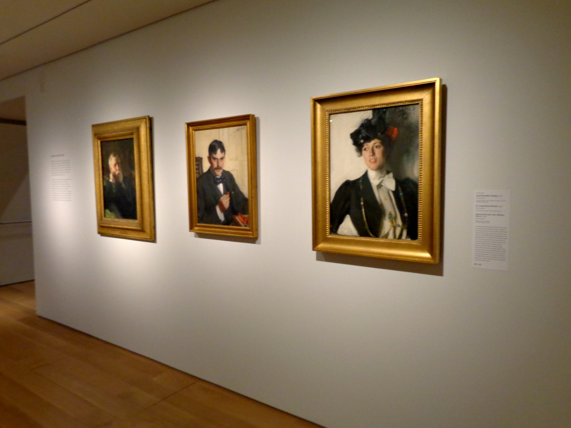
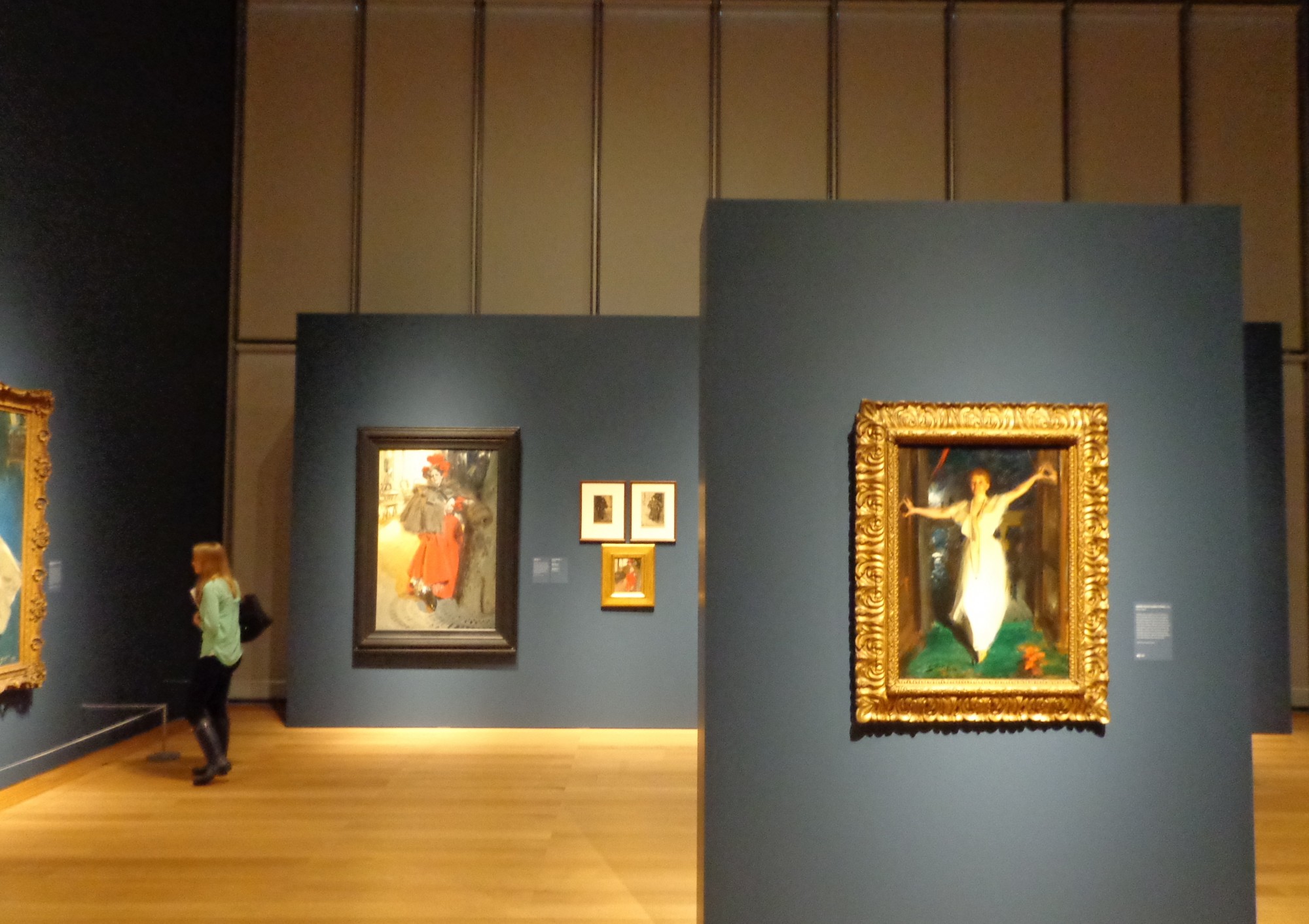
This week, the Isabella Stewart Gardner Museum opened a new exhibition dedicated to the works of Anders Zorn, a Scandinavian artist whose skillful impressionist portraiture won him celebrity status during the Belle Epoque in Paris.

The gallery was just phenomenal, but I’m a sucker for impressionism, especially when its framed by shiny gold and hung on deep blue walls.
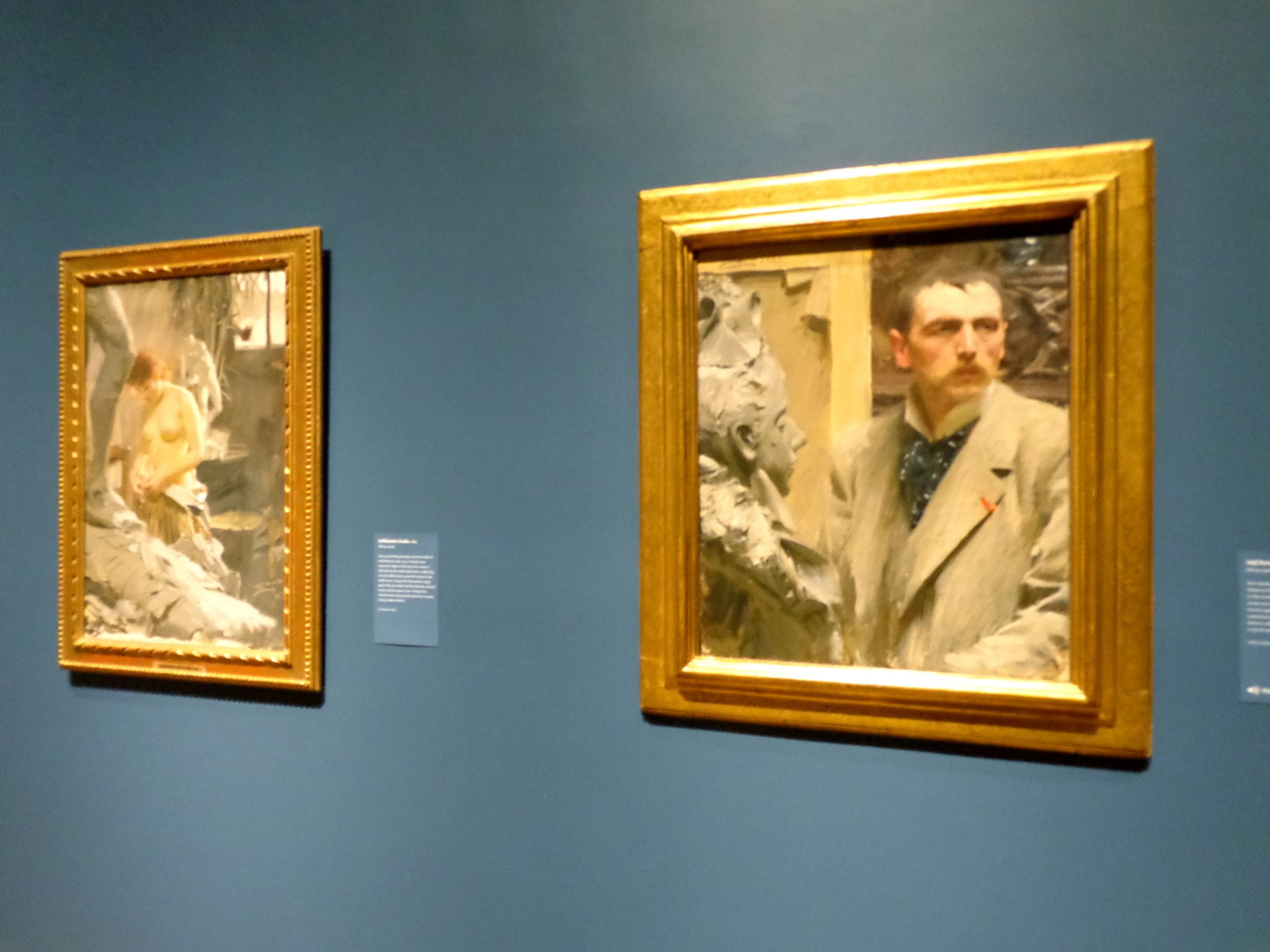
Each wall of this high-ceilinged cube was given allotted works from a different section of Zorn’s life, and even though the women looked like goddesses in the high society portraits, my favorite wall was the “In the Studio.”

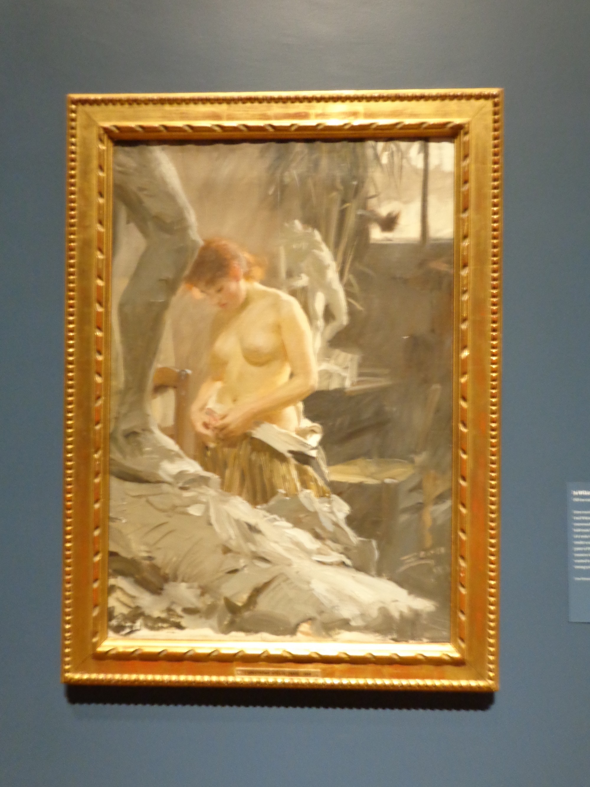
Left: In Wikstrom’s Studio, 1889
Right: Self-Portrait, 1889
In Zorn’s “Self-Portrait,” his face looks out past the frame, placed kitty-corner to a bust’s face staring past him the same way. His whiskers are long and balance out a wide forehead that crouches over small eyes with a very serious look in them.

In Wikstrom’s Studio, 1889
Hanging next to this work sits another painting incorporating sculpture – here creating soft blurry contrast with the model undressing. “In Wikstrom’s Studio,” her smooth figure stands behind a large gray leg and before a headless white nude sculpture facing the light and leaning back, his shoulders still suppoted by a brace. The warm light shines across all three figures: sculpture, model, sculpture with red hair glowing.
For more pictures of the new exhibit, check out the Gardner’s website and my Flickr set!

Night Effect, 1895

Right: Martha Dana, 1899
Left: Joseph Randall Coolidge, 1899


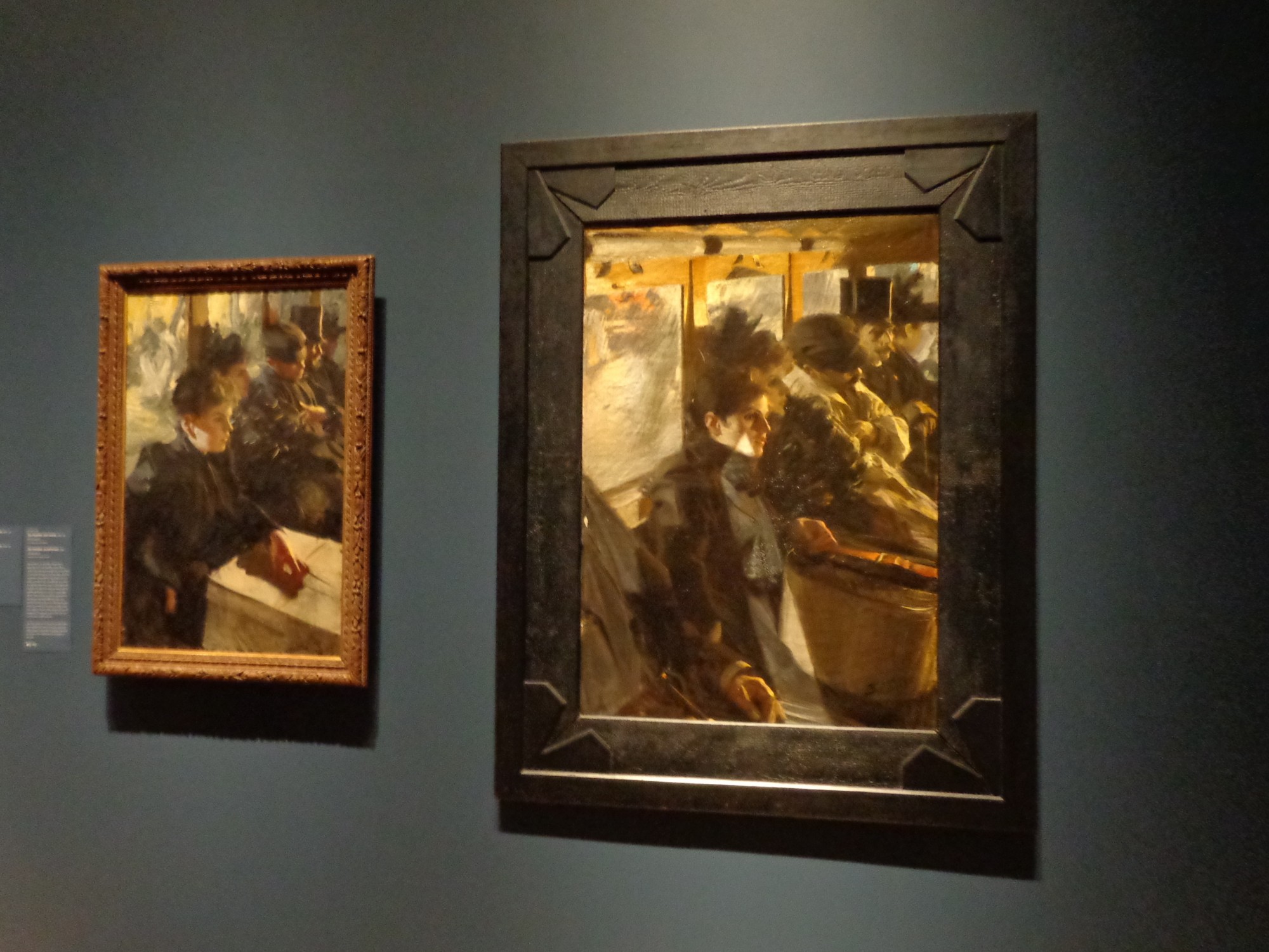
“Omnibus,” Paris 1892
GD Star Rating
loading...
Feb 28, 2013 | illustration, interviews, painting

From his series, “Where the crows fly on their backs.”
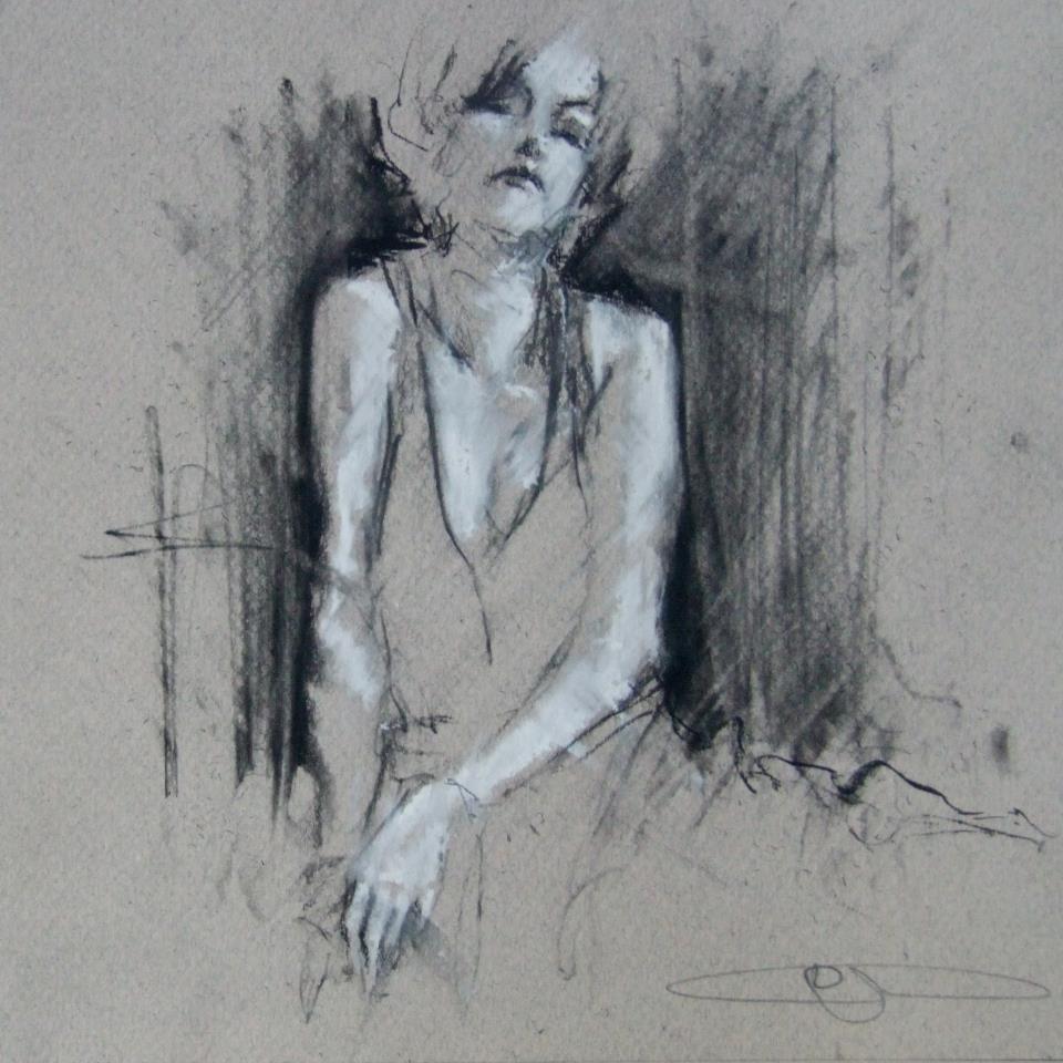
We see her through smoke, the black outlines only revealing what’s necessary and letting the rest of her float away. Her skin is luminescent in white chalk that’s used to cast shadows across her body, left side glowing and right side faded, but her high cheekbones pick up light on both sides. Her head tilts back, and even though there’s no way to know for sure if her eyes are open, it somehow still feels like she’s looking at you because she knows you’re looking. After all, someone this beautiful must always have eyes on them.
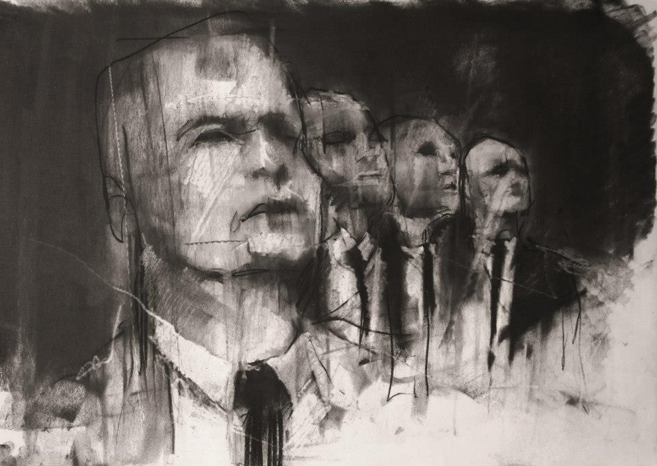
Guy Denning’s impulsive sketching masterfully reveals something beautiful, usually a person, which is probably the most beautiful thing there is. The faces he draws use heavy shadow and sometimes a filled in background to emerge from the lines and paper, but they always come to life with the movements of the sketch, made so obvious that you’re able to imagine the process of each drawing coming to life.

“And the other heads FIST
Since they’ve lost the desire to even try
And instead look ahead.”
conte and chalk on paper
30 x 40 cm
12th February 2013
What usually inspires the creation of a new image?
Ideas come from all over the place. Usually it arrives to a canvas after it’s sat in my head for a couple of months, and I’ve drawn it a couple of times. I’ve got more ideas in my head than time left to do ’em.
How would you define neomodernism?
No more than what’s defined here. In fact there’s a lot on my blog about methods, ideas and inspiration.
From Guy’s blog: “The Post-modern is useful only in terms of further defining Modernism from its origins and is essentially only a continuity of modernism – sometimes termed hyper-modernism. These are all useful, to a greater or lesser degree, in terms of avoiding the ideas of the ‘end of (Art) history’ but with regards to the actual creation of artworks they are invalid. People do not set out to create a work of ‘Post-modern Art’. If we must have a new label, let it be a New Modernism – a return to the critical aesthetic giving the artist the opportunity to create work that has some relevance to the new modern audience – an audience already familiar with ‘modern art’, where validation of quality is not founded on post-modern hyper-obsession with language and semiology and the artist is not ground into politically correct subservience. I do not see this as a retrograde step – it can be the only way forward – to let the artist communicate without the bonds of corporate and state art politics.
To those claims of ‘Art is Dead – long live Art’ –
Post-modernism is dead – long live Neo-modernism.”

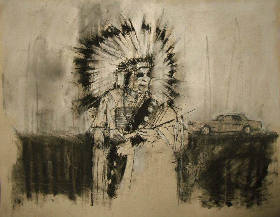
“AIM, the second battle of Wounded Knee (February 1973)”
conte and pastel on paper
66 x 55 cm
28th February 2013
What do you hope your pieces accomplish?
The most I can hope for is to emotionally move a viewer. Everyone brings their own lives and history to anything they look at, listen to or read. Consuming culture is as specific to the individual as making it.
When did you first begin painting and why?
I was drawing from childhood and I think that’s where my competency came from. I did little but draw and read – I certainly didn’t mix with other kids. First oil paintings were done at age 10 or 11 after my dad gave me a set of oil paints that he’d got bored with (a passing hobby in his 30s). I was hooked from the start.
Guy Denning is an English artist who’s been creating since the early 90s, and his work has been featured in exhibitions all over the UK as well as in Germany, Italy, France, and the US. You can see more of Guy’s work on his website, and all of these images come from his Facebook, which is filled with more things worth describing than I could ever filter into one post.

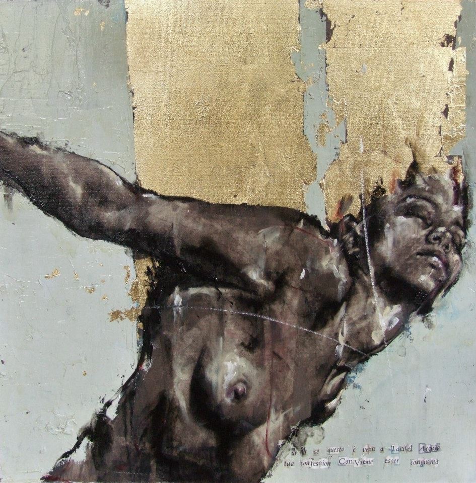
From the Purgatorio show, 2011 “dì, dì se questo è vero a tanta accusa tua confession conviene esser congiunta”
GD Star Rating
loading...
