Apr 2, 2013 | design, news

‘mark’s house’ by two islands
image © two islands
A giant reflective structure seems to float above the platform, but it actually sits on a thick mirrored pedestal that can’t be seen until you look close enough. Titled “Mark’s House” by the London-based design studio Two Islands, the design tells the story of an imagined Flint, Michigan resident named Mark Hamilton, whose family loses a home to foreclosure. Their Tudor-style home is reborn as a flying shining mirage of what it used to be, serving as a metaphor both for what the city has lost and what it’s working to gain back again.
“Mark’s House” was among the 221 entries submitted to the Flint Public Art Project’s inaugural Flat Lot Competition, which called for designs of temporary structures that take up no more than eight parking spots, and offer support for public programs by providing a stage, shade, and cooling devices.
“Mark’s House” can hold up to 1,500 gallons of water for a cooling spray on the hottest days, and its gridded panels beneath the floating house soak up even more of the sun’s rays. In the end this multi-faceted functionality of a design illusion won the $25,000 grand prize in the Flat Lot competition, and “Mark’s House” will be the temporary summer pavilion in Flint’s downtown parking lot during Flint Art Walk, opening on June 14 and remaining until Fall.

water droplets cool down visitors
image © two islands
Images & info via Flint Public Art Project.
GD Star Rating
loading...
Mar 29, 2013 | interviews, painting
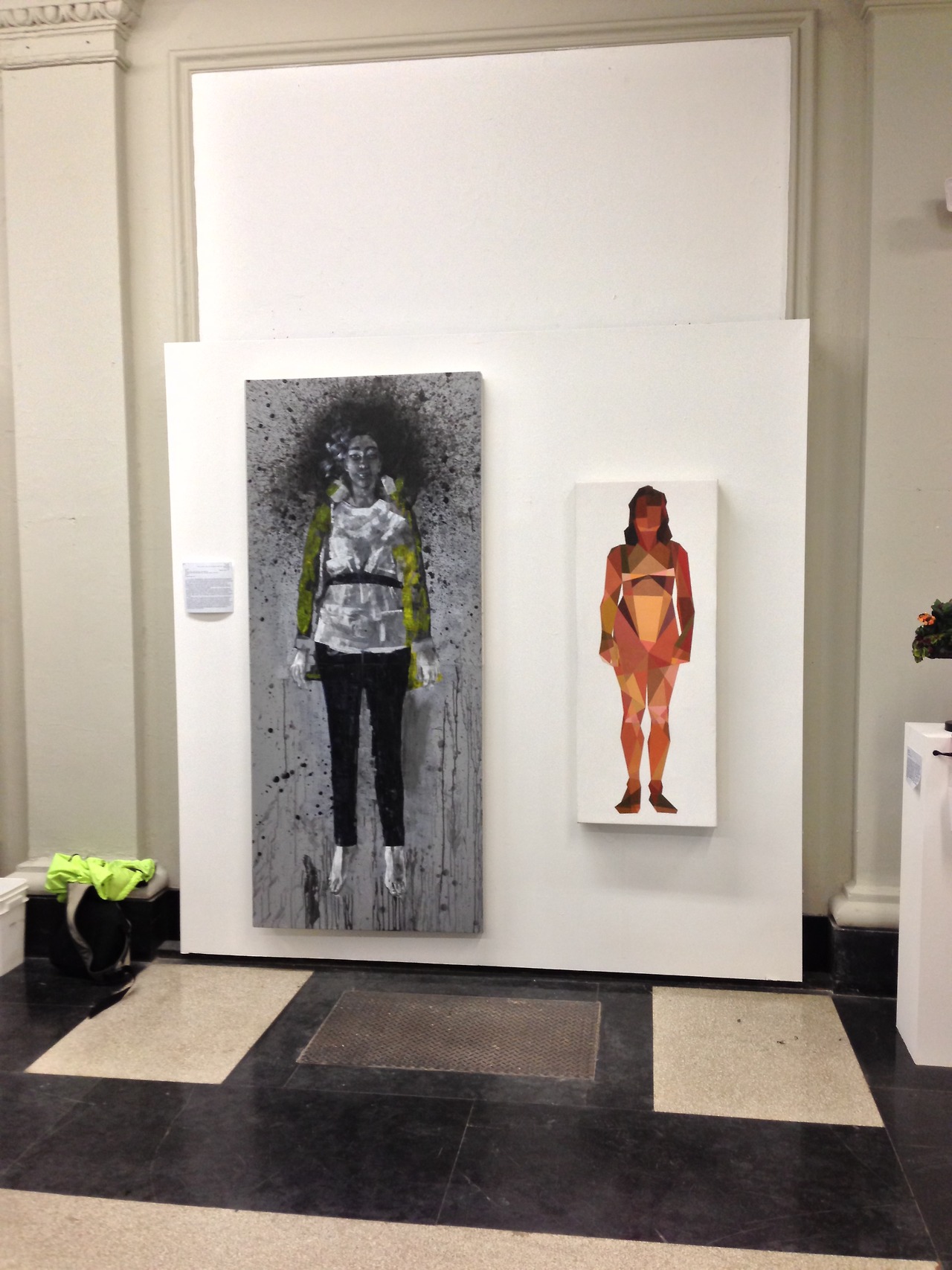
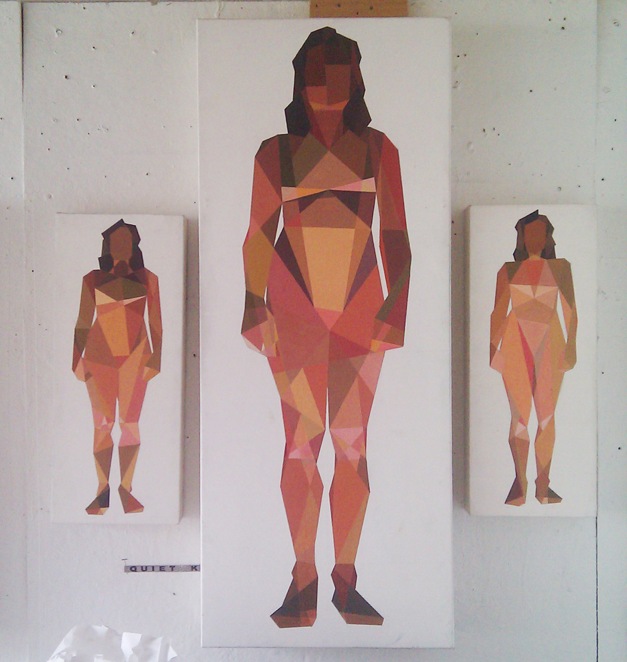
The women in Ian Gage’s paintings have recently begun transitioning – changing from realistic women splashed in dark paint to geometric pixillations that fragment her body and surroundings. The result is a shattered representation of women like minimalist stained glass windows, the light shining off of each shape differently, and with her body arranged in sometimes symmetrical but always balanced compositions.
Toll, Knell, & Peal reveal three different interpretations of the same front facing woman, and in each, her body is shattered into different shapes shaded in different shades of light. The transition between Ian’s realism style and his fragmented one can be traced from work to work, like a breadcrumb trail of the artistic process. Scrolling through his Tumblr is like reading a mystery novel where all the clues are visual, connecting the works that come before and after.
Cease and Knell shown at the Sustain/Able show at MassArt, 2012
What is the first thing you can ever remember drawing?
I think Godzilla. I was pretty preoccupied with typical giant robot/creature type products as a child—typically referred to as kaiju, though I don’t usually throw around that term. A Google search of that pretty much sums up the things I drew as a child.
Toll, Knell, & Peal
To you, what is it about women that make them so worth painting?
The anecdote I usually dispense as an answer for this is that I only took up an interest in drawing in response to a middle school crush. The crush in question was very interested in art and I pursued it to impress her. She moved away and nothing ever came of that, but I kept drawing. Ever since that point I’ve been interested in drawing or painting my romantic interests—it’s fairly transparent at this point to the people close to me.
I think there are a lot of things about painting women, in particular romantic interests, which one has to be cautious about. The first thing you hear in art school is that portraying someone you’re close to inevitably leads to an idealization complex—you’re never really able to accurately portray your subject because you’re occupied trying to flatter them. I’d like to think I’ve broken that barrier based alone on my obsession with proportionate accuracy, but one can never be trusted to judge themselves objectively. I can at least say in my defense that no one has mentioned idealization critically to me for probably two years. The second—and more broadly relevant point of caution, is my position as a male painting the female form. After seeing a Hilary Harkness lecture this past fall I grew somewhat uncomfortable with the plausibility of being labeled a misogynist based on my work, and so I try to be as aware of the presence of the male gaze in my paintings as possible. The effectiveness of that awareness can really only be judged by the female audience—I am at their mercy under the circumstances and that is the way it ought to be. Those are the two chief dangers I think.
I realize of course I have yet to answer the question, but that feels like some necessary pretext. I think I’ve always been very interested in making art about women due to their general impact on my life; it’s difficult to give an answer less nebulous than that. Painting women is something I generally don’t question, it’s just something that feels necessary, and has felt more so as I’ve gotten older. Continuing painting women, and justifying it, involves a lot of thought and deliberation on a daily basis; particularly revolving all of the implications of me painting women, and of painting women in general.
Untitled, Oil on canvas, 12”x16”
When did you first begin moving away from straight representations to geometry-inspired interpretations, and why?
I really started painting the geometric pieces in Catherine Kehoe’s representative painting class. From the beginning of the class I assumed we were learning to paint representatively (a logical assumption) but we were in fact learning the building blocks. I assumed the class structure would revolve around Kehoe giving us broad lessons on the tenets of painting naturalistically, and then individual suggestions to improve the realism of our work. I was chiefly interested in exhaustive detail—I wanted to paint like Scott Prior by the end of the class.
I found fairly quickly she was teaching the opposite of detail. Kehoe encouraged us to reduce the picture plane to the simplest shapes possible. I fiercely resisted this for about half of the semester, at which point I became exasperated and painted an exhaustively reductive study in an attempt to parody her lessons. It was absolutely meant to be a juvenile jab at her teaching, but to my surprise she loved the painting and encouraged me to pursue it further. For the duration of the class I developed a vocabulary in a style I had originally created as a joke, and grew to like it despite the fact I was painting expressive acrylic paintings in my personal studio. When I had my final critique in my painting studio the professor and guest artists were enamored of the Kehoe paintings and uninterested in my expressive paintings. That was the point at which I decided I needed to explore reductive painting more.
Untitled, Acrylic on canvas, 12”x16”
How would you describe the differences between those two styles?
Per the usual tortured artist criteria: I was in an emotionally turbulent point in my life for about a year, during which I lacked a single subject to paint. During that year I was really painting self-portraits with other people’s faces—I wanted to paint women but really just wanted to paint what I was feeling. That kind of expressive venting was the source of the majority of the imagery in that period of painting.
In a sort of coincidental windfall I was transitioning to painting geometrically when I met my current girlfriend, who is the subject of all of my paintings since that point (about a year now). In my personal life I moved into a more stable place, and my paintings became a lot more stable too. I think under these circumstances the primary difference is that the older paintings are very expressive and energetic; I was clearly being very physical with the works, and the current paintings are more analytical. I’m interested right now with proportionate accuracy, the dynamics of different geometric hierarchies, and color theory. Succinctly, the difference is expression vs. study.
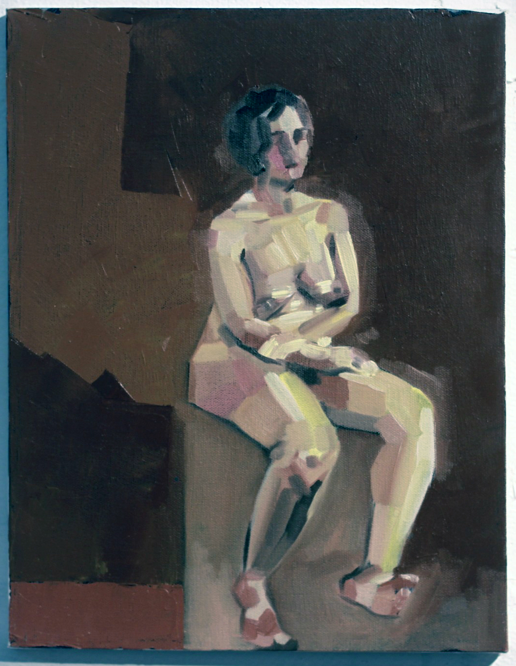
Seated Nude #3, Oil, Acrylic, Graphite on Canvas, 8”x10”
Who are these women? What do they represent to you?
The current paintings are all of Melissa, my girlfriend. Most of the older works are of Emma, a friend. The Emma paintings really fall under the self-portrait category, they’re about me at the time if anything. There were a couple of early Melissa paintings that fell under that category as well, namely Seam Ripper and Discrete Mathematics, after which point I dropped the expressive self-portrait vein for the reductive paintings.
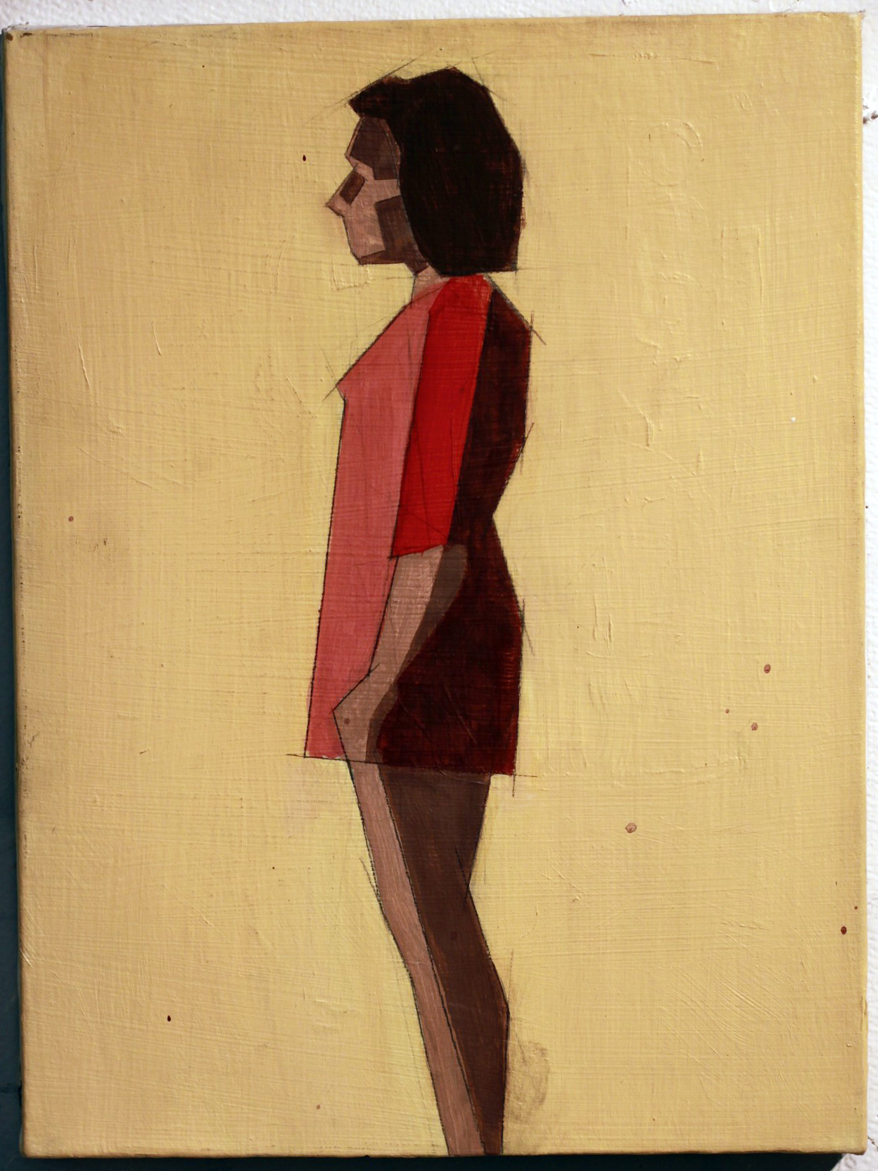
The reductive paintings are a lot less about expression and more about study. Every painting is an attempt at adding or manipulating a variable in a previously established control. When something works I add it to the control; I add it to my toolbox. When it doesn’t work it remains exclusive to that painting. For instance: the blank figures in Seated Nudes 1 & 2 were an accident—I had placed a red ground, drawn the space, and painted the backgrounds. I decided before I painted the figures that they looked interesting as they stood, and left them. The silhouetted figure became part of my vocabulary at that point, and it reappeared in later paintings.
As far as what the women in the paintings represent to me beyond the above technicalities, I can’t really say. I try not to assign meaning to my paintings; I find I’m opposed to explaining the content because it places the painting in a box. A painting is infinitely more valuable to the viewer when they can assign their own meaning to it or attempt to glean the meaning themselves.
Reclining Nude IV, Oil on canvas 12”x12”
What sort of impression do you hope your works leave on the viewer?
It’s difficult to say based on the above statement. I hope it strikes a chord with them, I hope there’s something in them that they can take away. I hope they want to spend more time with it than five seconds.
[pureslideshow] https://thingsworthdescribing.com/wp-content/uploads/2013/03/gage8.jpg;https://thingsworthdescribing.com/wp-content/uploads/2013/03/gage7.jpg; [/pureslideshow]
Ian will be graduating from Massachusetts College of Art and Design this spring.
See more of his work on his Tumblr.
GD Star Rating
loading...
Mar 21, 2013 | art fairs, installation, sculpture
From within a plain framed canvas sticks a nail, and atop it stands a matching silver bug, holding some kind of weight across its shoulders. Existing somewhere between reality and a Pixar movie, the little silver fellow is given character, a purpose, and the ability to walk on two legs. The nail he balances upon isn’t in the center of the canvas either, it’s just off to the side, and the little bug walks towards the wide ocean of white as if he were unaware of the inability to travel through physical matter.
But that doesn’t matter anyways, because in this artwork he’s frozen in time, and as if there were three different suns, three of his shadows stretch out from where the nail meets the canvas – two drawn on with pencil and a third that is an actual shadow, created by the lights above booth 2.11 at VOLTA NY.
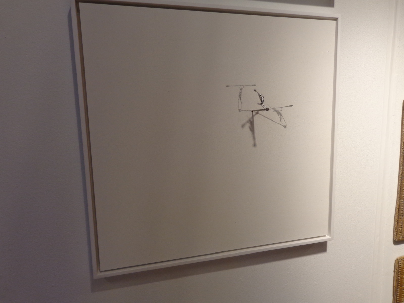
A work by Colombian artist Sebastian Mejia, the strong little bug was echoed throughout the artist’s booth at the fair, sometimes framed on portable canvas like this one and other times just nailed right into the wall with shadows drawn temporarily. And even though the bug would have squashed if it were alive and real, the image of something so inconsequential trying so hard at something was adorable and disheartening at the same time, since the task seems so menial and even if the bug did succeed at whatever it was he was working towards, no one would care regardless.
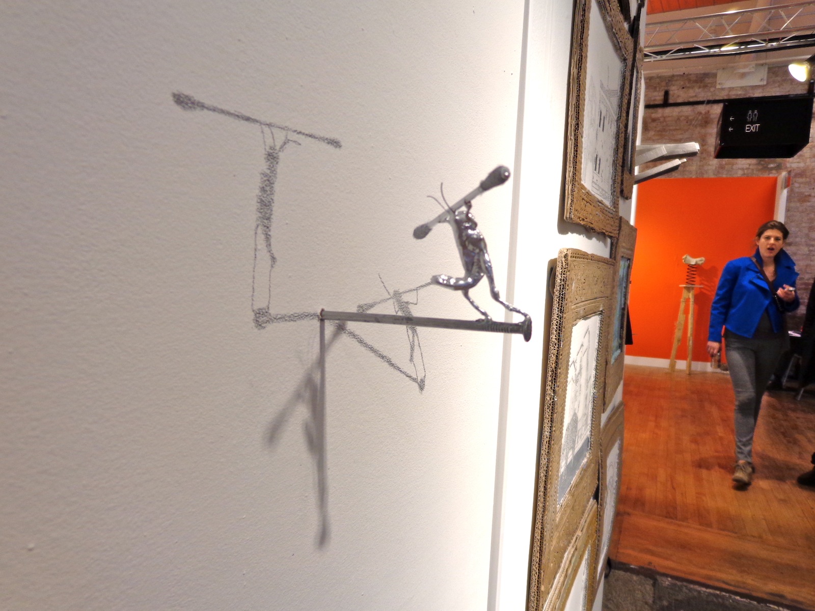
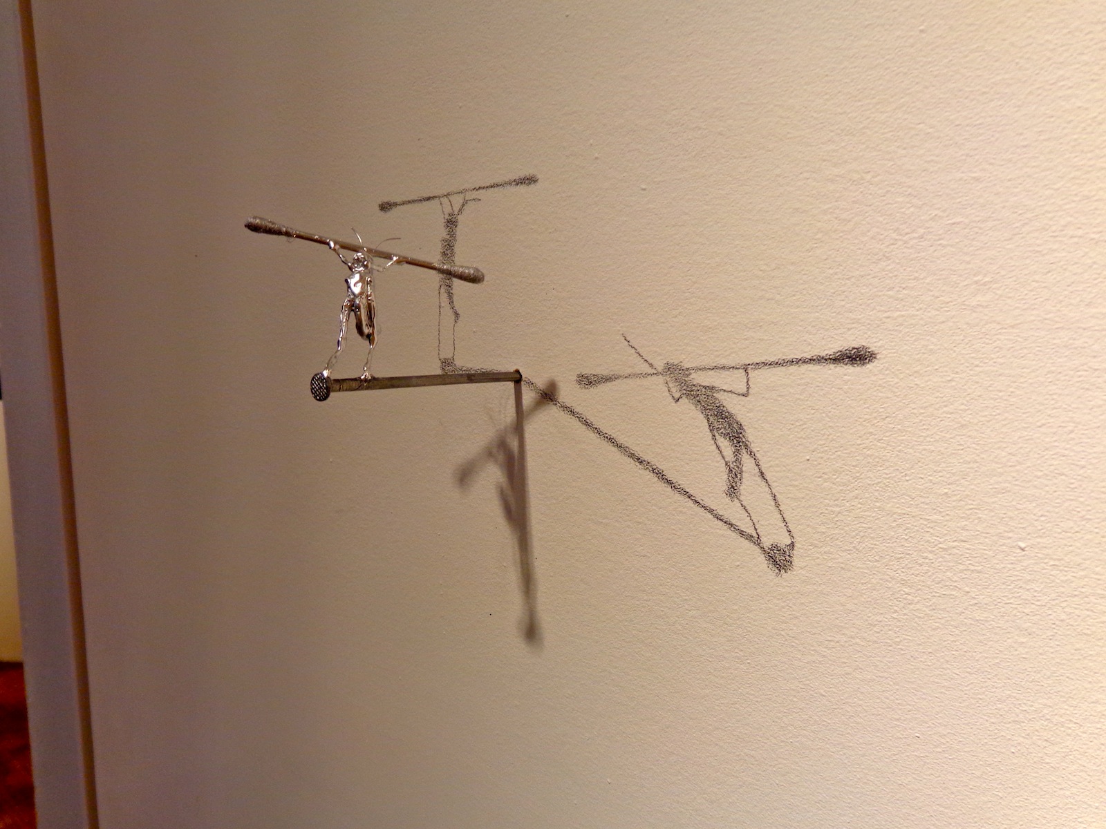
But it’s probably not so much about what he’s trying to do, but about how we perceive what he’s trying to do. He’s immortalized by two carefully drawn shadows, meaning that there are at least four different representations of him in one place – a factor multiplied every time someone takes a photo. He’s strong the way we imagine hardworking insects to be, but he’s silver, and a shinier silver than the nail he balances upon and the q-tip shaped weight he carries across his shoulders. He’s smaller than the disposable pieces of cotton we use to clean our ears, but he’ll survive much longer and be remembered for much more.
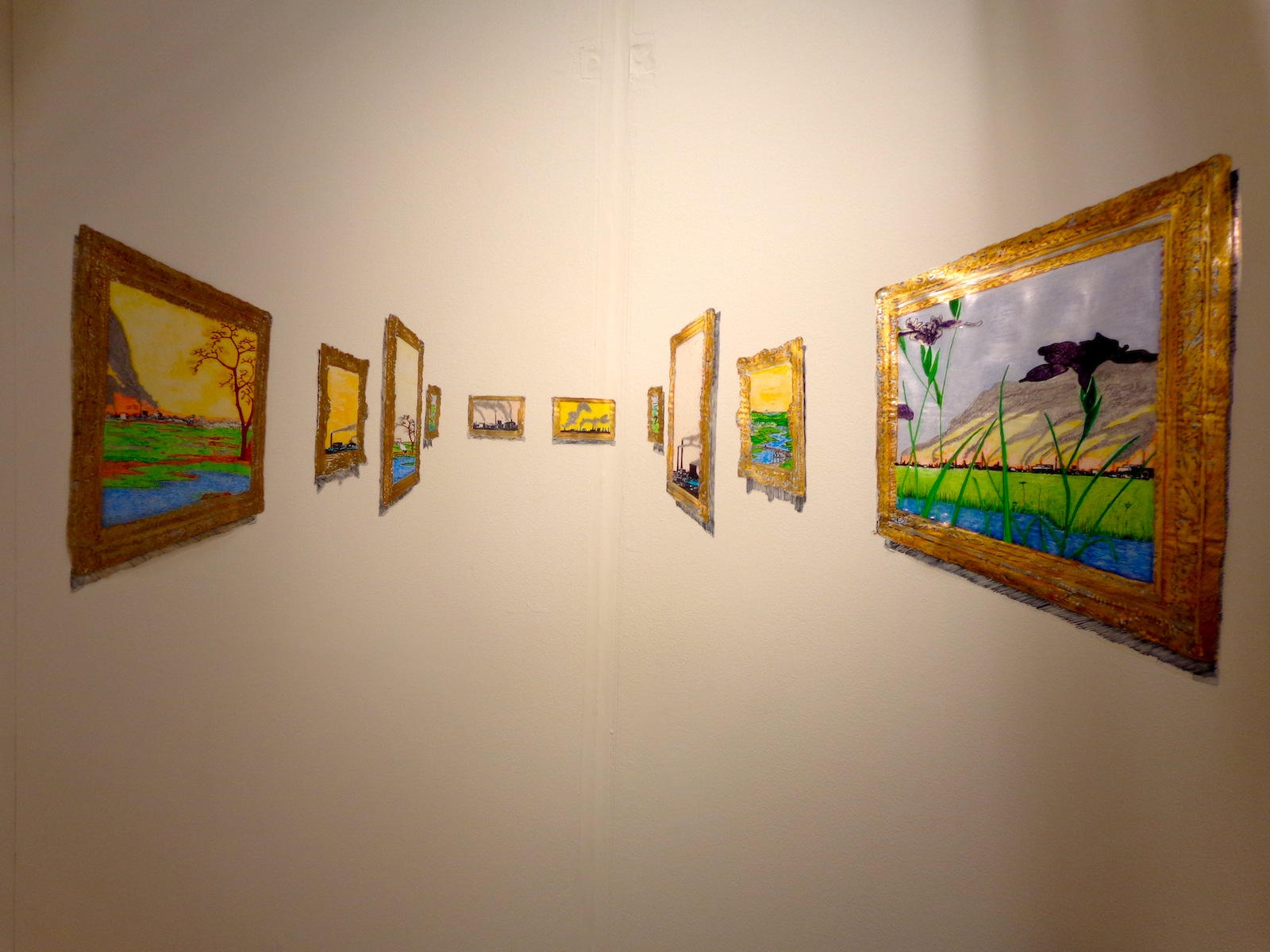
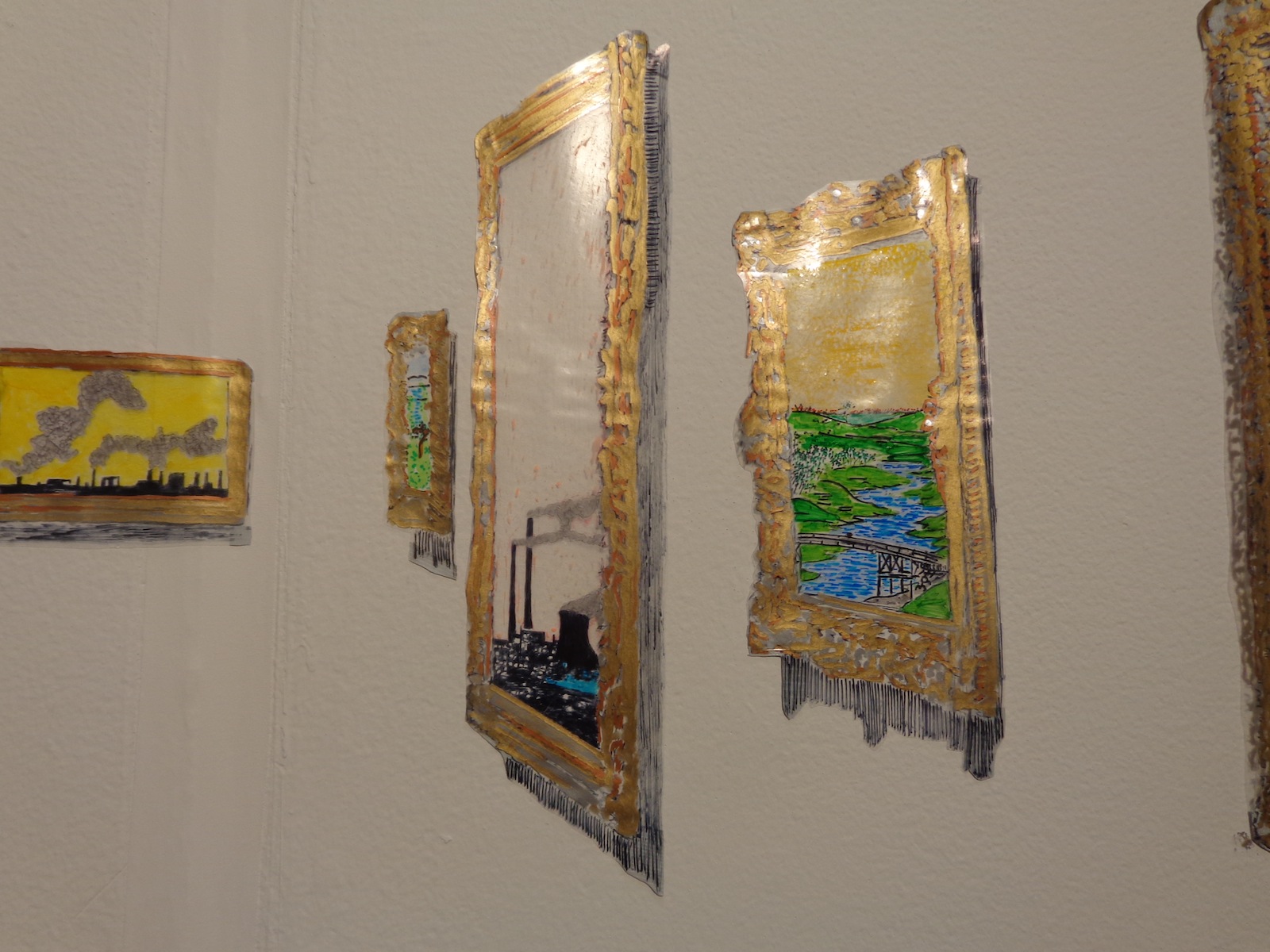
It’s hard to fully appreciate this one in two-dimensions, although it is very much a two-dimensional work. Works of art framed in shiny gold appear to stretch back into the distance, but everything is actually made of something shiny and plastic, even the fading black shadows scrawled beneath each work. The trains within the paintings that look farthest away are just as close to you as anything else, they’re just smaller.
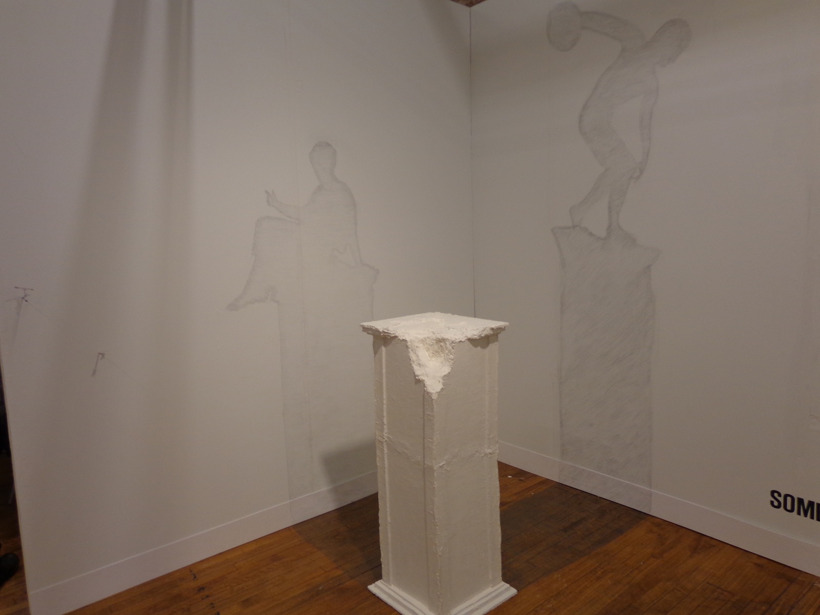
Shadowed wall drawings come from a cracked pedestal on which an ancient statue should stand – the floor and walls both filled in with gray to become the silhouettes of something nonexistent but expected. Sebastian’s whole booth, titled “Sombras Nada Mas” or “Shades Nothing More,” created a game between your brain and your eyes, as each piece forced a recognition of what was represented and what was really there.
Sebastian Mejia was represented at VOLTA by balzerARTprojects in Basel, Switzerland. According to his artist statement at the fair, his work “focuses upon the dissemination of visual information in different cultures.” He uses his work to examine the differences in symbolism between European and Latin American cultures, but all with a heavy-handed sense of comic relief to lighten the mood.
“Mejia’s work is an epistemological enquiry into the nature of knowledge, how it is acquired, presented, and how it can be retained, communicated, and implemented… Based on the ‘Allegory of the Cave,’ Mejia argues that language is a mere shadow of reality. Translated into the ‘visual,’ shadows of objects cannot represent reality of forms – truth must be experienced rather than told as language fails to convey belief. As ephemeral as his work seems at first sight, they are also about monumental historical and intellectual concepts, such as cultural interactivity, lightness, and adaptation.”
For more of Sebastian’s work, see his website – on the homepage there’s a pretty interesting video of the artist reading a book about Vasari in a library.
GD Star Rating
loading...


