Feb 28, 2013 | illustration, interviews, painting

From his series, “Where the crows fly on their backs.”
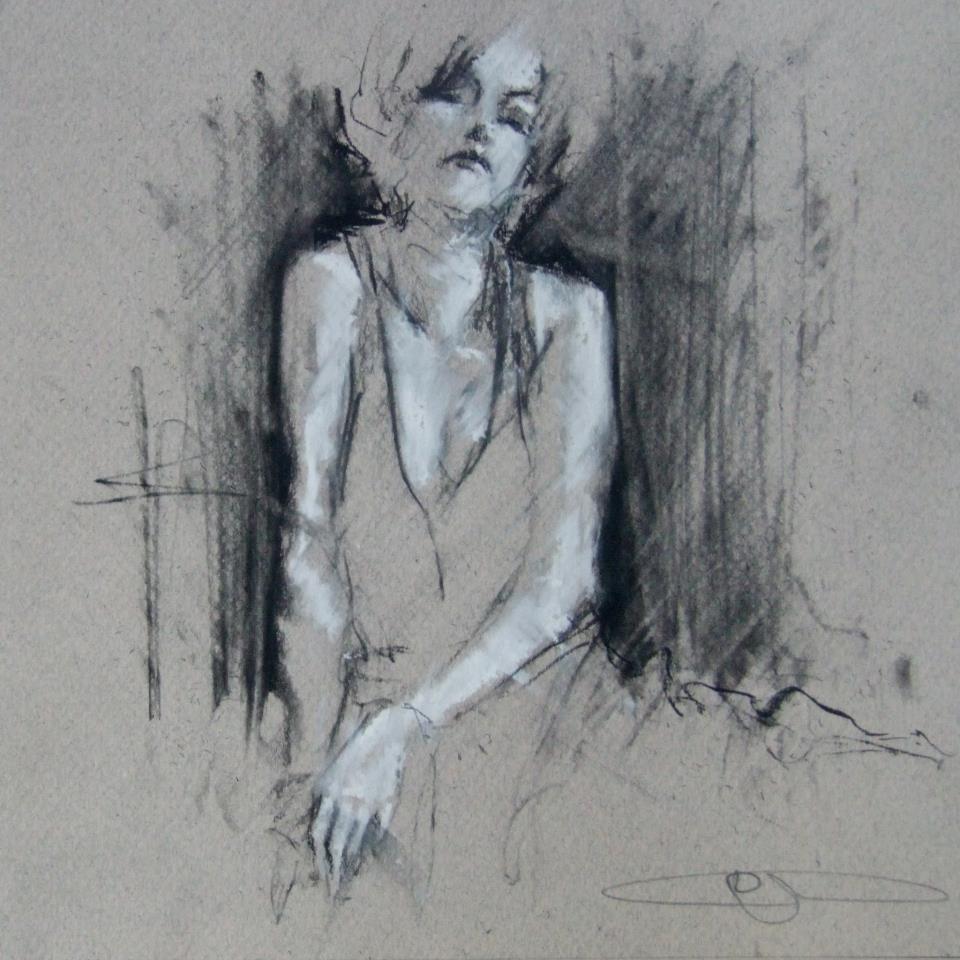
We see her through smoke, the black outlines only revealing what’s necessary and letting the rest of her float away. Her skin is luminescent in white chalk that’s used to cast shadows across her body, left side glowing and right side faded, but her high cheekbones pick up light on both sides. Her head tilts back, and even though there’s no way to know for sure if her eyes are open, it somehow still feels like she’s looking at you because she knows you’re looking. After all, someone this beautiful must always have eyes on them.
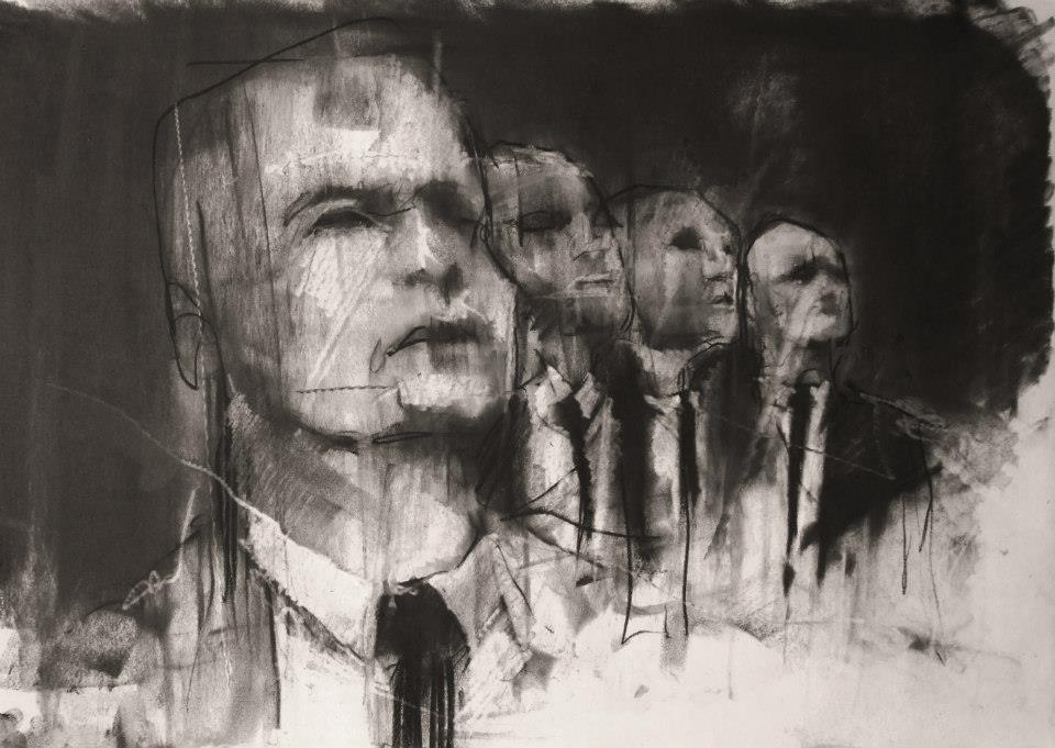
Guy Denning’s impulsive sketching masterfully reveals something beautiful, usually a person, which is probably the most beautiful thing there is. The faces he draws use heavy shadow and sometimes a filled in background to emerge from the lines and paper, but they always come to life with the movements of the sketch, made so obvious that you’re able to imagine the process of each drawing coming to life.

“And the other heads FIST
Since they’ve lost the desire to even try
And instead look ahead.”
conte and chalk on paper
30 x 40 cm
12th February 2013
What usually inspires the creation of a new image?
Ideas come from all over the place. Usually it arrives to a canvas after it’s sat in my head for a couple of months, and I’ve drawn it a couple of times. I’ve got more ideas in my head than time left to do ’em.
How would you define neomodernism?
No more than what’s defined here. In fact there’s a lot on my blog about methods, ideas and inspiration.
From Guy’s blog: “The Post-modern is useful only in terms of further defining Modernism from its origins and is essentially only a continuity of modernism – sometimes termed hyper-modernism. These are all useful, to a greater or lesser degree, in terms of avoiding the ideas of the ‘end of (Art) history’ but with regards to the actual creation of artworks they are invalid. People do not set out to create a work of ‘Post-modern Art’. If we must have a new label, let it be a New Modernism – a return to the critical aesthetic giving the artist the opportunity to create work that has some relevance to the new modern audience – an audience already familiar with ‘modern art’, where validation of quality is not founded on post-modern hyper-obsession with language and semiology and the artist is not ground into politically correct subservience. I do not see this as a retrograde step – it can be the only way forward – to let the artist communicate without the bonds of corporate and state art politics.
To those claims of ‘Art is Dead – long live Art’ –
Post-modernism is dead – long live Neo-modernism.”

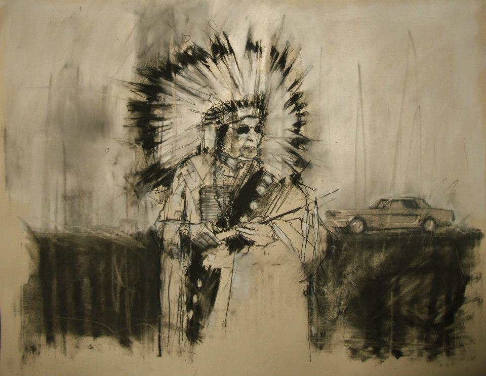
“AIM, the second battle of Wounded Knee (February 1973)”
conte and pastel on paper
66 x 55 cm
28th February 2013
What do you hope your pieces accomplish?
The most I can hope for is to emotionally move a viewer. Everyone brings their own lives and history to anything they look at, listen to or read. Consuming culture is as specific to the individual as making it.
When did you first begin painting and why?
I was drawing from childhood and I think that’s where my competency came from. I did little but draw and read – I certainly didn’t mix with other kids. First oil paintings were done at age 10 or 11 after my dad gave me a set of oil paints that he’d got bored with (a passing hobby in his 30s). I was hooked from the start.
Guy Denning is an English artist who’s been creating since the early 90s, and his work has been featured in exhibitions all over the UK as well as in Germany, Italy, France, and the US. You can see more of Guy’s work on his website, and all of these images come from his Facebook, which is filled with more things worth describing than I could ever filter into one post.

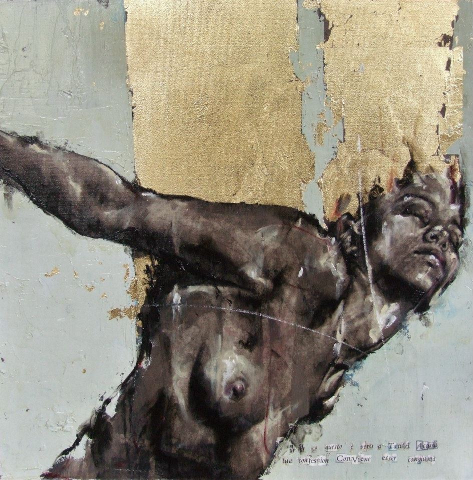
From the Purgatorio show, 2011 “dì, dì se questo è vero a tanta accusa tua confession conviene esser congiunta”
Feb 21, 2013 | illustration, interviews
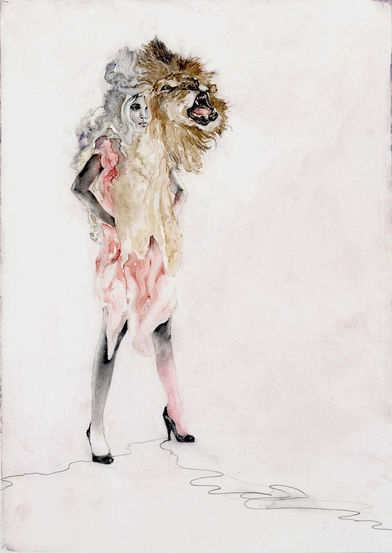
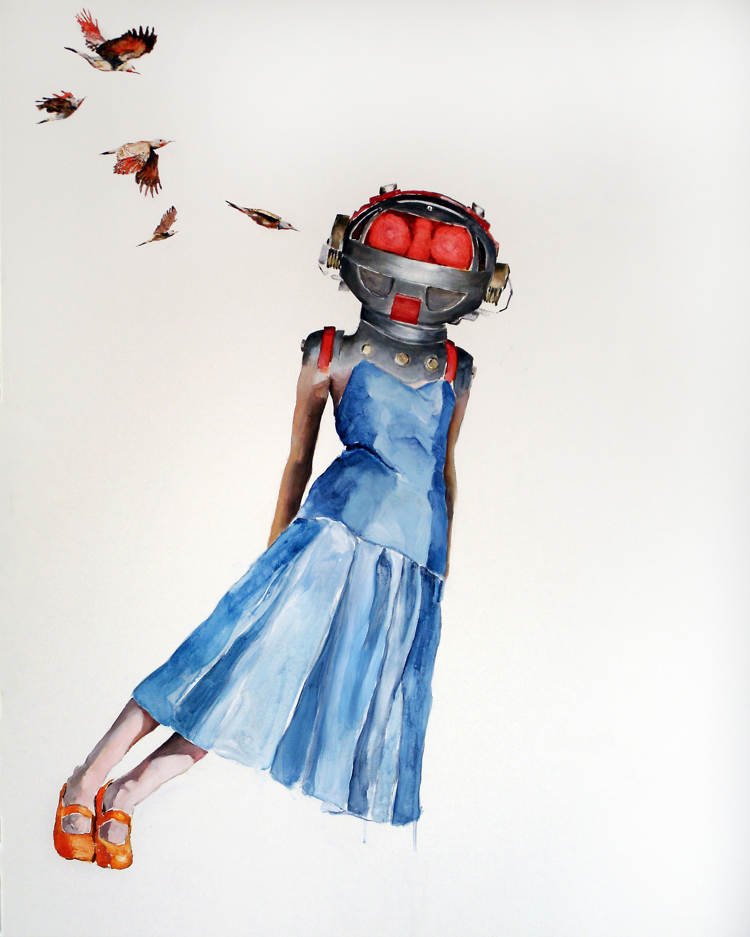
Contemporary artist Shari Rubeck uses watercolor and acrylics to create simple scenes filled with glamour, curiosity and chaos. Each brightly colored artwork beautifully explores the human psyche, with a suggested meaning that’s left open to interpretation . Her style is multi-faceted, each series develops its own sort of visual voice that usually involves some kind of animal imagery along with a sense of raw purity, the paint allowed to run and swirl organically in confined areas of the composition.
“Lion Girl” is a watercolor and graphite work that shows a woman standing defiantly, hands on her hips as her serene face is overlaid with that of a powerful lion roaring, the color of his mane melting into her fiery tethered dress. A girl in a blue dress leans impossibly far to the right in “Sharp Intrusion,” her head hidden by a glowing red space helmet with five birds flying towards it, as if they were working as a team to knock her over.

What’s the first thing you can remember painting?
The inside of my parent’s station wagon with crayons is one of my earliest artistic memories. But my first memory of painting would have to be when I received a good quality set of brushes and went to town filling large pieces of watercolor paper with all varieties of brushstrokes until I could think of no more.
What do you think watercolor adds to the creation of a piece?
Watercolors are fresh, light and have an immediate quality. I am working to bring that sense of luminescence to some of my larger acrylic paintings on linen.
What do you like about including animals in your work? Particularly bunnies?
Animals are a big part of my life and psyche. They are present often in my thoughts, dreams and work. They are my connection to the subtle workings of the world. They are magical, intuitive, and fierce, connected and make wonderful story tellers. As a human race we have turned our backs on them. Should technology suddenly drop off we would look to them for knowledge, guidance and find ourselves thanking them once again for sustenance.
The Bunnies arrived on the ‘scene’ soon after I began ‘working’ a puppet, named ‘Bunny’ for my son in his struggle to find comfort of sleep at bedtime. Bunny has a tremendously silly, but slightly cynical sense of humor and became my artistic story teller. The bunnies illustrate humor in the serious and not so serious sides of life’s events and emotions.

Who are the people your works represent?
The figures in my work represent all of us – humans and humanness. Some pieces are more representative of my own self and direct experiences, while others are observations from distant perspectives.
What do empty backgrounds allow for in your work and how do you choose a background for each character?
 I fluctuate between giving color & detail to the areas surrounding my characters and leaving them alone in their space. An intense drive to express an idea, message or observation leaves me feeling that the figures can communicate strongly without anything around them. The blank or negative space is carefully considered and tells much about the tensions while simultaneously allowing for areas of visual repose.
What do you like about the image of a figure with a mismatched head?
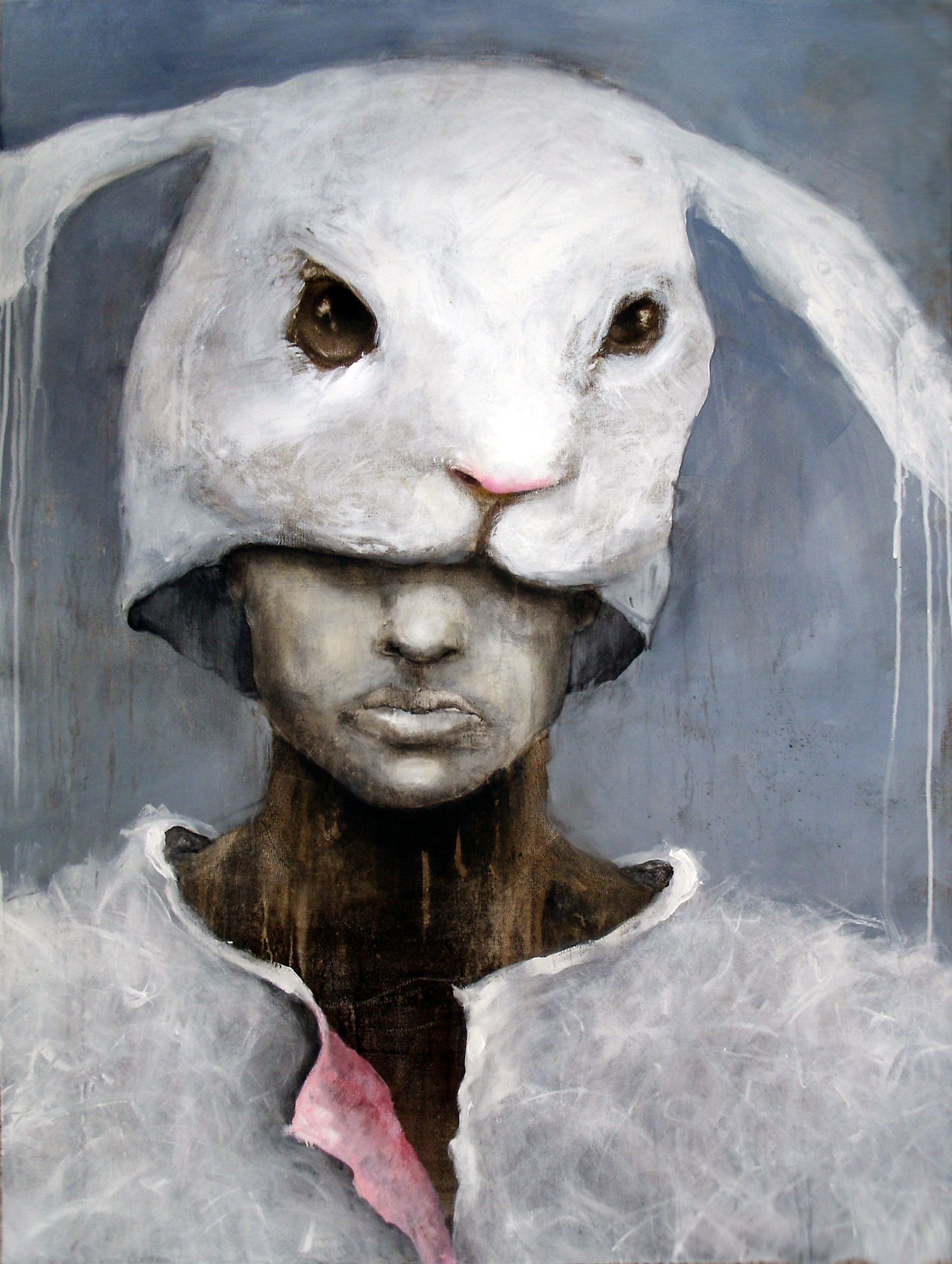
A figure with mismatched head…isn’t that what we all are? Or I could elaborate and say that we are all different degrees of mask wearers. My Ego series transformed into the Alter Egos. The first Alter Ego shows a human wearing a bunni mask or a bunni wearing a human – there is some ambiguity. I have always been intrigued by masks and what they can represent. There is so much that goes on ‘backstage’. I do also love the weight of a head that is too large for its body; whether mechanical or creature.
What are some of the art websites or blogs you follow?
Some sites that I am affiliated with or keep up with are: BlueCanvas, Twitter, ARTCZAR, Elisa Contemporary, Artsrogueisland, GalleryZ, ColoColo, Hallway Gallery, and now of course ThingsWorthDescribing. I find many intriguing sites on random searches but may only visit them once.
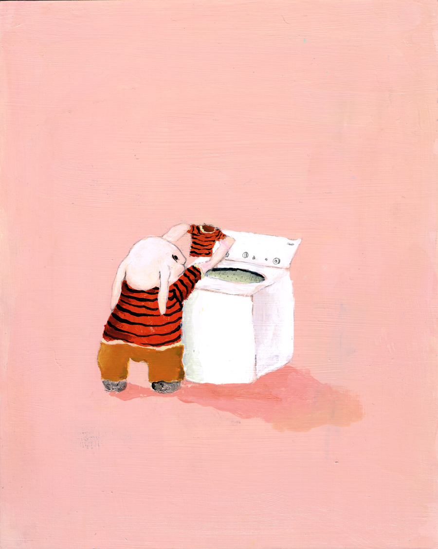
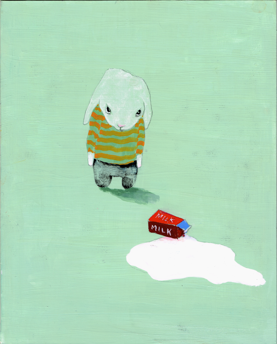
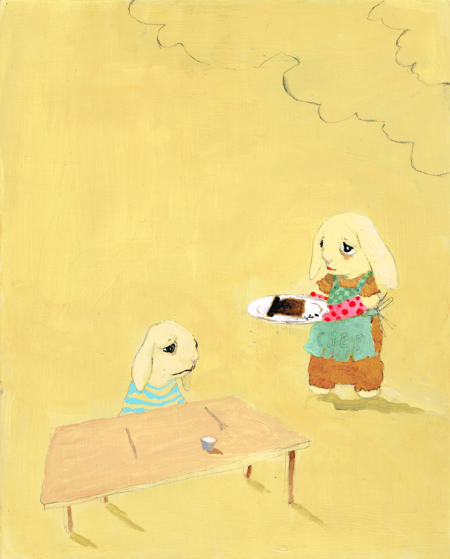
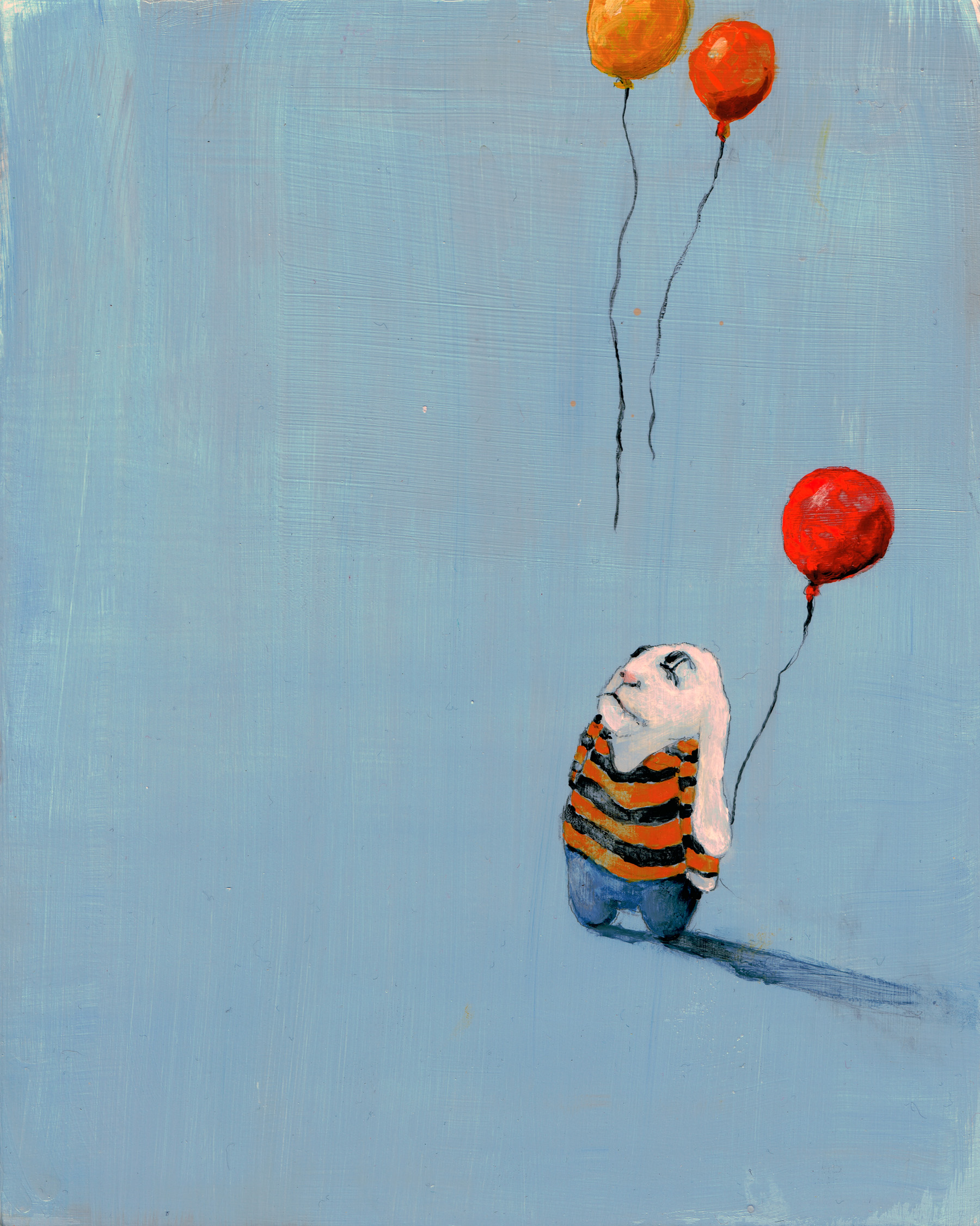
Minor Situations is her newest series of bunny paintings that’s by far the most adorable – fluffy floppy characters shown after a small disappointment like burning toast, letting balloons go, or spilling milk. Their little bunny faces look so downtrodden, and their long ears allow for an exaggerated sense of unhappiness as they fall down the back of every bunny. Simple scenes against bright-colored backgrounds, these works are lovable in a silly sad way.


For more of Shari’s work, head to her website Art in Mind.
Feb 13, 2013 | books, interviews
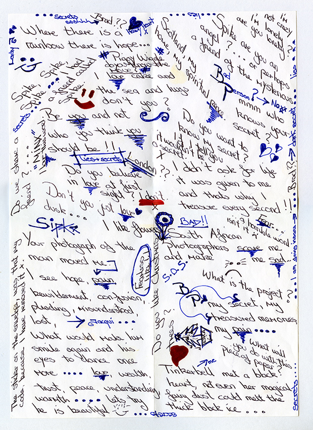
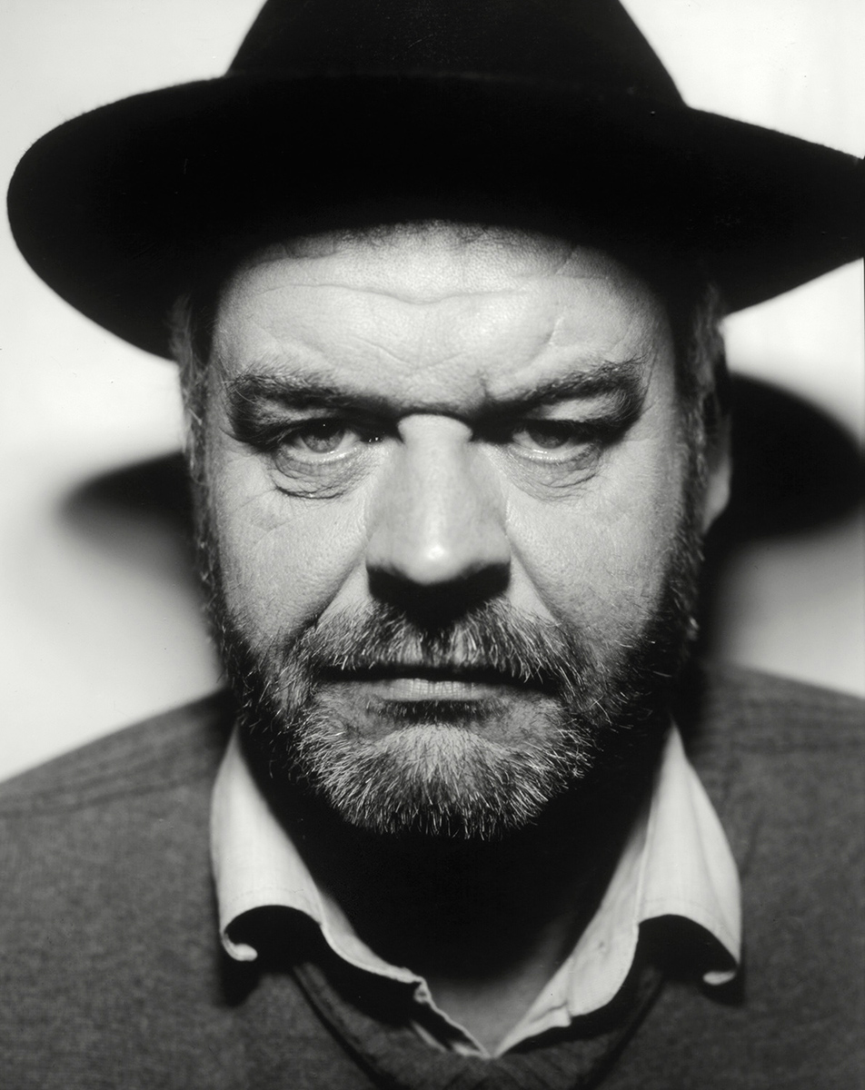
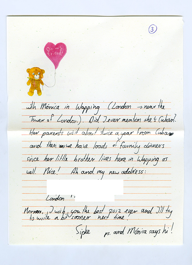
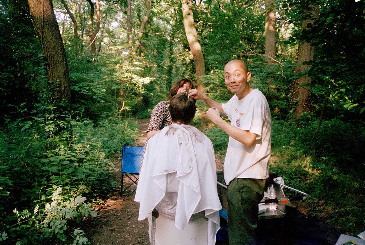
Sipke Visser grew up in the northern Netherlands, but currently resides in Wapping, London. All of his works involve strangers, and this time connecting strangers – people who otherwise would have no knowledge of the other’s existence. Sipke “aims to photograph those intimate moments when people are immersed in themselves or with each other,” and for this project Return to Sender, Sipke sent those photographs to hundreds of random addresses across the UK. Included with these photographs was a stamped and addressed return envelope along with a handwritten letter asking for a very open-ended response – either to the photograph, about your day, a random thought, anything really.
Return to Sender was recently published as a 480 page book, a careful recording of the correspondences that came from each of the 500 letters that Sipke sent over the course of two and a half years. He found the addresses at random on GoogleMaps, sending a few of the letters to the US as well. A random human response survey that allows for any sort of reply, using what’s almost now an archaic form of communication – although it is the only one that still remains somewhat physical.
This post contains images of the photographs sent and letters received, courtesy of the artist.

Did you ever have a pen pal when you were little? Do you often used the postal system to communicate with people, even if it’s just for the novelty of it?
I must have at some point but to be honest I don’t remember at all. If my penpal from back then remembers, please let me know!
When did the idea for Return to Sender strike you? Was it always intended to turn into a book?
It was in the autumn of 2008 and I was having take away dinner with three friends in yet another friends home in Amsterdam. One of them had been a postman for a while which we were talking about and then suddenly it struck me that it would be fun sending images to random strangers. The foreword in the book is written by one of these friends, the one who used to be a postman.

Which responses did you like the most? How often did the responses mention or relate to the photograph you’d sent them?
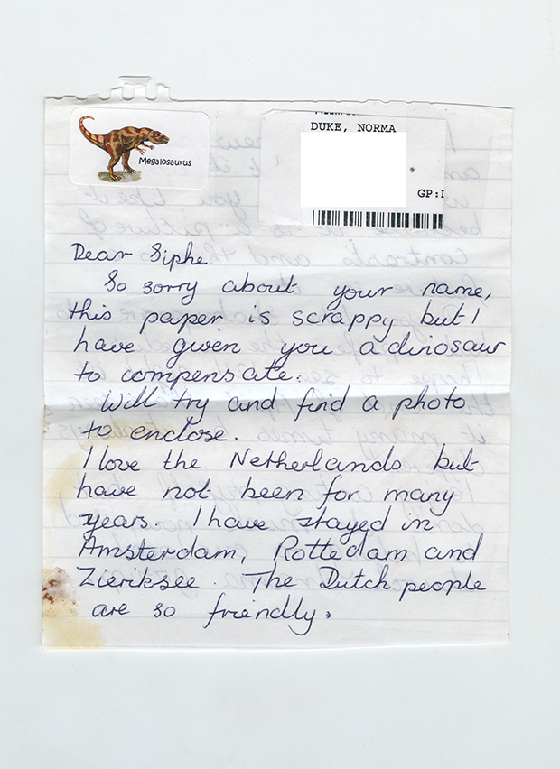
The one that stands out most is Norma since we kept on writing. There are many letters written by both of us to each other on the book. She writes about everything that happens to her. About her children, her grandchildren, her mum (who passed away at some point). I
write about what I do, my love life, London, etc. There is a guy called Donald who sent me pictures of himself and his sun. There is a beautiful one of a lady whose mother in law is not doing very well but who is very religious. The image she received happens to be religious and she writes how special that was for her. There is an A4 full of doodles by someone anonymous. And also some very rude or aggressive ones that are quite funny once you get past the rudeness – although I was a bit offended when receiving them.
Some people do talk about the image they received, but many others don’t.
What do you hope the readers of Return to Sender take away from both the book and the project as a whole?
For me it was about many things but I think the main thing is the idea that complete strangers receives a letter and a photo in the post without expecting it at all. And I’m so curious to where they ended up and I love receiving post and finding out. I think I just hope people will enjoy reading the responses and perhaps like the pictures. It’s a book you can open up on any page and since it’s a lot of pages you might find something new many times.

What other sorts of projects have you done previously and what do you think you’ll do next?
A few years ago I was very busy with work (I make most of my living as a retoucher) and barely had time to shoot so I thought it would be a good idea to invite people to my place to photograph them for an hour or so. I put an ad out on a website called Gumtree which I think is similar to Craigs List. Over 30 people visited me in about a years time and I took their portraits. The images and some text are on my website. I also once rented an empty room for a month and invited strangers over for an hour. All that was in the room was coffee, tea, an old 35mm camera with one lens and me. The light in the room was terrible and the pictures not great but it was a great way of spending time with a subject and a camera and nothing else. And I’ve got a great number of projects in my head that I want to do now, but I’m not saying what yet. The best way to stay up to date is to visit www.asortofdiary.com

{About A Sort of Diary: the website Sipke started when he moved to London from Amsterdam in 2005 to start a life in photography. A Sort of Diary is a visual outlet for what has kept him busy over the years. Not quite a blog, not quite a website, more a …. sort of diary. His eye for a great off-beat moment, combined with humorous comments and observations on the friends, family and strangers (not to mention animals) in the photos leave you feeling as though you’ve come to know him personally.}


For more of Sipke’s work, see his website.
Feb 1, 2013 | installation, interviews, painting
 |
| Sophia Ainslie’s mural in progress on 1/30/13 at the Kingston Gallery |
On Wednesday I was lucky enough to meet with Sophia Ainslie, a South African artist who’s currently working on a mural at the Kingston Gallery in Boston’s South End. Right now I’m working on
an Artscope post about this new show “in person,” but I needed to write something else too because it was just so incredible to watch that mural come to life.
 |
| Mural with projection. |
Sophia had three trained assistants painting while I was there, two up on ladders filling in bright colored sections and one standing, tracing the lines coming from a projector. The projector contained a zoomed in section of the wall’s intended design, made with a computer that was used to combine works from “Fragments,” the drawing series Sophia has been working on for the past four years.
 |
| Sophia Ainslie (right) instructing an assistant. |
She made a number of murals from this same series last year, but this is the first time she’s ever used assistants. She told me she wanted to see how much of the work she could give away, kind of like Sol LeWitt but without giving it all up – more like Frank Stella she said. She wants the concept to be hers, but she was still very particular about how the assistants painted, she trained them and walked them through the process, overseeing the wall’s development every step of the way. “I’m a painter,” she said, “I’m seduced by the architecture of paint.”
 |
| Paper works for “in person” at the Kingston Gallery |
The lined sections of this feathered, almost camouflage-like design, were inspired by landscapes, but the ones seen beneath her feet so that she’s involved in what surrounds her. The colored bits are abstracted interpretations of her mother’s last X-ray, before she made the decision against surgery for cancer at the age of 82. Sophia has been developing this series since her mother’s passing in 2009, and now the horizontal large-scale medium of the mural is allowing for a release, “This is more about a letting go,” she said, “all the other images were vertical and more about the body. This is a release of her.”
 |
| Sophia Ainslie (right) instructing an assistant. |
 |
| Mural with finished design taped up. |
See more of Sophia’s work on her website here.
And read more about this show in my Artscope post!
Dec 8, 2012 | interviews, sculpture
Robert Mango has been a working artist in Tribeca since the 70s. When he arrived it wasn’t yet called Tribeca; he set to transforming a bread and egg factory on Duane Street into a studio and home, the wooden floors still stained yellow from all the yolk. I was lucky enough to get a tour of this studio yesterday as he walked me through a body of work even more impressive than his transformed gallery, exposed brick walls lined with art. His work began as sculpture and painting that coalesced into a new kind of mixed media; a constructed layering of materials and color that projects three dimensionally, but is still contained on all four sides within a frame.
Working with the female form as his muse, Mango’s most recent series presents women as powerful forces of feeling, with limbs twisting and swirling inside and on top of the border’s edges. Instead of being simplified, these women are glorified, celebrated, and admired – each one embodying an entire sensibility. Their arms and legs curve into distinct postures that transform each piece into the goddess of her action:
Anticipate
A swirling body painted in matching swirls of orange, she sits on bronze stool with her ankles daintily crossed, leg joined with a hip that spirals up into the two small circles of her chest. Her body keeps twisting up into arms and a bronze head – her right arm disjointed and dropping down into fingers that tap restlessly on her leg. The attention on this arm leaves the whole rest of her body stacked on the right side, her abstracted torso looks like the face of a frowning man – left leg propped up to become his chin and cheek. She’s poised but waiting, with some impatience but with more grace.
Envelop
Her figure spirals out on a grey-orange-purple background that looks worn compared to her bright blue and white. These orange and purple shapes are sketched out in rough black outline, and her figure literally floats off its surface, crafted puzzle pieces of sculpted foam that float together, two legs that cross and a single arm that encircles her head above. Looking up, her hair glides down and springs up to create a space for the hand coming towards it, which creates a sort of compositional symmetry that matches her criss-crossed legs. Her form dances, embracing itself and the space it occupies, a space that becomes yours physically with her figure projecting inches from the background.
Adore
She is absolutely absorbed in emotion, all her limbs motioning in the same direction as the kiss she’s blowing. The whole work is shiny, blue and green loops of metallic make up a background that leaves spaces for the wall behind to come through. Her hair is blown back into little casual curls in a bright shade of metallic blonde. The left shoulder looks like a cave shaped for her heart, a little spiral that projects itself forward like a megaphone disguised as her Adam’s apple. It calls out just like her kiss does, her toes curled with a hint of tense desire.
 |
“Girl with Trumpet,” 2012
Image courtesy of the artist. |
Captivate
Here the sculpted foam is photographed against a white background, but of course photography can’t do much for sculpted foam. In person, her figure physically comes toward you, grabbing bits and pieces of the abstract background behind her and becoming a kind of golden goddess, bent over like she’s in the middle of modern dance rehearsal. Her gold-plated head and hair in profile bring out the frame that’s overlaid with the abstract shapes that become the trumpet part of the piece. She’s powerful, with a warm, sexy forcefulness – emboldened by the dynamic background and confident in the fact that you’re looking even though she isn’t.
These women work as goddesses of action, fully involving their environment by revealing the wall behind them and by physically coming into your space; relief sculptures of carefully shaped and colored foam that melt in the most organic way, merging into legs and arms and hearts that become a single, powerful action.
See more of Robert Mango’s work on his website here.
