May 7, 2015 | art fairs, painting, political art, San Francisco
This past weekend three different art fairs decorated the San Francisco peninsula. One of them, Art Market SF, comes around every time this year, but the two others celebrated their inaugural opening. The Parking Lot Art Fair let artists set up booths in parking spots on a first-come, first-serve basis, starting as early as 5am. They didn’t even announce which parking lot they’d be momentarily filling with art until the day before the pop-up fair opened.
But my favorite was the stARTup Art Fair, an independently produced contemporary collection of unrepresented artists. The fair was held in the open-air grounds of Hotel Del Sol, a 1950s motel turned boutique hotel, which housed one exhibitor per hotel room during the three-day event. More than 3,500 people came to browse the hotel filled up with art.
Here are a few of my favorite rooms:
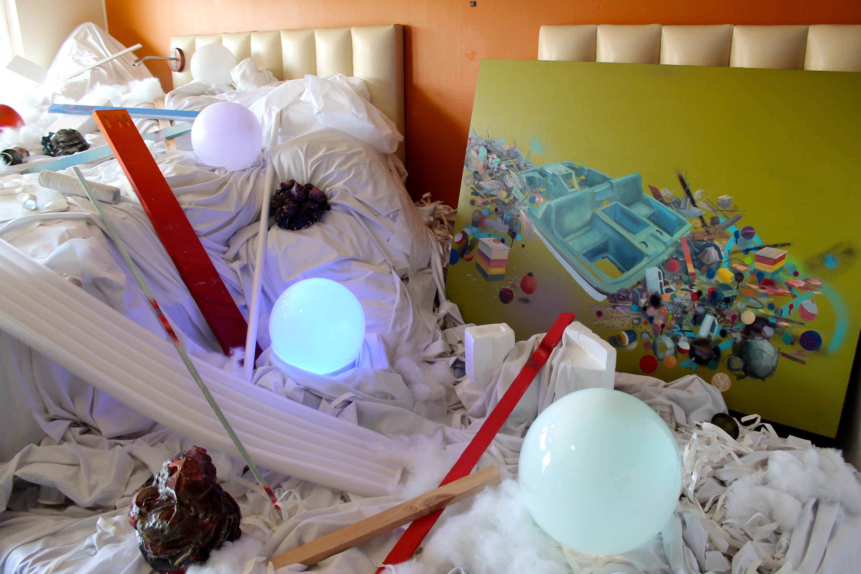
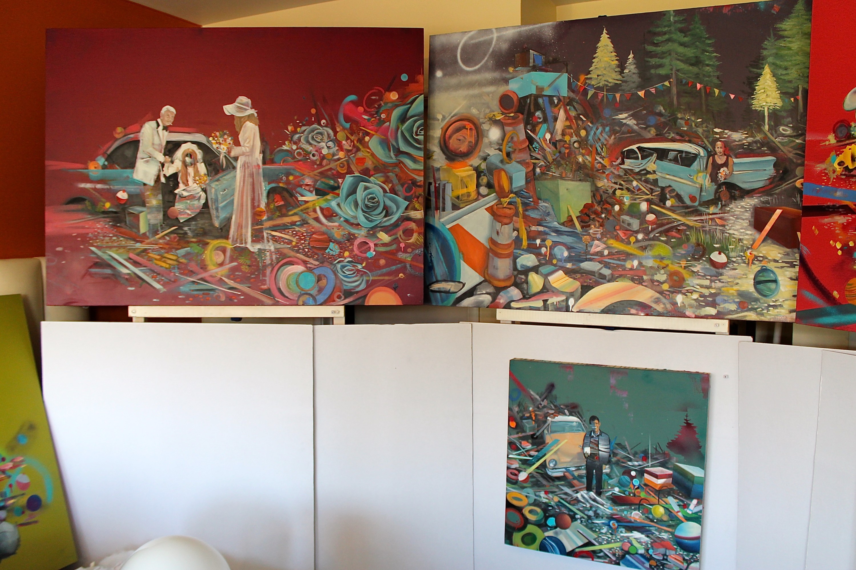
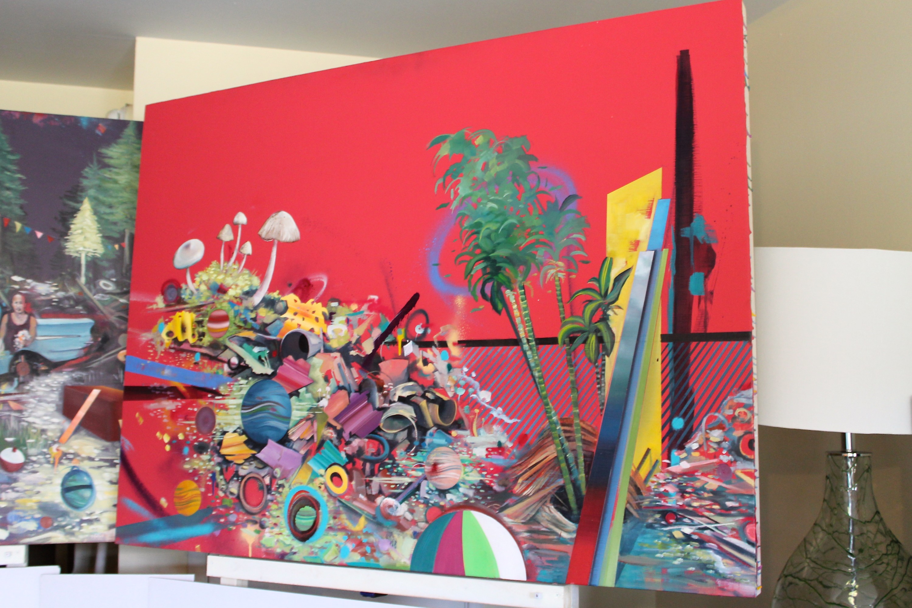
Joshua‘s work breaks memories down into hues and shapes set against solid neon color. Because our conceptions of the memories that shape us can’t always be explained through smiling grainy photographs. A day on the beach is a chaotic pile of planets and geometric debris, a shovel lost in the mix and the beachball nearly out of sight. A cluster of palm trees are ringed like Saturn in blue, but they stand against a bright yellow backdrop, a line of ugly tall brown sand hiding not-so-conspicuously behind it.
How many our happiest childhood moments have been reshaped by the reflections of all the happy images we’ve seen in ads and TV shows since? The way Joshua paints them, I definitely prefer the messy bright amalgamations of color to fading, disappointing memories.

“The deconstruction of both form and subject reveals the fragile fabrication of the facade, as well as equating the surreal deterioration to our capacity to retain memory and the inevitable fleeting of the details. color and suggestive shape alone play a huge part in tickling the senses. Even the most gestural marks in context with each other can suggest something so real to our memory.”


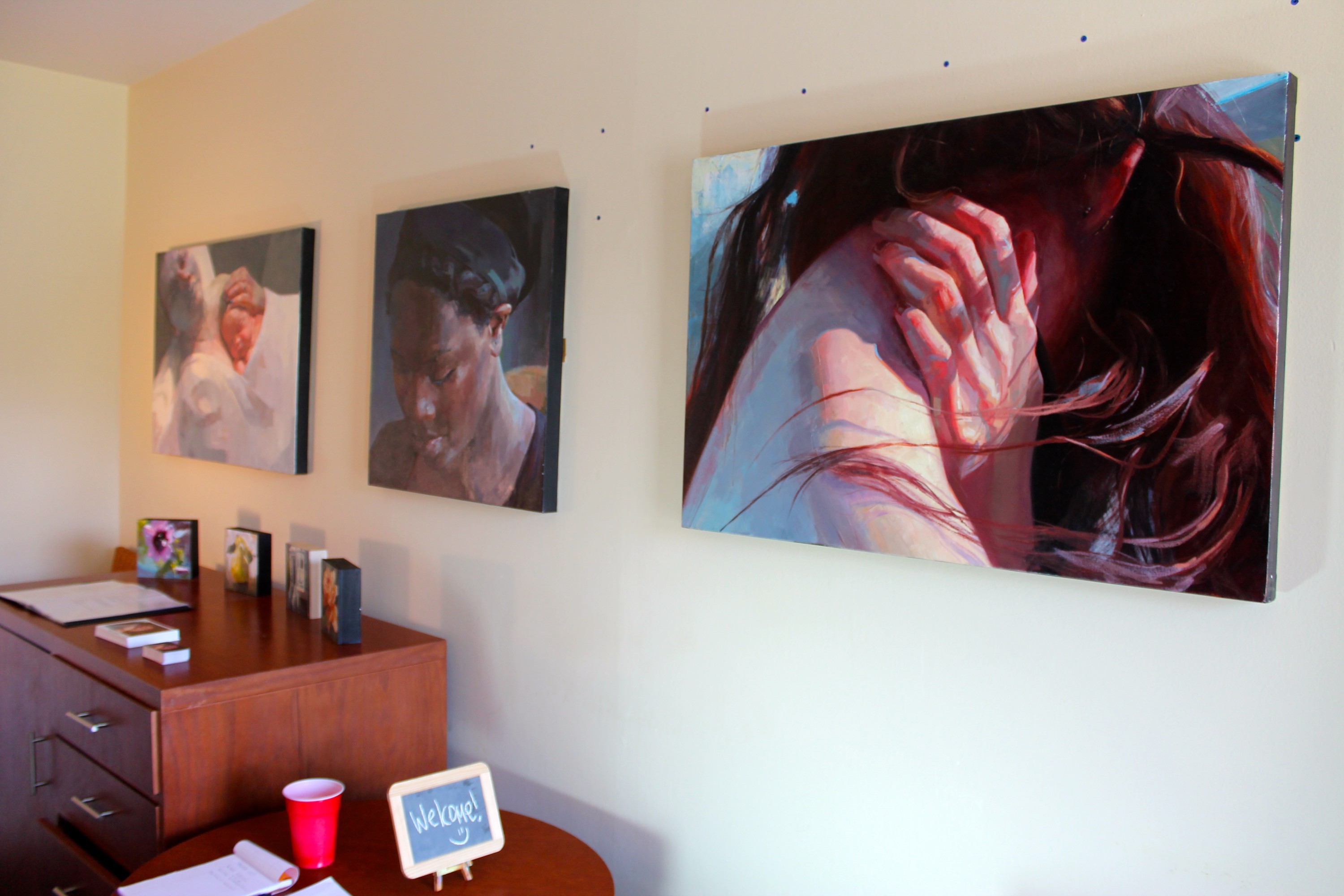
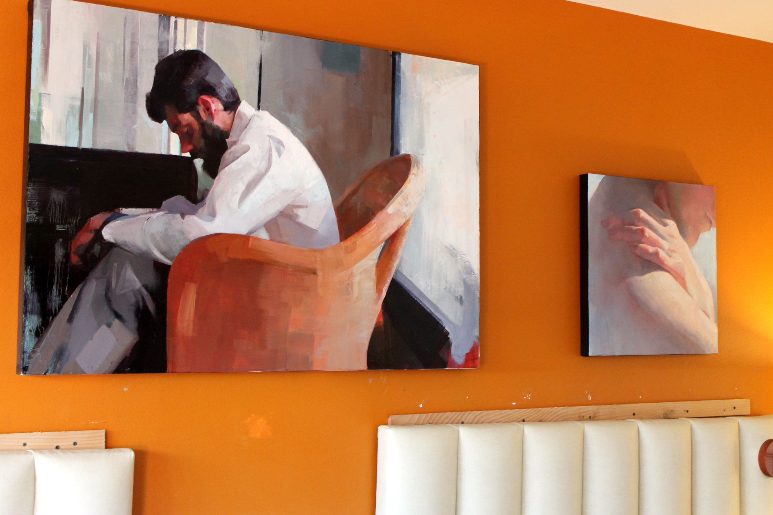
Light touches Theresa‘s subjects the same way we imagine clouds splitting to shine down eternal wisdom. She paints skin with a soft, glowing brightness that gives way to all the tender muscles and bones struggling quietly underneath. And yet her faces and gestures are delicate and relaxed, thick brushstrokes interpreting each figure and scene through a silky haze, like when you first see the world with your eyes half-closed each morning.
“I aim to find what is interesting in what is ordinary; an appreciation for the every day experience. Through close observation, I use the versatility of oil paints to capture the interesting abstractions found in even the simplest of objects… My work is centered on drawing attention to what we might otherwise take for granted.”


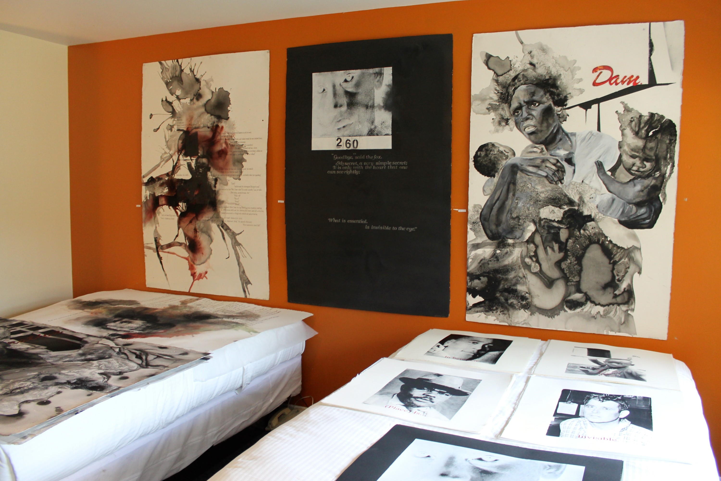
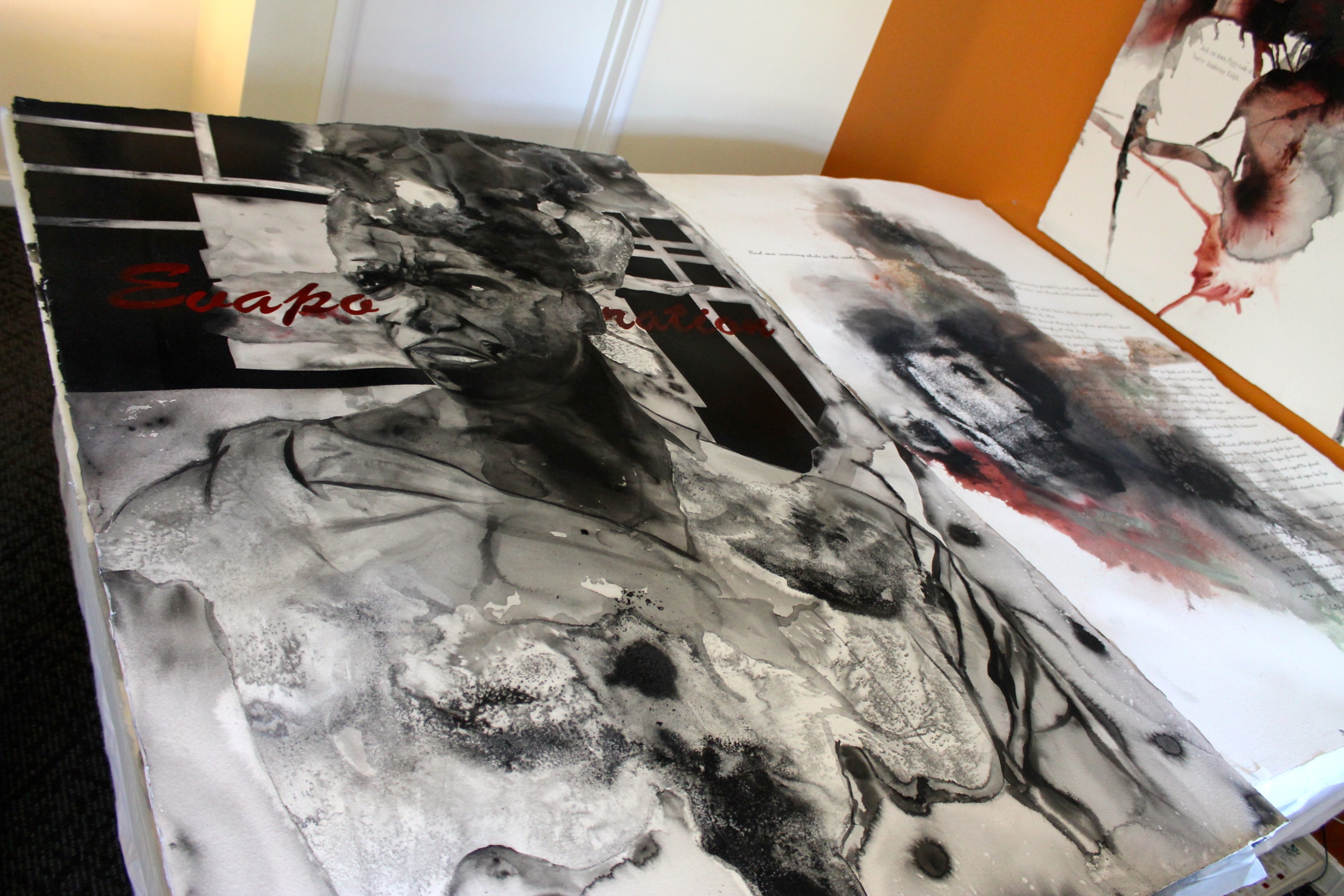
Rodney‘s work uses black and white text and images to prove that the world could never be that simple. Splashing watercolors are dissolved away by salts that further fade each figure, as if these canvases held the histories we’re so in danger of losing. But the one part of each figure you can always see unmistakably is a pair of eyes peering out, sometimes with hope and other times with defiance, but always witnessing the circumstances that surround them.
Some in our country jump to say the roots of these problems don’t exist anymore, but the politics behind thousands of years of racial injustice should feel very real when our cities are rioting because sons and fathers aren’t safe.

“While debating demanding topics such as race, religion, or war, it is simple enough to become polarized, and see situations in either black or white, right or wrong. These tactics may satisfy individuals whose position depends on employing policies or implementing strategies that promote specific agendas for a specific constituency. But as an artist, it is more important to create a platform that moves us past alliances, and begins a dialogue that informs, questions, and in some cases even satires our divisive issues.
Without this type of introspection, we are in danger of having apathy rule our senses. We can easily succumb to a national mob mentality, and ignore individual accounts and memories. With my work I am creating an intersection where body and place, memory and fact are merged to re-examine human interactions and cultural conditions to create a narrative that requires us to be present and profound.”

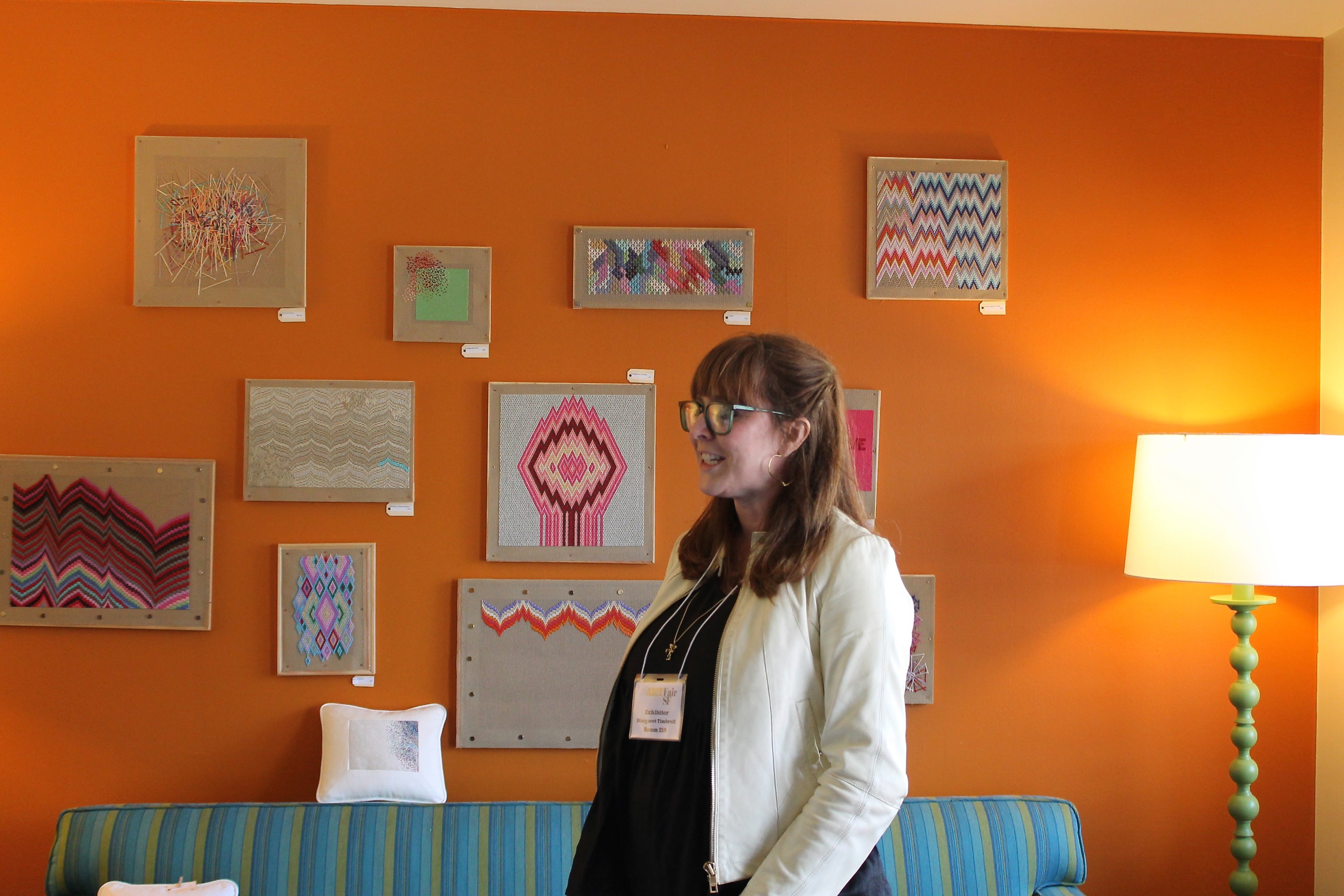
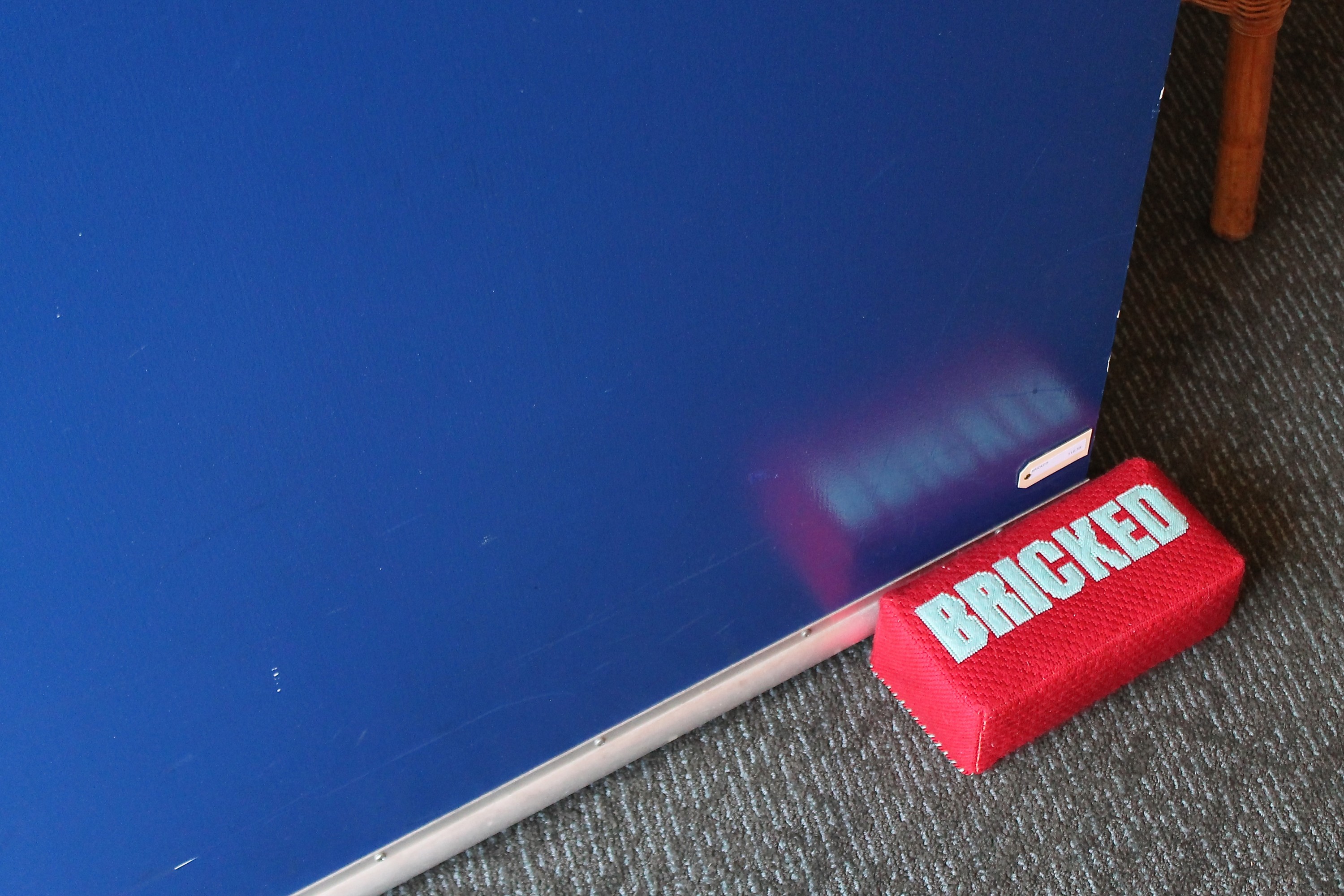
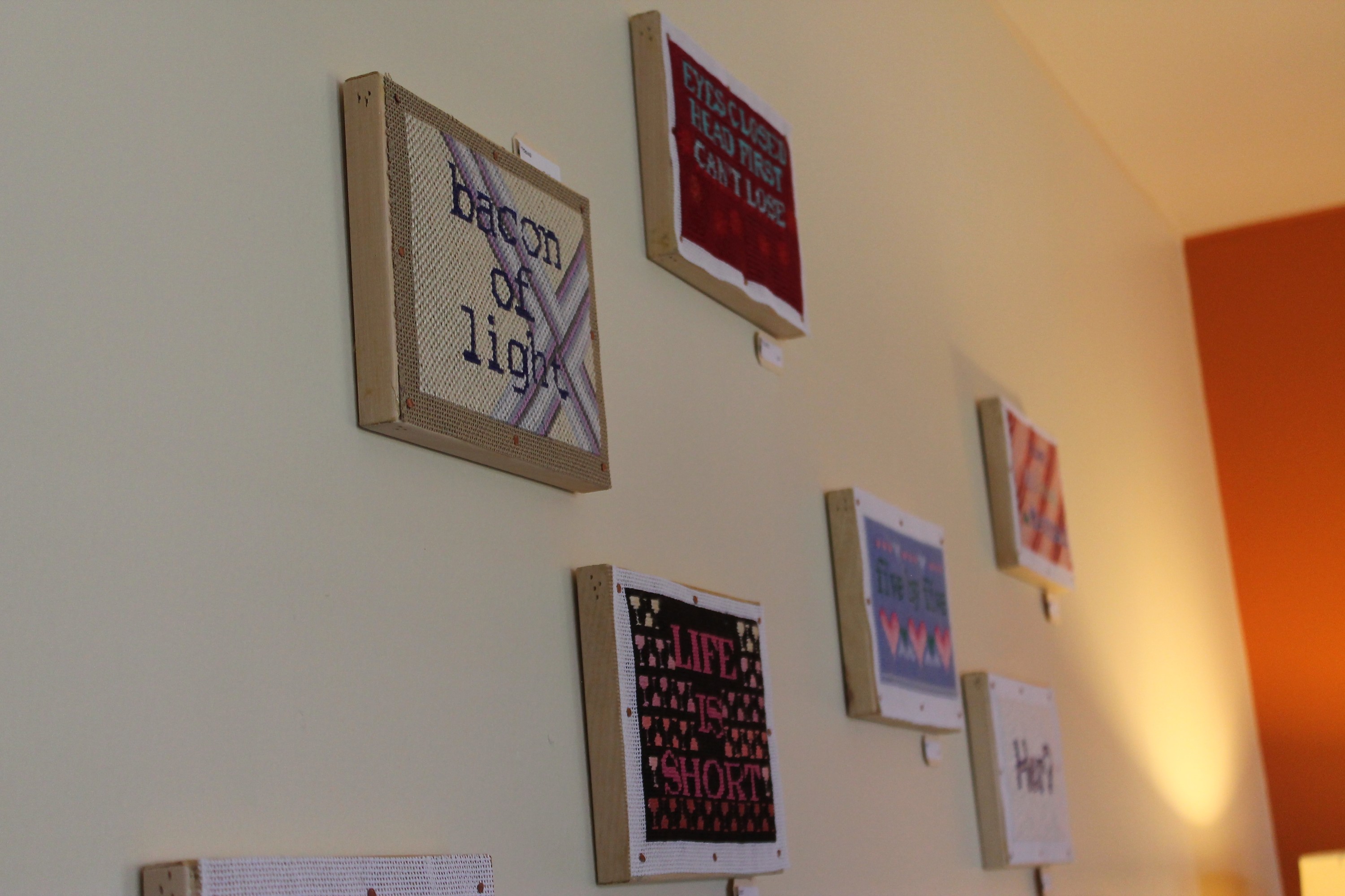
Margaret‘s needlework pays homage to the art of sewing while relaying quips that definitely wouldn’t land as hard in another medium. Something about cross-stitched letters begs you not to take them seriously, and in this case that intuition happens to be exactly right. Motivational statements like “Life is short,” and “Eyes closed head first can’t lose” are funny stitched out, and intentionally silly pieces like “Bacon of light,” “There’s no crying in baseball,” “Hello? This is dog” and “Her?” are borderline hilarious.


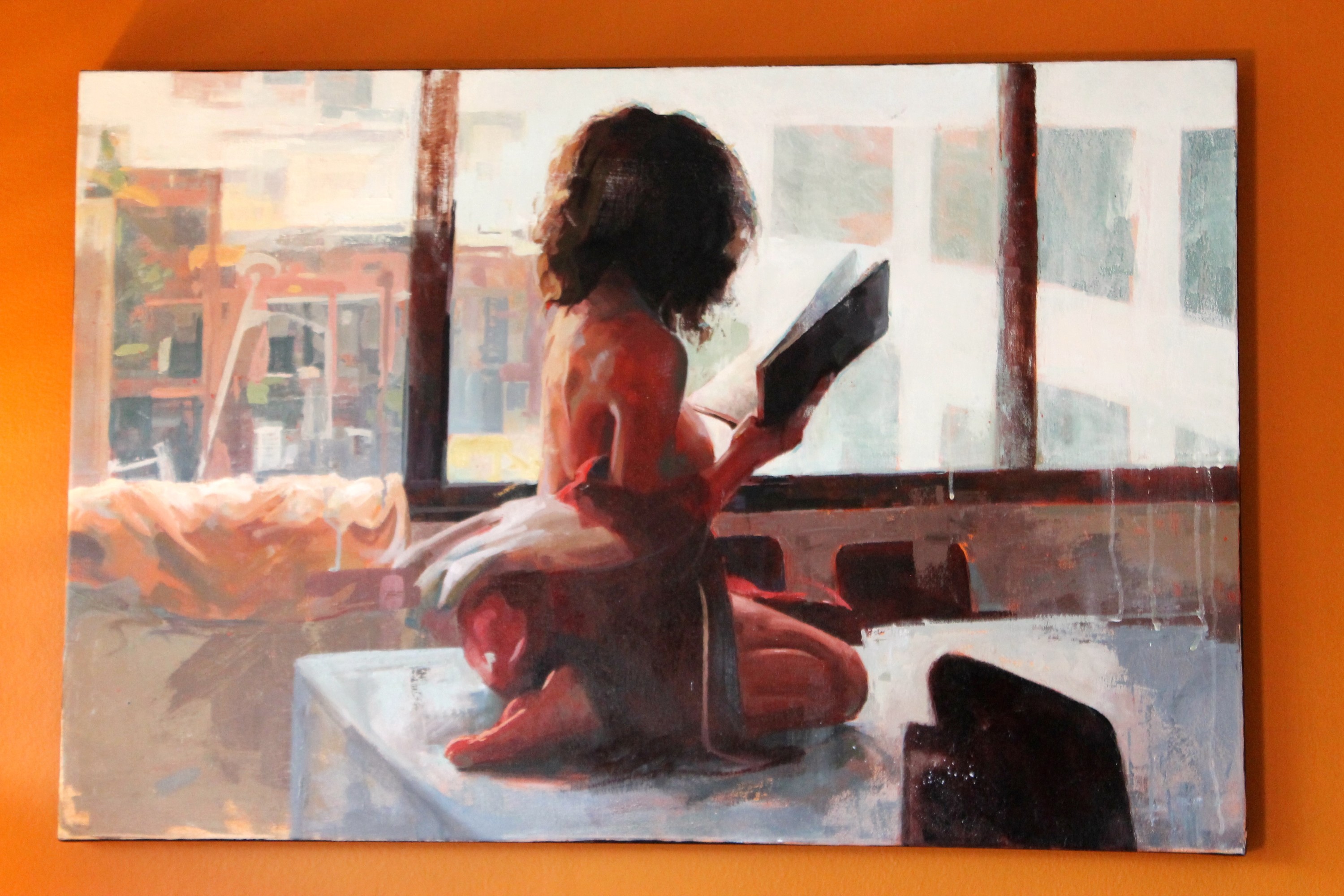
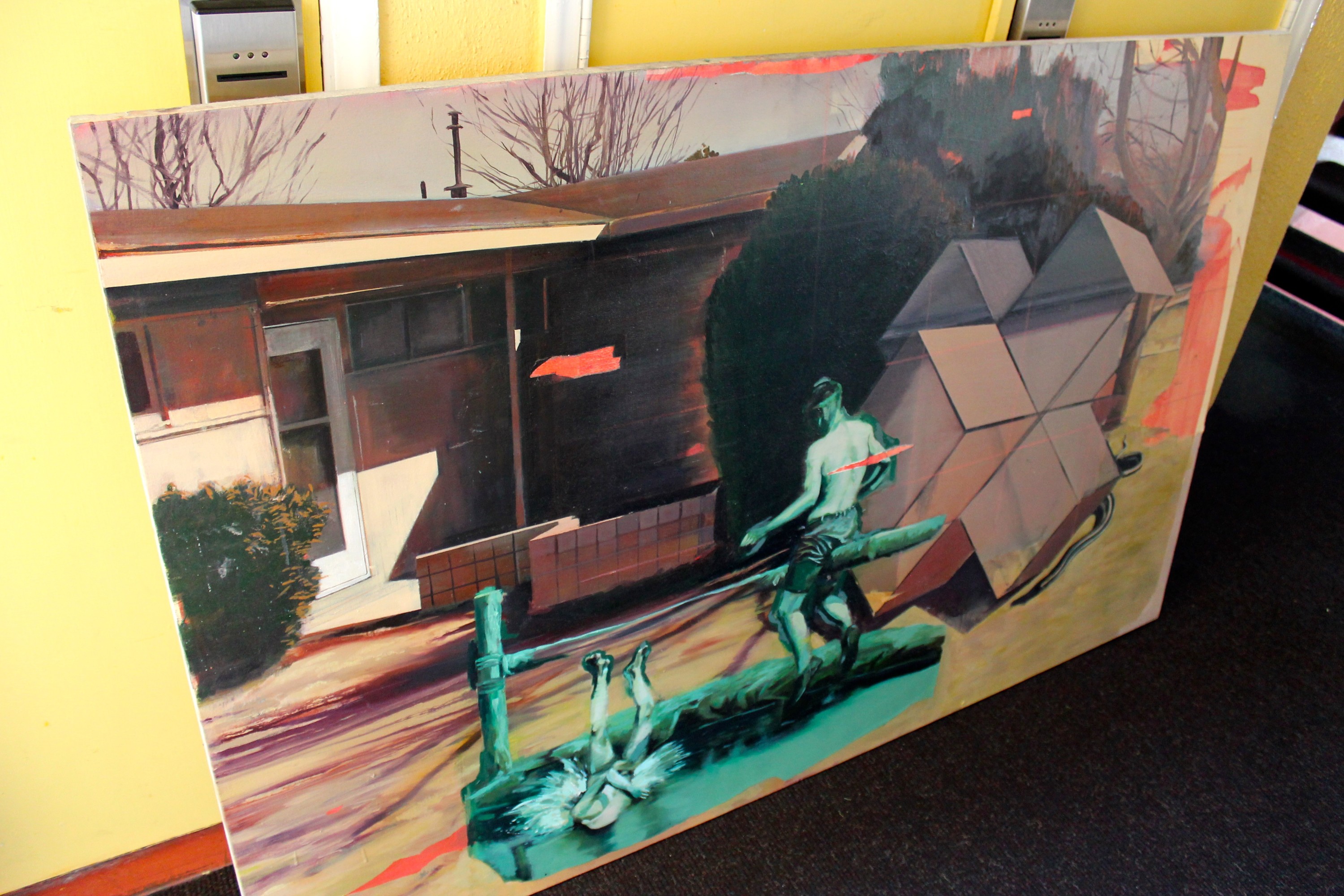
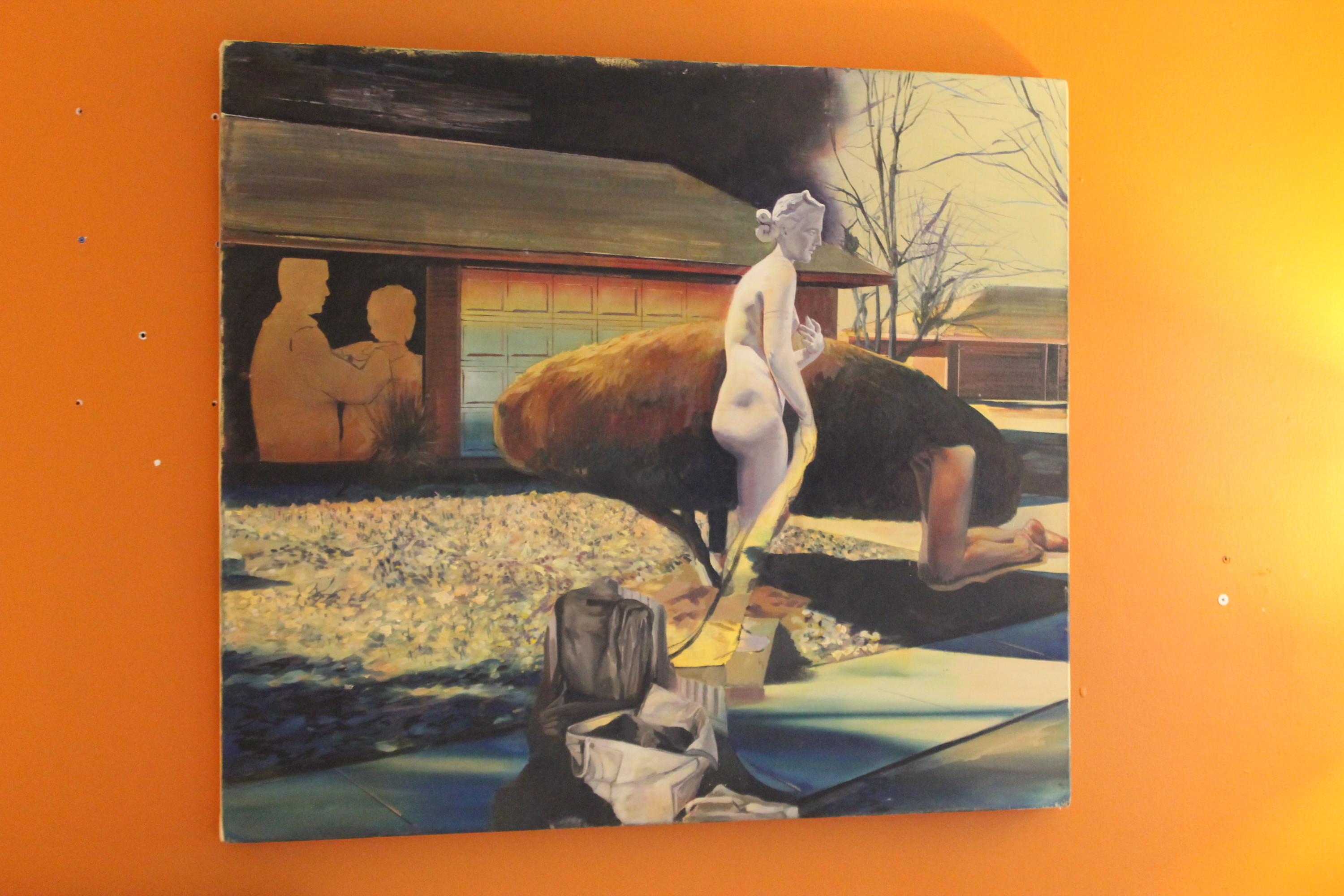
Jessica‘s paintings play with reflection and memory in an art-historical way, using color schemes and scene framings to give her work a stunning voice. The line between what’s real and what isn’t doesn’t matter in a world where what’s tangible serves as the backdrop to representations of a memory or frame of mind.

“In my pictures, I manipulate the body’s position in space to explore the dynamic between place and identity. My paintings often reflect the decentered, placeless zones of suburbia or urban peripheral as a function of a dislocated identity or collective fantasy. I construct narrative clashes, where the protagonist participates in the pictorial space of the painting surface, residing in the logic of an allegorical perspective.”

Mar 21, 2013 | art fairs, installation, sculpture
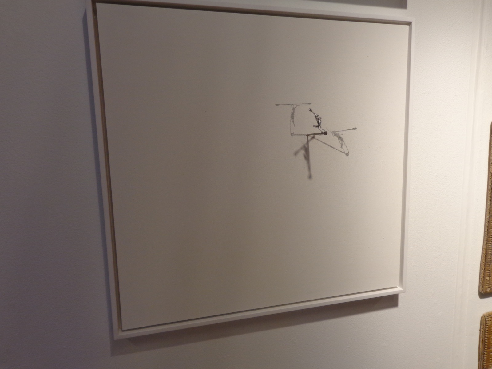
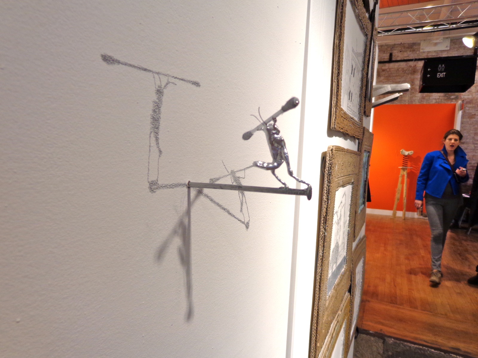
From within a plain framed canvas sticks a nail, and atop it stands a matching silver bug, holding some kind of weight across its shoulders. Existing somewhere between reality and a Pixar movie, the little silver fellow is given character, a purpose, and the ability to walk on two legs. The nail he balances upon isn’t in the center of the canvas either, it’s just off to the side, and the little bug walks towards the wide ocean of white as if he were unaware of the inability to travel through physical matter.
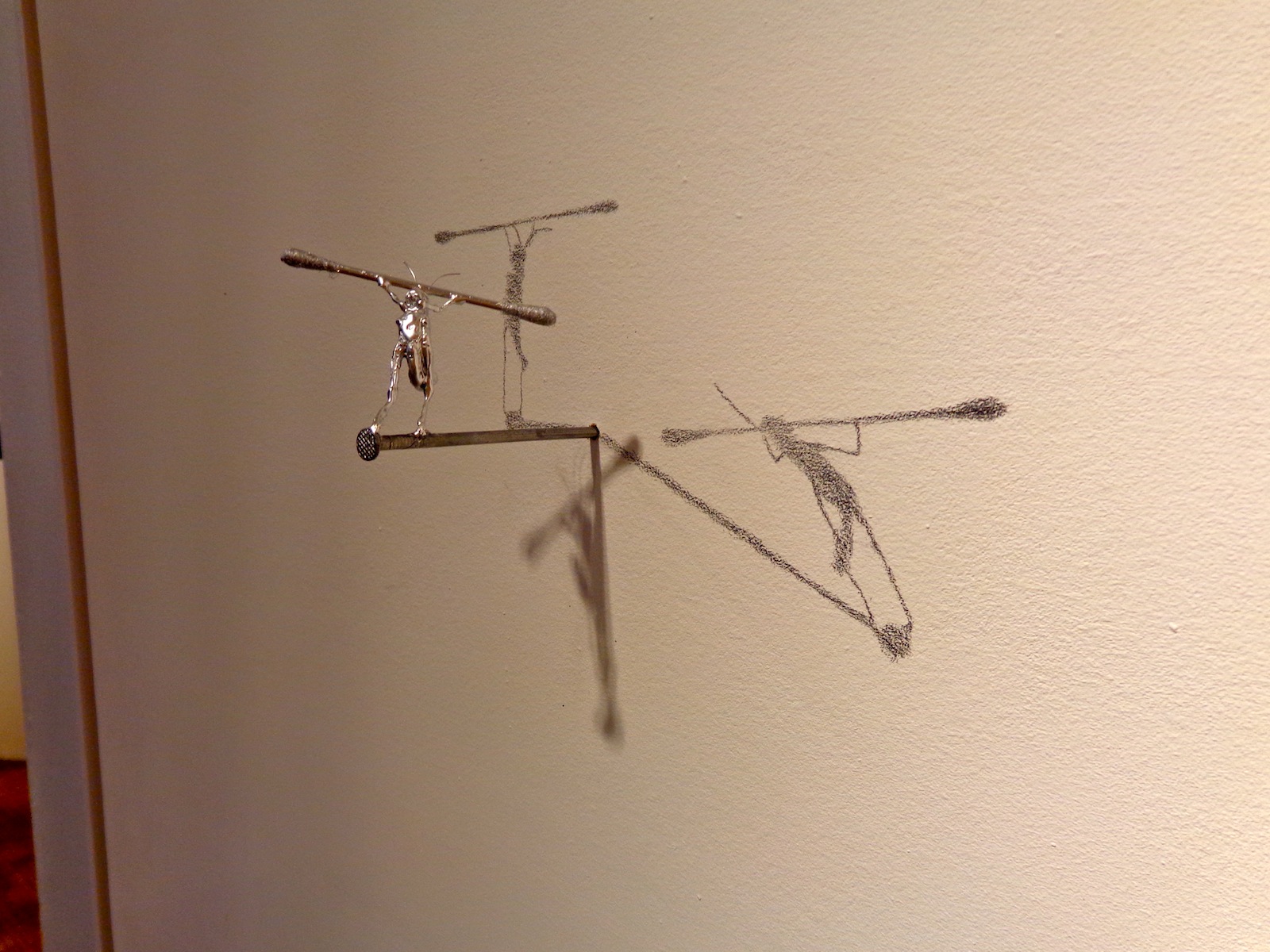
But that doesn’t matter anyways, because in this artwork he’s frozen in time, and as if there were three different suns, three of his shadows stretch out from where the nail meets the canvas – two drawn on with pencil and a third that is an actual shadow, created by the lights above booth 2.11 at VOLTA NY.

A work by Colombian artist Sebastian Mejia, the strong little bug was echoed throughout the artist’s booth at the fair, sometimes framed on portable canvas like this one and other times just nailed right into the wall with shadows drawn temporarily. And even though the bug would have squashed if it were alive and real, the image of something so inconsequential trying so hard at something was adorable and disheartening at the same time, since the task seems so menial and even if the bug did succeed at whatever it was he was working towards, no one would care regardless.


But it’s probably not so much about what he’s trying to do, but about how we perceive what he’s trying to do. He’s immortalized by two carefully drawn shadows, meaning that there are at least four different representations of him in one place – a factor multiplied every time someone takes a photo. He’s strong the way we imagine hardworking insects to be, but he’s silver, and a shinier silver than the nail he balances upon and the q-tip shaped weight he carries across his shoulders. He’s smaller than the disposable pieces of cotton we use to clean our ears, but he’ll survive much longer and be remembered for much more.

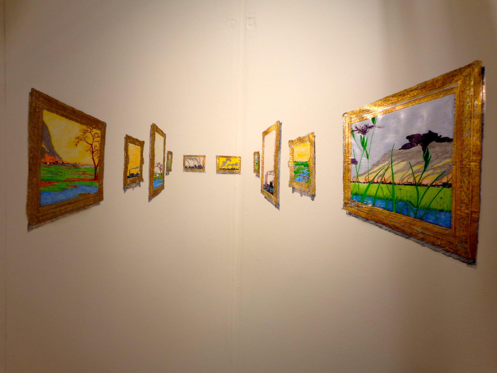
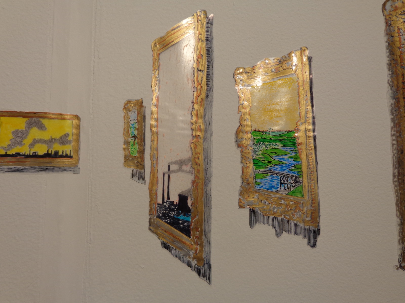
It’s hard to fully appreciate this one in two-dimensions, although it is very much a two-dimensional work. Works of art framed in shiny gold appear to stretch back into the distance, but everything is actually made of something shiny and plastic, even the fading black shadows scrawled beneath each work. The trains within the paintings that look farthest away are just as close to you as anything else, they’re just smaller.
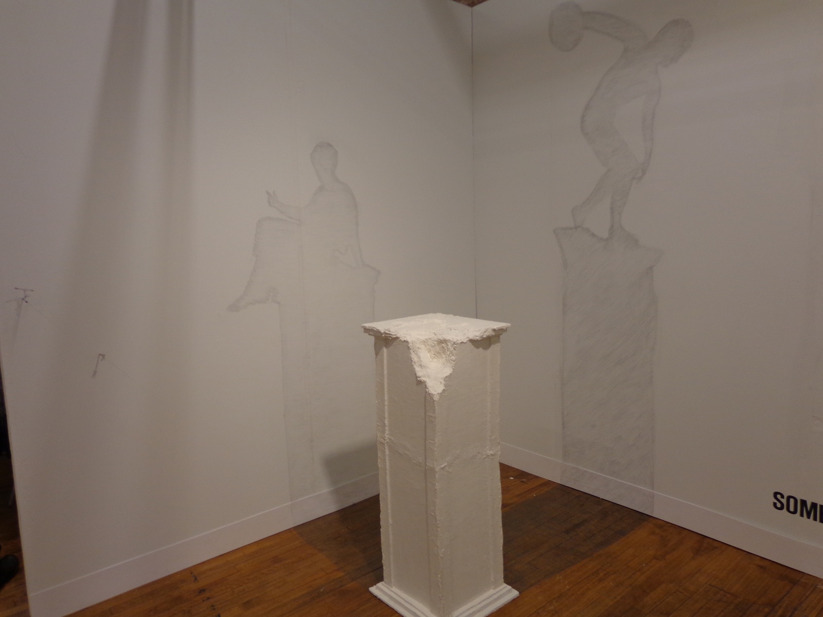
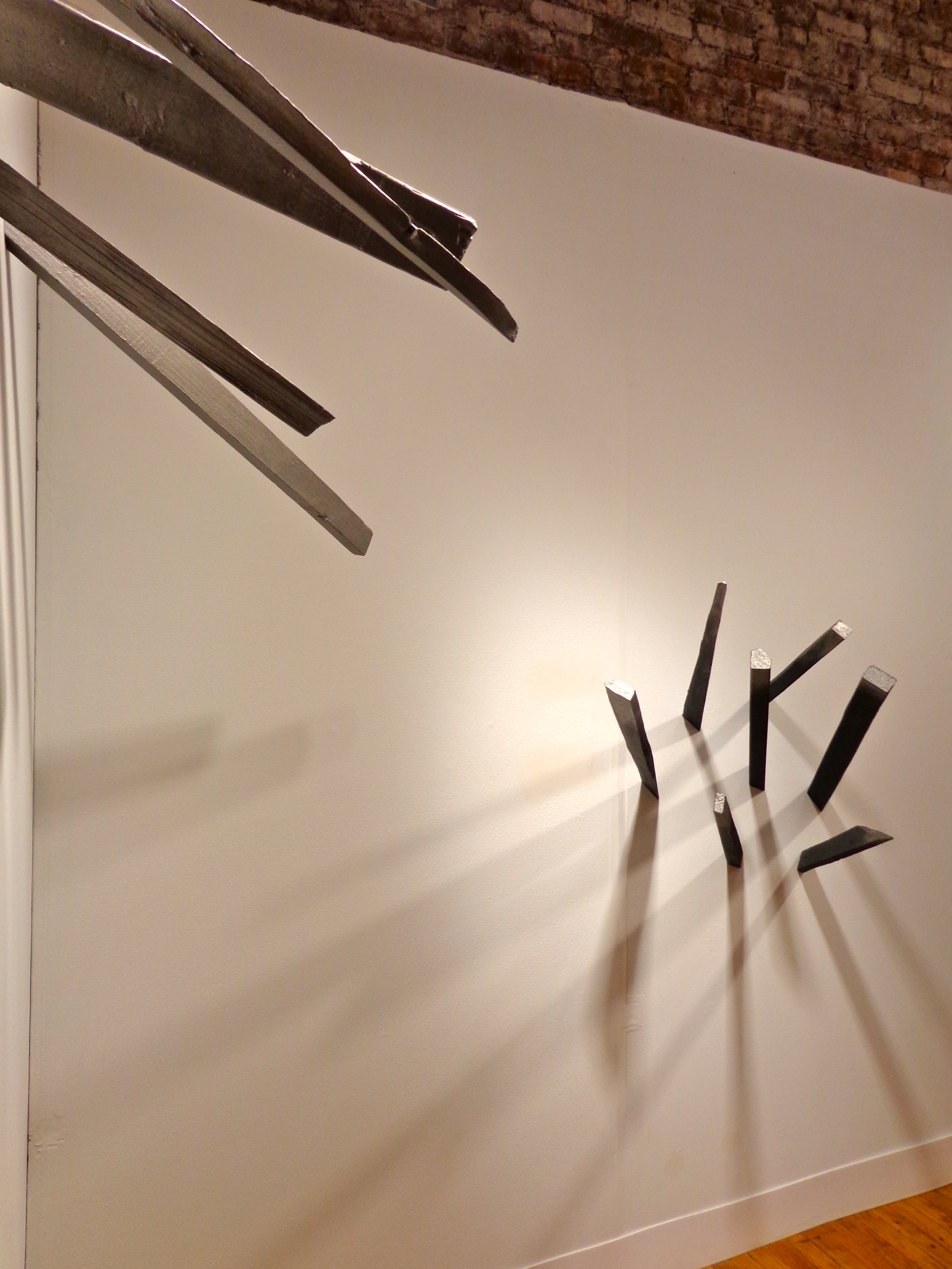
Shadowed wall drawings come from a cracked pedestal on which an ancient statue should stand – the floor and walls both filled in with gray to become the silhouettes of something nonexistent but expected. Sebastian’s whole booth, titled “Sombras Nada Mas” or “Shades Nothing More,” created a game between your brain and your eyes, as each piece forced a recognition of what was represented and what was really there.

Sebastian Mejia was represented at VOLTA by balzerARTprojects in Basel, Switzerland. According to his artist statement at the fair, his work “focuses upon the dissemination of visual information in different cultures.” He uses his work to examine the differences in symbolism between European and Latin American cultures, but all with a heavy-handed sense of comic relief to lighten the mood.
“Mejia’s work is an epistemological enquiry into the nature of knowledge, how it is acquired, presented, and how it can be retained, communicated, and implemented… Based on the ‘Allegory of the Cave,’ Mejia argues that language is a mere shadow of reality. Translated into the ‘visual,’ shadows of objects cannot represent reality of forms – truth must be experienced rather than told as language fails to convey belief. As ephemeral as his work seems at first sight, they are also about monumental historical and intellectual concepts, such as cultural interactivity, lightness, and adaptation.”

For more of Sebastian’s work, see his website – on the homepage there’s a pretty interesting video of the artist reading a book about Vasari in a library.
Mar 19, 2013 | art fairs, installation, painting

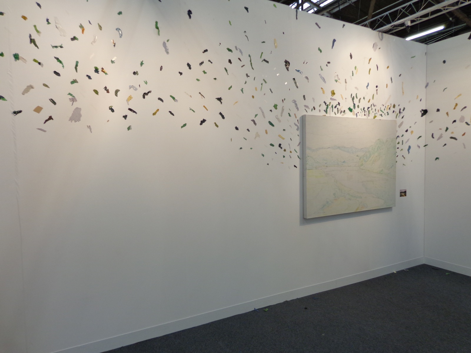
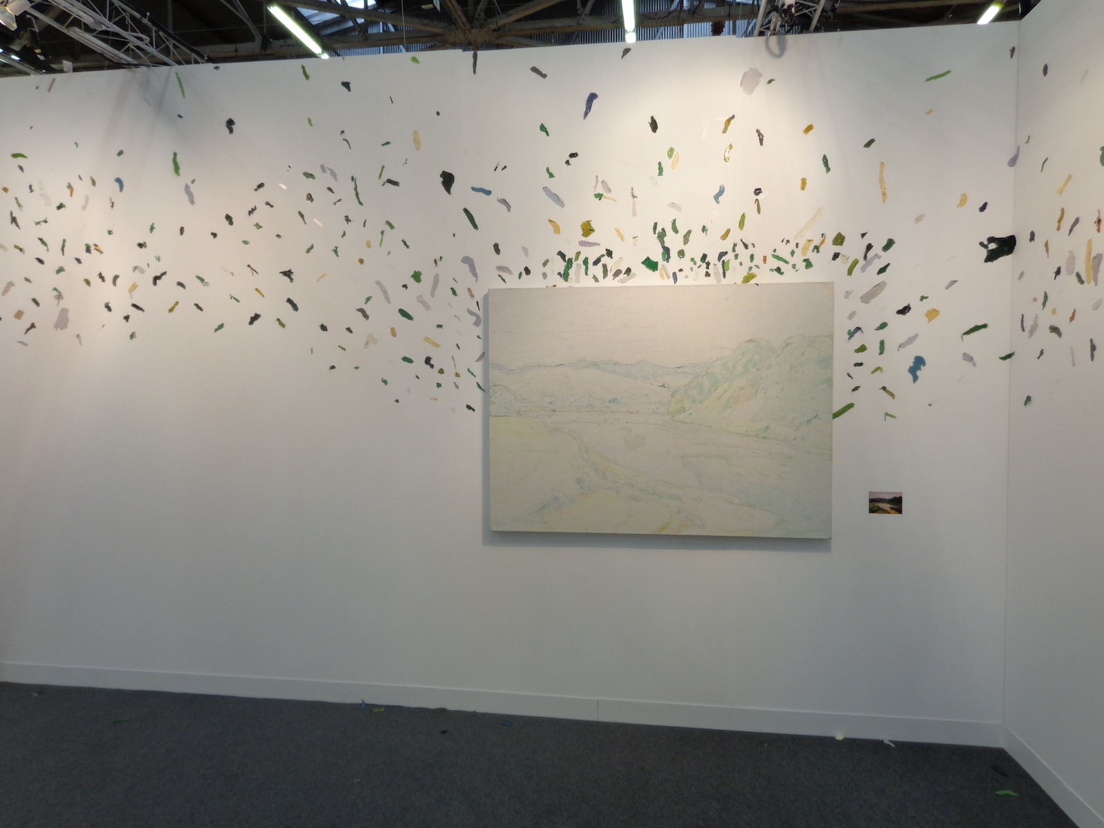
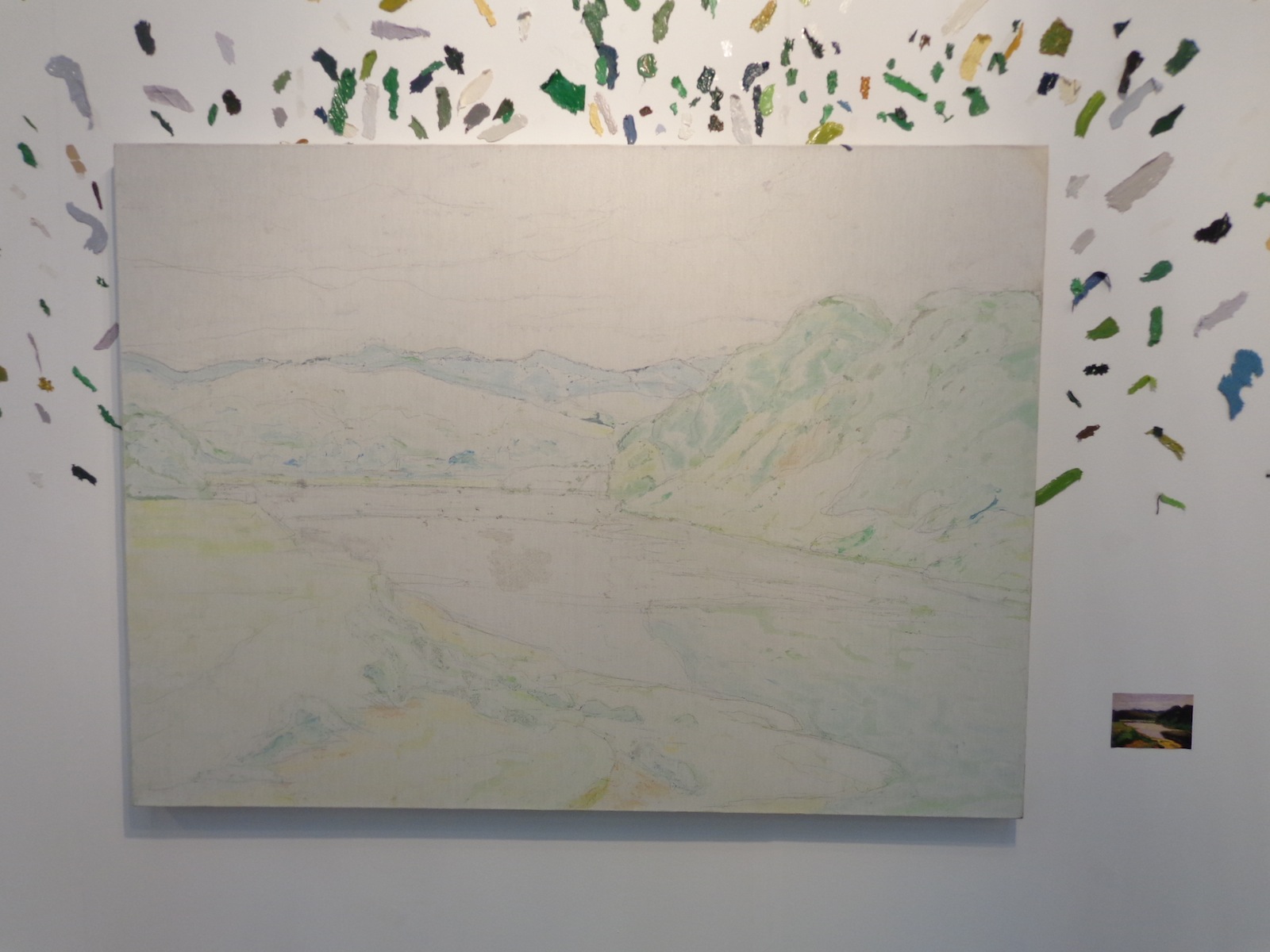
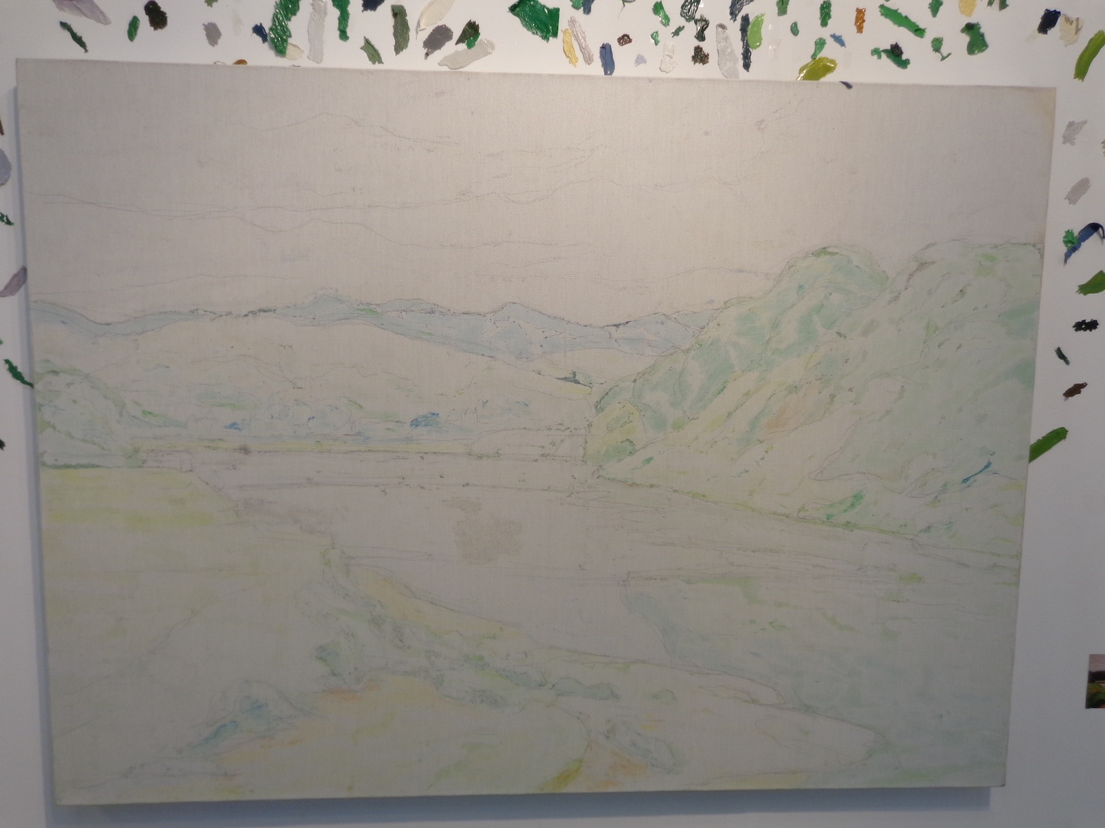
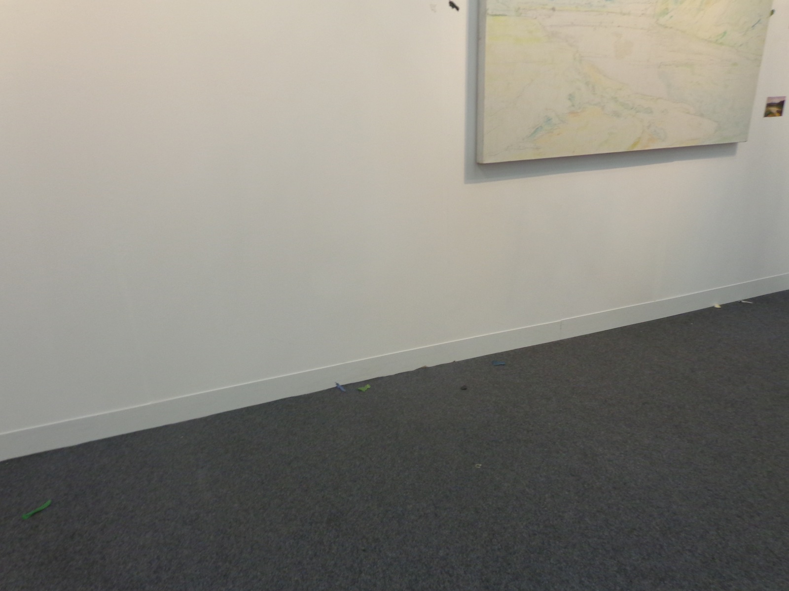
One large-scale canvas that was covered only in colored pencil underpainting took up an entire wall of Tang Contemporary’s booth at The Armory Show. The canvas was surrounded by flying flecks of color, the same colors that should be on the painting instead of around it. It was just a simple landscape scene, a valley surrounded by green hills that led the eye off into the distance, but spreading the paint everywhere keeps you inside the booth instead of letting you escape into the scene like typical paintings intend.
A scattered, abstract way of interpreting absence versus presence, the piece is titled “A painting-Landscape,” and was created by contemporary Chinese artist Wang Yuyang in 2010.

The piece mimics the Dr. Suessian notion of smacking color right off of the objects they belong to – you can almost see the artist finishing the landscape, hating it, and then KERSPLAT! He slams the canvas against the wall and paints flies everywhere. Of course, the canvas can’t be left completely empty since then there would be no correlation between the colors and what they used to represent, so the pale outlines and colors remain within the 85 x 55 cm rectangle.
There’s a connection between past and present, what used to be and what is now, all compared to what should be. Societal standards are overrated.

A miniature version of what the painting was intended to look like stood beside it, allowing viewers to compare color with the lack of it, although it’s hard to tell if this painting was ever really completed or just filled in with computers. Similar to one of those cube-scaling projects each art class has on its curriculum, the miniature version lets your eyes fill in the appropriate emptinesses of its older brother scene whose paint has flown the coop.

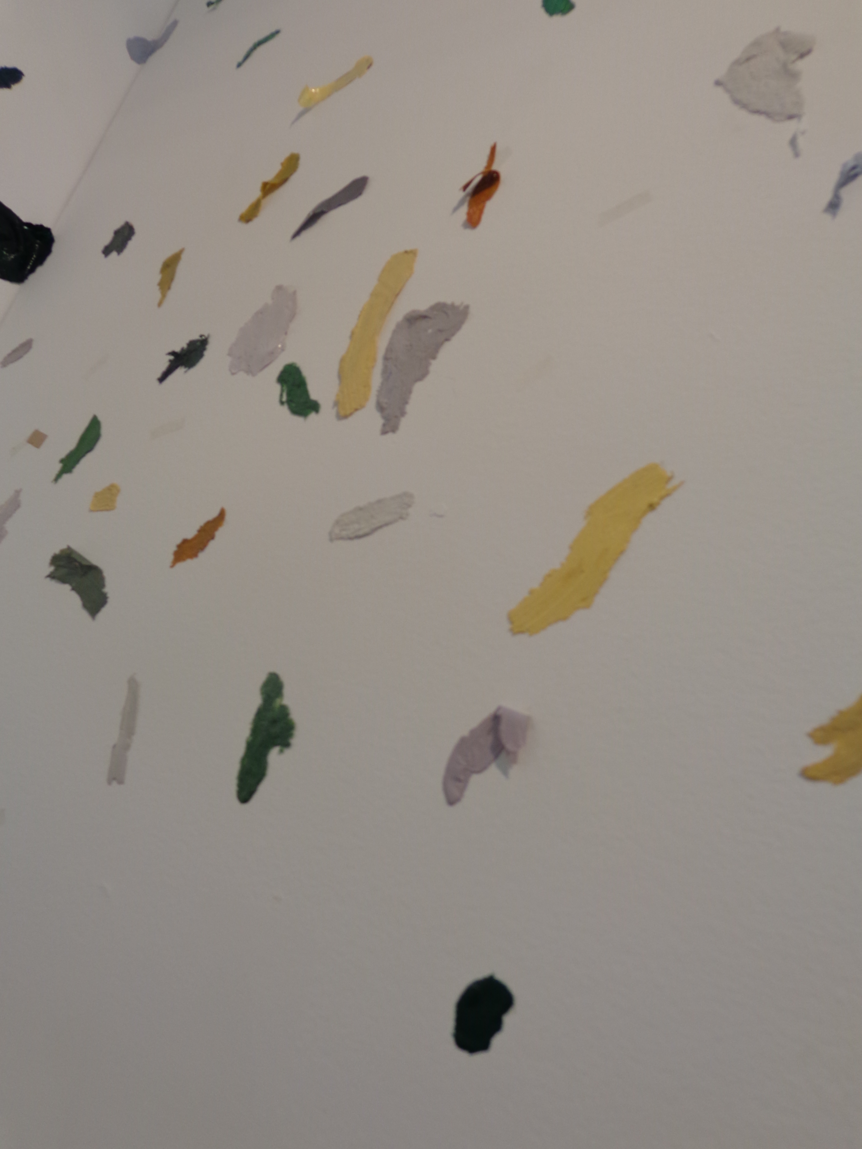
If you look close, you can see that all the little flecks of paint aren’t just oil and water, they have a plasticity to them that makes them more substantial than if they’d just been merged and flowed across a landscape scene. Each individual shade of green, yellow, gray, white, blue and black stands independently – defiantly almost, refusing to become part of the whole and wanting its own space on the wall to be noticed by passing viewers.
Tiny colored flecks even fall on the floor beneath the painting, bringing this contemporary art piece all the way to your feet.

Wang Yuyang is a 34-year-old contemporary Chinese artist whose work deals with technology and our relationship to it, along with the aesthetics of brokenness and pilings of material waste.
“I like the traditional Chinese philosophy because it talks about the relationship between 1 and 0, on and off, black and white, something and nothing,” Yuyang explained, “My works explore this connection.” He is also particularly interested in exploring what he calls “the zero state” – an emptiness filled with nothing but silence and stillness.

For more of Wang Yuyang’s work, see his bio pages from the galleries who represent him, White Rabbit and Boers-Li.
Mar 15, 2013 | art fairs, features
VOLTA NY is a showcase of individual minds and hands – hands that painted, sculpted, collaged, and sewed something incredible to be here. It’s held annually in both New York and Switzerland, and last week it took up two stories of 82MERCER in SoHo, and more than 22,000 people showed up.


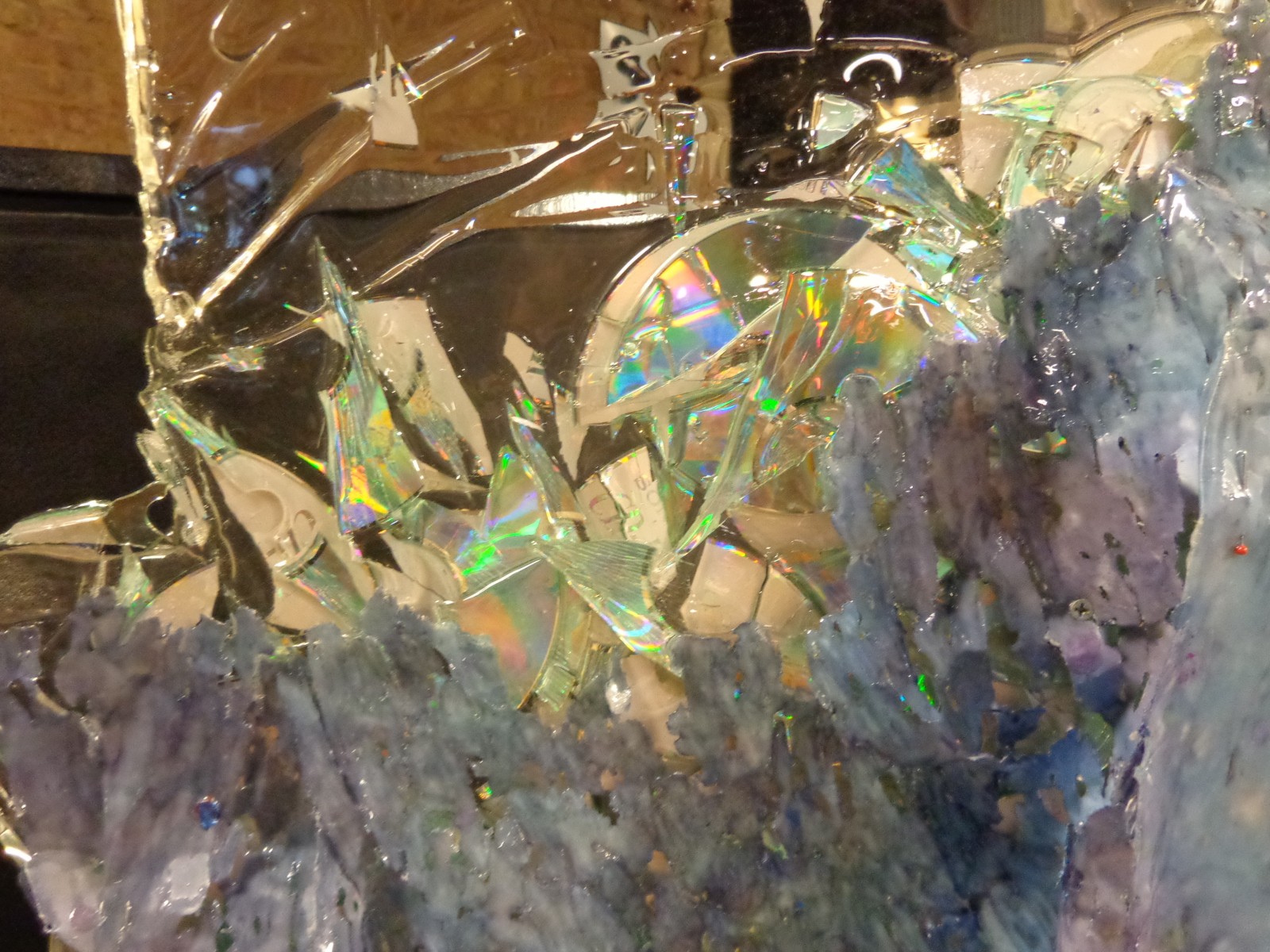
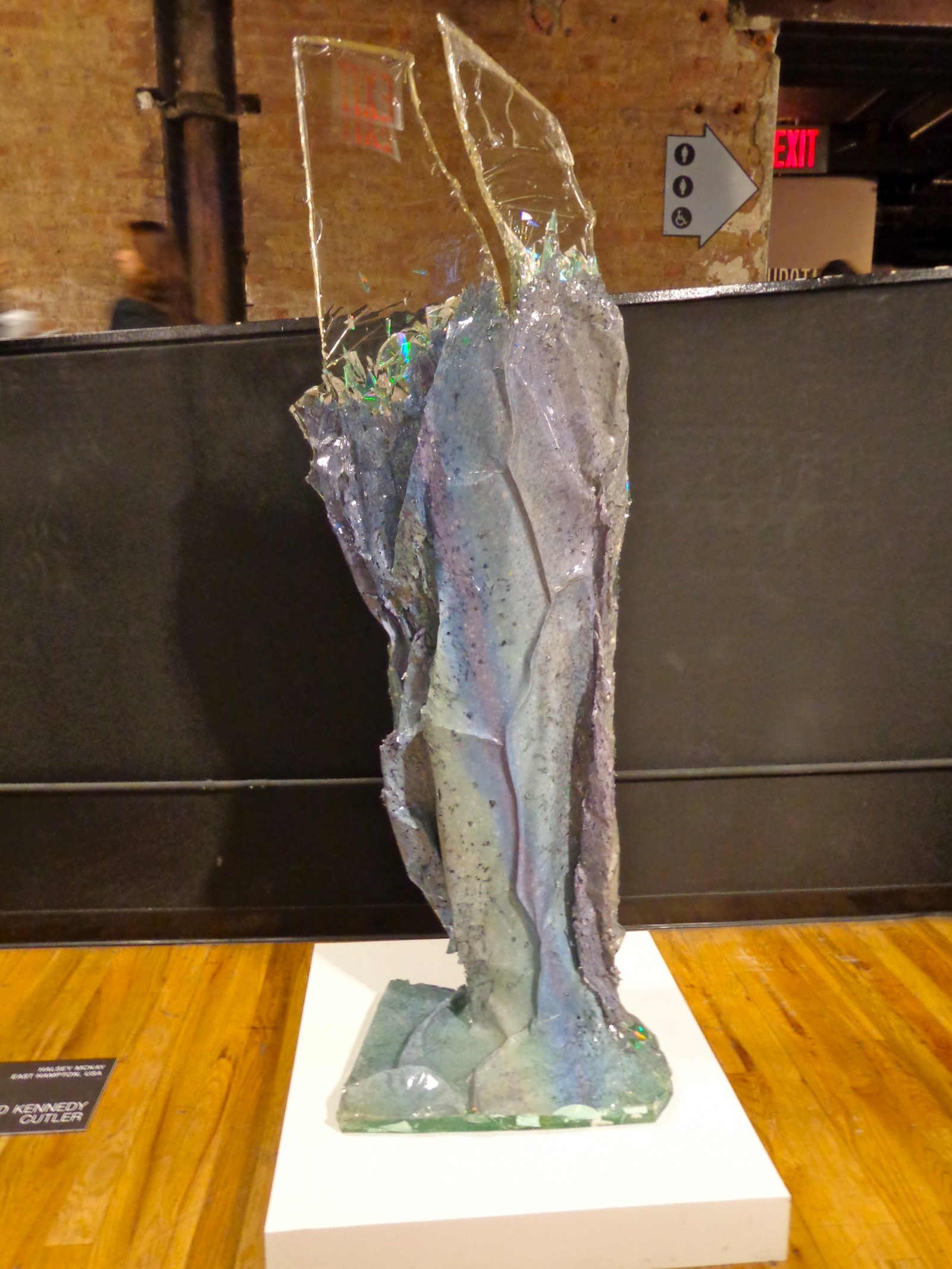
David Kennedy Cutler, represented by Halsey McKay, East Hampton.
The show’s design lead you around through two rows of art per room, and even though it was a bit cramped when tons of people showed up, the art took up most of the space, and the artists were sometimes there to greet you and discuss their work which is very exciting but also kind of nerve-wracking David Kennedy Cutler’s sculpture stood right in the fair’s halfway point, greeting visitors as they walked towards the stairs and up to a whole new level of art – this one with higher ceilings and exposed brick walls.

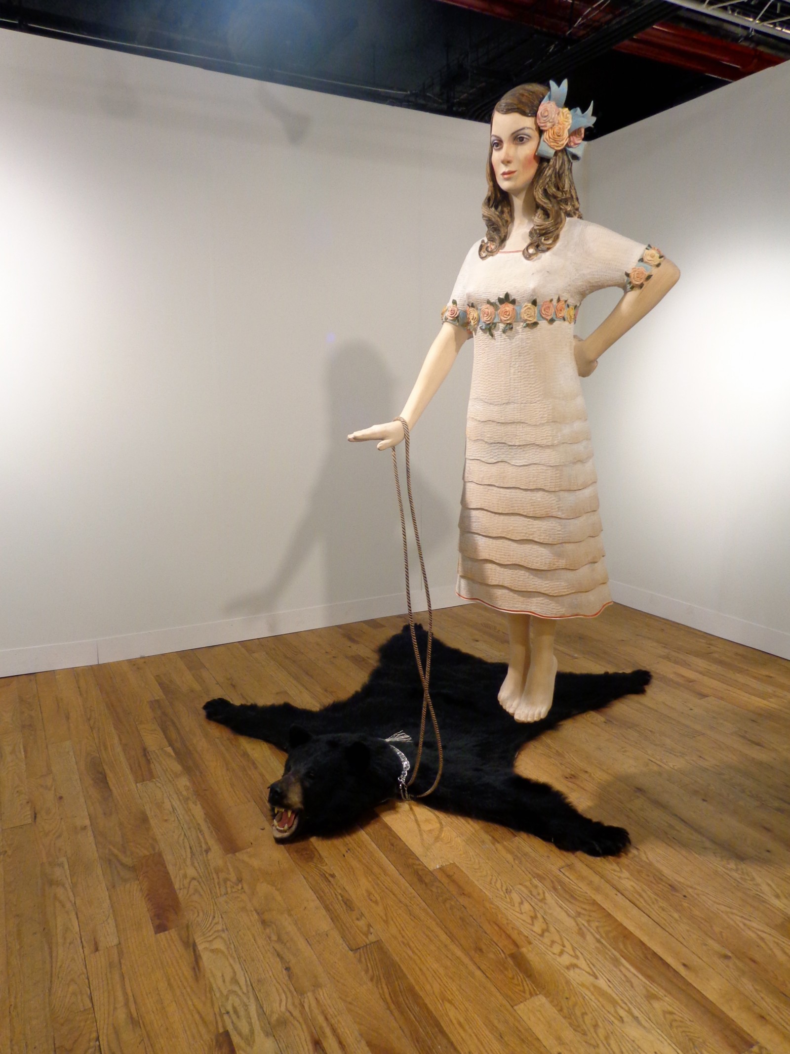
Marc Fromm represented by Jarmuschek + Partner, Berlin.
A whole crowd was gathered around Marc Fromm’s levitating piece – the girl somehow miraculously held up by the seemingly slack rope draped causally around her wrist. The bear and the girl together make for an interesting pair: the bear’s furry face is still somewhat ferocious looking, and even though the flying girl is all dolled up with flowers and everything, there’s hardly any expression behind her empty doll face.

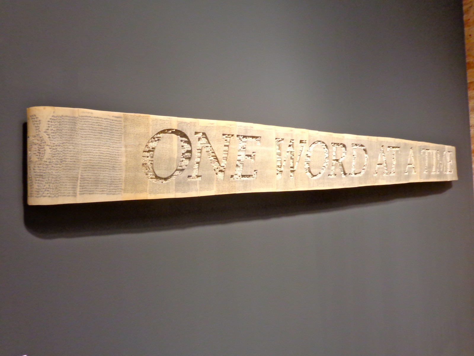
“One Day at a Time,” 2012 (paperback books, acrylic varnish)
by Brian Dettmer represented by Kinz + Tillou, NY

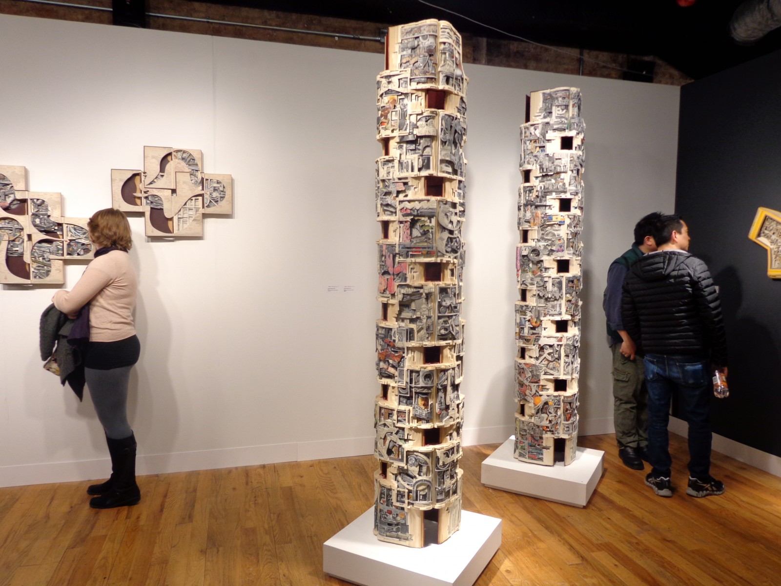
“An Encyclopedia of World History” by by Brian Dettmer
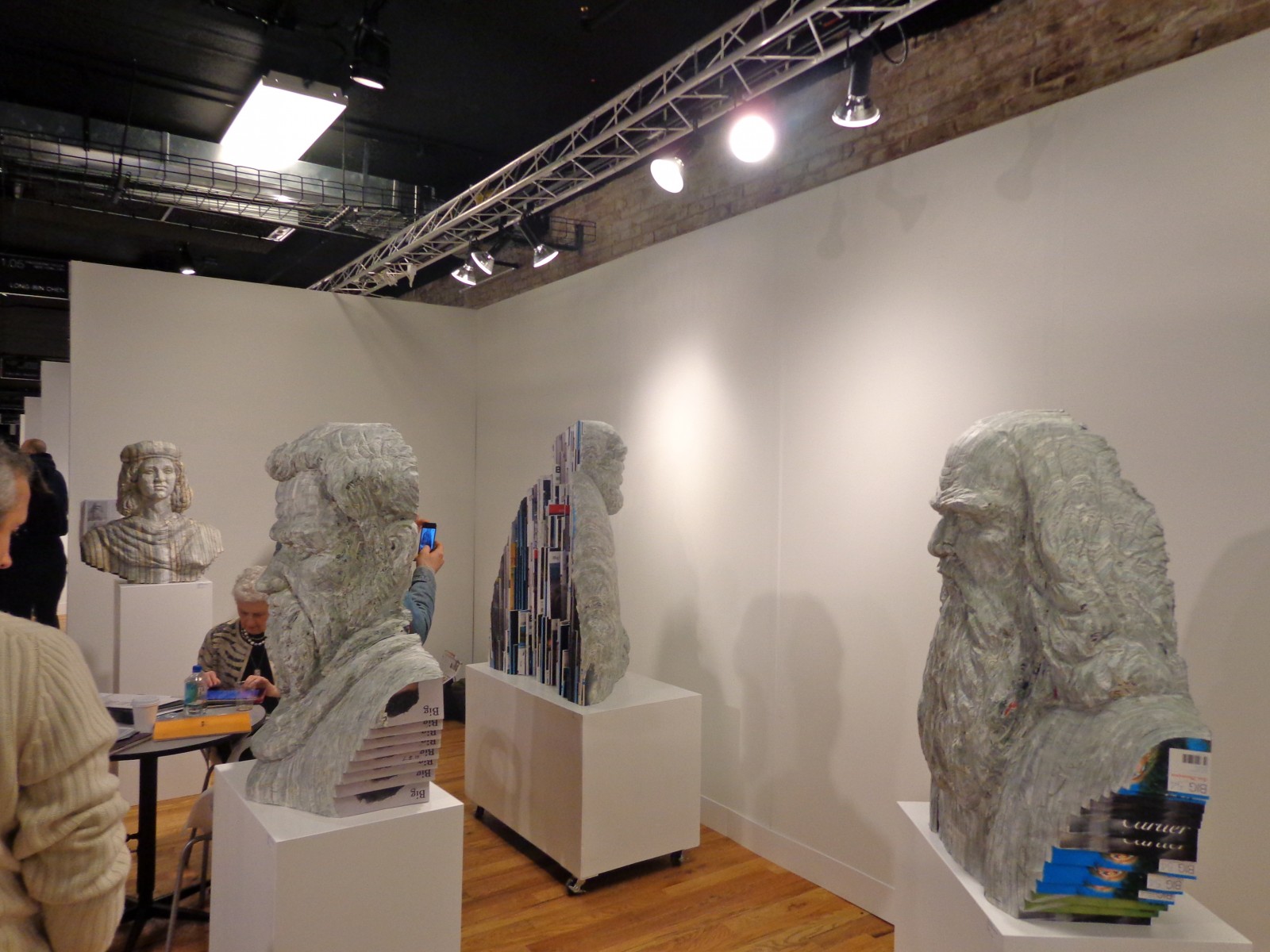
Brian Dettmer’s works appeared the most labor-intensive at VOLTA. His towers and wall sculptures are made from encyclopedias and involved hours of pouring through old books and carefully cutting and rearranging. “One Day at a Time” actually reads ‘One Word At A Time’ with each of the letters carefully filled in with thousands of individually cutout letters.

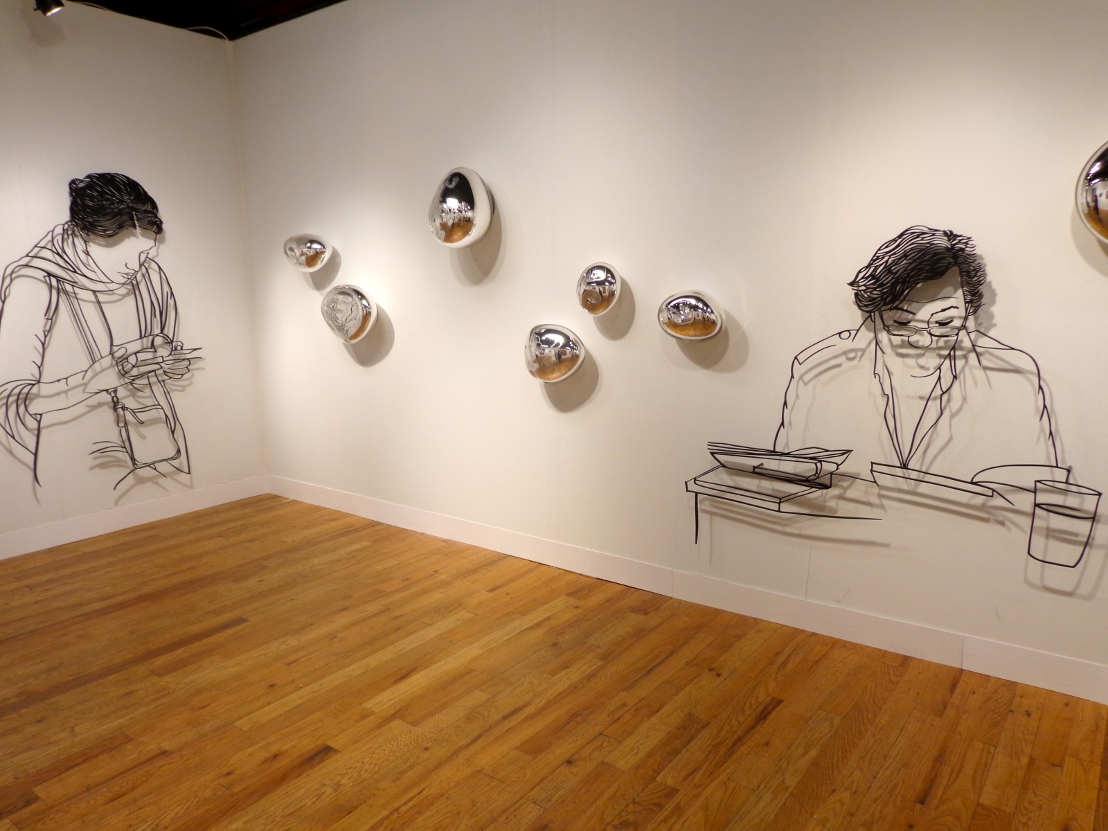
Hae-Sun Hwang represented by Gallery Simon, Seoul

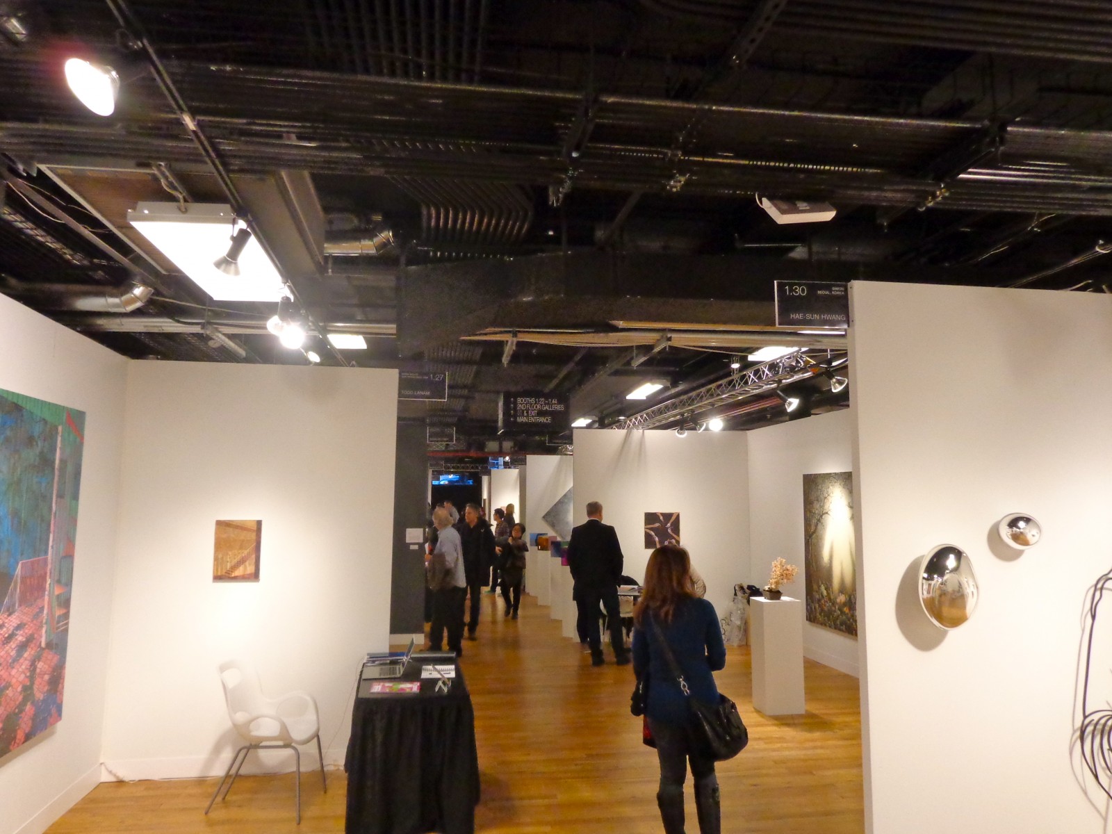
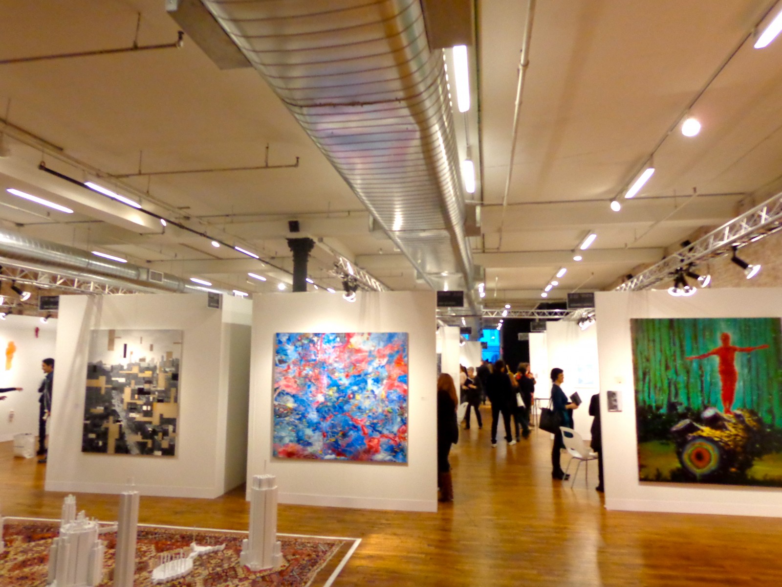
The SoHo area around VOLTA was busy the entire weekend, the whole city buzzing with art fair fever. And even though thousands of people walked through the same space in four days, it somehow still had a personal feel. Each booth was dedicated to one artist’s work so viewers were individually immersed in different artists’ styles as they walked from one white-walled booth to the next.
“People were already talking about it before we even opened,” said Amanda Coulson, VOLTA’s Artistic Director. “People were already talking about it before we even opened…and then the quality of the space itself, with the wooden floors and huge daylight windows, is just putting everybody in a fantastic mood. Along with the solo artist concept, which is now being picked up more strongly at all the major events, visitors are leaving with only enthusiastic comments. Suffice to say, we are extremely pleased.”

Long-bin Chen, represented by Frederieke Taylor Gallery

by Sarah Hardesty


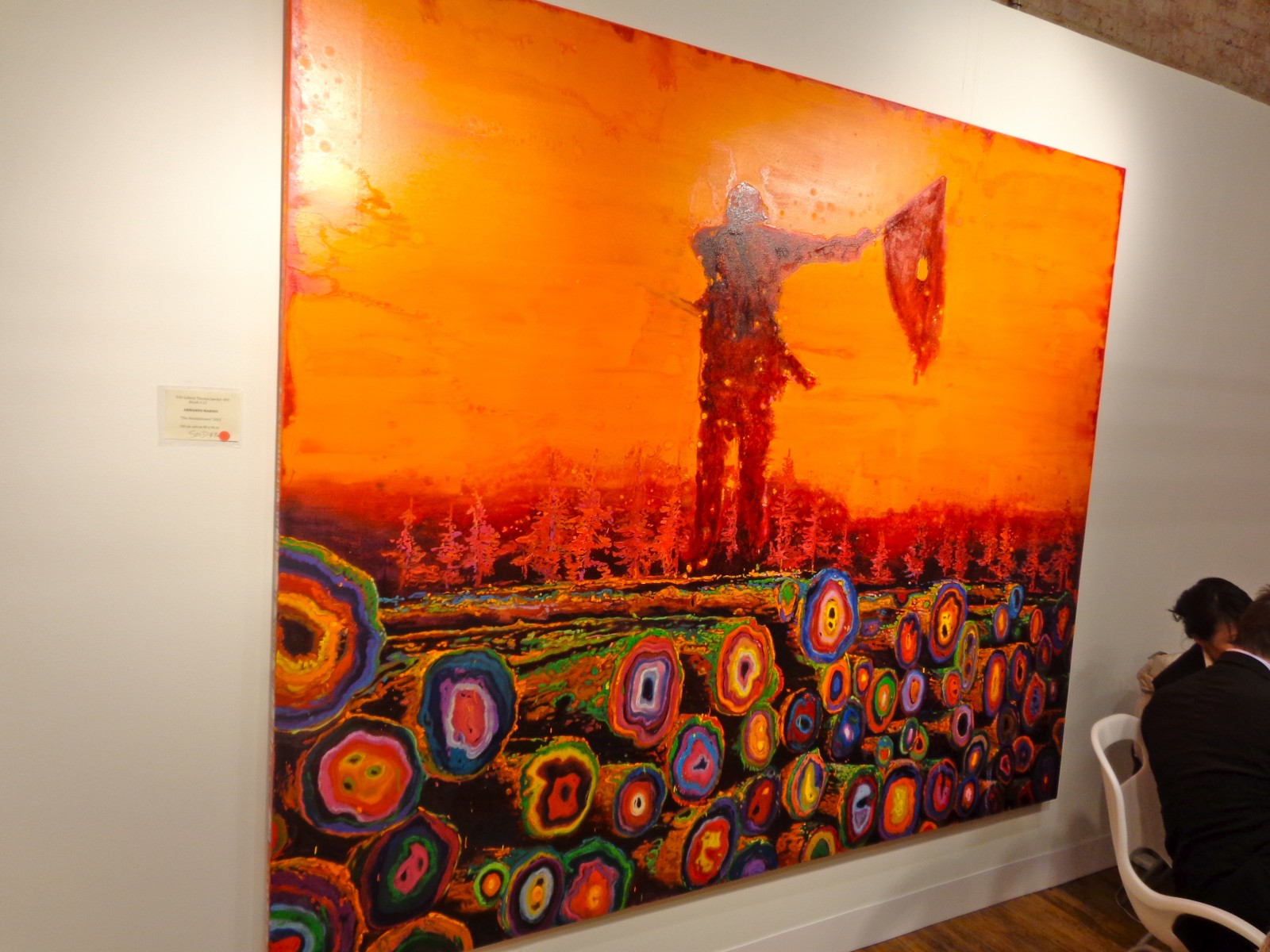
Armando Marino’s “The Revolutionary,” 2013
oil/paper
Represented by 532 Gallery T. Jaekel, NY.
A Flickr album for VOLTA is currently in the works, and expect a lot of future descriptions of the incredible work that was there.
See more of VOLTA on their website.
Mar 13, 2013 | art fairs, painting

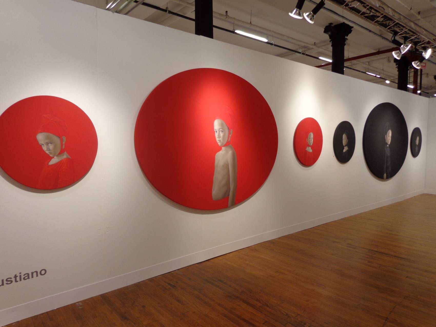
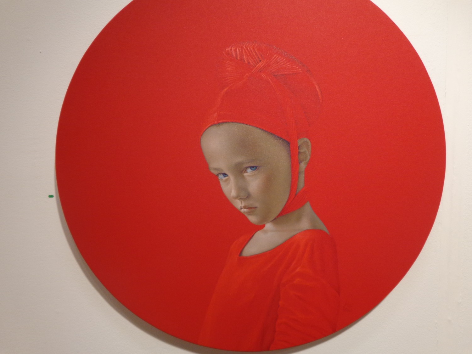
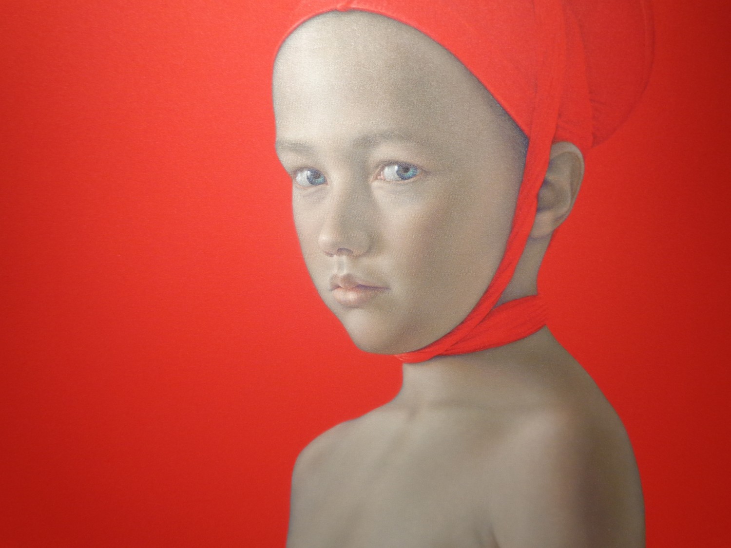
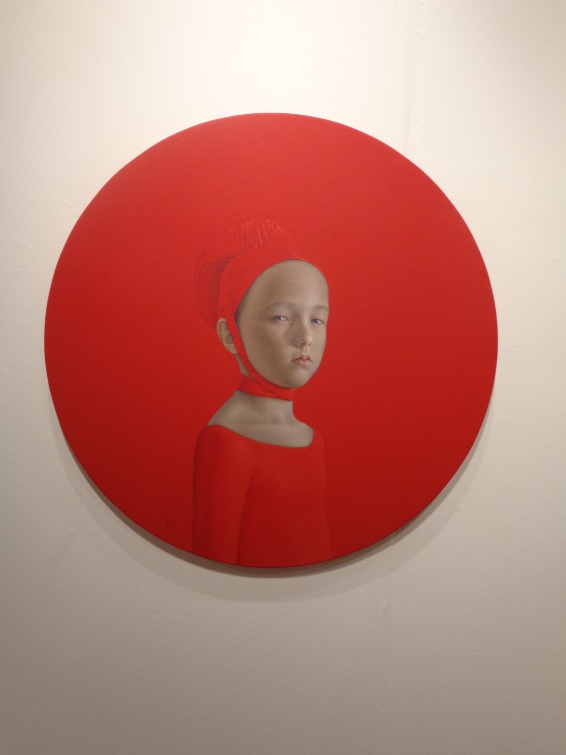
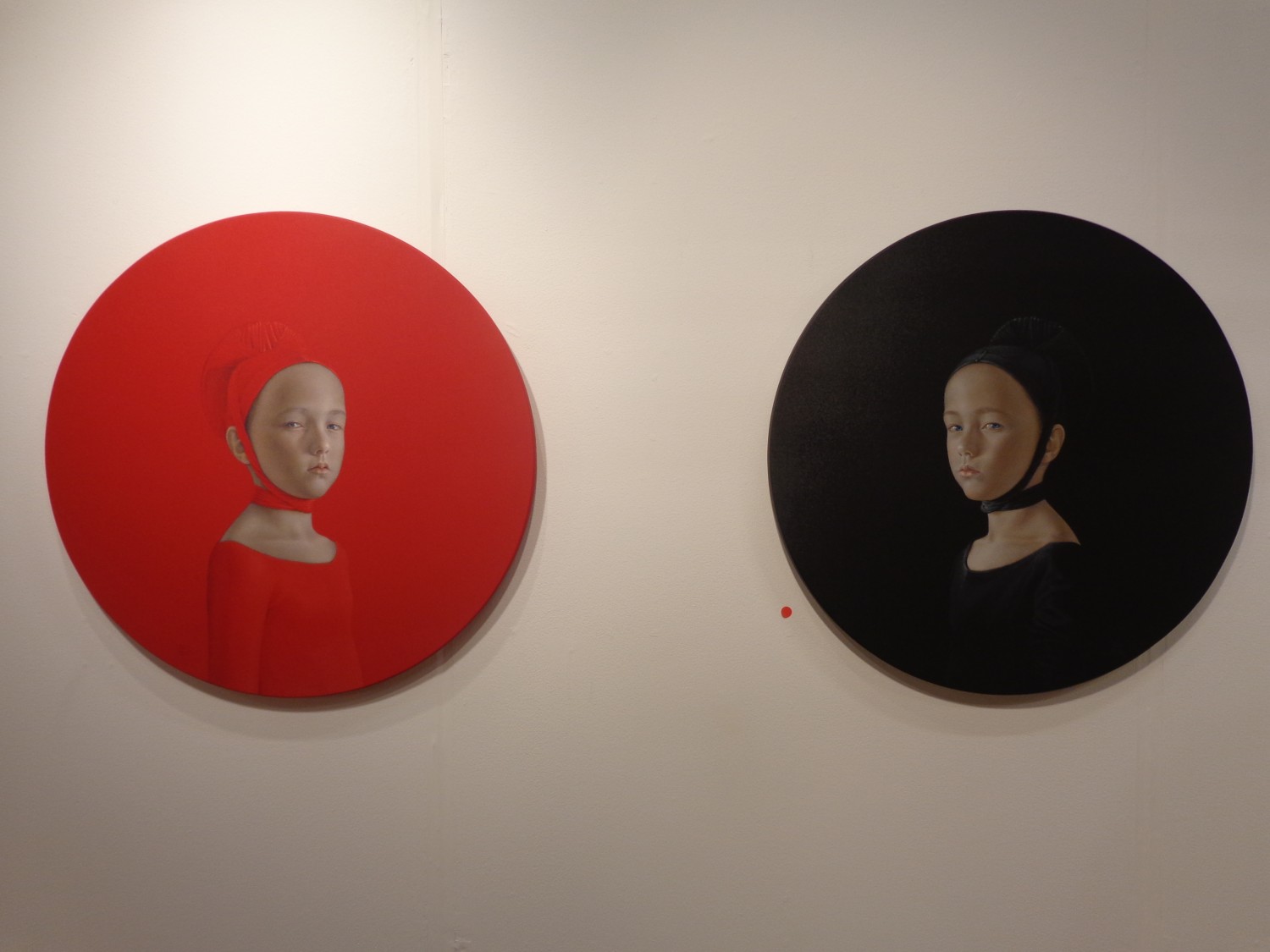
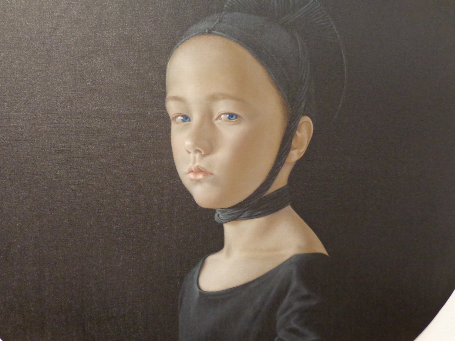
It’s arresting – seeing six symmetrical circles holding the faces of little scowling children, all spread across the wall, three red paired against three black. Cast in Renaissance clothing, these children wear the exact color of the background, making the definition between the two an act of magic. Your eyes tell you where the headdress stops and where her shirt begins, but they only know because of delicate shadows and folds that are obvious in some places, but left invisible where the painted fabric is as tight as the canvas.

It’s hard to tell whether these are all the same little boy or girl – all of their faces have the same elegant roundness, the same crystal blue eyes and the same smooth perfect skin. But their expressions are subtly different – the four within the smaller circles seem to hold more contempt in their eyes, like they’re upset with how small their worlds are compared to the two children within the larger circles, whose expressions lie closer to curiosity or suspicion.

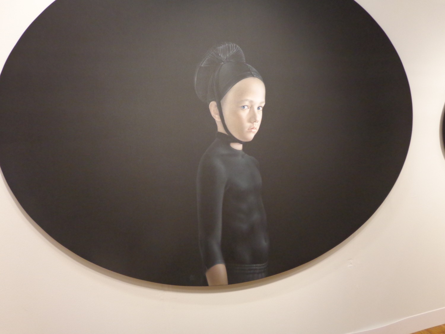
The only element offsetting perfect symmetry here comes in the clothing of these two children within the largest circles. The boy in red is bare-chested, wearing only a headdress while the child in the large black oval wears a shiny black shirt that grips his little body so tight he might as well not be wearing it at all.

The largest circles are stretched wider to form more of an oval shape – the smaller perfect circles play a supporting role by framing their larger counterpart and interacting with the opposite color across the wall. The abrupt visual contrast of the black versus red, along with the dagger stares coming from intense perfect children makes the whole wall come alive with ideas about conflict and disdain, youth and maturity. And the Renaissance headdresses hint at an address of institutionalized religion or just religion as a whole.

Perhaps the most dynamic part comes where the two colors meet – both children with the exact same grimacing glare pointed right at us, although it really seems like their unhappiness is actually rooted in their physical closeness to the antidote – the opposite color with a contrast too strong to look directly at.

Born in Seville, Spain in 1965, Salustiano has an exhibition list too long for even multiple pages on his website. He’s shown between 10-20 exhibitions per year since 2001, and began all the way back in 1994. Beginning in Spain, then moving to Portugal in 1999, he showed in Italy in 2000 and New York City in 2001, and has since had work displayed all over the world, from Seoul to Salzburg to Moscow.
Salustiano’s VOLTA comment read:
“For me, emotion is a key word in contemporary art and should continue to be so in the future. In recent years in the art world, artists have tried to flee from ’emotion’: saturated with every kind of visual stimulus, they have been more concerned with making an ‘impact’ on the spectator than in touching an emotional fibre. I strongly believe that emotion should be the principal motivation and purpose of the artist. For centuries art has emotionally impacted upon, moved or even perturbed the spectator; and this ‘interior’ movement has contributed to the evolution of mankind. I also think that even if the artist intends to stimulate the intellect of his or her audience, then this should be done through ’emotion’….”

For more of Salustiano’s work, see his website.
All photographs taken by Lindsey @VOLTA NY ’13 where Salustiano was represented by KAVACHNINA CONTEMPORARY in Miami.
