Apr 2, 2013 | design, news

‘mark’s house’ by two islands
image © two islands
A giant reflective structure seems to float above the platform, but it actually sits on a thick mirrored pedestal that can’t be seen until you look close enough. Titled “Mark’s House” by the London-based design studio Two Islands, the design tells the story of an imagined Flint, Michigan resident named Mark Hamilton, whose family loses a home to foreclosure. Their Tudor-style home is reborn as a flying shining mirage of what it used to be, serving as a metaphor both for what the city has lost and what it’s working to gain back again.
“Mark’s House” was among the 221 entries submitted to the Flint Public Art Project’s inaugural Flat Lot Competition, which called for designs of temporary structures that take up no more than eight parking spots, and offer support for public programs by providing a stage, shade, and cooling devices.
“Mark’s House” can hold up to 1,500 gallons of water for a cooling spray on the hottest days, and its gridded panels beneath the floating house soak up even more of the sun’s rays. In the end this multi-faceted functionality of a design illusion won the $25,000 grand prize in the Flat Lot competition, and “Mark’s House” will be the temporary summer pavilion in Flint’s downtown parking lot during Flint Art Walk, opening on June 14 and remaining until Fall.

water droplets cool down visitors
image © two islands
Images & info via Flint Public Art Project.
Apr 1, 2013 | tv
Warning: Spoilers below. Don’t read on until you’ve seen the Game of Thrones Season 3 premiere – it deserves both watching and describing.

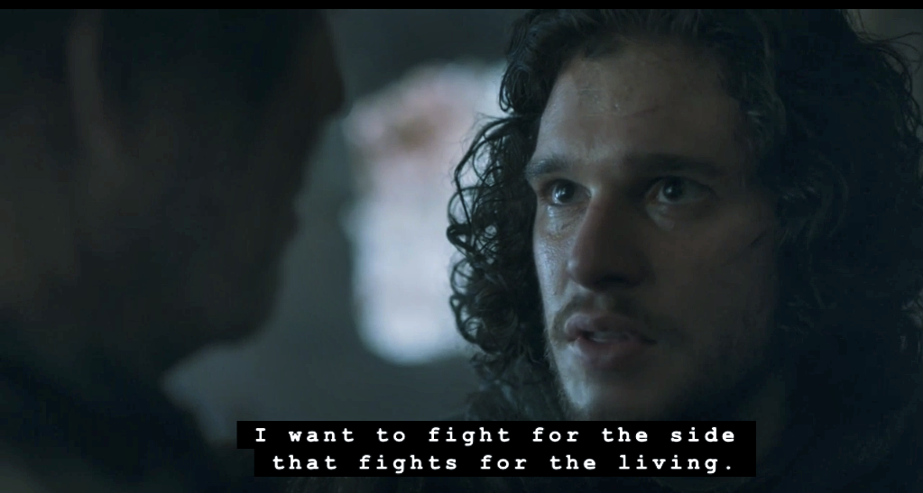
John Snow as he watches the giant.
A black screen looms while you hear sounds of White Walkers, screeching and taking lives. Then a BOOM and the sun rises on the horizon as Sam finds a fellow man of the Night’s Watch, kneeling and holding his own head in his hands, his whole body frozen over, blood solidified. At the end of Season 2, we left Sam cowering behind a rock as the White Walkers wandered past him, the leader noticed him but moved forward anyways – a dramatic nuance not mentioned in the book.
The Season 3 premiere continues each story line from the exact point of departure at the end of Season 2 – although there are so many characters to cover, some don’t even get screen time. Both sets of Stark children on the run, both Arya with her friends, and Bran and Rickon with their wildling protector, weren’t mentioned at all – except for when Little Finger promised Lady Sansa that she’d be seeing her sister soon, even though he has no idea where she is.
The episode begins beyond the wall, first with Sam and the ranging Night’s Watch and then to John Snow being led by his sexy-yet-dangerous Ygritte to the wildling’s king. On the way we see the first giants – huge and deformed, and John Snow stops as we watch one pound a stake through the snow.
Gradually the show reveals more and more of its magical side, separating it bit by bit from our world – easing us into it like its folklore, and slowly preparing us for the time when winter will come and all of those things that “died thousands of years ago” will become very very real.
When John Snow meets Mance Rayder to be judged, he gives the perfect response to the question, “Why do you want to join us?”:
“Thousands of years ago, the First Men battled the White Walkers and defeated them. I want to fight for the side that fights for the living. Did I come to the right place?”

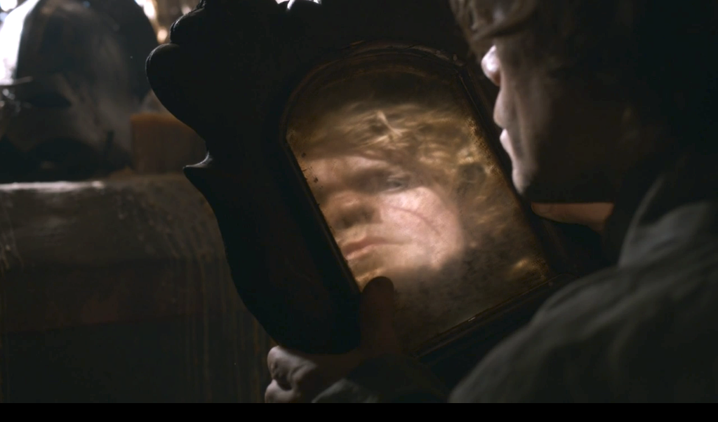
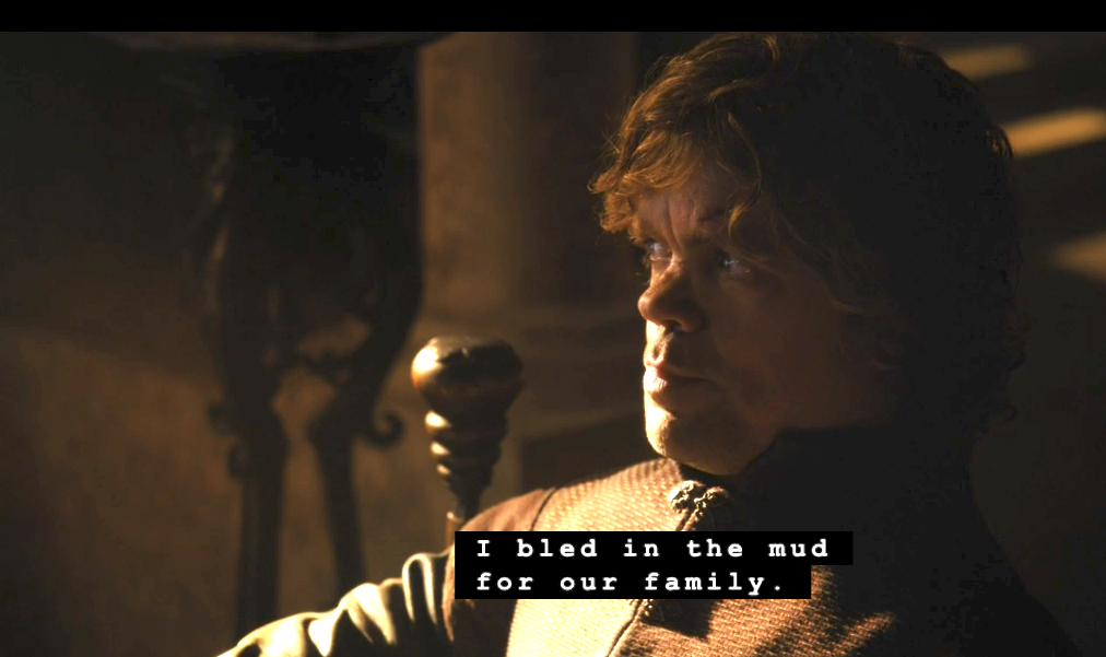
Another flawless confrontation scene comes when Tyrion meets with his father and demands he be given Casterly Rock, since he is the rightful heir as the oldest son. He’s hurt that his father didn’t come to see him since his injury, after he stepped up and led the charge in battle while the ‘King’ Jeoffrey “quivered in fear behind the walls.” Lord Tywin and took all the glory away from him, and at the same time he took his job as Hand to the King, and his chambers. But his father is still bitter that an imp took his wife away from him – says he’ll give him a better job and a better place to live but when Tyrion asks why Casterly Rock shouldn’t be his, Tywin ends with sharp words that seem to reopen the wound across Tyrion’s face as it falls to pieces:

Tyrion’s introduction to Season 3
“You, who killed your mother to come into the world? You are an ill-made, spiteful little creature full of envy, lust, and low cunning. Men’s laws give you the right to bear my name and display my coors since I cannot prove that you are not mine. And to teach me humility, the gods have condemned me to watch you waddle about wearing that proud lion that was my father’s sigil and his father’s before him. But neither gods nor men will ever compel me to let you turn Casterly Rock into your whorehouse.”
Tyrion just sits there and takes it, his eyes sinking and his heart falling. Everything in his life was decided for him at birth, before memory, and before choices. He tries to make as much of himself as society will allow, but spends his days watching Cersei and Jamie and Joffrey make one selfish choice after the next one, doing whatever they please with no consequences at all.

But some of the best quotes of the episode come from Sansa while she sits on the at the shore with Shae making up stories about where the boats are going:
“But it’s not coming back. The captain’s tired of risking his life so King’s Landing lords and ladies can get drunk on better wine than they deserve.”
And when Shae actually knows where one of the ships is going she says, “That’s not how the game works. You’re not supposed to just blurt out the right answer. You’ve got to invent a story about where the ship is going and why.”
“Why should I make up a story when I know the truth?”
“Because the truth is always either terrible or boring.”
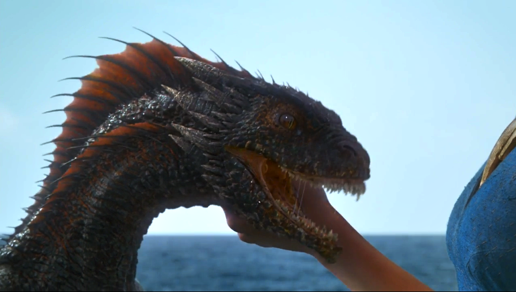
We don’t see Daenerys Targaryen’s dragons till 35 minutes in, but it’s worth the wait:

For more on the new season, check out the following:
Mar 29, 2013 | interviews, painting
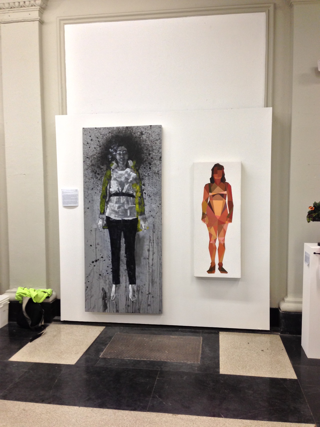
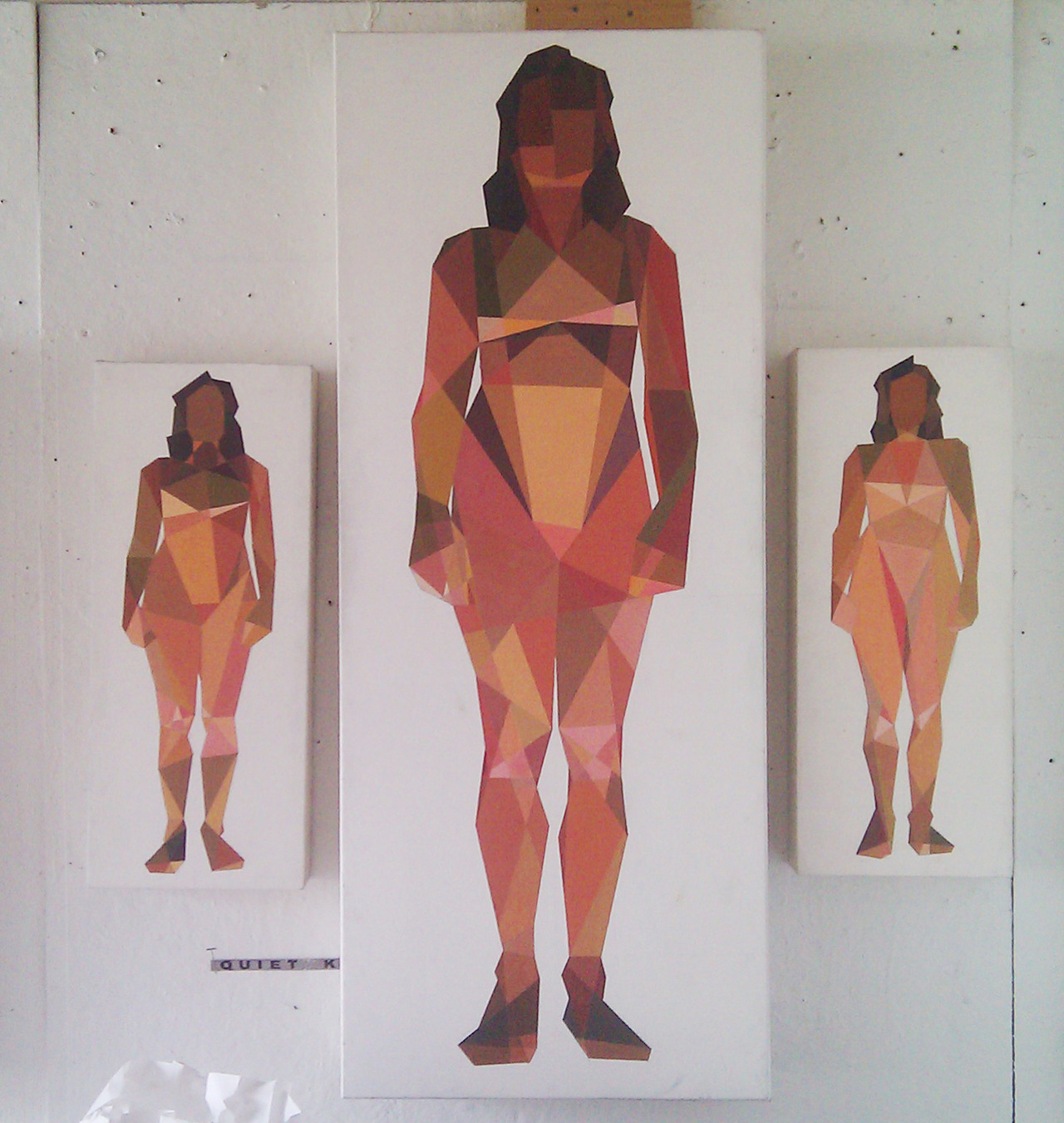
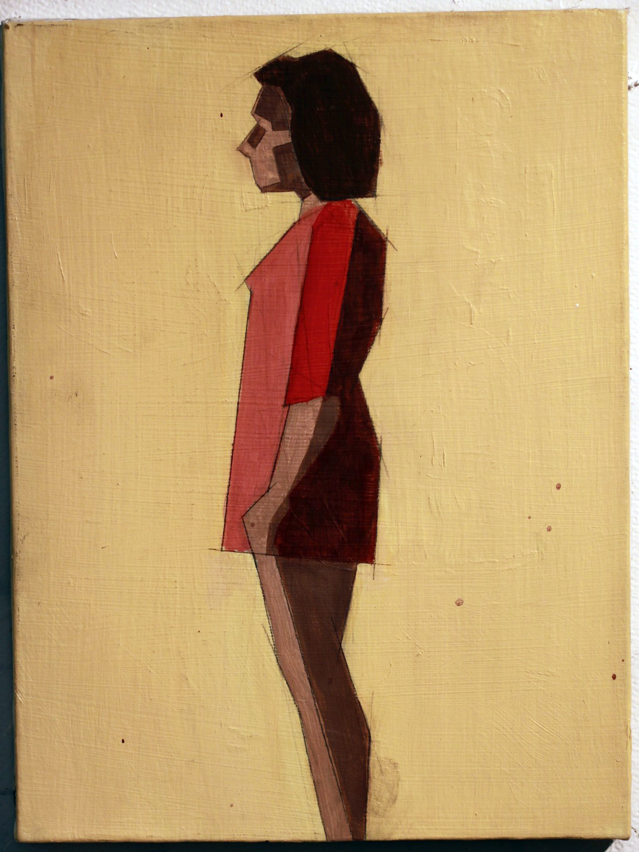
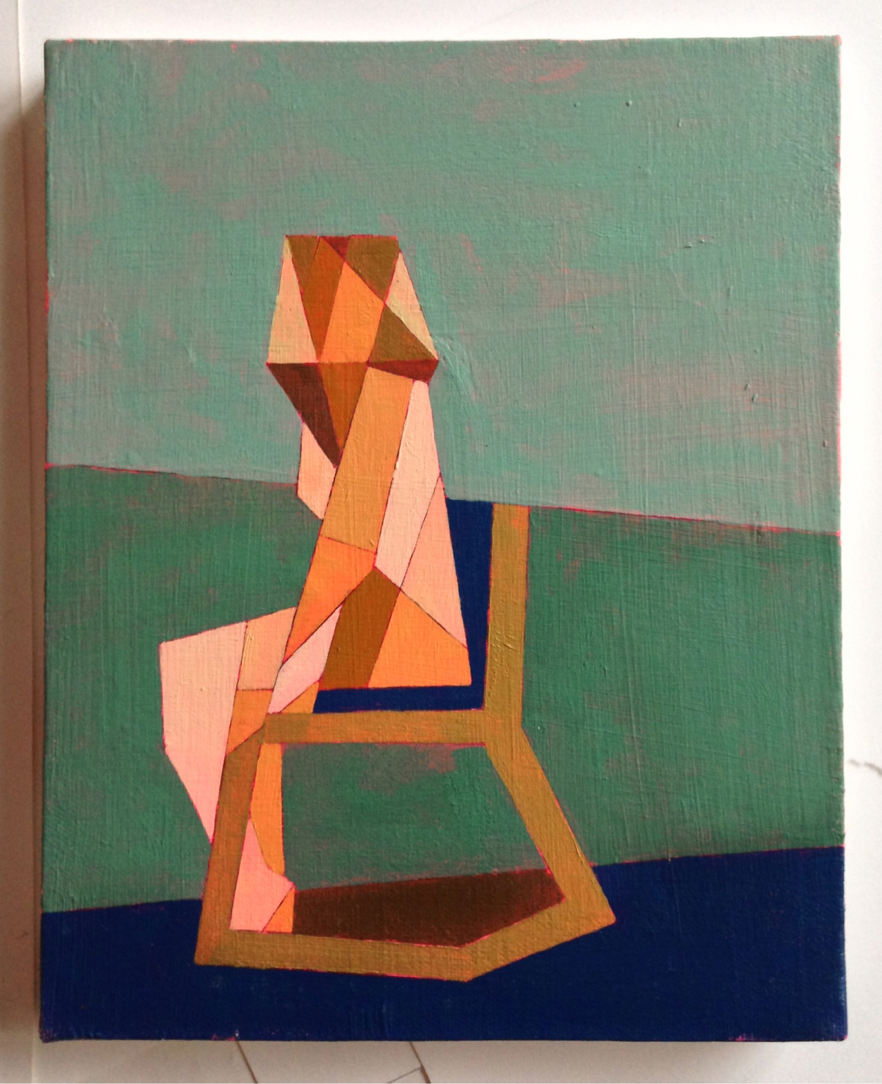
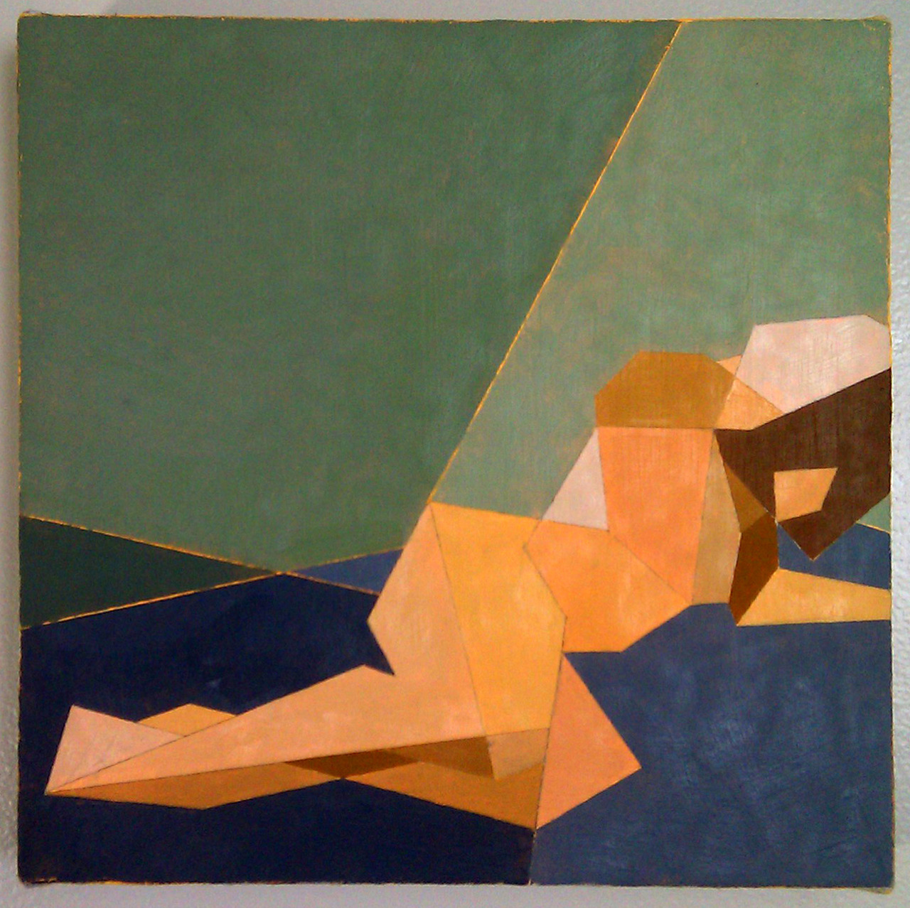
The women in Ian Gage’s paintings have recently begun transitioning – changing from realistic women splashed in dark paint to geometric pixillations that fragment her body and surroundings. The result is a shattered representation of women like minimalist stained glass windows, the light shining off of each shape differently, and with her body arranged in sometimes symmetrical but always balanced compositions.
Toll, Knell, & Peal reveal three different interpretations of the same front facing woman, and in each, her body is shattered into different shapes shaded in different shades of light. The transition between Ian’s realism style and his fragmented one can be traced from work to work, like a breadcrumb trail of the artistic process. Scrolling through his Tumblr is like reading a mystery novel where all the clues are visual, connecting the works that come before and after.

Cease and Knell shown at the Sustain/Able show at MassArt, 2012
What is the first thing you can ever remember drawing?
I think Godzilla. I was pretty preoccupied with typical giant robot/creature type products as a child—typically referred to as kaiju, though I don’t usually throw around that term. A Google search of that pretty much sums up the things I drew as a child.

Toll, Knell, & Peal
To you, what is it about women that make them so worth painting?
The anecdote I usually dispense as an answer for this is that I only took up an interest in drawing in response to a middle school crush. The crush in question was very interested in art and I pursued it to impress her. She moved away and nothing ever came of that, but I kept drawing. Ever since that point I’ve been interested in drawing or painting my romantic interests—it’s fairly transparent at this point to the people close to me.
I think there are a lot of things about painting women, in particular romantic interests, which one has to be cautious about. The first thing you hear in art school is that portraying someone you’re close to inevitably leads to an idealization complex—you’re never really able to accurately portray your subject because you’re occupied trying to flatter them. I’d like to think I’ve broken that barrier based alone on my obsession with proportionate accuracy, but one can never be trusted to judge themselves objectively. I can at least say in my defense that no one has mentioned idealization critically to me for probably two years. The second—and more broadly relevant point of caution, is my position as a male painting the female form. After seeing a Hilary Harkness lecture this past fall I grew somewhat uncomfortable with the plausibility of being labeled a misogynist based on my work, and so I try to be as aware of the presence of the male gaze in my paintings as possible. The effectiveness of that awareness can really only be judged by the female audience—I am at their mercy under the circumstances and that is the way it ought to be. Those are the two chief dangers I think.
I realize of course I have yet to answer the question, but that feels like some necessary pretext. I think I’ve always been very interested in making art about women due to their general impact on my life; it’s difficult to give an answer less nebulous than that. Painting women is something I generally don’t question, it’s just something that feels necessary, and has felt more so as I’ve gotten older. Continuing painting women, and justifying it, involves a lot of thought and deliberation on a daily basis; particularly revolving all of the implications of me painting women, and of painting women in general.

Untitled, Oil on canvas, 12”x16”
When did you first begin moving away from straight representations to geometry-inspired interpretations, and why?
I really started painting the geometric pieces in Catherine Kehoe’s representative painting class. From the beginning of the class I assumed we were learning to paint representatively (a logical assumption) but we were in fact learning the building blocks. I assumed the class structure would revolve around Kehoe giving us broad lessons on the tenets of painting naturalistically, and then individual suggestions to improve the realism of our work. I was chiefly interested in exhaustive detail—I wanted to paint like Scott Prior by the end of the class.
I found fairly quickly she was teaching the opposite of detail. Kehoe encouraged us to reduce the picture plane to the simplest shapes possible. I fiercely resisted this for about half of the semester, at which point I became exasperated and painted an exhaustively reductive study in an attempt to parody her lessons. It was absolutely meant to be a juvenile jab at her teaching, but to my surprise she loved the painting and encouraged me to pursue it further. For the duration of the class I developed a vocabulary in a style I had originally created as a joke, and grew to like it despite the fact I was painting expressive acrylic paintings in my personal studio. When I had my final critique in my painting studio the professor and guest artists were enamored of the Kehoe paintings and uninterested in my expressive paintings. That was the point at which I decided I needed to explore reductive painting more.

Untitled, Acrylic on canvas, 12”x16”
How would you describe the differences between those two styles?
Per the usual tortured artist criteria: I was in an emotionally turbulent point in my life for about a year, during which I lacked a single subject to paint. During that year I was really painting self-portraits with other people’s faces—I wanted to paint women but really just wanted to paint what I was feeling. That kind of expressive venting was the source of the majority of the imagery in that period of painting.
In a sort of coincidental windfall I was transitioning to painting geometrically when I met my current girlfriend, who is the subject of all of my paintings since that point (about a year now). In my personal life I moved into a more stable place, and my paintings became a lot more stable too. I think under these circumstances the primary difference is that the older paintings are very expressive and energetic; I was clearly being very physical with the works, and the current paintings are more analytical. I’m interested right now with proportionate accuracy, the dynamics of different geometric hierarchies, and color theory. Succinctly, the difference is expression vs. study.

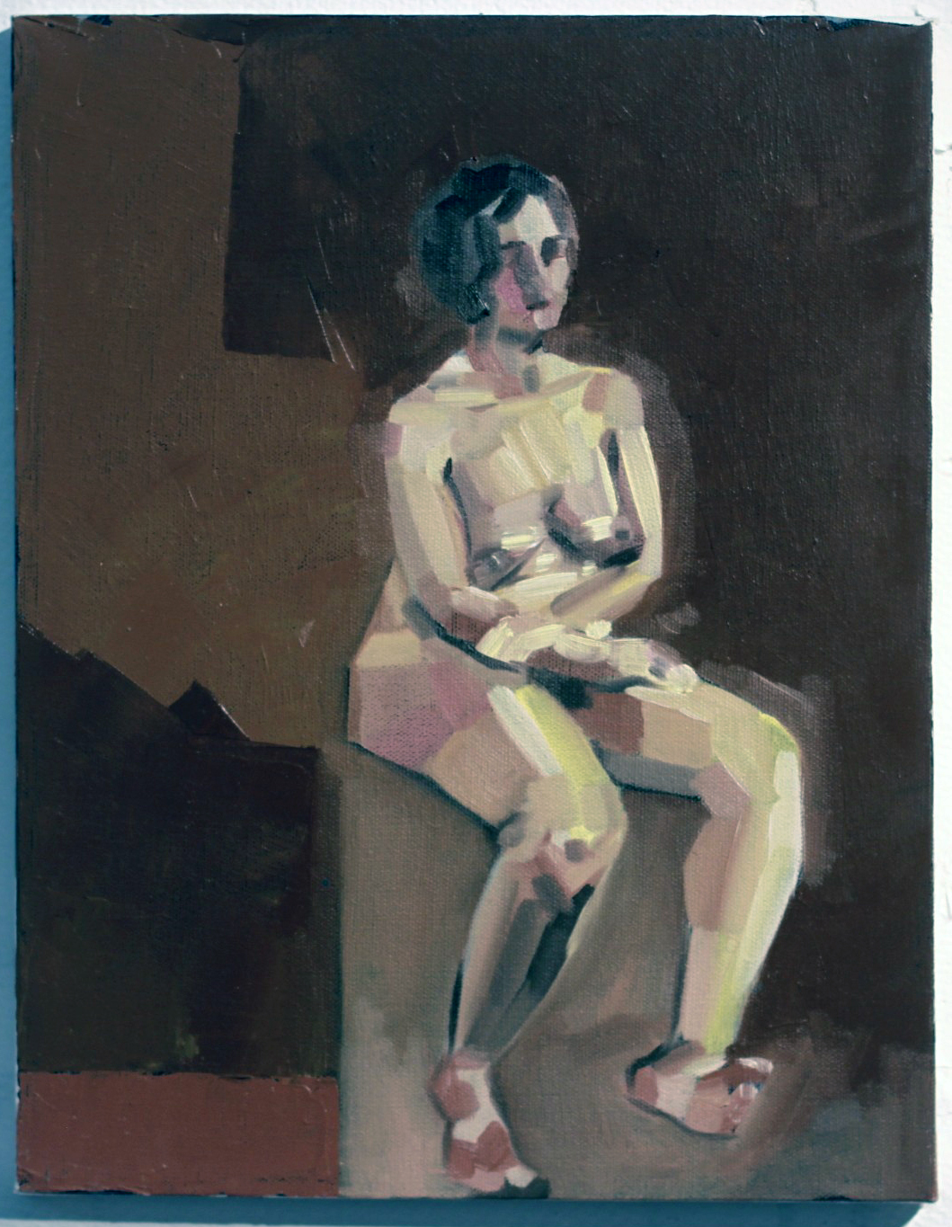
Seated Nude #3, Oil, Acrylic, Graphite on Canvas, 8”x10”
Who are these women? What do they represent to you?
The current paintings are all of Melissa, my girlfriend. Most of the older works are of Emma, a friend. The Emma paintings really fall under the self-portrait category, they’re about me at the time if anything. There were a couple of early Melissa paintings that fell under that category as well, namely Seam Ripper and Discrete Mathematics, after which point I dropped the expressive self-portrait vein for the reductive paintings.
The reductive paintings are a lot less about expression and more about study. Every painting is an attempt at adding or manipulating a variable in a previously established control. When something works I add it to the control; I add it to my toolbox. When it doesn’t work it remains exclusive to that painting. For instance: the blank figures in Seated Nudes 1 & 2 were an accident—I had placed a red ground, drawn the space, and painted the backgrounds. I decided before I painted the figures that they looked interesting as they stood, and left them. The silhouetted figure became part of my vocabulary at that point, and it reappeared in later paintings.
As far as what the women in the paintings represent to me beyond the above technicalities, I can’t really say. I try not to assign meaning to my paintings; I find I’m opposed to explaining the content because it places the painting in a box. A painting is infinitely more valuable to the viewer when they can assign their own meaning to it or attempt to glean the meaning themselves.

Reclining Nude IV, Oil on canvas 12”x12”
What sort of impression do you hope your works leave on the viewer?
It’s difficult to say based on the above statement. I hope it strikes a chord with them, I hope there’s something in them that they can take away. I hope they want to spend more time with it than five seconds.
[pureslideshow] https://thingsworthdescribing.com/wp-content/uploads/2013/03/gage8.jpg;https://thingsworthdescribing.com/wp-content/uploads/2013/03/gage7.jpg; [/pureslideshow]
Ian will be graduating from Massachusetts College of Art and Design this spring.
See more of his work on his Tumblr.
Mar 28, 2013 | street art
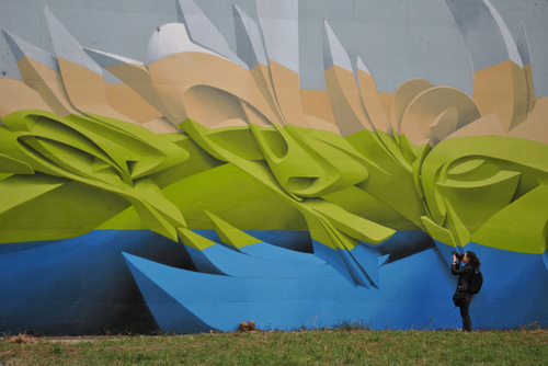
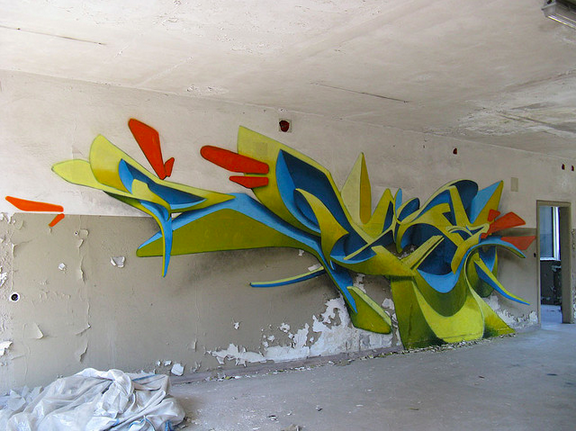
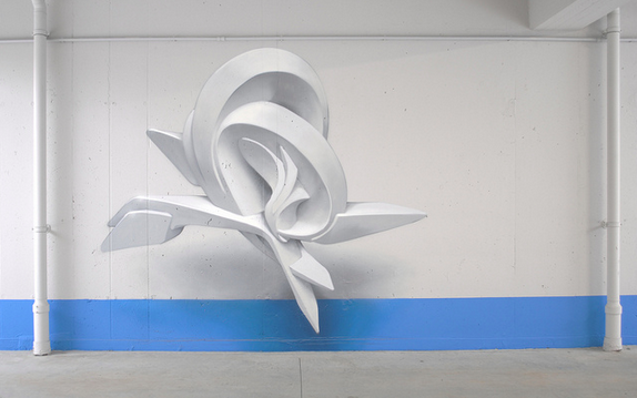
Sharp swoops emerge from the walls of parking garages and the sides of buildings, the one below is covered in shades of electric colors layered according to saturation with the densest boldest blue on bottom. The lettering seems to jut out into three dimensions, forming abstracted S-shapes with dramatic twists and extensions that reach up to the whitened top. It’s almost like a conglomerate of unfinished CGI designs from an oriental-themed Transformers movie, painted in lovely bold colors.
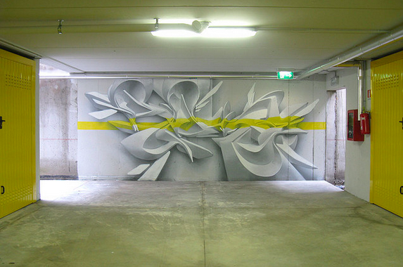
Sometimes the shapes take simpler forms, individual pieces of three-dimensional abstract shapes floating in space, usually arranged around the shapes that surround it. They form composite designs that are electrified by the power of whatever force keeps those shapes above ground, and the bright colors that slash their way through the forms only amplify the piece’s momentum. This 3D graffiti is created by the Italian artist Peeta, and his splices of futuristic bundles cover walls all over Italy.

September 2012, Banja Luka (BA) Graffiti Writing Jam
Peeta is also known as Manual Di Rita, and he has been a graffiti artist in Venice since 1993. By breaking down typographical forms and remaking them into dynamic shapes with deep shadowing, the whole design recesses into the wall. He said he particularly focuses on the lettering in his own name, Peeta, playing with the shapes of the letters and how much they can be twisted to become something else.

In an underground parking in Milan Italy, April 2009

In the Venice Industrial Port, Italy.
“Thus my own lettering is brought into the fluidity of the urban, where words are continuously ruptured from their own histories, readapted into idiom and gestures learned off the street,” he said,
“The final result derived from the fusion between traditional lettering and three dimensional style has ended up in giving life to a unique kind of visual rhythm, created by the intersecting lines between sections of conic, cylindrical and twisting surfaces. The role of sculpture comes to be essential for this purpose. It represents for me a direct contact with three-dimensionality in order to understand the rules of light and shadows and to reproduce them.”

Wall in Milan, Italy
For more of Peeta’s work, check out his website & Flickr.
Mar 27, 2013 | photography
A naked man stands before an empty gray background, shown only from the waist up, but parts of him are missing – whole sections of his arms and stomach and head are edited out. But instead of seeing bones and blood inside, there’s just a gaping clean-cut hole, and you can even see the same skin within him, as if we’re all just empty skin vessels filled with soul.
In the image below, the faceless man seems aware of his missing parts, looking down and reaching through the hole in his stomach with hands crisscrossed and fingers elegantly outstretched, feeling for something that isn’t there. His spine’s notches rise up at his shoulders, creeping to his neck.

A warm light shines luminescent against his skin, almost white in some places, blinding but not quite. In the image below, the man doesn’t seem to realize his head’s upper half is missing, which could have something to do with the fact that his eyes are gone too. Cut right at where his mouth opens, his lower lip remains above a cavity of empty head – a basin of smooth dented skin with arms stretching behind it, as if his head were still there to lean on.

Defragmentados means “defragmented” in Spanish, which according to Google:

This man’s emptiness, without any sort of interior flesh, somehow makes him seem less human, and more like a virtual recreation that’s intended to do away with all the messiness we real humans have inside us.

Yago Partal is a 29-year-old Spanish artist doing editorial work for the special effects company DDT Efectos Especiales, which actually sounds like the greatest job ever. DDT won an Oscar for their work in Pan’s Labyrinth, and Partal uses his photography and photo manipulation skills to perfect their special effect designs.
Partal’s website is filled with conceptual photography like this – his Zoo Portraits series features exotic animals in suits and ties and is almost too adorable.

For more conceptual photography from Yago Partal, check out his website.


