Apr 26, 2013 | apropos//ts, art with
Art that’s made out of words has to walk a thin line between simple and serious, drawing many meanings from a few little letters. By changing how the words are presented, they become more than just letters strung together to mean something – now that meaning is amplified to envelope whole concepts and a lot of them. My favorite works poke fun at their lettered, arbitrary existence. The words only mean something because of identities we’ve assigned them, so seeing those identities get turned on their head can be a lot of fun…
Hint: Hover!
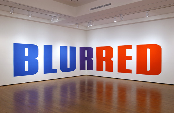
1. Kay Rosen, Blurred (2004)
[zl_mate_code name=”Blue Dynamic” label=”2″ count=”1″ who=”div” text=”‘BLU’ on one side of the wall and ‘RED’ on the other, each is painted in its corresponding color, and the two words meet at the wall’s corner, a purple ‘R’ joining them together in one word.
Two contrasting sides that don’t seem to have anything in common – you can try to mold them into one cohesive thought but then things get blurry.”]
[/zl_mate_code]
Source: Art Ruby
2. Faried Omara, I’m fine and
everything’s OK
[zl_mate_code name=”Green Dynamic” label=”4″ count=”1″ who=”div” text=”This sidewalk is one thing that does need fixing.
Irony cuts the words down the middle, drawing attention to the fact that mostly this expression is just used as an excuse to be lazy. How broken does something have to be before it’s worth the time it takes to fix?”]

[/zl_mate_code]
Source: fairedesign.tumblr.com
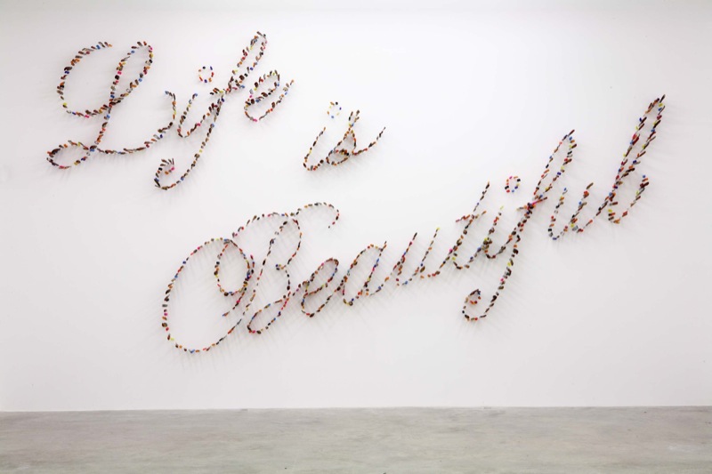
3. Farhad Moshiri, Life is
Beautiful (2009)
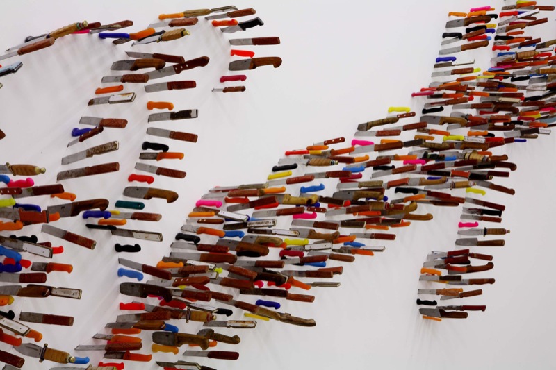
[zl_mate_code name=”Orange Dynamic” label=”3″ count=”1″ who=”div” text=”Knives turned into elegant cursive letters adds a teensy bit of discomfort to the words they spell, since someone had to slam all those sharp things through the wall to make it look that way.
It also makes you wonder… how beautiful can life be if the message comes from a violent place?”]
[/zl_mate_code]
Source: razorshapes.tumblr.com
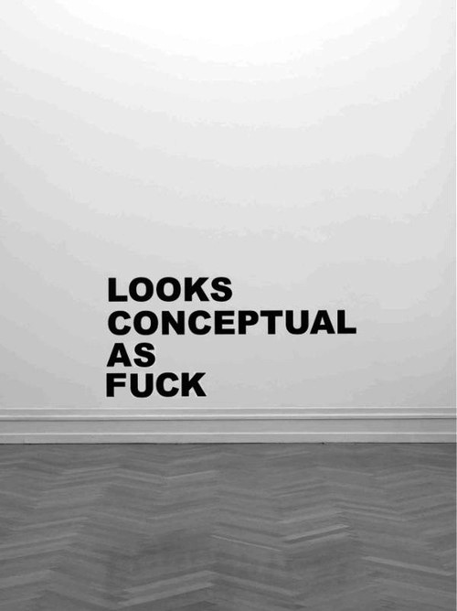
4. “Looks Conceptual as Fuck”
[zl_mate_code name=”Pink Dynamic” label=”1″ count=”1″ who=”div” text=”Instead of giving you something conceptual to look at so you can come to this conclusion on your own, the words let you work backwards, giving you some hilarious final thoughts about an artwork without showing you the actual thing.
The words slingshot you from the beginning of the art viewing process to the end, without ever really having a beginning at all.”]
[/zl_mate_code]
Source: cheesekills.tumblr.com
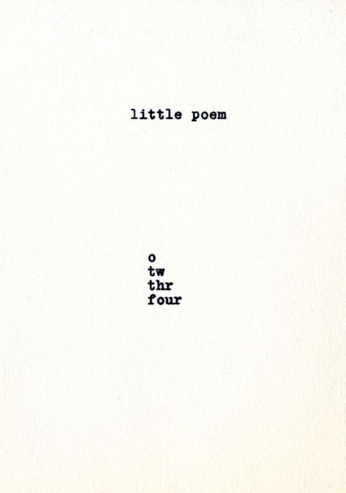
5. Jiri Valoch, Little Poem
[zl_mate_code name=”Green Dynamic” label=”4″ count=”1″ who=”div” text=”The only work on a piece of paper, this little poem assigns meaning to representation, only showing the number of letters that the word itself indicates, counting till a word is whole.
Or maybe we’re spelling something else… What do letters mean anyway when they’re all on their own?”]
[/zl_mate_code]
Source: blushingcheekymonkey.tumblr.com
6. Gardar Eide Einarsson, In
Taxis, On the Phone, In Clubs
and Bars, At Football Matches,
At Home With Friends (2013)
[zl_mate_code name=”Blue Dynamic” label=”2″ count=”1″ who=”div” text=”A warning against sharing information, the work is a declaration for privacy, even when you’re supposed to trust the people you’re with.”]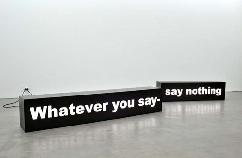
[/zl_mate_code]
Source: Global Art News
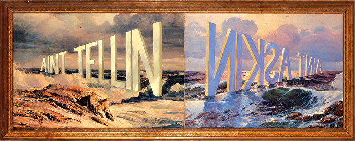
7. Wayne White, Ain’t Tellin
Ain’t Asking
[zl_mate_code name=”Orange Dynamic” label=”3″ count=”1″ who=”div” text=”Two sides of the same scene, with words standing tall in the water. The sun shines bright against ‘Ain’t Tellin’ but ‘Ain’t Askin’ casts shadows on the waves.”]
[/zl_mate_code]
Source: Minus Manhattan
Apr 25, 2013 | art history, Art Institute in Chicago, painting
“The Eventuality of Destiny” shows what could be the Three Graces, or just three random goddesses who are trapped on all sides by gray walls and ceiling. The architecture creates a sense of confinement that’s relieved only under the arm of the featured goddess – a little patch of blue sky that holds three tiny clouds.
This featured goddess stands tall with her arm gracefully draped over her head, and her whole body seems to glow from within with bright fiery colors. The greens, blues and oranges nearly burst out of her assumed human form, and the only sitting goddess looks like she holds whole universes within her. The women overtake the manmade architecture behind them, three maidens in elegant postures and only one reveals her face, bright blue shadows cast across her cheek with the tops and bottoms of her eyes lined in bold streaks of white.
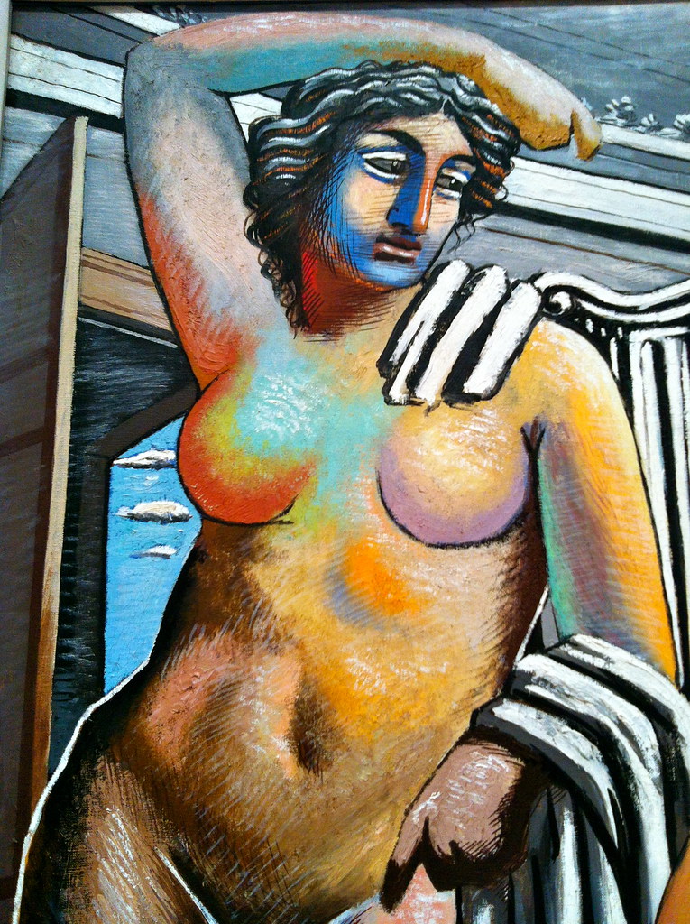
An Italian artist born in Greece, Giorgio de Chirico imagines the Greek goddesses as colossal creatures, perfect in form and covered in color. This painting gives a glorious hopeful portrayal of the supernatural beings in charge of our universe, and yet they’re still confined within the boundaries we created for them.
[zl_mate_code name=”twitter/facebook” label=”5″ count=”2″ link1=”http://www.twitter.com/share?url=https://thingsworthdescribing.com/2013/04/25/the-eventuality-of-destiny-by-giorgio-de-chirico-1927/” link2=”http://www.facebook.com/share.php?u=https://thingsworthdescribing.com/2013/04/25/the-eventuality-of-destiny-by-giorgio-de-chirico-1927/”]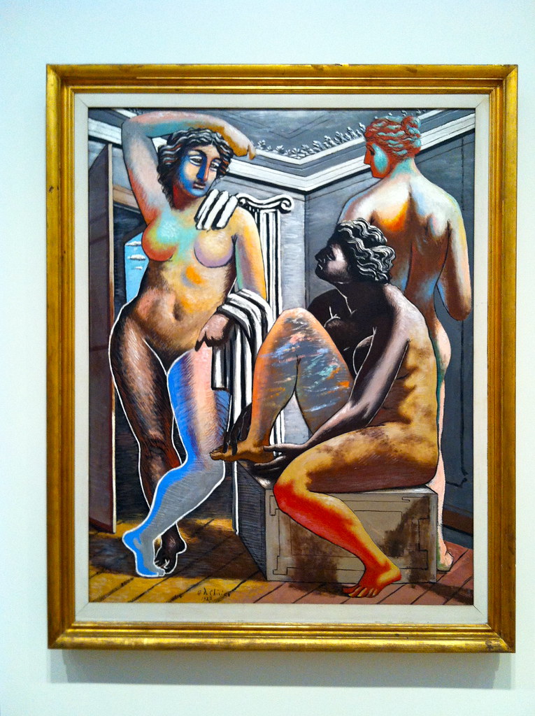 [/zl_mate_code]
Photographs taken at the Art Institute in Chicago. For more photos from this museum, see my Flickr set.
And for more information about this painting or de Chirico, check out this JAMA article.
Apr 24, 2013 | art history, interviews
Ben Street is a freelance art historian, writer and curator based in London. He has lectured for the National Gallery for many years and also lectures for Tate, Dulwich Picture Gallery, the Saatchi Gallery and Christie’s Education. Ben writes for the magazine Art Review and has published numerous texts for museums and galleries in Europe and America. He is the co-director of the art fair Sluice, and has curated a number of contemporary art shows at galleries in London. More information can be found at www.benstreet.co.uk.
Ben kindly answered some questions about how he got to where he is, and what it’s like to share art professionally in pretty much every way possible. He works with art that spans centuries, lecturing in the halls of prestigious museums while curating and covering contemporary art for modern magazines and galleries.
How did you come to realize that studying fine art was what you wanted to do with your life? What is it about art that makes it worth your dedication?
I got into art by making art, which I don’t do any more (at the moment, at least, to the great relief of many of my artist friends). Through painting, I became interested in various painters (Bacon, Grosz, Beckmann, people like that – I was a teenager, obviously). I remember seeing retrospectives in London of Picasso and Pollock, and the New York Guggenheim’s big Rauschenberg retrospective, which sparked a fascination with twentieth-century art, and I came to older art much later. (Initially I found it – older art, of the Renaissance and so on – incredibly difficult to grasp, which is the opposite way around to how it usually works). I can’t quite work out what makes art worth all this time, but I can’t stop spending all my time on it. I never feel like I know enough, that’s the motivation. Even paintings I’ve seen literally hundreds of times, and have written about and researched extensively – I feel I barely know them, which is an exciting feeling.
Can you remember the first work of art that had a really deep, profound impression on you?
I don’t think early experiences of art are really about deep and profound impressions. They’re about a gradual and insidious seeping into the subconscious and slow possession of the psyche, like an anaconda slowly suffocating a missionary explorer, and once you realise it’s happened, it’s too late – you can’t wriggle out again. I didn’t see that much famous art until I was a teenager, and even then it was mostly in books or on postcards. Consequently I have probably a deeper relationship with reproductions than with ‘real’ works of art – I have a sneaking suspicion they can be just as good as the original thing.
How does your knowledge and experience in lecturing play a role in the curation process for new work?
I have no idea – in fact, I’d try and avoid any crossover there for fear of being didactic. The worst curatorial policy begins with a theme and seeks works of art to illustrate it. Although I’d like my teaching/lecturing to be more about facilitating conversations between works of art across history, which is my idea of interesting curation, rather than regurgitating all the facts I’ve read, which is my idea of bad teaching.
Would you consider yourself an “art critic” at all? What does an artwork need to lack or have for you to absolutely hate or love it?
Yes, because I review exhibitions for Art Review magazine. Every really good work of art sets its own criteria by which it should be judged. There isn’t a universal measure, in other words. This is true of Titian as much as it is of Donald Judd, Matisse, David Hammons, or Duccio, to name a few artists I’ve been pretty obsessed with recently. It’s about a certain kind of force which obliges you to reassess what you thought you thought. That force is not dependent upon scale, or historical period, or medium. You know it when you see it – like pornography.
Whether lecturing or writing, how do you gauge the appropriate style that will reach the audience most effectively? Do you base it on their level of knowledge, assumed interests or something else?
I’d like very much to communicate ideas in a clear and comprehensible way, without compromising the complexity of those ideas. Sometimes that works and sometimes not. I’m very much in favour of encouraging people to look closely at works of art, and to be prepared to work hard (thinking, looking, analysing, discussing) to reap the big rewards. Looking has to be active and thoughtful and switched-on, but our world conspires against that: we see more images than ever, but our seeing has become passive – images require giving, not just receiving. Works of art are like gyms for the eyes, and once you start working out – stay with me – your life will be enlivened in a quite amazing way.
For more from Ben Street follow him on Facebook and on Twitter.
Apr 24, 2013 | design
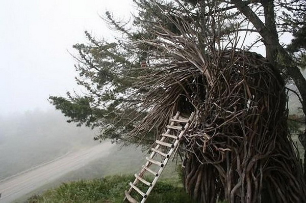
California artist Jayson Fann creates these spirit nests as part of the Big Sur Spirit Garden, an International Arts and Cultural Center in California’s Big Sur valley, between the Santa Lucia Mountains and the Pacific Ocean. Each nest is big enough for at least one person, and they range in scale from love seat size all the way to a 20 person nest that is wider than a highway and has a second story inside it.
Each nest is made with tree branches from local forests, each limb carefully cut and chosen to ensure that the tree itself isn’t damaged in the process. Jayson most often uses the wood from Eucalyptus trees because it’s strongest and lasts longer than most others, cutting away their leaves with a machete and transporting the harvested wood to the new nest’s building site.

To begin building the nest, Jayson first separates the wood by size.
“The process consists of fitting the puzzle of branches into a flowing form that integrates structural integrity with artistic flow,” he said, “I use tension by bending the wood and counter sunk screws that are virtually invisible to ensure a strong structure.”


Each nest creates a delicate new relationship between human and nature, one that was lost long ago when we first went indoors to shield ourselves from the elements. In these nests, we’re granted a place among the elements instead of being pitted against them, connecting us for an instant to the all the beauty that’s out there in this miracle of a world.
That’s the perfect image these pictures create. The nests are set in elegant forests and waterfronts, with the sun shining and the sky glowing, and all of these ingredients are amplified in each tree branch that’s been harmoniously joined with its brother to create a pattern of protection.


Image source: Cuded
For more information, check out Big Sur Spirit Garden’s website.
Apr 23, 2013 | apropos//ts, art with, photography
It might be the coolest superpower ever, and with photo editing software now it’s possible: people can fly. Only visually unfortunately, not physically, but seeing the image of a person flying makes it seem like it’s that much closer to possible. Maybe someday soon it will be, inventions these days are reaching new levels of amazing – we’re basically able to reconstruct working human limbs now so jetpacks can’t be too far off. But then there would have to be flying legislation and we wouldn’t actually get to use the jetpacks legally till the year 3000.
Hint: hover for descriptions!
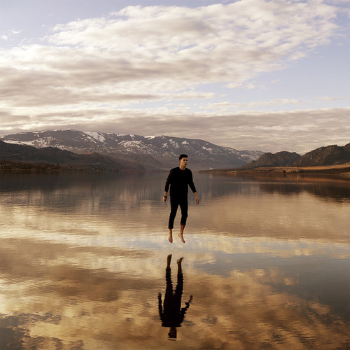
1. Sky Fall by Evan Borges
[zl_mate_code name=”Pink Dynamic” label=”1″ count=”1″ who=”div” text=”More floating than flying, he glides eerily over the smooth top of the lake.
He’s in the exact center, and the sky’s clouds and colors are reflected in the lake below, the ripples transforming their shapes into a real kind of impressionism.”] [/zl_mate_code]
Source: galito26.tumblr.com
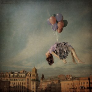
2. Away to the Sky by Anka
Zhuravleva
[zl_mate_code name=”Orange Dynamic” label=”3″ count=”1″ who=”div” text=”Balloons lift a girl from her center, and she’s flying without realizing it; her head falls back and her body is limp in the middle of the sky.
The scene behind her is blurred and faded – not as real as the girl in the plaid skirt who looks like she’s just flown away from the party. “] [/zl_mate_code]
Source: unplu66ed.tumblr.com
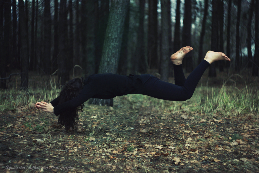
3. Untitled by Agnieszka
Sikorska
[zl_mate_code name=”Blue Dynamic” label=”2″ count=”1″ who=”div” text=”Flying is more like hovering here. A figure dressed all in black hangs a couple feet off the ground, her hair falling forward and tickling the leaves and the dirt.
She looks captive, hands held above her head and feet kicking back, speckled in dirt.”]  [/zl_mate_code]
Source: whynotrishu.tumblr.com
4. Chairway to Heaven by Julia
Anna
[zl_mate_code name=”Green Dynamic” label=”4″ count=”1″ who=”div” text=”Against a fiery red sky, the girl plays a dangerous game of musical chairs, arms outstretched for balance even though she’s not afraid of falling.
She’s almost halfway to the chair at the other end of the sky.”]  [/zl_mate_code]
Source: i-rene.tumblr.com
5. Leaving the Body by Hands
of Skill
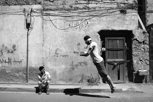
[zl_mate_code name=”Orange Dynamic” label=”3″ count=”1″ who=”div” text=”A man levitates and leans forward, blindfolded and thrust forward by whatever’s in his hands.
A boy sits on the curb and stares up holding his head in his hand, watching the man fly past as if levitation were an ordinary thing.”] [/zl_mate_code]
Source: myphotologbook.tumblr.com
6. The Journey by David Shauf
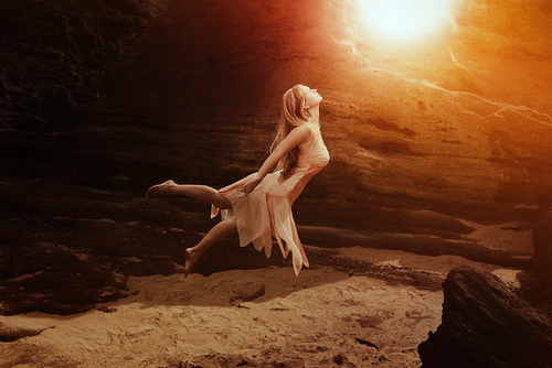
[zl_mate_code name=”Pink Dynamic” label=”1″ count=”1″ who=”div” text=”She doesn’t have wings but she still looks like a fairy, a girl flying over the sand in the sunlight with her back arched; the petals of her skirt dance in the wind.”] [/zl_mate_code]
Source: insaneobsession28.tumblr.com
7. Floating Chair by Hannah
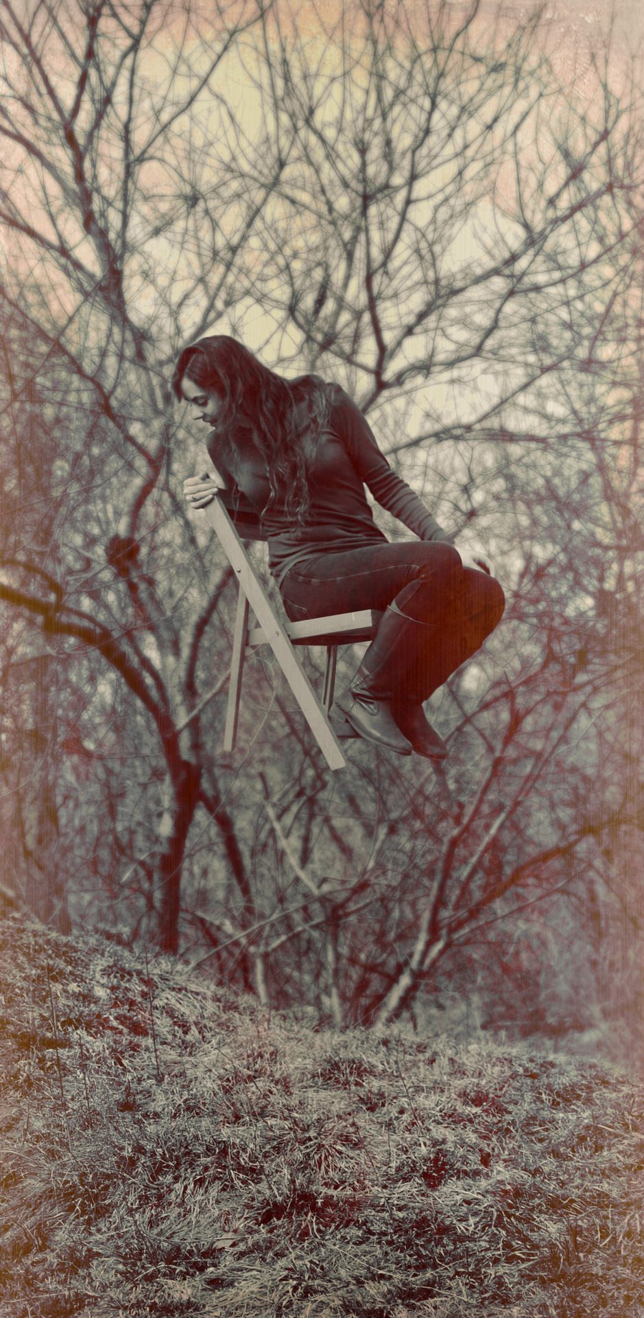
[zl_mate_code name=”Blue Dynamic” label=”2″ count=”1″ who=”div” text=”She sits in a wooden fold-up chair and both chair and girl fly a few feet above the ground, with tree branches stretching out like spiderwebs behind her.
She looks over the back of the chair and down, surprised at the magic she’s found in the woods.”] [/zl_mate_code]
Source: tumblropenarts.tumblr.com
8. Head in the Clouds by
Stefano Galeotti
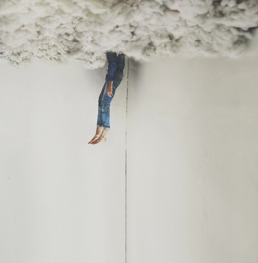
[zl_mate_code name=”Green Dynamic” label=”4″ count=”1″ who=”div” text=”Thick wooly clouds hide the girl’s head, but her body stick out of the fluffy ceiling like a stick stuck in the dirt.
Her body’s set against the corner of a room, the line of the wall running down behind her.”] [/zl_mate_code]
Source: unplu66ed.tumblr.com


 [/zl_mate_code]

