Art that’s made out of words has to walk a thin line between simple and serious, drawing many meanings from a few little letters. By changing how the words are presented, they become more than just letters strung together to mean something – now that meaning is amplified to envelope whole concepts and a lot of them. My favorite works poke fun at their lettered, arbitrary existence. The words only mean something because of identities we’ve assigned them, so seeing those identities get turned on their head can be a lot of fun…
Hint: Hover!
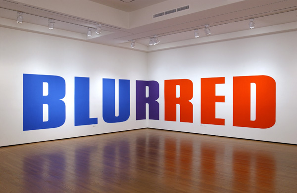
[zl_mate_code name=”Blue Dynamic” label=”2″ count=”1″ who=”div” text=”‘BLU’ on one side of the wall and ‘RED’ on the other, each is painted in its corresponding color, and the two words meet at the wall’s corner, a purple ‘R’ joining them together in one word.
Two contrasting sides that don’t seem to have anything in common – you can try to mold them into one cohesive thought but then things get blurry.”]
[/zl_mate_code]
Source: Art Ruby
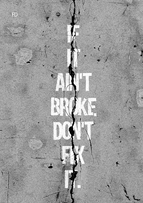
[zl_mate_code name=”Green Dynamic” label=”4″ count=”1″ who=”div” text=”This sidewalk is one thing that does need fixing.
Irony cuts the words down the middle, drawing attention to the fact that mostly this expression is just used as an excuse to be lazy. How broken does something have to be before it’s worth the time it takes to fix?”]
[/zl_mate_code]
Source: fairedesign.tumblr.com
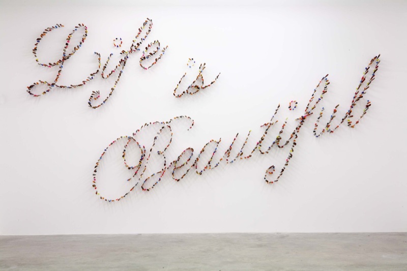
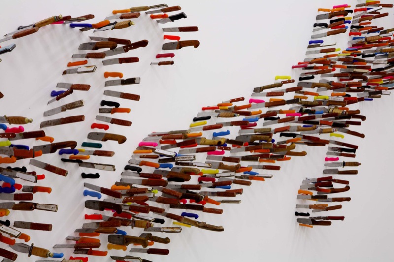
[zl_mate_code name=”Orange Dynamic” label=”3″ count=”1″ who=”div” text=”Knives turned into elegant cursive letters adds a teensy bit of discomfort to the words they spell, since someone had to slam all those sharp things through the wall to make it look that way.
It also makes you wonder… how beautiful can life be if the message comes from a violent place?”]
[/zl_mate_code]
Source: razorshapes.tumblr.com
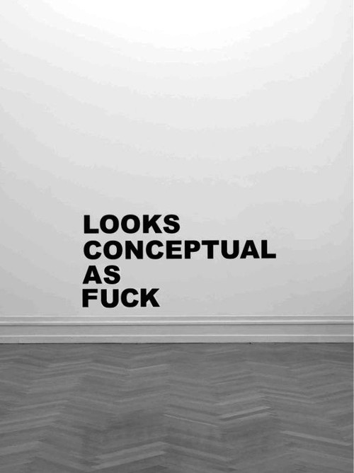
4. “Looks Conceptual as Fuck”
[zl_mate_code name=”Pink Dynamic” label=”1″ count=”1″ who=”div” text=”Instead of giving you something conceptual to look at so you can come to this conclusion on your own, the words let you work backwards, giving you some hilarious final thoughts about an artwork without showing you the actual thing.
The words slingshot you from the beginning of the art viewing process to the end, without ever really having a beginning at all.”]
[/zl_mate_code]
Source: cheesekills.tumblr.com
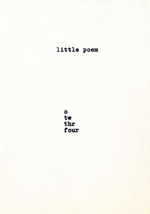
[zl_mate_code name=”Green Dynamic” label=”4″ count=”1″ who=”div” text=”The only work on a piece of paper, this little poem assigns meaning to representation, only showing the number of letters that the word itself indicates, counting till a word is whole.
Or maybe we’re spelling something else… What do letters mean anyway when they’re all on their own?”]
[/zl_mate_code]
Source: blushingcheekymonkey.tumblr.com
and Bars, At Football Matches,
[zl_mate_code name=”Blue Dynamic” label=”2″ count=”1″ who=”div” text=”A warning against sharing information, the work is a declaration for privacy, even when you’re supposed to trust the people you’re with.”]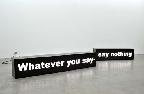
[/zl_mate_code]
Source: Global Art News
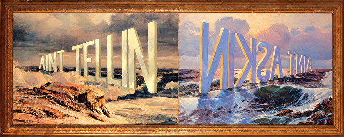
[zl_mate_code name=”Orange Dynamic” label=”3″ count=”1″ who=”div” text=”Two sides of the same scene, with words standing tall in the water. The sun shines bright against ‘Ain’t Tellin’ but ‘Ain’t Askin’ casts shadows on the waves.”]
[/zl_mate_code]
Source: Minus Manhattan
loading...


