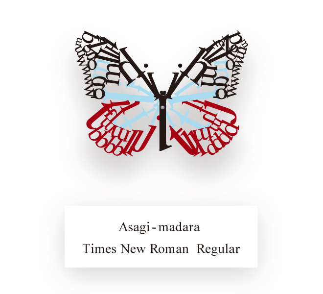
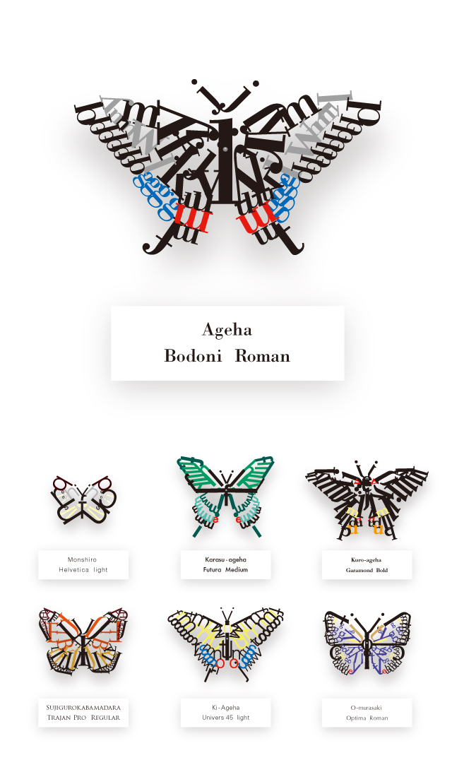
These lovely lettered butterflies were created by a 25-year-old graphic design student who used a different font for each. He goes only by guusan, and on loftwork, the Japanese portfolio site where these images were uploaded, he said, “I imagined different fonts as butterflies and then created a specimen book based on that.”
These typographic butterflies use the shape of the letters to decide whether each wing will curve or point, and “I’s” and “J’s” stretch up to form antennas. The color schemes correspond to the severity of the letter’s shapes – Helvetica Light is black, gray and yellow, Futura Medium is green and turquoise with a hint of red, and Garamond Bold is mostly black with splashes of orange, red and yellow thrown in. Each wing is the mirror of its opposite – jumbled letters that are given shape, color and a significance that might let them fly away.
Source: Spoon & Tamago
loading...


