Feb 28, 2013 | illustration, interviews, painting
From his series, “Where the crows fly on their backs.”
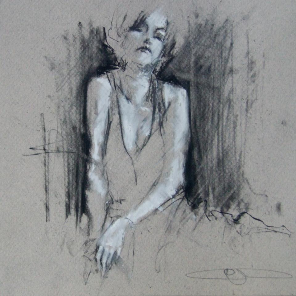
We see her through smoke, the black outlines only revealing what’s necessary and letting the rest of her float away. Her skin is luminescent in white chalk that’s used to cast shadows across her body, left side glowing and right side faded, but her high cheekbones pick up light on both sides. Her head tilts back, and even though there’s no way to know for sure if her eyes are open, it somehow still feels like she’s looking at you because she knows you’re looking. After all, someone this beautiful must always have eyes on them.
Guy Denning’s impulsive sketching masterfully reveals something beautiful, usually a person, which is probably the most beautiful thing there is. The faces he draws use heavy shadow and sometimes a filled in background to emerge from the lines and paper, but they always come to life with the movements of the sketch, made so obvious that you’re able to imagine the process of each drawing coming to life.
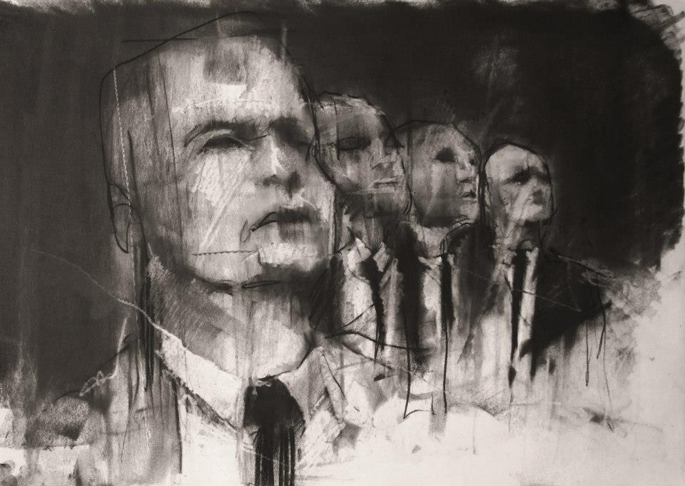
“And the other heads FIST
Since they’ve lost the desire to even try
And instead look ahead.”
conte and chalk on paper
30 x 40 cm
12th February 2013
What usually inspires the creation of a new image?
Ideas come from all over the place. Usually it arrives to a canvas after it’s sat in my head for a couple of months, and I’ve drawn it a couple of times. I’ve got more ideas in my head than time left to do ’em.
How would you define neomodernism?
No more than what’s defined here. In fact there’s a lot on my blog about methods, ideas and inspiration.
From Guy’s blog: “The Post-modern is useful only in terms of further defining Modernism from its origins and is essentially only a continuity of modernism – sometimes termed hyper-modernism. These are all useful, to a greater or lesser degree, in terms of avoiding the ideas of the ‘end of (Art) history’ but with regards to the actual creation of artworks they are invalid. People do not set out to create a work of ‘Post-modern Art’. If we must have a new label, let it be a New Modernism – a return to the critical aesthetic giving the artist the opportunity to create work that has some relevance to the new modern audience – an audience already familiar with ‘modern art’, where validation of quality is not founded on post-modern hyper-obsession with language and semiology and the artist is not ground into politically correct subservience. I do not see this as a retrograde step – it can be the only way forward – to let the artist communicate without the bonds of corporate and state art politics.
To those claims of ‘Art is Dead – long live Art’ –
Post-modernism is dead – long live Neo-modernism.”
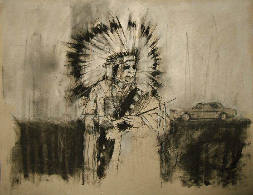
“AIM, the second battle of Wounded Knee (February 1973)”
conte and pastel on paper
66 x 55 cm
28th February 2013
What do you hope your pieces accomplish?
The most I can hope for is to emotionally move a viewer. Everyone brings their own lives and history to anything they look at, listen to or read. Consuming culture is as specific to the individual as making it.
When did you first begin painting and why?
I was drawing from childhood and I think that’s where my competency came from. I did little but draw and read – I certainly didn’t mix with other kids. First oil paintings were done at age 10 or 11 after my dad gave me a set of oil paints that he’d got bored with (a passing hobby in his 30s). I was hooked from the start.
Guy Denning is an English artist who’s been creating since the early 90s, and his work has been featured in exhibitions all over the UK as well as in Germany, Italy, France, and the US. You can see more of Guy’s work on his website, and all of these images come from his Facebook, which is filled with more things worth describing than I could ever filter into one post.
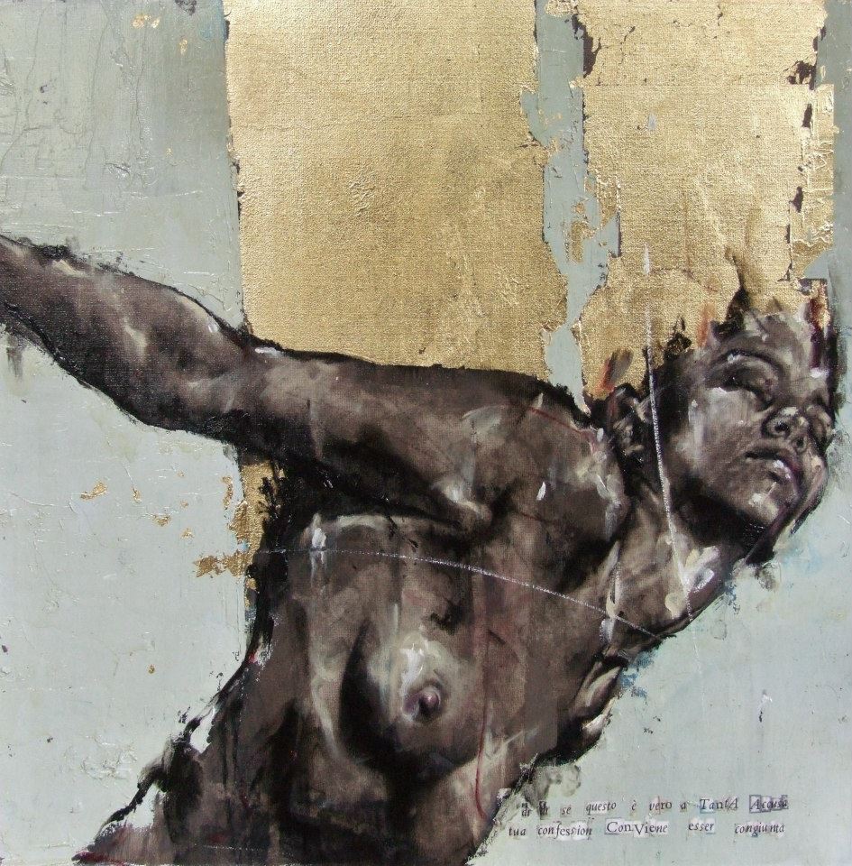
From the Purgatorio show, 2011 “dì, dì se questo è vero a tanta accusa tua confession conviene esser congiunta”
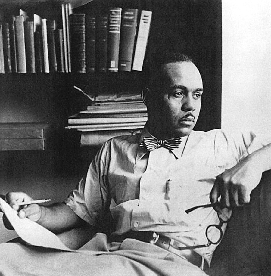
Feb 27, 2013 | books
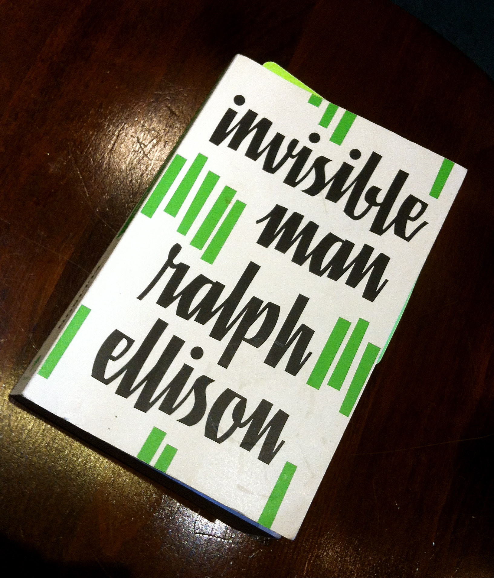 Invisible Man is a dense piece of text, but if you have enough free time and a love for words and African American history then it’s more than worth it.
Sometimes the words won out over clarity though – the head trauma/hospital scene hardly makes any sense at all. There’s an out of place prologue from our nameless protagonist, where he tells us his current situation: living rent free under the radar in New York City, stealing electricity with a basement apartment covered in lightbulbs – his own personal form of sticking it to the man after years of being taken advantage of.
You’d think that foreshadowing this heavy would ruin the suspense of the entire book, but there’s no way anyone could guess the all the terrible things that happen to this poor boy trying to figure things out for himself – in the south society won’t let him and in the north there’s not a soul who cares.
Finally though he is stabbed in the back too many times to try anymore, going through an aimless wandering phase until he witnesses the eviction of an elderly couple in Brooklyn. The community gathers to watch the police move everything the couple has out onto the street and the scene nearly escalates to a riot when our protagonist feels compelled to speak, and his talent for moving people with words becomes a local news story. The Brotherhood recruited him that night, and even though he just felt lucky to have a job, joining the Brotherhood would be the last self-sacrifice he’d make before realizing how important the self actually is.
His first speech as a Brother (and yes, they all call each other Brother so-and-so) was regarded as a failure by the elder brothers because it relied too much on emotion and too little on the literature detailing the Brotherhood principles that he’d only had a few days to study. The speech was the book’s major highlight, although the story does get a lot more interesting once our protagonist becomes the star of a racial equality , almost cult-like protest movement.
After an anticlimactic beginning interrupted by some mouthy audience members, this “emotional speech” continued,
“There was a stir behind me. I waited until it was quiet and hurried on.
‘Silence is consent,’ I said, ‘so I’ll have it out, I’ll confess it!’ My shoulders were squared, my chin thrust forward and my eyes focused straight into the light. ‘Something strange and miraculous and transforming is taking place in me right now… as I stand here before you!’
I could feel the words forming themselves, slowly falling into place. The light seemed to boil opalescently, like liquid soap shaken gently in a bottle.
‘Let me describe it. It is something odd. It’s something that I’m sure I’d never experience anywhere else in the world. I feel your eyes upon me. I hear the pulse of your breathing. And now, at this moment, with your black and white eyes upon me, I feel… I feel…”
I stumbled in a stillness so complete that I could hear the gears of the huge clock mounted somewhere on the balcony gnawing upon time.
‘What is it, son, what do you feel?’ a shrill voice cried.
My voice fell to a husky whisper, ‘I feel, I feel suddenly that I have become more human. Do you understand? More human. Not that I have become a man, for I was born a man. But that I am more human. I feel strong, I feel able to get things done! I feel that I can see sharp and clear and far down the dim corridor of history and in it I can hear the footsteps of militant fraternity! No, wait, let me confess… I feel the urge to affirm my feelings… I feel that here, after a long and desperate and uncommonly blind journey, I have come home… Home! With your eyes upon me I feel that I’ve found my true family! My true people! My true country! I am a new citizen of the country of your vision, a native of your fraternal land. I feel that here tonight, in this old arena, the new is being born and the vital old revived. In each of you, in me, in us all.
‘SISTERS! BROTHERS!
WE ARE THE TRUE PATRIOTS! THE CITIZENS OF TOMORROW’S WORLD!
‘WE’LL BE DISPOSSESSED NO MORE!’
The applause struck like a clap of thunder.”
The story circles back to the beginning, but without the protagonist obviously ending in his hole in a basement filled with 1,369 lights. The prologue is actually the most interesting part, but only once you’ve read the book already – it references characters not introduced till the 300th page, although the general meaning can still be understood.
It begins,
“I am an invisibile man. No, I am not a spook like those who haunted Edgar Allan Poe; nor am I one of your Hollywood-movie ectoplasms. I am a man of substance, of flesh and bone, fiber and liquids – and I might even be said to possess a mind. I am invisible, understand, simply because people refuse to see me. Like the bodiless heads you see sometimes in circus sideshows, it is as though I have been surrounded by mirrors of hard, distorting glass. When they approach me they see only my surroundings, themselves, or figments of their imagination – indeed, everything and anything except me.”
After a beginning like that, I was hooked, especially with the somber poetic link between race and invisibility. The rest of the book moves more slowly, carefully and eloquently telling the story of a black boy caught between his grandparent’s generation of slavery and his own time – one painfully pushing towards equality, attempting to undo centuries of hateful thinking and misconceptions, even within his own mind.
Feb 26, 2013 | sculpture
Peter Callesen uses paper itself as a medium, carefully cutting away forms and shapes from a sheet of backdrop, then reconstructing those fallen bits into miniature sculptures that are sometimes still connected to the flat blank paper they used to be, almost as if they were falling out of place. These simple delicate masterpieces combine two-dimensional shapes with three-dimensional sculptures, now affected by gravity and casually laying upon the wooden frame’s platform.
In “Dead Angels” this is exactly the case, winged skeletons falling from the cutout silhouettes of flying angels. The concept behind trace and form lends itself to this duality of ideas – the lack of paper inside the angels’ forms indicate their absence, accounted for by the three skeletons only held up by the paper’s thick wooden frame, their wings still attached but useless. I especially love the third skeleton, hanging by one big toe to the angel he used to be as his body leans upside-down, but in a silly way, arms outstretched as if to say ‘oh well.’
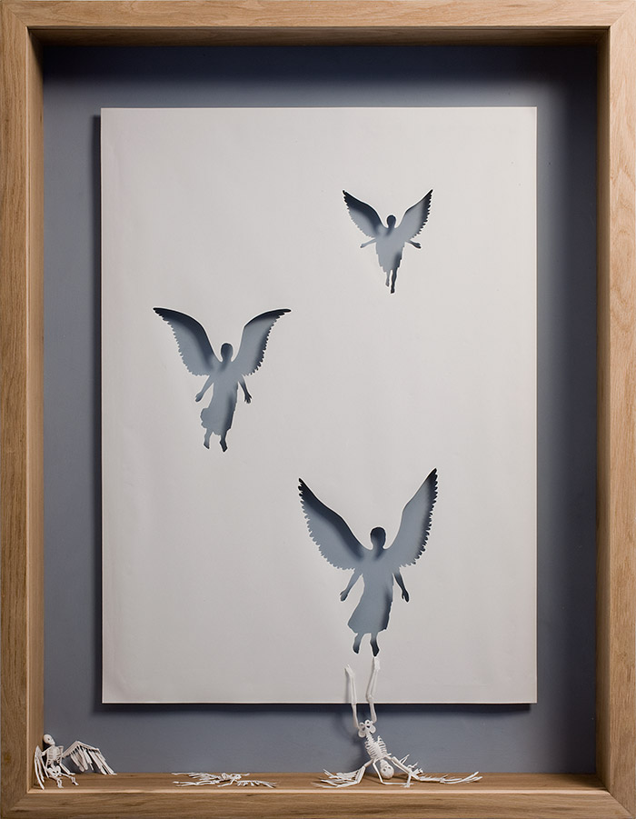
Dead Angels, 2007
Acid Free paper, glue, acrylic paint, and oak frame.
127 x 94 x 11,5 cm.
“City of Homeless Thoughts” visualizes its title metaphorically, the intricately cut profile view of a head is filled with interlocked tubes and wiring that branch outside his form, cast above the frame litered with miniature paper houses.
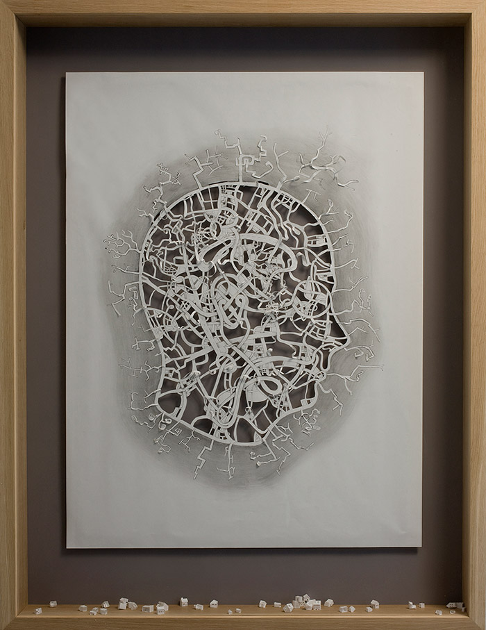
City of Homeless Thoughts , 2008
Acrylic paint, on 120 gsm acid free paper, pencil and oak frame.
139 x 106 x 13 cm.
“Cut to the Bone II” is the funniest of them all in a dark twisted kind of way – a skeleton against a dull pink background rolls down the paper his form came from, his skeleton legs and feet still drawn inside the painted paper that’s held rolled up by his skinny little skeleton fingers at the hips.
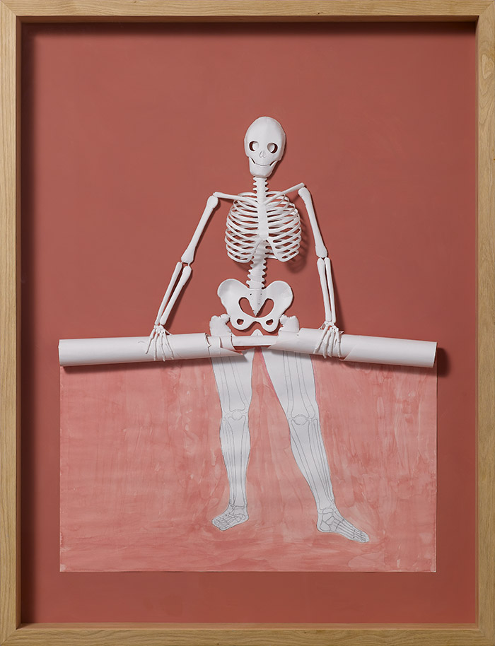
Cut To The Bone II, 2008
Watercolor and pencil on 120 gsm acid free paper, glue, and oak frame.
139 x 107 x 13 cm.
“The Roots of Heaven” shows a poetic detail of a tree too symmetrical to be real, its cut out form laying on the frame, still connecting and now visually serving as the tree’s roots, linking it to its past.

The Roots of Heaven, 2009
Acid-free 120 gsm paper, glue, acrylic paint and wooden frame.
107 x 107 x 13 cm
See more of Peter Callesen’s work on his website here.
Feb 25, 2013 | illustration, painting
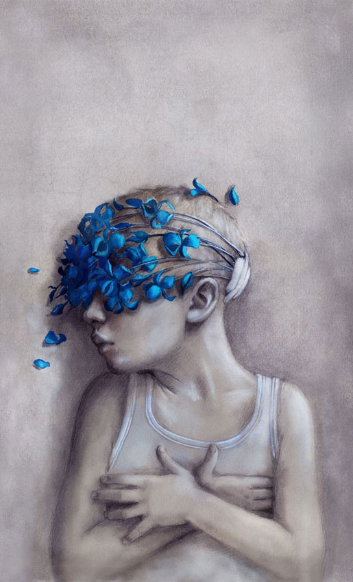
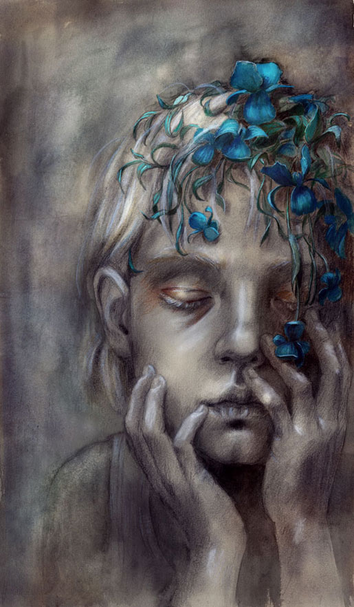
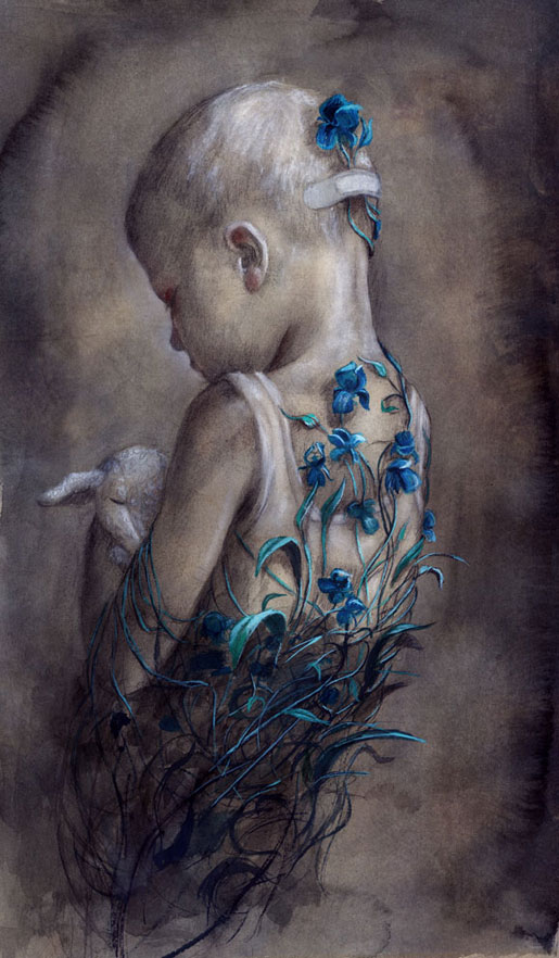
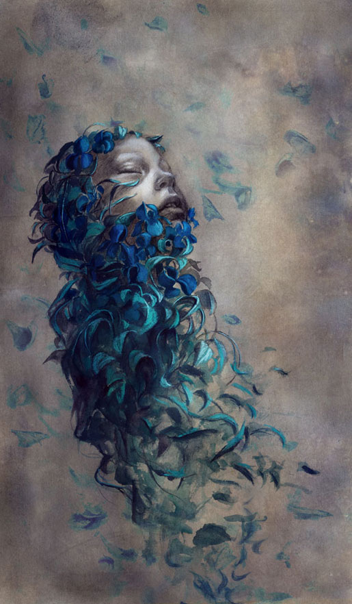
Artist and illustrator Beatriz Martin Vidal draws children in such an incredible way, highlighting their purity and innocence with simple shadows and sharp colors. The arresting colors – the ones that really make your eyes pull the car over – are usually only applied to flowers and other visual accessories, contrasting with the child and his monochrome background in a meaningful way – suggesting connections between youth and vitality while always maintaining a somber undertone about how fleeting all of it is anyway.
This collection is titled “birgit” in Vidal’s gallery of novel illustratons, and here she uses these stunning bright blue flowers to metaphorically encircle the beautiful children. Here they’re drawn in white tank tops with disheveled hair, creating a link to poverty and want – two things a child should never have to experience for herself.
In this first work the flowers cover the little boy’s eyes, stemming from a bandage at the back of his head, creating a blindfold on everything outside his own imagination, protecting him from whatever caused the need for a bandage in the first place.
In the second we see what to me looks like a little girl’s face, although her hair is cut short just past her ears. She sits, eyes closed, holding her face in her hands with eyelids tinted gold, as the bright blue flowers blossom and cascade down her forehead.
In the third work, a little boy stands with his back to us, holding his bunny/sheep stuffed animal close to his chest with his head cast down toward it. The flowers creep up his back, vines growing up from the depths and encircling his tiny frame.
In the last illustration the flowers have almost whisked the whole child away to someplace safer, only her face still peeking through the petals, turned up towards the sky with eyes closed and an expression of gratitude and peace.
See more of Beatriz Martin Vidal’s work on her website here.
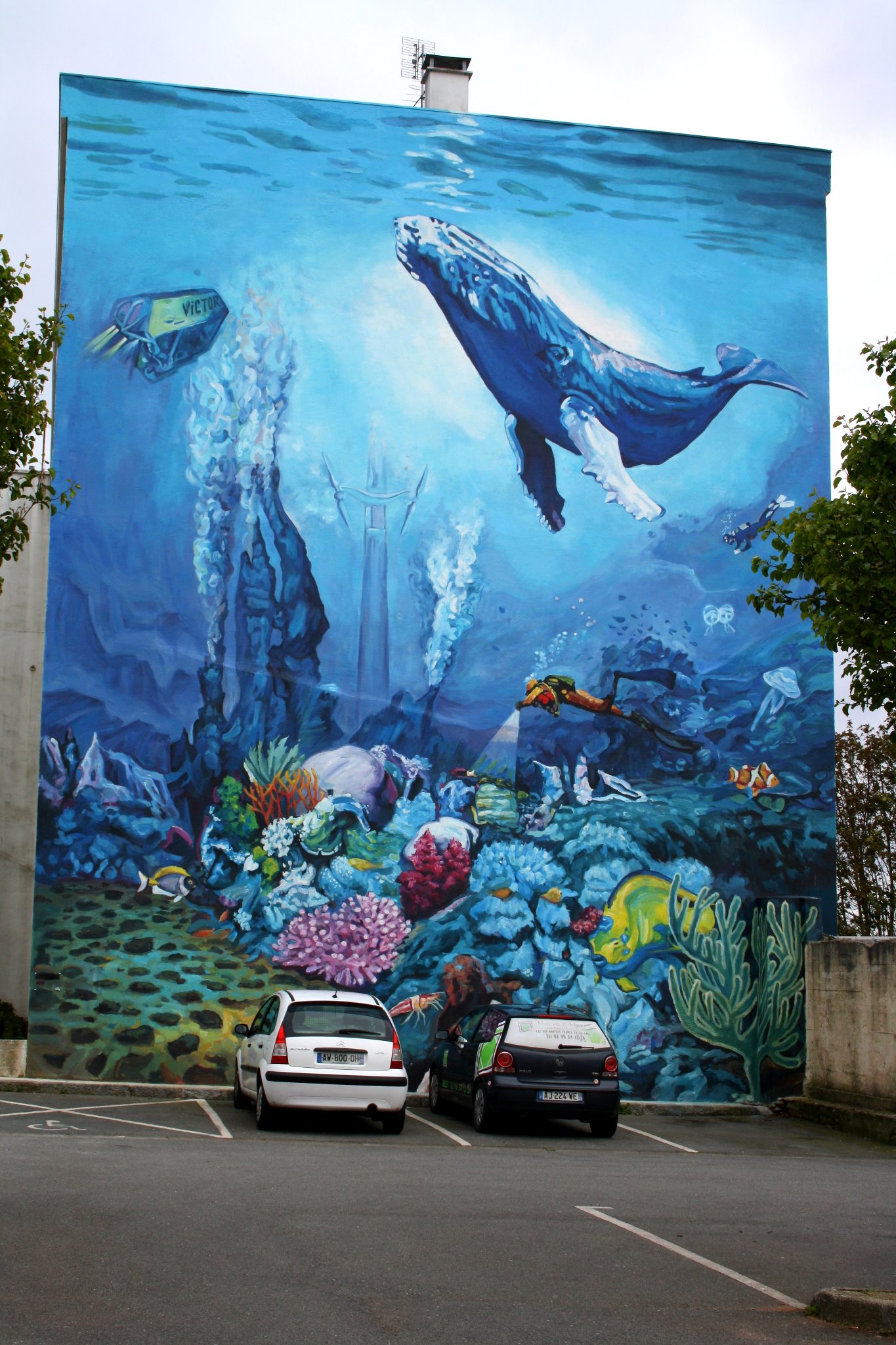
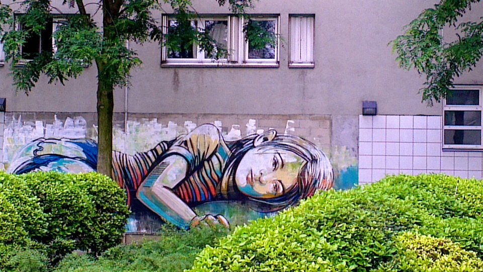
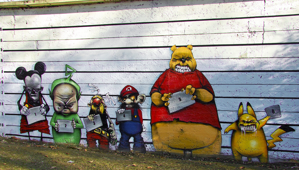
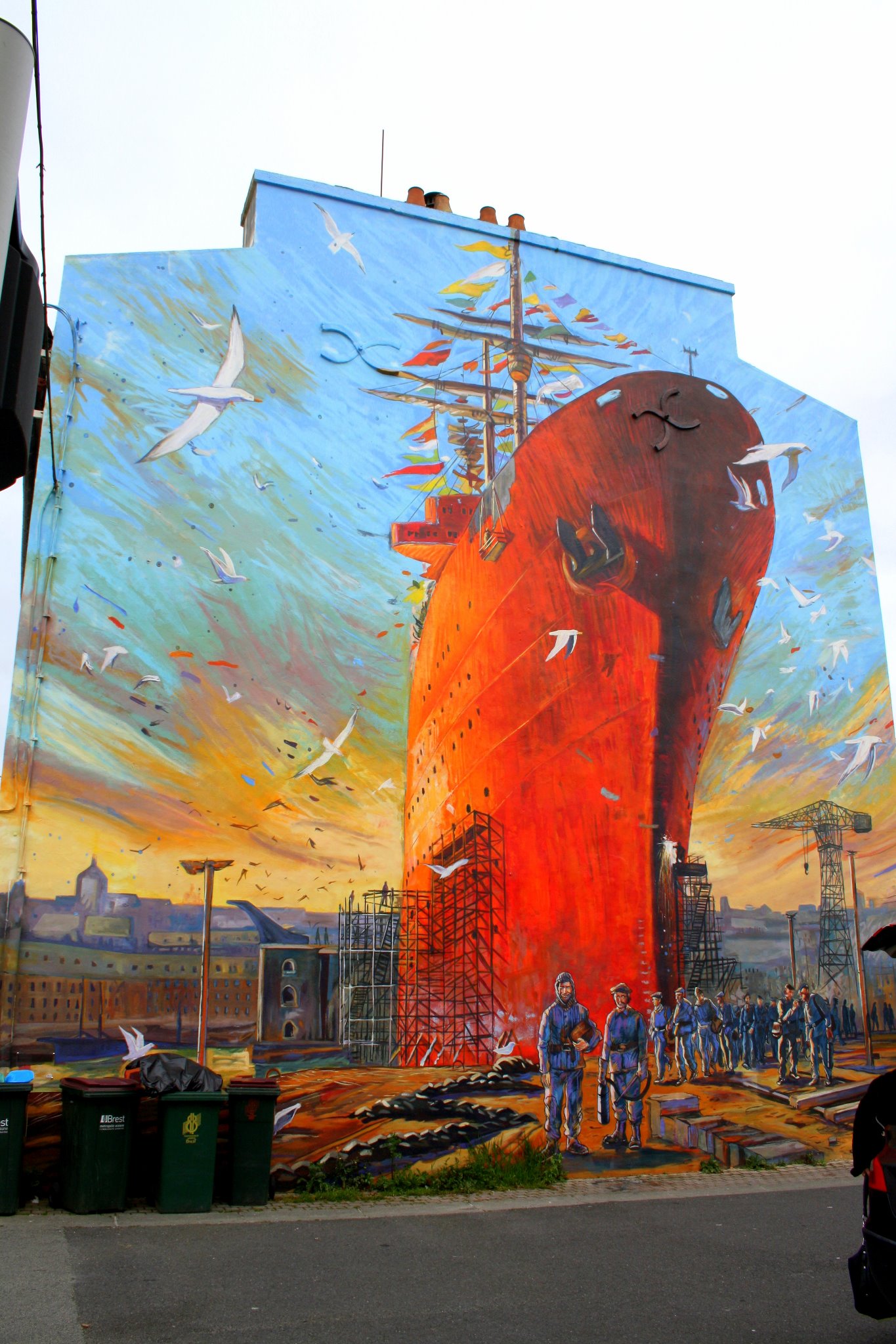
Feb 22, 2013 | street art
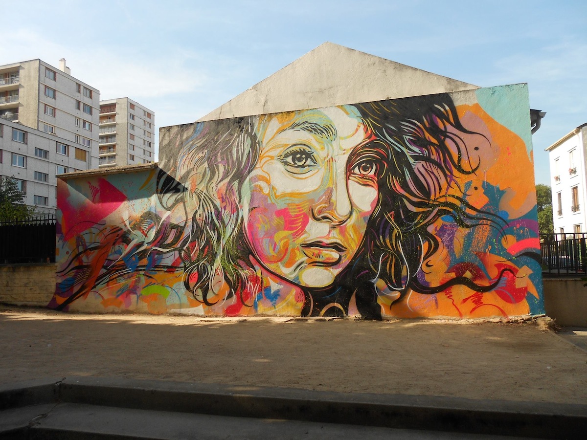
by c215 in Vitry-sur-Seine, France
I can’t get enough of the way this girl was painted. The lines on her face echo and dance in bright bouncy colors that give her expression a sense of motion – almost urgency but not quite. The lines almost look like skinny little fish, swimming through the colors, some synchronized in groups and some scattered and rushing along as quick as they can.
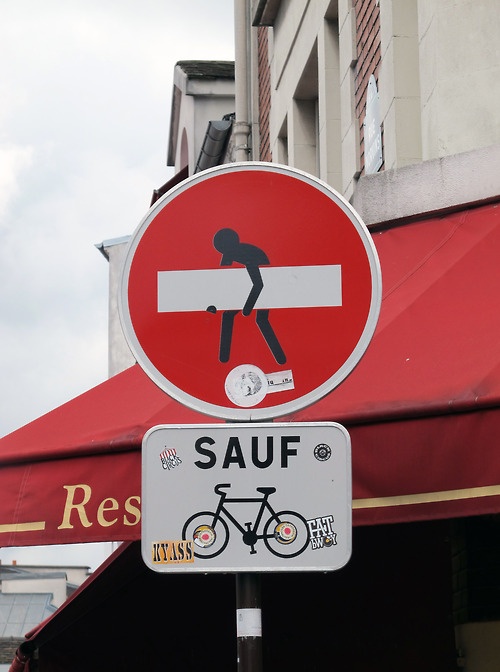
Street art is so great because of how impromptu it seems, and when you see it yourself it’s always the happiest surprise. France looks like it might be one of the best places to see it – a lot of whole building sides taken up with larger than life scenes that brighten up the cityscape. Even small quirky street art like the one on the right makes you smile, and brightens up a boring sign just a bit.
My favorite street art from France fills up this post but if you know another country whose street art is worth describing, comment and I’ll make a series out of it☺
at Montmartre, Paris, France
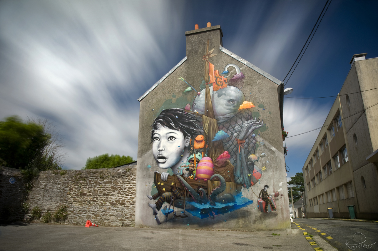
by Liliwenn Bom K in Brest City, France
in Brest, France
by Alice in Vitry sur Seine
in Chambery, France

in Brest, France
Images via Creative Guerilla Marketing.