Apr 5, 2013 | illustration
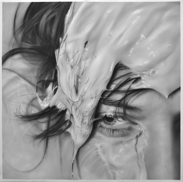
Thick paint drips down her face in a color close the skin’s; it covers and reveals hair and flesh wherever gravity takes it.
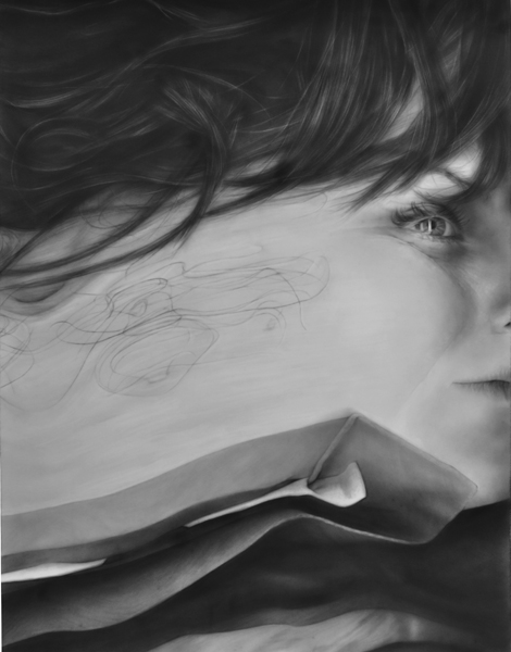
Melissa Cooke’s series “Surfaced” analyzes obscured faces – faces covered in liquids and warped by Xerox machines in ways that make you wonder where the real skin actually begins and ends. But these aren’t photographs, so none of it is really real anyways – they’re graphite drawings that capture every follicle and wrinkle, every tug and pull of skin, and they immerse you in a world that plays with texture and perception in bold closeup ways, gathering intensity from details.
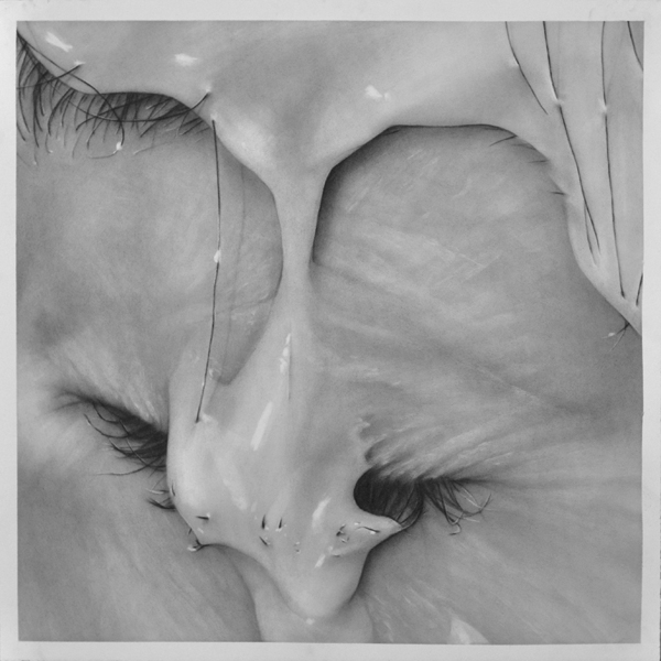
Trickle, graphite on paper, 24 ” x 24 “
Paint and hair don’t function harmoniously the way paint and skin do. Hair isn’t manageable and flat – it pokes through the liquid that’s attempting to cover it, refusing to be masked or hidden. In “Surfaced,” this is the role of the eyelashes and eyebrows, lines of rebellion against the paint, breaking through the color the same way the lines in the skin do.
They become something different because the paint gives them an alias, a form of cover, but the most substantive parts can’t be completely obscured. The paint dips into the flesh’s crevices, filling and amplifying the lines that have come from years of smiling and crying.
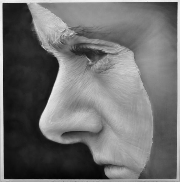
Crested, graphite on paper, 50 ” x 50 “
According to Melissa’s description of the series, “Surfaced” works to examine the relationship between photography, painting and drawing in portraiture. She used her own face as a canvas, painting and pouring liquids onto herself as she took photographs. Then, she used those photos to create her graphite drawings.
“The photo shoot references the practice of drawing and painting; then the final graphite drawing references photography,” she said, “The boundaries between the mediums are broken down and the processes are interwoven.”
She purposefully focused on zoomed in sections of her face, obscuring the notion of the portrait and concentrating on humanness in general as opposed to one specific human:
“The cropping pushes the face to the surface of the paper, making the figure more ambiguous. Flesh becomes abstracted: obliterated by paint on the skin, distorted by the eye of the camera lens, or smeared by the glass of a Xerox machine.”
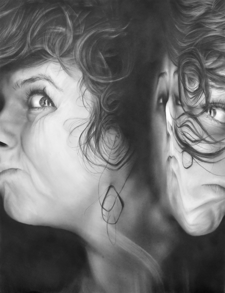
Xerox #5, graphite on paper, 50 ” x 38 “
Washed Out, graphite on paper, 50 ” x 50 “
Melissa Cooke, 30, is an artist originally from Wisconsin specializing in these kind of intricate graphite drawings that examine the relationships between photography, performance, and drawing in portraiture.
She makes her drawings by dusting thin layers of graphite onto paper with a dry brush, and then editing the soft graphite against the smooth paper by erasing in details and textures. She doesn’t use pencils at all, so more than anything it’s an art of subtraction instead of addition, likening it to sculpture in a way, as Melissa carefully chips away the spots of color that shouldn’t be there.
Xerox #1, graphite on paper, 50 ” x 38 “
See more from “Surfaced” and her other series of graphite drawings on Melissa’s website.
Mar 13, 2013 | art fairs, painting
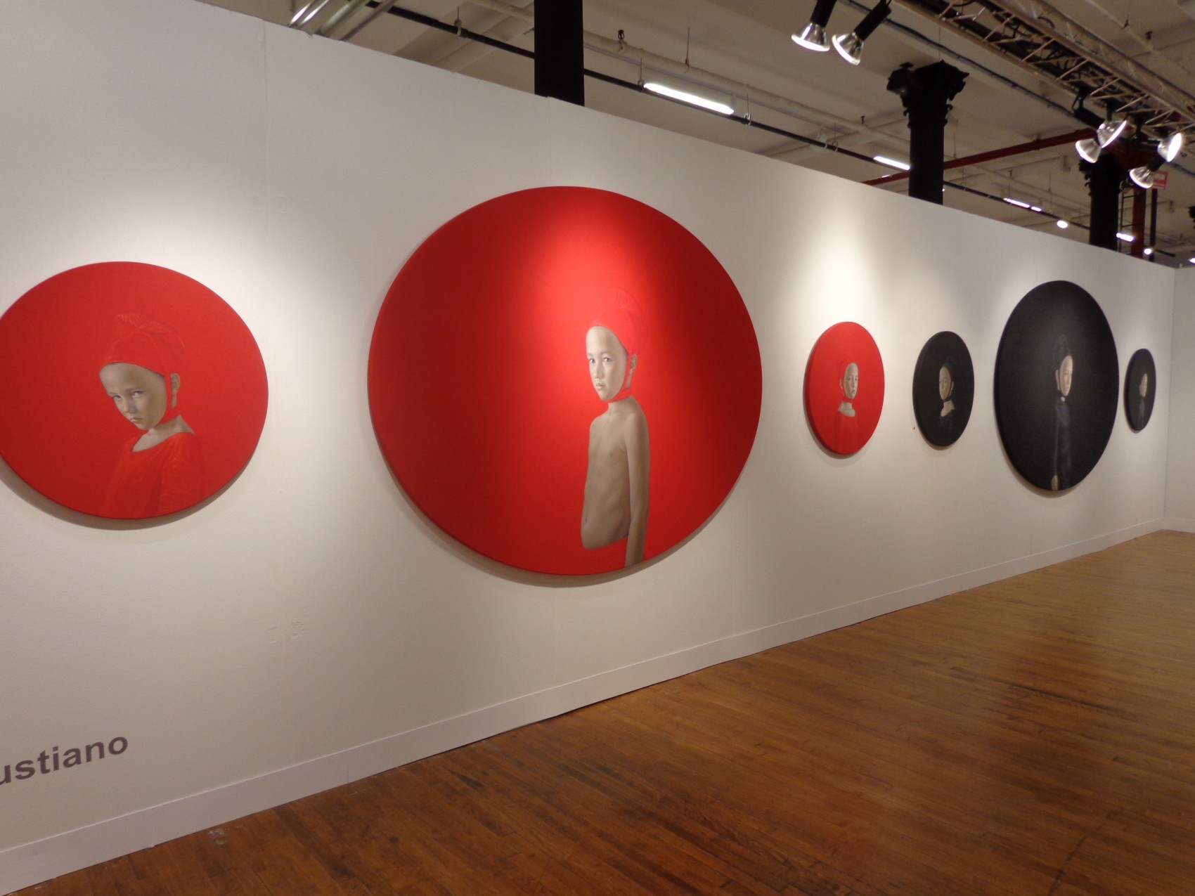
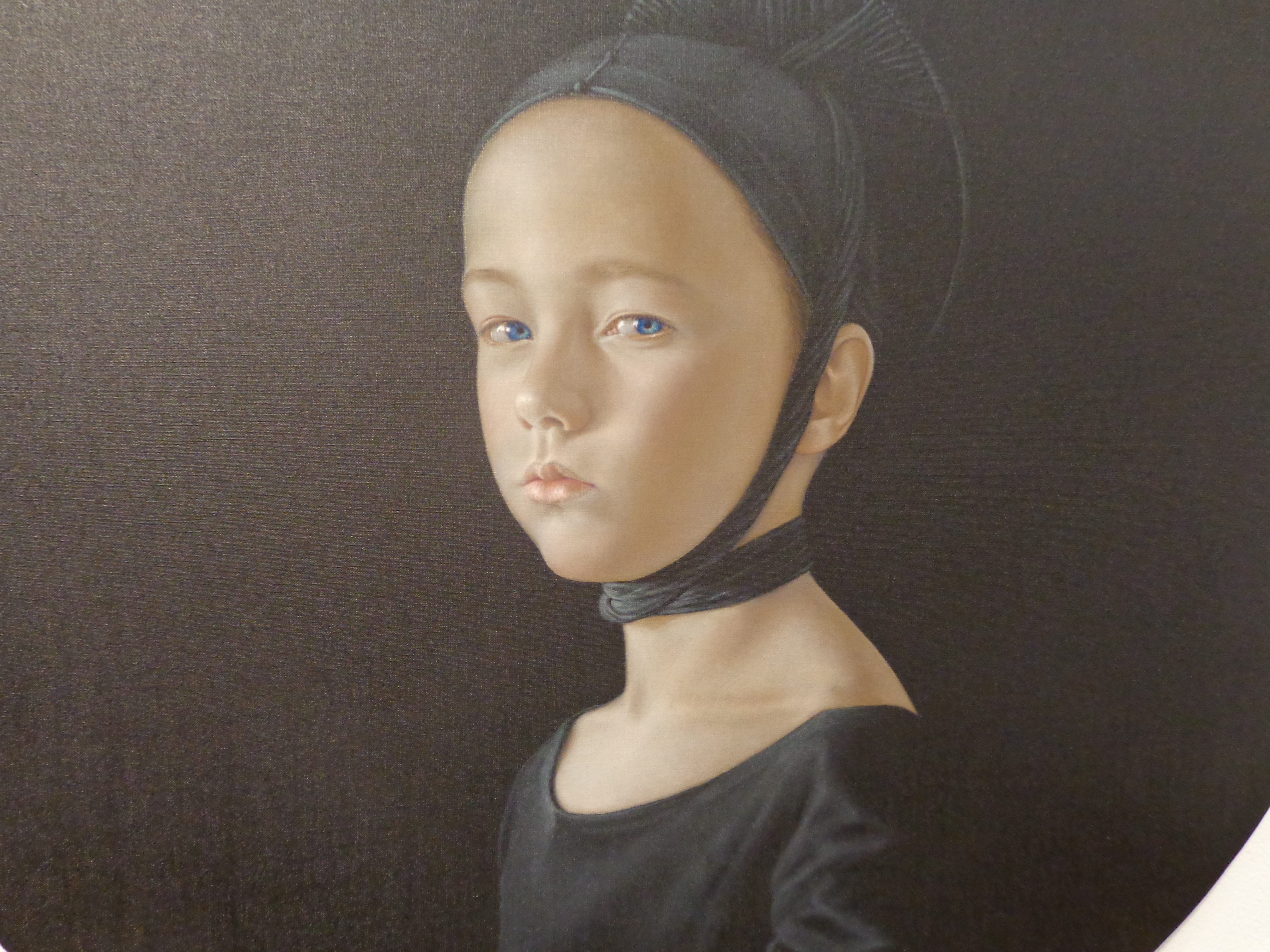
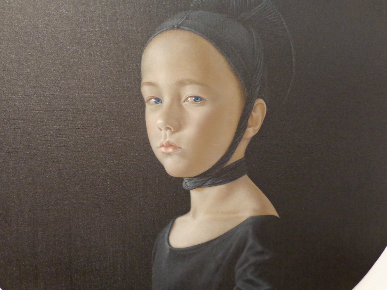
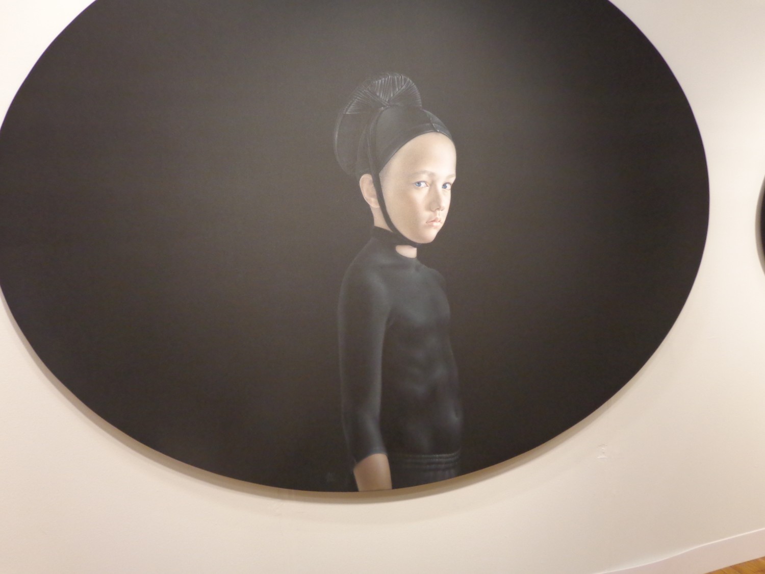
It’s arresting – seeing six symmetrical circles holding the faces of little scowling children, all spread across the wall, three red paired against three black. Cast in Renaissance clothing, these children wear the exact color of the background, making the definition between the two an act of magic. Your eyes tell you where the headdress stops and where her shirt begins, but they only know because of delicate shadows and folds that are obvious in some places, but left invisible where the painted fabric is as tight as the canvas.
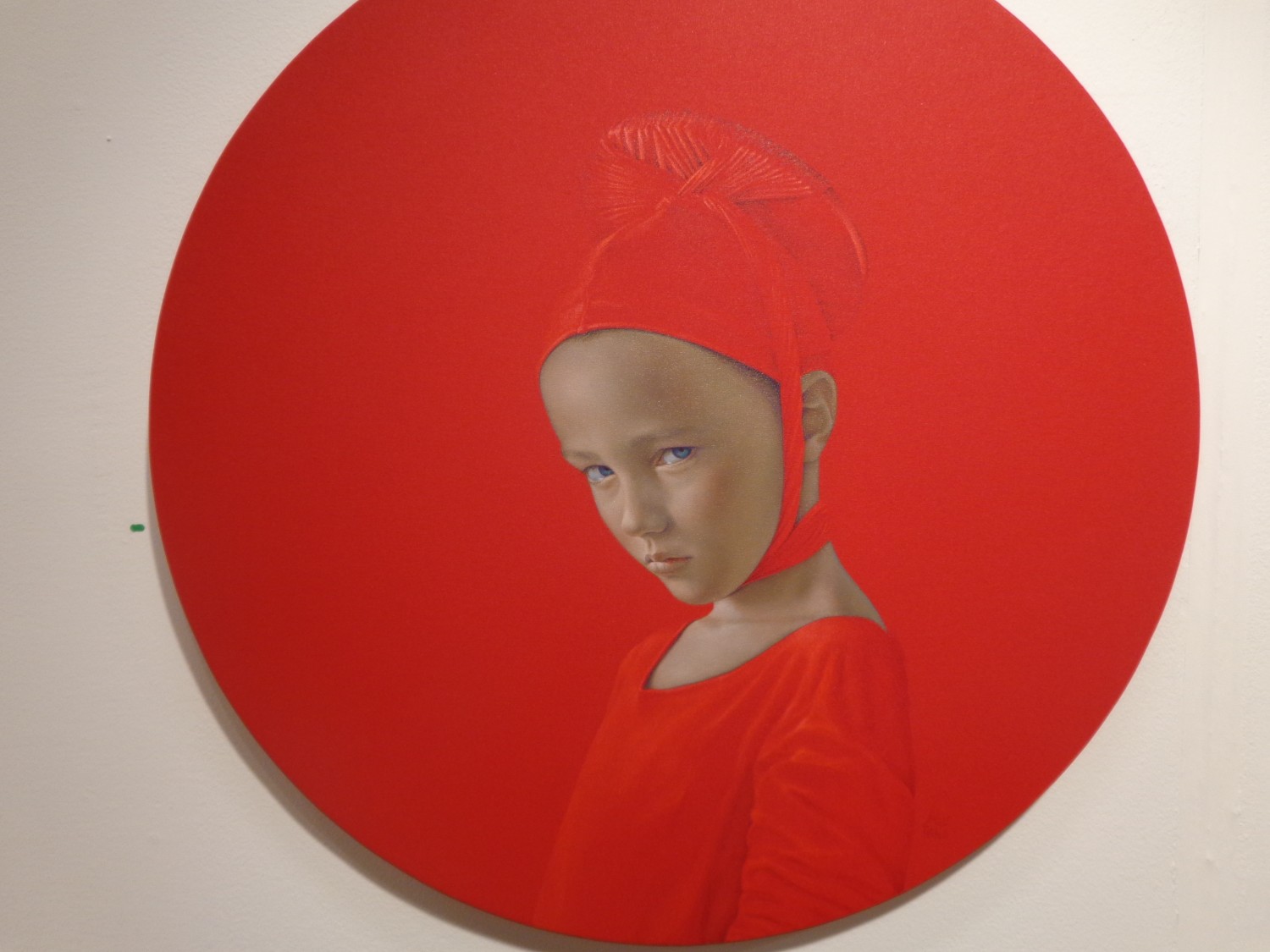
It’s hard to tell whether these are all the same little boy or girl – all of their faces have the same elegant roundness, the same crystal blue eyes and the same smooth perfect skin. But their expressions are subtly different – the four within the smaller circles seem to hold more contempt in their eyes, like they’re upset with how small their worlds are compared to the two children within the larger circles, whose expressions lie closer to curiosity or suspicion.
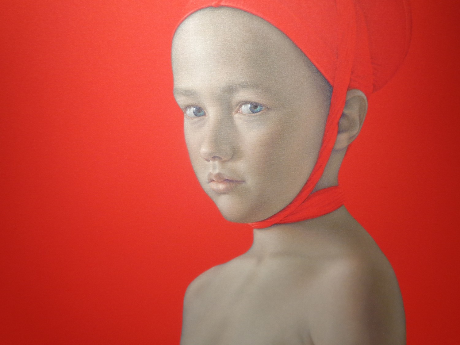
The only element offsetting perfect symmetry here comes in the clothing of these two children within the largest circles. The boy in red is bare-chested, wearing only a headdress while the child in the large black oval wears a shiny black shirt that grips his little body so tight he might as well not be wearing it at all.
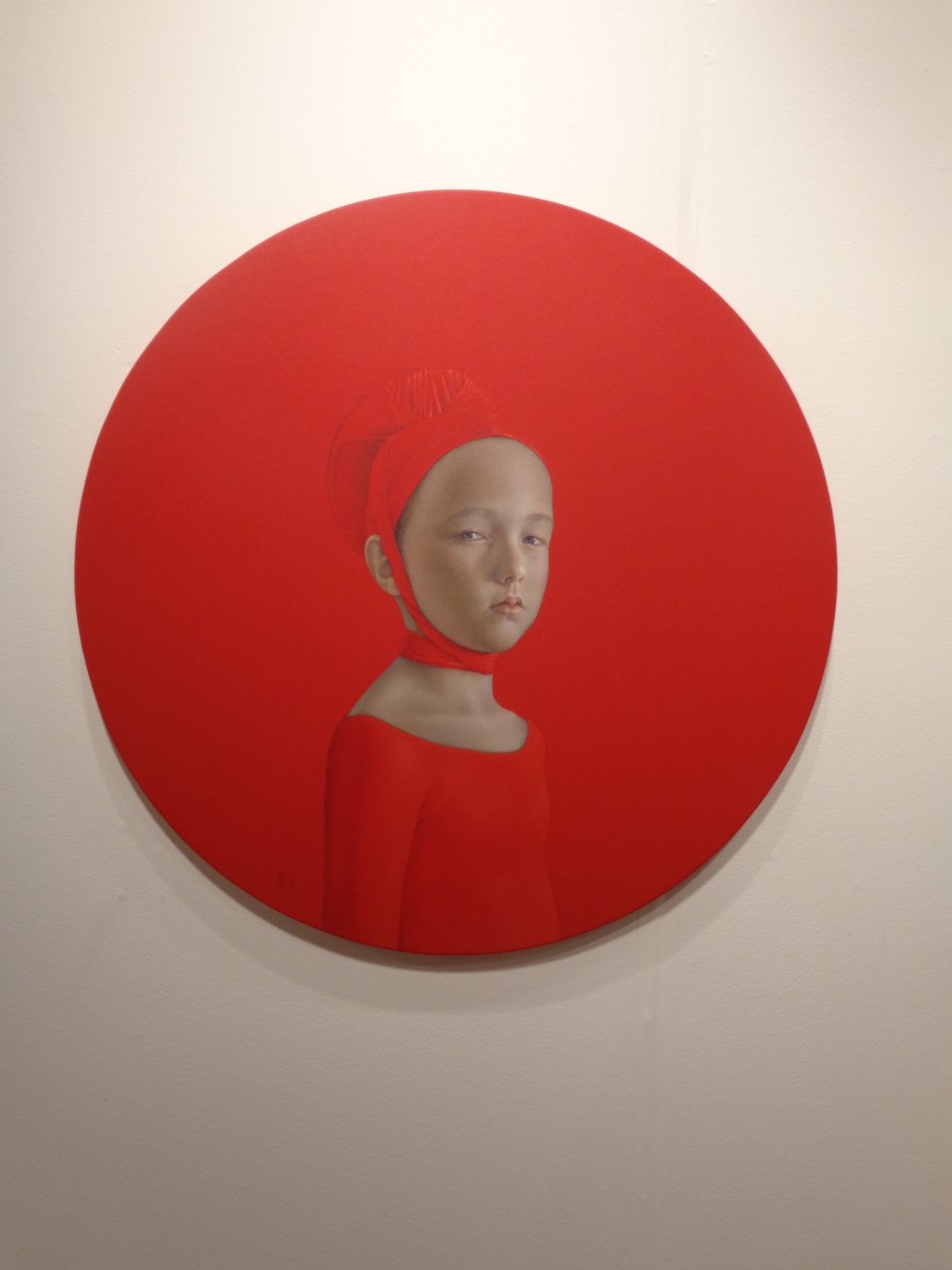
The largest circles are stretched wider to form more of an oval shape – the smaller perfect circles play a supporting role by framing their larger counterpart and interacting with the opposite color across the wall. The abrupt visual contrast of the black versus red, along with the dagger stares coming from intense perfect children makes the whole wall come alive with ideas about conflict and disdain, youth and maturity. And the Renaissance headdresses hint at an address of institutionalized religion or just religion as a whole.
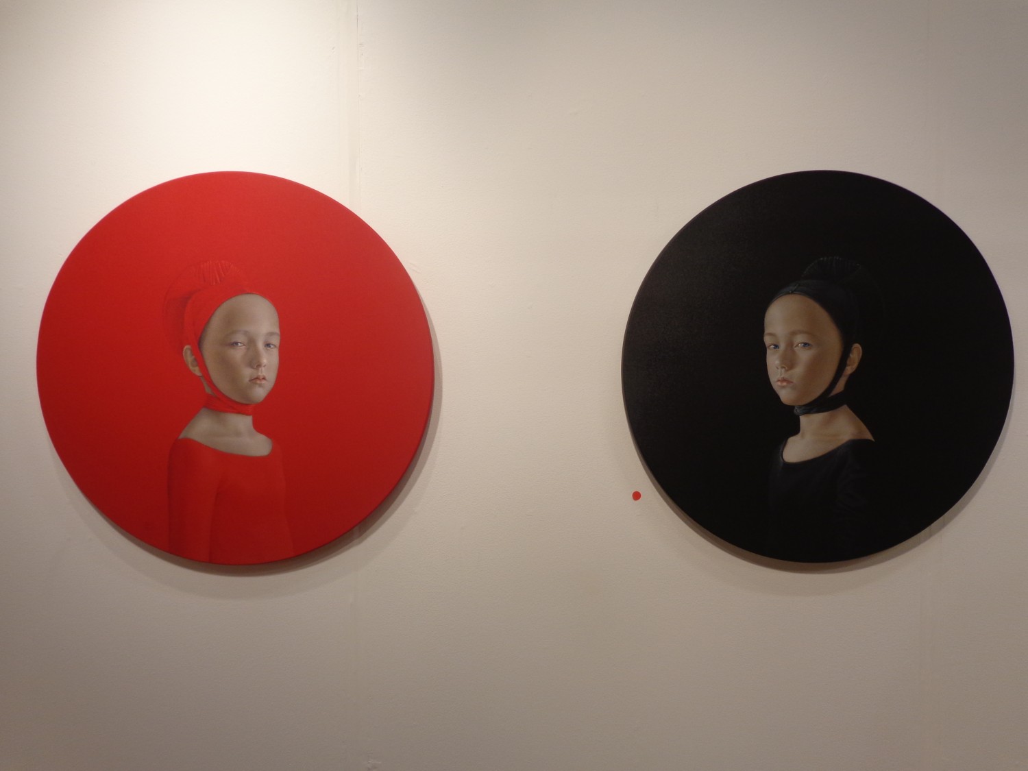
Perhaps the most dynamic part comes where the two colors meet – both children with the exact same grimacing glare pointed right at us, although it really seems like their unhappiness is actually rooted in their physical closeness to the antidote – the opposite color with a contrast too strong to look directly at.
Born in Seville, Spain in 1965, Salustiano has an exhibition list too long for even multiple pages on his website. He’s shown between 10-20 exhibitions per year since 2001, and began all the way back in 1994. Beginning in Spain, then moving to Portugal in 1999, he showed in Italy in 2000 and New York City in 2001, and has since had work displayed all over the world, from Seoul to Salzburg to Moscow.
Salustiano’s VOLTA comment read:
“For me, emotion is a key word in contemporary art and should continue to be so in the future. In recent years in the art world, artists have tried to flee from ’emotion’: saturated with every kind of visual stimulus, they have been more concerned with making an ‘impact’ on the spectator than in touching an emotional fibre. I strongly believe that emotion should be the principal motivation and purpose of the artist. For centuries art has emotionally impacted upon, moved or even perturbed the spectator; and this ‘interior’ movement has contributed to the evolution of mankind. I also think that even if the artist intends to stimulate the intellect of his or her audience, then this should be done through ’emotion’….”
For more of Salustiano’s work, see his website.
All photographs taken by Lindsey @VOLTA NY ’13 where Salustiano was represented by KAVACHNINA CONTEMPORARY in Miami.