Jul 31, 2016 | installation, political art, public art, sculpture
Carl Fredrik Reuterswärd. Non-Violence, 1985. Photo: UN News Centre.
America is a nation based on the right to free speech, and theoretically the people whose taxes fund the bureaucracy should have a say in what their money pays for, but unfortunately and unsurprisingly that’s rarely the case. Despite the fact that majority opinion on the value of public art seems to have improved in recent years, historically any government money spent on something as extraneous and subjective as art has been considered a waste. Our most rigid institutions are having a hard time adapting to the recent acceptance of public art as a valid expenditure: in 2005 Congress commissioned its first artwork since 1873. This paper examines works of art in America that were in some way supported by this slow-changing government, focusing on interventional artworks with an opinion of their own, that attempt to shift attitudes in viewers for better or worse. It’s difficult enough to find public art that isn’t ugly or inconvenient, so why would the government consider funding public art with a point of view that can open a proverbial can of complaints from all those with the potential to disagree? Originally the promotion of art with an obvious opinion was accidental. The first artworks commissioned in a newborn America were war monuments and statues of the white men who “made this nation great.” These statues noticeably endorse the European, patriarchal America that today’s public art actively fights against. In between we saw the WPA’s mural arts program as a more contemporaneous backlash to those patriotic monuments, promoting the American-Mexican community and the working class. Next came modern and postmodern minimalism with the sunny potential of offending no one, and this led into site-specific works which eventually became urban renewal projects with artworks that double as benches or street lamps. Each work that sparked a community backlash only made it more clear that public art doesn’t just need to be created for the amorphous physical space it occupies, but for the community that calls that space home. It’s this insight that led to some of the most interventional artworks to date, and although most were welcomed and beloved by the local population, it was often because these works spoke for them. If the work were transplanted or created elsewhere, a community with a different set of values might react with a hostility to match the approval that greeted the artwork originally. In this way, the government has had a hand in sponsoring progressive monuments to gay rights and equality for blacks and women. But because of stratified arts funding processes and the open interpretations that all artworks are inevitably left to, no one noticed.
“In the context of a Protestant work ethic, it [public art] is an unnecessary frill.”
Public art’s first hurdle was to convince Americans that it was necessary at all. As Harriet Senie and Sally Webster write, “In the context of a Protestant work ethic, it [public art] is an unnecessary frill.” By commissioning works that spoke to the upper-class patriarchy who controlled the budget, these people who made the decisions were persuaded — to an extent. The preachy, patronizing statues they commissioned left a narrow-minded understanding of what’s worthy of monument, as well as further distancing “public art” from an ever abstracting art world. The 1922 commission from the City of New York, Civic Virtue, wasn’t speaking from an objective place when the sculptor chose to depict Virtue as a man and Vice as a woman.
Frederick William MacMonnies. Civic Virtue, 1909-1922. Photo: Kew Garden History.
What’s more, the artwork shows Virtue literally trampling Vice; he stands proud with his sword slung cavalierly over his shoulder as she writhes sexually under his feet, somehow still gazing back at him, infatuated. This work is only interventional on behalf of government institutions pushing a puritan, patriarchal agenda, but its where our nation’s history with opinionated art begins. Although the funds for the statue were bequeathed in 1891 by a widow (yes, a woman unknowingly paid for this chauvinist masterpiece), the City of New York commissioned the artist, Frederick MacMonnies, who with committee guidance created the design. It took 17 years for the city to get around to facilitating the project in the first place, six more years for the artist to finish a model, and finally another eight years till the work was installed, 31 years after Angelina Crane’s passing. When the public expressed dismay for the work, MacMonnies only made matters worse by proudly admitting that he purposefully created it for an “elite, and purposefully had not taken into consideration the ‘narrow prejudices’ of the rest of the people.” Paradoxically, it’s Civic Virtue that appears most prejudiced in this circumstance. The work is what Judith Baca refers to as “cannon in the park” art: sculptures that praise a specific version of the nation’s history and in doing so exclude large portions of the populace. As Suzanne Lacy writes, “the construction of meaning depends on who is doing the making.”
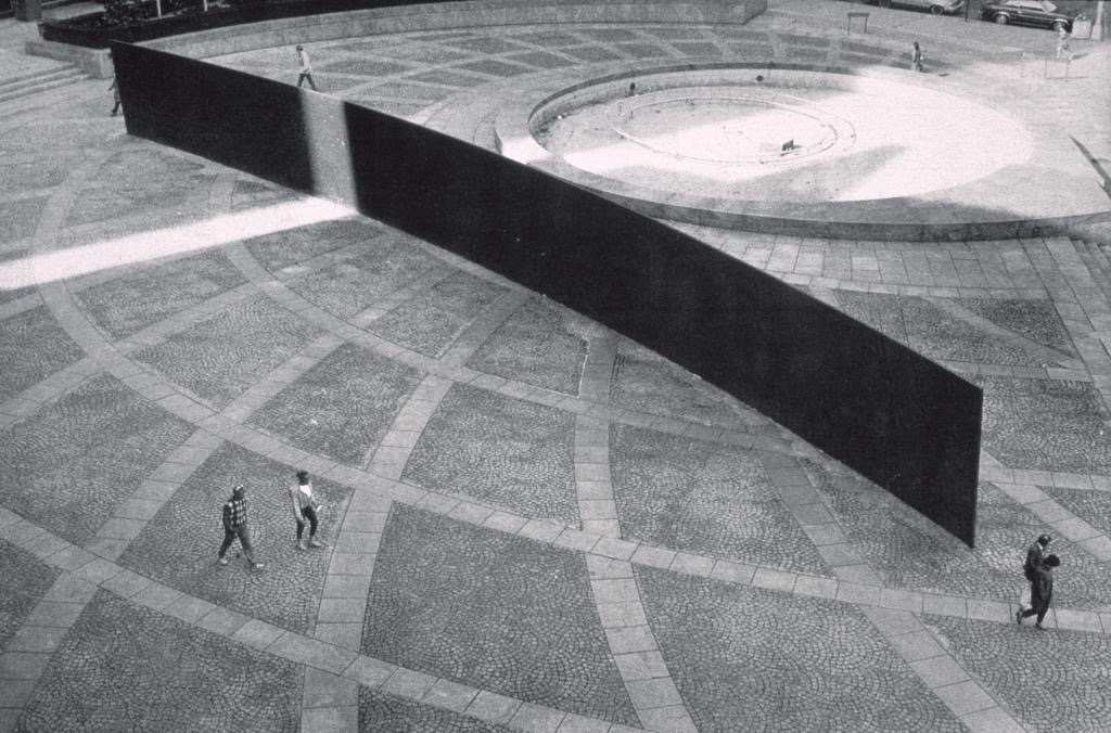
The years of public art commissions that followed only had one goal: don’t offend. With the emergence of minimalism, the job ended up being fairly simple. The sixties saw the start of this trend, with the goal of government-funded art shifting towards what the National Endowment for the Arts described as giving “the public access to the best art of our time outside museum walls.” Works by Isamu Noguchi and Michael Heizer reigned in what Harriet Senie calls the “pet rock” craze: the seventies trend of bringing highbrow museum works down to the common people in the hopes that they’d understand, no it’s not just a rock. “What too many artists did was to parachute into a place and displace it with art,” Jeff Kelley remarked. Miwa Kown refers to these works as the “art-in-public-places” paradigm, a re-situation of fine art that had the potential to revitalize urban environments while bringing money to the traditional institutions representing the already internationally-established male artists whose work was being showcased on a larger-than-life scale. For the purposes of this essay, this public art trend was only interventional in its staunch conviction that renowned artists knew best, regardless of whether they’d ever even visited the cities where their works were displayed. This public art trend met its demise with the disastrous reception of Richard Serra’s Tilted Arc, a large-scale conceptual piece the government spent $175,000 to commission before it was removed only eight years after installation. Tilted Arc was physically and conceptually interventional, but ultimately it was enforced as spatially hostile, in direct physical opposition to the thousands of people who had to walk around it everyday in Manhattan’s Foley Federal Plaza. Tilted Arc sparked a new conception of what good public art entails: “Public art needs to be seen as a function not of art, but of urbanism. It needs to be thought of in relation to, rather than insulated from the numerous other functions, activities and imperatives that condition the fabric of city life.”
Richard Serra. Tilted Arc, 1981. Photo: Cave to Canvas.
And so site-specific art transformed into community-oriented art, as the NEA changed its directive away from works “appropriate to the immediate site” in 1974 to works that included “plans for community involvement, preparation, and dialogue,” in 1983. This gave way to what Suzanne Lacy deems “new genre public art”: work that attempts to tackle the issues facing the community it’s a part of, whether societal, environmental or political. Its here in the eighties and nineties that public art begins to find its true purpose: as a reflection of and an intervention on behalf of the people whose daily lives involve constant interaction with the work. These works had to be conceived of in collaboration with the community, an art that “comes from a gentle, diffused mode of listening… a kind of art that cannot be fully realized through monologue. It can only come into its own in dialogue, in open conversation in which one is obliged to listen and include other voices.” It’s in this phase of public art that the government has played its largest role in commissioning art that’s most deliberately interventional.
The most successful and far-reaching of this new genre of public art has been murals and sculptures that are a direct reflection of the local communities’ values, regardless of whether or not those values stand in opposition to values held in other parts of the country. Perhaps the earliest of these was George Segal’s Gay Liberation, which wealthy Louisiana art patron Peter Putnam spent $100,000 and the last eight years of his life working to get installed in Christopher Park, close to the historic Stonewall Inn. The piece is only interventional once the title is known, it features four of Segal’s well-known textured white figures: a homosexual couple standing, and a heterosexual couple sitting. There’s nothing offensive or disruptive about the figures themselves, but the implication is that the gay couple’s interaction, which is nothing more than a simple hand on a shoulder, is wrongly regarded as morally subordinate to the straight couple, even though the woman has her hand suggestively on her partner’s upper thigh. The work was finally installed after 13 years of bureaucratic setbacks and internal battles within the gay community who wanted to see all of their dynamism represented in the piece. The work was funded by Putnam, but the City of New York agreed to budget 20 years-worth of conservation funds to keep the work maintained. Three years after that 20-year contract expired, the work is still installed and has become a celebrated part of the neighborhood.
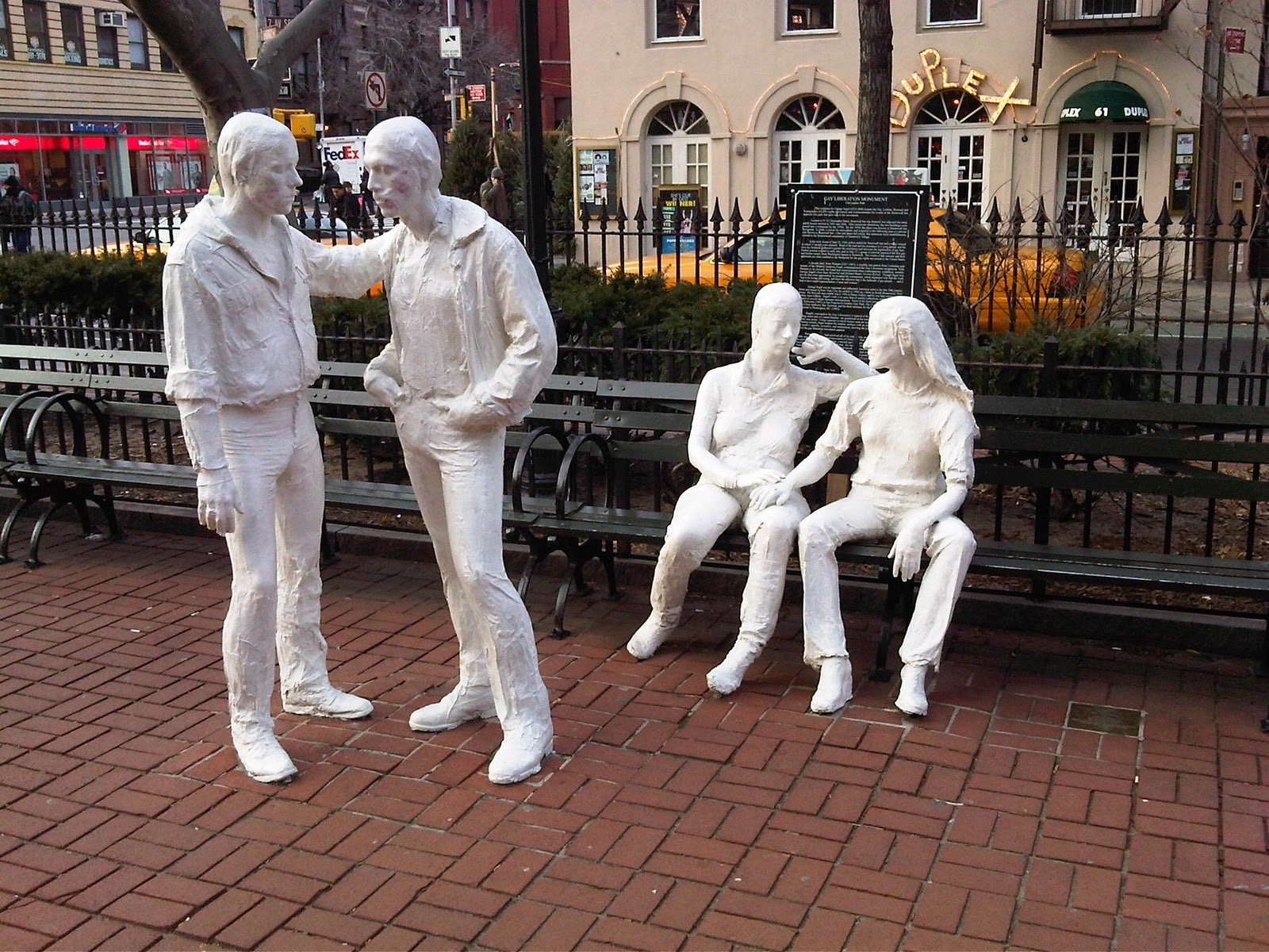
George Segal. Gay Liberation, 1980. Photo: Whose Streets / Our Streets.
Another government-sponsored public artwork that spoke on behalf of its community is Robert Graham’s Monument to Joe Louis in Detroit, a disembodied fist punching forward, hanging from the triangular structure surrounding it. Nicknamed the “Brown Bomber,” Louis became a patriotic symbol of anti-Nazi sentiment when he won the Heavyweight World Championship in 1937, at a time when Hitler was trying to prove to the world that the Aryan race was both physically and mentally superior. Representative of his punches both in and out of the ring, the sculpture commemorates Louis for his physical strength as much as his social activism — the boxer fought Jim Crow laws, which symbolically aimed the fist at racial injustice. The work has been criticized for only emphasizing Louis’ more superficial contribution to Detroit’s legacy, but its giant clenched fist echoes and immortalizes black power’s fight for equality, and the cables that both hold the arm aloft and render it immobile are reminiscent of the slave shackles that were a reality only 120 years before the work was installed. Once again the sculpture was paid for with private funds, in this case provided by Sports Illustrated magazine, but the sculpture’s installation and upkeep is facilitated and funded by the local municipal government.
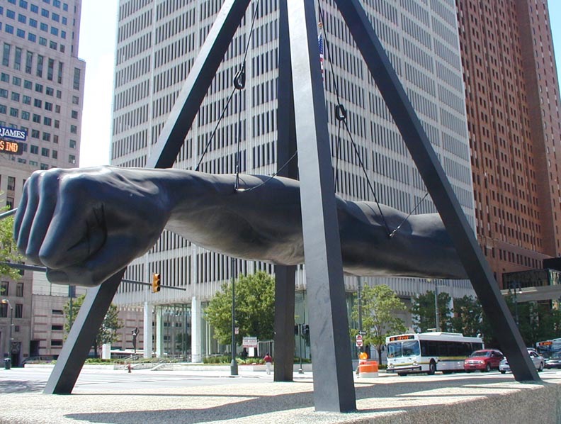
Robert Graham. Monument to Joe Louis, 1986. Photo: Newsone.
Other interventional new genre public artworks address a community’s environmental concerns rather than the community itself. Mel Chin’s 1989 Revival Field, uses plants to clean a circular area of toxic soil in an old landfill near downtown St. Paul, Minnesota. Regarded as an experimental “green remediation” project, the work was co-sponsored by the Minnesota Pollution Control Agency and developed in collaboration with U.S. Department of Agriculture agronomist Rufus Chaney. Revival Field blurs the boundaries between science and art, so well in fact that the NEA temporarily pulled funding while the artist worked to prove that the project was indeed art. Chin describes the work as conceptual, intended to sculpt the site’s ecology. Formally it consists of a circular plot of land outlined by a chain-link fence that houses a garden of hyperaccumulators, plants that can eliminate heavy metals from toxic soil. The circle encloses perpendicular paths that cross at its center, and the whole garden is framed by a square of additional chain-link fence that gives the test-site a border of unplanted area to serve as the control variable in this ecological experiment. Another environmental preservation work that pushes the definition of art is Alan Sonfist’s Time Landscape of New York City. Begun in 1965 and unveiled in 1978, Time Landscape transformed the 8,000 square-foot plot at the corner of LaGuardia Place and Houston Street into an ecological time capsule consisting of the trees and plants that inhabited Manhattan 300 years ago, before European settlement. Sonfist restored the soil, reestablished the land’s original elevation and planted vegetation in three stages to recreate the native woodlands accurately. The work is the first site-specific sculpture to be permanently maintained by the city’s public park system. The artist wrote, “As in war monuments that record the life and death of soldiers, the life and death of natural phenomena such as rivers, springs and natural outcroppings need to be remembered.” As global warming becomes less of a theory and more of an unavoidable reality, hopefully environmental public artworks like these will be considered less interventional and more essential, seen for what they are: an indispensable reclamation of land almost completely destroyed.
“As in war monuments that record the life and death of soldiers, the life and death of natural phenomena such as rivers, springs and natural outcroppings need to be remembered.”
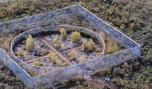
Mel Chin. Revival Field, 1991-present. Photo: The Schuylkill Center for Environmental Education.
Perhaps the most opinionated interventional public artworks have a political message, speaking for a position espoused by its local community, and therefore against another. Barbara Kruger’s anti-commercial, feminist perspectives have often been facilitated by the Public Art Fund, a private nonprofit organization partially funded by government grants. Her Messages to the Public in 1983 lit up an 800 square-foot Times Square billboard with text like “One guy says he’s the strongest because he has the biggest weapon,” and “I’m not trying to sell you anything.”
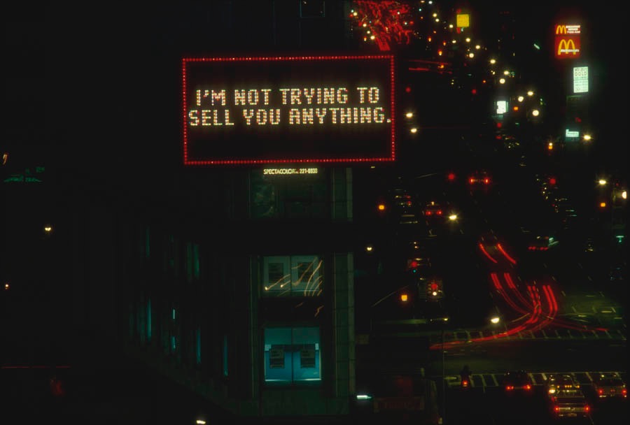
Barbara Kruger. Messages to the Public, 1983. Photo: Public Art Fund.
The Public Art Fund also paid for Barbara Kruger’s 1991 art-ad series Untitled [Bus Shelter Posters], which consisted of three portraits of American men who are asking for help because fictional scenarios are forcing them to deal with the reproductive issues women struggle with daily. Another artist operating from a feminist perspective is Suzanne Lacy. Her 1977 work Three Weeks in May was comprised of more than 30 events held throughout Los Angeles. One facet of the project involved a three week installation of two 25-foot maps in the City Hall shopping mall. One map showed the locations of women’s assistance agencies in the city, while the other became a living record of all the reported instances of rape during the three weeks the maps were on view. With each rape, a large red stamp marked where it occurred, and each stamp that represented a confirmed report was surrounded by nine fainter stamp markings that symbolized the estimated nine additional rapes that occurred for every one reported. Over the course of the project’s 21 days, the map morphed into a sea of red ink, and the project as a whole was supported by the Los Angeles Department of Public Works as well as by various government agencies and officials throughout the city.
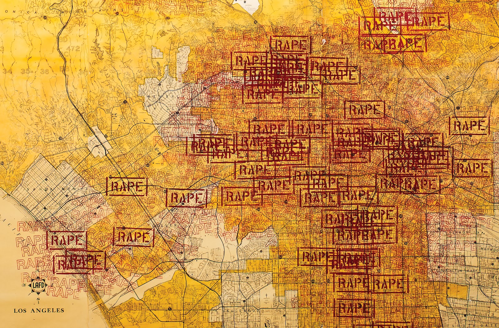
Suzanne Lacy. Three Weeks in May, 1977. Photo: Recorridos e Intervenciones.
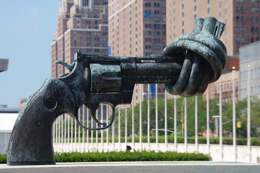
Still other interventional government-sponsored public art addressed more divisive political issues. Carl Fredrik Reuterswärd’s Non-Violence was given as a gift to the UN, but again government funds have kept it maintained since its installation in 1988. Created in response to the murder of John Lennon, a friend of the artist, Non-Violence has become a political art campaign, with more than 30 versions of the sculpture installed all over the world. It depicts a cocked 45-caliber revolver, but the barrel of the gun has been tied in a knot to ensure that the deadly weapon poses a threat to no one.
Carl Fredrik Reuterswärd. Non-Violence, 1985. Photo: UN News Centre.
This pro-peace directive has become the rallying cry of The Non-Violence Project Foundation, a Switzerland-based nonprofit spreading the sculpture and its message internationally. Artist David Hammons addresses more ambiguous social concerns with Higher Goals, a conceptual sculpture that was revived three times throughout the eighties. Consisting of five decorated basketball hoops installed atop twenty to fifty-foot-tall telephone polls, the work was intended as the artist’s comment on young black men’s risky, misplaced delusions of becoming basketball stars. The first version of the work was installed in a vacant lot in Harlem in 1983, and the work’s second installation was sponsored by the Public Art Fund in 1986, this time in Columbus Park, Brooklyn. The work’s third version came in 1988 and was unfortunately destroyed by unknown assailants. Each of the five poles and hoops were studded with designs created in a labor-intensive process that involved nailing more than 10,000 bottle caps into the metal of the poles. The artist explains, “It takes five to play on a team, but there are thousands who want to play” — those thousands who don’t make the cut are represented by the bottle caps that climb up each pole. Although the work speaks directly to the recklessness of basing an entire future on the hopes of playing professional sports, conceptually the sculptures also speak more generally about the unattainability of commonplace goals like shooting a basket or getting an education for youth growing up in underserved communities.
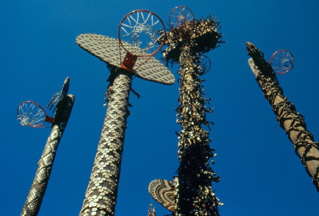
David Hammons. Higher Goals, 1986. Photo: Public Art Fund.
Although this paper is only able to cover a small segment of the interventional public art supported by government agencies in the United States, a prevailing pattern becomes clear: at the nation’s founding, priority was given to patriotic, patriarchal works that worked to exemplify the values upheld by the fragile new republic. As America formed its identity and diversified the types of artwork it deemed worthy of public funds, art-in-the-public-space programs brought museum works to the streets, even if the public couldn’t fully understand them. Finally the trend of community-based public art evolved, and the government found itself supporting the viewpoints of diverse communities where activism was most rampant. The works have the greatest potential for catalyzing change when they’re developed as a voice for the community that surrounds them. As Patricia C. Phillips writes,
“Public art is about the free field — the play — of creative vision. The point is not just to produce another thing for people to admire, but to create an opportunity — a situation — that enables viewers to look back at the world with renewed perspectives and clear angles of vision.”
Sources
Architect of the Capitol. “Rosa Parks.” Last modified December 15, 2015. Accessed December 16, 2015.
Auyash, Sean. “The Knotted Gun: A Compelling Symbol for Non-Violence,” November 5, 2012. Foreign Affairs Review. Accessed December 12, 2015.
Bogart, Michele H. “The Rise and Demise of Civic Virtue.” Critical Issues in Public Art: Content, Context, and Controversy, 1992. Washington D.C.: Smithsonian Institution Press, 175-188.
Chin, Mel. “Revival Field.” Accessed December 14, 2015.
Deutsche, Rosalyn. “Public Art and Its Uses.” Critical Issues in Public Art: Content, Context, and Controversy, 1992. Washington D.C.: Smithsonian Institution Press, 158-170.
Disponzio, Joseph. “George Segal’s Sculpture on a Theme of Gay Liberation and the Sexual- Political Equivocation of Public Consciousness.” Critical Issues in Public Art: Content, Context, and Controversy, 1992. Washington D.C.: Smithsonian Institution Press, 199-214.
Gibson, Eric. “Public Art and the Public Realm.” Sculpture 7 (January-February 1998): 32.
Graves, Donna. “Representing the Race: Detroit’s Monument to Joe Louis.” Critical Issues in Public Art: Content, Context, and Controversy, 1992. Washington D.C.: Smithsonian Institution Press, 215-227.
Kwon, Miwon. “Sitings of Public Art: Integration versus Intervention.” One Place After Another: Site Specificity and Locational Identity. Cambridge, MA: MIT Press, 2002.
Lacy, Suzanne. Mapping the Terrain: New Genre Public Art. Seattle, WA: Bay Press, 1996.
Non-Violence: Inspiring Youth Through Education. “The Non-Violence Project Foundation.” Accessed December 12, 2015.
Phillips, Patricia C. “Public Constructions.” Mapping the Terrain: New Genre Public Art, 1996. Seattle, WA: Bay Press, 60-71.
Public Art Fund. “Barbara Kruger: Messages to the Public.” Accessed December 14, 2015.
Public Art Fund. “Barbara Kruger: Untitled [Bus Shelter Posters].” Accessed December 14, 2015.
Public Art Fund. “David Hammons: Higher Goals.” Accessed December 14, 2015.
Senie, Harriet F. “Baboons, Pet Rocks, and Bomb Threats: Public Art and Public Perception.” Critical Issues in Public Art: Content, Context, and Controversy, 1992. Washington D.C.: Smithsonian Institution Press, 237-276.
Senie, Harriet F. and Sally Webster. Critical Issues in Public Art: Content, Context, and Controversy. Washington D.C.: Smithsonian Institution Press, 1992.
Steinman, Susan Leibovitz. “Directional Signs: A Compendium of Artists’ Works.” Mapping the Terrain: New Genre Public Art, 1996. Seattle, WA: Bay Press, 186-291.
Stiles, Kristine and Peter Selz. Theories and Documents of Contemporary Art: A Sourcebook of Artists’ Writings. Berkeley, CA: University of California Press.
Suzanne Lacy. “Three Weeks in May (1970).” Accessed December 11, 2015..
Mar 25, 2013 | installation, sculpture
A silver hand stretches from the sky, cut off just below the elbow and grabbing hold of an older black Fiat 500, stopping the car in its tracks. But there’s no driver in the car, so perhaps before it wasn’t moving. After all, the hand’s grip is loose and casual, long thick silver fingers folded over windows – fingers the size of legs, like they belong to a five-footed monster with no face.
It’s not a monster, but a child’s hand, holding the car like a toy, playing with it along our teeny tiny streets. The name comes from what most children say while they play with toy cars: “vroom vroom,” evocative of the way we all sort of speak our lives into existence, validating with words that end up being just as small as we are.
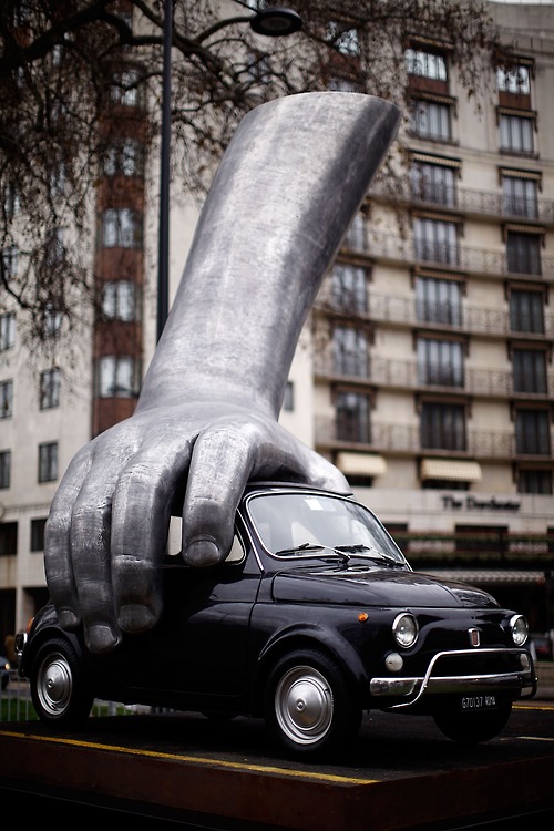
Because how much control do we really have anyway? If our brakes fail and smash us into a building, how much difference would it make knowing that a giant metal baby was in charge of all the chaos? Would you trust the baby more than a bearded prophet with surviving stories?
Lorenzo Quinn uses his sculpture as a visual facility for communication, all with the goal of helping viewers develop values like understanding, tolerance, and harmony. A Roman-born artist who studied at the American Academy of Fine Arts in New York with the intention of becoming a surrealist painter, Quinn discovered his passion for sculpture at 21 and moved to Spain after the birth of his first child. Now at 47 Quinn’s sculptural works have become enormously successful, shown all over Europe since the late 80s.
“I make art for myself and for people who want to join me on a walk through my dreams,” Quinn said, “The way we live our own lives, is paramount. That is why most of my work has to do with values and emotions. ”
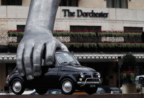
“Vroom Vroom” was initially presented at the Institute of Modern Art in Valencia, Spain in the summer of 2010, and appeared that same year at the Abu Dhabi Art Fair. In January 2011 the sculpture was settled in Park Lane, London as part of the Westminister City Council’s sculpture festival.
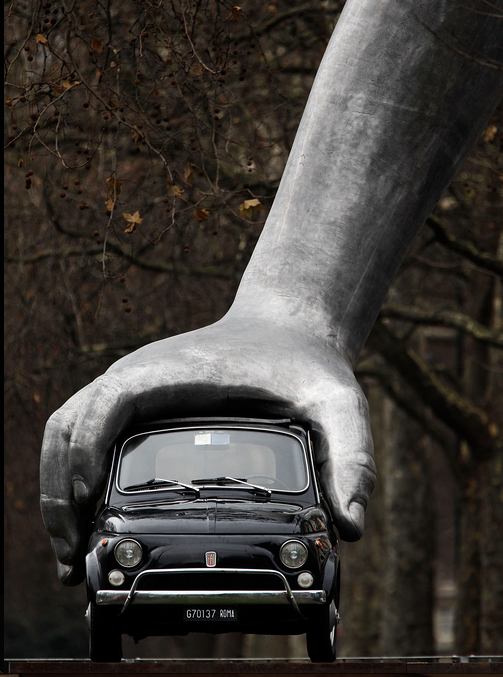
The nearly 15 feet high sculpture creates an open dialogue about our place in the world, the child’s hand indicating the littleness of it all and the title opening all sorts of other discussions about reality, awareness, and language – what does it mean to you?
See more of Lorenzo Quinn’s work on his website.
Mar 21, 2013 | art fairs, installation, sculpture
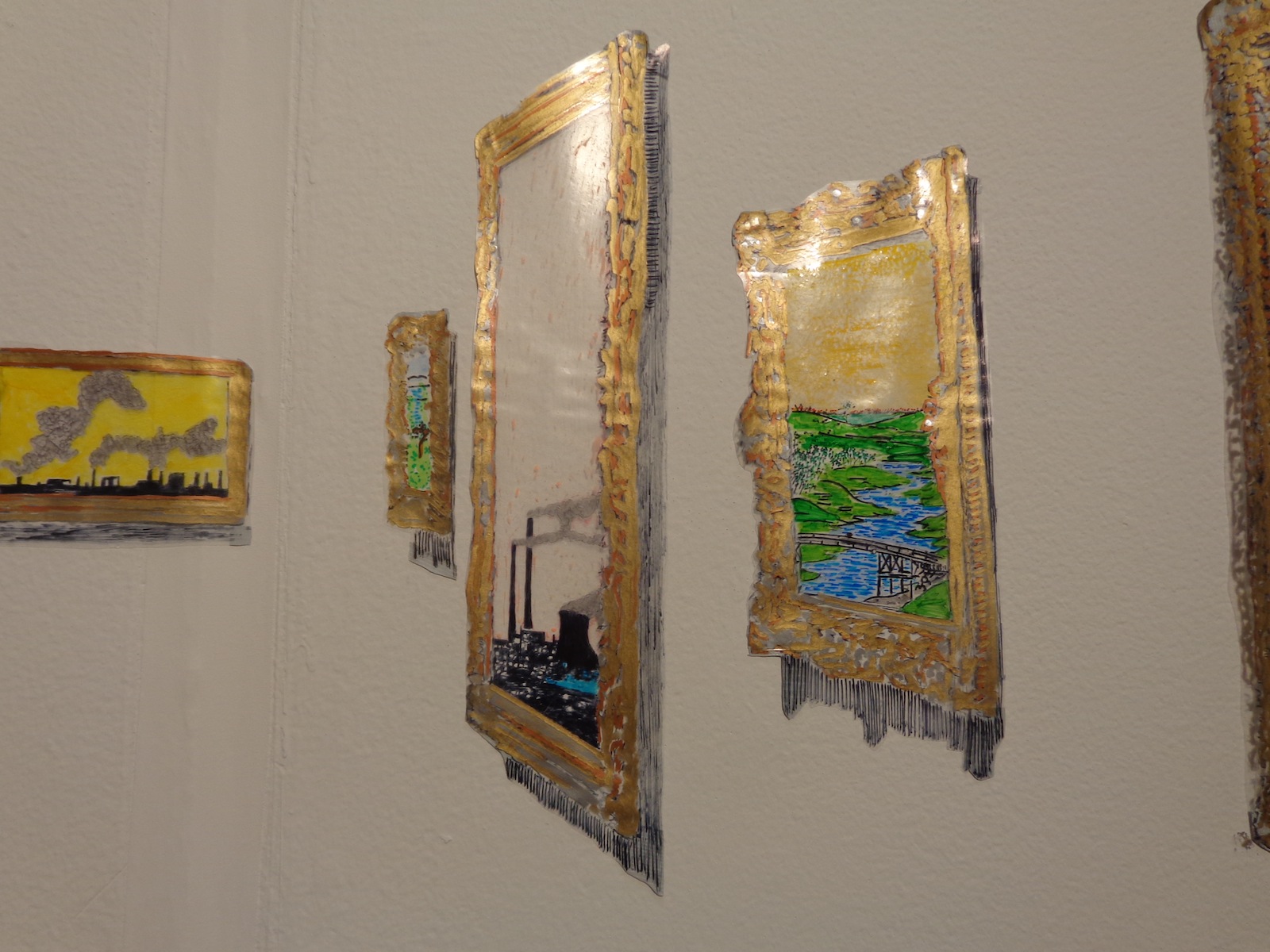
From within a plain framed canvas sticks a nail, and atop it stands a matching silver bug, holding some kind of weight across its shoulders. Existing somewhere between reality and a Pixar movie, the little silver fellow is given character, a purpose, and the ability to walk on two legs. The nail he balances upon isn’t in the center of the canvas either, it’s just off to the side, and the little bug walks towards the wide ocean of white as if he were unaware of the inability to travel through physical matter.
But that doesn’t matter anyways, because in this artwork he’s frozen in time, and as if there were three different suns, three of his shadows stretch out from where the nail meets the canvas – two drawn on with pencil and a third that is an actual shadow, created by the lights above booth 2.11 at VOLTA NY.
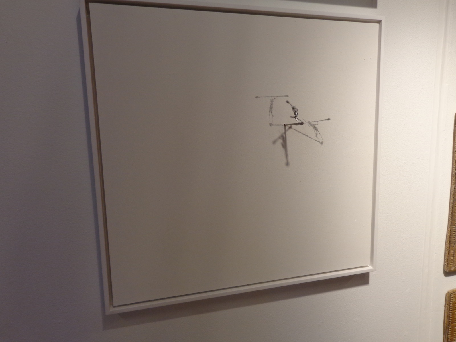
A work by Colombian artist Sebastian Mejia, the strong little bug was echoed throughout the artist’s booth at the fair, sometimes framed on portable canvas like this one and other times just nailed right into the wall with shadows drawn temporarily. And even though the bug would have squashed if it were alive and real, the image of something so inconsequential trying so hard at something was adorable and disheartening at the same time, since the task seems so menial and even if the bug did succeed at whatever it was he was working towards, no one would care regardless.
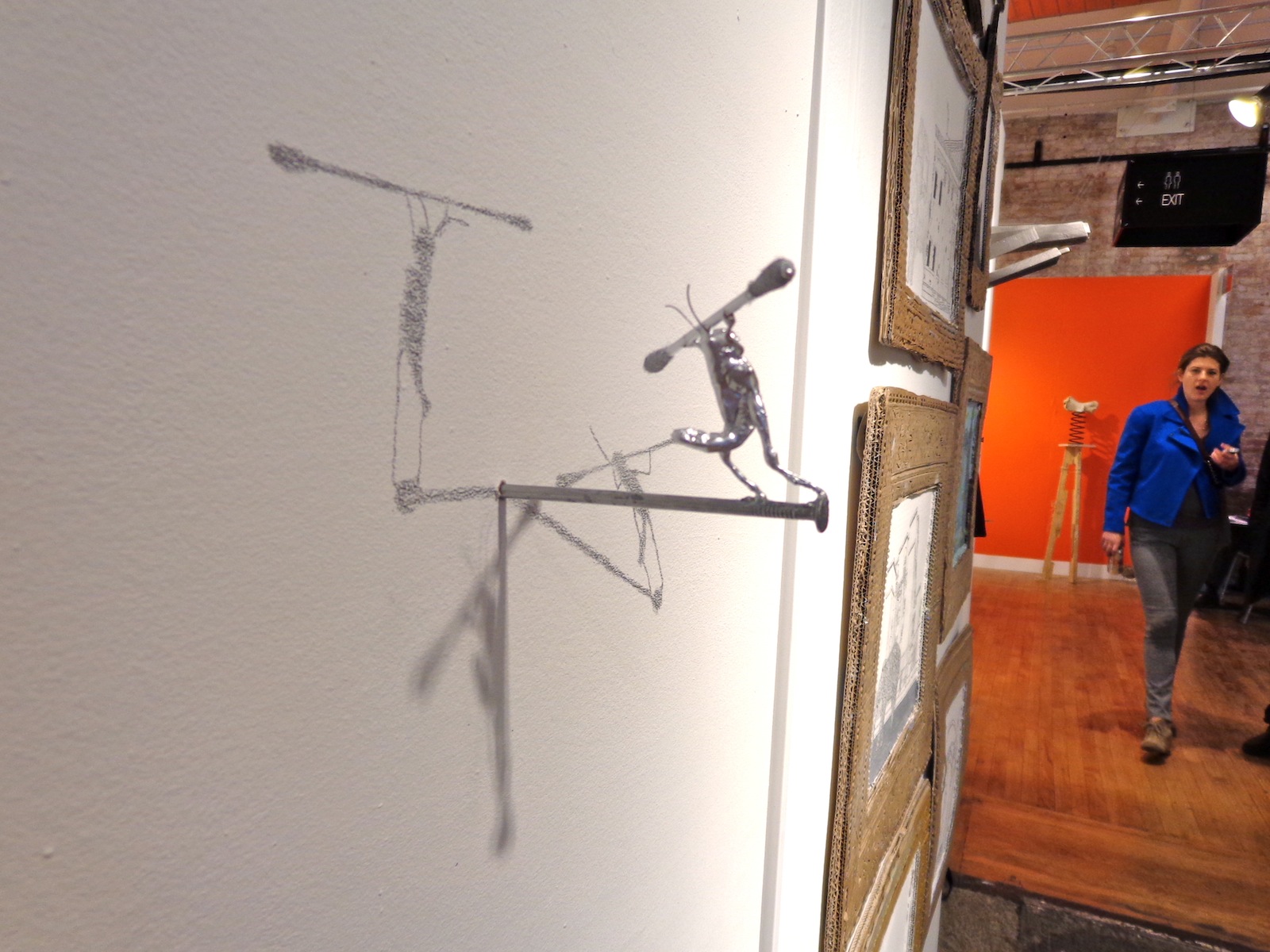
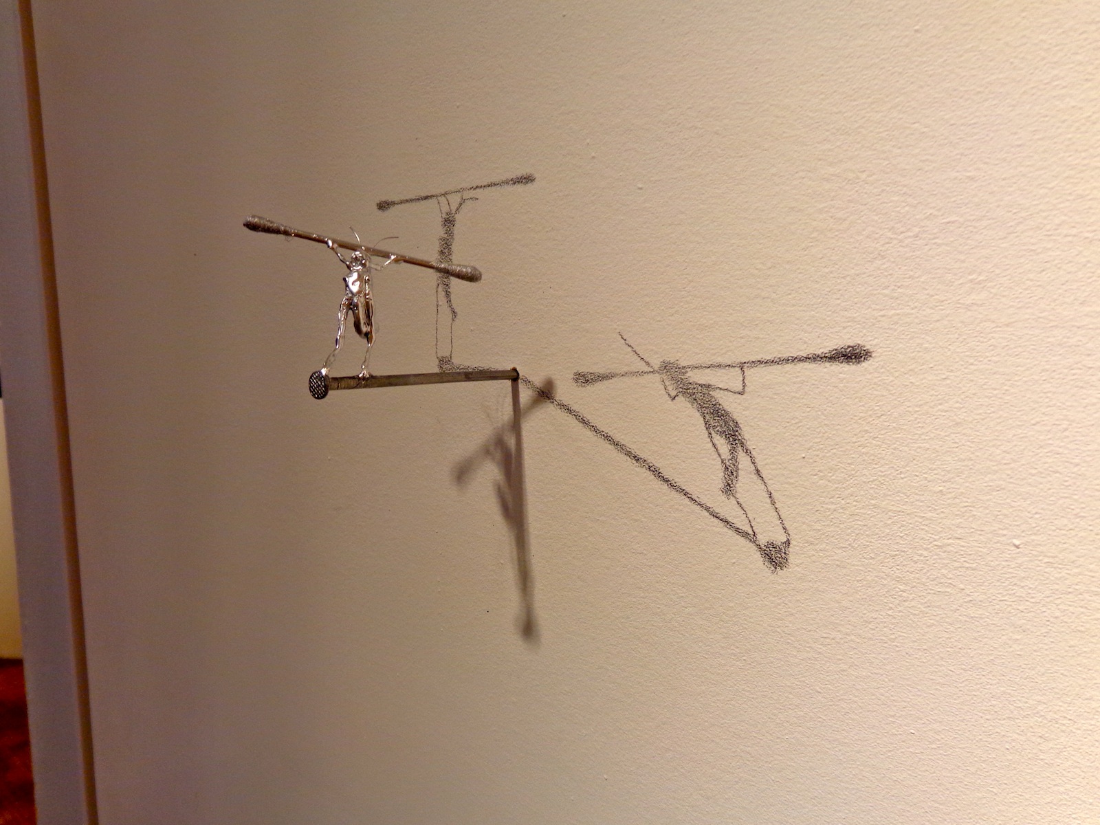
But it’s probably not so much about what he’s trying to do, but about how we perceive what he’s trying to do. He’s immortalized by two carefully drawn shadows, meaning that there are at least four different representations of him in one place – a factor multiplied every time someone takes a photo. He’s strong the way we imagine hardworking insects to be, but he’s silver, and a shinier silver than the nail he balances upon and the q-tip shaped weight he carries across his shoulders. He’s smaller than the disposable pieces of cotton we use to clean our ears, but he’ll survive much longer and be remembered for much more.
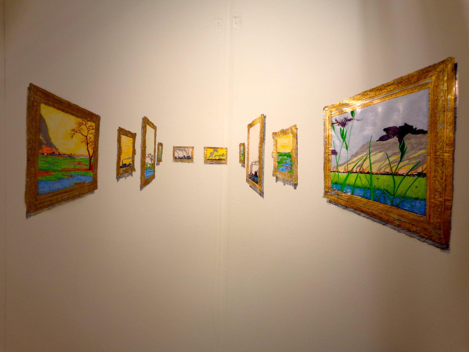
It’s hard to fully appreciate this one in two-dimensions, although it is very much a two-dimensional work. Works of art framed in shiny gold appear to stretch back into the distance, but everything is actually made of something shiny and plastic, even the fading black shadows scrawled beneath each work. The trains within the paintings that look farthest away are just as close to you as anything else, they’re just smaller.
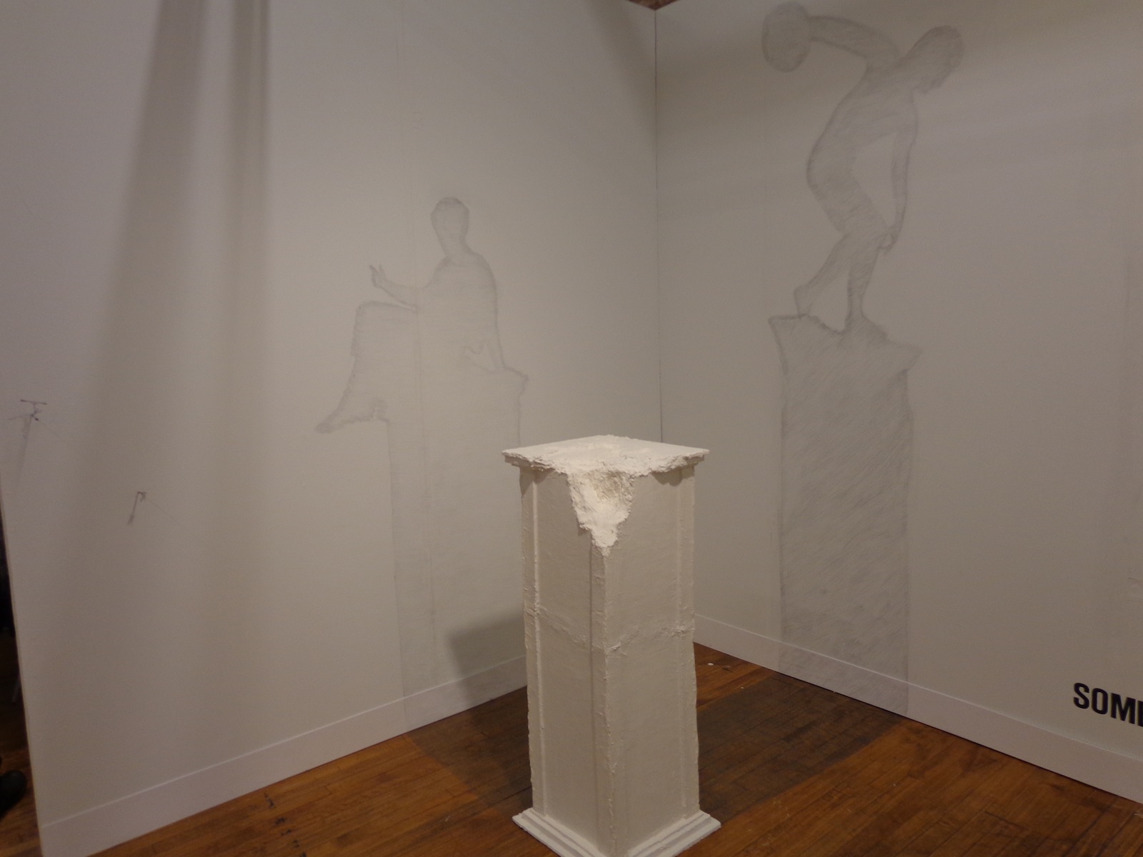
Shadowed wall drawings come from a cracked pedestal on which an ancient statue should stand – the floor and walls both filled in with gray to become the silhouettes of something nonexistent but expected. Sebastian’s whole booth, titled “Sombras Nada Mas” or “Shades Nothing More,” created a game between your brain and your eyes, as each piece forced a recognition of what was represented and what was really there.
Sebastian Mejia was represented at VOLTA by balzerARTprojects in Basel, Switzerland. According to his artist statement at the fair, his work “focuses upon the dissemination of visual information in different cultures.” He uses his work to examine the differences in symbolism between European and Latin American cultures, but all with a heavy-handed sense of comic relief to lighten the mood.
“Mejia’s work is an epistemological enquiry into the nature of knowledge, how it is acquired, presented, and how it can be retained, communicated, and implemented… Based on the ‘Allegory of the Cave,’ Mejia argues that language is a mere shadow of reality. Translated into the ‘visual,’ shadows of objects cannot represent reality of forms – truth must be experienced rather than told as language fails to convey belief. As ephemeral as his work seems at first sight, they are also about monumental historical and intellectual concepts, such as cultural interactivity, lightness, and adaptation.”
For more of Sebastian’s work, see his website – on the homepage there’s a pretty interesting video of the artist reading a book about Vasari in a library.
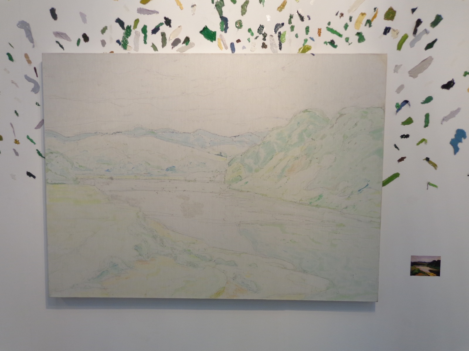
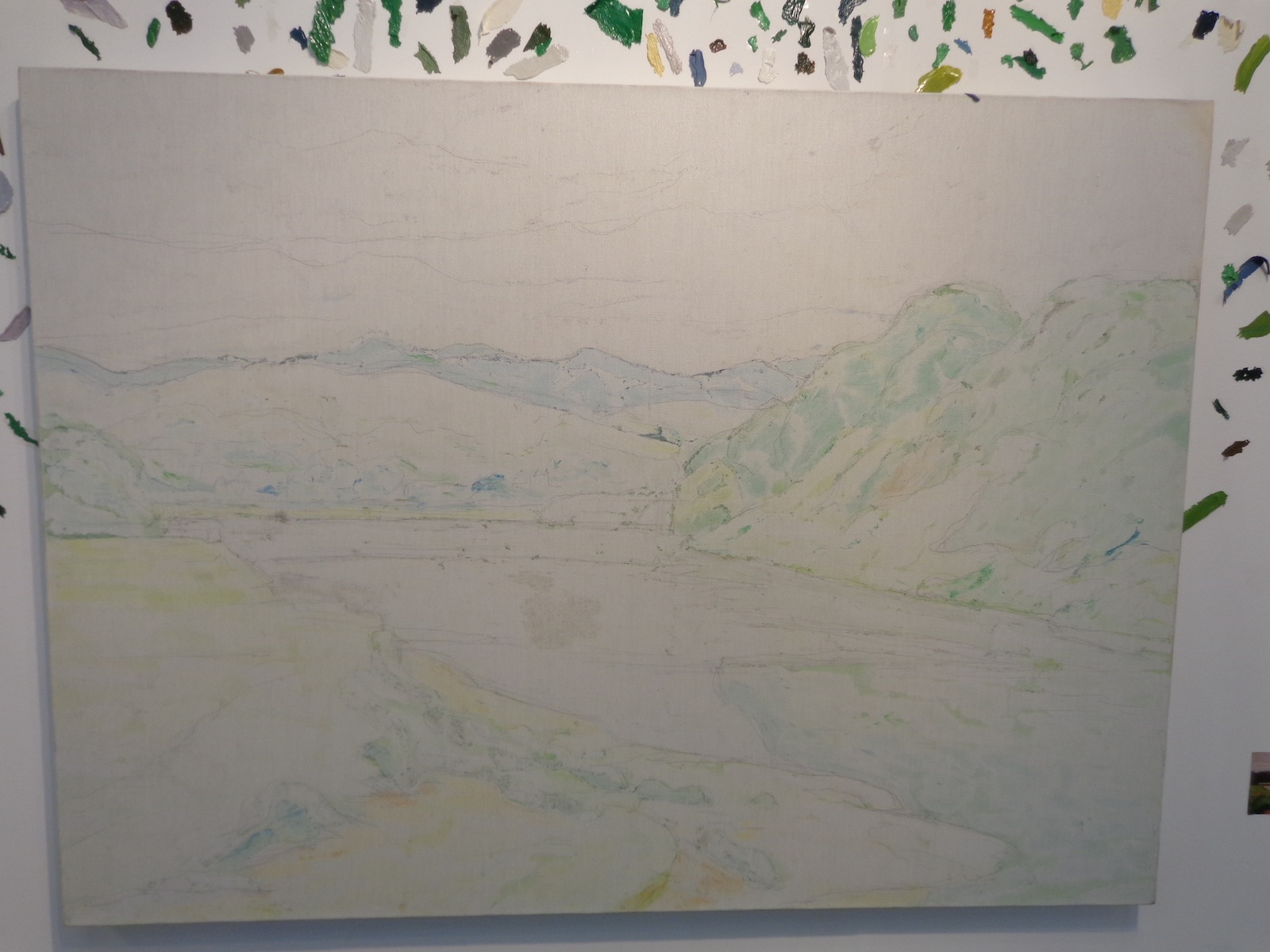
Mar 19, 2013 | art fairs, installation, painting
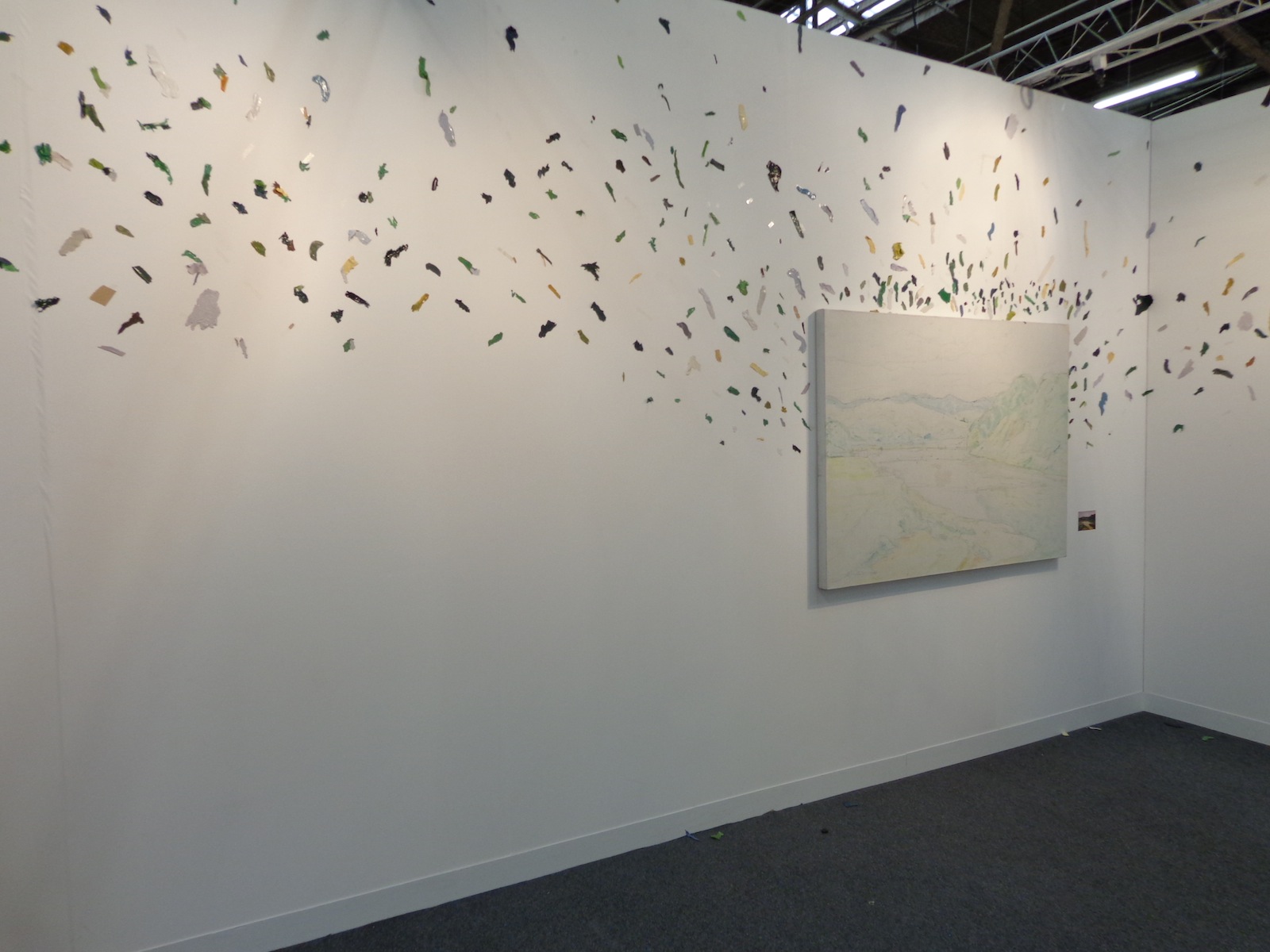
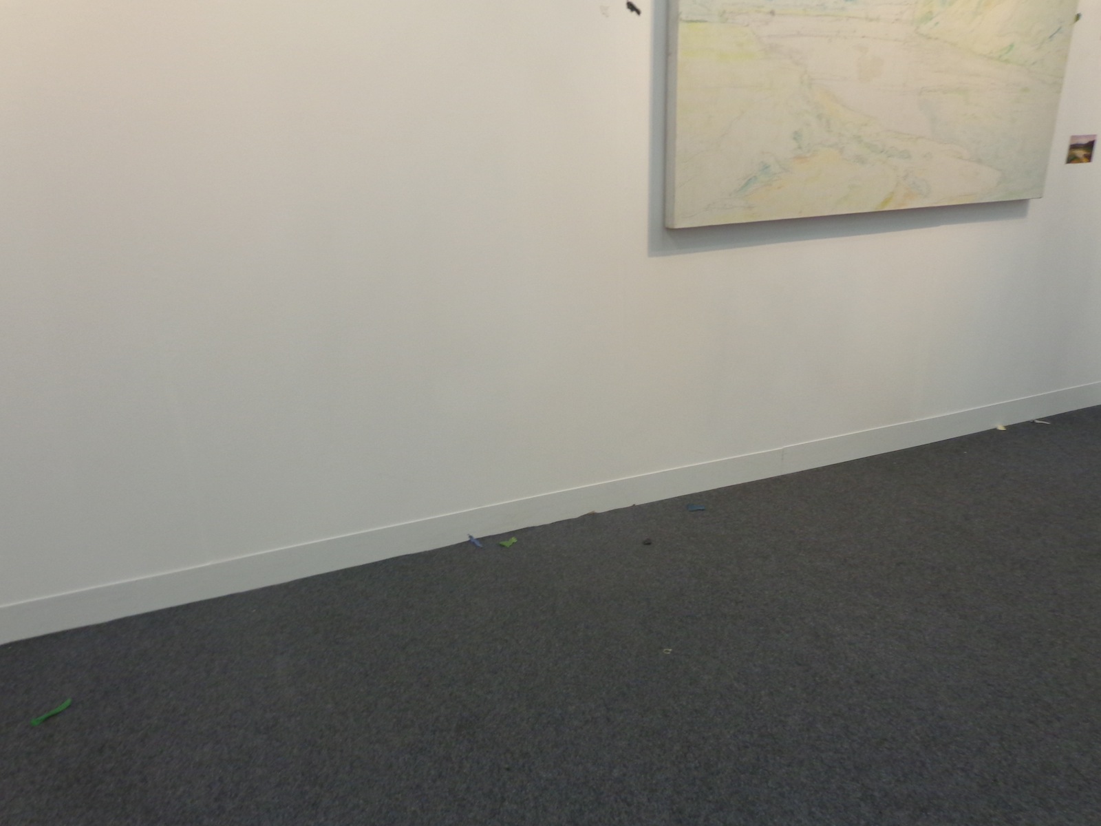
One large-scale canvas that was covered only in colored pencil underpainting took up an entire wall of Tang Contemporary’s booth at The Armory Show. The canvas was surrounded by flying flecks of color, the same colors that should be on the painting instead of around it. It was just a simple landscape scene, a valley surrounded by green hills that led the eye off into the distance, but spreading the paint everywhere keeps you inside the booth instead of letting you escape into the scene like typical paintings intend.
A scattered, abstract way of interpreting absence versus presence, the piece is titled “A painting-Landscape,” and was created by contemporary Chinese artist Wang Yuyang in 2010.
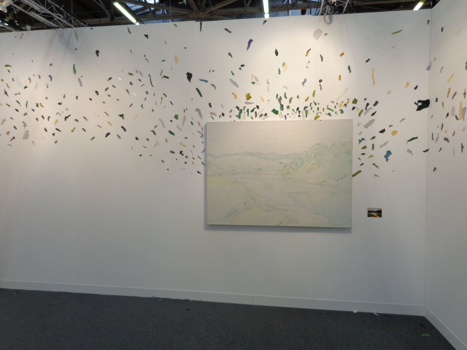
The piece mimics the Dr. Suessian notion of smacking color right off of the objects they belong to – you can almost see the artist finishing the landscape, hating it, and then KERSPLAT! He slams the canvas against the wall and paints flies everywhere. Of course, the canvas can’t be left completely empty since then there would be no correlation between the colors and what they used to represent, so the pale outlines and colors remain within the 85 x 55 cm rectangle.
There’s a connection between past and present, what used to be and what is now, all compared to what should be. Societal standards are overrated.
A miniature version of what the painting was intended to look like stood beside it, allowing viewers to compare color with the lack of it, although it’s hard to tell if this painting was ever really completed or just filled in with computers. Similar to one of those cube-scaling projects each art class has on its curriculum, the miniature version lets your eyes fill in the appropriate emptinesses of its older brother scene whose paint has flown the coop.
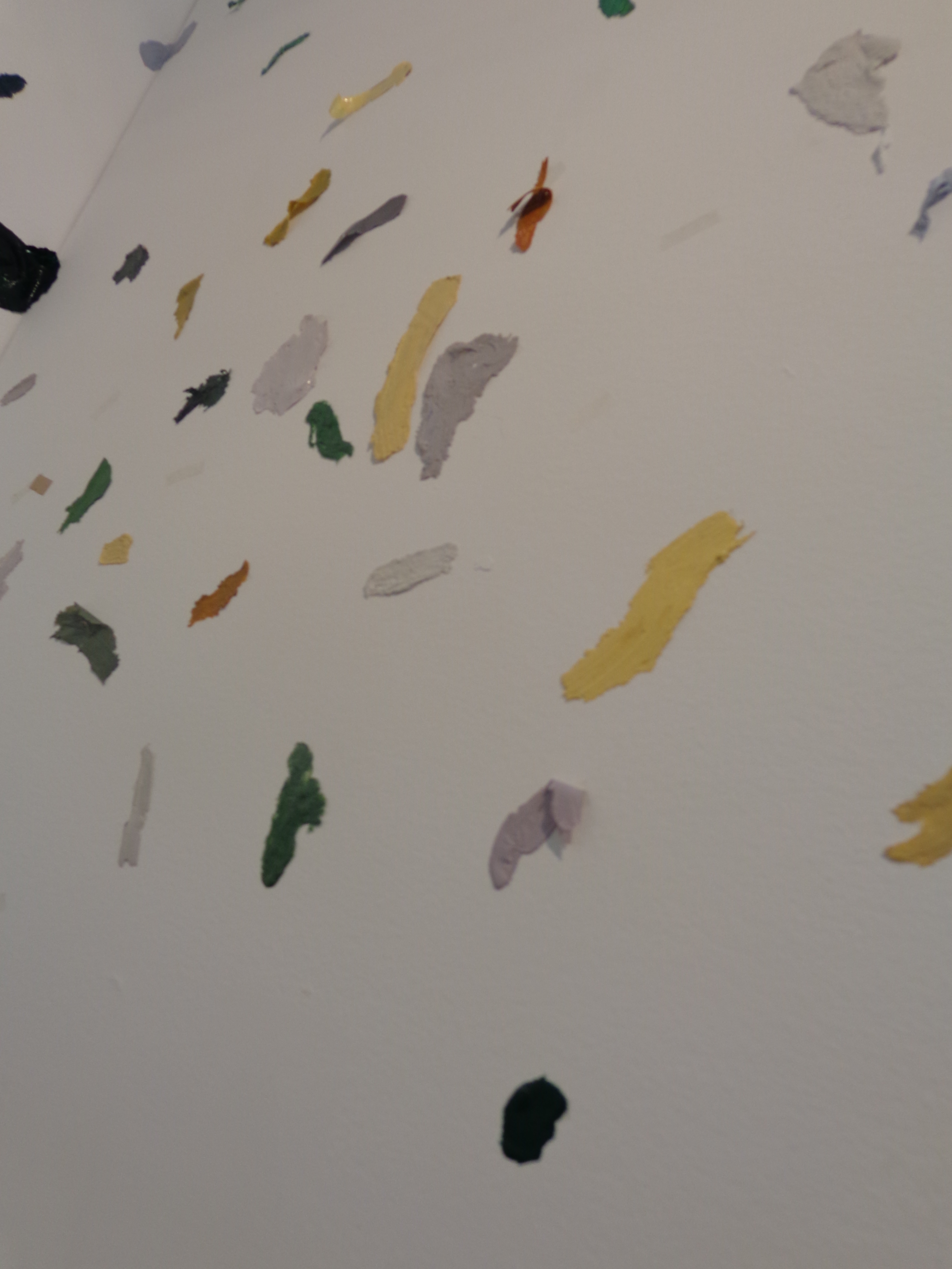
If you look close, you can see that all the little flecks of paint aren’t just oil and water, they have a plasticity to them that makes them more substantial than if they’d just been merged and flowed across a landscape scene. Each individual shade of green, yellow, gray, white, blue and black stands independently – defiantly almost, refusing to become part of the whole and wanting its own space on the wall to be noticed by passing viewers.
Tiny colored flecks even fall on the floor beneath the painting, bringing this contemporary art piece all the way to your feet.
Wang Yuyang is a 34-year-old contemporary Chinese artist whose work deals with technology and our relationship to it, along with the aesthetics of brokenness and pilings of material waste.
“I like the traditional Chinese philosophy because it talks about the relationship between 1 and 0, on and off, black and white, something and nothing,” Yuyang explained, “My works explore this connection.” He is also particularly interested in exploring what he calls “the zero state” – an emptiness filled with nothing but silence and stillness.
For more of Wang Yuyang’s work, see his bio pages from the galleries who represent him, White Rabbit and Boers-Li.