Peter Callesen’s Framed Paper Sculptures
Peter Callesen uses paper itself as a medium, carefully cutting away forms and shapes from a sheet of backdrop, then reconstructing those fallen bits into miniature sculptures that are sometimes still connected to the flat blank paper they used to be, almost as if they were falling out of place. These simple delicate masterpieces combine two-dimensional shapes with three-dimensional sculptures, now affected by gravity and casually laying upon the wooden frame’s platform.
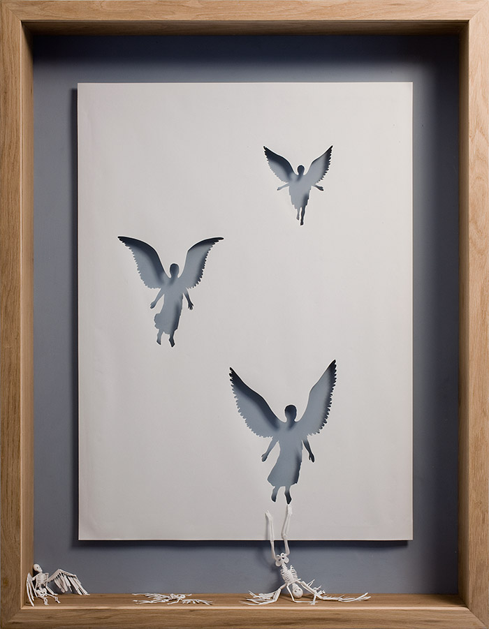
In “Dead Angels” this is exactly the case, winged skeletons falling from the cutout silhouettes of flying angels. The concept behind trace and form lends itself to this duality of ideas – the lack of paper inside the angels’ forms indicate their absence, accounted for by the three skeletons only held up by the paper’s thick wooden frame, their wings still attached but useless. I especially love the third skeleton, hanging by one big toe to the angel he used to be as his body leans upside-down, but in a silly way, arms outstretched as if to say ‘oh well.’
“City of Homeless Thoughts” visualizes its title metaphorically, the intricately cut profile view of a head is filled with interlocked tubes and wiring that branch outside his form, cast above the frame litered with miniature paper houses.
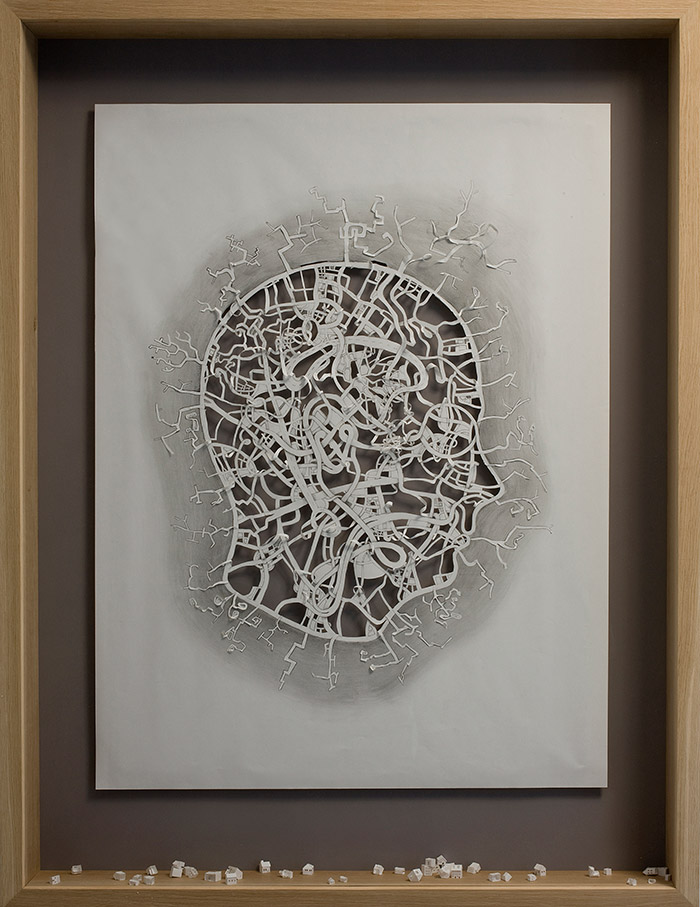
City of Homeless Thoughts , 2008
Acrylic paint, on 120 gsm acid free paper, pencil and oak frame.
139 x 106 x 13 cm.
“Cut to the Bone II” is the funniest of them all in a dark twisted kind of way – a skeleton against a dull pink background rolls down the paper his form came from, his skeleton legs and feet still drawn inside the painted paper that’s held rolled up by his skinny little skeleton fingers at the hips.
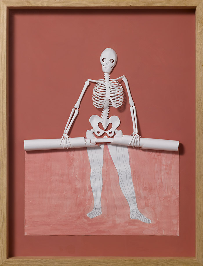
Cut To The Bone II, 2008
Watercolor and pencil on 120 gsm acid free paper, glue, and oak frame.
139 x 107 x 13 cm.
“The Roots of Heaven” shows a poetic detail of a tree too symmetrical to be real, its cut out form laying on the frame, still connecting and now visually serving as the tree’s roots, linking it to its past.
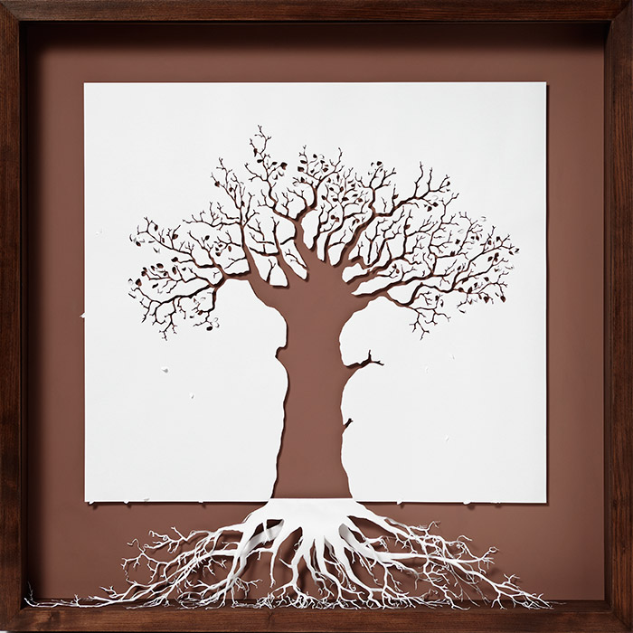
The Roots of Heaven, 2009
Acid-free 120 gsm paper, glue, acrylic paint and wooden frame.
107 x 107 x 13 cm
See more of Peter Callesen’s work on his website here.

