Jan 19, 2012 | film
In honor of The Artist winning the 2012 Golden Globe for Best Comedy/Musical (and therefore beating my favorite movie 50/50), I’m going to review it. Now, I’ve never done a movie review before, but for some reason I think silent film has more in common with fine art than normal film. I’m not saying it’s better or worse, but just that you have to read deeper into it because nobody’s telling you anything. But that’s just my opinion. Hopefully it will make my transition to movie reviewing slightly easier. (And don’t worry, I won’t spoil it for those of you who’ve yet to see it:) Wish me luck!
 |
| The Artist movie poster. Photo from heyuguys.co.uk. |
For some reason, I had a tremendous amount of faith in this movie. I had only heard rave reviews from every online news source along with my friends who had already seen it, so I knew everything would work out for the best in the end. Even though in the middle there it got kind of crazy. I don’t mean that as a spoiler; my faith in the movie actually made the whole experience better because I never got frustrated with the plot since I knew it would all work out in the end. The whole idea of the film was interesting. In an age of 3-D television and instant streaming, the thought of creating a silent film that anyone would be able to sit through must have seemed so far off. But it did more than entertain. It provoked thought by telling the story of the last silent film star. The whole movie being silent just felt like a giant metaphor for the protagonist’s unwillingness to speak on screen. And the fact that there was no dialogue made the written words that you actually had to read that much more important. The very first words that indicated dialogue read something along the lines of, “I won’t speak!” as a part of a scene from the first silent film we see our protagonist starring in. He’s the one saying it, and he’ll be saying it for the remainder of the film in a different context. But his journey is saddening and mysterious. He’s fading, but it’s hard to understand why he doesn’t make the transition to talkies when offered the opportunity. That’s where having faith in the film came in handy. I knew there had to be a good explanation. Which made it easier to connect and sympathize with him as he struggled. Plus, his dog managed to be more talented than adorable, a pretty difficult feat.
 |
| Screen shot. Photo from thesun.co.uk. |
One of my favorite parts of the movie was his relationship with the girl who’s career he had to see flower while his faded, Peppy Miller. She’s too adorable not to love, and she clearly loves him in some kind of way too. But whether or not their love is romantic is never really made explicit. In most movies, this would have been annoying because I’d usually be hoping for them to get married and settle down, but the difference in their ages made it more appropriate that they just left that part out. She is obviously fascinated with him in the beginning, and it seems romantic-ish, but he doesn’t really treat her like that (more like a child than anything else) and their lips don’t touch once. When he stays with her, he sleeps in a separate room. And she has a boyfriend. Although this poster I found makes it seem more romantic than I picked up on, she’s still smiling as opposed to leaning in for the kiss. But he does seem just a tad too old to be with Peppy, who looks like she could be 17 at the start of the movie. Plus, I bet they’re much better at dancing together than they would be at kissing.
Jan 15, 2012 | painting, The Whitney Museum
 |
| Oil on composition board. Whitney Museum. |
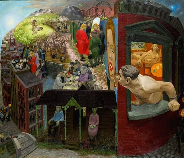
The whole image is comprised of varying scenes on one landscape, one globe, that connect in surreal, imagined ways. The street of a celebration scene leads by a warped metaphorical bridge to the front porch of an old couple colored green– they may already be dead. Over their roof leans a frumpy, middle-aged man who’s just left his very normal woman in bed to look out his window over his surely disappointing, surreally laid-out life. An unhappy dinner party takes place by a lake in the center, but the lake itself looks more like a glimpse into the underworld than a reflection of nearby trees. A nude man murders his brother in a field on the top left of this world, (very reminiscent of Cain and Abel) mirrored by topless farmers on the right. Metaphorical roller coasters can be seen in the distance, and a grotesque grayed woman examines herself in a more literal mirror while her even grosser friends look on. Really the only aesthetically pleasing aspect of this painting is the woman in the advertisement on the side of the middle-aged man’s building, but even she has a crack running through her face.
Jan 9, 2012 | MoMA, painting
 |
| Oil and enamel on canvas. |
(I saw the de Kooning: A Retrospective exhibit at the MoMA this weekend:)
Because of its strategic placement within the exhibit, you know it’s a big deal. It’s at the dead center in the very back, as a way of suggesting that this is what the rest of the exhibit is leading up to. And it’s understandable why it’s such a big deal. I’ve never seen anything like it. It was completed in the same harsh, hurried style that de Kooning seems fond of, but the slashes and spots of color seem more like the result of a more methodical process. The yellows, dark pinks, turquoises, and deep reds break through the overwhelming creme/beige color in ways that both complement the colors themselves, as well as their placements on the canvas. The sometimes-dripping, sometimes-smudged, black lines that surround and seem to almost reveal these colors really does make the piece a kind of excavation. A search for color and brightness that takes a lot of harsh black and ugly beige to find. It makes me pretty proud to be wearing bright red pants as I stand here staring at it.
Jan 7, 2012 | MoMA, painting
 |
| Oil and enamel on fiberboard. |
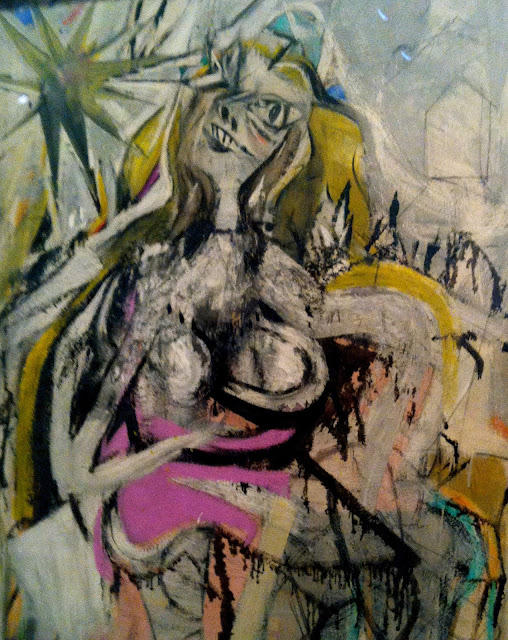
At first glance she’s almost frightening. The harsh, dripping nature of the ink outline of her dress gives the whole piece a rather crude, unfinished look. But it’s obvious by the content of the painting that it actually is finished.
The woman’s left eye is wide and cartoon-like, while her right is blurred and blinded by a huge star above her, morphing the entire space where her eye would be into a deliberate reflection of the star’s dark light. The other elements of her face are scratched out in a similarly eerie fashion, with her nose mostly nostril and her mouth mostly teeth. The empty, colorless outline of a house behind her is only background, the past, forgotten. Especially when confronted with her rounded irregular breasts magnified by their foreground presence, and bright off-putting hues of purple, pink, turquoise, and orange. The pale, sick yellow of her willowy hair mirrors the yellow of the star that she seems to be so enthralled with.
Nov 22, 2011 | sculpture, The Met
I’m just going to be honest, in this statue she looks like a dude. From the neck up, she could be a man– her face is really masculine and you can’t see any of her hair because it’s all covered up by her khat (or, pharoah hat). If her dress hadn’t slid down quite scantily to reveal her entire left breast, she could have easily been mistaken for a boy.
She is wearing a very crisply carved flowing dress that hangs around her stone body as if it were actual fabric. Her doubled beaded necklace has a huge centerpiece hanging from it that looks like it would have been pretty heavy in real life. But for all this glamour she looks upset, her eyebrows are furrowed and her right arm is propping up her head and casting her gaze downward, like the answer to whatever problem she’s having is somewhere on the floor. Or maybe she’s just upset that she’s been put by the wall where no one can see her, instead of out in the middle of the gallery exhibit where all the more naked, more feminine statues stand.


