Nov 16, 2016 | interviews, painting

Judith Seligson
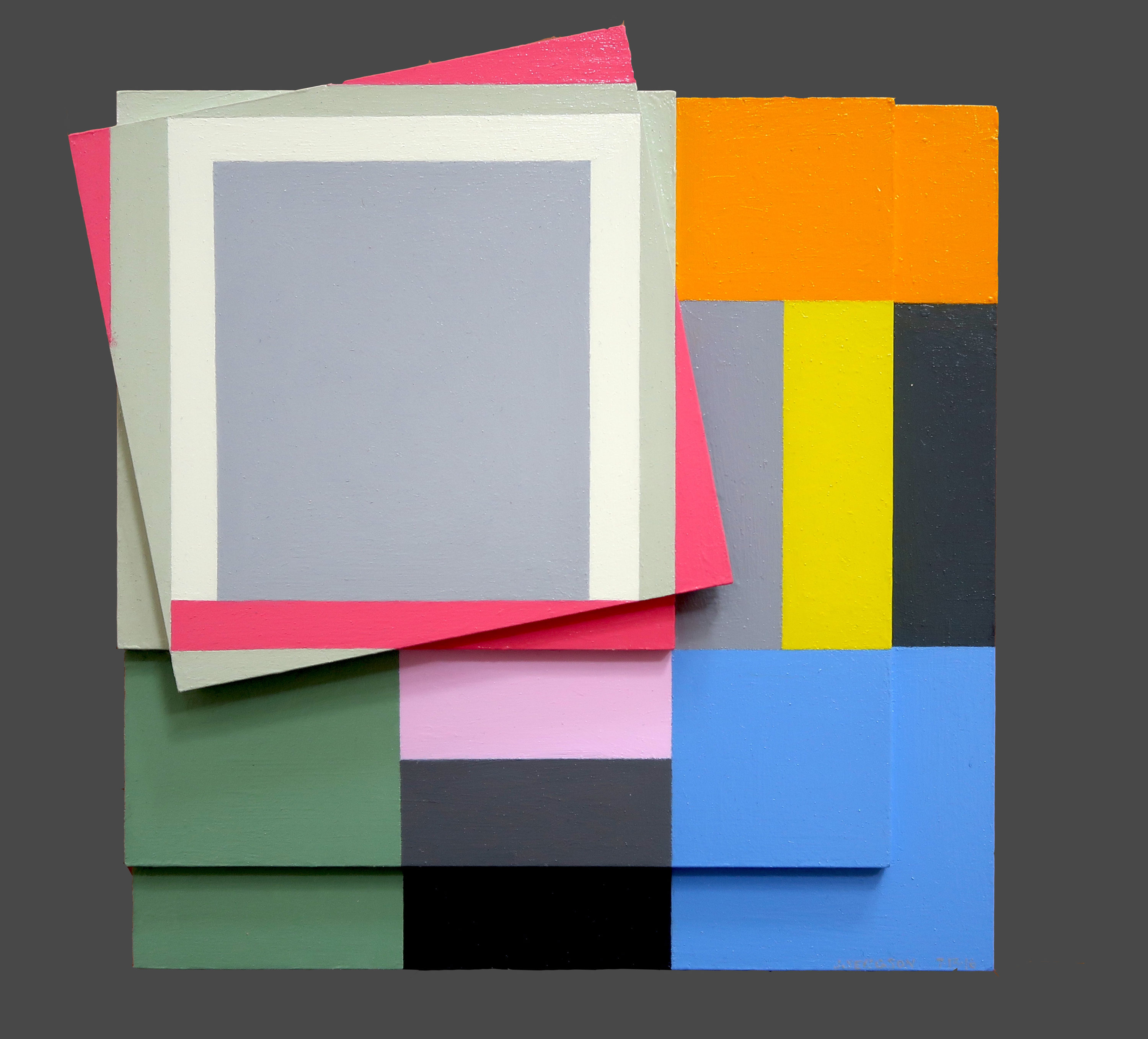
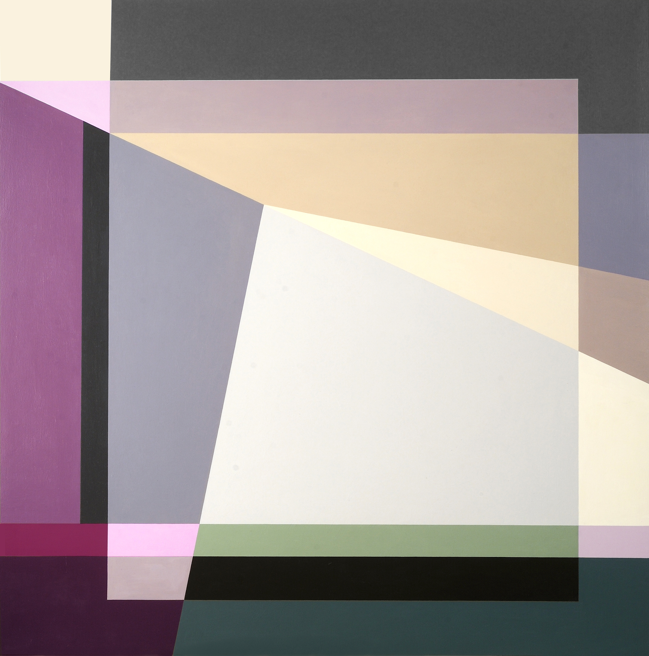
Signs Of Struggle, 2016
Oil on panels
8.5 x 8.5 in.
Courtesy of the artist
Colors fracture, shapes surface, and together the two work in tandem to continue Josef Albers’ exploration of minimalist, geometric compositions. Judith Seligson’s new exhibition Drawing the Line is comprised of elegant, cheerful examples of shape and color getting well acquainted.
How did you begin in geometric painting? What was the initial spark of inspiration for you?
I developed a series of charcoal drawings in my first studio, in Cambridge, MA in 1973, just after I graduated from Harvard, that presaged everything that was to come. I was drawing from life; both the studio itself and a vase of my mother’s dead roses were my subjects. Despite charcoal’s propensity for infinite shades of gray, I found myself using the charcoal simply to outline discrete empty shapes. Each petal surface was a shape. This method flattened objects and made them of a piece with everything else in the work, like tesserae in a mosaic.
At that time, too, I was studying a book called Cézanne’s Composition: Analysis of His Form with Diagrams and Photographs of His Motifs by Erle Loran. He “reduced” a painting to a series of lines of force. I began applying this method to some of my favorite Vermeers. Vermeer too focused my attention on drawing architecture.
My love of building blocks and of finding hidden structures in a painting and in life continued to grow and develop. Still, I pushed against it then and still do. In 1978 I had a show of painting pairs – each pair used the same palette, but one was geometric and one expressionist. I ended up pursuing the geometric direction, thinking that I could always pull the expressionist one off the back burner if I needed a change. When I look at those small painting pairs now, I find the expressionist ones much better than the geometric ones.

Judith Seligson
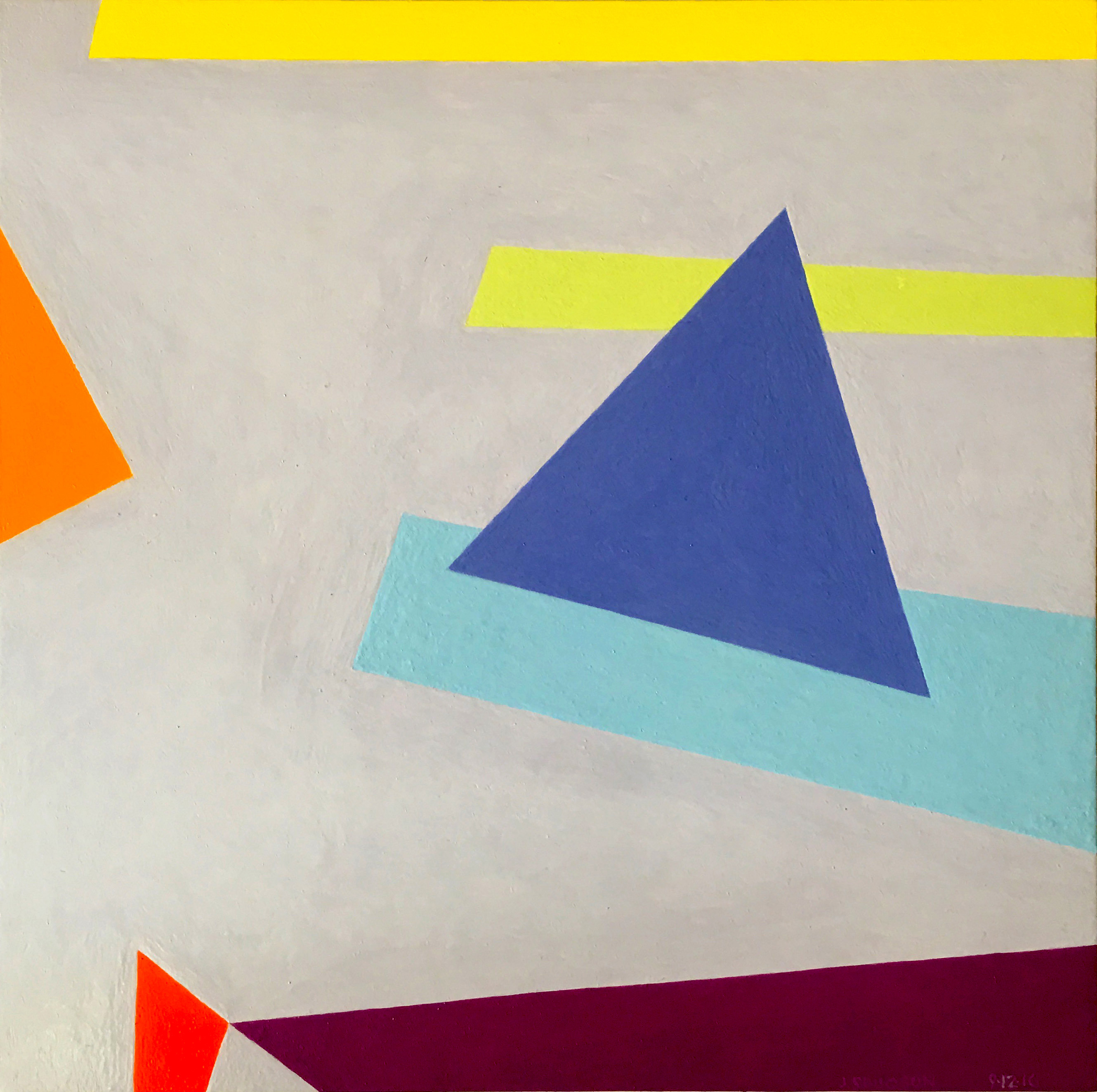
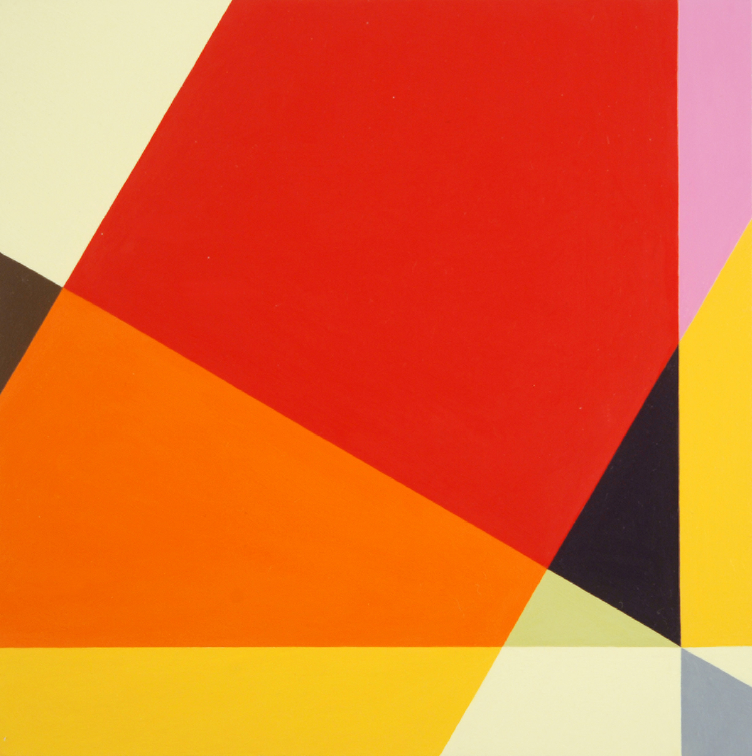
Golden, 2016
Oil on panel
7 x 7 in.
Courtesy of the artist
Galérie Mourlot describes your work as having a “feminist bent.” In what ways do you see your work as uniquely feminist?
Here is a quote from my article, Contrapuntal Painting, which appeared in the Radcliffe Quarterly, March 1992:
“Many of my paintings are diminutive, intimate, three to five inches in either direction. Rather than physically overpowering (as many men are to women), they suggest a more interactive relationship with the viewer. Smallness in art may be coming under a more favorable star, but in my lifetime size has mostly been a directly proportional measure of importance and, though no one would admit it, quality. The small works are painted on paper. Arthur Danto has aptly pointed out that paper, since it is so expendable, is considered a less “serious” medium than canvas, panels, or walls, and so has become associated with the artist’s “intimate moods.”
“Paper and women have a lot in common in that they both have developed a reputation for being less than serious but good for intimate moods, and maybe even expendable. I take these stereotypes, these preconceptions, and play with them. I draw on the bare paper — actually four-ply museum board — and then apply multiple layers of a gesso wash to protect the painting from the board. This way I can be serious, intimate, expendable, and conservable all at once.”

Judith Seligson
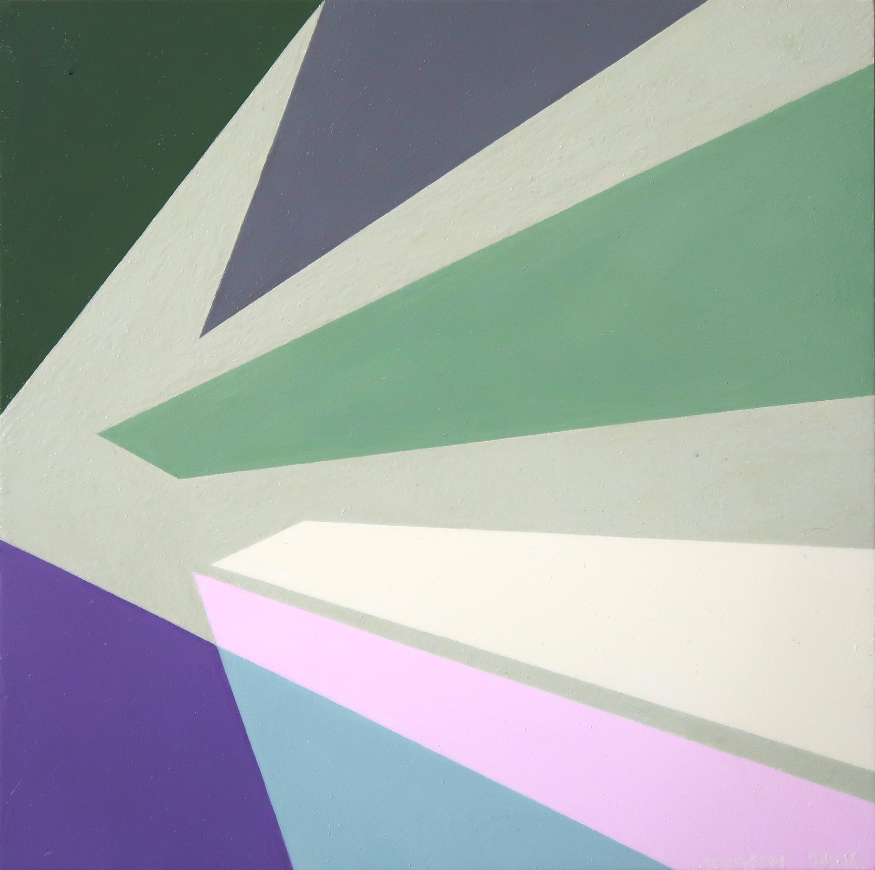
Healing Brush, 2016
Oil on panel
6 x 6 in.
Courtesy of the artist
When did you first introduce three-dimensionality to your work?
About four years ago. I was making a series of collages using, among other things, fragments of my own paintings. These were works I didn’t love or didn’t think were finished, but couldn’t toss. Then I started placing paintings that I had signed into a single composition. That led to adjusting one or the other to improve the composition. Then I started gluing together completely blank panels. At that point, I didn’t know how I wanted to paint them. I looked at them for over two years until I figured out the topological painting in Fine Tuned.

Judith Seligson
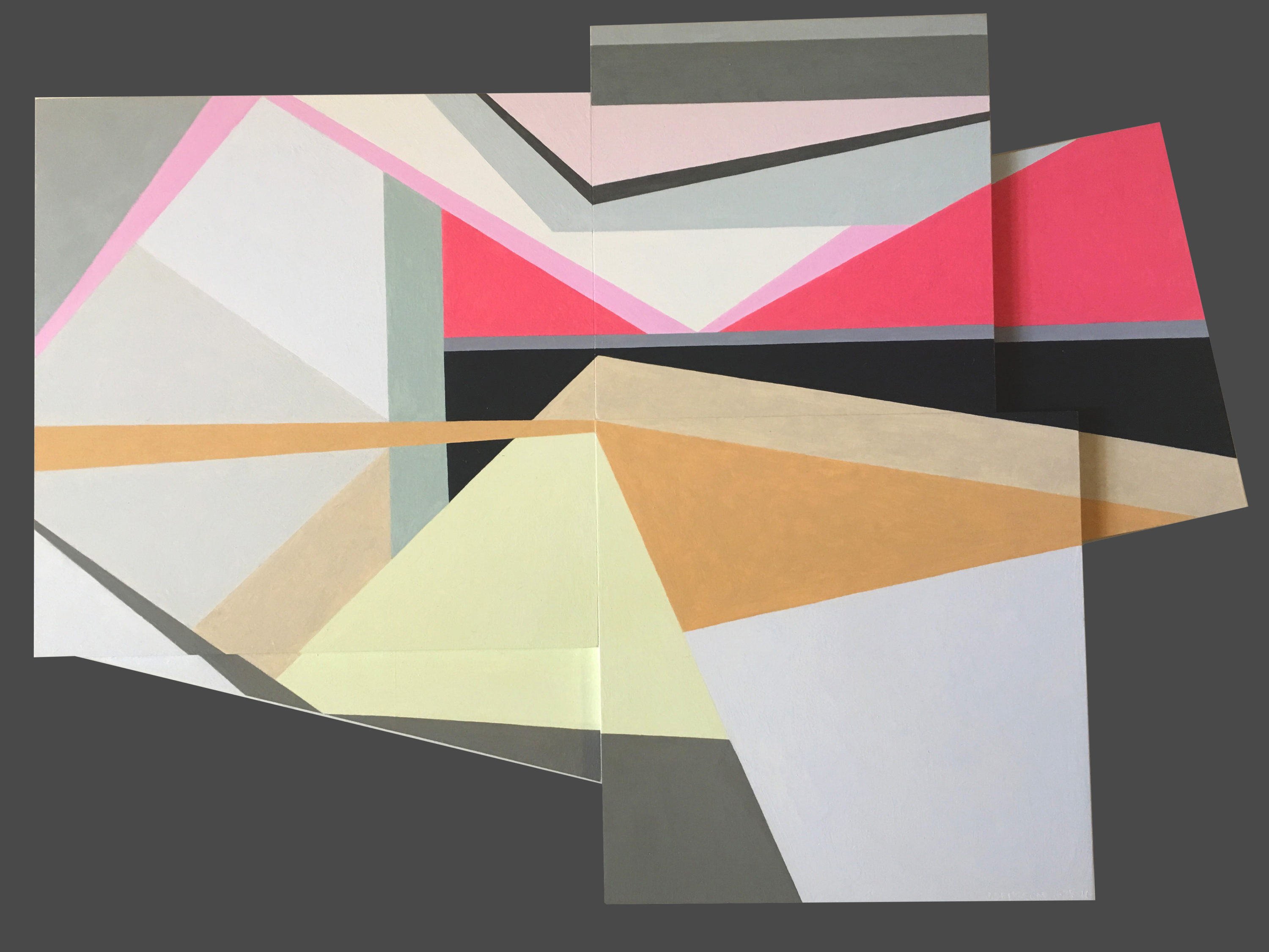
Complications, 2016
Oil on panel
11 x 16 in.
Courtesy of the artist
Can you walk us through the process of creating one of your works? Which comes first, color or shape?
The chicken or the egg. Each painting begins with a graphite line drawing. Usually, I draw directly on the painting surface. Sometimes, I trace a drawing onto a panel, or enlarge a small drawing onto a larger surface. I draw and erase until I see the blank shapes pushing and pulling, à la Hans Hoffman, moving in the shallow 3-D illusionary space created by an interplay of color and form.
I then apply several layers of thinned gesso, sanding between layers, to get a very smooth surface. The drawing is still visible, but the graphite will not mix with the paint.
Positive shapes, like a vase, will appear in front of a negative shape, like the shape around the vase. Matisse said that painting begins when you can see both the vase and the space around it at the same time. Warm reds push forward, blues recede. I work each against the other so that the color shapes are pushing and pulling my eye around the surface in what I call I visual melody. I will use a cool color to push back a shape that appears too forward, or a warmer color to pull forward a shape that is receding. Like a great song, a visual melody is a whole structured by notes, tempo, dynamics, and a sense of beauty – or is it pleasure? Each shape is a note in several simultaneous visual melodies, playing on the scales of hue, tone, temperature, intensity, and negative/positive shape. I have called my work Contrapuntal Painting, in that counterpoint in music is created by two or more melodies played simultaneously. Each is both an independent melody and also the harmony to the other.
In this sense, too, my work is feminist. Man and woman can be the counterpoint to each other, rather than the woman traditionally being only the harmony to the man’s melody.

Judith Seligson
Self Portrait, 2014
Oil on panel
36 x 36 x 2 in.
Courtesy of the artist
Which artists or websites do you most often find yourself looking towards for inspiration?
I look to many of the Dutch painters – Rembrandt, Vermeer, Mondrian, and de Kooning. Their devotion to structure and to light in a painting is a constant inspiration.
I like Elizabeth Peyton’s small portraits and Cecily Brown’s paint handling. I like Peter Halley’s electrical circuit paintings. I look at and read Artforum and Bookforum in print. Intermittently, I read artnet News, Hyperallergic, and Blouin Artinfo.

Judith Seligson
Candy, 2008
Unique digital painting on canvas
43 x 43 in.
Courtesy of the artist
Drawing the Line opens tomorrow, November 17 at Galerie Mourlot on 79th Street in Manhattan where it will remain on view through January 9, 2017.
Nov 6, 2016 | installation, public art

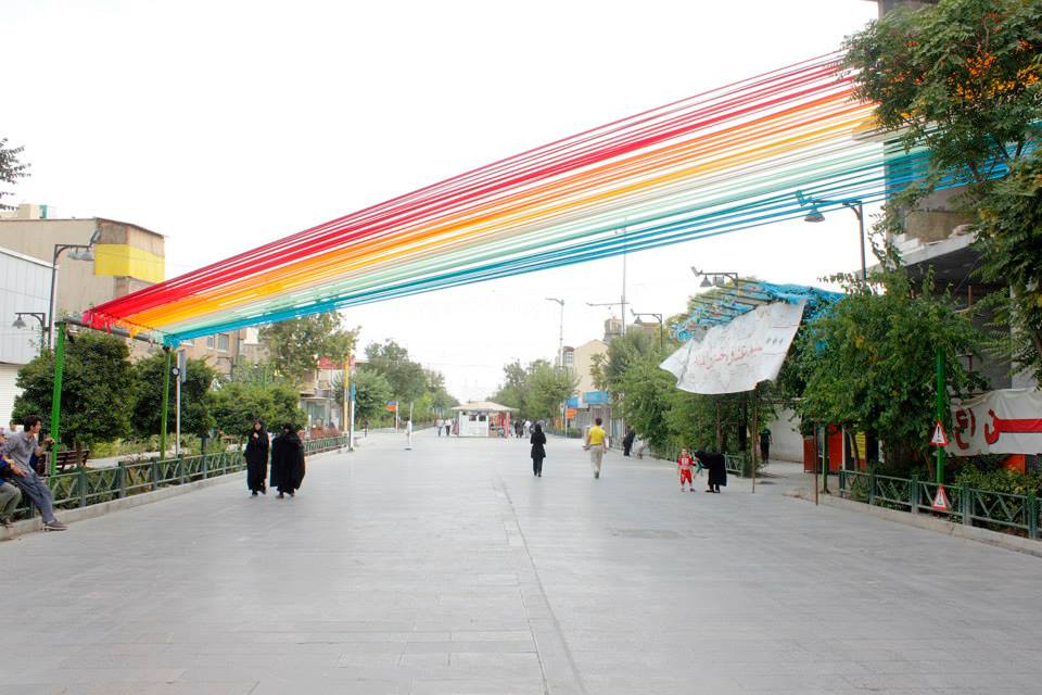
Hanieh Alizadeh, Mahmoud Ganji, Mehdi Rabie (EOT design studio). Whispering Rainbow, 2012. Satin ribbon. Hefdah-E-Shahrivar Street, Tehran. Photo via EOT design studio’s Facebook.
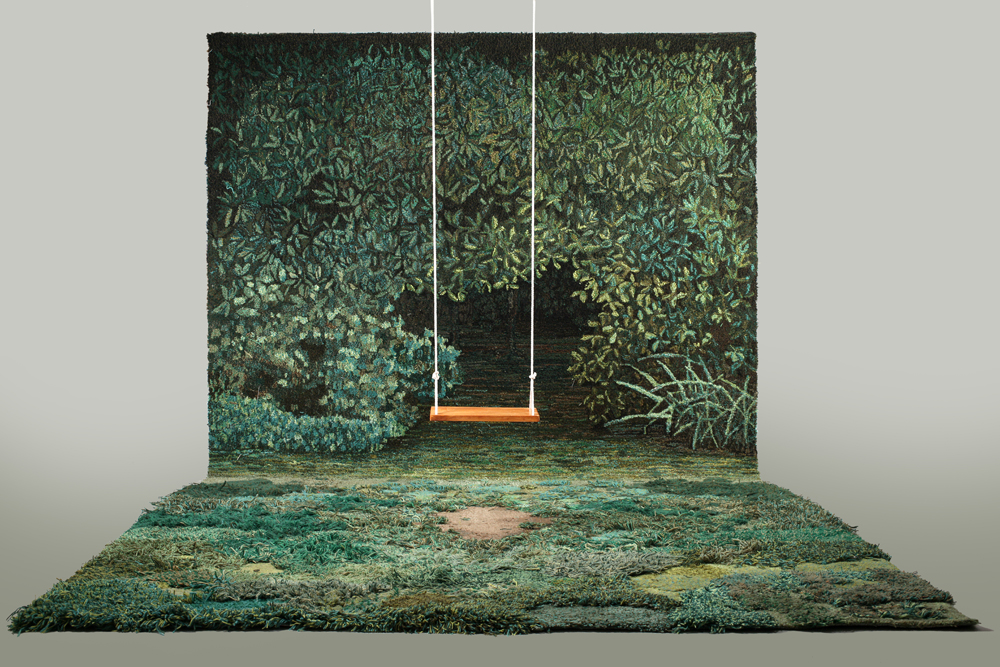
When every object we touch is factory-made, are manufactured environments somehow more real? Both Alexandra Kehayoglou’s Shelter for a Memory and EOT design studio’s Whispering Rainbow are knowingly synthetic; they mimic the earth’s beauty as a tribute by celebrating some of the most joyful natural elements. Shelter for a Memory’s delight arises from a collaboration between man and nature — a wooden swing that within the myth of the scene hangs from a towering, enveloping tree. In a similar way, Whispering Rainbow is a collaboration through appropriation, a reenvisioning of a rainbow remade in 150 rolls of satin ribbon (a potentially natural medium). When the wind blew the satin shook to create the sound of rain, adding an audible dimension to the rainbow’s recreation.
Whispering Rainbow evokes only happiness, and its installation across a public street in Tehran makes seeing it fun and serendipitous. Shelter for a Memory differs in both respects: viewers enter its space with certain expectations because of its place in a gallery, and the scene’s deliberate edges create a conceptual frame that conveys a sense of disillusionment and inauthenticity when seen from a distance. But its title acknowledges the potential for fiction in nostalgia, and Kehayoglou creates her wool rugs through a hand-tufting process that lends a truth to the piece. Together, both installations ask: can an artificial environment carefully crafted by human hands be more real than the nature it imitates?

Alexandra Kehayoglou. Shelter for a Memory, 2012. Wool, paint, wood, rope. Photo: Artist’s website.

Hanieh Alizadeh, Mahmoud Ganji, Mehdi Rabie (EOT design studio). Whispering Rainbow, 2012. Satin ribbon. Hefdah-E-Shahrivar Street, Tehran. Photo: EOT design studio’s Facebook.
This text was originally written for a class titled Installation Art: Design & Change at Pratt.
You can also read more pairings on the Pairings: Blog set up by our professor, Kim Connerton, PhD.
Jul 31, 2016 | installation, political art, public art, sculpture

Carl Fredrik Reuterswärd. Non-Violence, 1985. Photo: UN News Centre.
America is a nation based on the right to free speech, and theoretically the people whose taxes fund the bureaucracy should have a say in what their money pays for, but unfortunately and unsurprisingly that’s rarely the case. Despite the fact that majority opinion on the value of public art seems to have improved in recent years, historically any government money spent on something as extraneous and subjective as art has been considered a waste. Our most rigid institutions are having a hard time adapting to the recent acceptance of public art as a valid expenditure: in 2005 Congress commissioned its first artwork since 1873. This paper examines works of art in America that were in some way supported by this slow-changing government, focusing on interventional artworks with an opinion of their own, that attempt to shift attitudes in viewers for better or worse. It’s difficult enough to find public art that isn’t ugly or inconvenient, so why would the government consider funding public art with a point of view that can open a proverbial can of complaints from all those with the potential to disagree? Originally the promotion of art with an obvious opinion was accidental. The first artworks commissioned in a newborn America were war monuments and statues of the white men who “made this nation great.” These statues noticeably endorse the European, patriarchal America that today’s public art actively fights against. In between we saw the WPA’s mural arts program as a more contemporaneous backlash to those patriotic monuments, promoting the American-Mexican community and the working class. Next came modern and postmodern minimalism with the sunny potential of offending no one, and this led into site-specific works which eventually became urban renewal projects with artworks that double as benches or street lamps. Each work that sparked a community backlash only made it more clear that public art doesn’t just need to be created for the amorphous physical space it occupies, but for the community that calls that space home. It’s this insight that led to some of the most interventional artworks to date, and although most were welcomed and beloved by the local population, it was often because these works spoke for them. If the work were transplanted or created elsewhere, a community with a different set of values might react with a hostility to match the approval that greeted the artwork originally. In this way, the government has had a hand in sponsoring progressive monuments to gay rights and equality for blacks and women. But because of stratified arts funding processes and the open interpretations that all artworks are inevitably left to, no one noticed.
“In the context of a Protestant work ethic, it [public art] is an unnecessary frill.”
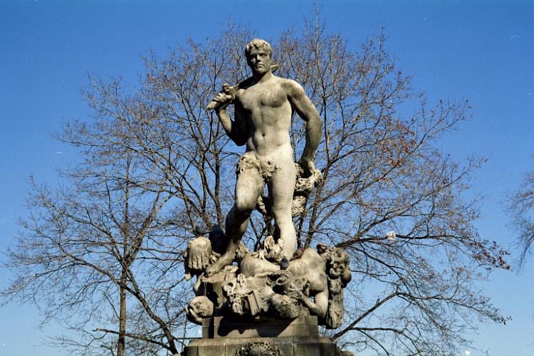
Public art’s first hurdle was to convince Americans that it was necessary at all. As Harriet Senie and Sally Webster write, “In the context of a Protestant work ethic, it [public art] is an unnecessary frill.” By commissioning works that spoke to the upper-class patriarchy who controlled the budget, these people who made the decisions were persuaded — to an extent. The preachy, patronizing statues they commissioned left a narrow-minded understanding of what’s worthy of monument, as well as further distancing “public art” from an ever abstracting art world. The 1922 commission from the City of New York, Civic Virtue, wasn’t speaking from an objective place when the sculptor chose to depict Virtue as a man and Vice as a woman.

Frederick William MacMonnies. Civic Virtue, 1909-1922. Photo: Kew Garden History.
What’s more, the artwork shows Virtue literally trampling Vice; he stands proud with his sword slung cavalierly over his shoulder as she writhes sexually under his feet, somehow still gazing back at him, infatuated. This work is only interventional on behalf of government institutions pushing a puritan, patriarchal agenda, but its where our nation’s history with opinionated art begins. Although the funds for the statue were bequeathed in 1891 by a widow (yes, a woman unknowingly paid for this chauvinist masterpiece), the City of New York commissioned the artist, Frederick MacMonnies, who with committee guidance created the design. It took 17 years for the city to get around to facilitating the project in the first place, six more years for the artist to finish a model, and finally another eight years till the work was installed, 31 years after Angelina Crane’s passing. When the public expressed dismay for the work, MacMonnies only made matters worse by proudly admitting that he purposefully created it for an “elite, and purposefully had not taken into consideration the ‘narrow prejudices’ of the rest of the people.” Paradoxically, it’s Civic Virtue that appears most prejudiced in this circumstance. The work is what Judith Baca refers to as “cannon in the park” art: sculptures that praise a specific version of the nation’s history and in doing so exclude large portions of the populace. As Suzanne Lacy writes, “the construction of meaning depends on who is doing the making.”
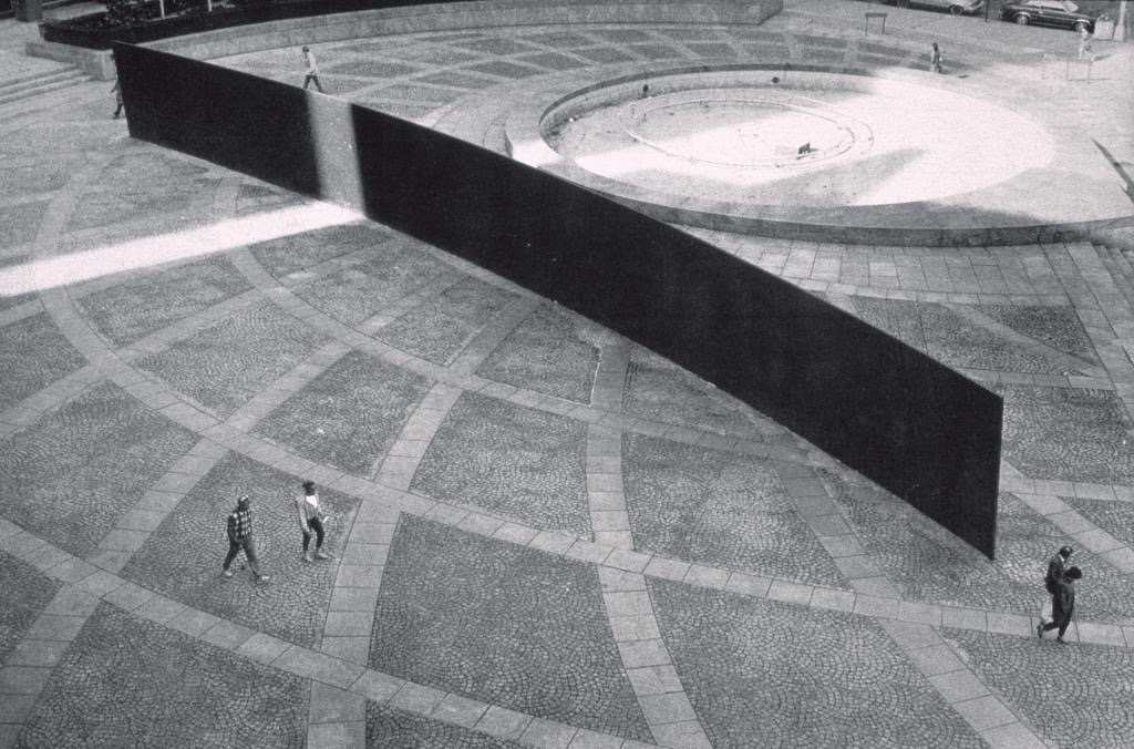
The years of public art commissions that followed only had one goal: don’t offend. With the emergence of minimalism, the job ended up being fairly simple. The sixties saw the start of this trend, with the goal of government-funded art shifting towards what the National Endowment for the Arts described as giving “the public access to the best art of our time outside museum walls.” Works by Isamu Noguchi and Michael Heizer reigned in what Harriet Senie calls the “pet rock” craze: the seventies trend of bringing highbrow museum works down to the common people in the hopes that they’d understand, no it’s not just a rock. “What too many artists did was to parachute into a place and displace it with art,” Jeff Kelley remarked. Miwa Kown refers to these works as the “art-in-public-places” paradigm, a re-situation of fine art that had the potential to revitalize urban environments while bringing money to the traditional institutions representing the already internationally-established male artists whose work was being showcased on a larger-than-life scale. For the purposes of this essay, this public art trend was only interventional in its staunch conviction that renowned artists knew best, regardless of whether they’d ever even visited the cities where their works were displayed. This public art trend met its demise with the disastrous reception of Richard Serra’s Tilted Arc, a large-scale conceptual piece the government spent $175,000 to commission before it was removed only eight years after installation. Tilted Arc was physically and conceptually interventional, but ultimately it was enforced as spatially hostile, in direct physical opposition to the thousands of people who had to walk around it everyday in Manhattan’s Foley Federal Plaza. Tilted Arc sparked a new conception of what good public art entails: “Public art needs to be seen as a function not of art, but of urbanism. It needs to be thought of in relation to, rather than insulated from the numerous other functions, activities and imperatives that condition the fabric of city life.”

Richard Serra. Tilted Arc, 1981. Photo: Cave to Canvas.
And so site-specific art transformed into community-oriented art, as the NEA changed its directive away from works “appropriate to the immediate site” in 1974 to works that included “plans for community involvement, preparation, and dialogue,” in 1983. This gave way to what Suzanne Lacy deems “new genre public art”: work that attempts to tackle the issues facing the community it’s a part of, whether societal, environmental or political. Its here in the eighties and nineties that public art begins to find its true purpose: as a reflection of and an intervention on behalf of the people whose daily lives involve constant interaction with the work. These works had to be conceived of in collaboration with the community, an art that “comes from a gentle, diffused mode of listening… a kind of art that cannot be fully realized through monologue. It can only come into its own in dialogue, in open conversation in which one is obliged to listen and include other voices.” It’s in this phase of public art that the government has played its largest role in commissioning art that’s most deliberately interventional.
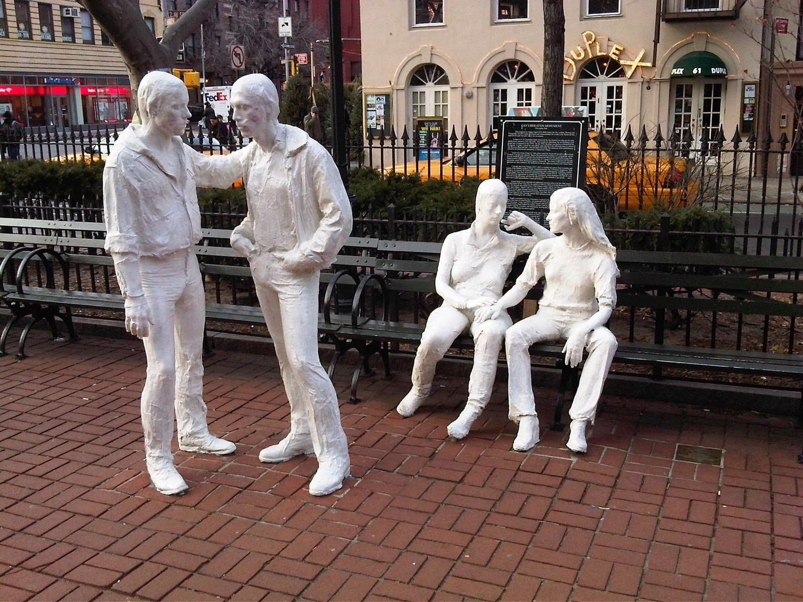
The most successful and far-reaching of this new genre of public art has been murals and sculptures that are a direct reflection of the local communities’ values, regardless of whether or not those values stand in opposition to values held in other parts of the country. Perhaps the earliest of these was George Segal’s Gay Liberation, which wealthy Louisiana art patron Peter Putnam spent $100,000 and the last eight years of his life working to get installed in Christopher Park, close to the historic Stonewall Inn. The piece is only interventional once the title is known, it features four of Segal’s well-known textured white figures: a homosexual couple standing, and a heterosexual couple sitting. There’s nothing offensive or disruptive about the figures themselves, but the implication is that the gay couple’s interaction, which is nothing more than a simple hand on a shoulder, is wrongly regarded as morally subordinate to the straight couple, even though the woman has her hand suggestively on her partner’s upper thigh. The work was finally installed after 13 years of bureaucratic setbacks and internal battles within the gay community who wanted to see all of their dynamism represented in the piece. The work was funded by Putnam, but the City of New York agreed to budget 20 years-worth of conservation funds to keep the work maintained. Three years after that 20-year contract expired, the work is still installed and has become a celebrated part of the neighborhood.

George Segal. Gay Liberation, 1980. Photo: Whose Streets / Our Streets.
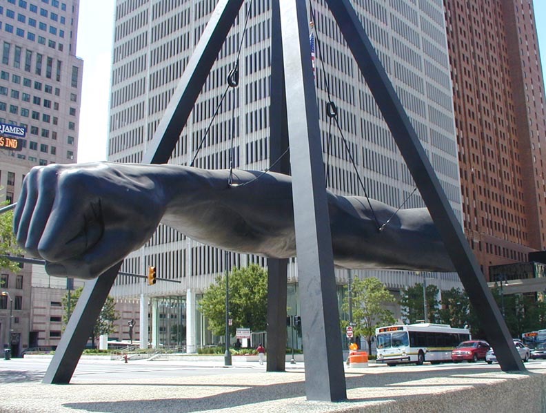
Another government-sponsored public artwork that spoke on behalf of its community is Robert Graham’s Monument to Joe Louis in Detroit, a disembodied fist punching forward, hanging from the triangular structure surrounding it. Nicknamed the “Brown Bomber,” Louis became a patriotic symbol of anti-Nazi sentiment when he won the Heavyweight World Championship in 1937, at a time when Hitler was trying to prove to the world that the Aryan race was both physically and mentally superior. Representative of his punches both in and out of the ring, the sculpture commemorates Louis for his physical strength as much as his social activism — the boxer fought Jim Crow laws, which symbolically aimed the fist at racial injustice. The work has been criticized for only emphasizing Louis’ more superficial contribution to Detroit’s legacy, but its giant clenched fist echoes and immortalizes black power’s fight for equality, and the cables that both hold the arm aloft and render it immobile are reminiscent of the slave shackles that were a reality only 120 years before the work was installed. Once again the sculpture was paid for with private funds, in this case provided by Sports Illustrated magazine, but the sculpture’s installation and upkeep is facilitated and funded by the local municipal government.

Robert Graham. Monument to Joe Louis, 1986. Photo: Newsone.
Other interventional new genre public artworks address a community’s environmental concerns rather than the community itself. Mel Chin’s 1989 Revival Field, uses plants to clean a circular area of toxic soil in an old landfill near downtown St. Paul, Minnesota. Regarded as an experimental “green remediation” project, the work was co-sponsored by the Minnesota Pollution Control Agency and developed in collaboration with U.S. Department of Agriculture agronomist Rufus Chaney. Revival Field blurs the boundaries between science and art, so well in fact that the NEA temporarily pulled funding while the artist worked to prove that the project was indeed art. Chin describes the work as conceptual, intended to sculpt the site’s ecology. Formally it consists of a circular plot of land outlined by a chain-link fence that houses a garden of hyperaccumulators, plants that can eliminate heavy metals from toxic soil. The circle encloses perpendicular paths that cross at its center, and the whole garden is framed by a square of additional chain-link fence that gives the test-site a border of unplanted area to serve as the control variable in this ecological experiment. Another environmental preservation work that pushes the definition of art is Alan Sonfist’s Time Landscape of New York City. Begun in 1965 and unveiled in 1978, Time Landscape transformed the 8,000 square-foot plot at the corner of LaGuardia Place and Houston Street into an ecological time capsule consisting of the trees and plants that inhabited Manhattan 300 years ago, before European settlement. Sonfist restored the soil, reestablished the land’s original elevation and planted vegetation in three stages to recreate the native woodlands accurately. The work is the first site-specific sculpture to be permanently maintained by the city’s public park system. The artist wrote, “As in war monuments that record the life and death of soldiers, the life and death of natural phenomena such as rivers, springs and natural outcroppings need to be remembered.” As global warming becomes less of a theory and more of an unavoidable reality, hopefully environmental public artworks like these will be considered less interventional and more essential, seen for what they are: an indispensable reclamation of land almost completely destroyed.
“As in war monuments that record the life and death of soldiers, the life and death of natural phenomena such as rivers, springs and natural outcroppings need to be remembered.”

Mel Chin. Revival Field, 1991-present. Photo: The Schuylkill Center for Environmental Education.
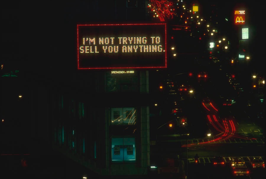
Perhaps the most opinionated interventional public artworks have a political message, speaking for a position espoused by its local community, and therefore against another. Barbara Kruger’s anti-commercial, feminist perspectives have often been facilitated by the Public Art Fund, a private nonprofit organization partially funded by government grants. Her Messages to the Public in 1983 lit up an 800 square-foot Times Square billboard with text like “One guy says he’s the strongest because he has the biggest weapon,” and “I’m not trying to sell you anything.”

Barbara Kruger. Messages to the Public, 1983. Photo: Public Art Fund.
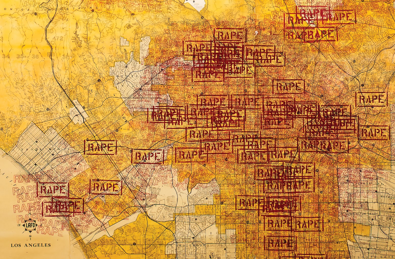
The Public Art Fund also paid for Barbara Kruger’s 1991 art-ad series Untitled [Bus Shelter Posters], which consisted of three portraits of American men who are asking for help because fictional scenarios are forcing them to deal with the reproductive issues women struggle with daily. Another artist operating from a feminist perspective is Suzanne Lacy. Her 1977 work Three Weeks in May was comprised of more than 30 events held throughout Los Angeles. One facet of the project involved a three week installation of two 25-foot maps in the City Hall shopping mall. One map showed the locations of women’s assistance agencies in the city, while the other became a living record of all the reported instances of rape during the three weeks the maps were on view. With each rape, a large red stamp marked where it occurred, and each stamp that represented a confirmed report was surrounded by nine fainter stamp markings that symbolized the estimated nine additional rapes that occurred for every one reported. Over the course of the project’s 21 days, the map morphed into a sea of red ink, and the project as a whole was supported by the Los Angeles Department of Public Works as well as by various government agencies and officials throughout the city.

Suzanne Lacy. Three Weeks in May, 1977. Photo: Recorridos e Intervenciones.
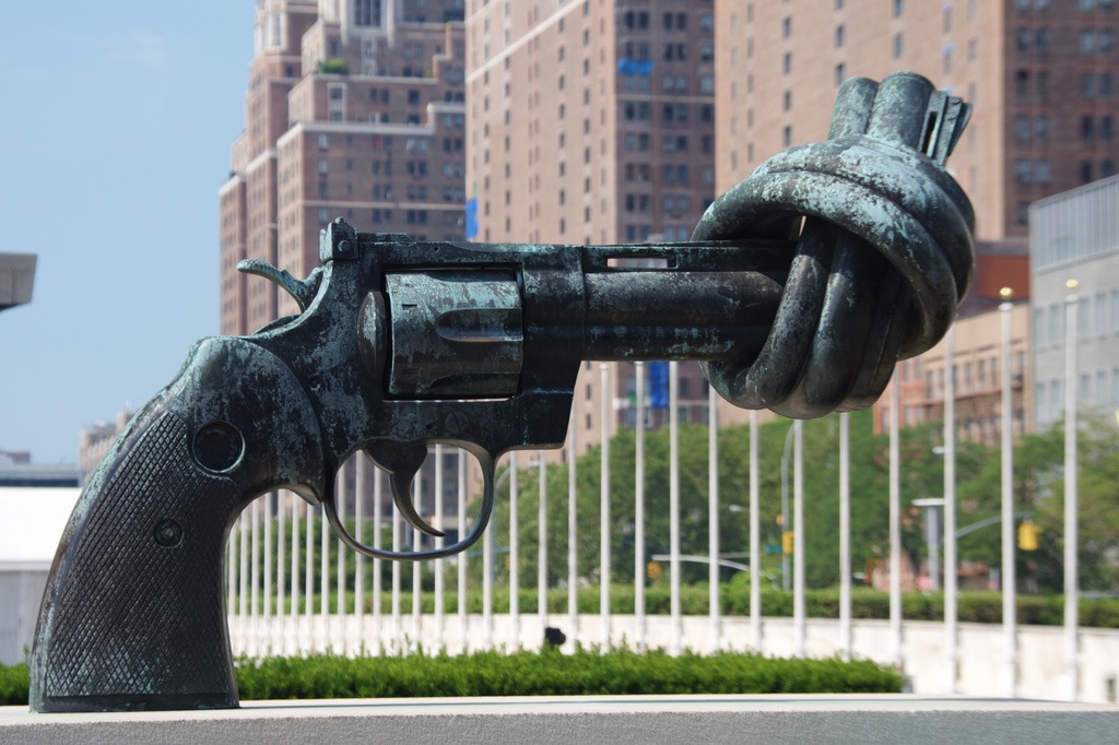
Still other interventional government-sponsored public art addressed more divisive political issues. Carl Fredrik Reuterswärd’s Non-Violence was given as a gift to the UN, but again government funds have kept it maintained since its installation in 1988. Created in response to the murder of John Lennon, a friend of the artist, Non-Violence has become a political art campaign, with more than 30 versions of the sculpture installed all over the world. It depicts a cocked 45-caliber revolver, but the barrel of the gun has been tied in a knot to ensure that the deadly weapon poses a threat to no one.

Carl Fredrik Reuterswärd. Non-Violence, 1985. Photo: UN News Centre.
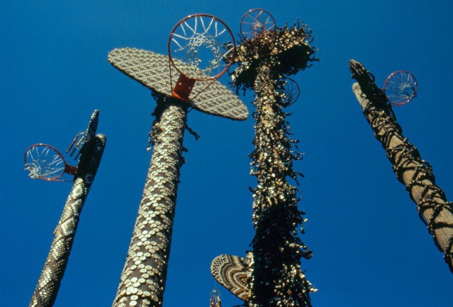
This pro-peace directive has become the rallying cry of The Non-Violence Project Foundation, a Switzerland-based nonprofit spreading the sculpture and its message internationally. Artist David Hammons addresses more ambiguous social concerns with Higher Goals, a conceptual sculpture that was revived three times throughout the eighties. Consisting of five decorated basketball hoops installed atop twenty to fifty-foot-tall telephone polls, the work was intended as the artist’s comment on young black men’s risky, misplaced delusions of becoming basketball stars. The first version of the work was installed in a vacant lot in Harlem in 1983, and the work’s second installation was sponsored by the Public Art Fund in 1986, this time in Columbus Park, Brooklyn. The work’s third version came in 1988 and was unfortunately destroyed by unknown assailants. Each of the five poles and hoops were studded with designs created in a labor-intensive process that involved nailing more than 10,000 bottle caps into the metal of the poles. The artist explains, “It takes five to play on a team, but there are thousands who want to play” — those thousands who don’t make the cut are represented by the bottle caps that climb up each pole. Although the work speaks directly to the recklessness of basing an entire future on the hopes of playing professional sports, conceptually the sculptures also speak more generally about the unattainability of commonplace goals like shooting a basket or getting an education for youth growing up in underserved communities.

David Hammons. Higher Goals, 1986. Photo: Public Art Fund.
Although this paper is only able to cover a small segment of the interventional public art supported by government agencies in the United States, a prevailing pattern becomes clear: at the nation’s founding, priority was given to patriotic, patriarchal works that worked to exemplify the values upheld by the fragile new republic. As America formed its identity and diversified the types of artwork it deemed worthy of public funds, art-in-the-public-space programs brought museum works to the streets, even if the public couldn’t fully understand them. Finally the trend of community-based public art evolved, and the government found itself supporting the viewpoints of diverse communities where activism was most rampant. The works have the greatest potential for catalyzing change when they’re developed as a voice for the community that surrounds them. As Patricia C. Phillips writes,
“Public art is about the free field — the play — of creative vision. The point is not just to produce another thing for people to admire, but to create an opportunity — a situation — that enables viewers to look back at the world with renewed perspectives and clear angles of vision.”
Sources
Architect of the Capitol. “Rosa Parks.” Last modified December 15, 2015. Accessed December 16, 2015.
Auyash, Sean. “The Knotted Gun: A Compelling Symbol for Non-Violence,” November 5, 2012. Foreign Affairs Review. Accessed December 12, 2015.
Bogart, Michele H. “The Rise and Demise of Civic Virtue.” Critical Issues in Public Art: Content, Context, and Controversy, 1992. Washington D.C.: Smithsonian Institution Press, 175-188.
Chin, Mel. “Revival Field.” Accessed December 14, 2015.
Deutsche, Rosalyn. “Public Art and Its Uses.” Critical Issues in Public Art: Content, Context, and Controversy, 1992. Washington D.C.: Smithsonian Institution Press, 158-170.
Disponzio, Joseph. “George Segal’s Sculpture on a Theme of Gay Liberation and the Sexual- Political Equivocation of Public Consciousness.” Critical Issues in Public Art: Content, Context, and Controversy, 1992. Washington D.C.: Smithsonian Institution Press, 199-214.
Gibson, Eric. “Public Art and the Public Realm.” Sculpture 7 (January-February 1998): 32.
Graves, Donna. “Representing the Race: Detroit’s Monument to Joe Louis.” Critical Issues in Public Art: Content, Context, and Controversy, 1992. Washington D.C.: Smithsonian Institution Press, 215-227.
Kwon, Miwon. “Sitings of Public Art: Integration versus Intervention.” One Place After Another: Site Specificity and Locational Identity. Cambridge, MA: MIT Press, 2002.
Lacy, Suzanne. Mapping the Terrain: New Genre Public Art. Seattle, WA: Bay Press, 1996.
Non-Violence: Inspiring Youth Through Education. “The Non-Violence Project Foundation.” Accessed December 12, 2015.
Phillips, Patricia C. “Public Constructions.” Mapping the Terrain: New Genre Public Art, 1996. Seattle, WA: Bay Press, 60-71.
Public Art Fund. “Barbara Kruger: Messages to the Public.” Accessed December 14, 2015.
Public Art Fund. “Barbara Kruger: Untitled [Bus Shelter Posters].” Accessed December 14, 2015.
Public Art Fund. “David Hammons: Higher Goals.” Accessed December 14, 2015.
Senie, Harriet F. “Baboons, Pet Rocks, and Bomb Threats: Public Art and Public Perception.” Critical Issues in Public Art: Content, Context, and Controversy, 1992. Washington D.C.: Smithsonian Institution Press, 237-276.
Senie, Harriet F. and Sally Webster. Critical Issues in Public Art: Content, Context, and Controversy. Washington D.C.: Smithsonian Institution Press, 1992.
Steinman, Susan Leibovitz. “Directional Signs: A Compendium of Artists’ Works.” Mapping the Terrain: New Genre Public Art, 1996. Seattle, WA: Bay Press, 186-291.
Stiles, Kristine and Peter Selz. Theories and Documents of Contemporary Art: A Sourcebook of Artists’ Writings. Berkeley, CA: University of California Press.
Suzanne Lacy. “Three Weeks in May (1970).” Accessed December 11, 2015..
Mar 17, 2016 | installation, political art
I’m taking a class at Pratt called Installation Art: Design & Change, and we’ve been pairing up installation works as a weekly assignment. This is my first one!

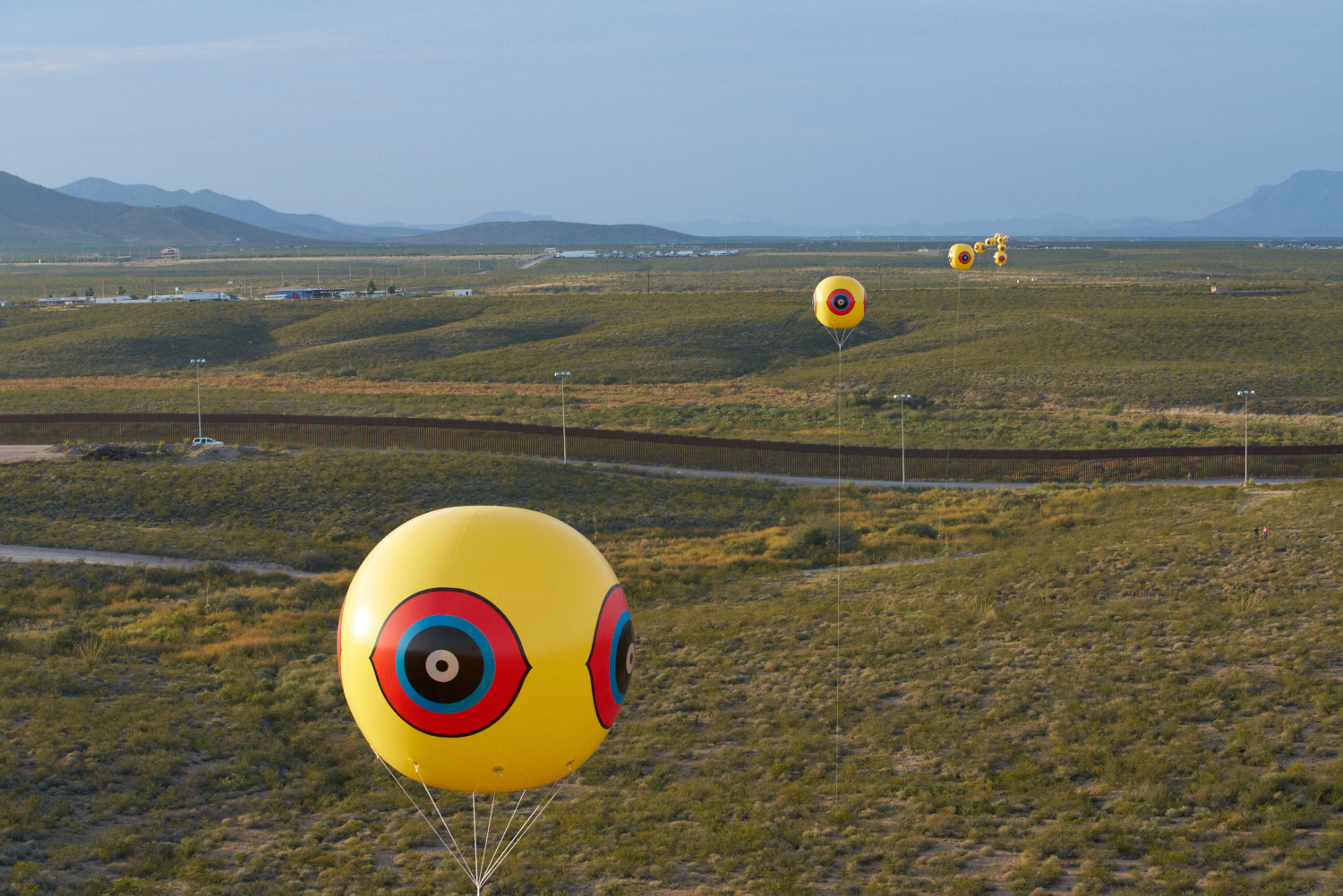
Postcommodity, Repellent Fence / Valla Repelente, October 9-12, 2015. Between the US/Mexico border cities of Douglas, Arizona and Agua Prieta, Sonora . Twenty-eight tethered balloons, 10 x 10 feet each.

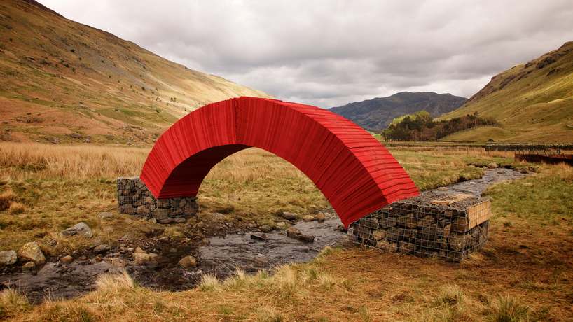
Steve Messam, PaperBridge, May 8-18, 2015. At the top of the Grisedale Valley, Patterdale, Cumbria, UK. 20,000 sheets of paper, four tons of found stone, 16.4 x 5.9 x 2.95 feet.
Both temporary installations in different kinds of wilderness, Postcommodity and Steve Messam’s work cross very different boundaries. Messam’s traverses a natural barrier while Postcommodity’s bisects a manmade one. Repellent Fencewas a community-backed two-mile long fence that traced an ancient trade route from Mexico through Arizona, nearly perpendicular to the border. The “scare-eye” design has indigenous origins and is still used to repel birds. Here the design seems to repel people—ancient indigenous travelers and their descendants in particular—warning them that the route is no longer safe because the US (a comparatively new nation) is obsessed with border security. At the same time, the two-mile installation sutures the divided nations together again.
While Repellent Fence confronts conceptual boundaries, Paperbridge defies physical ones. The paper’s wood pulp material mimics the wood that typical bridges are made of, while its bright red color lights up the landscape. Both works defy gravity in their own way. Repellent Fence flies 100 feet above the desert landscape and Paperbridge uses pressure to push out and up to allow safe passage over a stream in the northern UK. But the motivations behind the creation of these installations could not be more different. Postcommodity is a collective of three indigenous artists using projects like Repellent Fence to bring attention to oppressed Native Americans and migrant workers, while Steve Messam was commissioned to create Paperbridge.
I learned about Repellent Fence through an interview with the artists I worked on for ART21 Magazine.
You can also read my classmate’s pairings for this week on the Pairings: Blog set up by our professor, Kim Connerton, PhD.
Jan 24, 2016 | political art, street art

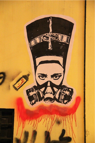
“Nefertiti”
El Zeft
Cairo, 2012
The Arab Spring that shook the Middle East saw two huge waves of protest in Egypt, both with nationalist and feminist undertones. The first in January 2011 overthrew President Hosni Mubarak whose 30-year reign saw a massive oppression of the Egyptian people perpetuated through overwhelming police brutality and corruption of power. The second began in June 2013 and overthrew newly elected President Mohamed Morsi whose rewrite of the Egyptian Constitution granted himself unlimited governmental powers. The Internet’s social tools gave these movements a global audience, and many women were directly involved in the organization and rallying of these revolutions. When the protests themselves transformed into a place of abuse and harassment for women — both by government forces and fellow protestors — outrage sparked a galvanized feminist movement desperate to protect Egyptian women from further harm. This movement was visualized on the streets of Cairo, Alexandria, Mansoura and Suez, where images of powerful women were painted as a feminist voice amongst the revolutionary graffiti that gave the uprisings a uniting cultural vision.
The newfound unification of the Egyptian people against their tyrannical government erupted on January 25, 2011, and was fueled by women as much as men. Young bloggers like Asmaa Mahfouz and Esraa Abdel Fattah rallied all Egyptians to join the protest through flyers, Youtube videos and blog posts. In the days leading up to Mubarak’s resignation, the women protesting in Tahrir Square accounted for 40-50 percent of the activists, when in previous protests they had accounted for 10 percent at most. Following the overthrow of Mubarak, all sense of solidarity between genders, religions and social classes seems to have vanished. In March 2011 a march in honor of International Women’s Day in Tahrir Square ended disastrously. After weeks of protest groups numbering in the hundreds of thousands, only a couple hundred women and a handful of men gathered in support of giving women a voice in the formation of a new Egypt. The protestors were soon surrounded by swarms of men hurling insults and even sexually harassing and groping women. Sami Sade, a journalist for Rose Al Youssef said, “They were shouted at by some men who told them to ‘go back to the kitchen.’” The protesters were chased from the square and those who returned the following day only found more hostility. Amnesty International reported that on March 9, 2011, 18 women were detained and tortured by security forces. All but one were strip searched and forced to undergo “virginity tests.” Several received one-year suspended sentences for charges including disorderly conduct, destroying property, obstructing traffic and possession of weapons.
The abuse of women only continued throughout Egypt’s subsequent protests. On the second anniversary of Egypt’s revolution, 43-year-old freelance journalist Hania Moheeb went to Tahrir Square to join the celebration, but the atmosphere was remarkably different than it had been two years before. “Something was wrong. There were negative vibes in the air,” she told the BBC, “All of a sudden I found myself inside a very, very huge circle of men who were attacking every inch of my body.” Hundreds of men participated in and witnessed Moheeb being stripped, brutally raped and strangled with the scarf around her neck. The attack lasted for more than a half hour, and five of her attackers even followed her into the ambulance where they continued assaulting her. This is only one horrific example of the violence inflicted on Egyptian women by men who face no consequences for their actions — often security and government officers are the ones perpetrating the abuse, whether verbal or physical. Ninety-nine percent of Egyptian women have reported experiencing some form of sexual harassment, and 96.5% reported some form of physical violation. The 10 days of protests that ousted President Mohamed Morsi in June and July 2013 saw 186 reported cases of harassment and abuse. In 2013 Thomson Reuters found Egypt to be the worst country for women outranking Iraq, Saudi Arabia and Syria. The so-called “circle of hell” ambush Moheeb experienced has become so common in Egyptian protest environments that Researcher at Nazra for Feminist Studies, Masa Amir has identified the strategy as a premeditated trap where men comb the crowd looking for women to attack, and as many as three circles of men surround her and prevent her escape. The circle closest to her strips and molests her, the second circle acts as if they are trying to get past the innermost circle to help (but when and if they do only perpetrate more abuse), and the third circle distracts the other people in the square from realizing what’s happening.
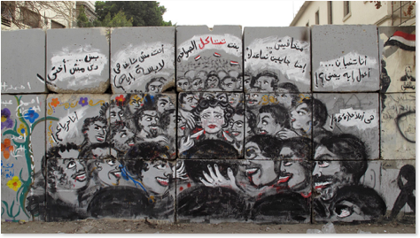
More than three such circles surround the woman in Egyptian artist Mira Shihadeh’s mural depicting the trauma suffered by Moheeb in Tahrir Square in 2013. Titled “Circle of Hell,” the painting shows a saddened solitary woman gazing out at the viewer, surrounded by those three circles of attackers on either side, with the crowd of thirsting men appearing to continue endlessly in the background and foreground. Blood pours from the men’s mouths and two knives point toward the woman’s neck. A reminder of a horrific event that’s become commonplace and inconsequential, the mural speaks to Egyptian women as a warning, and Egyptian men as a cautionary tale, or in some cases a mirror. Shihadeh’s work might be syntactically simple and formally caricatured, but its basis in real-life events and the Egyptian flags that fly in the background reveal just how unsuccessful the Egyptian Revolution was for so many of the people who fought for change.

“Circle of Hell”
Mira Shihadeh and El Zeft
Cairo, 2014
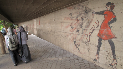
Shihadeh has painted other images of women suffering at the hands of men, but her most recognizable piece is a woman fighting back. A woman in heels with her hand on her hip uses a can of spray paint to drown miniaturized figures coming toward her. Shihadeh has painted multiple versions of this image; sometimes the woman is veiled other times her hair flows free, sometimes she’s dressed in red, other times in white, and in still others she’s just a silhouette. But in every iteration the words “no to sexual harassment” are written in Arabic beneath the outpouring of paint from her can.

Mira Shihadeh
Cairo, 2013

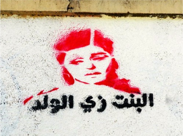
“Girls and Boys are equal”
Nooneswa
Mohamed Mahmoud Street, Cairo, 2011
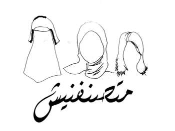
The incredible increase in violence against Egyptian women since the Revolution has sparked the creation of dozens of murals and stencils painted in public spaces; works intended to humanize women, both by revealing the despair of their helplessness like in “Circle of Hell,” and by showing how powerful women are and have been throughout Egypt’s history. Many of the murals and street artworks created have been supported by newly formed graffiti and street art organizations, determined to foster social change with just paint. Artist and activist Merna Thomas cofounded the community NooNeswa (Noon El Neswa) in 2012 as a way to combat the graffiti that appeared during and after the January 2011 revolution that spoke just to men and were often derogatory towards women. On the one-year anniversary of the “virginity tests” that occurred the day after the failed International Women’s Day march, the group launched their project “Graffiti Harimi,” a graffiti campaign that created stencils of powerful Egyptian women alongside text advocating for women’s equality. One of the most popular stencils depicts iconic Egyptian actress Soad Hosny above the text “A Girl is just like a Boy.” In an interview for the documentary “Shout Art Loud,” Thomas said “Graffiti has this power to insert some images or some messages to people very subliminally or very unconsciously because if you’re passing by an image for a long time, for months, for a year, it starts talking to you, you start having a dialogue with it.” Another of NooNeswa’s stencils shows the outlines of three women’s faces: the first wears a niqab that covers her head and face, the second wears a hijab that covers her hair and the third wears no headscarf at all. Beneath reads the text “Don’t label me,” a powerful message that illustrates the choice of veiling as the personal decision it is, one belonging only to the women who choose to wear it.

“Don’t label me”
Nooneswa
Stencil design, 2012
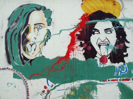
Another influential street art group is the organization Women On Walls (WOW) which began in 2013 as women-empowerment graffiti initiative. Its first edition included a collaborative mural covering the inside of a cement garage in Cairo and additional murals in Cairo, Alexandria, Luxor and Mansoura. Prior to painting in Mansoura, the WOW artists engaged the local women in a discussion on the issues that concerned them most so that the walls could be a direct reflection of the community’s needs. While sexual harassment is at the forefront of women’s issues in Cairo, in Mansoura the women said they’re worried about money and the role their appearances play in attaining financial security. In response, artist Ghadir Wagdy painted three successive women’s faces with free flowing hair and their mouths wide open, tongues stuck out in an act of rebellion.

“Exorcism” (detail)
Ghadir Wagdy
Mansoura, 2013
WOW has brought subsequent editions of its campaign to Egypt each year since its launch. In 2014, 20 Egyptian artists collaborated on murals for two additional Cairo walls that focused on the theme ‘Women in the Public Space.’ In 2015 they organized a week-long graffiti celebration called WOW Unchained, which included film screenings and a closing event of music and performances. Twenty artists from all over the Middle East and Sweden gathered to paint together on a wall at Cairo’s technology office park, the GrEEK Campus. The building’s face included an open graffiti wall that invited the public to write and draw messages and images in support of women and women’s rights.
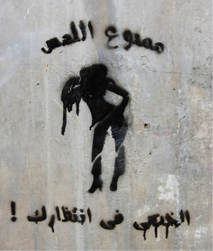
Although most women unsurprisingly feel more comfortable painting in large groups with organizational support, many brave women go out to stencil or paint their work alone. Hend Kheera, a 28-year-old structural engineer and fashion designer first started stenciling during the 2011 uprising. She goes out early in the morning to paint before heading to work, “so no one gives me any trouble,” she told Rolling Stone in a 2012 interview. She’s painted many political works directly antagonizing Egypt’s disappointing series of failed leaders, but syntactically her works resemble NooNeswa’s “Graffiti Harimi” project. She creates portraits of famous Egyptian celebrities above text demanding that women be respected. Generally her work is more controversial, as the text she includes often forcefully demands or threatens men on behalf of women, taking an aggressive and some might even say masculine approach to address abusers and harassers. One of her most well-known works shows the back of a woman’s silhouette; she has one hand on her hip and another on her shoulder in an exaggerated pose, surrounded by the words “Don’t touch or castration awaits you.” “You write on a wall in the street to speak to people,” Kheera said, “[Artists] have a tool not many people have — to express themselves — and maybe they can capture something nobody notices, focus on it and somehow show it in a visually beautiful way.”

“Don’t Touch”
Hend Kheera
Cairo, 2013
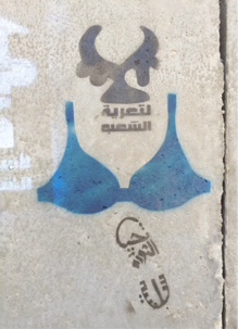
Another woman working to change how women are viewed through street art is Lebanese-Egyptian art historian Bahia Shehab who created the “A Thousand Times No” campaign during the 2011 revolution. “I am a quiet person, I don’t know how to scream,” she told Denmark’s Louisiana Museum of Modern Art in 2014. “My contribution to the revolution was to paint on the walls, was to be an artist.” The title of the series comes from a common Arabic saying that’s meant to confirm and emphasize rejection. She collected a thousand symbols that play on the word “no” in Arabic script and represent facets of oppression in Egypt’s long history. These she transformed into stencils that demand a stop to the tyranny, to the burning of books, to military rule, and to the stripping of women. That last one took the form of a stencil of a blue bra accompanied by the text “No to the stripping of people” — a direct reference to a video that surfaced during the 2011 protests of a woman being beaten by police who stripped her of her clothes and revealed her blue bra. “The blue bra is to remind us of our shame as a nation when we allow a veiled woman to be stripped and beaten on the street,” Shehab explained in a 2012 TED Talk. The blue stencil is often accompanied by a footprint that reads “Long live a peaceful revolution.” “My work is more concerned with memory, because of the intensity and speed of events people tend to forget,” she said.

“No to the stripping of people”
Bahia Shehab
Cairo, 2012
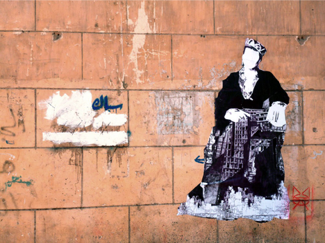
Some street artists refer to themselves only by their tag names, so there’s no way of knowing if they’re men or women. One such artist is The Mozza, a street artist working in wheat paste throughout Cairo. The Mozza’s work is exclusively portraits of women, usually done in black-and-white with intricate patterns inscribed within the folds of their clothing and veils. Some of the women are conversing with one another, some are solitary figures, but all of them are faceless — a circle of white devoid of a mouth to speak their minds and eyes to bear witness to what surrounds them. These works simultaneously speak to men and women, confronting men about the way they see women as objects undeserving of what makes someone human. Alternatively, the series allows both men and women to see themselves or their loved ones faces within the figures, in a sense transforming them into representations of the every-woman. Perhaps the most important are images created of women in positions of power. In one piece completed in Cairo, a crowned woman seated in nobility is holding the abstracted framework of a building in her lap. Her air of authority and the fact that she’s not overtly female makes the image more approachable to men, while showing every girl and woman the queen she can be.

The Mozza
Wheatpaste
Suburb of Cairo, 2014

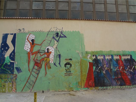
“Marching Women / Women Climbing Ladder”
Alaa Awaad
Cairo, 2012
Male street artists have also played a huge role in creating women-centric works in Egypt. Alaa Awad is an artist and Assistant Lecturer in Fine Art Luxor’s painting department. In 2012 he painted neo-pharaonic scenes of powerful women. “Marching Women/Women Climbing the Ladder” was compositionally based on a carving in the wall of the Ramesseum temple, the mortuary temple of Pharaoh Ramesses II constructed in the 13th century BCE. Awad’s large-scale mural painted in Cairo shows one group of women holding scrolls representative of knowledge walking forcefully in unison towards three women climbing a ladder. In the depiction in the Ramessuem temple the ladder leads to the afterlife where the deceased Pharaoh waits for them, but in Awad’s depiction the ladder leads towards progress, and only women see the necessity of reaching the top.

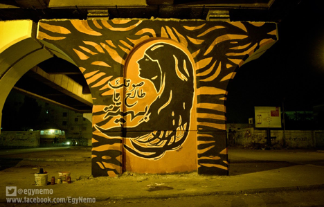
“Baheia, your voice is rising”
NeMo
Mansoura, 2013
This and many of Awad’s other works visually express the importance women have always had in the fostering of Egypt: “We can’t know our future if we forget our past,” he said. Popular Egyptian street artist NeMo has also created works in support of women. A 2013 mural painted under a bridge in Mansoura is titled “Baheia, your voice is rising.” It shows the profiled silhouette of a woman with her head scarf and hair flowing out beneath her, the waves of black echoed in the leaf-like pattern surrounding the portrait. Baheia refers to a common Arabic name for girls that means “beautiful” or “brilliant.” Perhaps the most famous example of feminist street art in Egypt is El Zeft’s 2012 portrayal of 14th century BCE Queen Nefertiti with a gas mask on her face. He shared a photo of the work online with the caption: “A tribute to all women in our beloved Revolution. Without you we wouldn’t have gotten this far. Thank you.” Nefertiti stares straight at the viewer with a look of defiance, protected both against the tear gas unleashed on protestors and against the fumes from her own spray paint cans.

“Nefertiti”
El Zeft
Cairo, 2012
A small victory for this movement was won when sexual harassment was criminalized in June 2014, punishable by up to five years in prison. But unfortunately vaginal penetration is the only form of abuse that can be prosecuted, so women who are molested in other ways still have no protection. The rising violence against women has been combatted with art in numerous ways both indoor and out, but this essay samples the most well-known and widespread examples. The earliest works were direct references to specific traumatic events, like a visual memory bank reminding the Egyptian community that the 2011 uprisings brought suffering along with the success of ousting the Mubarak regime. Nearly all of the street art supporting Egyptian women is figurative, collectively working to visually separate a woman’s body and face as entities distinct from her value as a human being. The inclusion of text takes some of these works a step further, ensuring that the meaning isn’t misinterpreted. Some of the pieces use aesthetics to draw the viewer in to contemplate meaning, but all of them share the common message that women contribute value to society outside the home. “In our case, we are not trying to install beauty. We have not yet reached that level,” Bahia Shehab said, “We communicate ideas of change to society. Because we believe in change and we believe in art as a tool for change. We are still in survival mode.”
Sources
Alaa Awad — the artist —. علاء عوض. “The Missing Murals.” Accessed October 17, 2015. http://alaa- awad.com/the-missing-murals.
Amnesty International. “Egypt: Admission of force ‘virginity tests’ must lead to justice,” May 31, 2011. Accessed October 15, 2015. https://www.amnesty.org/en/latest/news/2011/05/egypt-admission- forced-virginity-tests-must-lead-justice.
Biggs, Cassie. “Women make their power felt in Egypt’s revolution.” The National, February 14, 2011. Accessed October 14, 2015. http://www.thenational.ae/news/world/middle-east/women-make- their-power-felt-in-egypts-revolution.
Coletu, Ebony. “Visualizing Revolution: The Politics of Paint in Tahrir.” Jadaliyya, April 18, 2012. Accessed October 16, 2015. http://www.jadaliyya.com/pages/index/5136/visualizing- revolution_the-politics-of-paint-in-ta.
Downey, Michael. “The Writings on the Wall.” Rolling Stone: June 2012.
El-Rifae, Yasmin. “Egypt’s Sexual Harassment Law: An Insufficient Measure to End Sexual Violence.” Middle East Institute: July 17, 2014. Accessed October 21, 2015. http://www.mei.edu/content/at/ egypts-sexual-harassment-law-insufficient-measure-end-sexual-violence.
Guerin, Orla. “Egypt sex assault victims face long wait for justice.” BBC News: Cairo, October 24, 2013. Accessed October 14, 2015. http://www.bbc.com/news/world-middle-east-24657713.
Kearl, Holly. Stop Global Street Harassment: Growing Activism Around the World. (Santa Barbara: Praeger, 2015), 41-45.
Khamis, Sahar. “The Arab ‘Feminist’ Spring?” Feminist Studies, Vol. 37, No. 3, Feminist Histories and Institutional Practices (Fall 2011), p. 692-95.
Louisiana Channel. “Bahia Shehab: Art as a Tool for Change.” Louisiana Museum of Modern Art: 2014. Accessed October 15, 2015. http://channel.louisiana.dk/video/bahia-shehab-art-tool-change.
NeMo .. Just Street Artist. “صوتك طالع يا بهية Baheia, your voice is rising.” Accessed October 20, 2015. http://egynemo.blogspot.com.eg/2013/10/baheia-your-voice-is-raising.html.
Pangburn, DJ. “Street artist El Zeft pays tribute to Egypt’s female rebels.” death and taxes, September 27, 2012. Accessed October 19, 2015. http://www.deathandtaxesmag.com/189107/street-artist-el- zeft-pays-tribute-to-egypts-female-rebels.
Patry, Melody. Shout Art Loud. Cairo, Egypt: Index on Censorship, 2014. https:// www.indexoncensorship.org/shoutartloud.
Schultz, Colin. “In Egypt, 99 Percent of Women Have Been Sexually Harassed.” Smithsonian Magazine, June 13, 2014. Accessed October 14, 2015. http://www.smithsonianmag.com/smart-news/ egypt-99-women-have-been-sexually-harassed-180951726.
Shehab, Bahia. “A thousand times no.” Filmed June 2012, TED Talk. Accessed October 13, 2005. https:// www.ted.com/talks/bahia_shehab_a_thousand_times_no.
Sholkamy, Hania. “Women Are Also Part of This Revolution.” In Arab Spring in Egypt, edited by Bahgat Korany and Rabab El-Mahdi, 153-174, American University in Cairo Press, 2012.
The Mozza. “in the daytime….” Accessed October 20, 2015. http://themozza.tumblr.com.
Thomson Reuters Foundation. Annual Report: Inform. Connect. Empower. London: 2013. Accessed October 15, 2015. http://www.trust.org/documents/annual-report-2013.pdf.
United Press International (UPI). Activists: Rapists use ‘circle of hell.’ Cairo: February 21, 2013. Accessed October 14, 2015. http://www.upi.com/Top_News/World-News/2013/02/21/Activists- Rapists-use-circle-of-hell/UPI-61851361480254/#ixzz2LvSOXlfp.
Women On Walls. “About WOW 2013.” Accessed October 12, 2015. http://womenonwalls.org/in- mansoura-join-us-or-if-you-cant-follow-our-daily-journal-and-flickr.
Women On Walls. “Site 1: Boursa Cafe’ Area.” Accessed October 12, 2015. http://womenonwalls.org/ site-1-boursa-cafe-area.
Women On Walls. “WOW UNCHAINED.” Accessed October 12, 2015. http://womenonwalls.org/wow- unchained.

