Apr 22, 2013 | features, Museum of Fine Arts: Boston, museums
My little sister came to visit me in Boston a couple of weeks ago, so I took her to museums and a Boston Symphony Orchestra performance that she enjoyed more than I did (she’s a pretty talented flautist, so it figures). Carrie’s turning sixteen on Friday (!!) and I was really interested in getting her take on art, so we went to the Museum of Fine Arts here in Boston on a pay-what-you-wish Wednesday night and had the best time.
She’s only fifteen but she’s pretty brilliant. Sometimes she’d mention a comment about a painting or sculpture I’d spent hours studying, and point out something I didn’t even think to consider. Because with art, what you know doesn’t matter as much as what you see, and how you view it through your own lens of experience.
Inspired by the new People’s Choice section, read on to meet Carrie and hear what she thinks about five masterpieces on view at the Museum of Fine Arts Boston:

Hi! My name is Carrie Davis. I’m currently a sophomore at Fairhope High School, and I just happen to be the little sister of the creator of the site you’re on right now. Music is my passion, but I recently went to the Museum of Fine Art with my sister so she’s putting me to work by writing about these lovely pieces of art. I also enjoy playing the flute, riding my horse, long walks on the beach, and bacon. HAVE A GREAT DAY, OKAY?
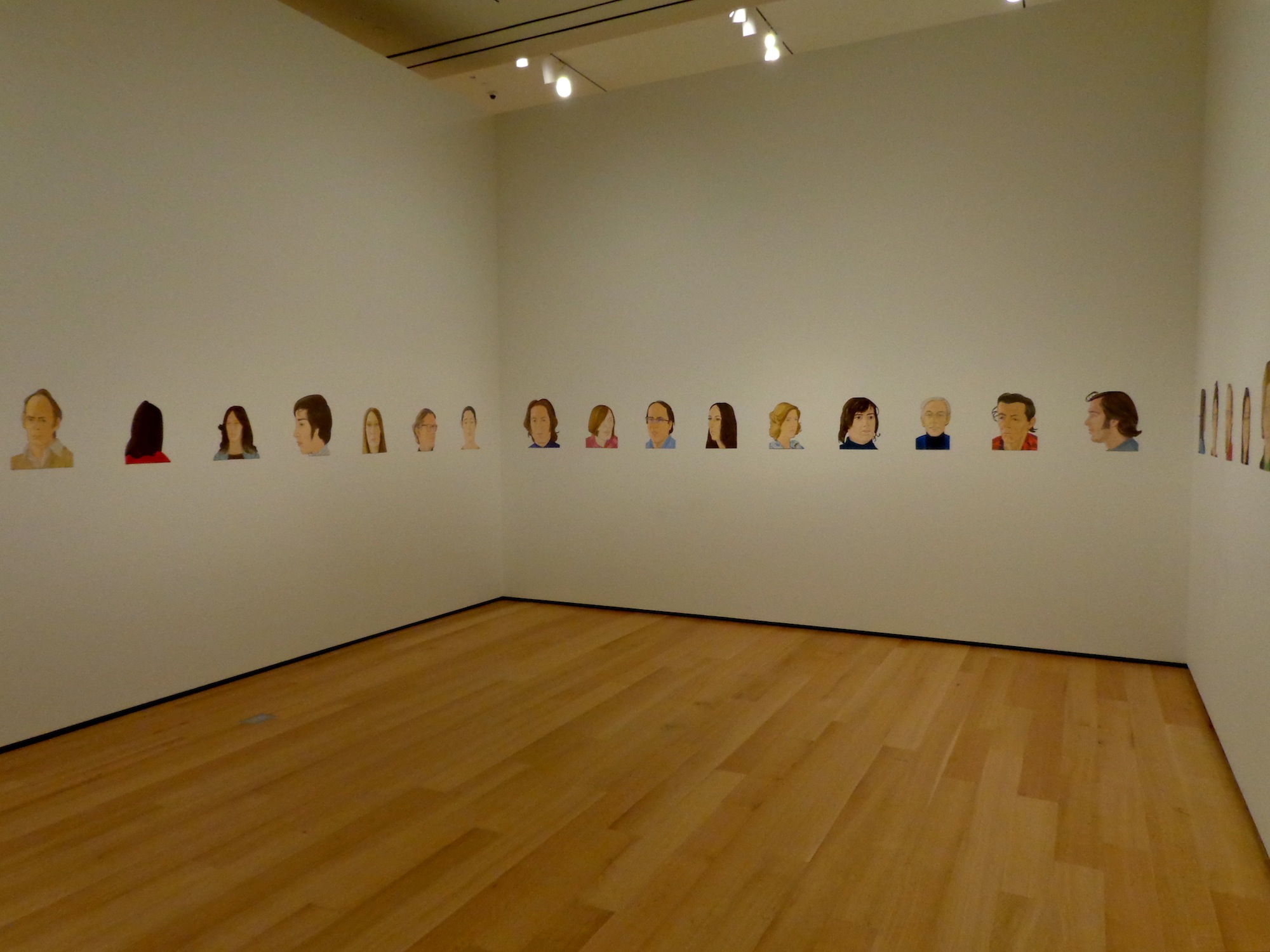
Alex Katz, “Rush,” 1971
Rush makes me curious as to who the inspirations are, or where they came from. I love the emotion in the faces, too. It’s very interesting how some of the faces are shown straight on, some show their profiles, and others only show the back side of their head.
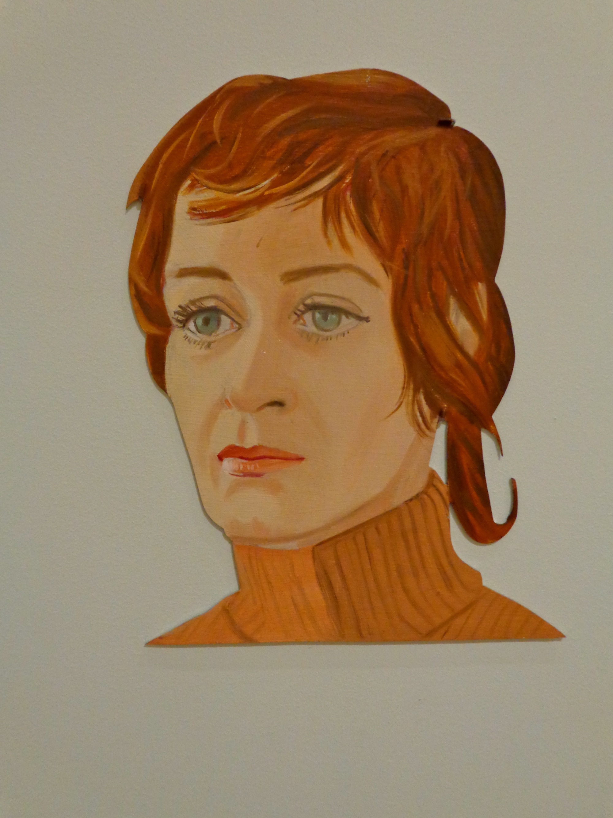
Detail, Alex Katz, “Rush,” 1971
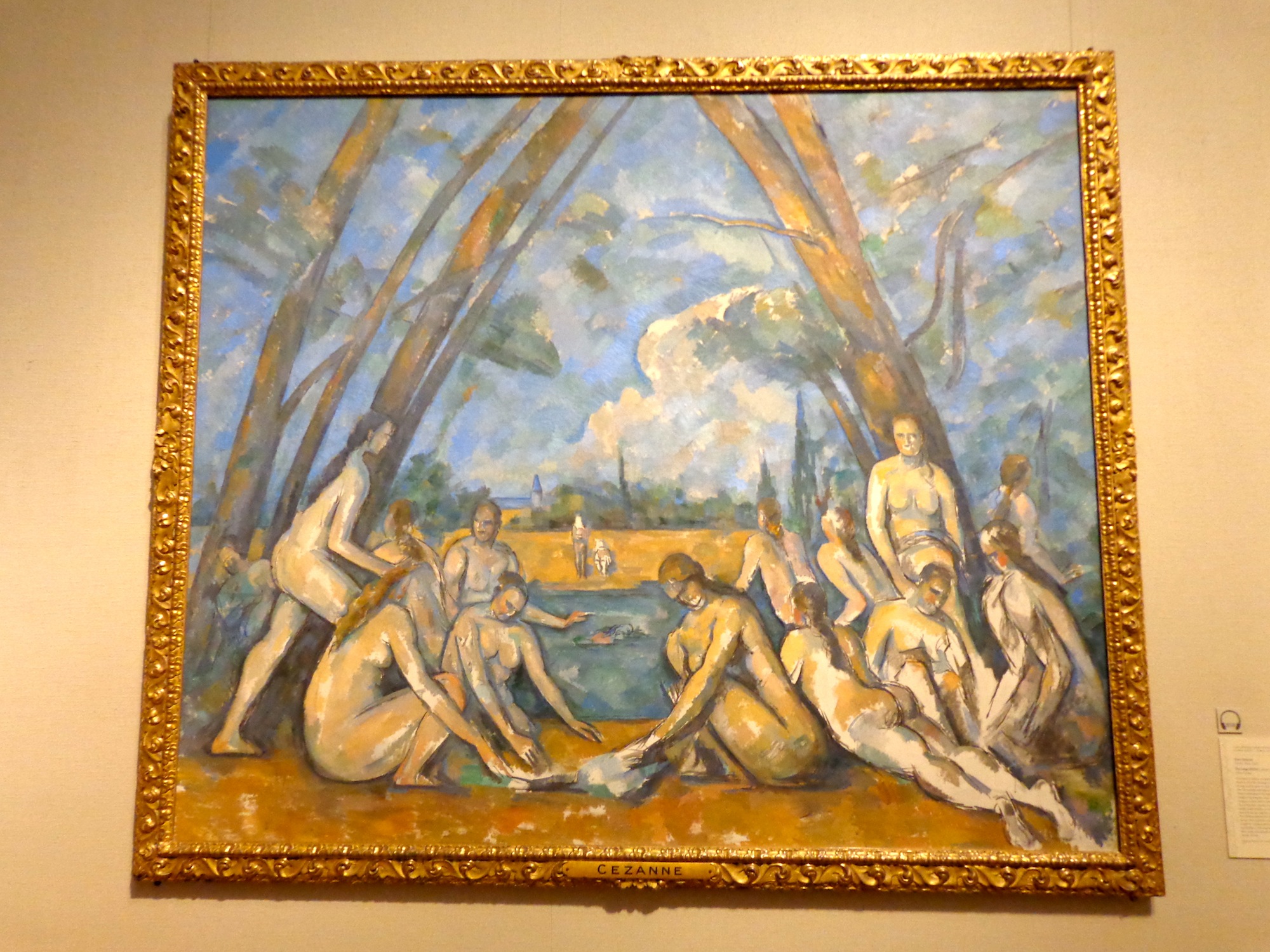
Paul Cezanne, “The Large Bathers,” 1879-1906
Paul Cézanne uses an almost watercolor looking technique in The Large Bathers to get a beautiful contrast of colors between the sky and the nature. The women in the painting appear to be doing the cliché deeds of women in the early 1900s when this artifact was created, which gives the viewer a glimpse back into time. The one thing I’m most curious about is the town in the background. It seems to be civilized, yet the people are nude. Could they be a different civilization of people, or possibly a single nudist colony? I’m in love with the way Cézanne makes you think and consider the possibilities of these lovely creatures.
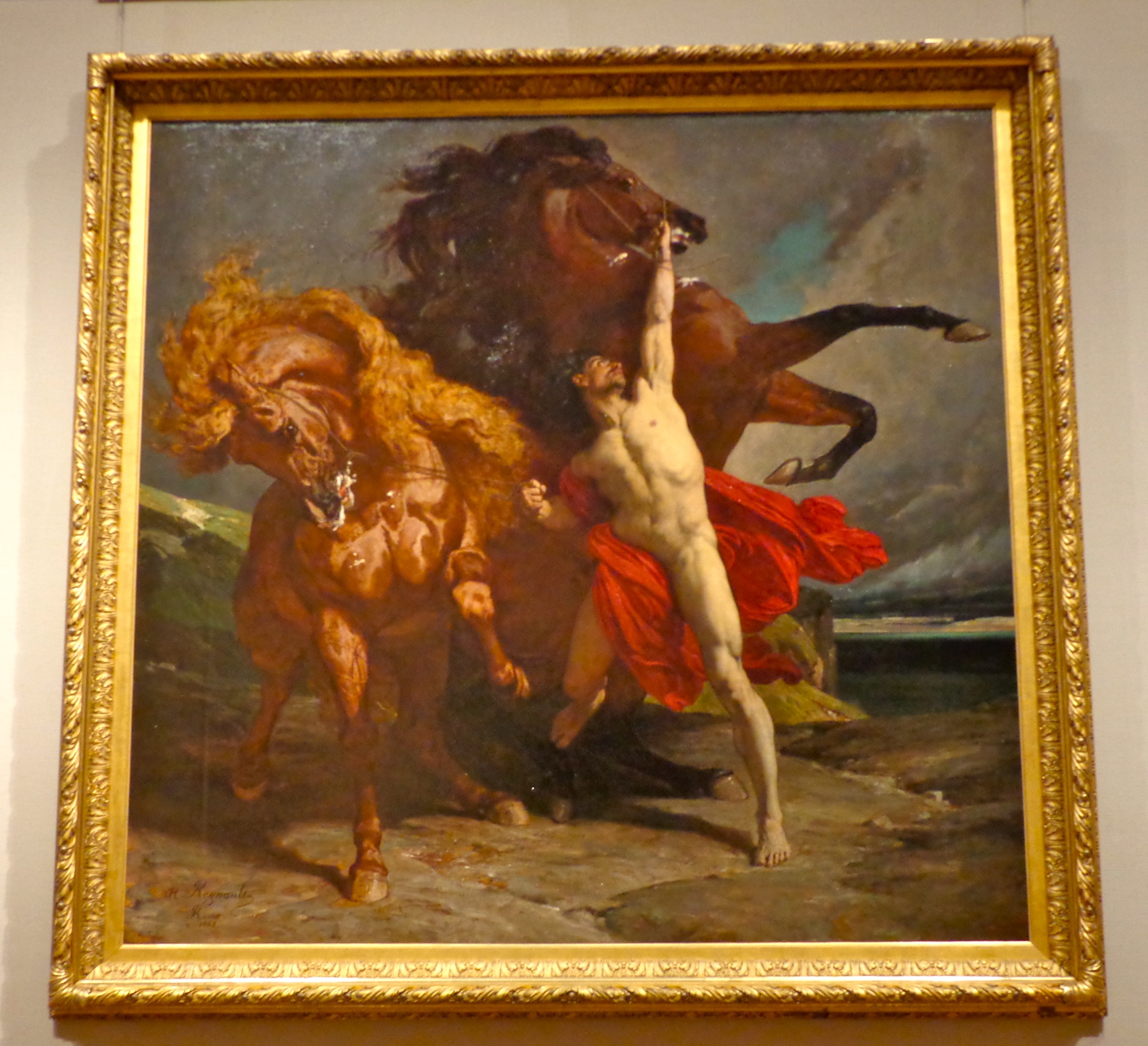
Alexandre-Georges-Henri Regnault, “Automedon with the Horses of Achilles,” 1868
The strength and fury of the horses in Automedon with the Horses of Achilles puts me in awe of how much bravery that man (Achilles?) must have. The foaming mouths of the horses as they rear up to the protagonist of the painting makes me astonished by the man’s power. This painting was at least eight feet tall, creating an entirely new feature that a computer screen lacks. The frame of the piece is very forceful. It looks like something that would be in a literary work by Homer. The raging horses, along with the raging ocean makes for an angry and terrifying mood.
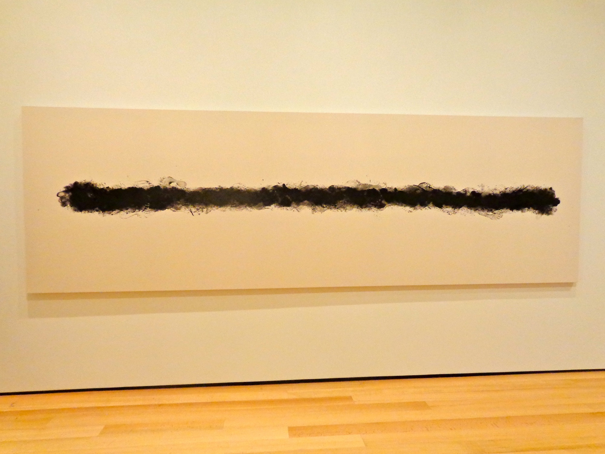
Annette Lemieux, “Pacing,” 1988
Pacing, by Annette Lemieux, is quite inspirational. It was created so simply, yet it’s so beautiful and interesting to look at. I love how most of the foot prints are very concealed, yet the ones on the outside are so detailed and noticeable.
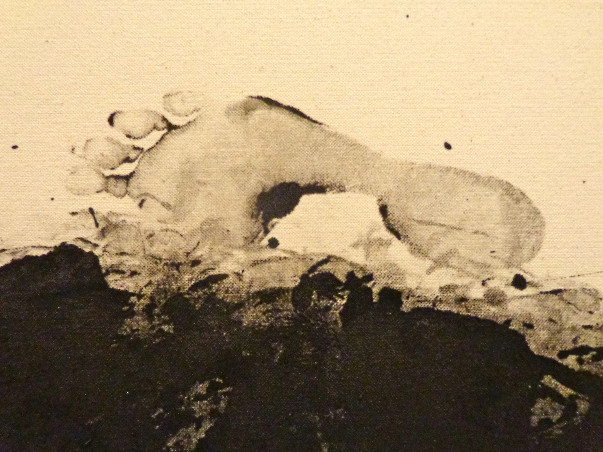
Detail, Annette Lemieux, “Pacing,” 1988
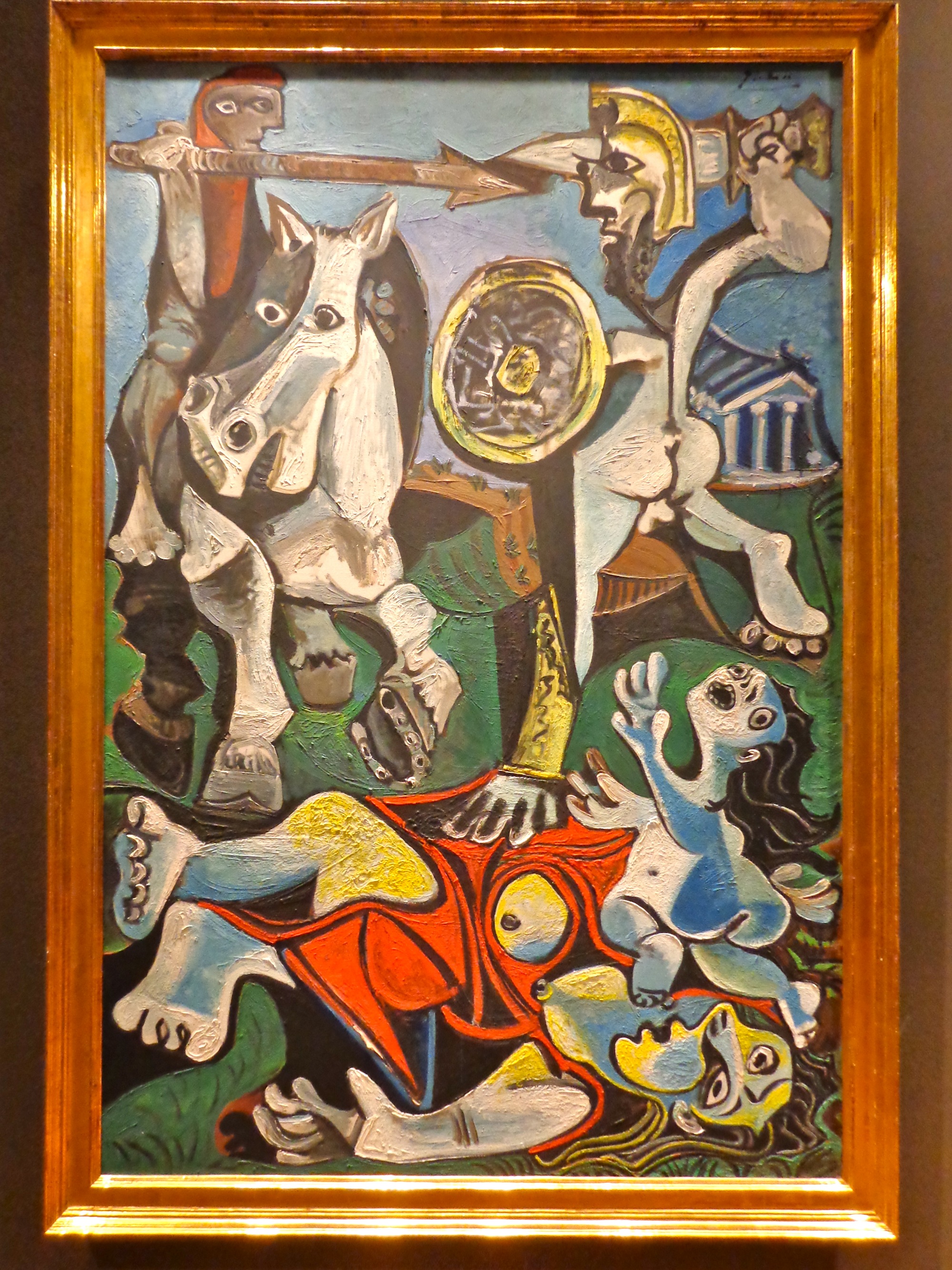
Pablo Picasso, “Rape of the Sabine Women,” 1963
In the Rape of the Sabine Women by Pablo Piccaso it makes me sad for the victims in the painting. The men want them so desperately, and are willing to hurt them in order to obtain that power. The poor child appears to be crying out for the men to cease, but they so crave the power and the sense of control that winning this brawl will give them.
For more from Carrie, you can follow her on Twitter, and be sure to wish her a happy birthday!
If you have your own impressions you’d like to share, use this form to join the People’s Choice Project and get your own post just like this one.
Jul 9, 2012 | MoMA, Museum of Fine Arts: Boston, museums

Favorite: Museum of Fine Arts, Boston
You can probably tell by all the MFA pieces I’ve been posting recently that I’m kind of smitten. From the outside, it looks like a mini-Met, but inside the rooms are more specifically decorated for the kinds of art within them. For instance the ancient Etruscan/Persian room is lined with geometric shapes with yellow/brown walls, while the contemporary art (in a completely different part of the building) is in a huge open room with white walls and high ceilings. Each room you walk into changes your mindset, and makes you more receptive to what’s inside.
There’s even a long, tall hallway filled with Renaissance paintings stacked on top of one another. It reminded me of the National Gallery in London or the Louvre, both filled with tall rooms of painting on top of painting next to painting. A part of me hates rooms like this because it doesn’t give each piece the space it deserves, but most of me loves the impressiveness of all those beautiful things so close to each other.
They also have these great “Conservation in Action” rooms where you can see works of art in the process of being preserved. There’s clear glass separating you from the preservationist’s workroom and they write notes on a blackboard about what step of the process they’re on

and what else it will take to keep the work in good condition. I’ve never seen a room like this in a museum before, but now I really think they all should have them, because anyone interested in seeing art and ancient artifacts would definitely be interested in what it takes to keep these things around.
Aside from being well-curated with beautiful rooms, the museum has a really solid collection– both in ancient art and contemporary, a feat not easily accomplished. They have the Red and Black Room wall paintings from ancient Rome, gold-lit rooms of Egyptian hieroglyphics, plus the standards by Warhol and Chuck Close. It’s also one of the few museums that actually had great contemporary art, including Manhole by Ivan Navarro (right, 2011) and some I’ve already written about like Cecily Brown’s Skulldiver III. Of course there’s always that “Black Panel” that sneaks in under the guise of ambiguity and draw-your-own-conclusion nonsense, but for the most part this place is filled to the brim with must-sees.
Least Favorite: Museum of Modern Art, New York
Now that I’ve been living in New York for a while, this and the Met are probably the museums I frequent the most. And every time I go I think, “Maybe this time they’ll step it up,” but unfortunately most of it is just trash– and I mean literal trash. I think it was supposed to be some sort of comment on the wastefulness of our society, but I’ll never forget walking into one of the temporary first floor galleries and just seeing random piles of trash sectioned off as “art.” Which is pretty lazy art if you ask me.
Maybe it’s because I just don’t “get” modern art most of the time, but I really don’t understand most of what this place chooses to showcase. The reason art is so great is because it takes time and talent and actual thought, and to me, calling everything you make “Untitled” is just a cop-out for not having a reason for making it in the first place.
The permanent collection is what I go to see. Of course there’s Starry Night and they recently acquired Monet’s Water Lillies (although I’m not sure for how long), but the new exhibits on the top and bottom-most floors are usually not worth taking the escalator to see. I know some people enjoyed the Cindy Sherman exhibit, but if I wanted to see a narcissistic Halloween party I would have stayed home and played dress-up myself.
I just feel like there’s so much potential for the temporary exhibits, and so much of it is wasted on blurry photographs and type-print posters. The Paining and Sculpture exhibits on the fourth and fifth floors make the MoMA worth going to, there’s just nothing to come back for once you’ve seen the good stuff. I recommend going on Friday afternoons when it’s free– just be prepared to elbow some tourists if you want to see what’s worth seeing.
More photos of the MFA (all taken by me):
Jun 28, 2012 | Museum of Fine Arts: Boston, painting
I absolutely love portraits of women. There are so many layers to them that any other kind of portrait seems to lack. Especially in older portraits like this one, there are all sorts of things to wonder about. Like did she want to be portrayed this way, and which parts of the portrait exist because of her input and not that of the painter or her father/husband? She was a New York society girl with a well-off family, but did she dress herself or did she have others do it for her? And my biggest question: why does her pinky linger at her mouth? It seems to be a pose representing deep thought and high status, but some part of me wishes she was doing it ironically.
 |
| Oil on canvas. |
According to differing reports from Ancestry.com and Geni.com, she was between 16 and 19 when this portrait was painted. The white dress makes it seem as if it’s to commemorate her wedding to Frederick Philip Nash, but I think that probably came later, since the reasons for portraiture went well beyond event-marking by the late 1800s.
Her eyes are so deep-set that you nearly fall into the painting looking at them; they’re dark and round, contrasting with her long pale face and narrow nose. Only her hair styling keeps her from looking too doll-like– it’s a sophisticated up-do that continues the long vertical line of her body down the center of the canvas. Her head tilts back enough to invite us in, and even though her stance might seem pretentious, her face is soft and empty of judgement.
Jun 26, 2012 | Museum of Fine Arts: Boston, sculpture
 |
| Bronze |
An abstract human form sits at an angle on a curved bench. There’s no focus at all on accuracy or perfection here, which somehow just makes it more pure. Moore wasn’t worried about the head-to-body ratio or even choosing a sex for this figure– he seems focused on the positioning of the long legs and arms, and the framing of the figure against the curved backdrop.
The entire piece is a rough brown monochrome that seems to exist somewhere between wood and metal. The bronze is easily masqueraded as wood in the curved wall, with horizontal lines that resemble a tree more than incised metal. The figure has shoulders that reach too far back and a head that seems to jut out of its torso, but above the head the wooden wall rises, framing the figure asymmetrically as he or she looks and gestures across the space.
Jun 14, 2012 | Museum of Fine Arts: Boston, painting
 |
| Oil on canvas |
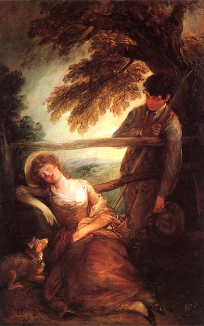
A pastoral film blankets the scene in the warmth of a summer day on a simple hillside. The girl relaxes, guarded by her dog and watched over by a farmer who leans against the fence that divides them. The warm-toned, tender brush strokes give only faint outlines in some areas and great detail in others, making the whole scene seem like the dream of the sleeping girl– too beautiful to really exist anywhere besides a painting.
Jun 7, 2012 | Museum of Fine Arts: Boston, painting
 |
| Oil on canvas |
The saint’s body swoons, as if he’s just kelt over from the intensity of all of it. A small angel, with the face of a boy but a strength that must be many times what’s expected, holds all of the falling saints weight, his wings touched with red and his young cheeks flushed. In comparison, the saint looks nearly dead, his face the same gray color as his robe; his three-dimensional halo floating softly above his tilted head.


