Jul 9, 2012 | MoMA, Museum of Fine Arts: Boston, museums

Favorite: Museum of Fine Arts, Boston
You can probably tell by all the MFA pieces I’ve been posting recently that I’m kind of smitten. From the outside, it looks like a mini-Met, but inside the rooms are more specifically decorated for the kinds of art within them. For instance the ancient Etruscan/Persian room is lined with geometric shapes with yellow/brown walls, while the contemporary art (in a completely different part of the building) is in a huge open room with white walls and high ceilings. Each room you walk into changes your mindset, and makes you more receptive to what’s inside.
There’s even a long, tall hallway filled with Renaissance paintings stacked on top of one another. It reminded me of the National Gallery in London or the Louvre, both filled with tall rooms of painting on top of painting next to painting. A part of me hates rooms like this because it doesn’t give each piece the space it deserves, but most of me loves the impressiveness of all those beautiful things so close to each other.
They also have these great “Conservation in Action” rooms where you can see works of art in the process of being preserved. There’s clear glass separating you from the preservationist’s workroom and they write notes on a blackboard about what step of the process they’re on

and what else it will take to keep the work in good condition. I’ve never seen a room like this in a museum before, but now I really think they all should have them, because anyone interested in seeing art and ancient artifacts would definitely be interested in what it takes to keep these things around.
Aside from being well-curated with beautiful rooms, the museum has a really solid collection– both in ancient art and contemporary, a feat not easily accomplished. They have the Red and Black Room wall paintings from ancient Rome, gold-lit rooms of Egyptian hieroglyphics, plus the standards by Warhol and Chuck Close. It’s also one of the few museums that actually had great contemporary art, including Manhole by Ivan Navarro (right, 2011) and some I’ve already written about like Cecily Brown’s Skulldiver III. Of course there’s always that “Black Panel” that sneaks in under the guise of ambiguity and draw-your-own-conclusion nonsense, but for the most part this place is filled to the brim with must-sees.
Least Favorite: Museum of Modern Art, New York
Now that I’ve been living in New York for a while, this and the Met are probably the museums I frequent the most. And every time I go I think, “Maybe this time they’ll step it up,” but unfortunately most of it is just trash– and I mean literal trash. I think it was supposed to be some sort of comment on the wastefulness of our society, but I’ll never forget walking into one of the temporary first floor galleries and just seeing random piles of trash sectioned off as “art.” Which is pretty lazy art if you ask me.
Maybe it’s because I just don’t “get” modern art most of the time, but I really don’t understand most of what this place chooses to showcase. The reason art is so great is because it takes time and talent and actual thought, and to me, calling everything you make “Untitled” is just a cop-out for not having a reason for making it in the first place.
The permanent collection is what I go to see. Of course there’s Starry Night and they recently acquired Monet’s Water Lillies (although I’m not sure for how long), but the new exhibits on the top and bottom-most floors are usually not worth taking the escalator to see. I know some people enjoyed the Cindy Sherman exhibit, but if I wanted to see a narcissistic Halloween party I would have stayed home and played dress-up myself.
I just feel like there’s so much potential for the temporary exhibits, and so much of it is wasted on blurry photographs and type-print posters. The Paining and Sculpture exhibits on the fourth and fifth floors make the MoMA worth going to, there’s just nothing to come back for once you’ve seen the good stuff. I recommend going on Friday afternoons when it’s free– just be prepared to elbow some tourists if you want to see what’s worth seeing.
More photos of the MFA (all taken by me):
Mar 8, 2012 | MoMA, painting
Water lilies, water lilies, water lilies. One of the most renowned and beautiful pieces of art sits before me right now. I mean, I couldn’t not write about it. Or at least try. I don’t know when these paintings arrived at the MoMA, but I’m so glad they’re here. The different layers of water, white, and lillies gives the whole scene so much depth. The rich, whitest pink that reflects the clouds above, along with the dark deep shadows on the right, lets me imagine the world outside this piece, and imagine myself in it. Another layer of depth comes from the varying shades of blue, indicating which spots of the lake are the deepest within the water. The green lillies are surrounded by a light hue of purple in some places, setting them apart while blending them into the blue water beneath at the same time. So so beautiful. Everyone come see it in person. Right this second.
Feb 14, 2012 | MoMA, painting
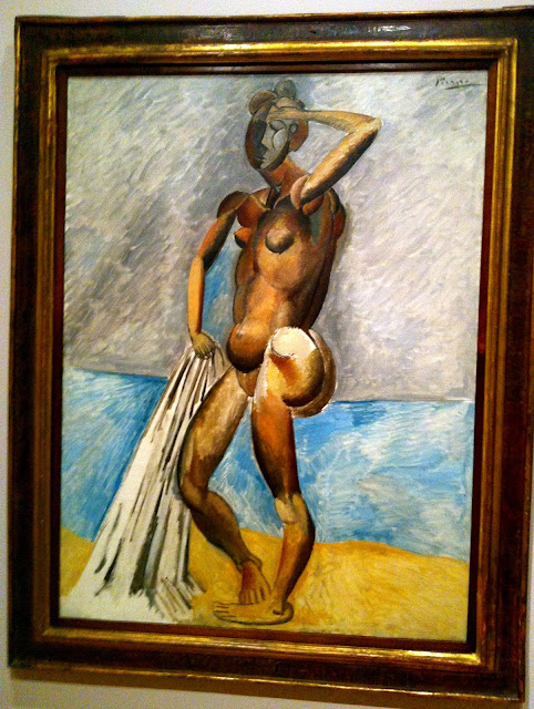 |
| Oil on canvas. It’s at the MoMA! |
His body is shown contorted, comprised of rounded shapes derived from the natural world. Reality is not a concern in this place, a semi-composite view is even used to reveal a second butt cheek and a line of back muscle that would have remained hidden otherwise. His face is grayed and abstracted in the same fashion. His joints consist of more rounded pieces than the rest of him; each piece of his shoulder fits into the next the same way our shoulders give us the same ability. But second to his abstracted use of composite parts, comes his use of color, with dark to light gradients revealing shadows on his back and a point of light lying behind the viewer. And the abstract use of stark white on his behind and dull gray on his face complements the rest of the portraits abstract nature. He’s holding his towel that still partly lingers on the ground while wiping his brow with his other hand. His unnatural pose and abstract representation leave us with no indication as to whether he’s just had a bath or is about to. He could be really dirty or really clean, although it hardly seems to matter. Only in that it gives him a reason to be nude and on the beach.
Jan 9, 2012 | MoMA, painting
 |
| Oil and enamel on canvas. |
(I saw the de Kooning: A Retrospective exhibit at the MoMA this weekend:)
Because of its strategic placement within the exhibit, you know it’s a big deal. It’s at the dead center in the very back, as a way of suggesting that this is what the rest of the exhibit is leading up to. And it’s understandable why it’s such a big deal. I’ve never seen anything like it. It was completed in the same harsh, hurried style that de Kooning seems fond of, but the slashes and spots of color seem more like the result of a more methodical process. The yellows, dark pinks, turquoises, and deep reds break through the overwhelming creme/beige color in ways that both complement the colors themselves, as well as their placements on the canvas. The sometimes-dripping, sometimes-smudged, black lines that surround and seem to almost reveal these colors really does make the piece a kind of excavation. A search for color and brightness that takes a lot of harsh black and ugly beige to find. It makes me pretty proud to be wearing bright red pants as I stand here staring at it.
Jan 7, 2012 | MoMA, painting
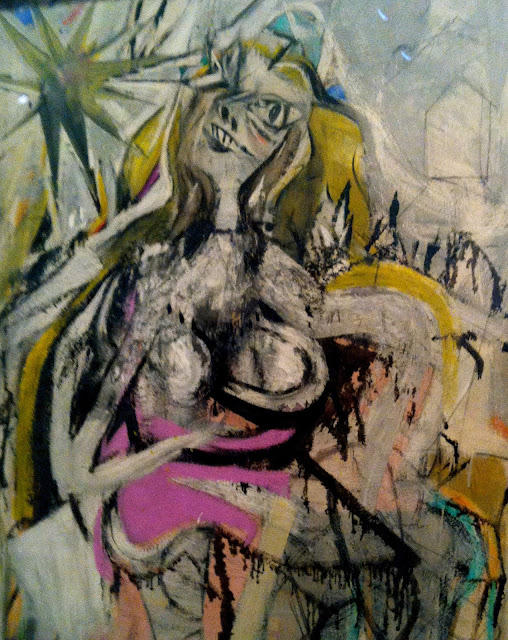 |
| Oil and enamel on fiberboard. |
At first glance she’s almost frightening. The harsh, dripping nature of the ink outline of her dress gives the whole piece a rather crude, unfinished look. But it’s obvious by the content of the painting that it actually is finished.
The woman’s left eye is wide and cartoon-like, while her right is blurred and blinded by a huge star above her, morphing the entire space where her eye would be into a deliberate reflection of the star’s dark light. The other elements of her face are scratched out in a similarly eerie fashion, with her nose mostly nostril and her mouth mostly teeth. The empty, colorless outline of a house behind her is only background, the past, forgotten. Especially when confronted with her rounded irregular breasts magnified by their foreground presence, and bright off-putting hues of purple, pink, turquoise, and orange. The pale, sick yellow of her willowy hair mirrors the yellow of the star that she seems to be so enthralled with.


