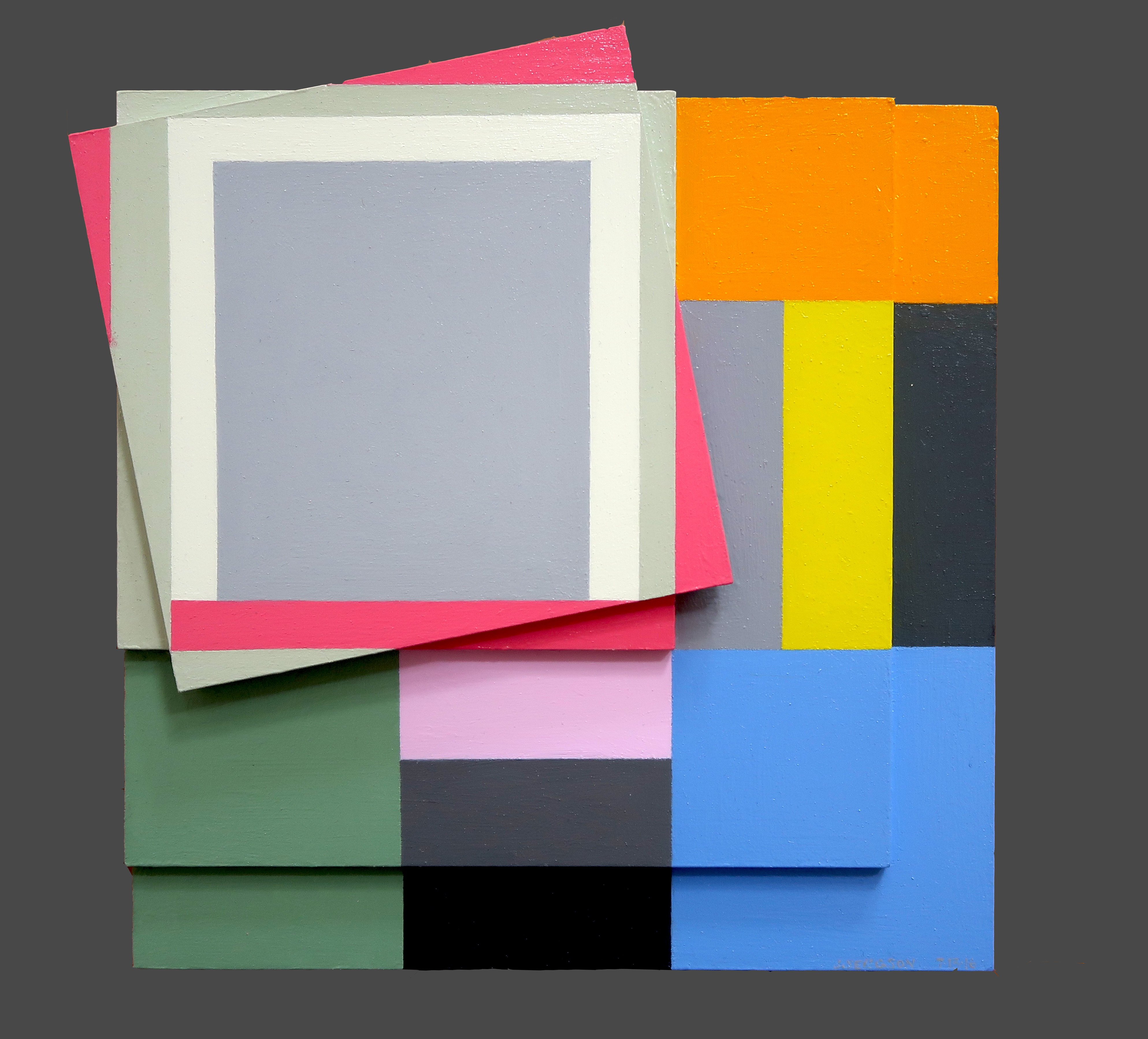
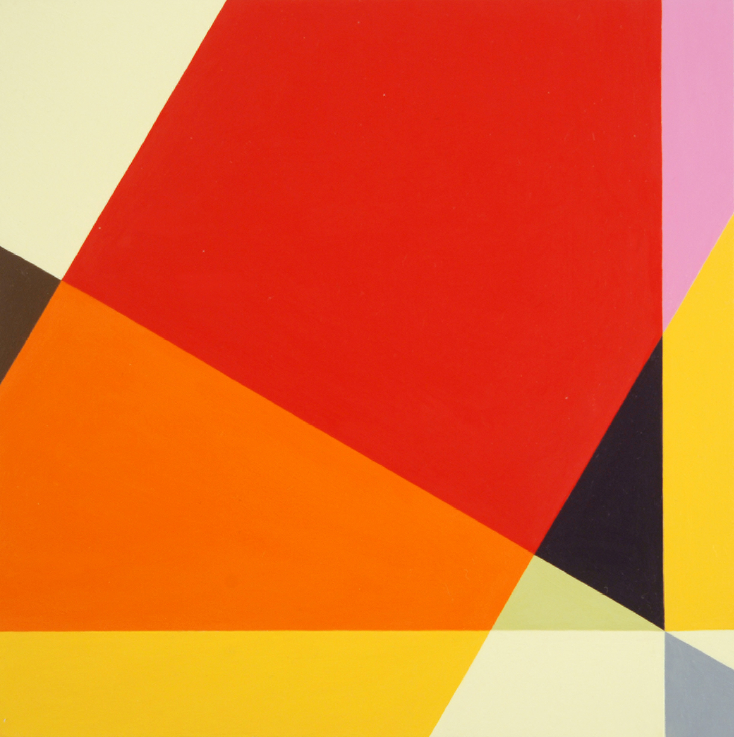
Judith Seligson
Signs Of Struggle, 2016
Oil on panels
8.5 x 8.5 in.
Courtesy of the artist
Colors fracture, shapes surface, and together the two work in tandem to continue Josef Albers’ exploration of minimalist, geometric compositions. Judith Seligson’s new exhibition Drawing the Line is comprised of elegant, cheerful examples of shape and color getting well acquainted.
How did you begin in geometric painting? What was the initial spark of inspiration for you?
I developed a series of charcoal drawings in my first studio, in Cambridge, MA in 1973, just after I graduated from Harvard, that presaged everything that was to come. I was drawing from life; both the studio itself and a vase of my mother’s dead roses were my subjects. Despite charcoal’s propensity for infinite shades of gray, I found myself using the charcoal simply to outline discrete empty shapes. Each petal surface was a shape. This method flattened objects and made them of a piece with everything else in the work, like tesserae in a mosaic.
At that time, too, I was studying a book called Cézanne’s Composition: Analysis of His Form with Diagrams and Photographs of His Motifs by Erle Loran. He “reduced” a painting to a series of lines of force. I began applying this method to some of my favorite Vermeers. Vermeer too focused my attention on drawing architecture.
My love of building blocks and of finding hidden structures in a painting and in life continued to grow and develop. Still, I pushed against it then and still do. In 1978 I had a show of painting pairs – each pair used the same palette, but one was geometric and one expressionist. I ended up pursuing the geometric direction, thinking that I could always pull the expressionist one off the back burner if I needed a change. When I look at those small painting pairs now, I find the expressionist ones much better than the geometric ones.
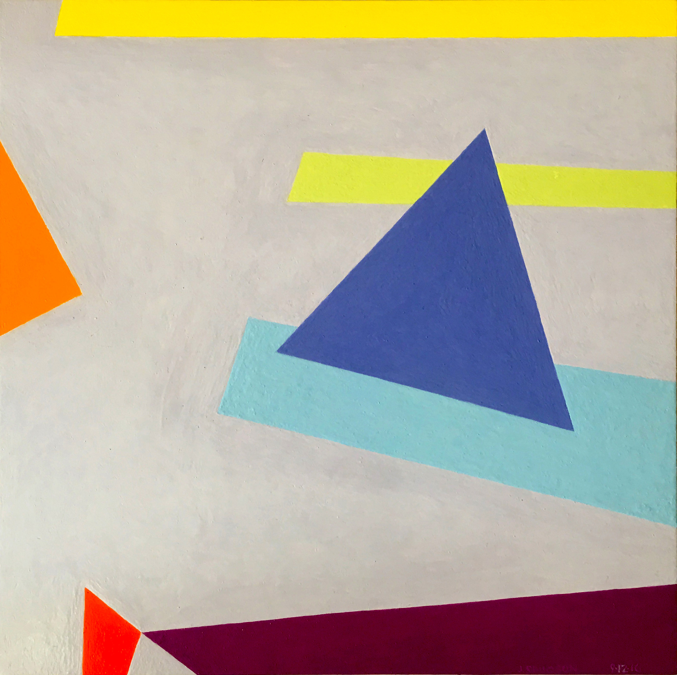
Judith Seligson
Golden, 2016
Oil on panel
7 x 7 in.
Courtesy of the artist
Galérie Mourlot describes your work as having a “feminist bent.” In what ways do you see your work as uniquely feminist?
Here is a quote from my article, Contrapuntal Painting, which appeared in the Radcliffe Quarterly, March 1992:
“Many of my paintings are diminutive, intimate, three to five inches in either direction. Rather than physically overpowering (as many men are to women), they suggest a more interactive relationship with the viewer. Smallness in art may be coming under a more favorable star, but in my lifetime size has mostly been a directly proportional measure of importance and, though no one would admit it, quality. The small works are painted on paper. Arthur Danto has aptly pointed out that paper, since it is so expendable, is considered a less “serious” medium than canvas, panels, or walls, and so has become associated with the artist’s “intimate moods.”
“Paper and women have a lot in common in that they both have developed a reputation for being less than serious but good for intimate moods, and maybe even expendable. I take these stereotypes, these preconceptions, and play with them. I draw on the bare paper — actually four-ply museum board — and then apply multiple layers of a gesso wash to protect the painting from the board. This way I can be serious, intimate, expendable, and conservable all at once.”
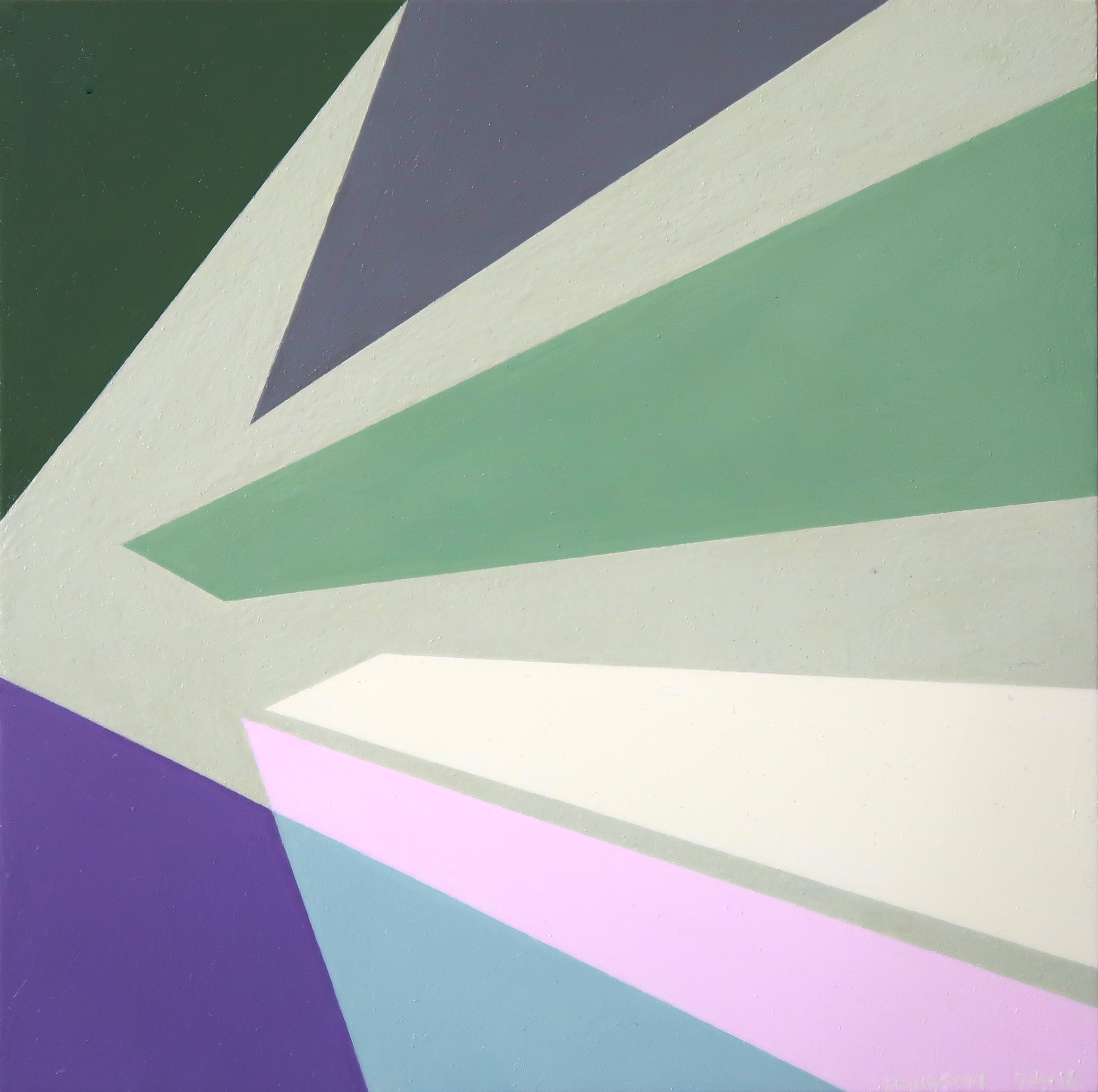
Judith Seligson
Healing Brush, 2016
Oil on panel
6 x 6 in.
Courtesy of the artist
When did you first introduce three-dimensionality to your work?
About four years ago. I was making a series of collages using, among other things, fragments of my own paintings. These were works I didn’t love or didn’t think were finished, but couldn’t toss. Then I started placing paintings that I had signed into a single composition. That led to adjusting one or the other to improve the composition. Then I started gluing together completely blank panels. At that point, I didn’t know how I wanted to paint them. I looked at them for over two years until I figured out the topological painting in Fine Tuned.

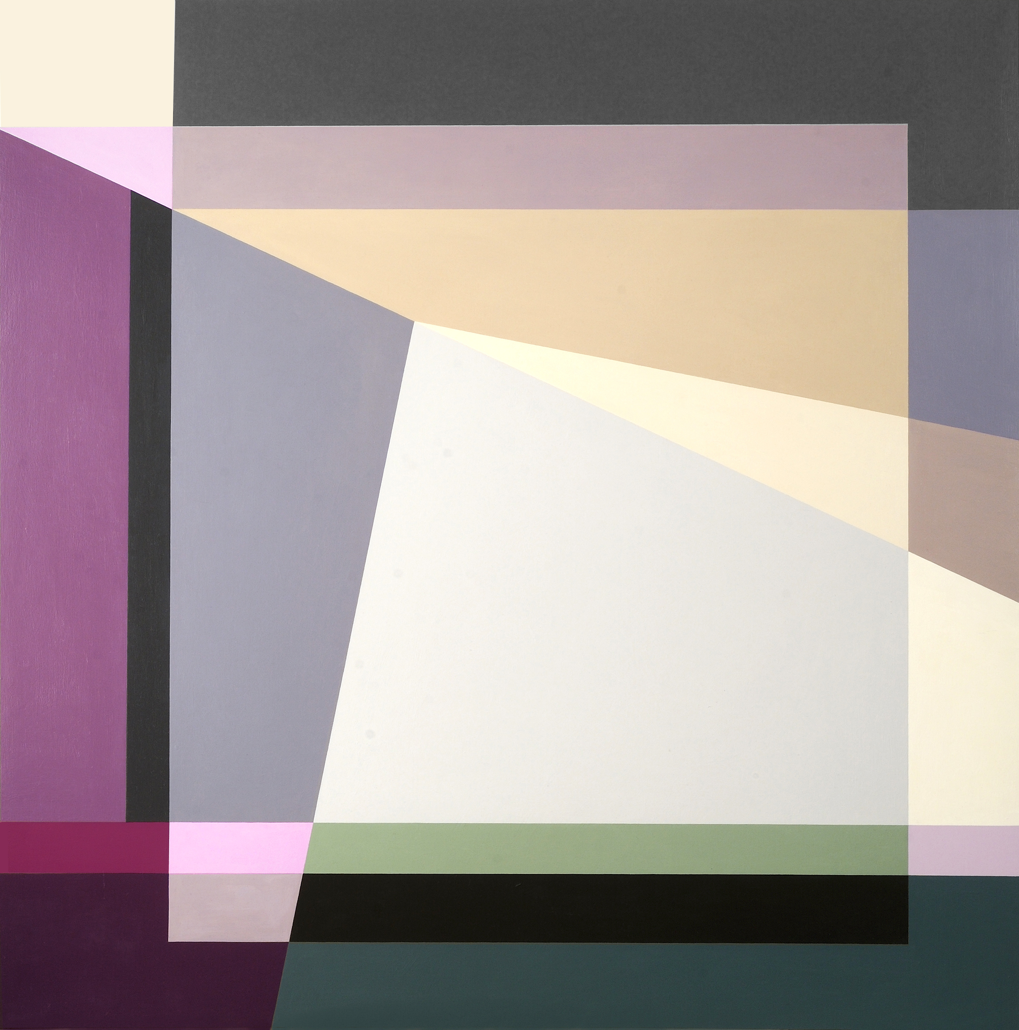
Judith Seligson
Complications, 2016
Oil on panel
11 x 16 in.
Courtesy of the artist
Can you walk us through the process of creating one of your works? Which comes first, color or shape?
The chicken or the egg. Each painting begins with a graphite line drawing. Usually, I draw directly on the painting surface. Sometimes, I trace a drawing onto a panel, or enlarge a small drawing onto a larger surface. I draw and erase until I see the blank shapes pushing and pulling, à la Hans Hoffman, moving in the shallow 3-D illusionary space created by an interplay of color and form.
I then apply several layers of thinned gesso, sanding between layers, to get a very smooth surface. The drawing is still visible, but the graphite will not mix with the paint.
Positive shapes, like a vase, will appear in front of a negative shape, like the shape around the vase. Matisse said that painting begins when you can see both the vase and the space around it at the same time. Warm reds push forward, blues recede. I work each against the other so that the color shapes are pushing and pulling my eye around the surface in what I call I visual melody. I will use a cool color to push back a shape that appears too forward, or a warmer color to pull forward a shape that is receding. Like a great song, a visual melody is a whole structured by notes, tempo, dynamics, and a sense of beauty – or is it pleasure? Each shape is a note in several simultaneous visual melodies, playing on the scales of hue, tone, temperature, intensity, and negative/positive shape. I have called my work Contrapuntal Painting, in that counterpoint in music is created by two or more melodies played simultaneously. Each is both an independent melody and also the harmony to the other.
In this sense, too, my work is feminist. Man and woman can be the counterpoint to each other, rather than the woman traditionally being only the harmony to the man’s melody.
Judith Seligson
Self Portrait, 2014
Oil on panel
36 x 36 x 2 in.
Courtesy of the artist
Which artists or websites do you most often find yourself looking towards for inspiration?
I look to many of the Dutch painters – Rembrandt, Vermeer, Mondrian, and de Kooning. Their devotion to structure and to light in a painting is a constant inspiration.
I like Elizabeth Peyton’s small portraits and Cecily Brown’s paint handling. I like Peter Halley’s electrical circuit paintings. I look at and read Artforum and Bookforum in print. Intermittently, I read artnet News, Hyperallergic, and Blouin Artinfo.
Judith Seligson
Candy, 2008
Unique digital painting on canvas
43 x 43 in.
Courtesy of the artist
Drawing the Line opens tomorrow, November 17 at Galerie Mourlot on 79th Street in Manhattan where it will remain on view through January 9, 2017.
loading...


